Watch Me Draw the Pug Goblin
Summary
Pug Goblin Character Process
This session covers the complete process of creating a fantasy pug goblin character in Photoshop, from a blank canvas through to a finished colored illustration. Over the course of ninety minutes, the work moves through rough massing, sketch refinement, finished line work, flat color application, and final color adjustments. The character is a small, stocky goblin creature wielding dual clubs, designed with a mix of monster appeal and cartoony charm influenced by Jim Henson-era creature design.
The demo showcases the honest pace of professional illustration work. There are no shortcuts or time-lapses. Every decision, hesitation, and correction plays out in real time, revealing how a professional artist navigates the inevitable uncertainties of designing something from scratch.
Rough Sketching
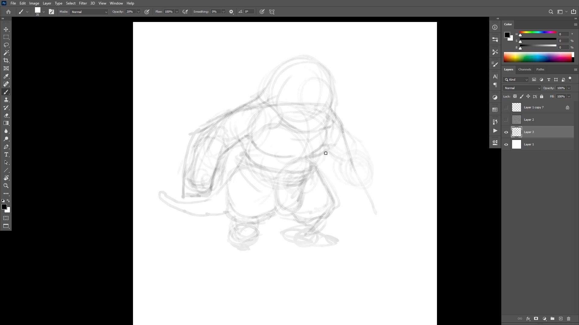
Massing In and Construction
The process begins with a large, low-opacity brush used specifically to prevent premature detail. By keeping the brush big enough that fine detail is physically impossible, the early phase stays focused on overall mass, pose, and proportions. The character gets pushed and pulled through Photoshop's warp tool to test different compositions and proportions before committing to anything.
Center lines play a critical role throughout construction. Finding the center of each form, particularly the head, determines whether features will read correctly once detail is added. The session demonstrates how drawing through forms, letting construction lines cross and overlap, creates the structural foundation that finished lines will eventually follow. Avoiding symmetry in the pose is a conscious decision, keeping the two arms doing different things to prevent the image from feeling static or boring.
Line Work
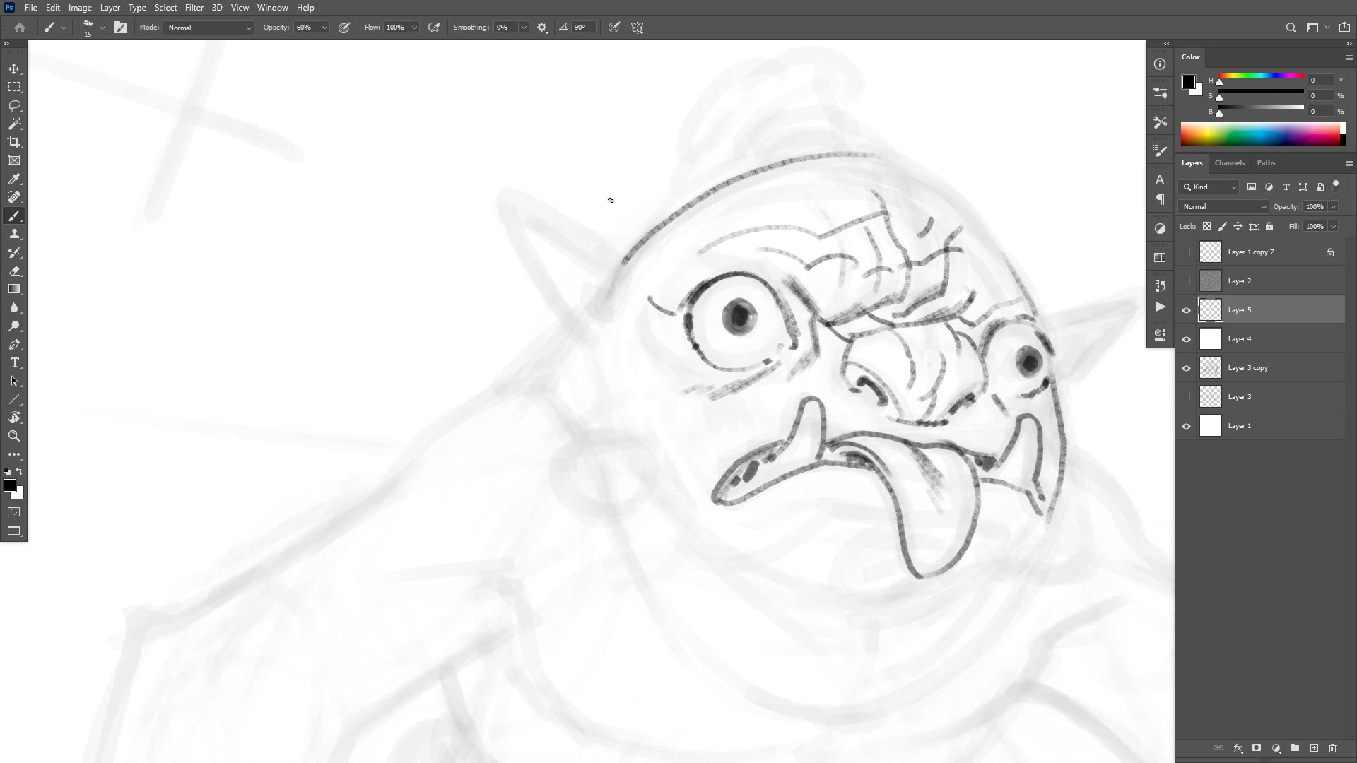
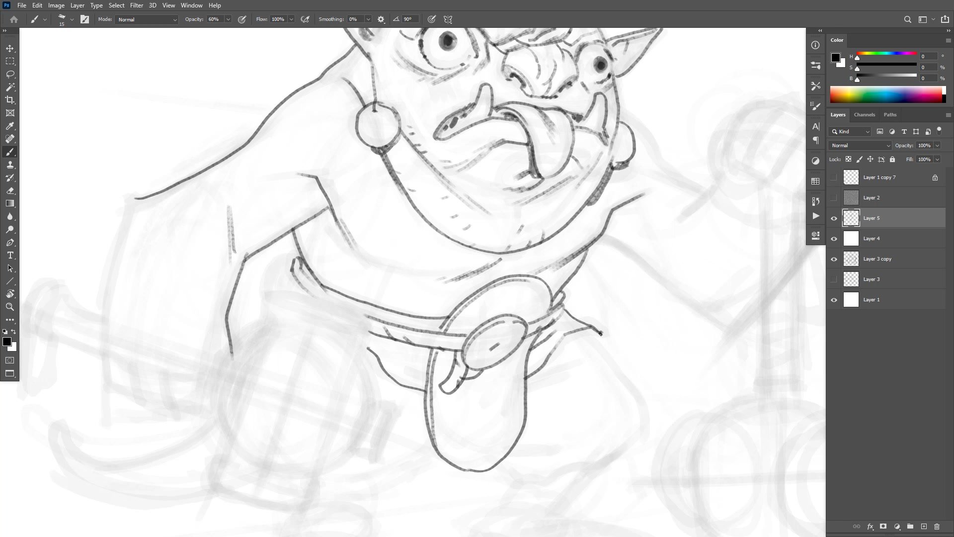
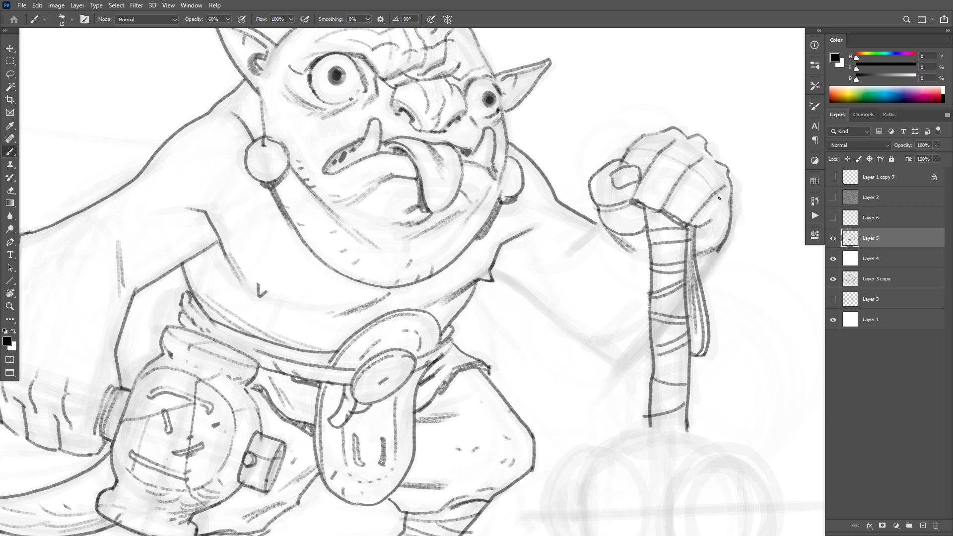
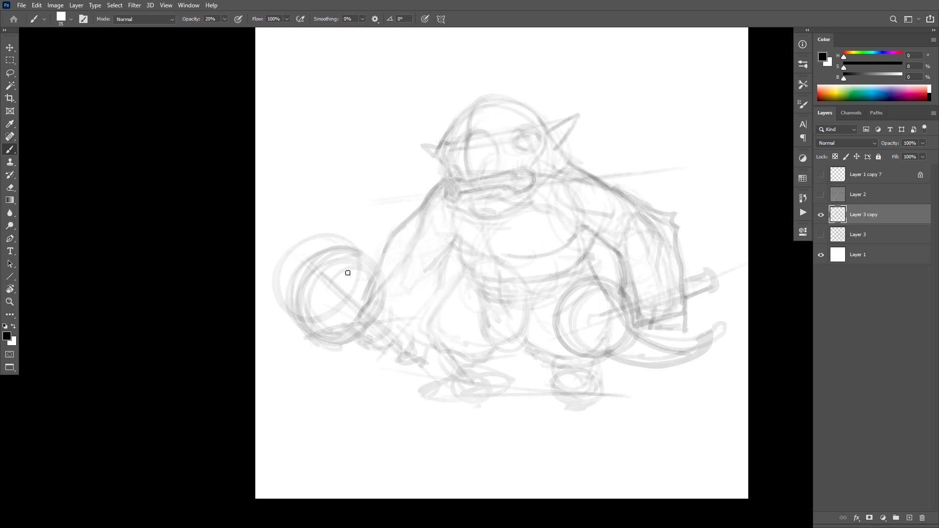
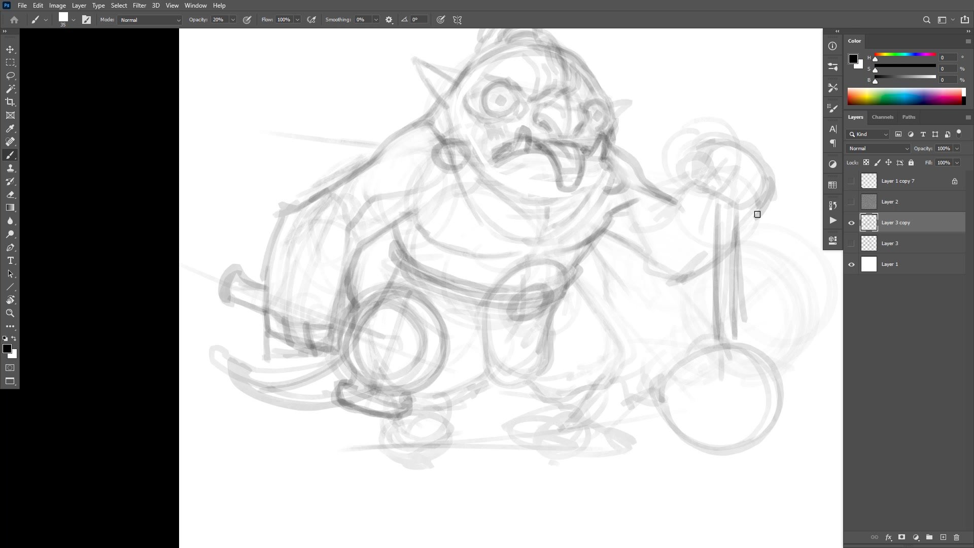
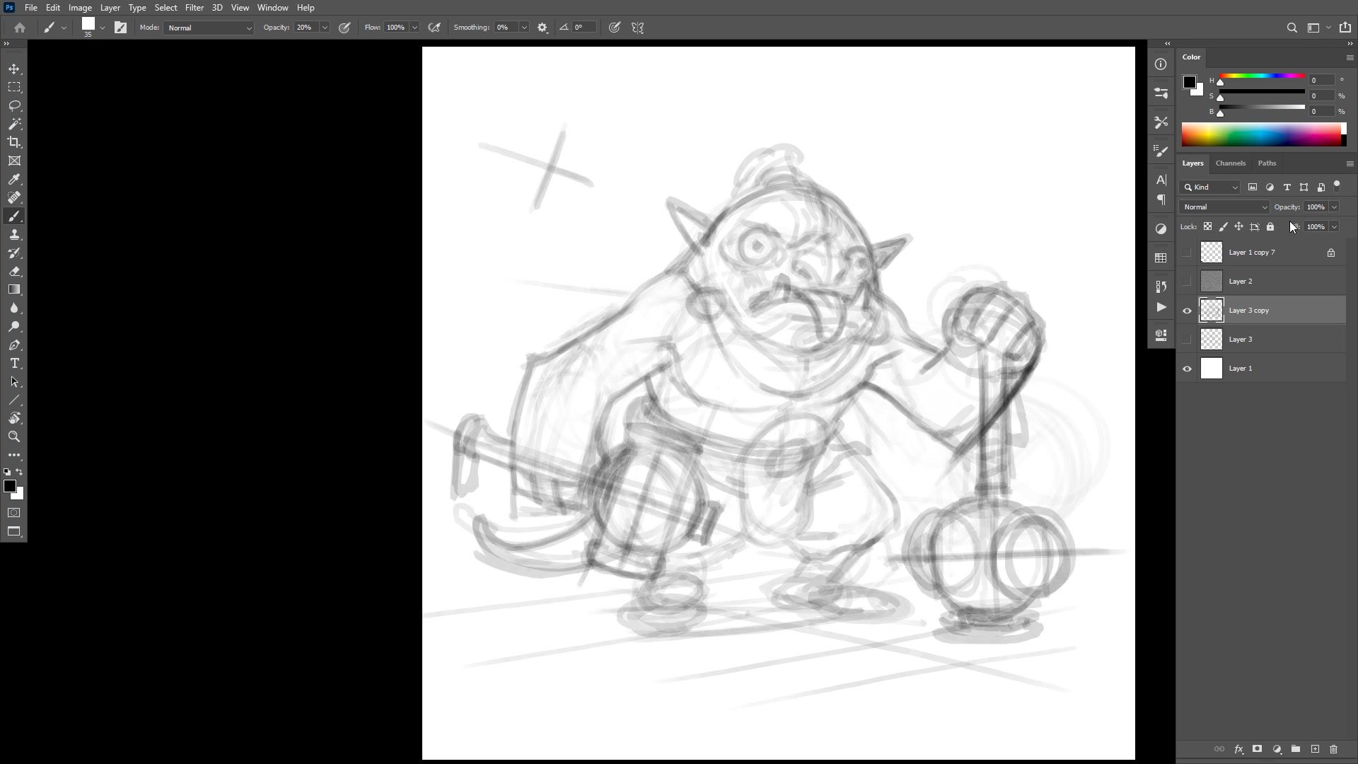
Finishing Lines and Inking
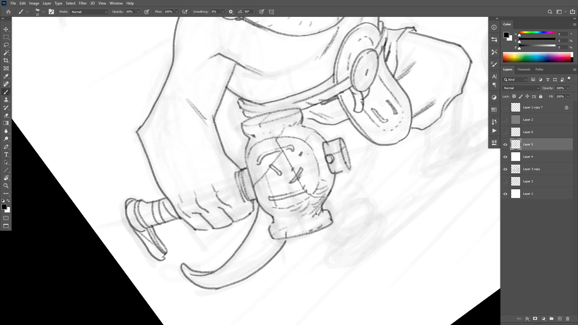
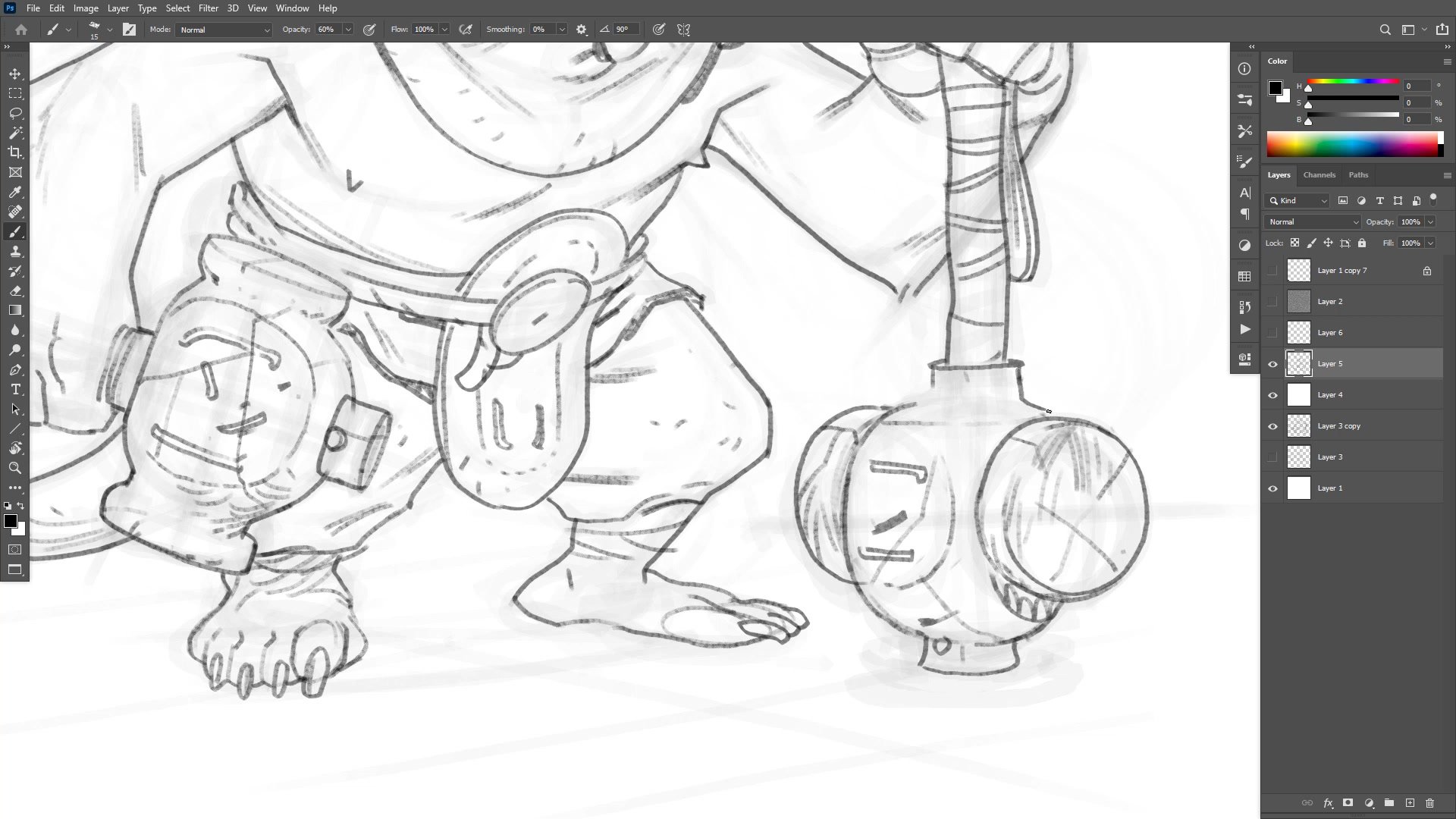
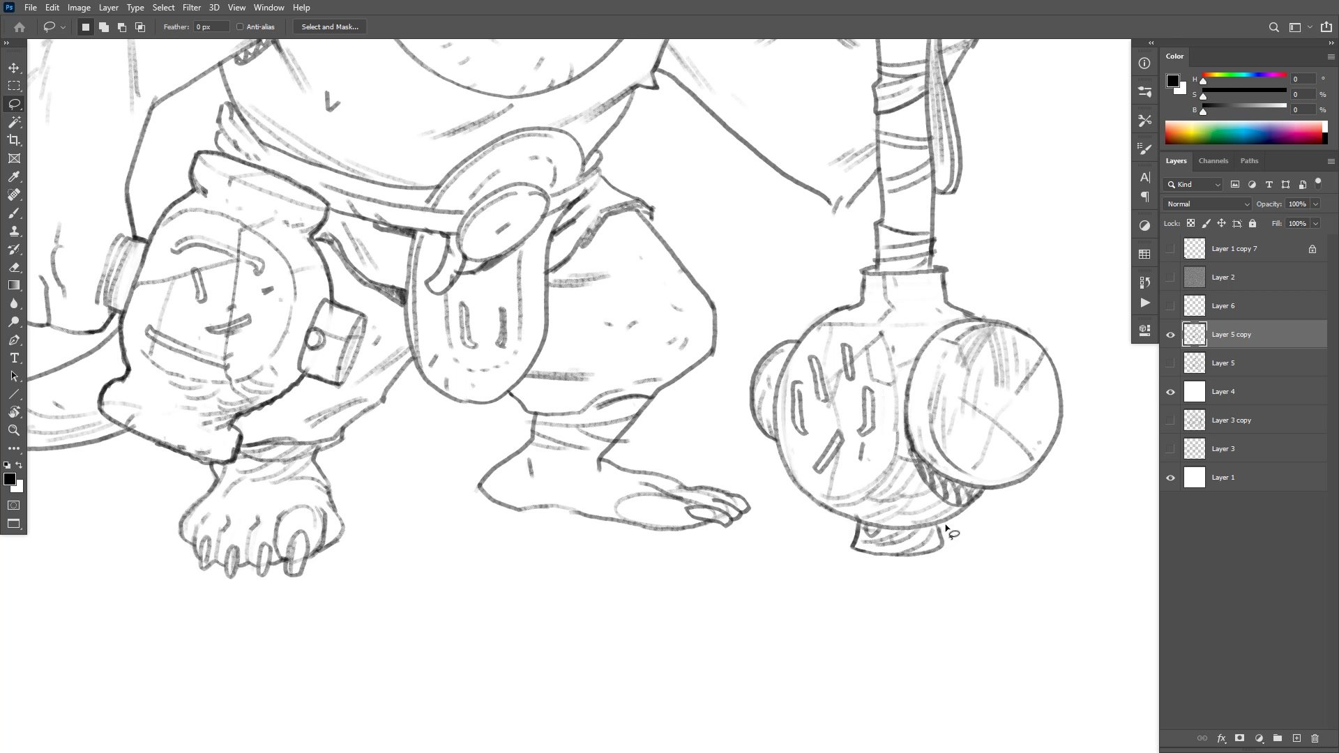
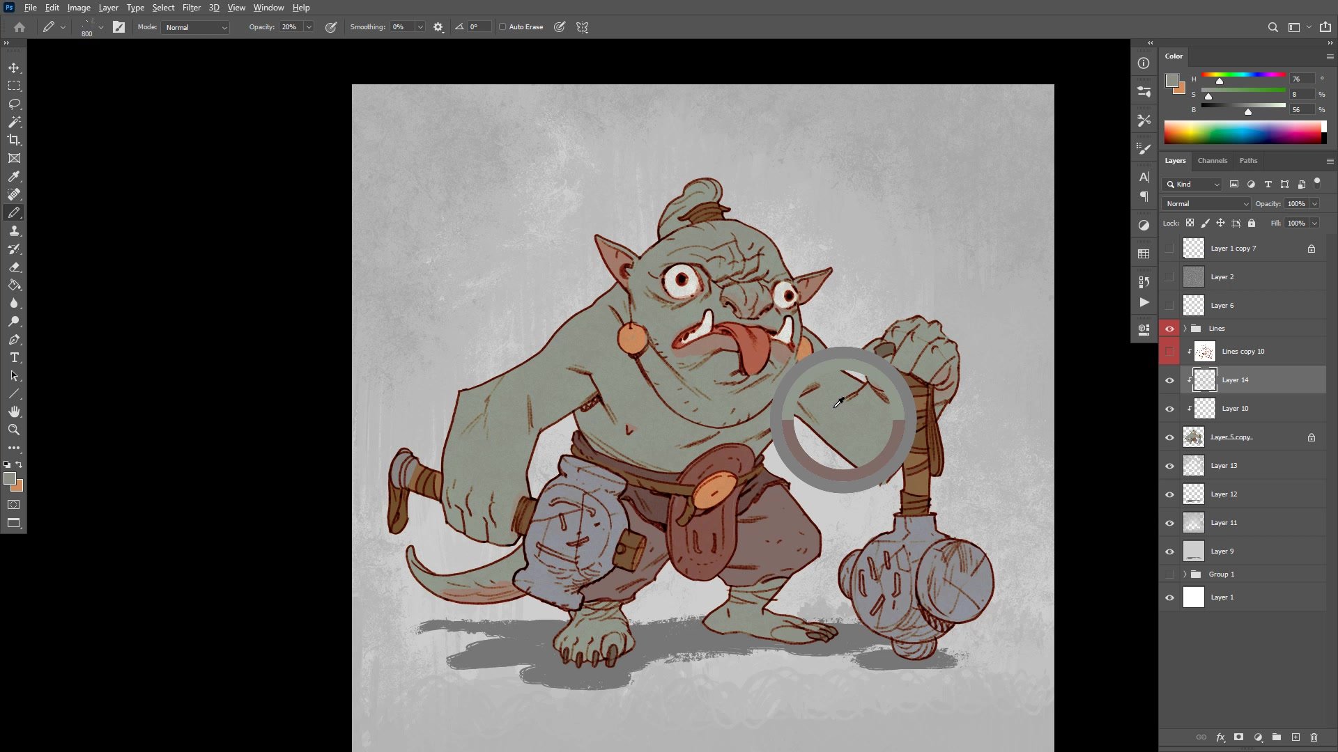
Transitioning to finished lines means reducing the sketch opacity and working on a clean layer above. The brush is set to around size fifteen at sixty percent opacity, providing a balance of control and expressiveness. One of the key challenges shown is deciding the right level of detail for each area. The face receives the most attention, while background elements like feet and tail get left deliberately looser since they are not the focal point.
The session demonstrates practical problem-solving throughout the inking phase. When ellipses on the club weapons prove difficult to draw consistently, the approach shifts to tracing one ellipse on a separate layer and duplicating it, using Photoshop's tools to assist rather than fighting through pure hand drawing. Broken line technique appears in areas where suggesting form is more effective than fully rendering it.
Color and Flatting
Color Strategy and Finishing
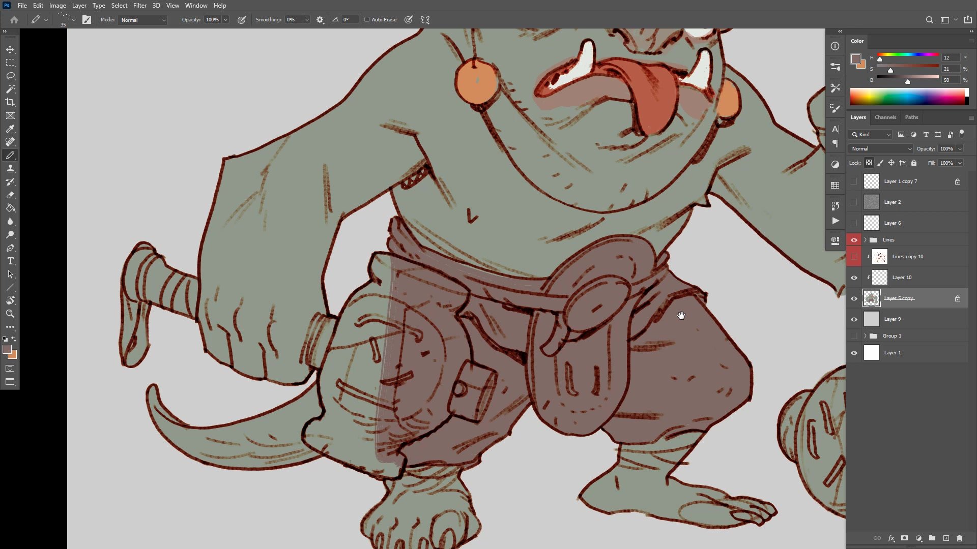
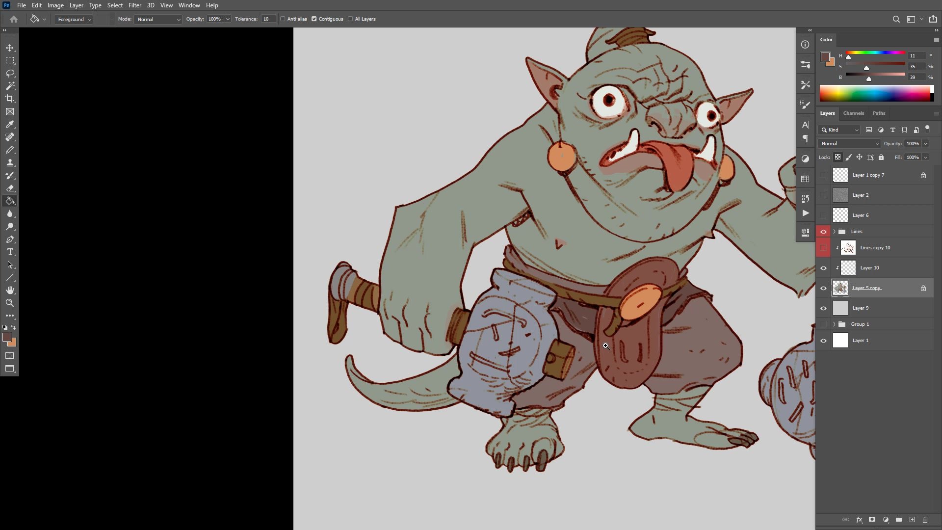
The flatting process works because all lines were closed during inking, allowing the paint bucket to fill cleanly. Base colors are chosen with careful attention to value separation, ensuring the character reads clearly against the background. The skin tone sits around value sixty while the background is at eighty-one, maintaining good contrast without being harsh.
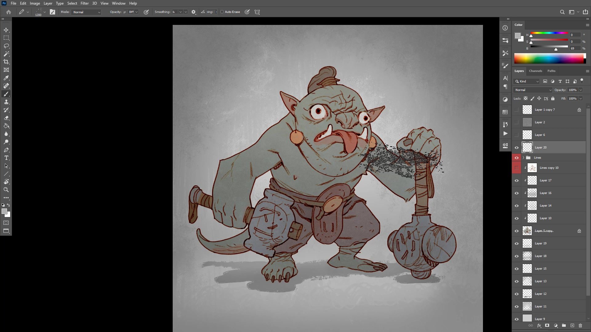
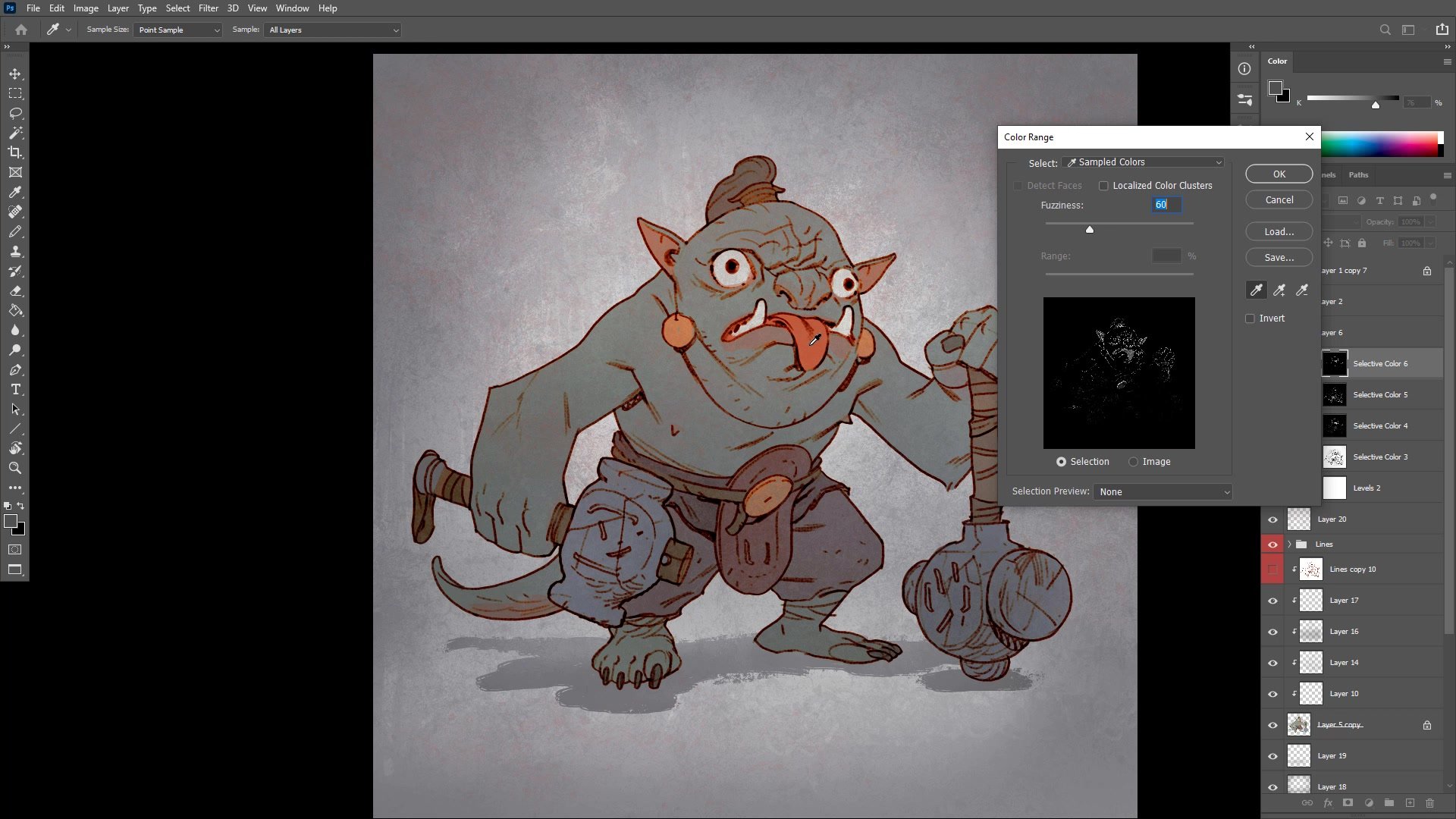
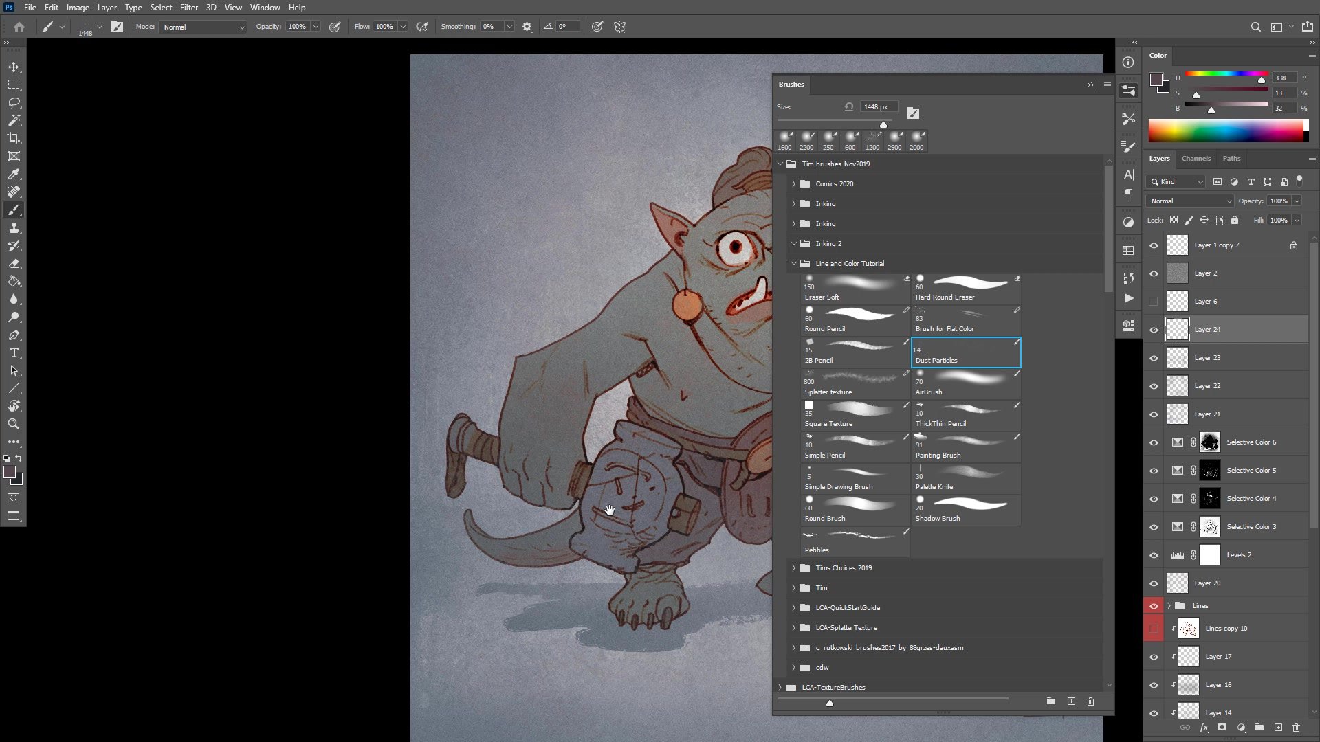
Color refinement uses selective adjustments to push specific areas. Red gets intensified in the eyes, tongue, and ears to create a sense of life and blood flow. Background color gets diffused into the character and vice versa, homogenizing the palette to simulate ambient lighting. Simple gradient work with an airbrush creates vignetting that draws focus to the face. A texture pass using a dust particles brush breaks up the digital cleanliness, adding the kind of natural randomness that traditional media provides for free.
Final Result
Key Techniques
Big Brush Start: Using an oversized brush at low opacity prevents premature detail work and keeps the early phase focused on mass, gesture, and overall proportions.
Draw Through Everything: Letting construction lines cross through forms builds structural understanding. Worrying about clean overlap at the sketch stage tightens the drawing and kills energy.
Value-Driven Color Separation: Monitoring the actual value numbers of base colors ensures the character reads against the background. Good separation at the flatting stage makes every subsequent adjustment easier.
Ambient Color Diffusion: Pushing background colors into the character and character colors into the background simulates real-world ambient lighting and makes the illustration feel cohesive rather than pasted together.
Try This Approach
Start Oversized: Pick a brush big enough that you physically cannot draw detail. Spend the first fifteen minutes only on mass and gesture, resisting the urge to define features.
Close Your Lines: Before flatting, zoom in and close every gap in your line work. This makes the paint bucket tool work cleanly and saves significant time during the coloring phase.
Homogenize Last: After finishing your base colors, take an airbrush at very low opacity and brush some background color across the character and some character color into the background. This single step dramatically improves cohesion.


