Watch Me Draw the LionRider Girl
Summary
Character Design Process
This real-time, fully narrated session covers the complete process of drawing and coloring an original character, the LionRider Girl, from blank page to finished illustration in Photoshop. Over nearly two hours, the session moves through rough gesture sketching, structural passes, finished line work, flat color application, background development, and final color grading. The focus is on character design iteration, discovering what works and what needs simplifying for repeated drawing.
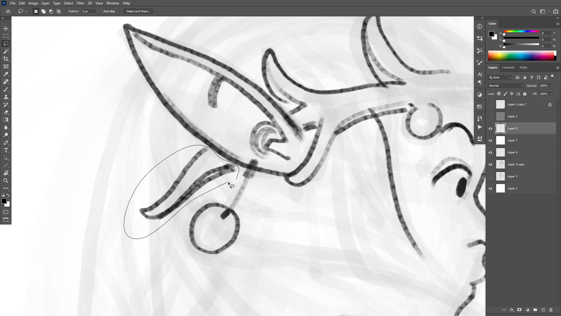
A recurring theme throughout is the tension between design complexity and practical drawability. Elaborate Art Nouveau hair and intricate jewelry may look appealing, but when a character needs to be redrawn hundreds of times for comics, simpler designs that remain fun to draw become essential.
Rough Sketching
Building From Gesture
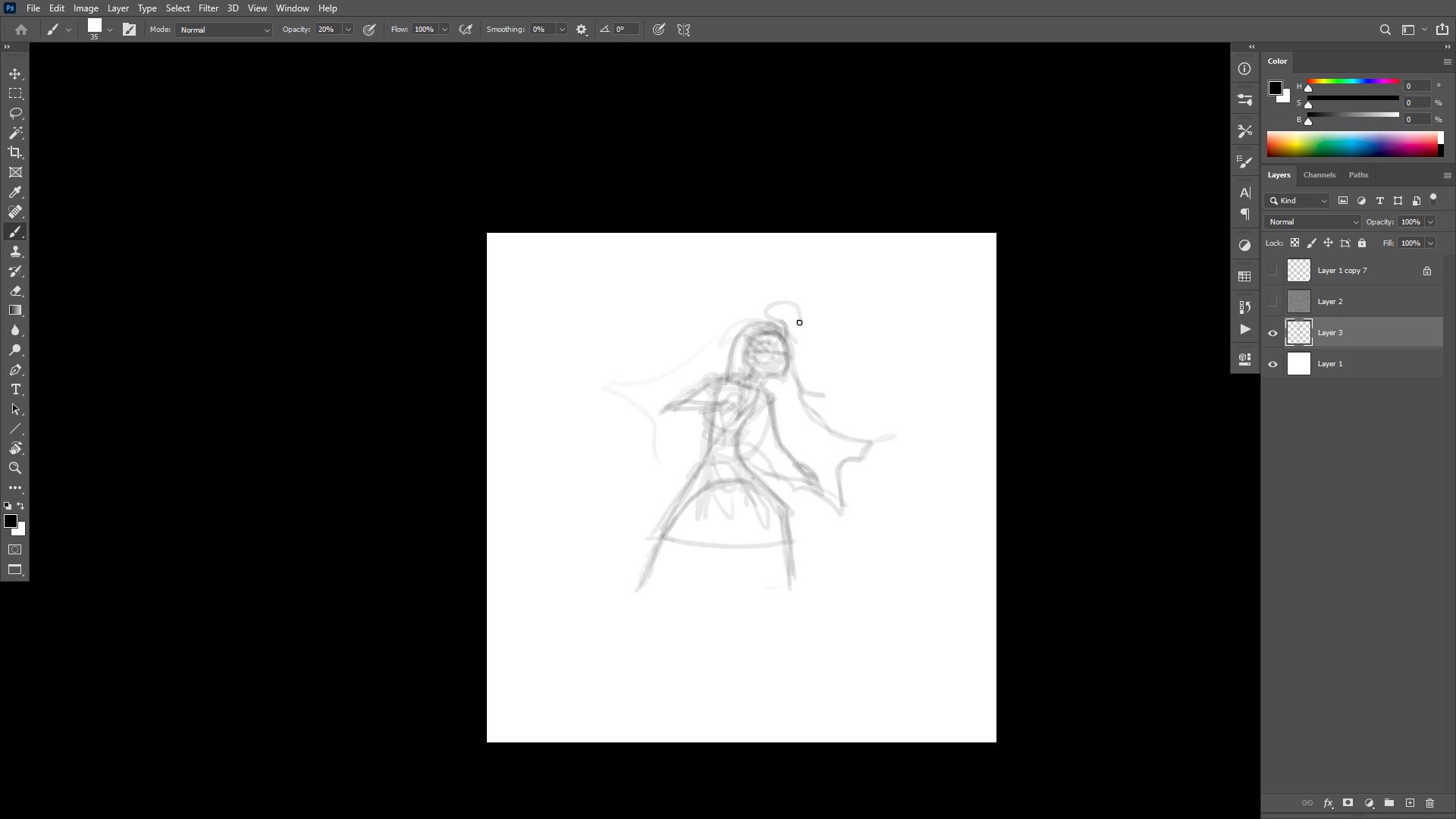
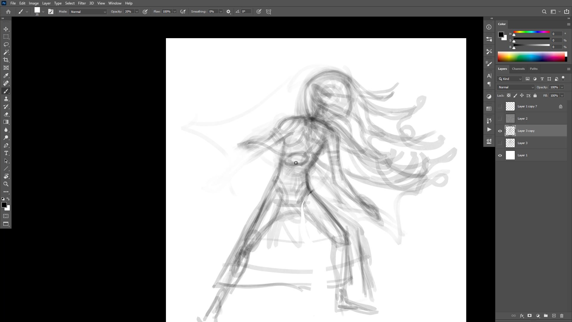
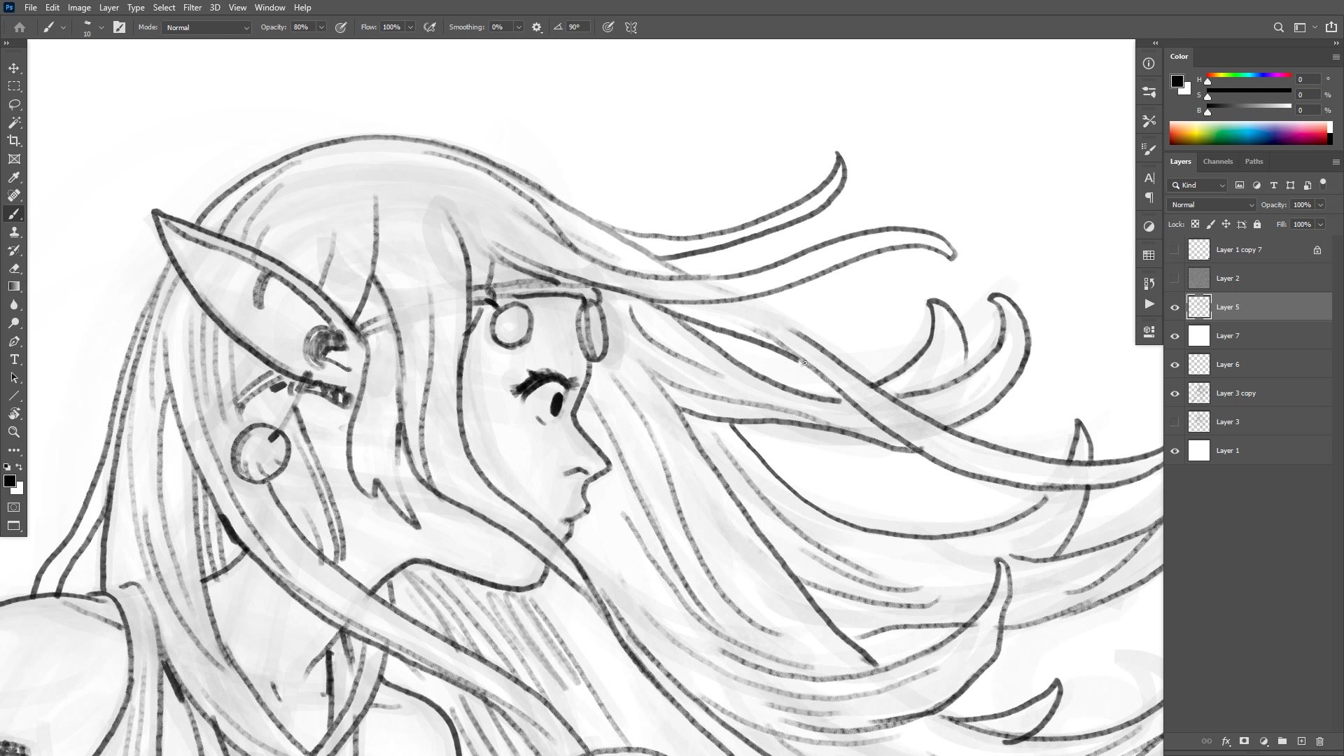
The session opens with a large, low-opacity brush roughing in the major forms. Starting big prevents getting lost in detail too early and forces attention toward gesture and overall posing. The character gets flipped back and forth to check for structural errors, though the emphasis is on fixing problems before flipping rather than relying on the mirror view to catch mistakes.
A secondary structural pass follows, using slightly higher opacity to place anatomical markers like the collarbone, rib cage bottom, and elbow positions. These structural landmarks may never appear in the final drawing, but they make every subsequent phase dramatically easier. The underdrawing exists to support the finished lines, and the amount of preparatory work needed changes from day to day depending on confidence, subject familiarity, and the level of polish required.
Line Work
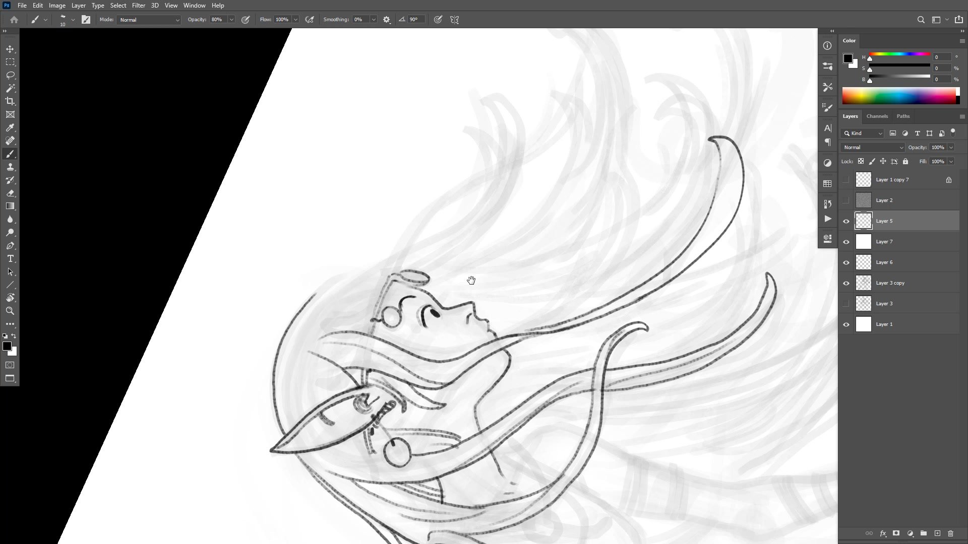
Finished Lines and Design
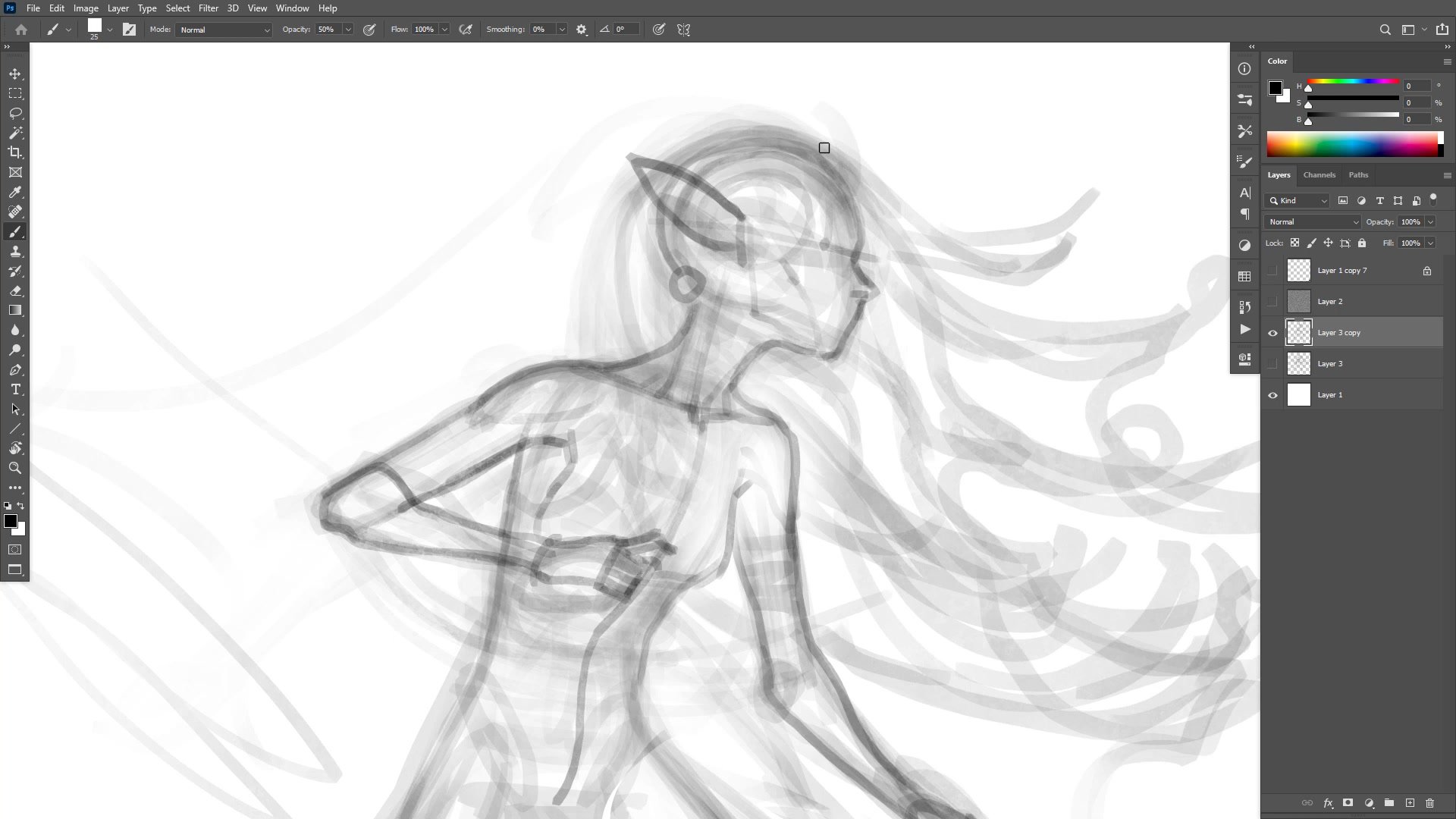
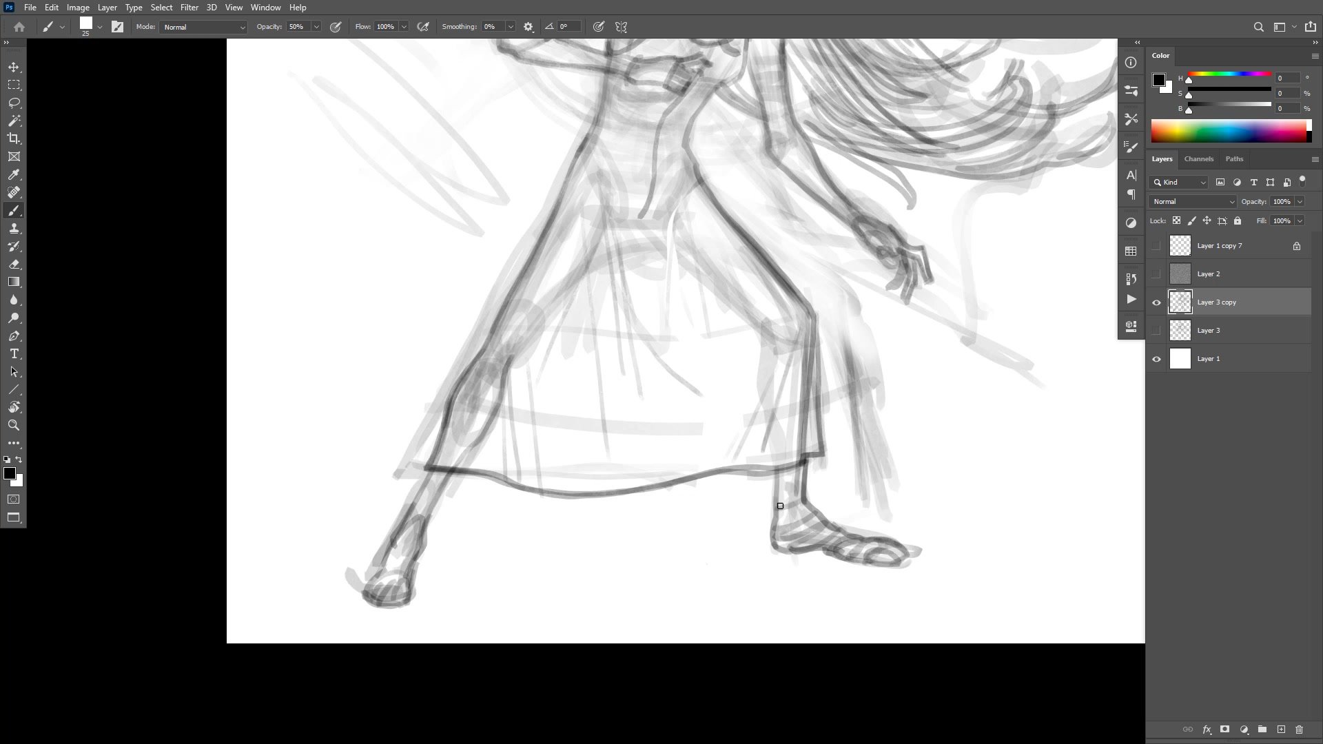
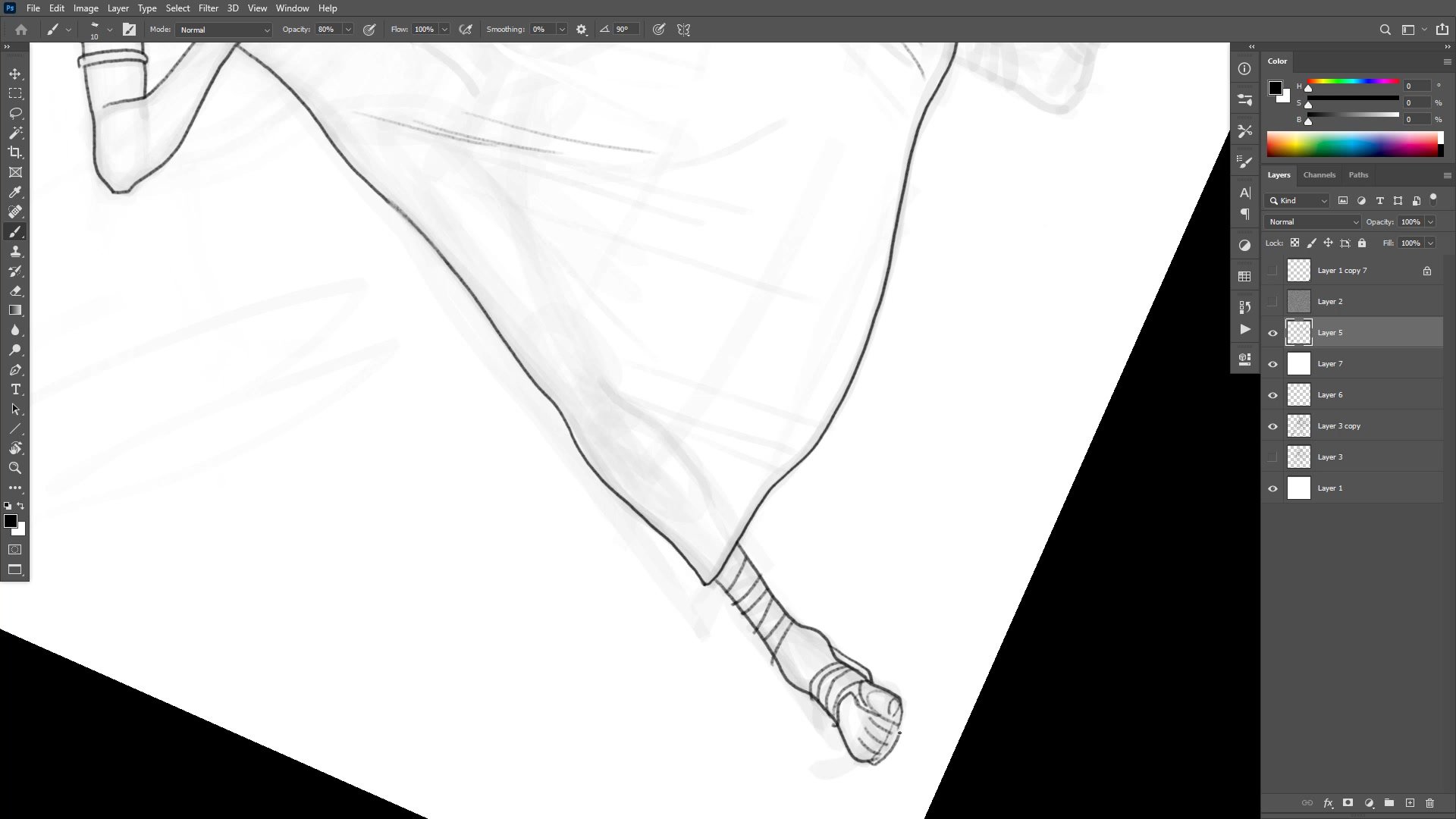
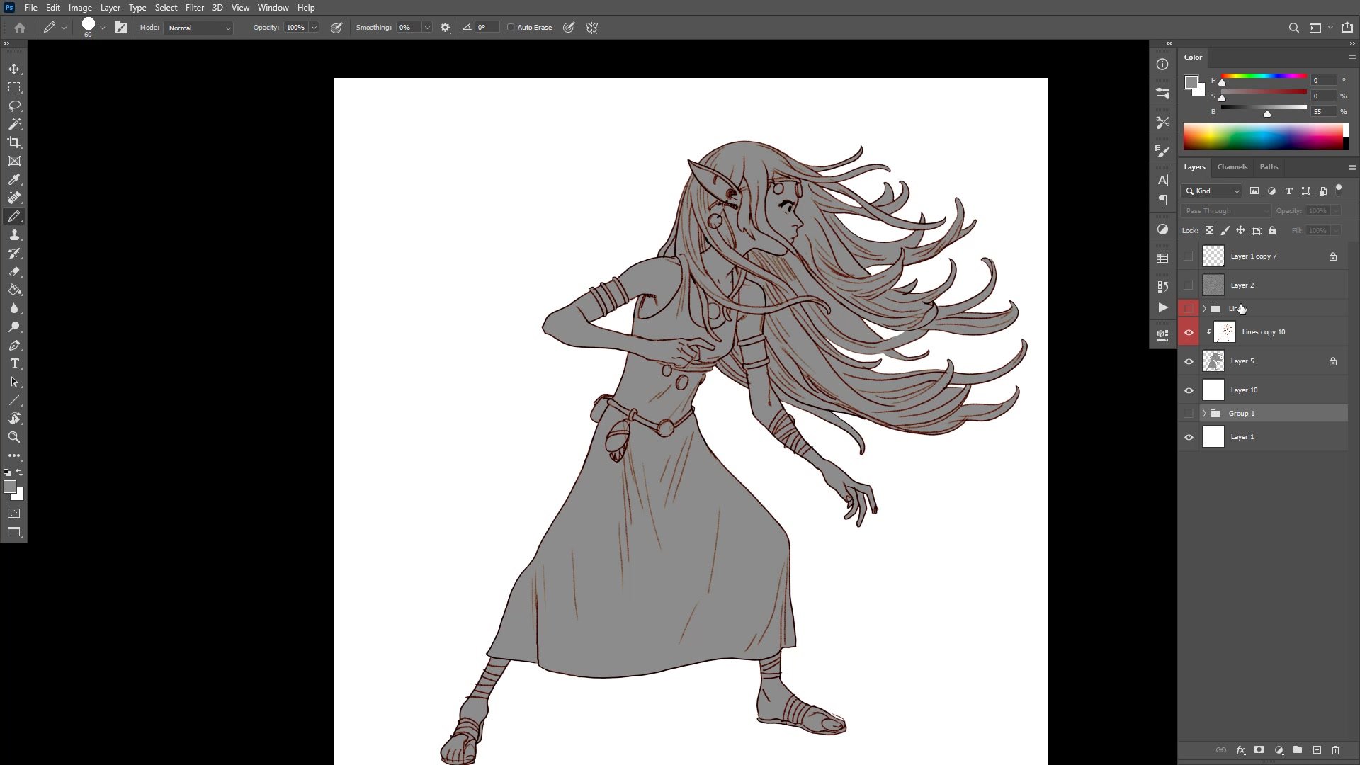
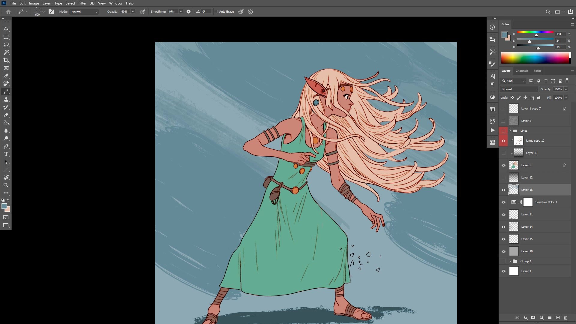
The inking phase uses the pencil tool at around 80% opacity, building up line weight gradually rather than committing to full black from the start. Priority management becomes critical here, drawing foreground elements first to establish clean overlaps and avoid tangent problems. The hands, face, and clothing all compete for attention, and resolving their layering order early prevents fussy corrections later.
A significant portion of the session addresses hair design. The Art Nouveau-inspired flowing locks look beautiful but pose real logistical problems for repeated drawing. This is where character design thinking diverges from one-off illustration. Complicated hair with many broken areas also makes flatting harder, increasing production time without necessarily improving the final result. The ongoing evaluation asks a practical question: is this design element worth the time it costs?
Color Application
Flatting and Color Strategy
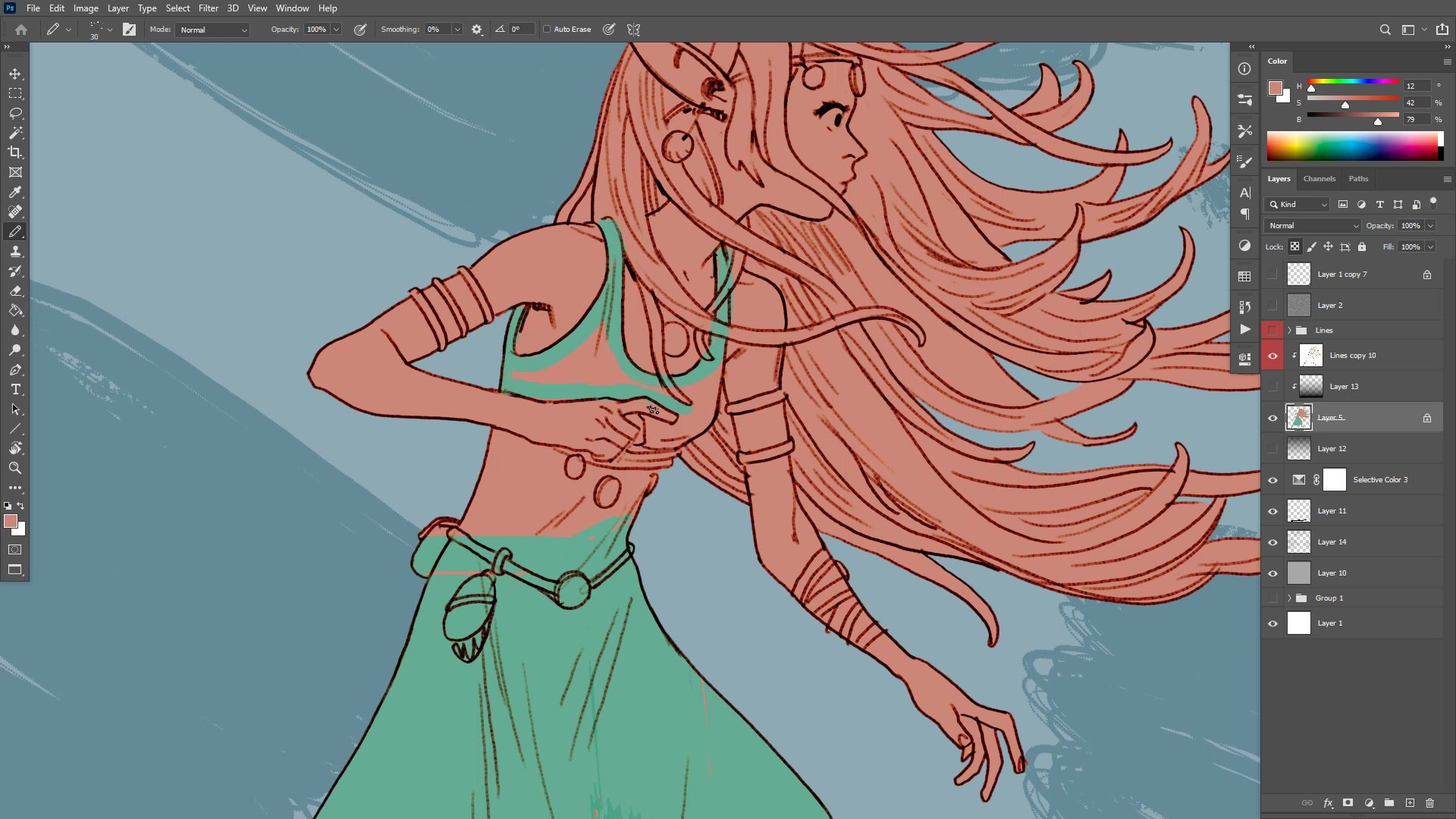
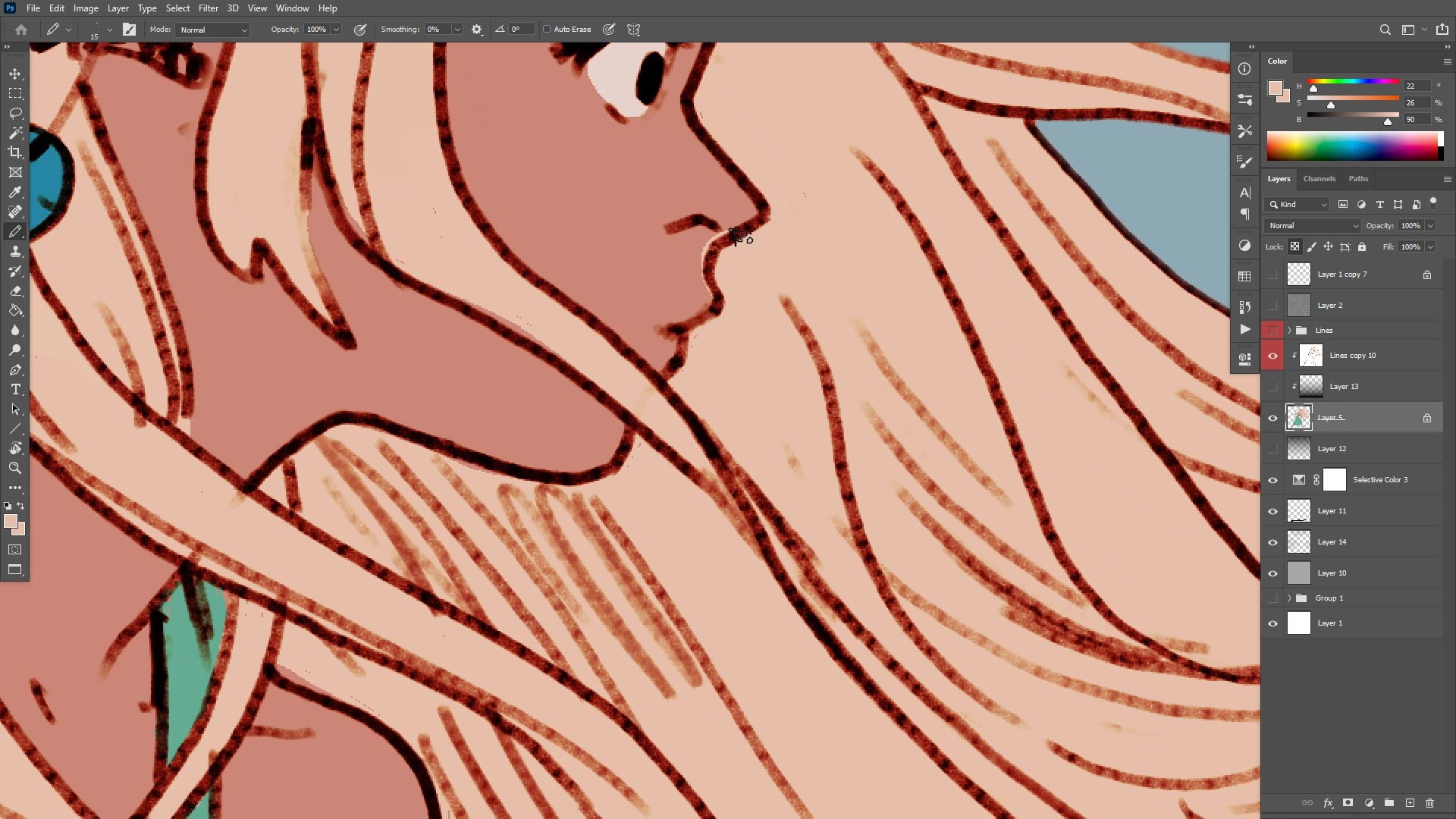
The color phase begins by establishing flat colors that sit at the right tonal values. Colors are kept bright, generally above 50% on the gray scale, ensuring the overall image reads with the intended lightness. The pencil tool rather than the brush tool keeps colors as pure flat fills, allowing instant recoloring with the paint bucket at any point in the process.
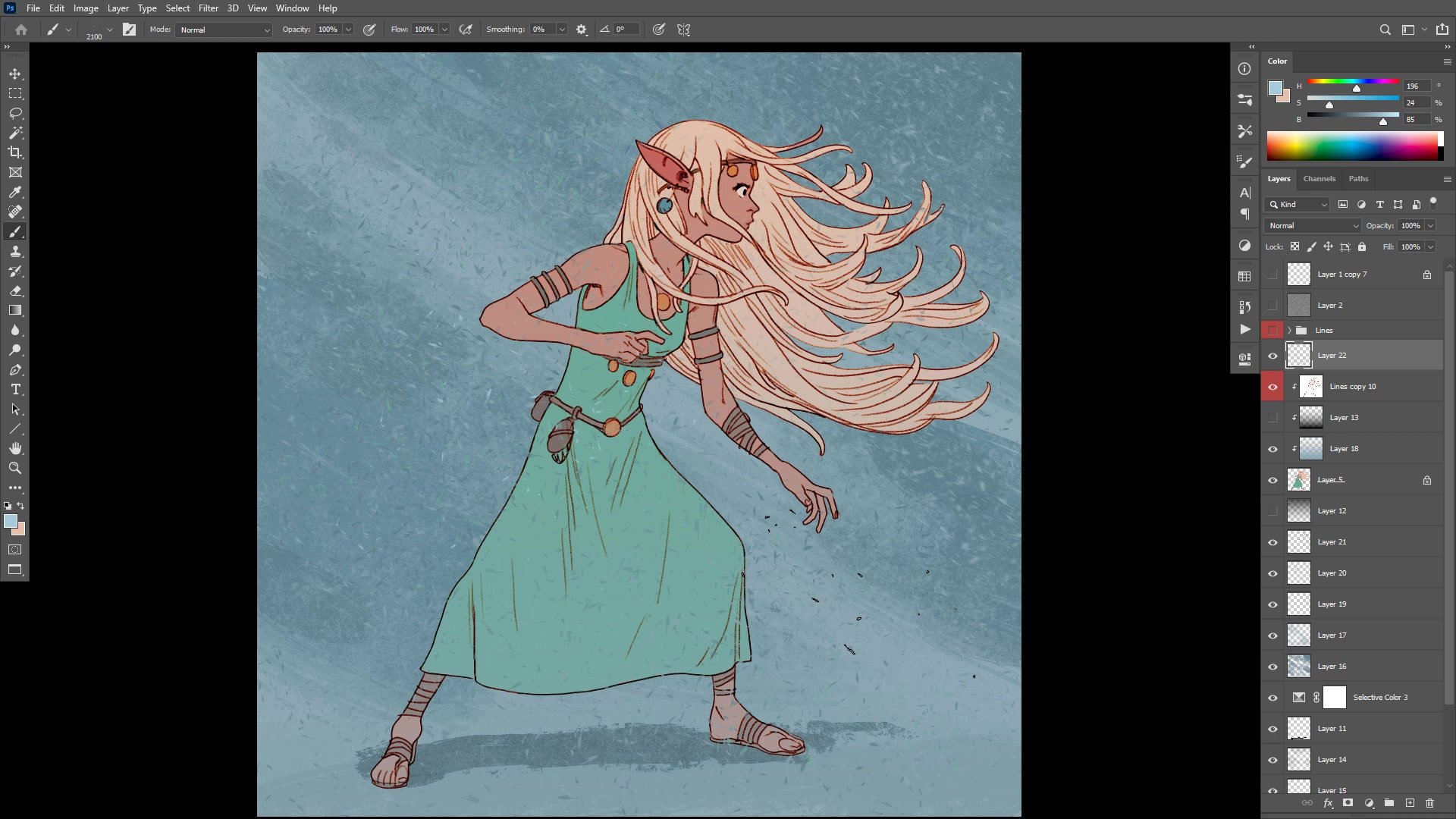
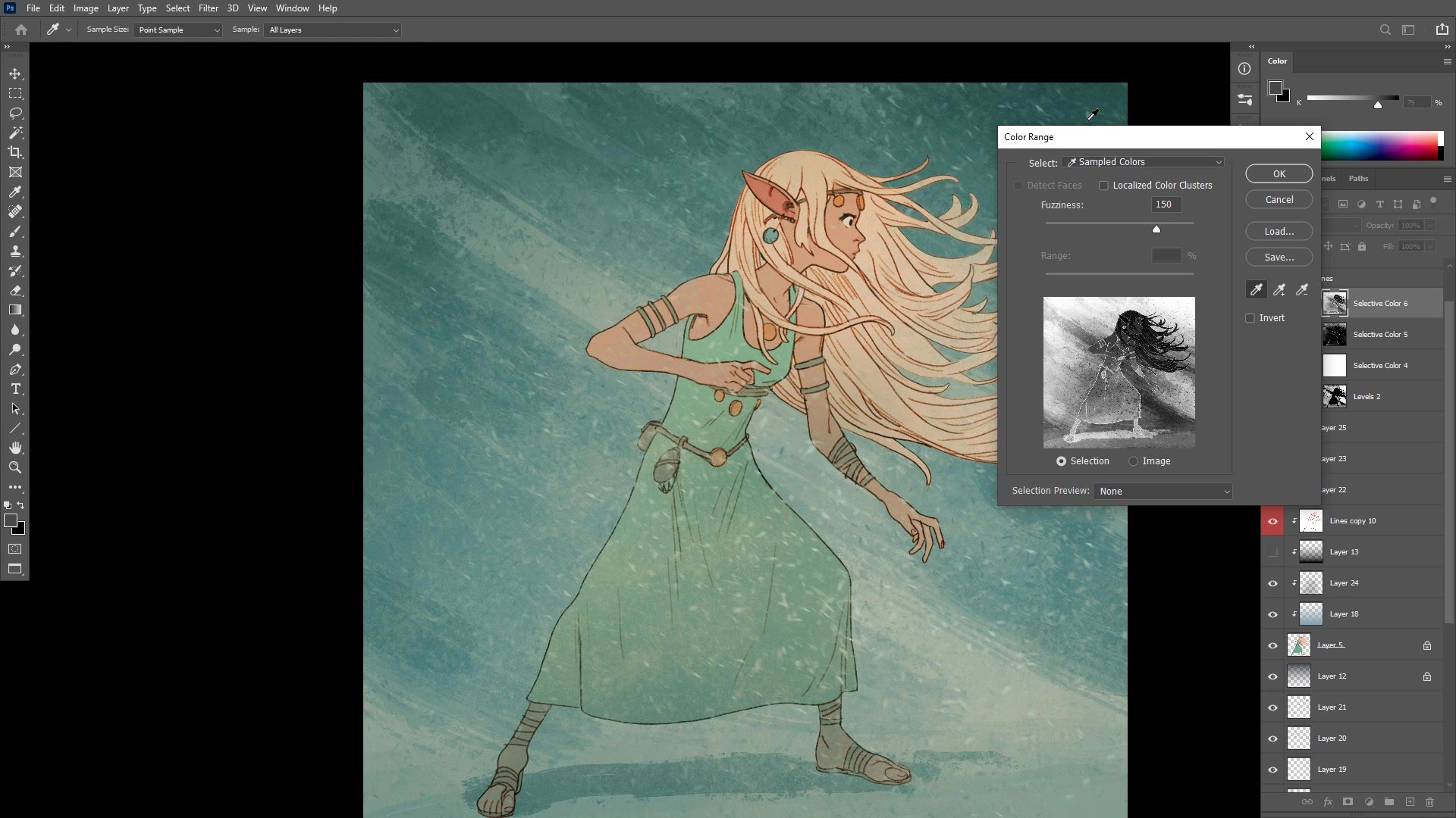
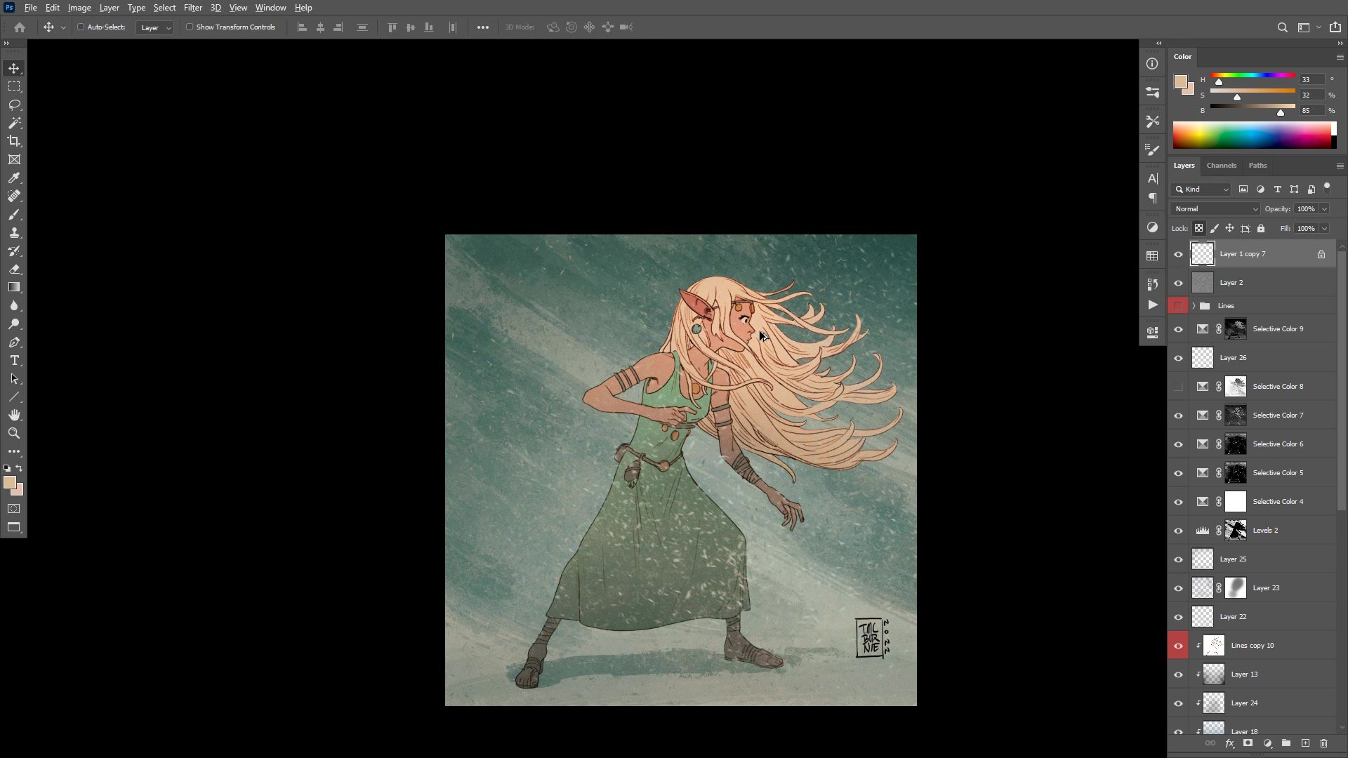
A key insight emerges around flatting accuracy. When adjacent colors share similar tonal values, slightly rough flatting becomes invisible at viewing distance. But if colors are later darkened to create more contrast, those same rough edges suddenly become very visible. Getting the tonal arrangement roughly correct from the start allows much faster, looser flatting. The background receives textured directional brushwork to create motion that complements the character's flowing hair, and multiple layers of particle effects and motion blur add atmosphere to the final composition.
Final Result
Key Techniques
Structural Markers First: Placing anatomical landmarks like the collarbone, rib cage, and elbow arc during the underdrawing makes finished line work far more confident and reduces rework.
Design for Redrawing: Character designs meant for comics or repeated use should prioritize elements that remain fun and practical to draw many times over, not just once.
Tonal Flatting Strategy: Matching the approximate tonal value of flat colors from the start allows much rougher, faster flatting because small inaccuracies become invisible when adjacent values are close.
Non-Linear Color Process: The line and color style allows freely jumping between character, background, and color adjustments without committing to a fixed sequence, making the entire process more flexible.
Layered Color Grading: Building up multiple subtle color adjustments produces a more sophisticated result than a single dramatic correction, with warm-cool contrast adding appeal to the final image.
Try This
Pick a Character to Redesign: Take an existing original character and redraw them with the goal of simplifying the design. Identify which elements are a pain to draw repeatedly and find alternatives that are more fun.
Test Your Flatting Speed: Apply flat colors using the pencil tool and try matching tonal values from the start. Notice how similar values let rough flatting disappear at zoom-out distance.
Add Background Motion: After finishing a character illustration, try adding a simple textured background with directional brushstrokes and motion-blurred particle layers to see how it changes the overall feeling.


