Watch Me Draw This Cool Goblin Rider
Summary
Goblin Rider Character Illustration
This real-time demonstration covers the complete process of creating a fantasy character illustration from initial sketch through to finished color. The subject combines two existing character designs into a new composition: a goblin character mounted on a bird-fox creature, perched on a tree branch with atmospheric background.
The session runs over two hours, providing an honest look at how professional illustration actually unfolds. This includes the inevitable adjustments, the problem-solving moments, and the decisions about when to push harder versus when to move forward. The image falls into a category called "character in background" where the character interacts with the environment rather than floating in abstract space.
Initial Sketching

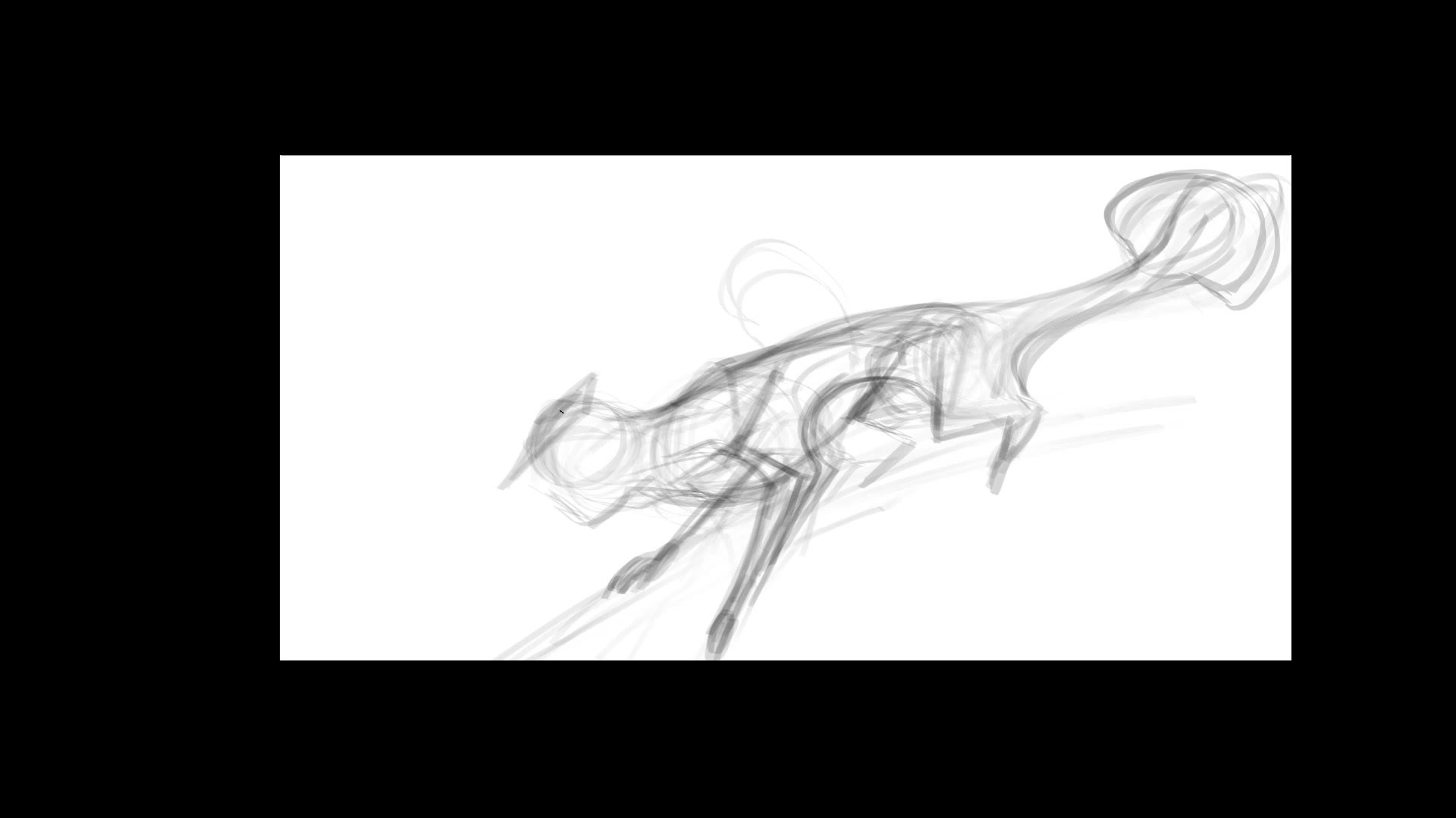
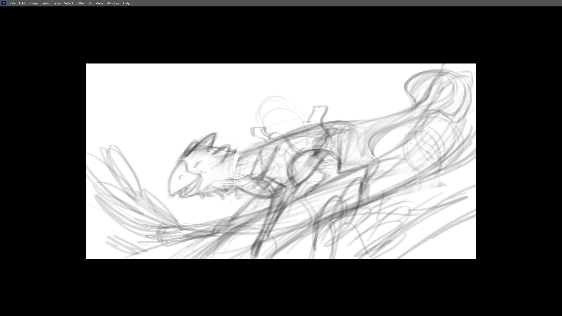
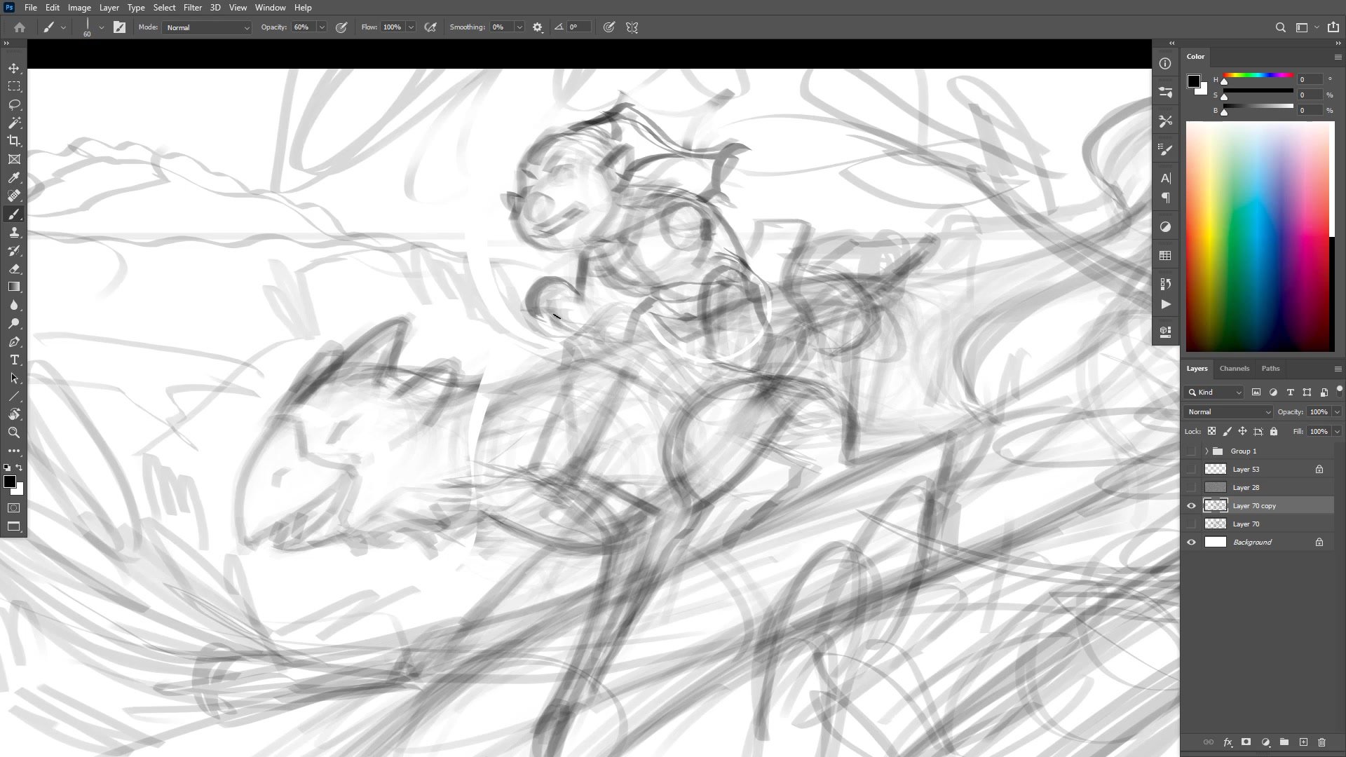
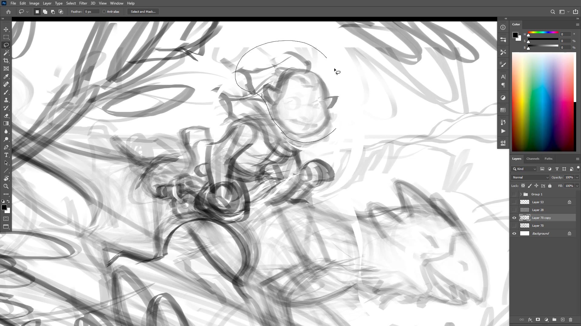
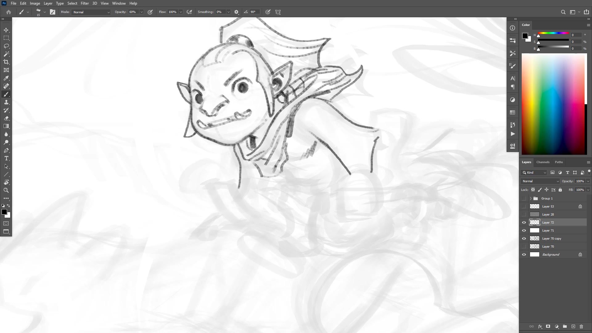
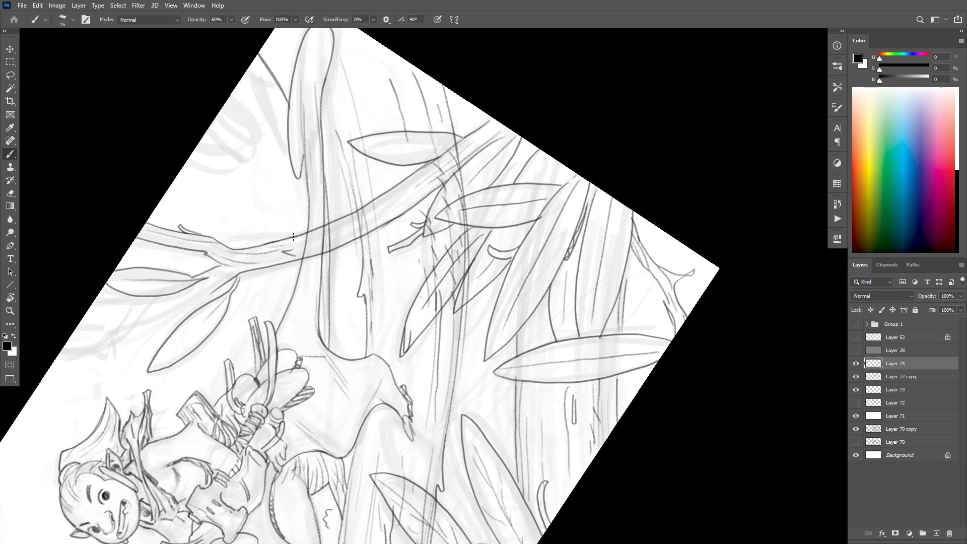
Exploratory Sketching and Structure
The sketching phase begins with loose pencil work, deliberately avoiding finished lines. Using a low opacity brush allows for gradual building up of forms without commitment. The creature's structure starts with three spheres representing the rib cage, head mass, and hips, positioned to create interesting depth and flow.
The process involves constant adjustment. The goblin rider proves tricky to position, initially appearing too large for the creature. Scale relationships matter enormously in creature-rider compositions. If the rider is too big, the poor creature looks like it would be crushed. The solution emerges through repeated repositioning and scaling, eventually arriving at proportions that feel believable.
Working with deliberately crude tools serves a purpose here. When the rough pencil becomes frustrating to use for detail work, that frustration signals it is time to move forward rather than overwork the sketch phase.
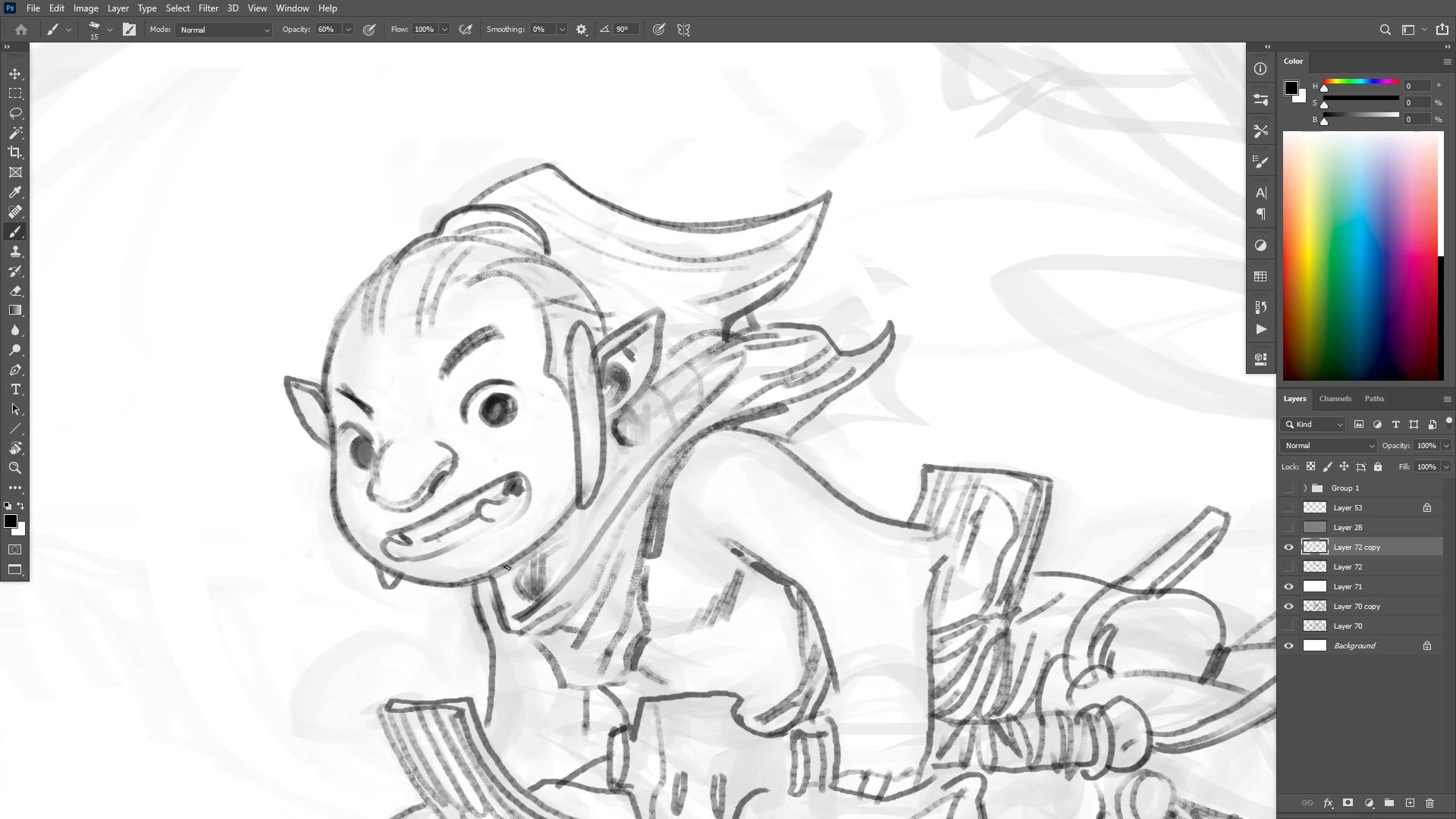
Inking and Line Work
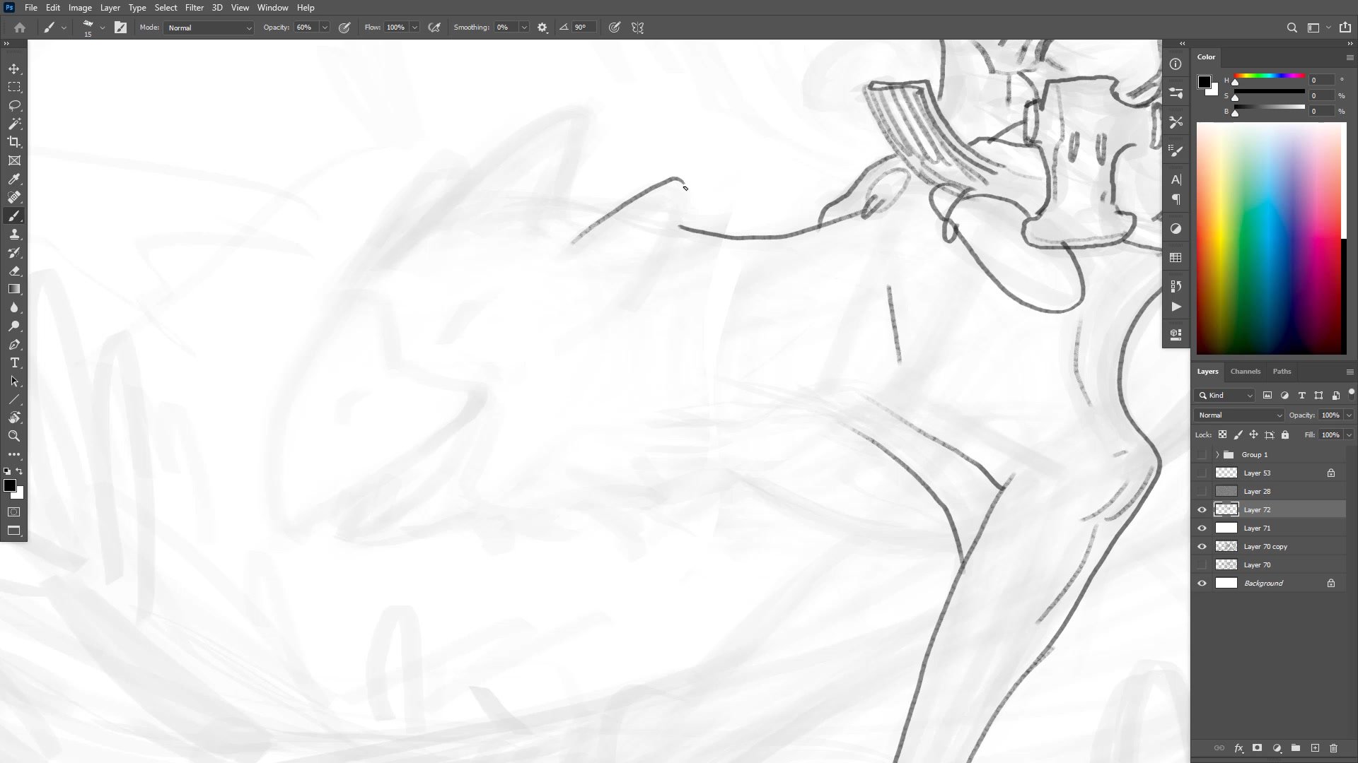
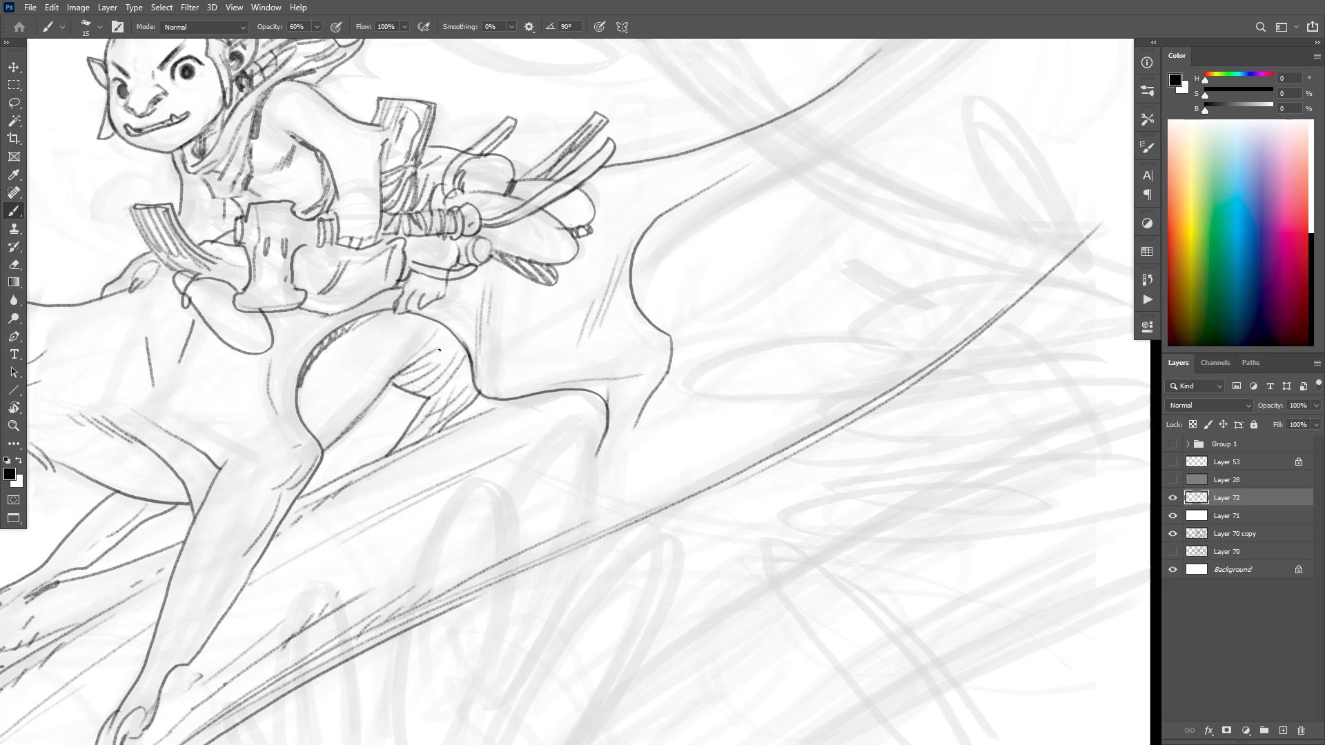
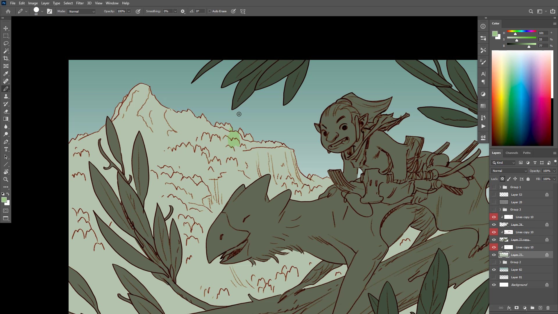
Inking Decisions and Character Appeal
The inking phase reveals problems that the sketch phase hid. The goblin's face, copied fairly accurately from a previous illustration, suddenly looks boring and static. This moment represents a common crossroads: spend an hour fiddling with something that might not matter, or accept it and move forward.
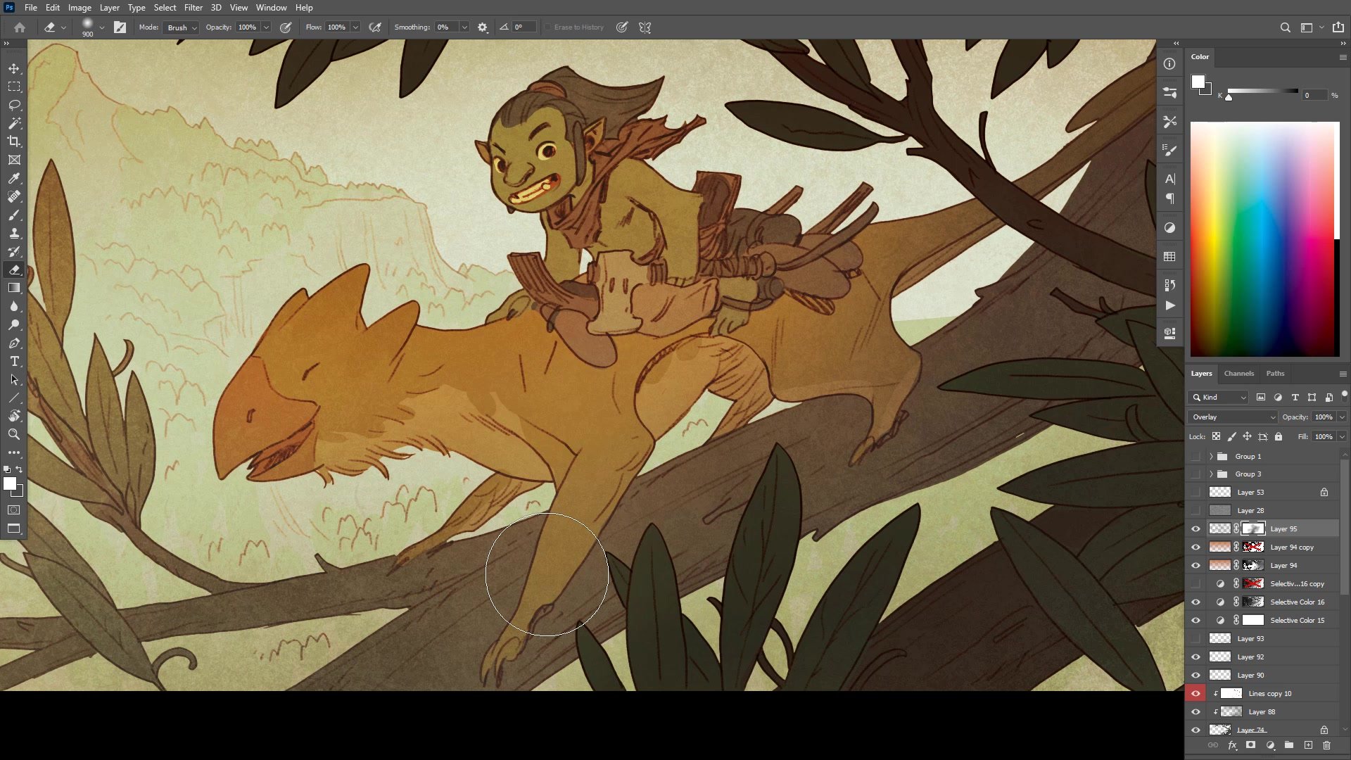
The bird-fox creature incorporates both bird-like and animal-like elements, mixing feather suggestions with fur textures. The inbuilt smile from the original design carries through, giving the creature an approachable quality. The tongue detail adds personality. These small character decisions accumulate into the creature's overall appeal.
Framing elements like large leaves and branches serve multiple purposes. They establish scale, showing how small these creatures are. They also create natural composition by directing the eye toward the focal point while adding depth through overlapping layers.
Color Blocking
Color Strategy and Atmosphere
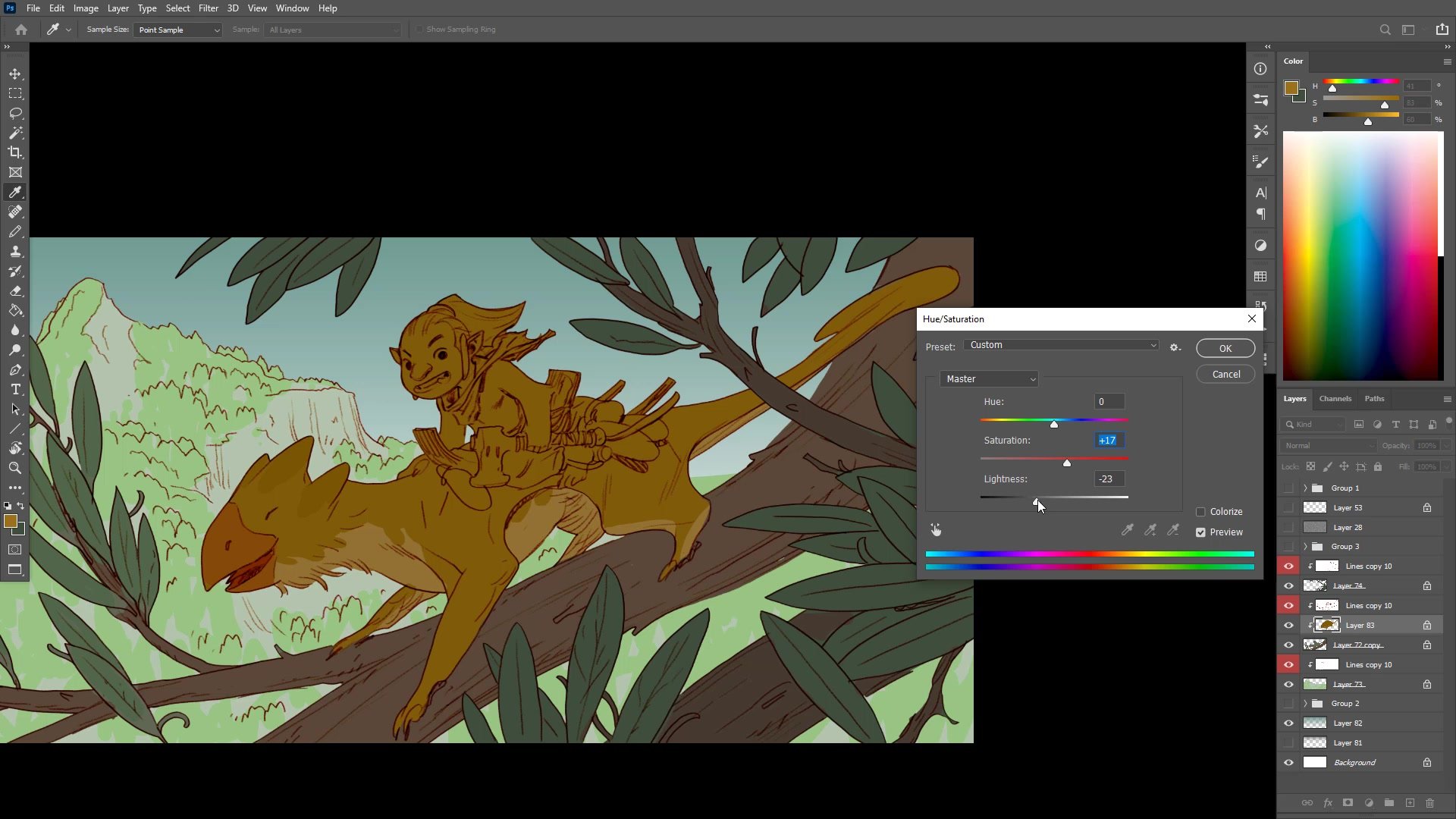
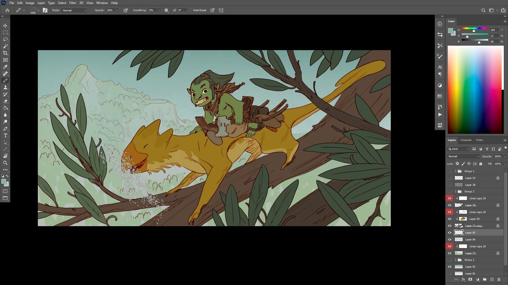
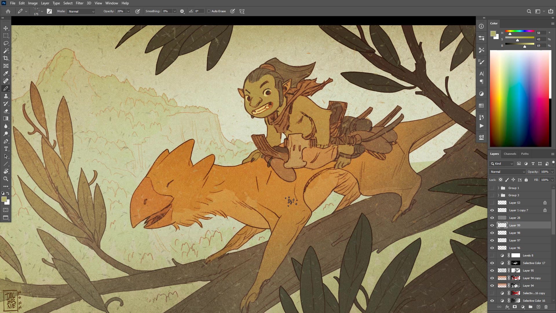
Color work begins with flat selections and simple fills, establishing a green base that can be adjusted later. The hierarchy of foreground, middle ground, and background gets separated through value alone before any color refinement. Starting lighter proves easier since colors can always be pushed down and darkened.
Atmospheric perspective does heavy lifting to create depth. The background gets pushed away with overlaid blue-gray, making it recede. The same principle applies between foreground elements and the main subjects. Adding subtle texture everywhere, including noise and grain, eliminates the flat coloring-book quality that simple fills create.
The warm-cool contrast gets pushed by adding yellow-orange tones to highlights and blue to shadows. A vignette effect draws focus toward the center by darkening the edges. These are simple techniques applied with restraint rather than sophisticated rendering, keeping the two-hour timeline achievable.
Final Adjustments
Key Techniques
Rough Tool Discipline: Using deliberately loose tools for sketching prevents overworking early phases. When the tool becomes frustrating for detail work, that signals it is time to progress.
Scale Relationships: In creature-rider compositions, the rider must be small enough that the creature does not look overburdened. Head size comparisons help establish believable proportions.
Atmospheric Depth: Simple overlays of blue-gray between layers create spatial separation without complex rendering. Start with lighter values since darkening is easier than lightening.
Warm-Cool Push: Adding yellow to highlights and blue to shadows creates visual interest even with flat color. The effect homogenizes the palette while adding depth.
Try This Approach
Start with References: Combine two existing character designs into a new composition. Having established designs reduces decision-making load during the drawing session.
Set a Time Limit: Two hours for character-in-background complexity provides enough time for reasonable finish without endless refinement. Understanding image complexity relative to time is a learnable skill.
Use the Quick Start Process: The same line and color workflow demonstrated here is covered step-by-step in the free Quick Start Guide, with all the brushes and templates included.


