Draw a Fantasy Elf Girl Portrait From Start to Finish
Summary
Elf Girl Portrait Process
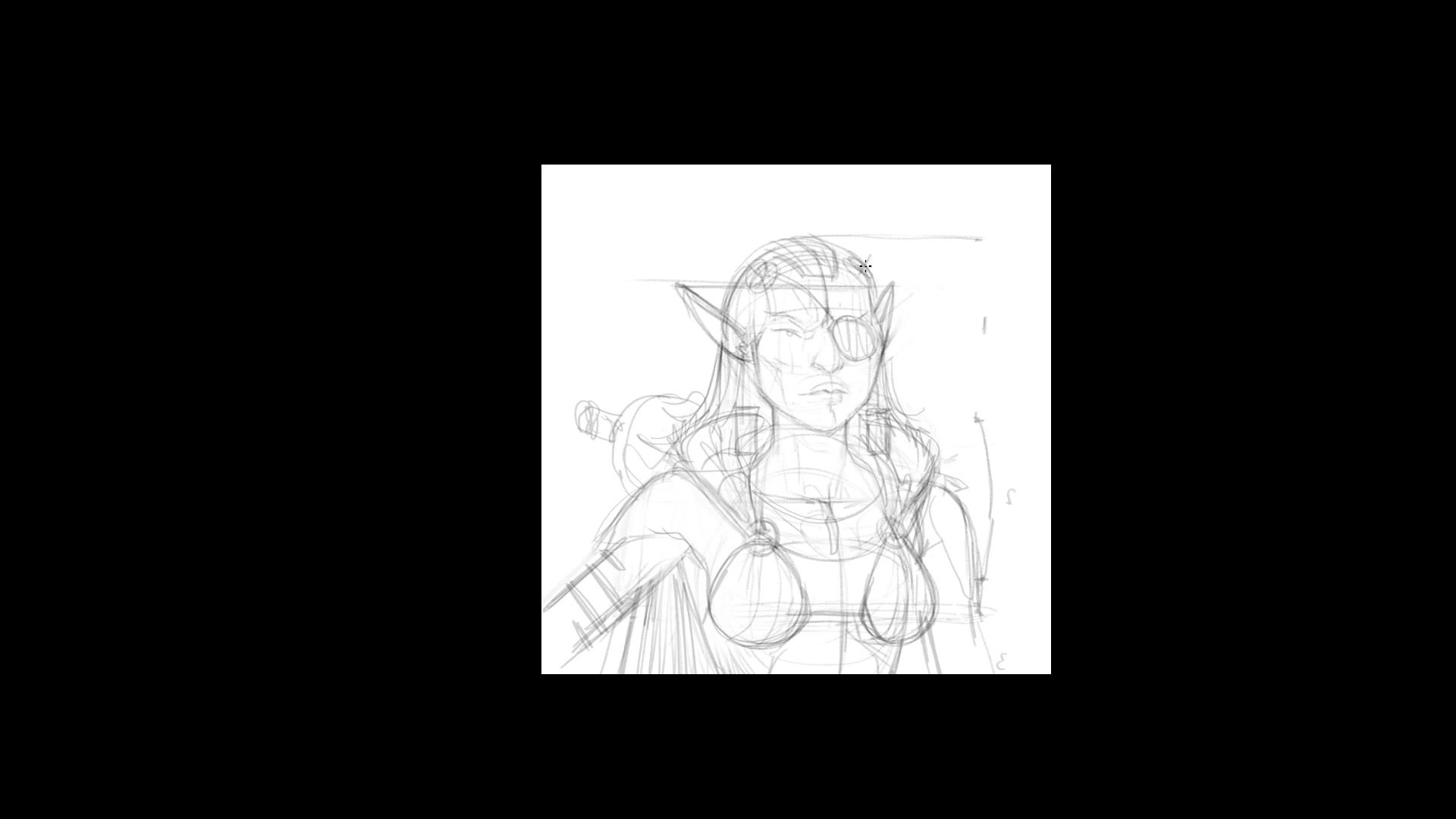
This real-time, fully narrated demo covers the complete process for creating a fantasy character portrait of Ara, an elf girl from an original comic book. The session runs roughly an hour and twenty-five minutes and moves through rough sketching, structural construction, pencil-style inking, flat color blocking, and simple color theory adjustments in Photoshop.
The focus here is on creating a quicker image, targeting a one-hour timeframe with a simpler subject. That means managing scope from the start, controlling detail, and making smart decisions about what to include and what to leave out. The result is a polished character portrait built on solid fundamentals without overworking any single stage.
Rough Sketch and Construction
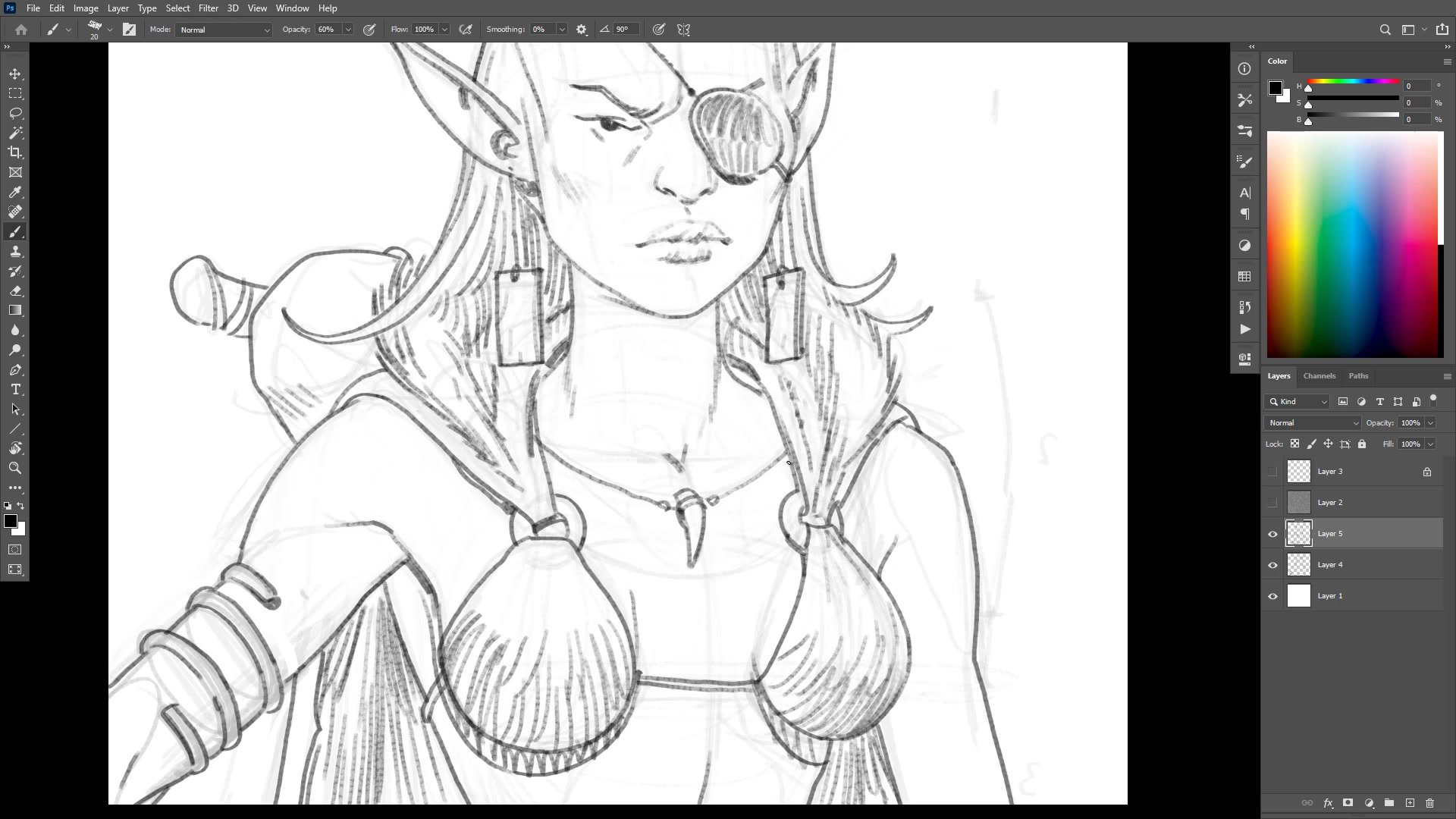
Center Lines and Structure
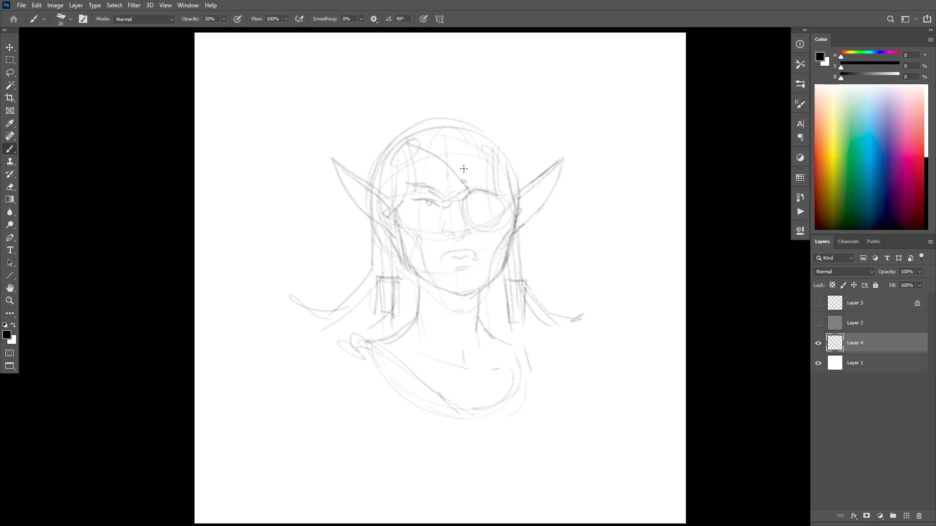
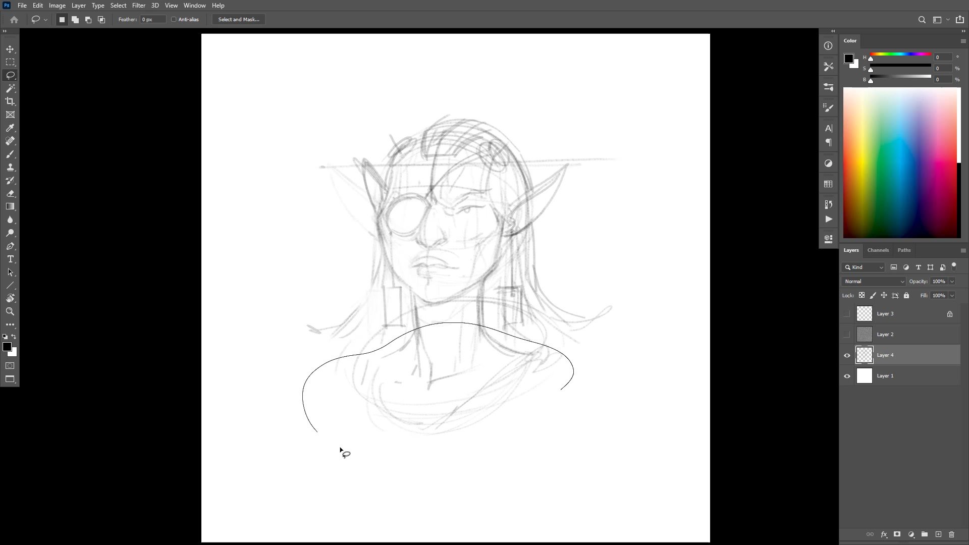
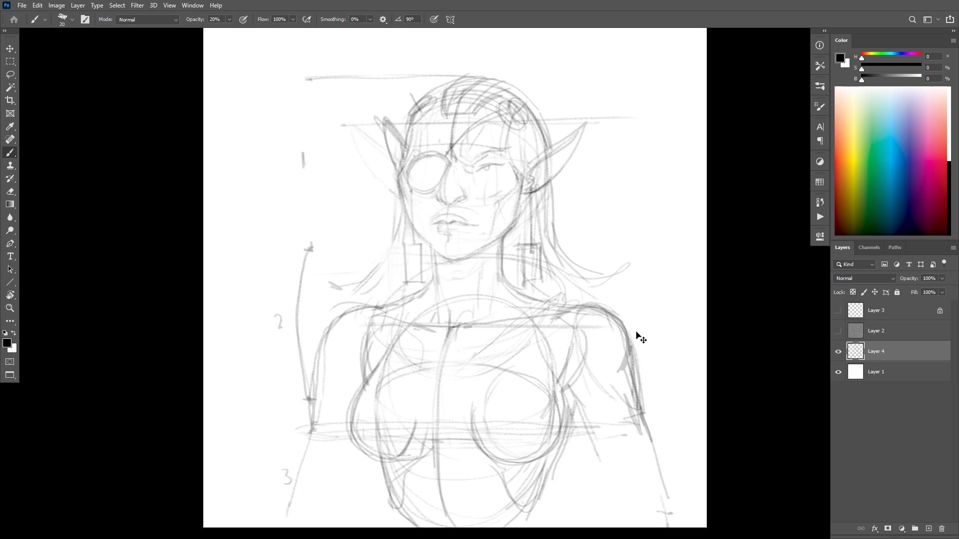
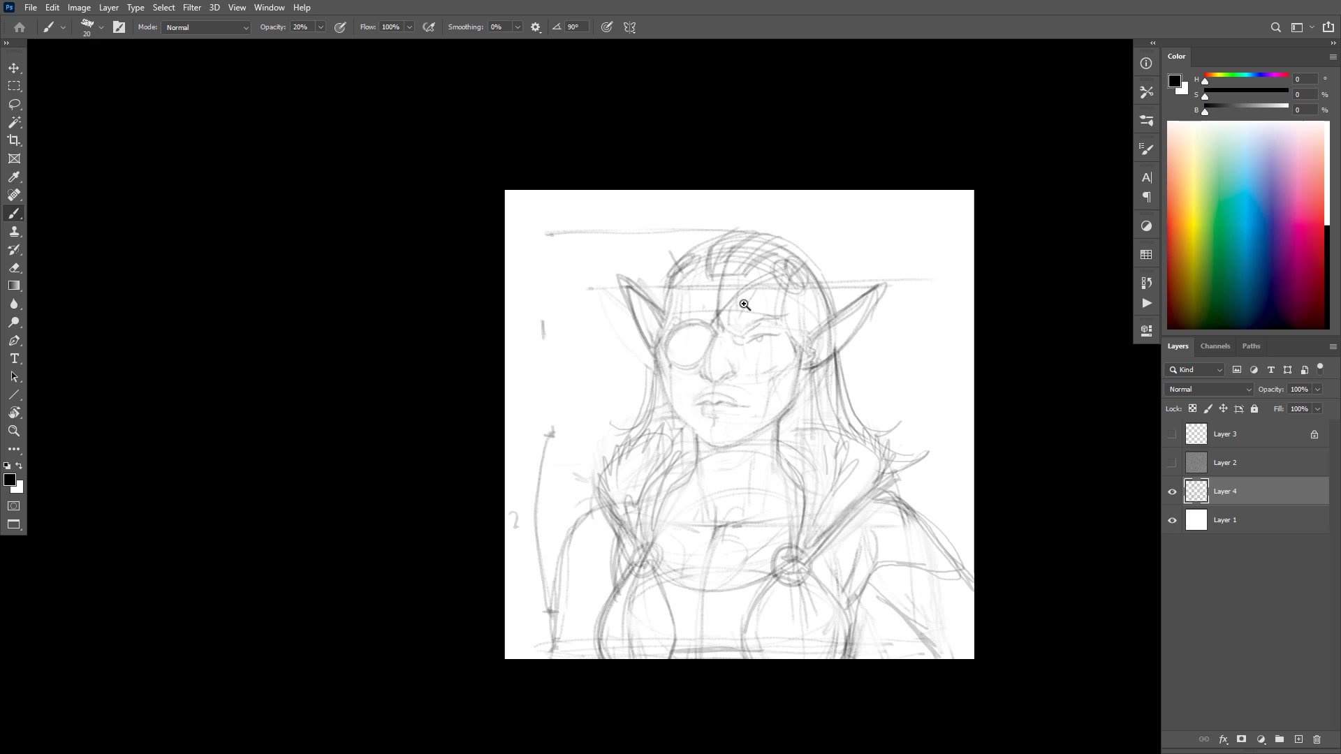
The drawing begins loose, playing around with poses and shapes for the character without heavy structural commitment. But once the general gesture feels right, the process shifts to truing up the drawing using center lines and proportional measurement. Flipping the canvas reveals asymmetry in the features, and the center line becomes the tool for correcting the nose position, lip placement, and ear alignment.
Head proportions get used as a measuring unit to place the torso structure below. One head proportion down from the chin locates the chest, and three down finds the bottom of the rib cage. Even though much of this anatomy stays hidden beneath the costume, understanding where it sits prevents the kind of structural errors that come from drawing heads in isolation. The process of truing up the drawing, finding center, flipping, and correcting repeats throughout the sketch phase.
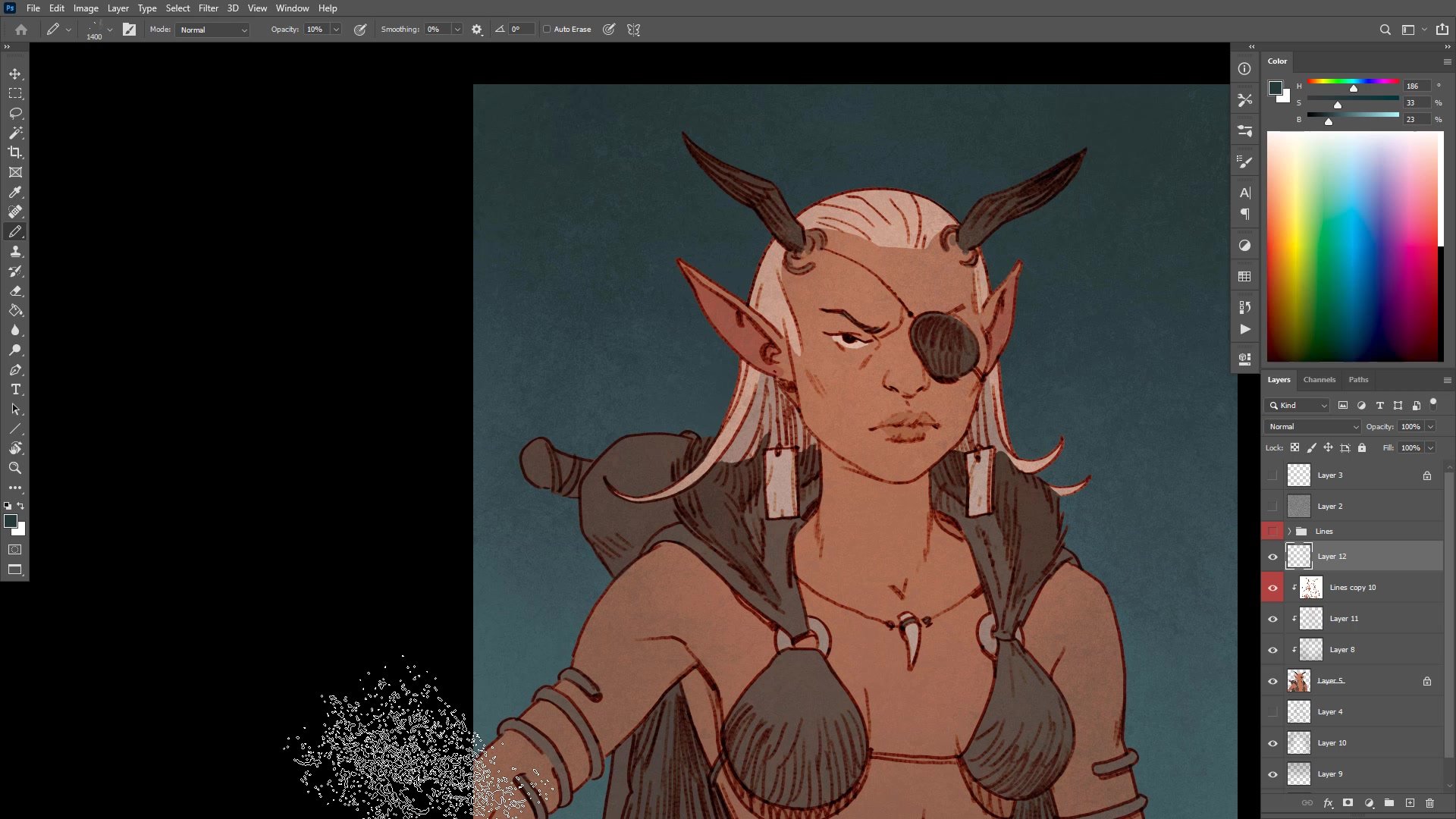
Inking and Line Quality
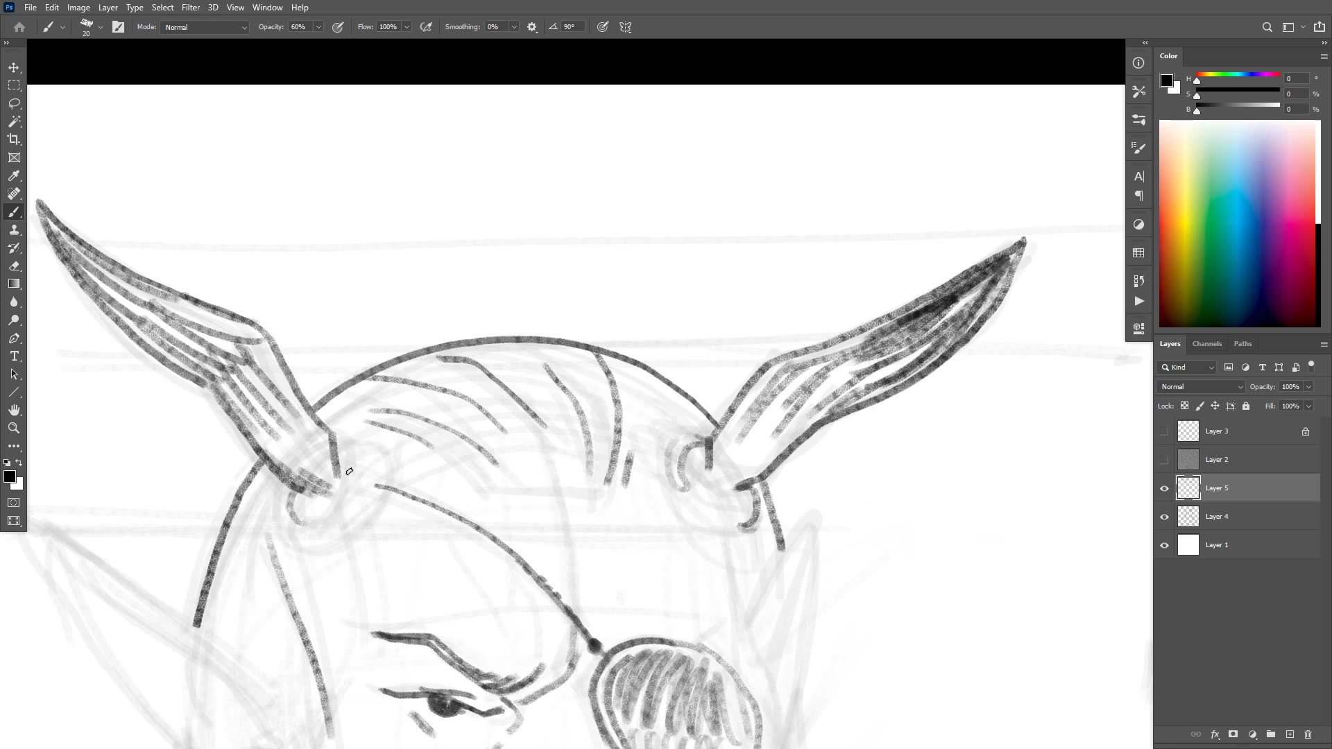
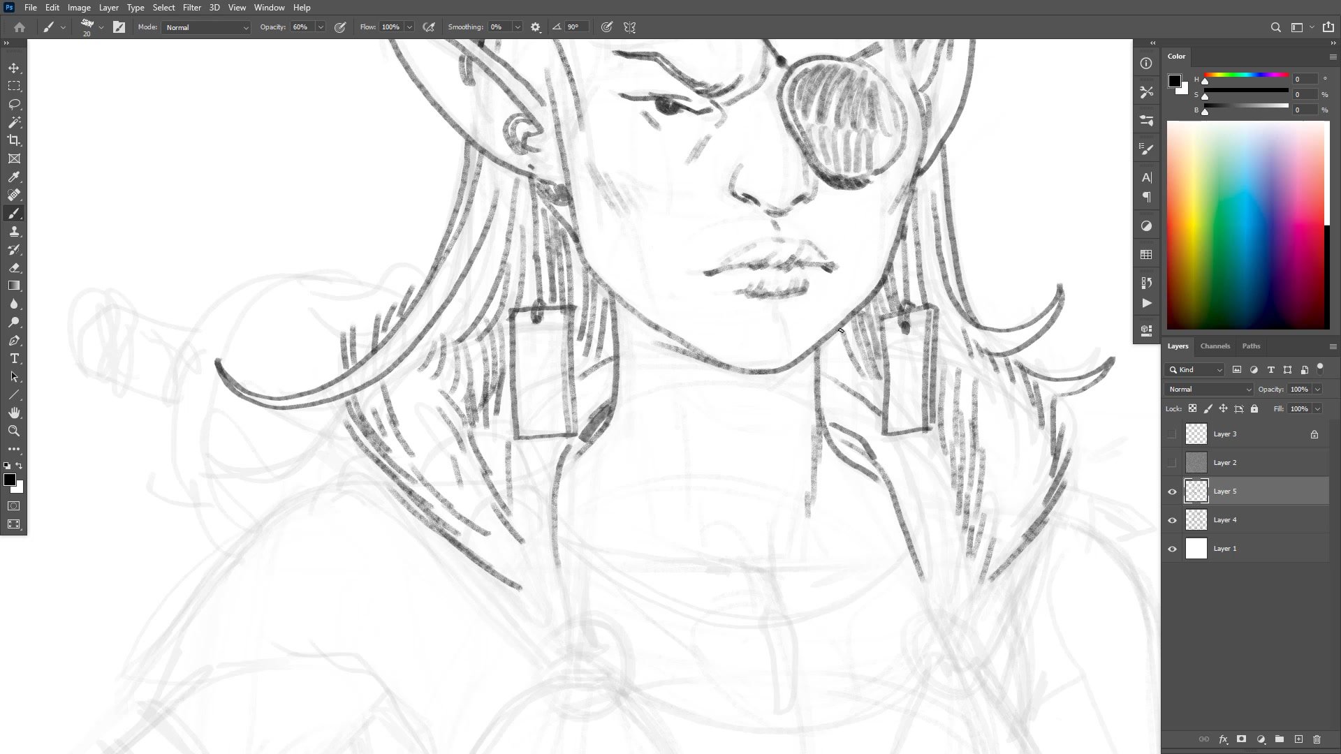

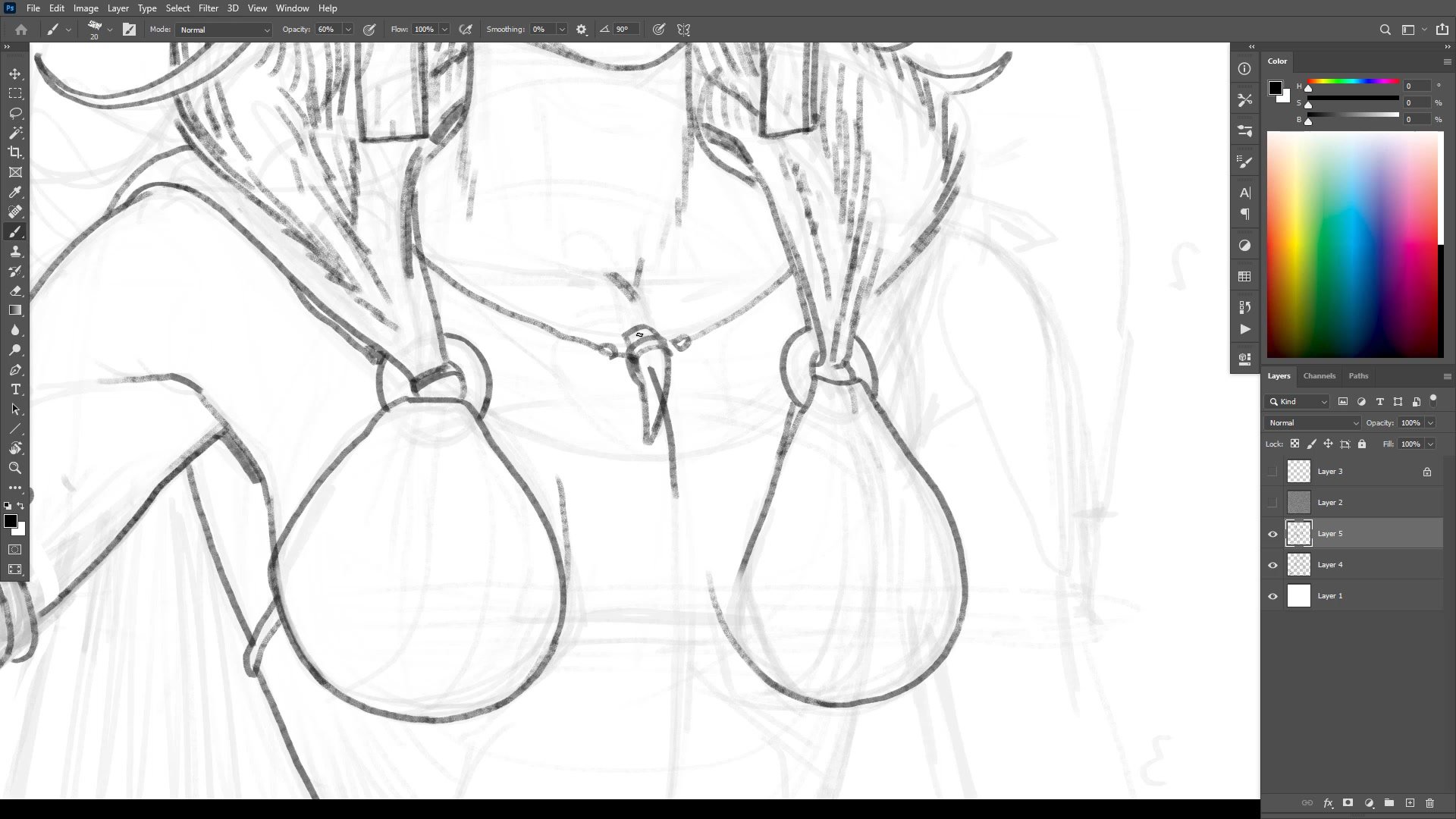
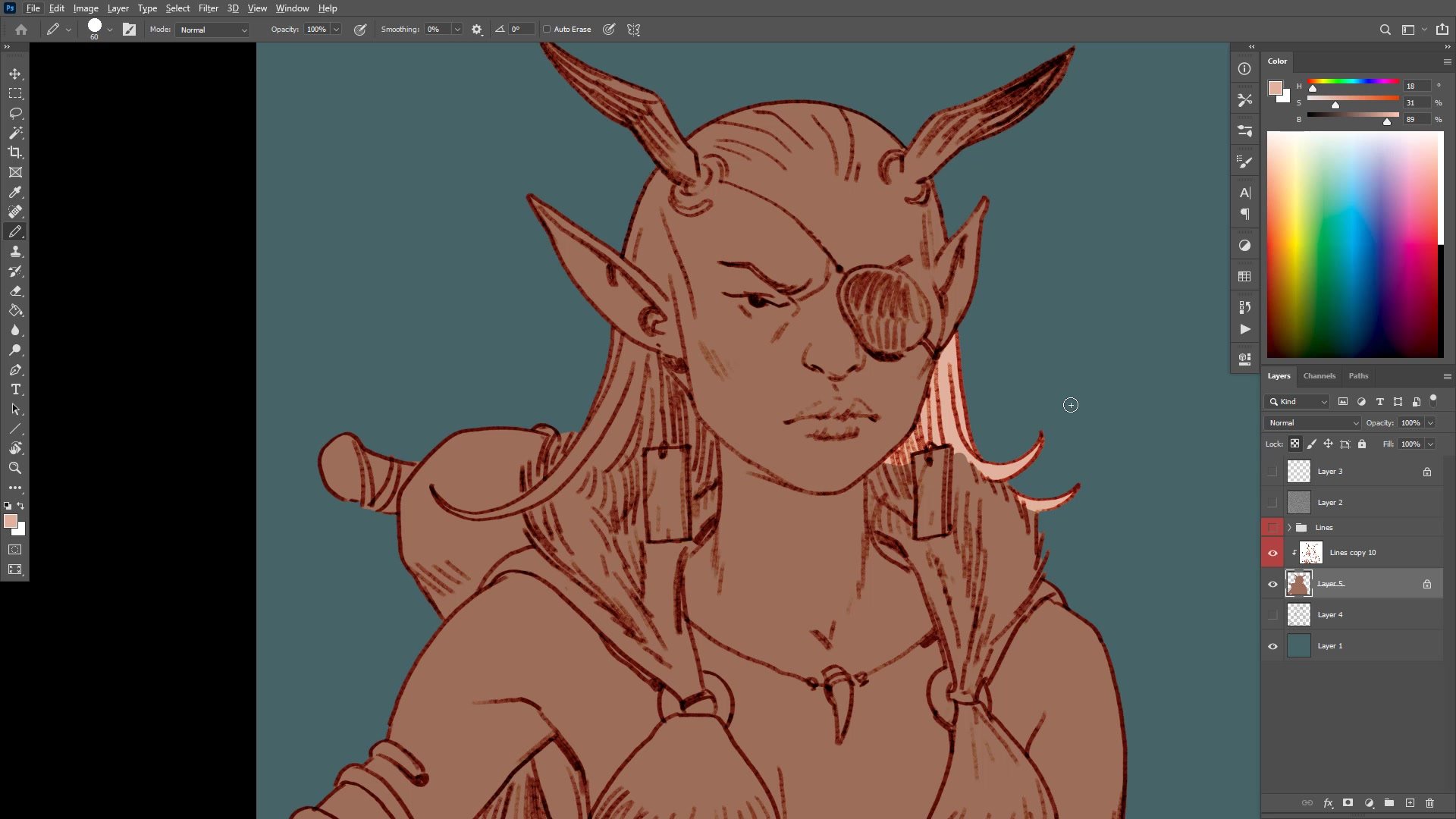
Pencil-Style Inking
The inking stage uses a specific brush approach. Rather than working at full opacity for a one-and-done ink line, the brush opacity gets reduced to create a pencil-like drawing feel. This allows building up lines with multiple passes, creating depth and texture through layered marks rather than committing to a single final stroke. Edges get lost deliberately in shadow areas, fading the line work into darkness where form moves away from the viewer.
The distinction matters because it changes the entire character of the finished piece. A full-opacity ink line feels final and graphic. The reduced-opacity approach gives room to emphasize certain features, de-emphasize others, and create subtle form indication through tonal variation. This is a personal preference that directly shapes the art style, and finding what feels natural is part of developing a reliable process.
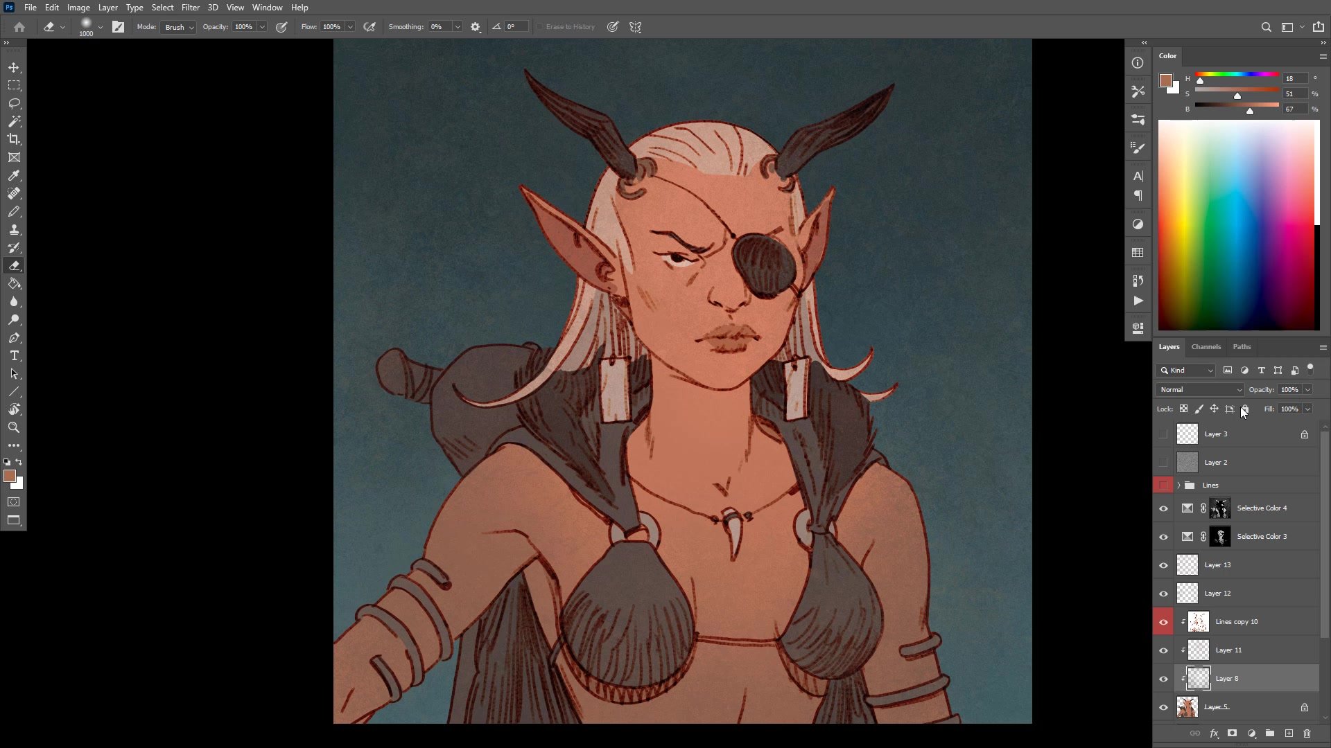
Flat Color and Color Theory
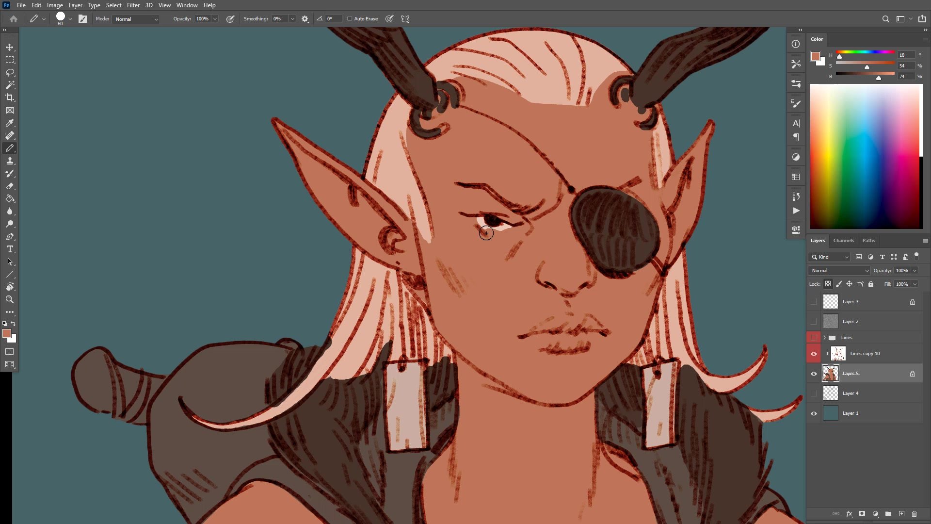
Simple Color Strategy
The color phase follows a deliberately simple plan. Warm character against cool background creates both temperature and value contrast. The skin reads as light and warm, while the blue-grey costume and teal background recede behind it. This warm-cool, light-dark separation is the foundation that makes everything else work.
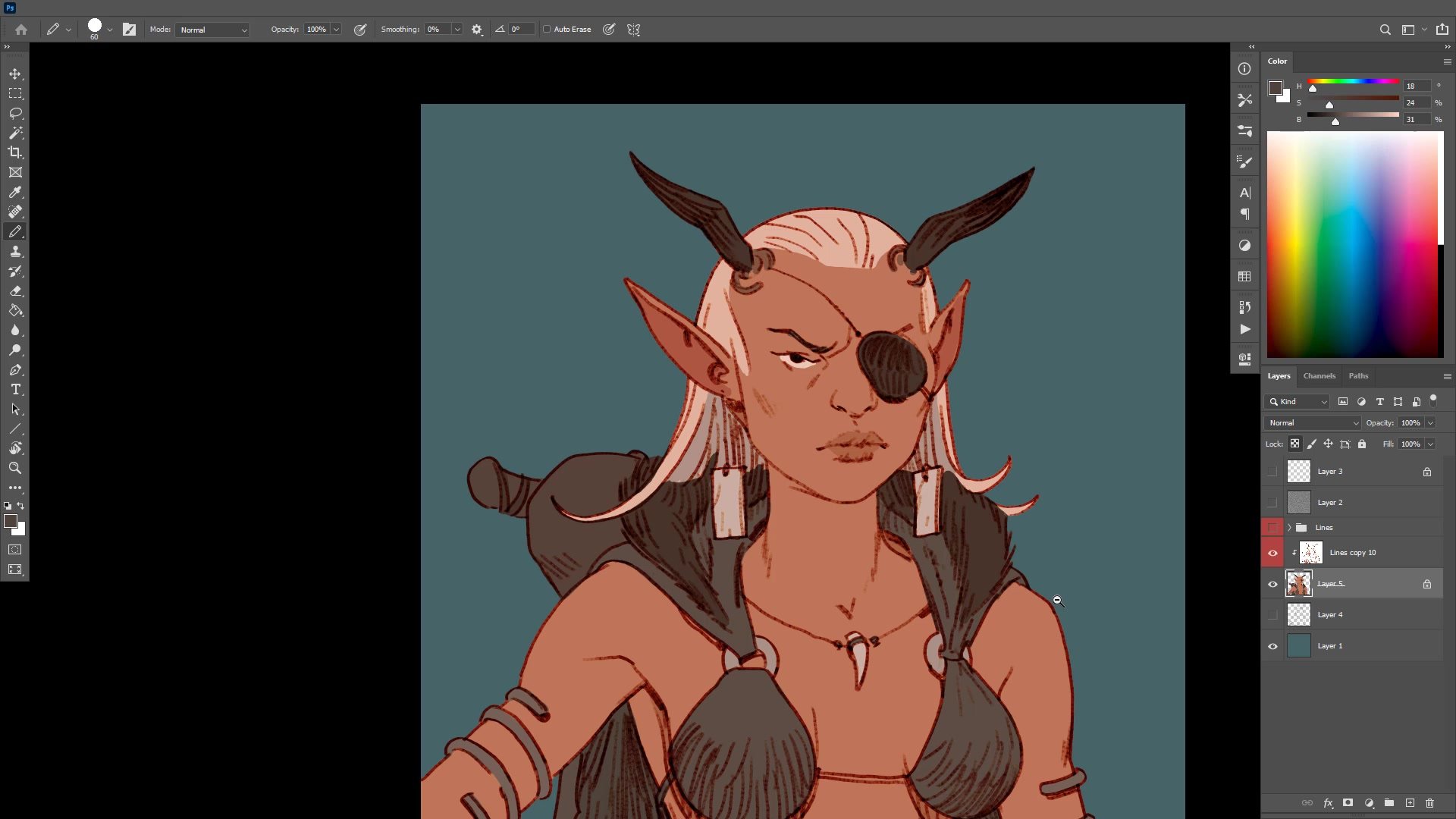
After blocking in flat colors, gradients get added using a large airbrush on low opacity rather than a literal gradient tool. Black gets painted in to darken peripheral areas and draw focus to the face. Then Selective Color adjustments, applied through color range selections, push the warm-cool relationship further. Because the gradients create subtle value variation across the figure, the color adjustments produce different effects in different areas automatically. A scatter brush adds texture to break up the flat digital look. The entire color finishing process takes only minutes but produces sophisticated results because the underlying warm-cool plan is solid.
Final Adjustments
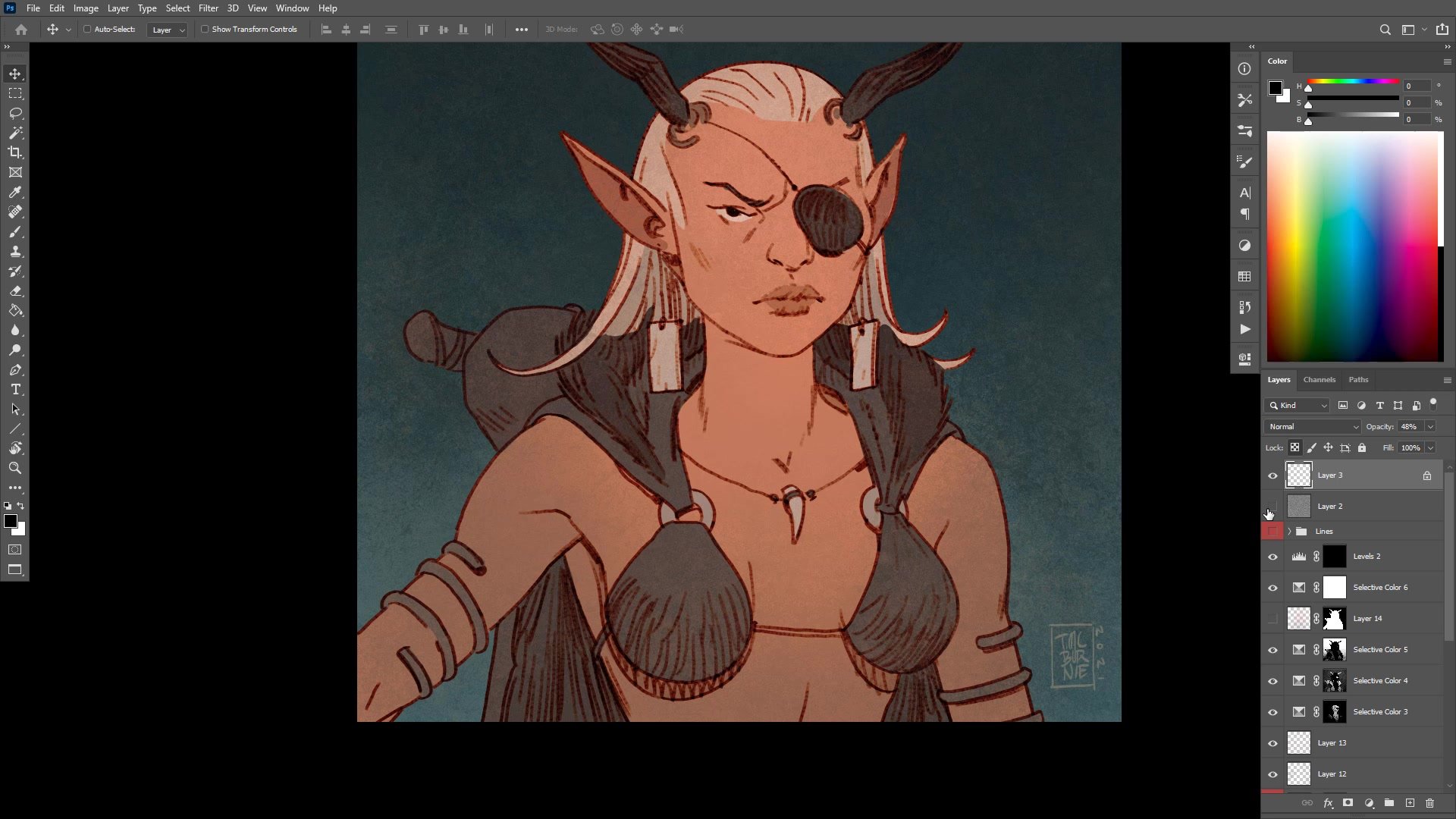
Key Techniques
Center Line Correction: Flipping the canvas and tracing center lines through the face and torso catches asymmetry that the eye misses. This truing-up process is essential whenever a drawing starts loose.
Proportional Construction: Using head-height as a measuring unit places chest, rib cage, and deltoid landmarks accurately, even when those areas will be hidden by costume. Knowing what is underneath prevents structural errors.
Reduced Opacity Inking: Drawing finish lines at lower brush opacity creates a pencil-like quality that allows building up through multiple passes, losing edges in shadow, and varying line emphasis without committing to a single stroke.
Warm-Cool Color Foundation: Placing a warm, light subject against a cool, dark background creates automatic contrast. Gradients and Selective Color adjustments on top of this foundation produce sophisticated color variation with minimal effort.
Try This Approach
Scope a Quick Portrait: Pick a character and aim for a one-hour finished image. Choose a simpler composition like a head and shoulders to keep the scope manageable.
True Up With Center Lines: After roughing in your sketch, flip the canvas and draw the center line from forehead through nose and chin. Correct any features that drift off center before moving to finish lines.
Block Flat Color Then Gradient: Lay in flat colors using a simple warm-cool plan, then add a single low-opacity black gradient to darken the periphery and focus attention on the face.


