Warrior Princess Illustration Process
Summary
Fantasy Warrior Princess Process
This three-hour real-time session covers the complete creation of a fantasy warrior princess illustration in Photoshop, from a rough sketchbook thumbnail all the way through construction drawing, finish line work, flat coloring, and final color grading. The subject is a character-focused pinup-style image inspired by the heroic compositions of artists like Frank Frazetta, featuring a warrior figure standing on rocky terrain with flying stingray creatures in the background.
The session demonstrates how to manage a relatively simple composition, a single character with an abstract background, while still creating visual impact through strong color contrast and deliberate design choices. Every phase of the process is shown unedited, including the problem-solving, the doubt, and the moments where things get adjusted or reworked.
Construction Phase
Building the Figure
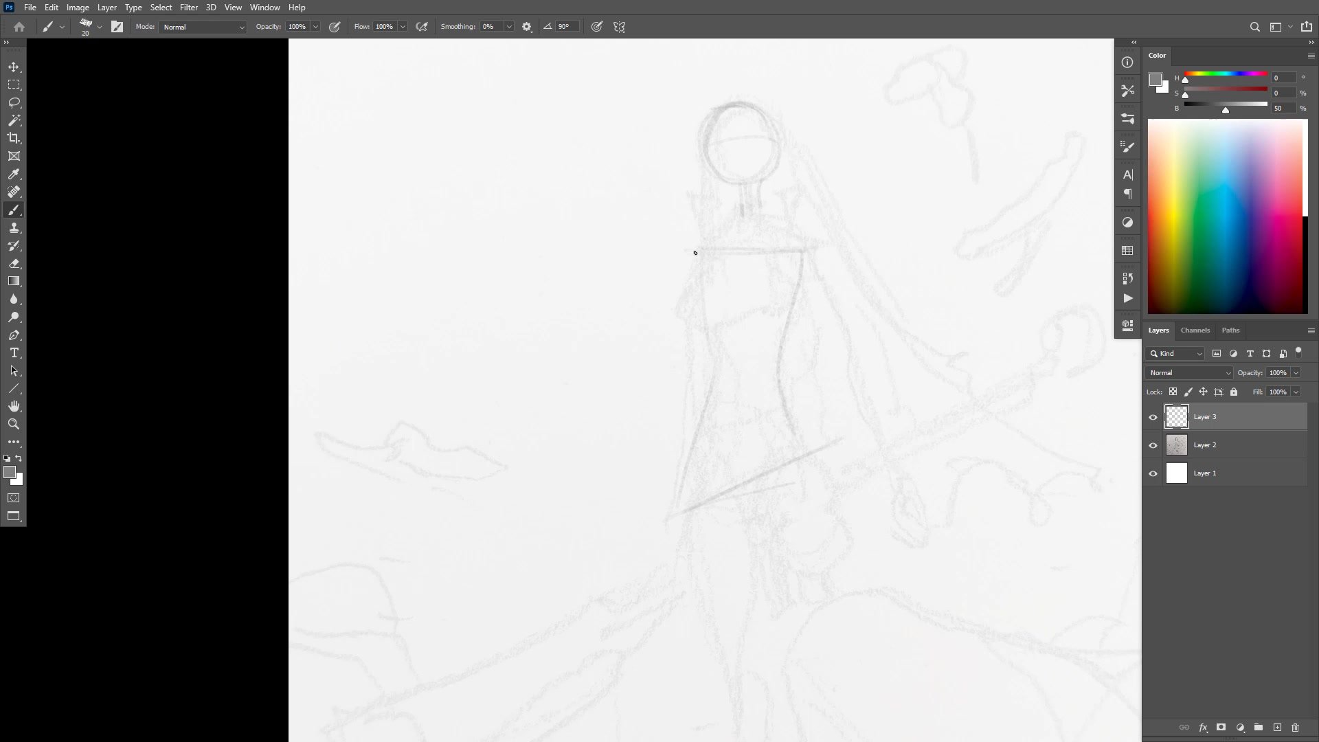
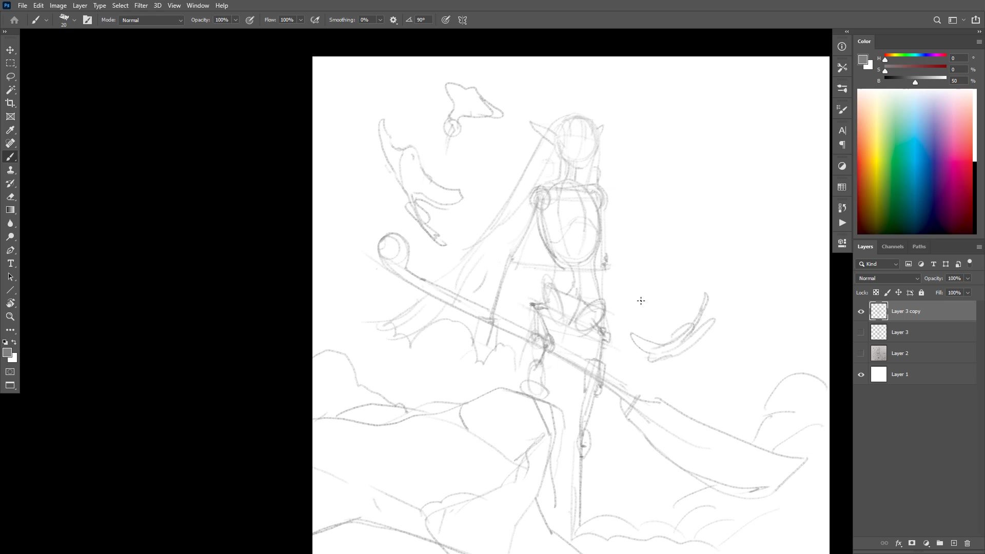
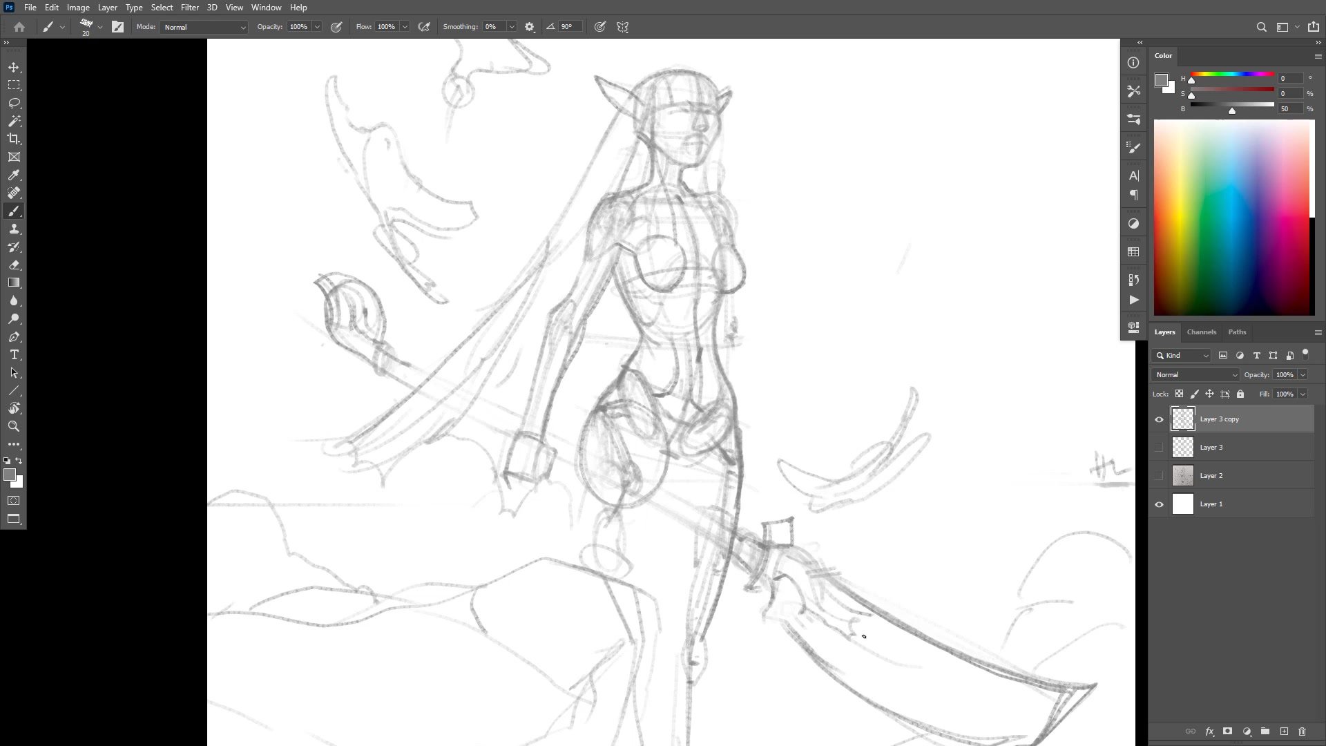
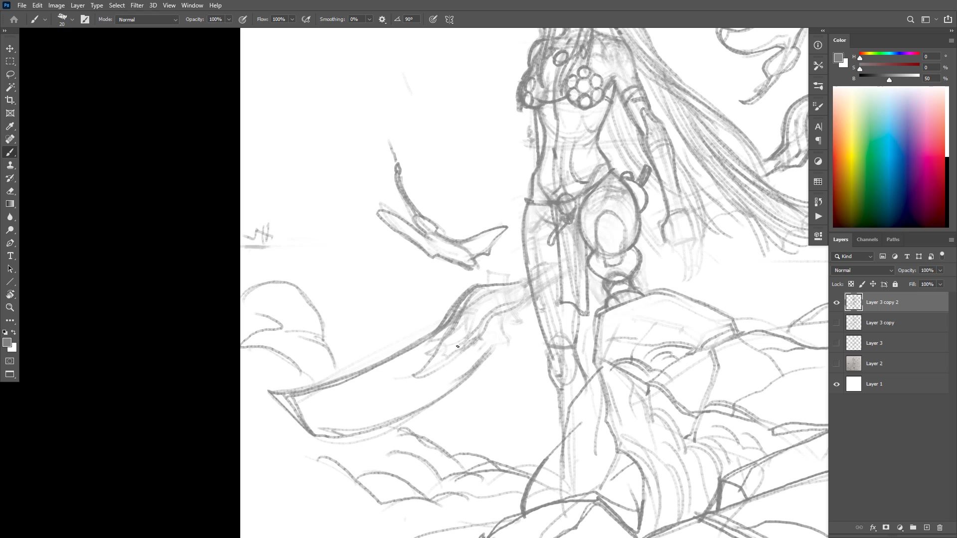
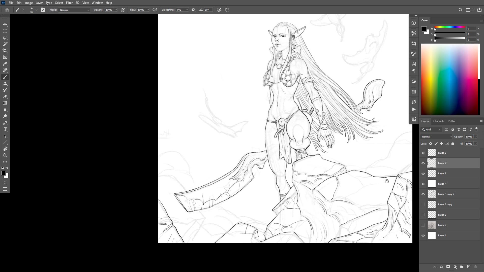
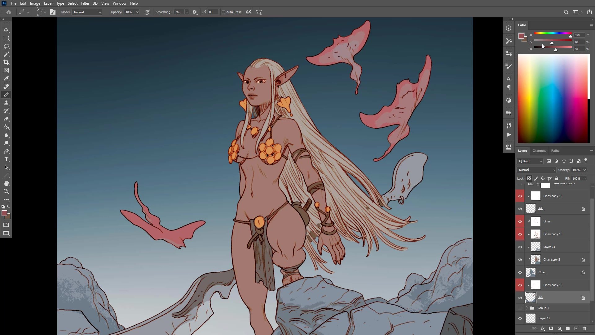
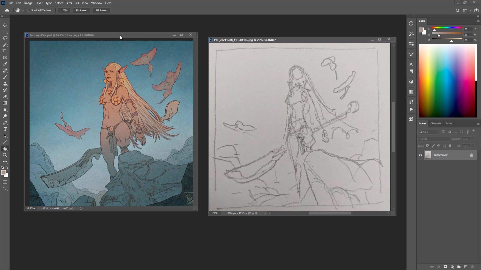
The construction phase begins with a low-quality phone photo of a sketchbook thumbnail placed at reduced opacity as a loose guide, not something to trace. The approach deliberately keeps the sketch disposable so the digital process can stand on its own. Working on a roughly 4000-pixel square canvas, the figure gets blocked in using basic anatomy landmarks: head size, shoulder placement, rib cage, pelvis, and a quick stick-figure skeleton to check proportions.
Throughout this phase, the duplicate layer technique surfaces repeatedly. Each time a significant milestone is reached, the layer gets duplicated before moving forward. This creates safe checkpoints that make it easier to take risks. The construction also involves regular flipping of the canvas and checking the image at a distance on a secondary monitor, catching proportion errors that are invisible when zoomed in.
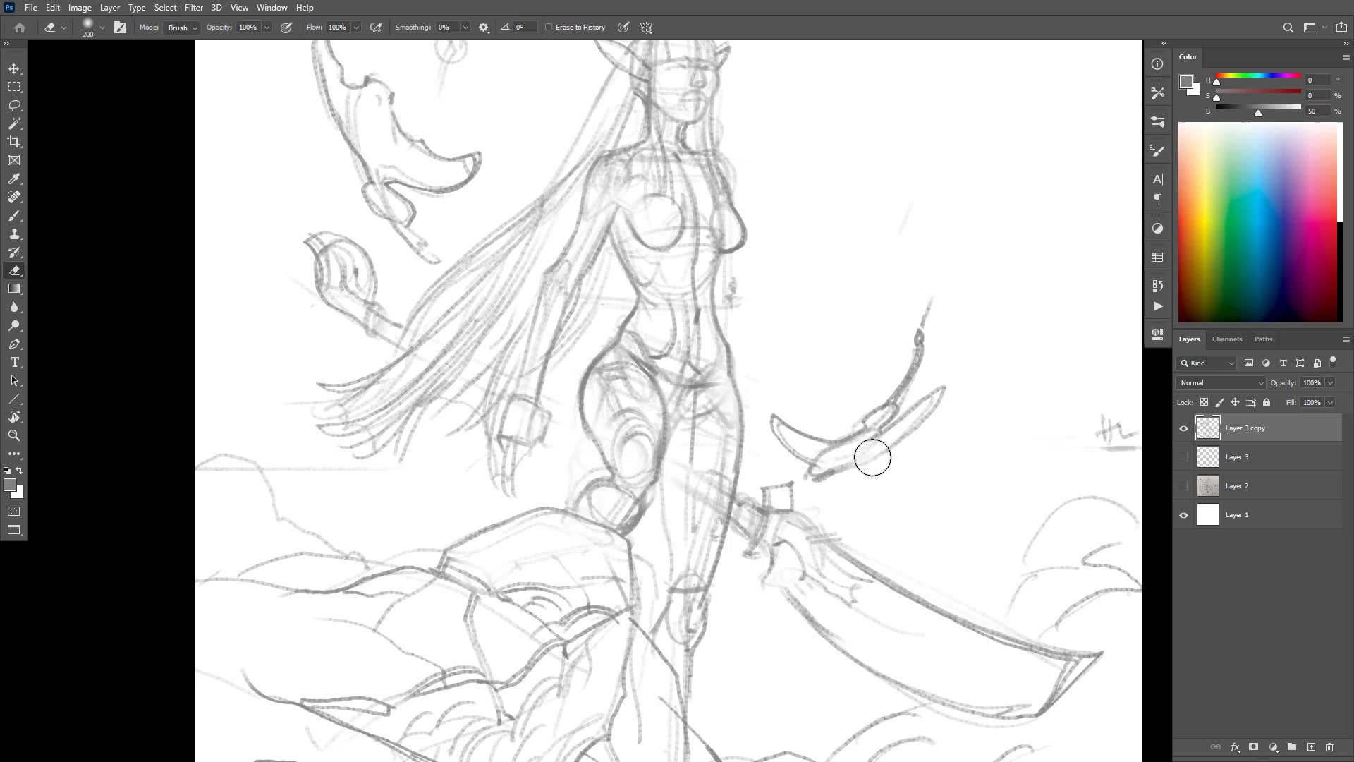
Line Work Development
Inking and Line Quality
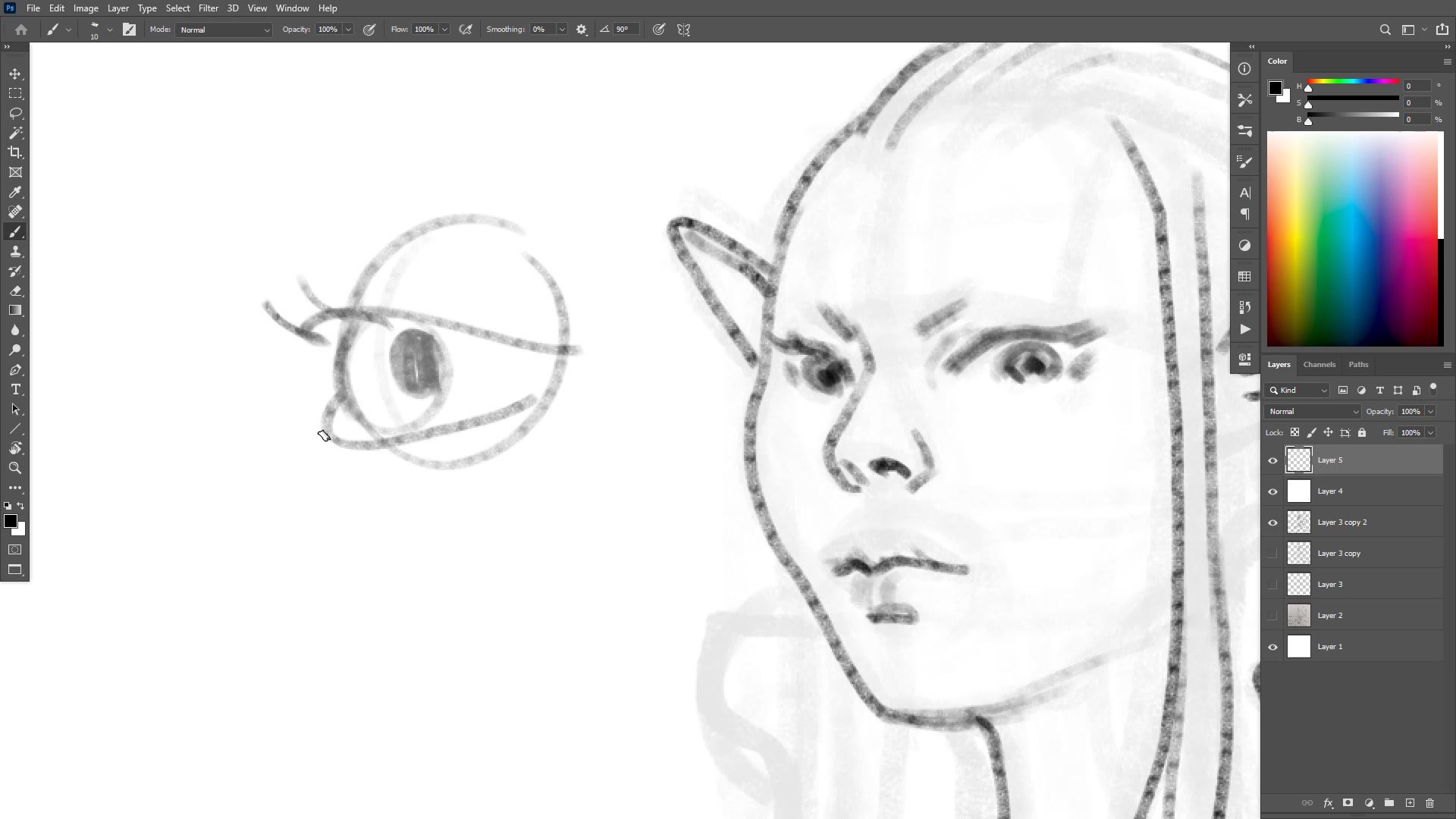
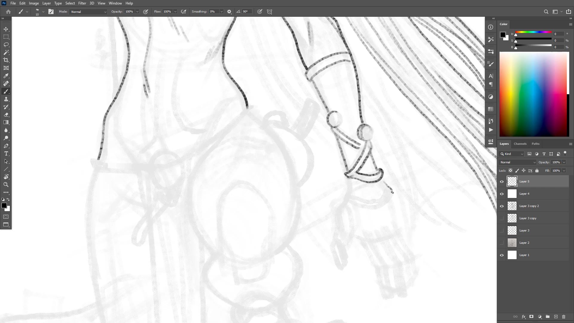
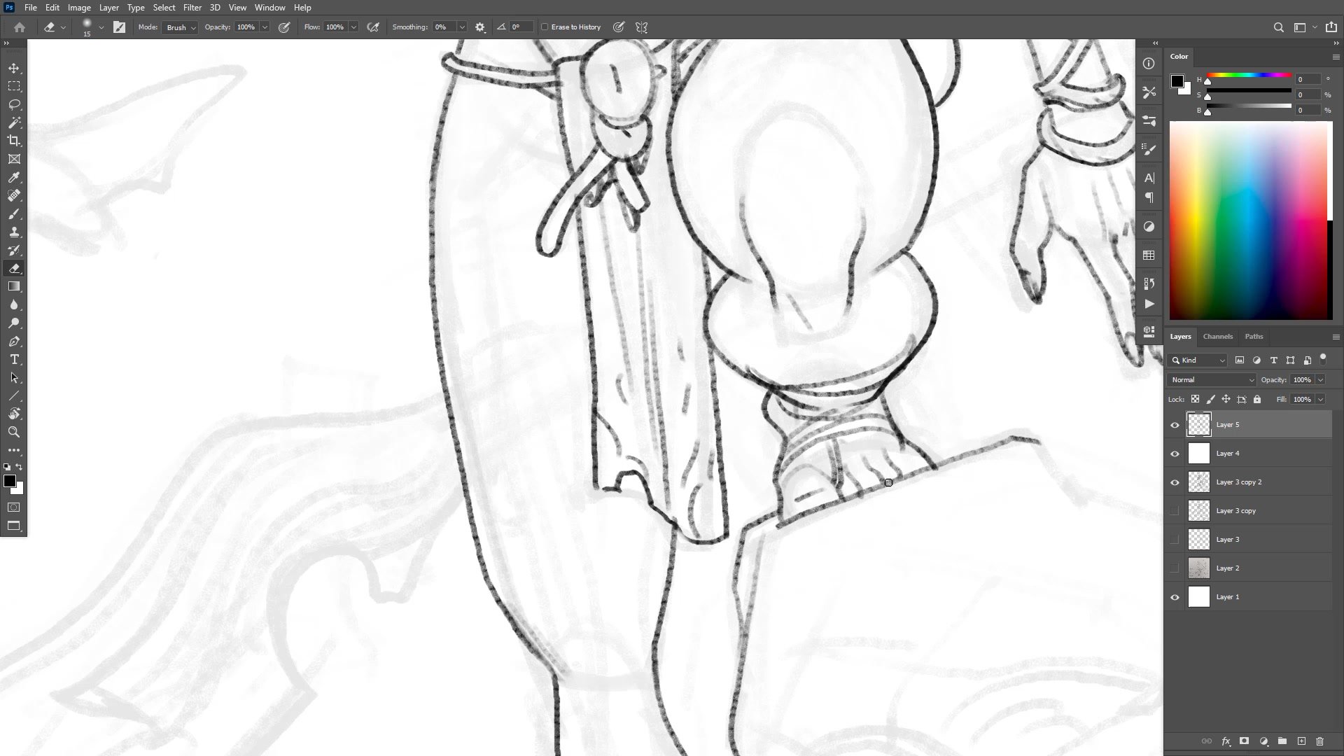
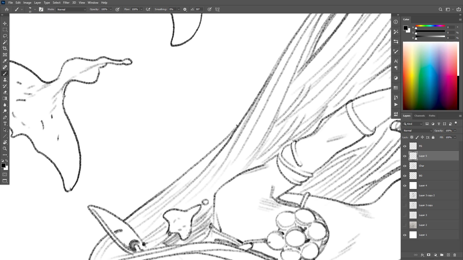
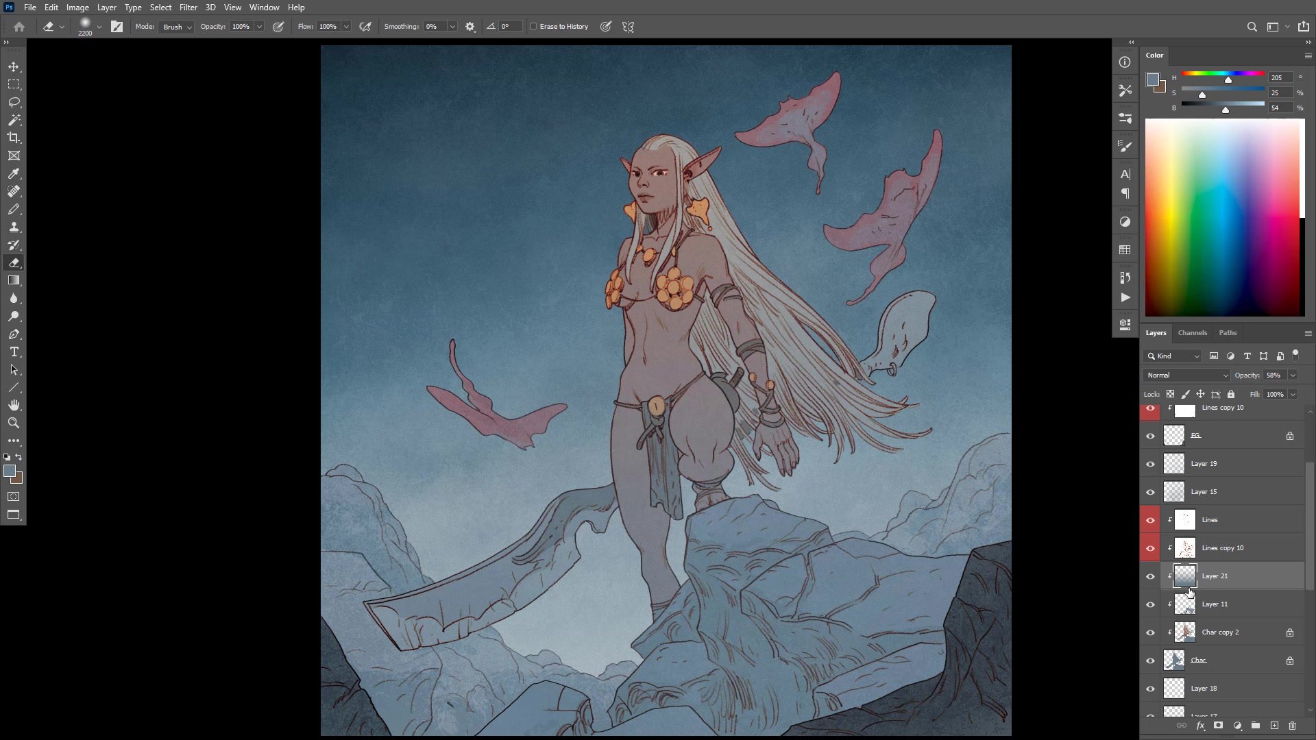
The inking phase uses a smaller pencil brush on a new layer, with a white layer underneath at reduced opacity to fade out the construction sketch. The approach works foreground elements first, then the character, then background, creating natural separation between layers. Line weight variation plays a key role in creating depth, with heavier outer silhouette lines and lighter interior detail.
A critical distinction emerges between structural drawing and expressive drawing during this phase. Rather than trying to render every anatomical detail perfectly, the focus stays on iconographic readability, making sure the pose, expression, and silhouette communicate clearly. The eyes, for example, rely more on understanding whether the viewer is looking up or down at the character than on perfect anatomical construction.
Color and Atmosphere
Flat Color and Grading
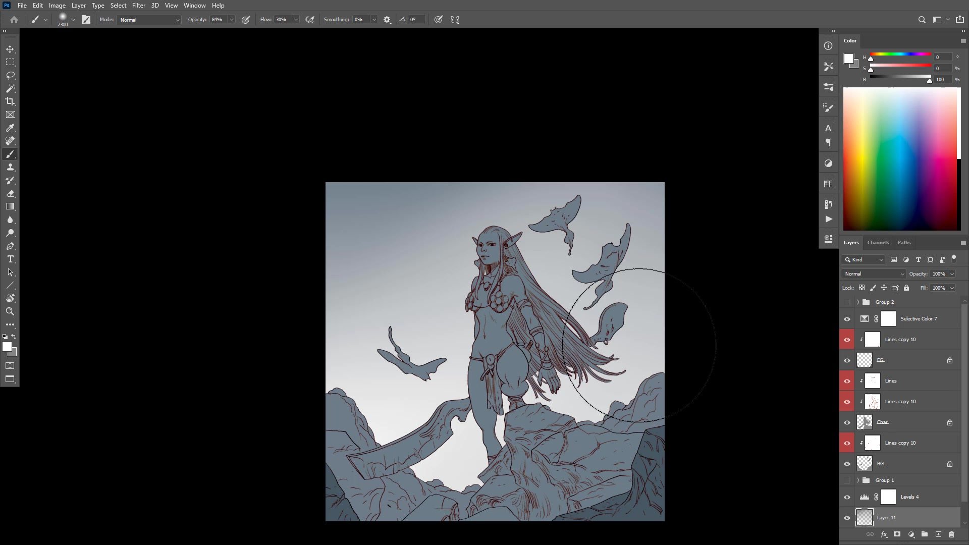
The coloring process starts with simple flat fills using the magic wand and paint bucket, establishing a basic value plan: a lighter character silhouetted against a darker atmospheric background. A slightly textured brush adds character to the flat fills, covering up any imprecise edges and creating visual interest even before rendering begins.
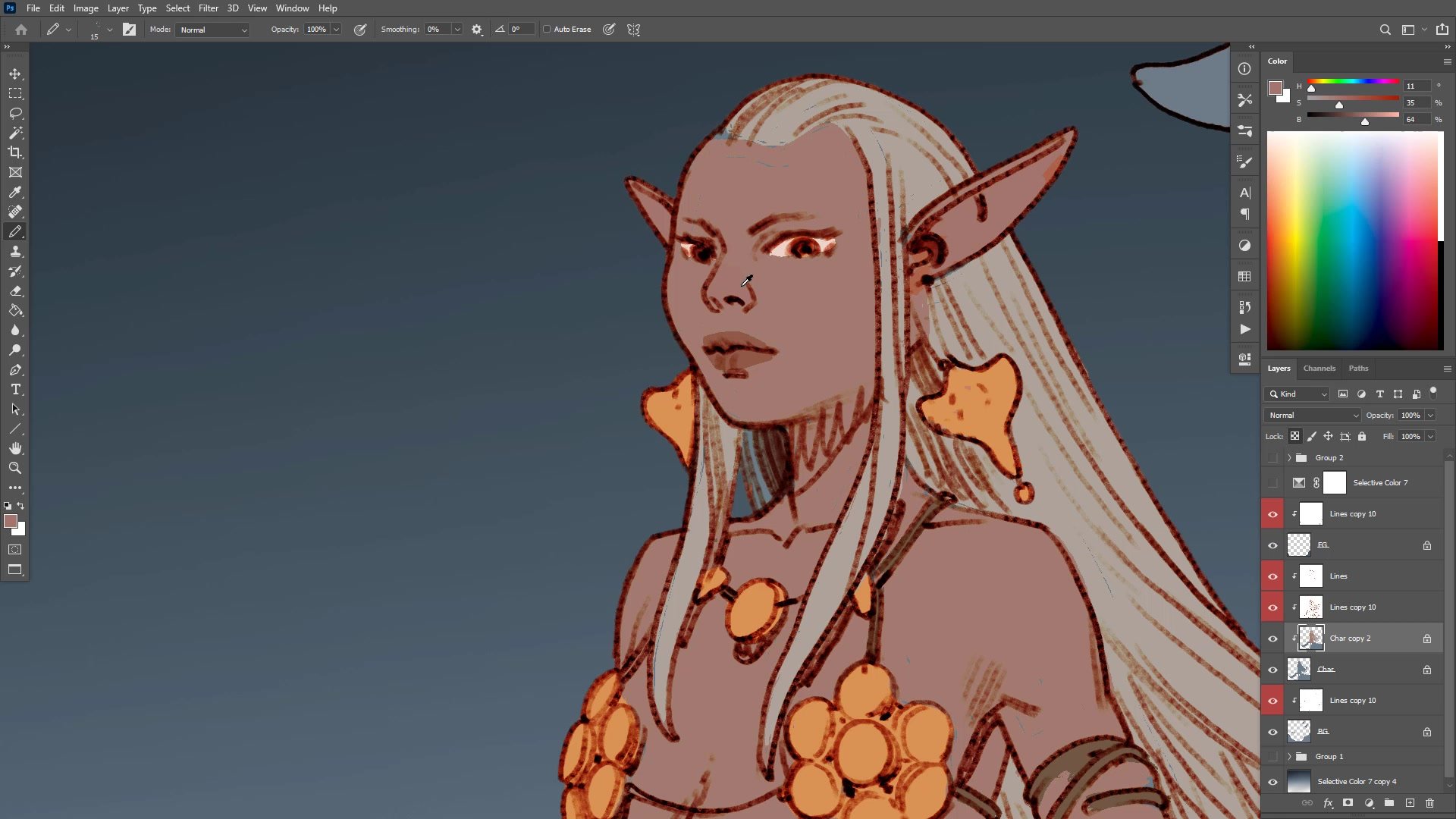
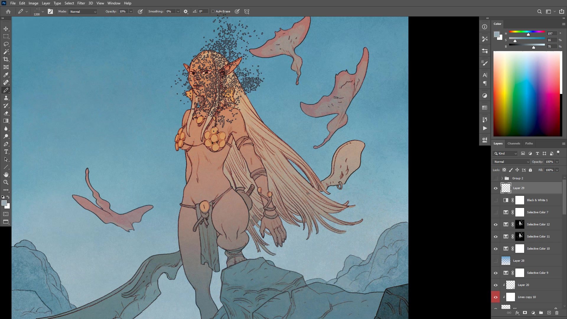
The final phase involves extensive color grading using selective color adjustments, levels, and overlay layers. The session reveals an important observation about color contrast versus value contrast. The piece works primarily through color contrast, with warm skin tones and cool blue backgrounds creating strong separation even though the value range remains relatively compressed. Cloud textures, grain effects, and atmospheric gradients bring the final image together over the last half hour of careful adjustment.
Final Result
Key Techniques
Disposable Thumbnails: Starting from a rough sketchbook photo keeps the digital construction process independent and prevents over-reliance on the initial sketch.
Checkpoint Duplicates: Duplicating layers at each significant stage creates safe rollback points that encourage bolder decision-making throughout the process.
Foreground-First Inking: Working from foreground to background on separate layers creates natural overlap and simplifies the later coloring process.
Color Contrast Over Value: Strong color temperature separation between warm and cool tones can create readable illustrations even when the overall value range stays compressed.
Try This Approach
Start Simple: Choose a single character with a minimal or abstract background to keep the composition manageable while focusing on process.
Work in Phases: Separate construction, line work, and color onto distinct layers, duplicating at each phase transition as a safety net.
Grade at the End: Reserve the final thirty minutes for color adjustment and grading rather than trying to nail the palette from the start.


