Warm Vs Cool Rules - Do Great Artists Actually Follow Them?
Summary
The Warm Vs Cool Challenge
Warm versus cool color theory is one of those concepts that sounds simple on the surface but runs surprisingly deep when put into practice. The basic idea is straightforward enough: modulating the temperature difference between colors in an image creates a feeling of enhanced contrast. Warm colors tend to come forward while cool colors recede, and playing with the temperature of shadows versus highlights can bring enormous vibrancy and depth to a piece.
What makes this genuinely interesting is seeing how professional artists actually handle these ideas across wildly different styles. From the tonalist approach of oil painting where temperature shifts happen within narrow value ranges, to the bold flat-color world of comic art where warm and cool contrasts are pushed to extremes, the underlying principle remains the same. But the way each artist applies it, bends it, and sometimes outright breaks the "rules" is where the real learning happens.
The common advice is always the same: warm in the foreground, cool in the background. And that advice works. It always works. But many of the best artists get striking results by doing the exact opposite, and understanding when and why they break those rules is what separates a basic understanding of color temperature from a sophisticated one.
Frazetta's Warm and Cool
Temperature in Tonalist Work
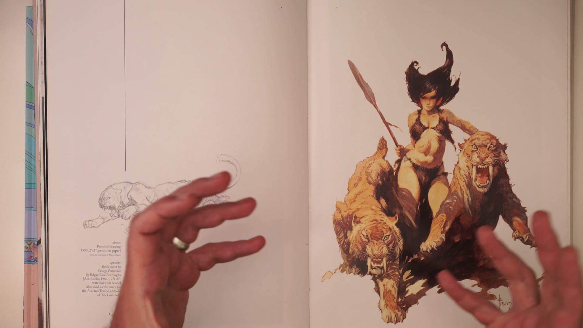
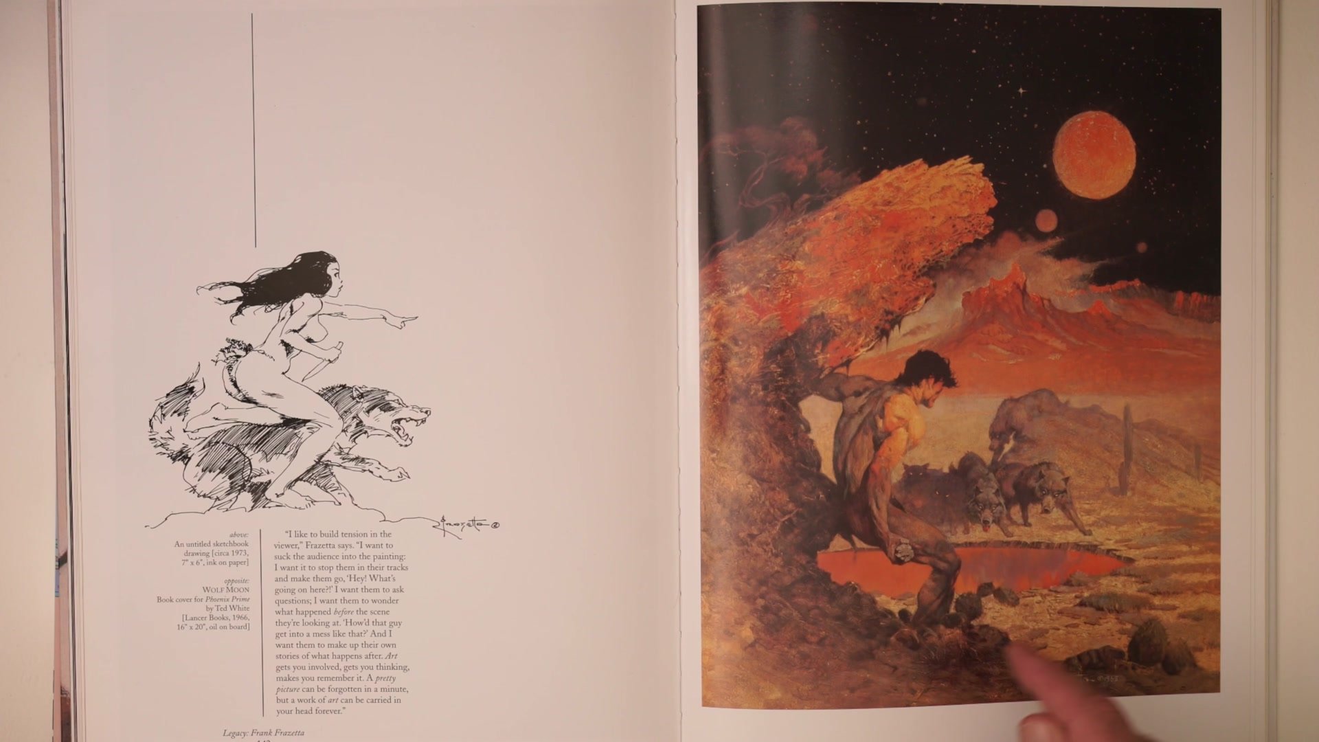
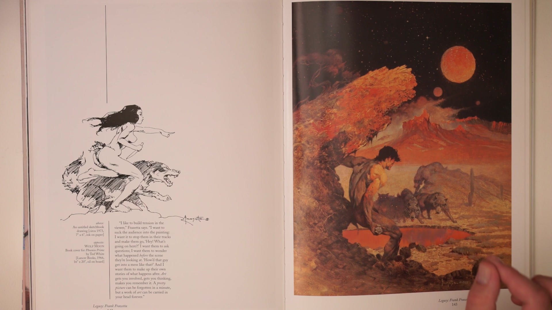
Frank Frazetta's paintings demonstrate one of the most effective uses of warm and cool contrast in a largely monotone color scheme. When an image is built almost entirely from yellows, oranges, and reds, the only way to create the feeling of depth and form is by modulating the temperature within that narrow range. The shadows become cooler and grayer relative to the warm, saturated highlights. This is what gives Frazetta's work that feeling of vibrancy even when the actual palette is quite limited.
The lit sides of forms carry warm, saturated color while the shadow sides pull toward cool grays and desaturated tones. This temperature differential creates a sense of light and form without needing a huge range of different hues. Even in images where the background is an intense warm orange, Frazetta makes it work because the understanding of how to place warm and cool is so controlled. It also shows that "rules" about warm foregrounds and cool backgrounds are starting points, not laws. An artist with enough experience and control can make anything work.
Comic Art and Game Art


Warm Shadows, Cool Highlights
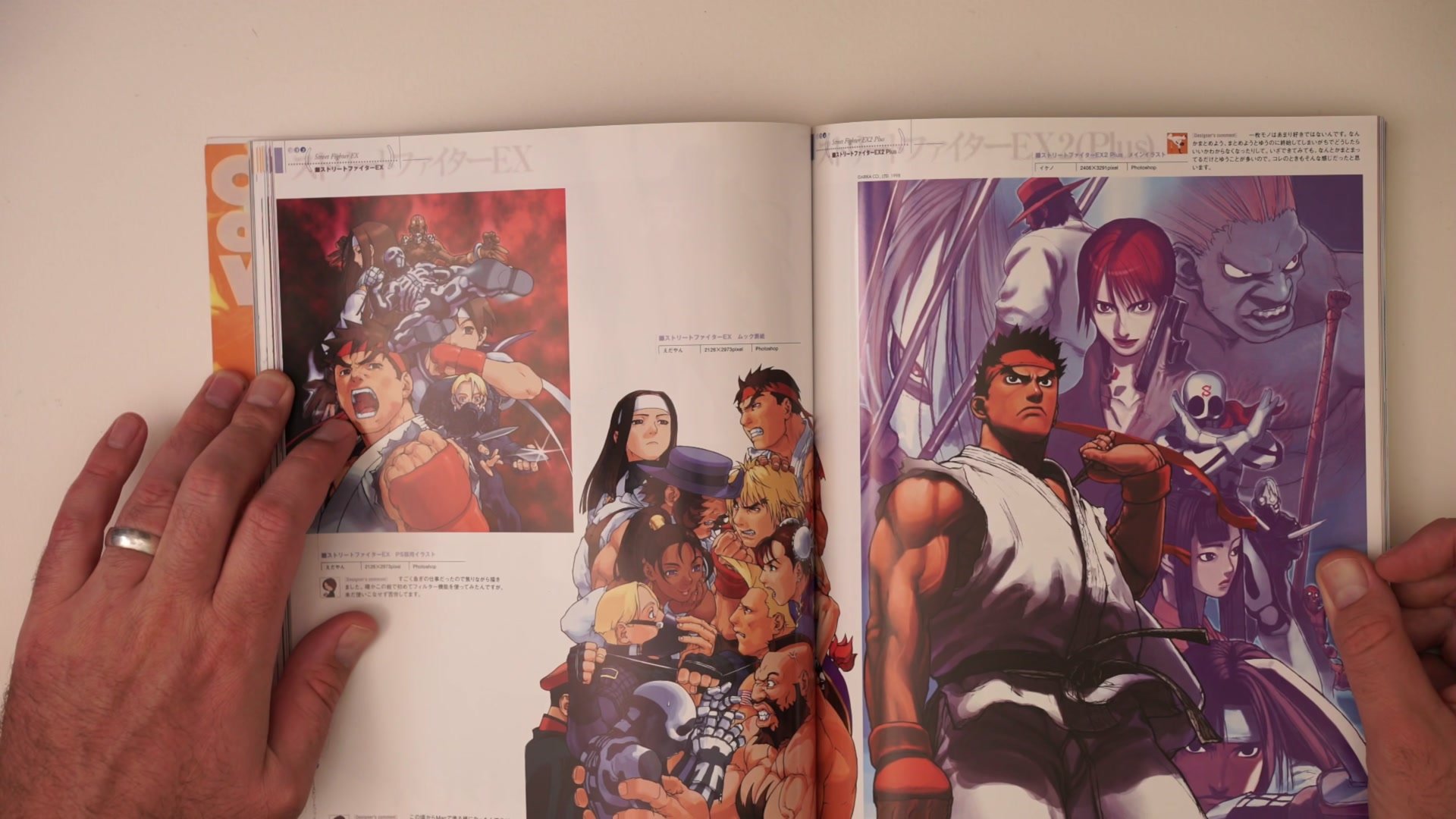
The Capcom Design Works art provides an interesting counterpoint to traditional warm-highlight, cool-shadow thinking. A lot of this character art uses warm shadows and relatively neutral or cool highlights, and the result is a high-energy, vibrant look that really pops against backgrounds. When shadows are warm, the image avoids looking muddy. The characters maintain a graphic, clean quality while still feeling like they have form and volume.
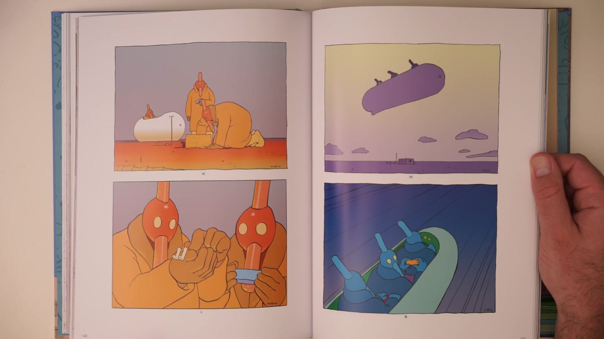
This approach is especially relevant for character art that needs to stand out. By keeping the shadow temperatures warm and the highlights relatively cool, the rendering stays clean and reads at a distance. A face rendered this way has clear form delineation without needing heavy value contrast. Moebius takes a completely different path, using pastel warm and cool contrasts in line and color work where very subtle temperature shifts between blues and yellows create striking, sophisticated images despite the colors themselves being quite muted. The same warm-cool principle works across both the high-energy Capcom approach and the subtle European comic style.
Sargent and Kerascoet

Sophistication Through Subtlety
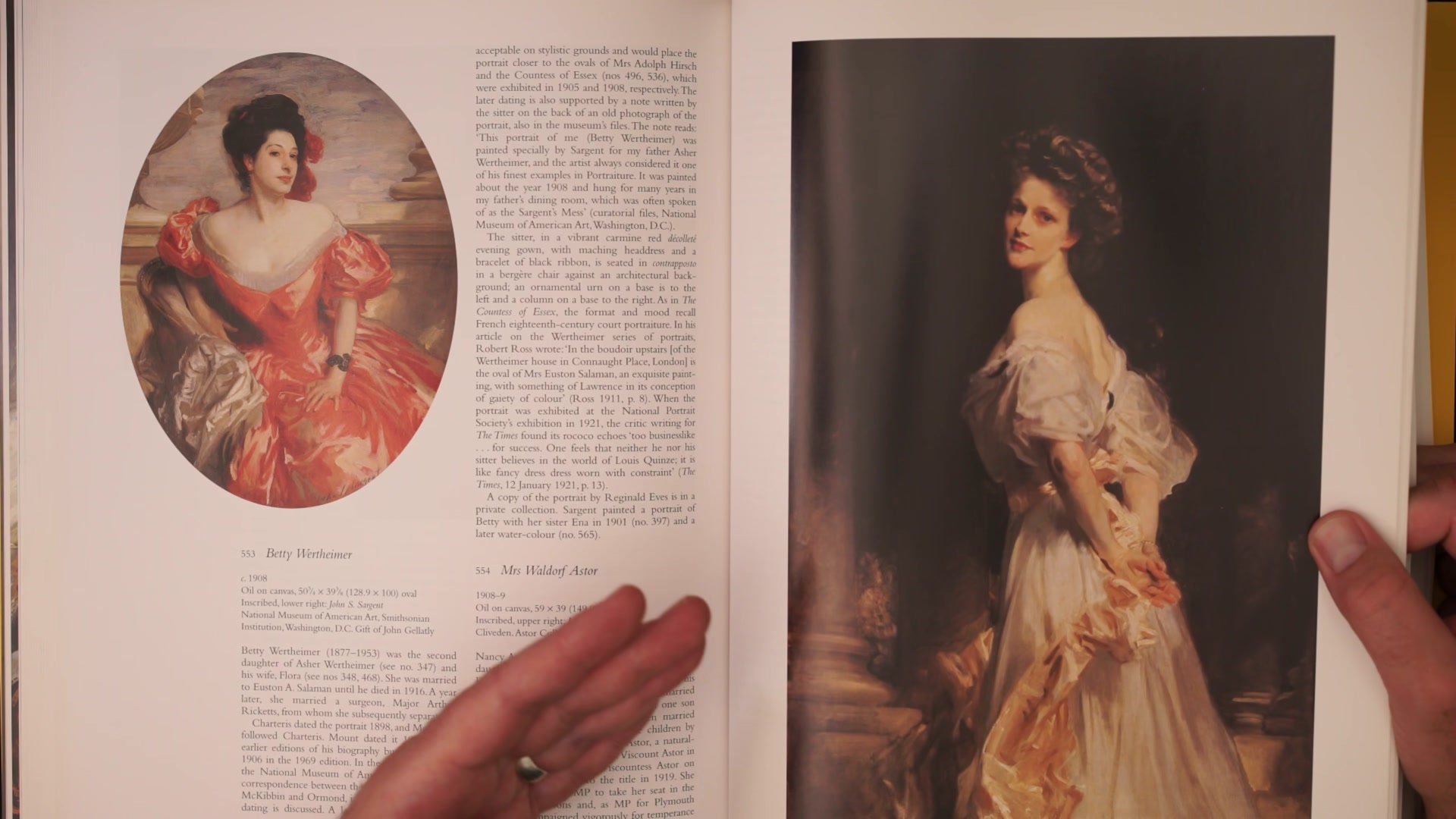
John Singer Sargent represents the pinnacle of using warm and cool temperature shifts to describe form in a tonalist painting context. The way Sargent modulates the temperature across a face, moving from warm highlights to cool, grayed shadow sides, creates an extraordinary sense of three-dimensionality. What looks deceptively simple is actually incredibly sophisticated. The temperature changes are so subtle that when studying one of these portraits closely, the actual color differences between the light and shadow side of the face are remarkably small, yet the effect is powerful.
Kerascoet and Hubert bring this same warm-cool sensitivity to the world of French comic art, where simple pastel color schemes with subtle temperature variation create pages that feel vibrant and beautiful despite being quite restrained in terms of actual color range. This is the real lesson of warm and cool: it works at every level of complexity. Whether the approach is bold and graphic or whisper-quiet and pastel, controlling the temperature relationship between colors in an image is fundamentally about controlling where the viewer looks and how the image feels.
Key Concepts
Temperature Creates Contrast: The feeling of enhanced contrast in an image comes not just from value differences but from the temperature relationship between warm and cool colors. Modulating this temperature is often what creates vibrancy, even in limited palettes.
Rules Are Starting Points: Warm foreground and cool background always works, but great artists regularly do the opposite to create dissonance, visual interest, or narrative tension. The "rules" exist as fallback plans when an image is not working, not as laws to follow.
Style Determines Application: Every artist applies warm and cool differently depending on their style. Frazetta uses it within narrow tonal ranges. Capcom artists flip the convention with warm shadows. Moebius uses pastels. Sargent uses whisper-subtle shifts. The principle is universal but the execution is unique to each artist.


