Visual Language for Living Breathing Worlds
Summary
The Design Language Challenge
Creating a world that feels alive means creating variety. Whether the task is designing a cast of characters, filling a forest with different trees, or populating a street with vehicles, the challenge is the same: how do you make things feel related but distinct? Without a deliberate approach, natural habits take over. Every tree ends up looking the same. Every character gets drawn with the same face. Every building shares the same silhouette. The result is a world that feels flat and repetitive rather than living and breathing.
Visual design language is the tool that solves this. It is fundamentally about creating conscious visual variety by understanding what makes things similar and what makes them different, then using those differences deliberately to communicate meaning. This is not about knowing every species of tree or having an encyclopedic knowledge of period costume. It is about understanding, at a design level, how to slice and dice the visual properties of shapes, details, and iconic elements so that everything in your world reads clearly and distinctly. This is one of the foundational pillars of design, and it applies to everything from a single illustration to an entire graphic novel.
Trees as Visual Language
Building Blocks With Trees
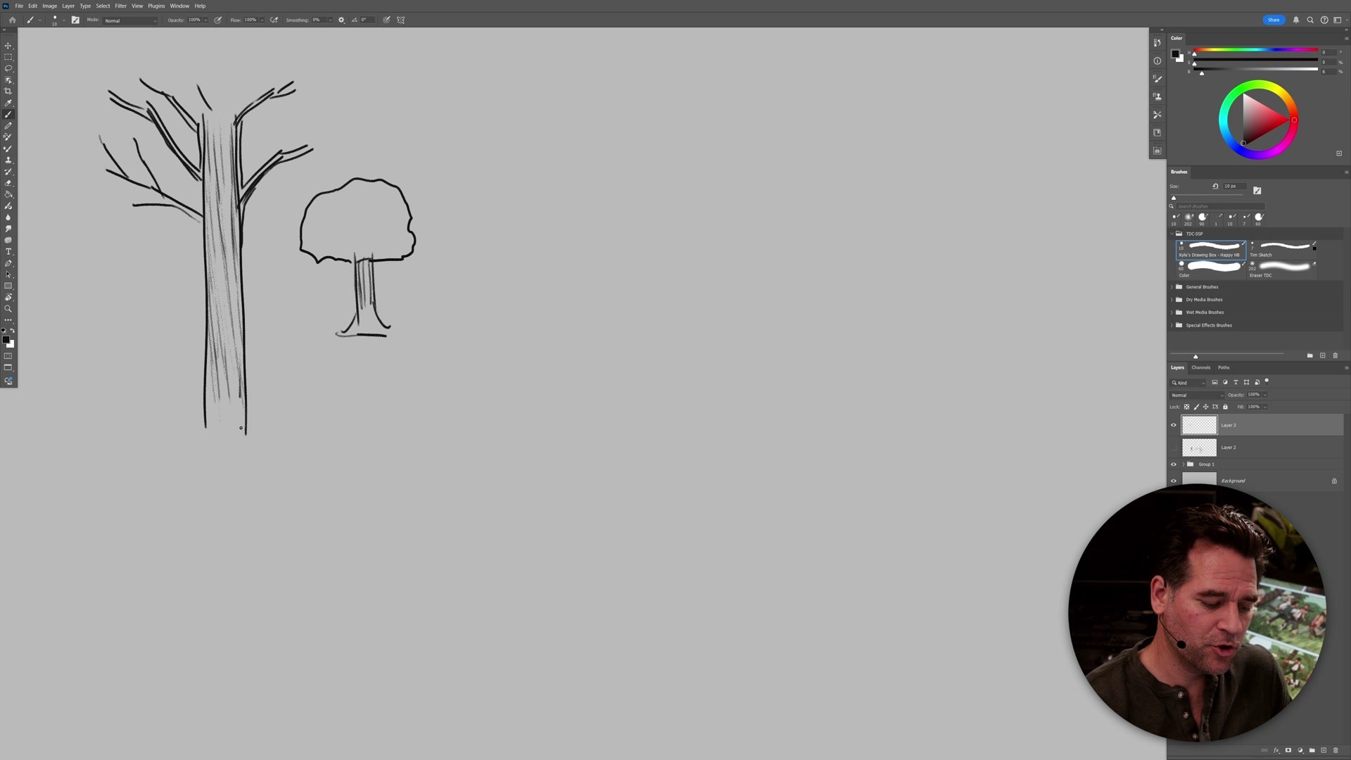
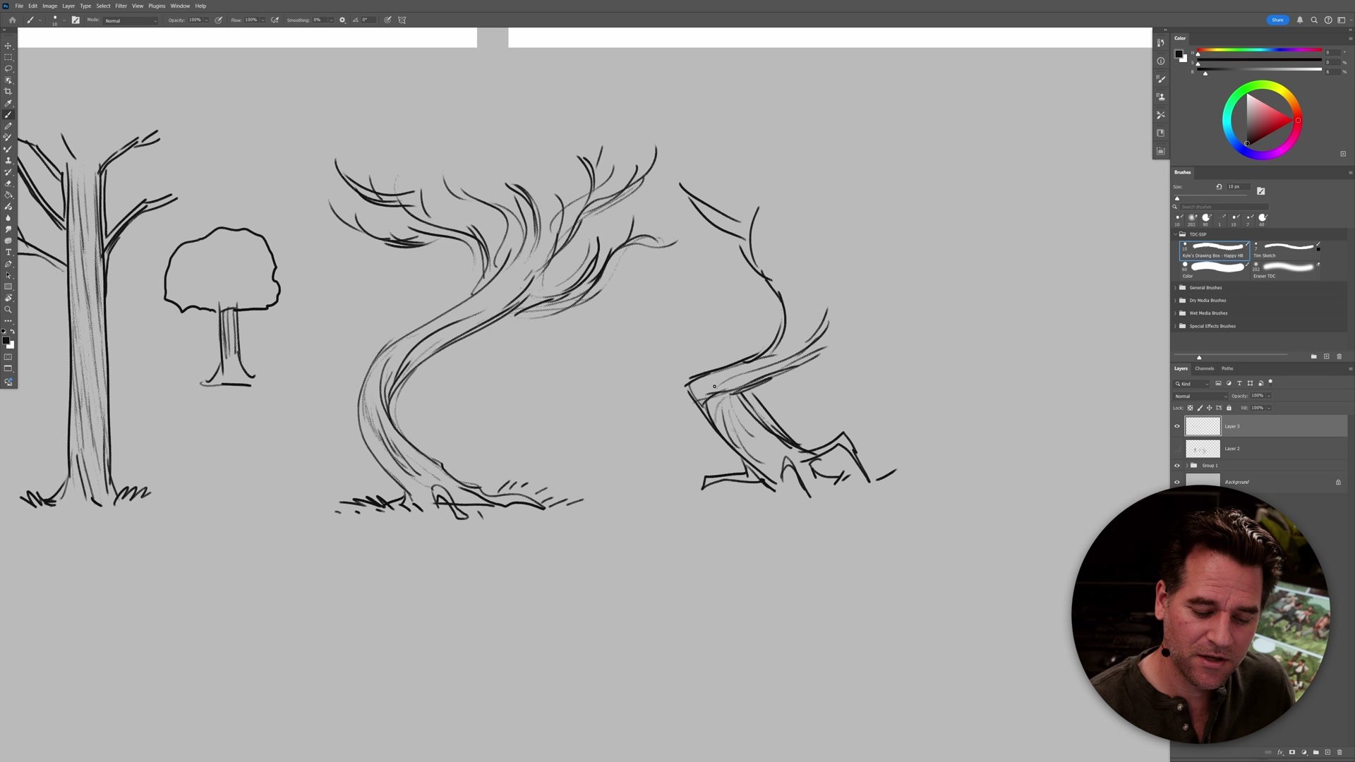
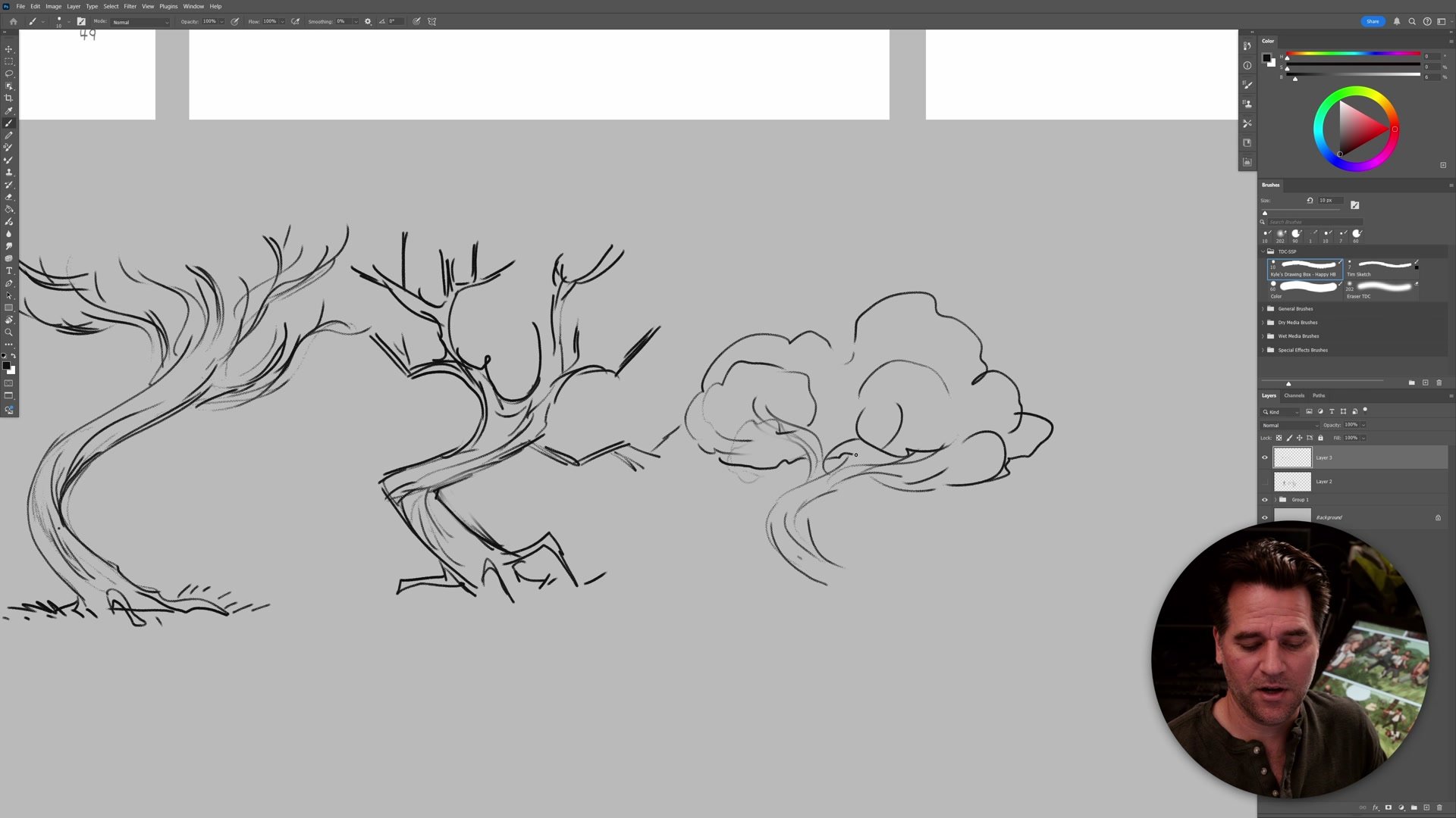
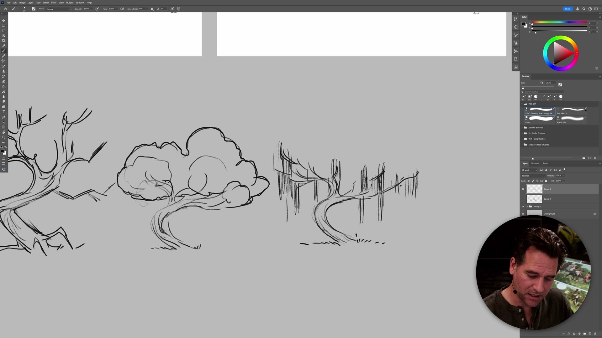
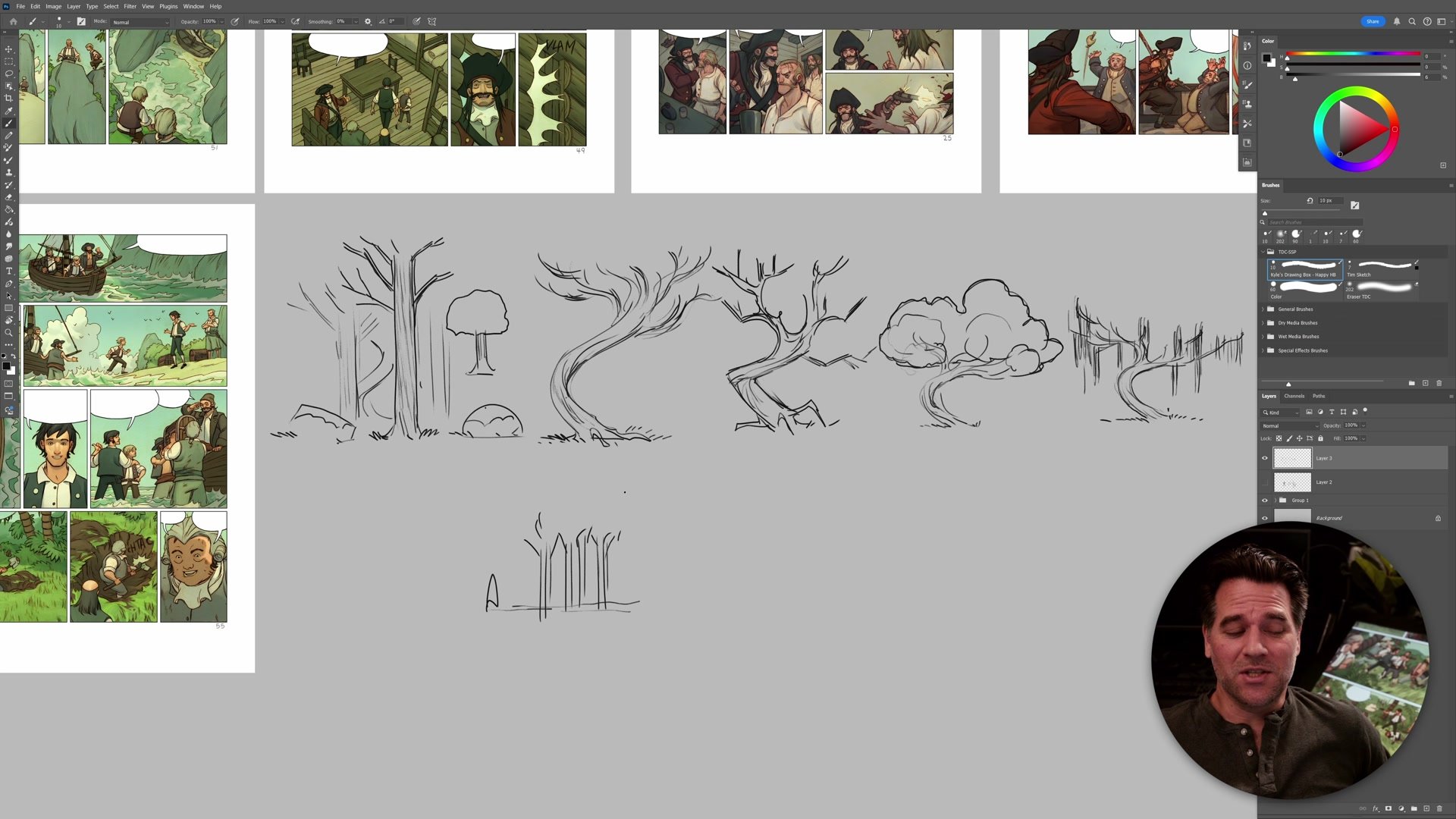
Trees serve as an accessible entry point to understanding visual design language because everyone can draw one. A tree has a trunk and foliage. That is the iconic, symbolic version. But from that shared anatomy, completely different feelings emerge by changing just the visual design language of how those elements are drawn. A straight trunk with standard foliage reads as a normal, background tree. A flowy, curving trunk with sweeping branches creates an entirely different mood. An angular, jagged trunk with sharp branching feels creepy or hostile.
The power here is that none of these need to be a specific species. They are just different shape languages applied to the same basic structure. And when placed together in a scene, those differences create story. A forest of identical straight trees serves as background, fading from attention through repetition. But when a single unique, curving tree appears in a clearing, it immediately draws the eye. Understanding this dynamic between similarity and difference is what allows a world to feel designed rather than defaulted.
Character Design Language
Designing Characters That Read
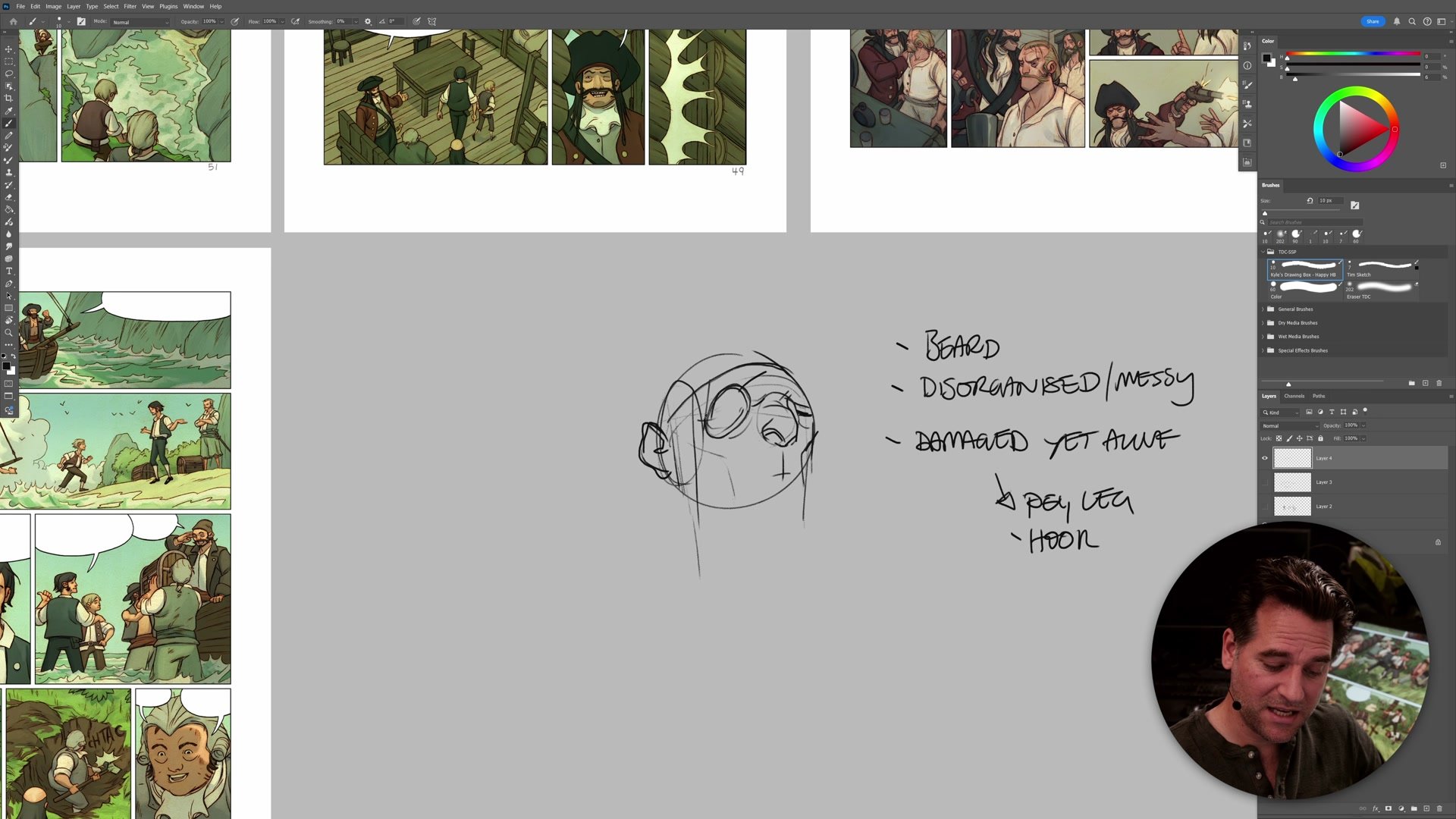
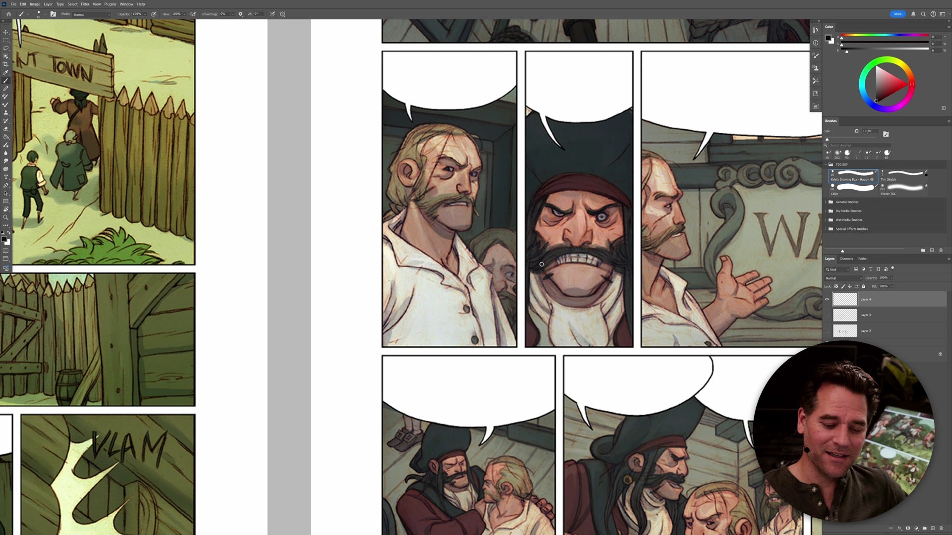
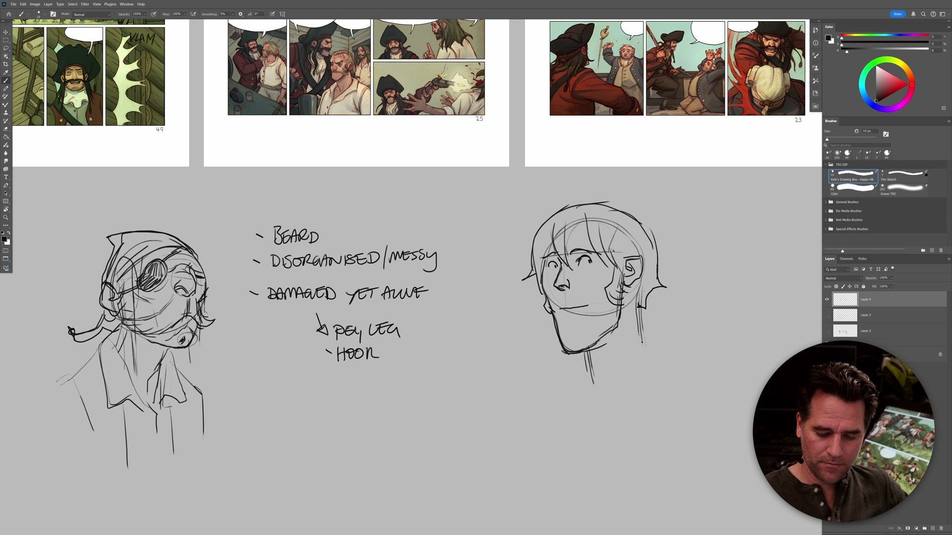
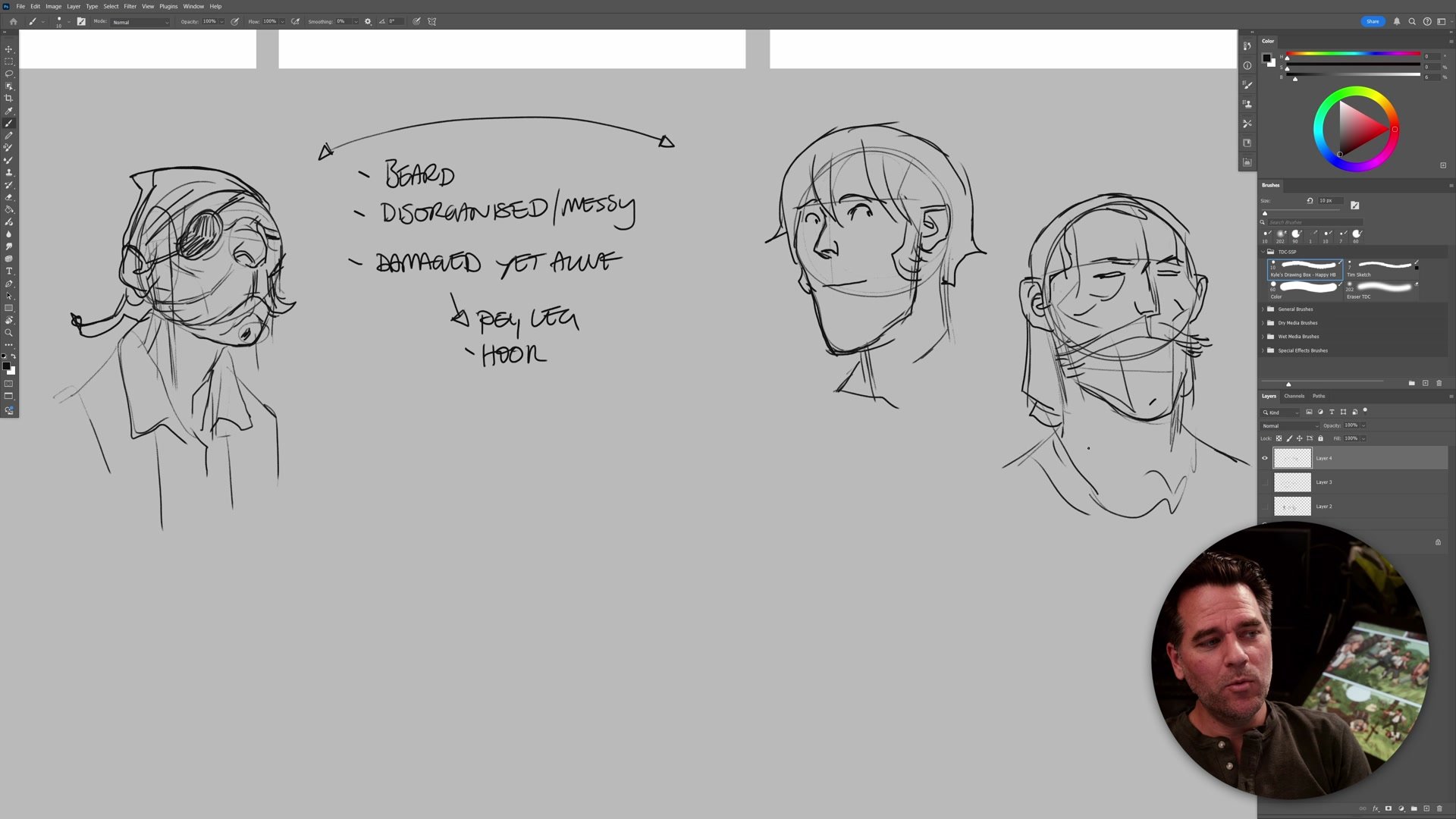
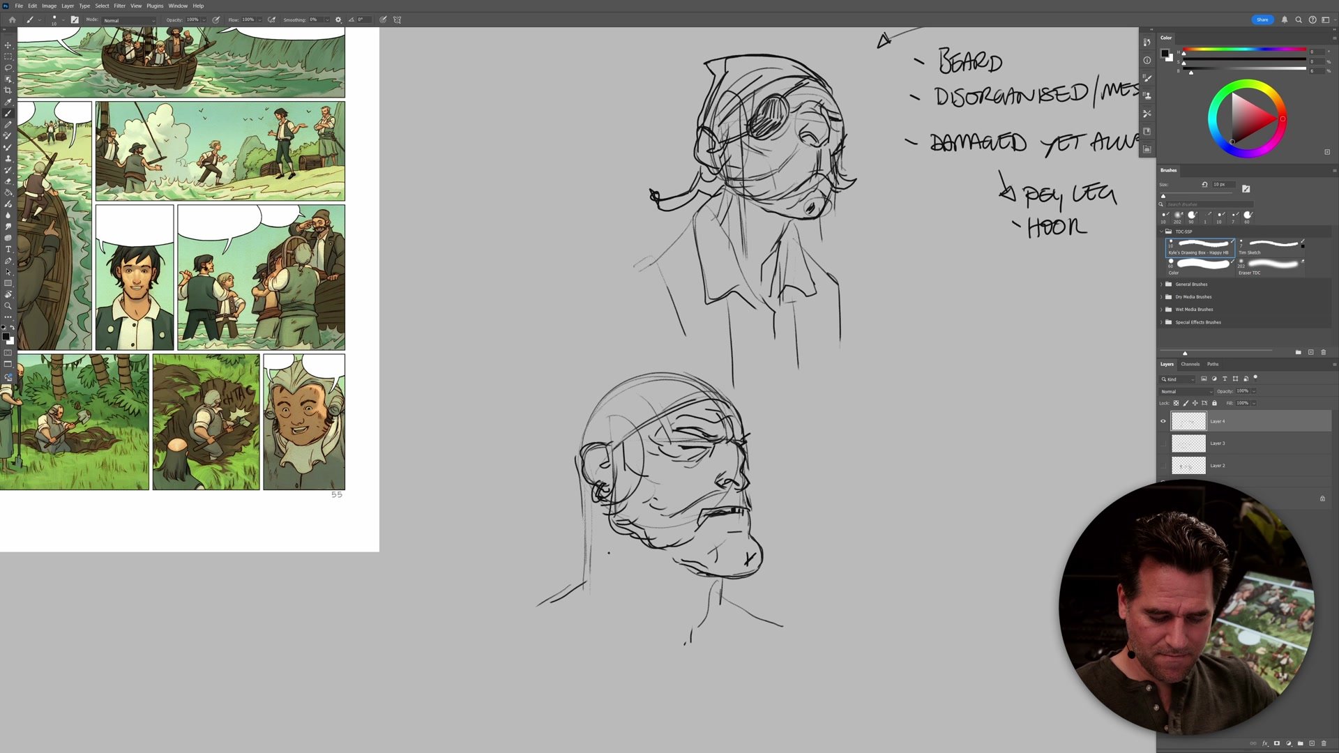
The same principles apply directly to character design. When designing a cast for a project, the challenge is making characters feel like they belong to the same world while being clearly distinguishable from each other. This is where stereotypes, archetypes, symbolism, and iconography become practical design tools rather than things to avoid. A pirate, for example, carries a visual design language built from identifiable traits: beards, disorganization, messiness, damage. These are functional and symbolic elements. Hooks and peg legs come from the genuine danger of life at sea. The roughness comes from operating outside structured military hierarchy.
Once those iconic design elements are established for a group, individual characters can be created by varying how strongly each element is expressed. A pirate captain might feel more organized, with a coat suggesting authority, while a deck-hand pirate embodies the roughness more directly. A non-pirate character like a young adventurer gets separated through clean-shaven features, tidier clothing, and an absence of those damage markers. This is how visual design language allows an infinite number of distinct characters to be generated from the same set of principles, all while remaining clearly identifiable within their respective groups.
Similarity and Difference
Telling Stories Through Design
The real power of visual design language emerges when similarity and difference are used strategically to serve the story. Most concept art education focuses on making every design as interesting and unique as possible. But in practice, a world needs boring things too. A street full of ordinary cars makes the one modified vehicle stand out. A sea of standard background characters makes the protagonist visually pop. Repetition is a legitimate and powerful design principle. It only becomes a problem when it happens by accident rather than by intention.
This is often one of the biggest challenges for artists working on personal projects like comics or graphic novels. Professional concept artists slice and dice visual design language every day, but the principles are rarely taught in a way that makes them applicable to solo creators building their own worlds. The key insight is that understanding what makes your designs similar and what makes them different, then being able to create both on demand, gives you control over what your audience notices and what fades into the background. That control is what makes a world feel considered, coherent, and alive.
Key Concepts
Same Anatomy, Different Language: Everything in a category shares basic structure. Trees have trunks and foliage. Cars have wheels and a body. Characters have heads and clothing. The visual design language of how those shared elements are drawn is what creates variety and meaning.
Iconic Elements Define Groups: Establishing a set of iconic visual traits for a group allows infinite characters to be generated within that group. Varying how strongly each trait is expressed creates hierarchy and individuality while maintaining group coherence.
Repetition Is a Tool: Similarity and repetition are not failures of design. They are deliberate choices that allow points of difference to carry meaning. A forest of same-looking trees makes the unique tree feel significant. Background characters make the protagonist visible.
Try This Exercise
Start With Trees: Draw a simple iconic tree with trunk and foliage. Then create three more versions using different visual design language for each, changing whether the lines are straight, flowy, or angular. Combine different trunk styles with different foliage styles to see how many distinct trees emerge from the same basic structure.
Apply It To Characters: Pick a character type or archetype. Write down three to five iconic visual traits that define that group. Then sketch several characters within that group, varying how strongly each trait appears. Notice how the shared traits keep them feeling related while the variations create individuality.
Design The Background: Draw a row of the same type of thing, whether cars, buildings, or people, keeping them visually similar. Then add one element that deliberately breaks from the design language. Observe how the repetition makes the unique element stand out.


