Give Your Art Impact With Tonal and Color Contrast
Summary
Two Tools for Contrast
One of the primary things artists do when creating imagery is define contrast. Whether separating the lit side of a form from its shadow, or distinguishing a character from a background, contrast is the mechanism that makes images readable. But there are fundamentally two different tools for creating that contrast, and the difference between them is often misunderstood.
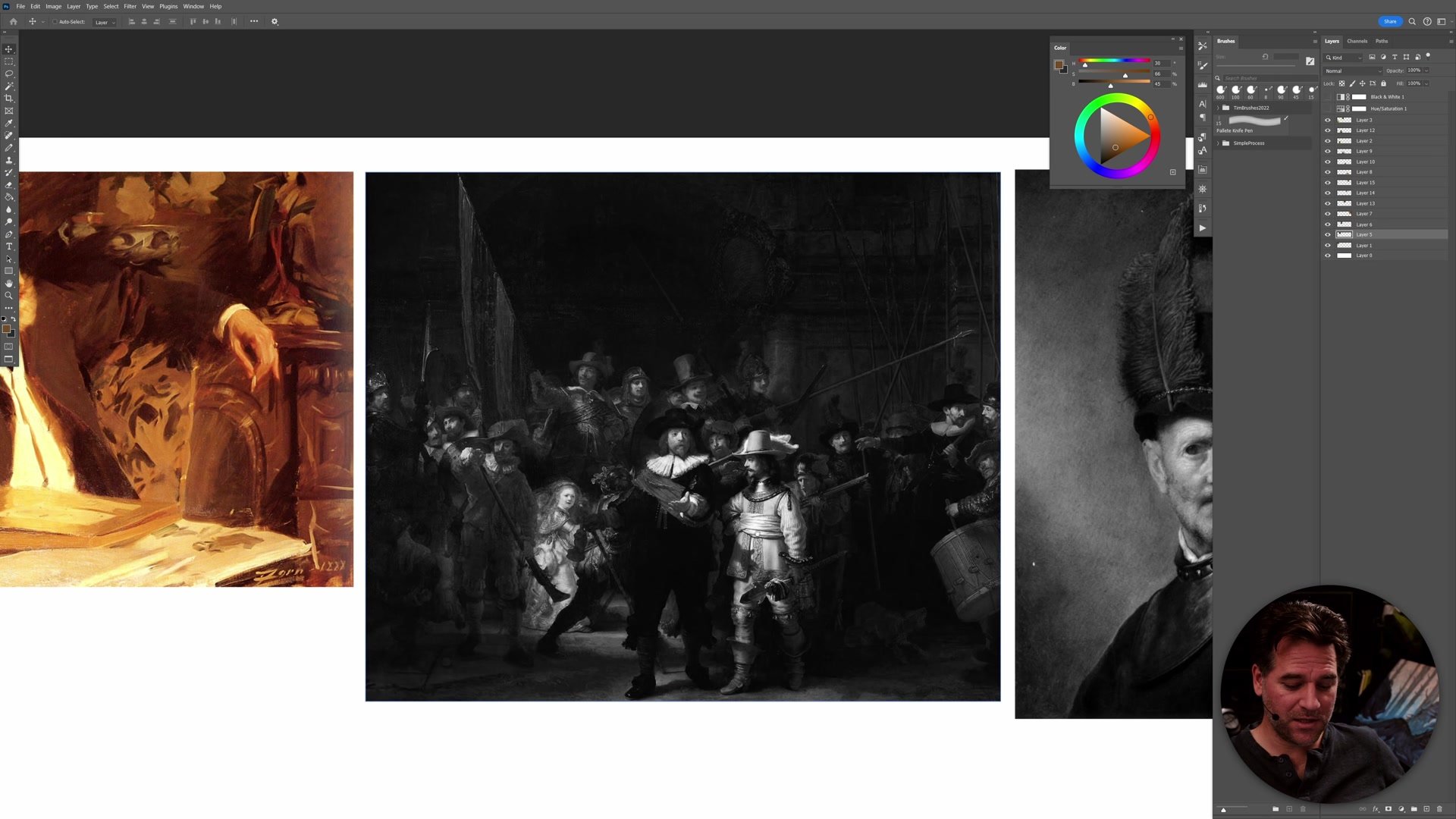
Tonal contrast is the difference between light and dark. Color contrast is the difference between hues. A Rembrandt painting defines contrast primarily through dramatic shifts in value, the classic chiaroscuro where light appears to glance off the canvas. A Monet haystack defines contrast primarily through shifts in color, where different hues placed side by side create vibrancy and separation. These are not interchangeable. Each communicates something different, and understanding which tool to reach for changes both how an image is planned and how problems are solved when things go wrong.
Tonal Masters and the B&W Test
The Black and White Myth
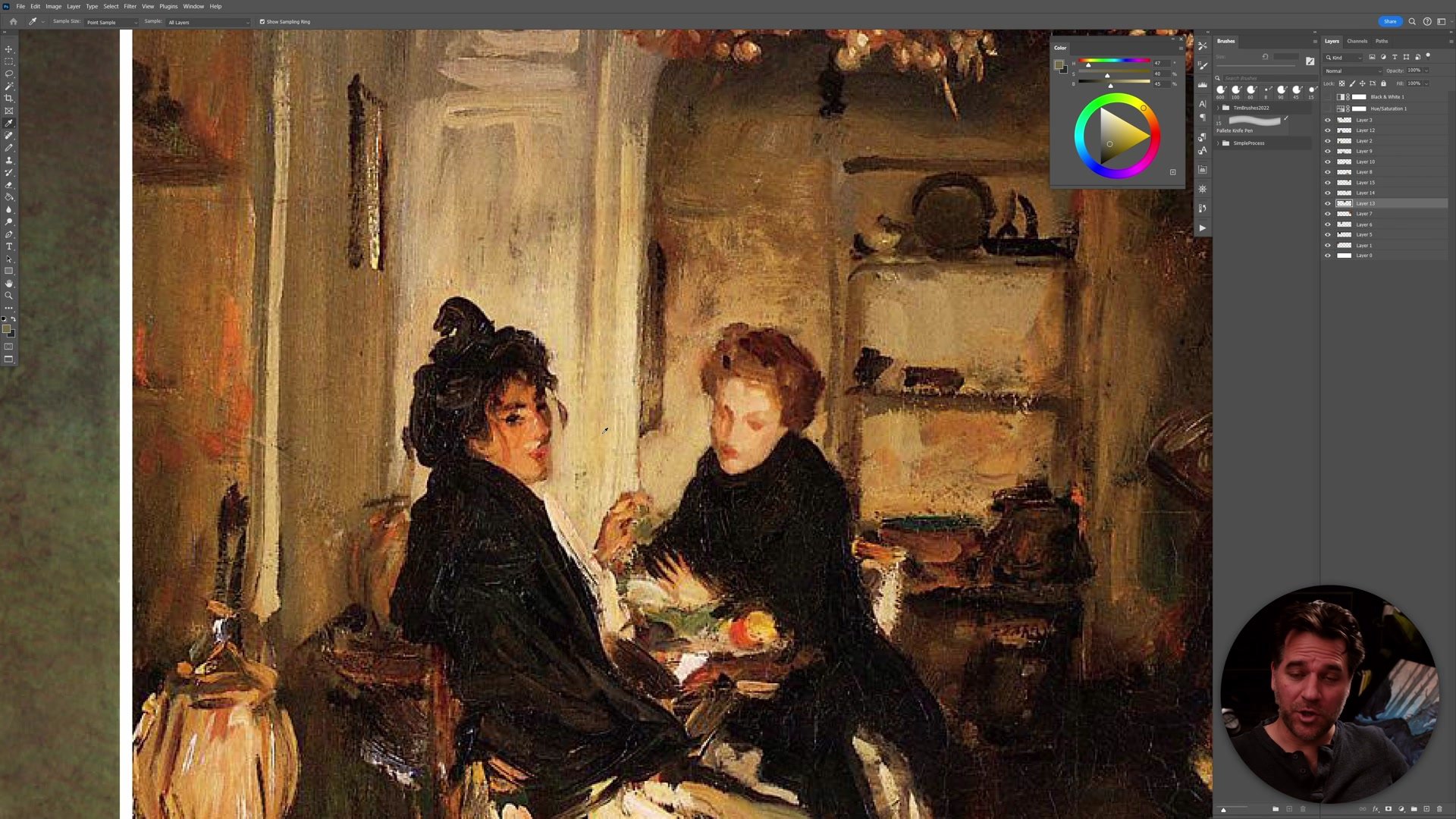
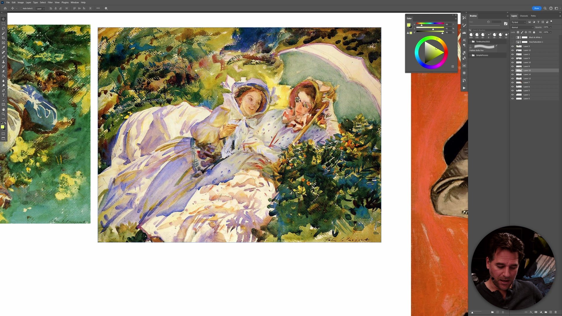
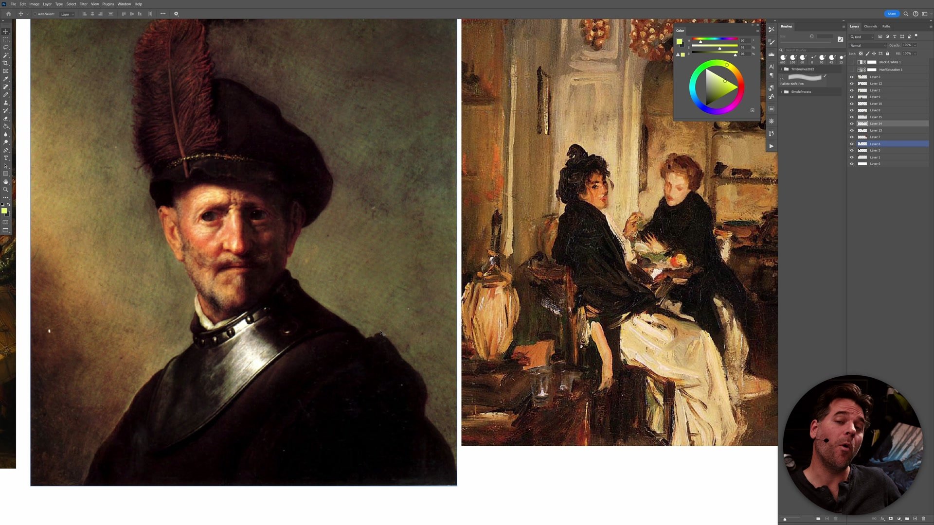
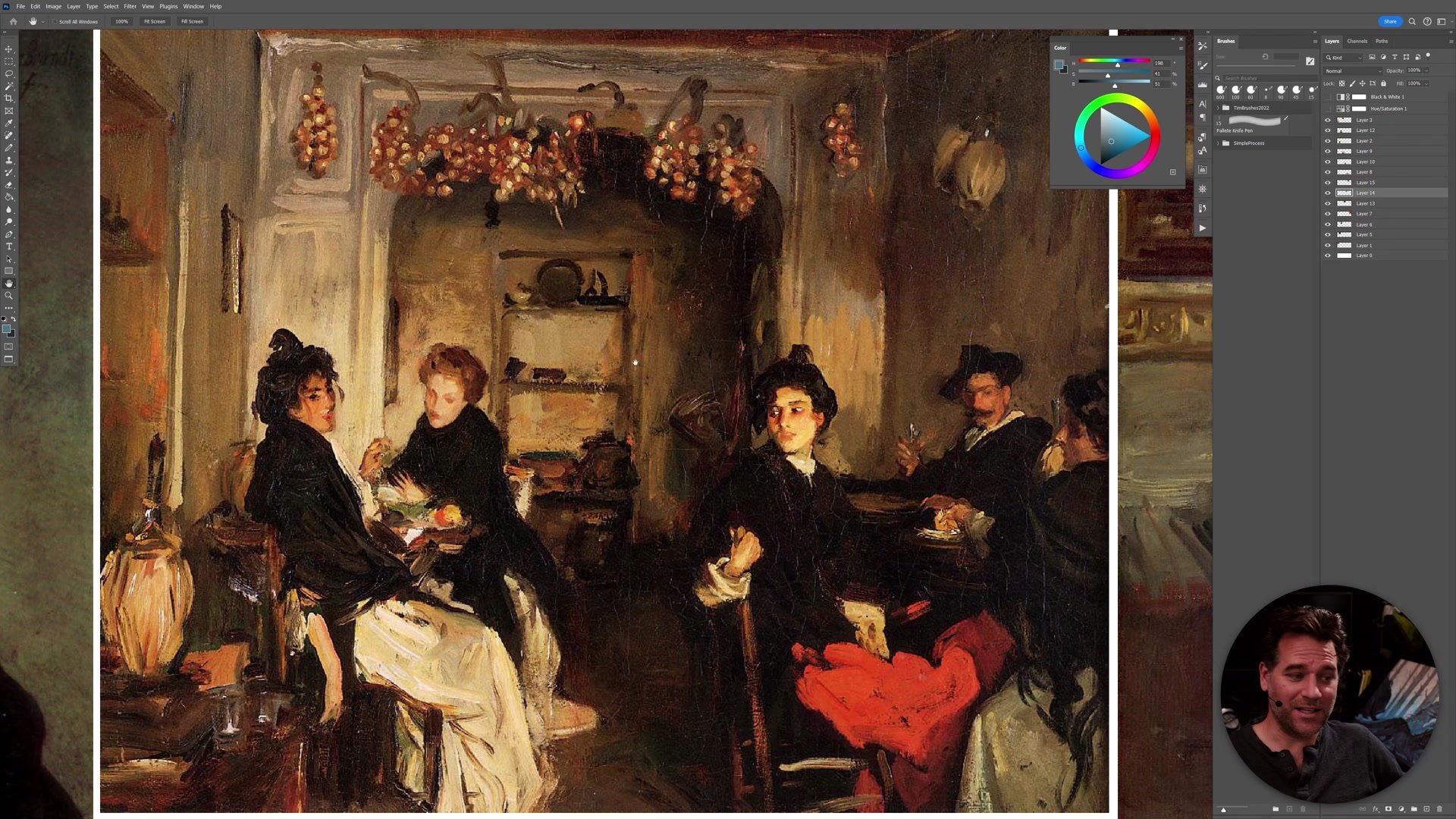
A common piece of art education advice says images need to work in black and white. There is truth to this, but it can become a trap. Tonal paintings by artists like Rembrandt, Zorn, and Sargent survive desaturation beautifully because their contrast is built on value. Strip the color from a Rembrandt portrait and it still reads as a powerful image.
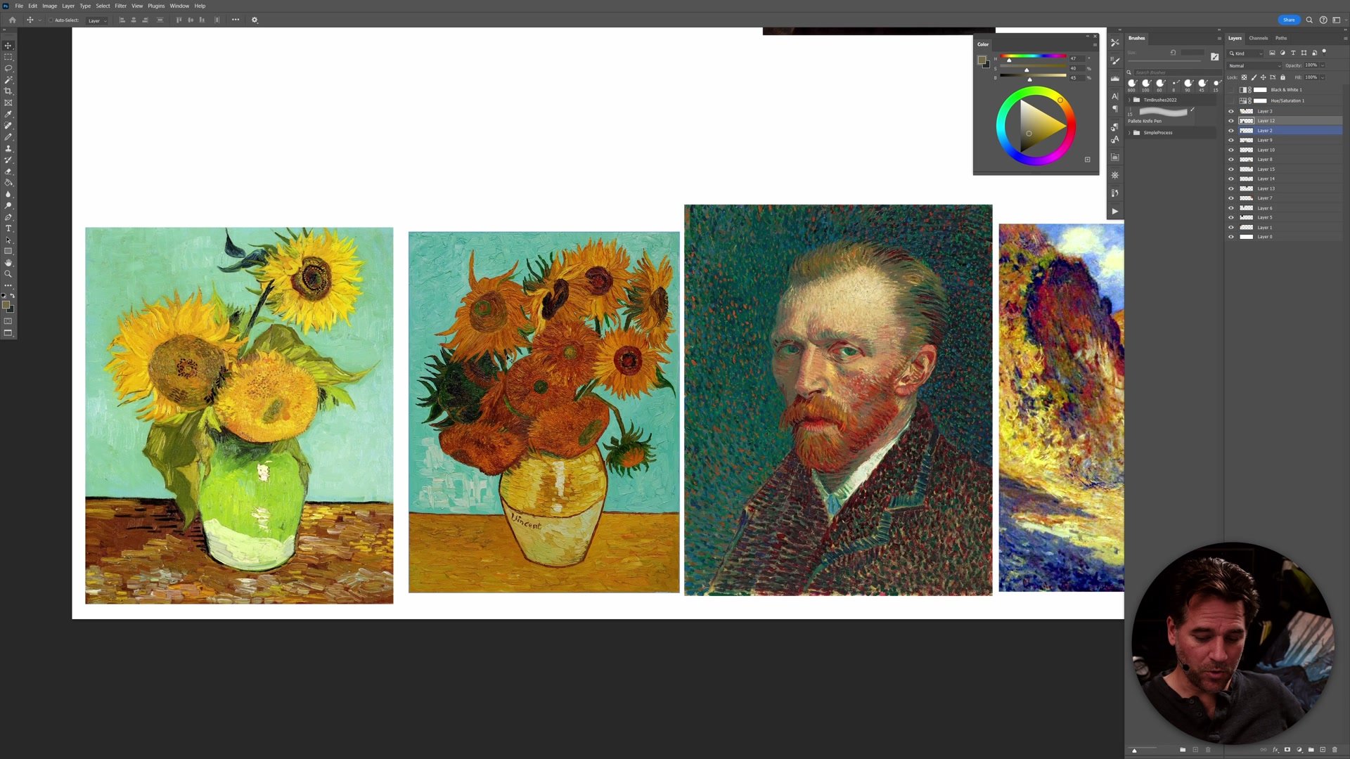
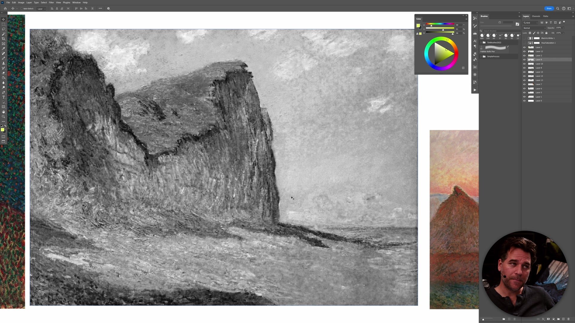
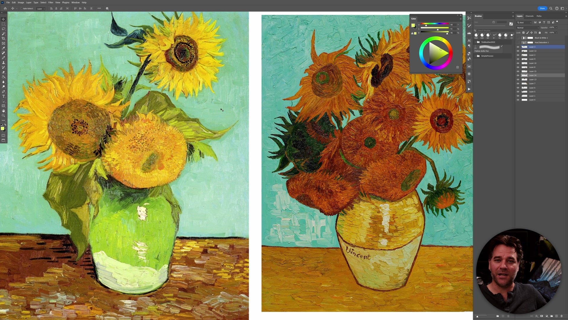
But strip the color from a Van Gogh self-portrait and the life drains out. Remove the hues from his sunflowers and what remains is unremarkable. The same happens with Monet's haystacks, where the entire sense of atmosphere and place disappears without color. This is not a failure of those paintings. It means the contrast was defined through color, not value. Understanding that both approaches are valid, and that they communicate different things, is what prevents artists from reaching for the wrong tool when they need to push contrast in their work.
Color Contrast in Practice
Applying This in Real Work
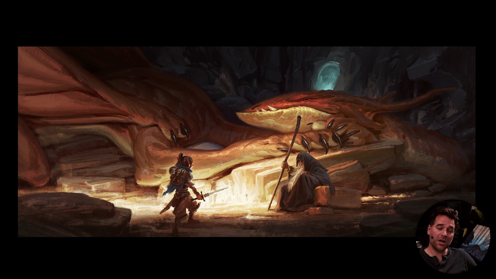
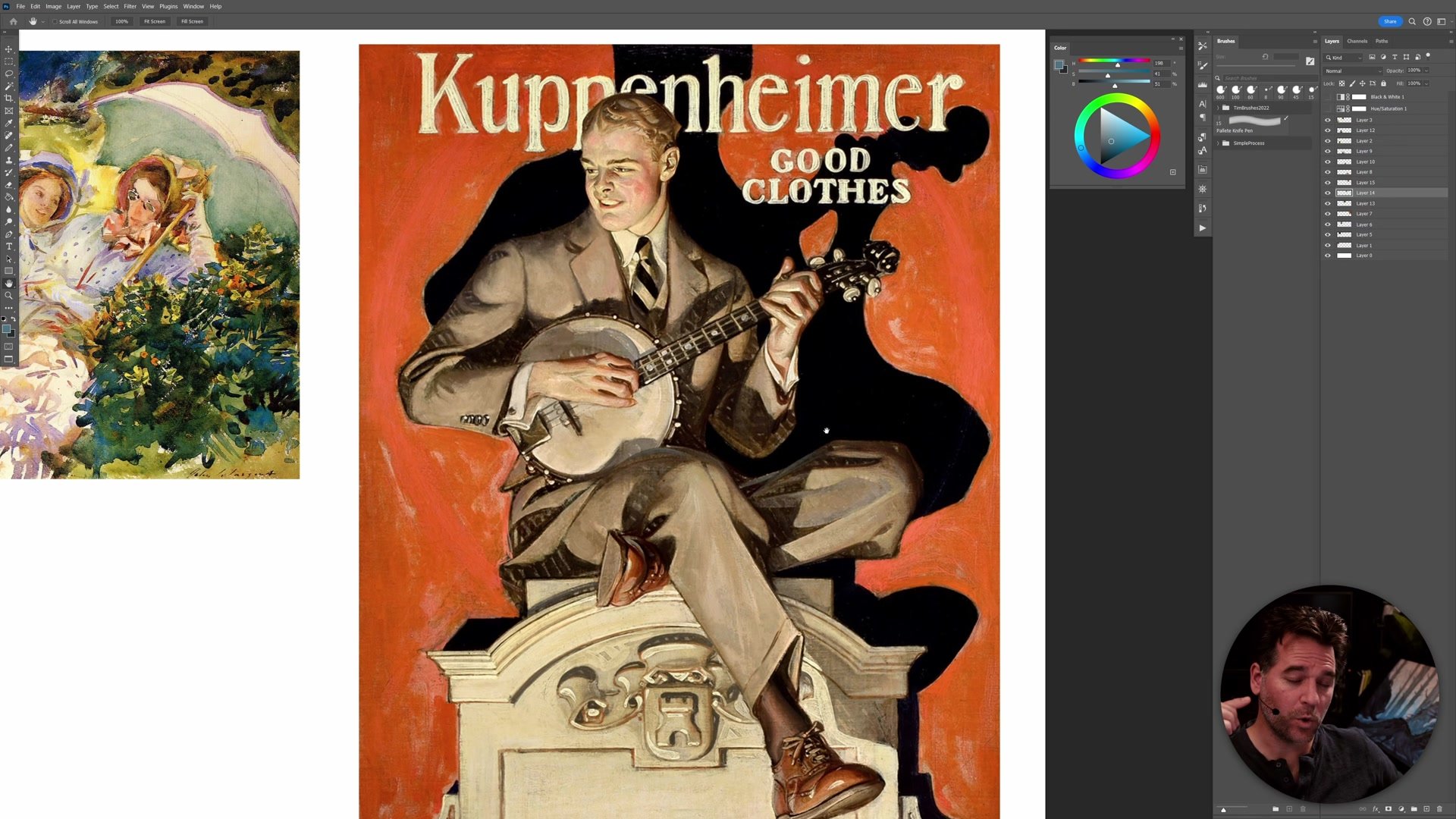
In professional practice, the choice between tonal and color contrast depends on what an image needs to communicate. Concept art for a video game often demands strong tonal readability because the work needs to feel grounded and the silhouettes need to separate cleanly. A comic book with a graphic, clean-line style might lean heavily into color contrast because that is what makes the pages vibrant and printable.
This is not about choosing one approach for everything. Within a single project, different scenes call for different solutions. A foggy silhouette shot can lean into pure value separation while a bright, colorful scene in the same book uses hue differences to create energy. The key is recognizing what is actually in the scene, what colors and lighting conditions exist, and then designing the contrast strategy around those realities rather than defaulting to one approach out of habit.
Professional Examples
Troubleshooting Contrast
When an image is not working and needs more contrast, the most common mistake is reaching for the wrong slider. Artists often look at tonal masters like Rembrandt and imagine there is more color in those paintings than actually exists. They then squeeze out vibrant blues and purples onto a palette that was working with a limited, sepia-toned range, and the painting falls apart. The reverse happens too. An image built on color vibrancy gets muddy when someone tries to add dark rendering instead of shifting hues.
The practical solution is to step back and classify the image. Is this working primarily on a tonal level or a color level? If it is essentially monochromatic, push value contrast. If there are already multiple hues at play, push the color differences further. Understanding which type of contrast is dominant in the image, and then working within that framework, is the most reliable way to elevate a piece that is not quite landing.
Key Concepts
Tonal vs Color Contrast: Tonal contrast separates elements through light and dark values. Color contrast separates elements through different hues. Both are valid tools, but they communicate different things and are not interchangeable.
The B&W Rule Has Limits: Not all great art needs to work in black and white. Color-dominant paintings like Van Gogh's sunflowers or Monet's haystacks lose their power when desaturated, and that is by design, not by failure.
Classify Before You Fix: When an image needs more contrast, first identify whether the dominant contrast is tonal or chromatic. Then push the slider that matches. Adding vibrant color to a tonal painting or dark rendering to a color painting creates mud.
Try This
Plan Your Contrast: Before starting an image, decide whether the dominant contrast will be tonal, chromatic, or a deliberate mix. Consider what is actually in the scene and what lighting conditions exist, then design the contrast strategy around those realities.
Run the Desaturation Test: Take a work in progress and desaturate it. If the image still reads strongly, the contrast is tonal. If most of the interest disappears, the contrast is built on color. Neither result is wrong, but knowing which one is at play tells you which tool to reach for next.
Audit Your References: Pick three artists whose work you admire and desaturate their images. Notice where each sits on the tonal-to-color contrast spectrum. This reveals what kind of contrast you are actually attracted to, which may be different from what you have been trying to create.


