Struggling To Pick Colors? Learn This
Summary
The Color Proportion Challenge
Figuring out which colors to use in an image is one challenge, but knowing how much of each color to include is where things get genuinely difficult. Color proportion is the overlooked dimension of color theory that determines whether an image actually works or falls flat. The core insight is counterintuitive: the majority of most successful images is made up of neutral, unremarkable tones. These muddy grays and subdued hues form the foundation that allows small amounts of vibrant accent color to do the heavy lifting.
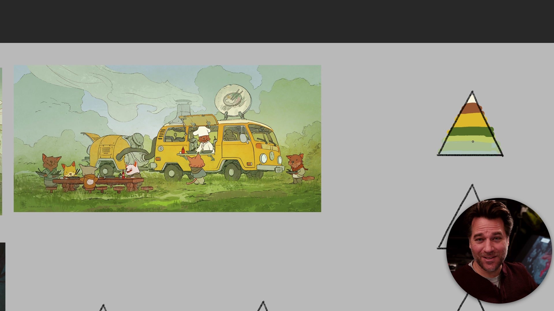
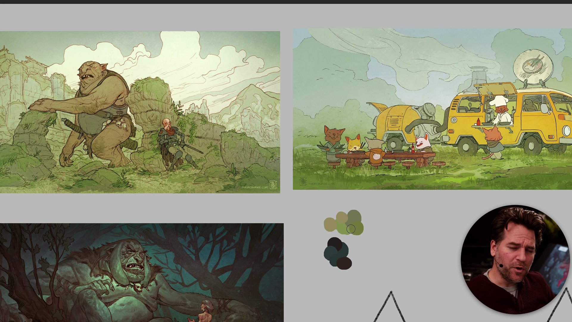
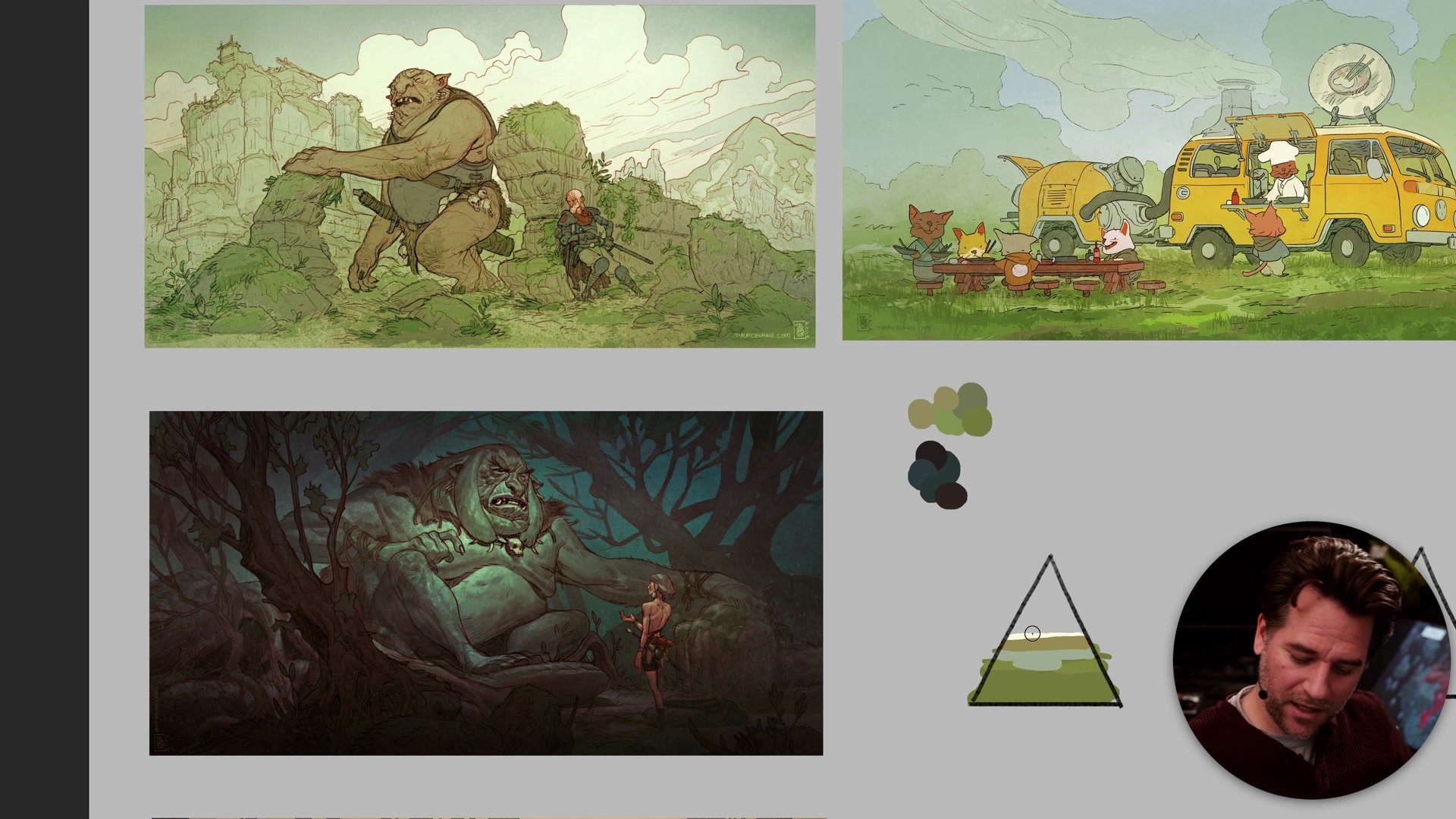
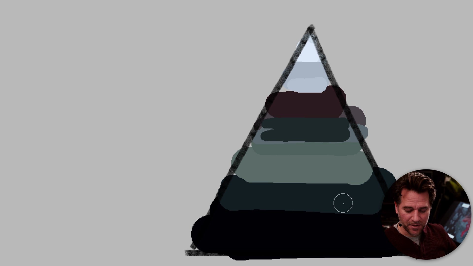
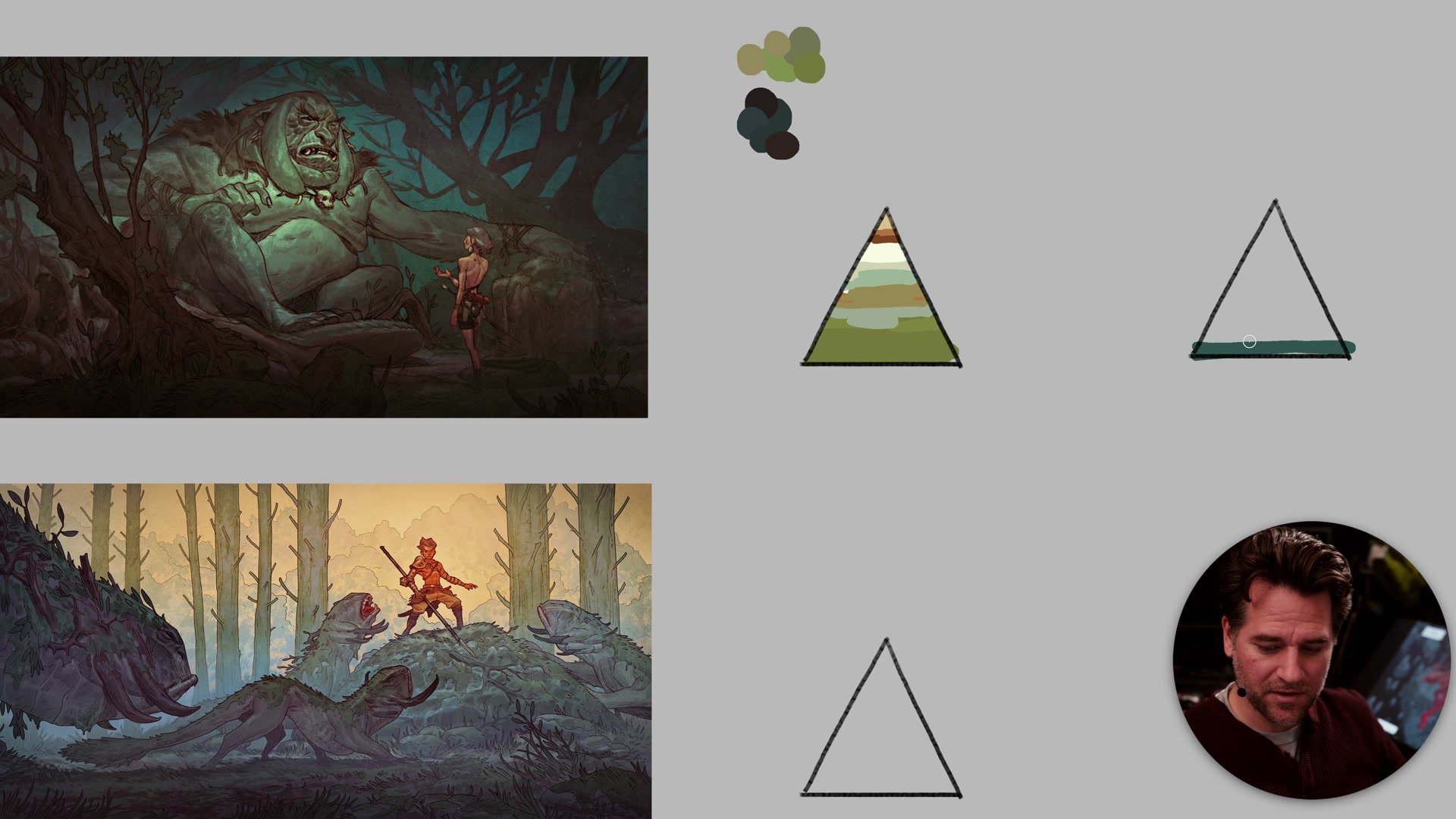
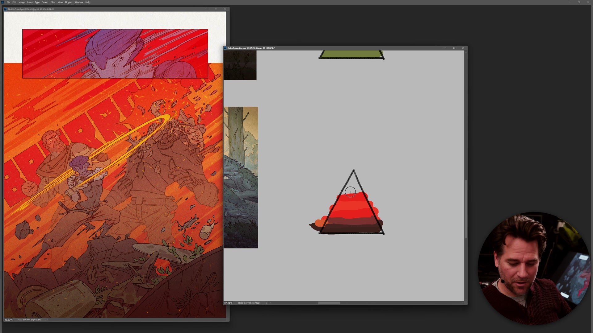
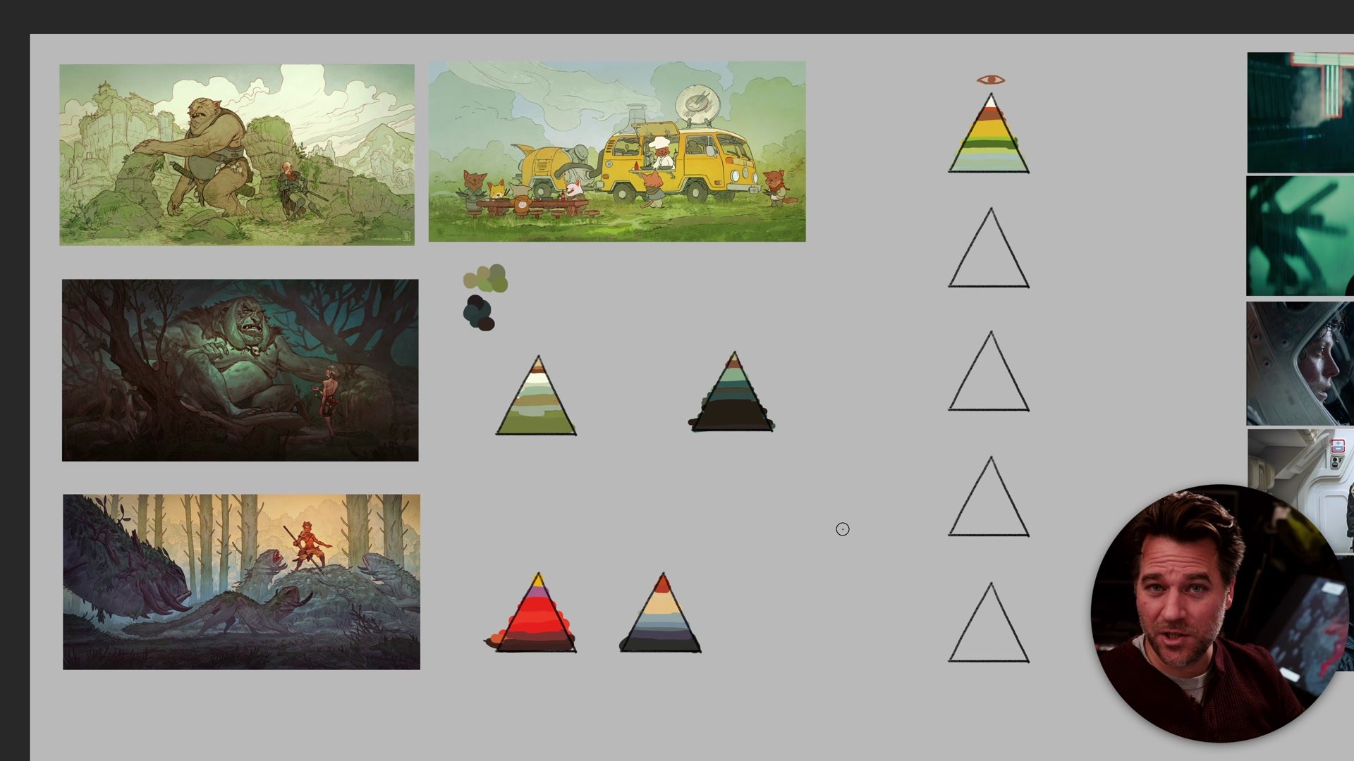
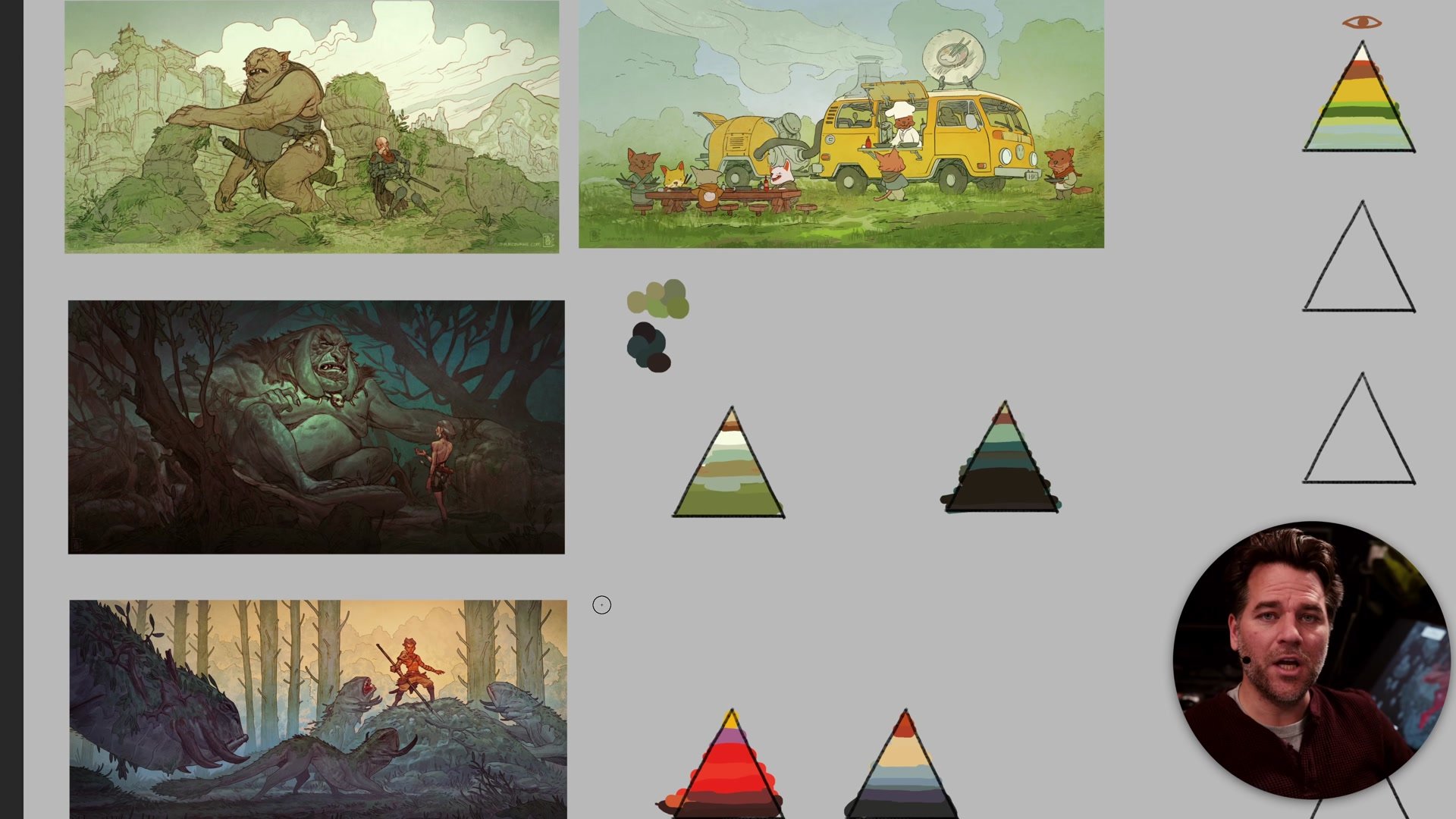
This concept can be visualized as a pyramid or layer cake of color. The broad base represents the largest proportion of the image, typically neutral and low-saturation tones. As the pyramid narrows toward the top, the colors become more vibrant and occupy less space. At the very peak sits the accent color, the thing that draws the viewer's eye first. Understanding this proportion is fundamental to building visual hierarchy and getting a clear one-two-three read in any image.
The Color Pyramid in Practice
Neutrals Are the Foundation
When most artists look at an image they admire, they notice the vibrant areas first. But if they actually used an eyedropper tool to sample the colors across the image, they would discover that the vast majority of what is there consists of these nothing grays and low-saturation tones. These muddy colors blend into each other and are largely unremarkable on their own. That is exactly the point. The mud creates the stage upon which accent colors perform.
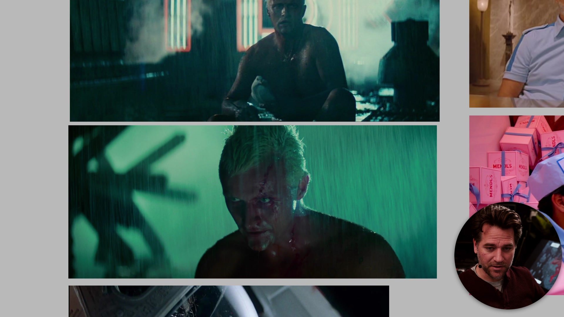
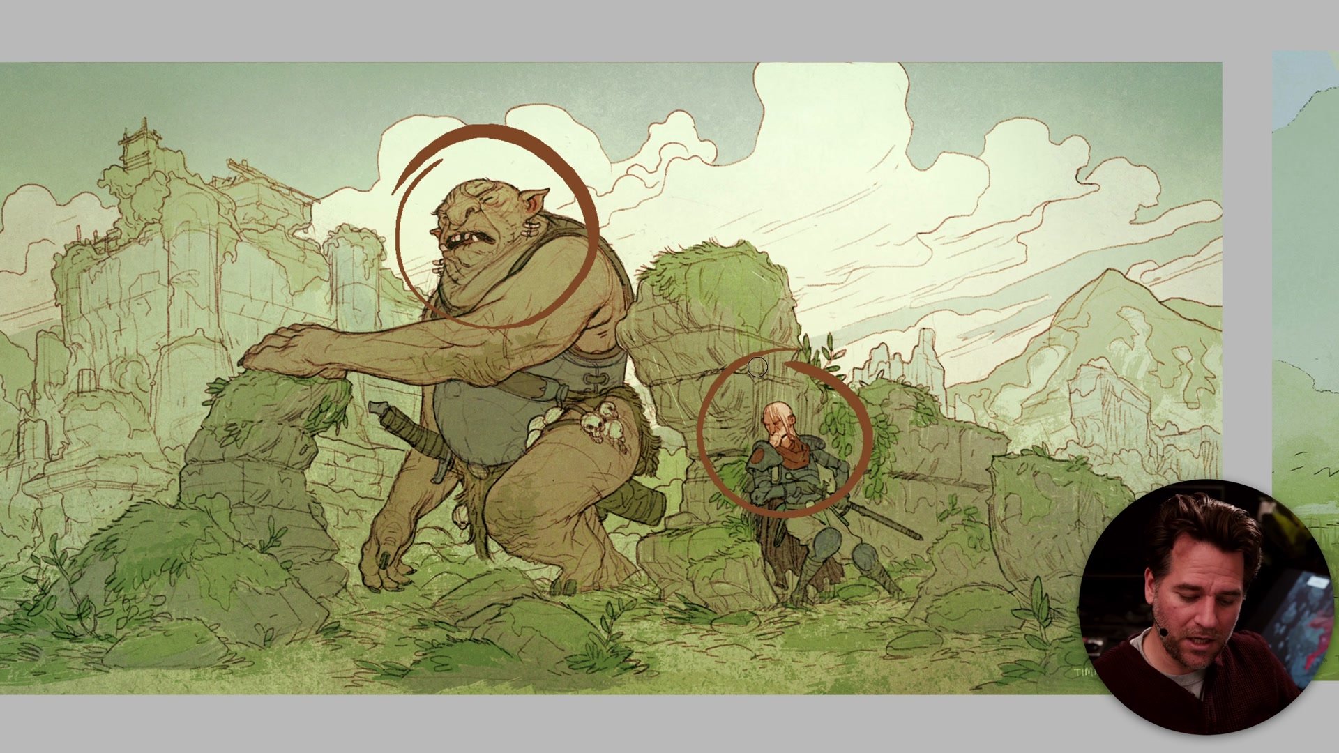
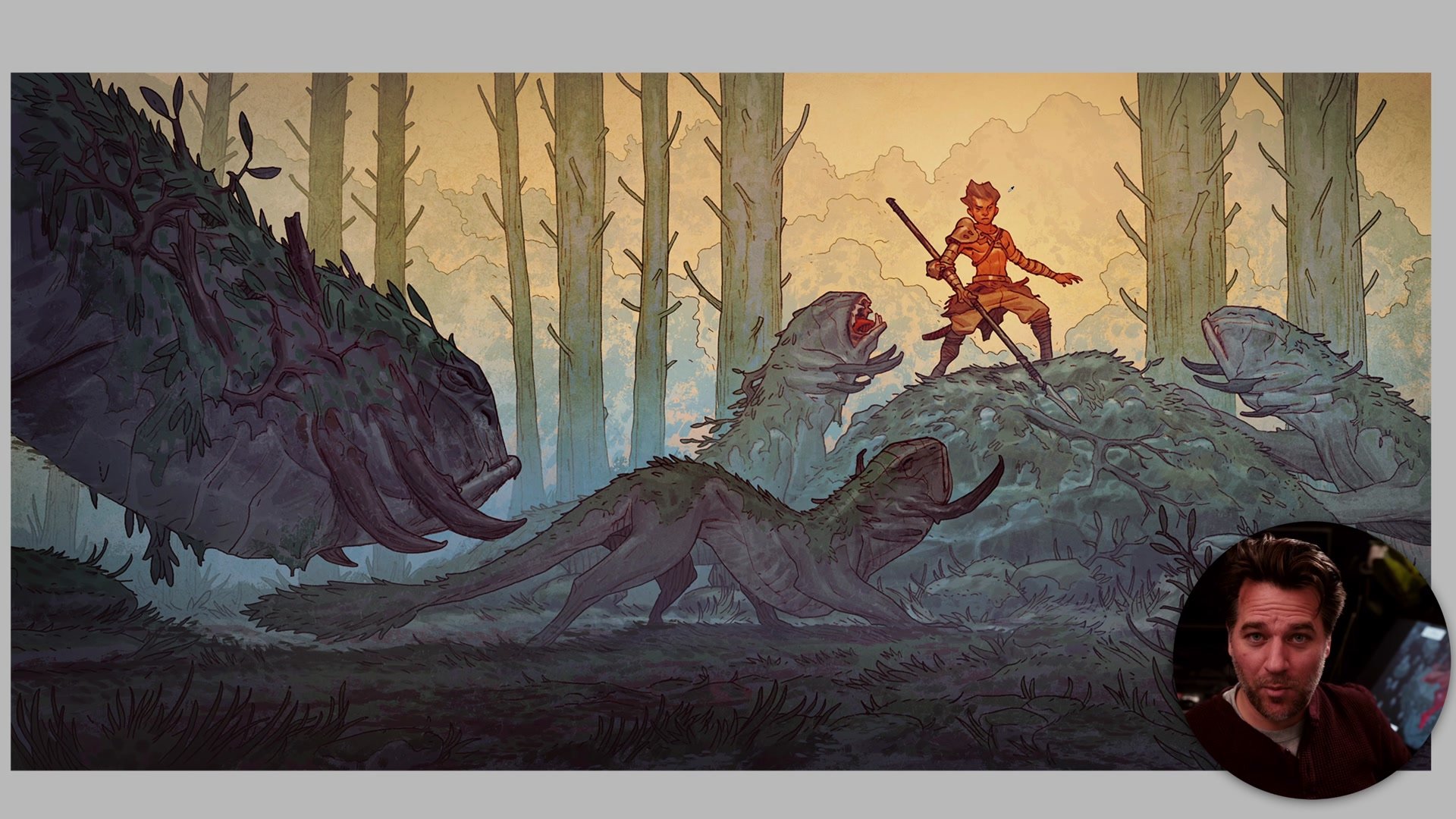
This applies across mediums. In illustration, the neutral greens and earthy tones of a landscape create the context for a small flash of red on a character's cloak. In cinema, frames from Blade Runner or Alien are dominated by darkness and desaturated tones, with only small areas of neon or warm skin tones providing the contrast that makes the image feel alive. Without that foundation of nothing, the accents have nothing to push against. Balance comes not from equal distribution but from strategic imbalance, where less saturation in most of the image creates more impact in the small areas that matter.
Balance Across Mediums
Hierarchy Drives the Eye
Color proportion is inseparable from visual hierarchy. The one-two-three read describes the order in which a viewer's eye moves through an image. The primary read is where the eye goes first, typically the area of greatest contrast. The secondary read is where the eye moves next, and the tertiary read encompasses everything else that the viewer explores. When color proportion is handled well, these reads are clear and deliberate. The accent colors at the top of the pyramid coincide with the primary read, and the neutral foundation supports everything below it.
This is not about making the focal point as vibrant as possible. The relationship between the accent and the surrounding tones is what creates contrast. A toned-down red in an otherwise entirely green image creates more pull than a saturated red surrounded by other saturated colors. Hierarchy is relative. The classic composition books by Andrew Loomis and Edgar Payne describe balance in terms of large elements against small, busy areas against rest, and the same principle applies directly to color. Understanding proportion in this way gives images deliberate structure rather than accidental chaos.
Composition and Visual Hierarchy
Planning and Adjusting
There are two practical ways to use color proportion. The first is planning it from the start through color thumbnails. When roughing out an image, thinking about the proportion of neutrals to accent colors gives the color thumbnail actual purpose beyond just slapping colors down. Studying images that resonate and breaking down their color proportions with an eyedropper tool reveals how they actually work, often showing far more mud and far less vibrancy than expected.
The second approach is adjusting proportion while working. When an image feels flat or the focal point is not reading, the instinct is usually to add more contrast, more color, more detail to the area that needs attention. But often the real solution is to take away from everywhere else. Toning down backgrounds, pushing neutral areas further back, and reducing vibrancy in secondary areas can do more for an image than cranking up the focal point. A simple starting proportion of roughly seventy percent neutrals, twenty percent secondary color, and ten percent accent provides a functional baseline to work from, though the real goal is to derive proportions from the specific images and styles that each artist actually wants to create.
Key Concepts
The Color Pyramid: Most of any successful image is made up of neutral, low-saturation tones. Vibrant colors occupy a small proportion at the top, and this imbalance is what creates visual impact. More mud means more power for the accents.
Hierarchy Is Relative: Whether a color reads as vibrant depends entirely on what surrounds it. A slightly warm red in a sea of greens creates more contrast than a saturated red among other saturated colors. The one-two-three read is built through proportion, not absolute intensity.
Make the Mud Interesting: The neutral foundation should not be boring. Playing up warm and cool contrasts within the grays, varying texture, and creating subtle color vibration within the low-saturation areas is what separates a lifeless background from one that rewards close looking.
Try This Exercise
Study What You Like: Pick three images from artists whose work resonates. Use an eyedropper tool to sample colors across each image and build a simple color pyramid showing the proportions of neutrals, mid-tones, and accent colors.
Plan With Proportion: On a next color thumbnail, decide the accent color and primary read first, then deliberately build the rest of the image from neutral tones that support it. Aim for roughly seventy percent neutrals, twenty percent secondary tones, and ten percent accent.
Subtract Instead of Add: When a work-in-progress image feels unfocused, resist the urge to add more vibrancy to the focal area. Instead, tone down the surrounding areas and push the background further back. Check the result against the color pyramid to see if the proportion has improved.


