Sketch to Final Fantasy Illustration Process
Summary
A Reliable Process From Sketch to Finish
Most artists struggle not with individual techniques but with knowing what comes next. A reliable illustration process removes that uncertainty, making art creation relaxed and enjoyable rather than stressful. This walkthrough covers the complete journey from initial thumbnail through finished illustration, using a combination of Procreate on iPad and Photoshop for final polish.
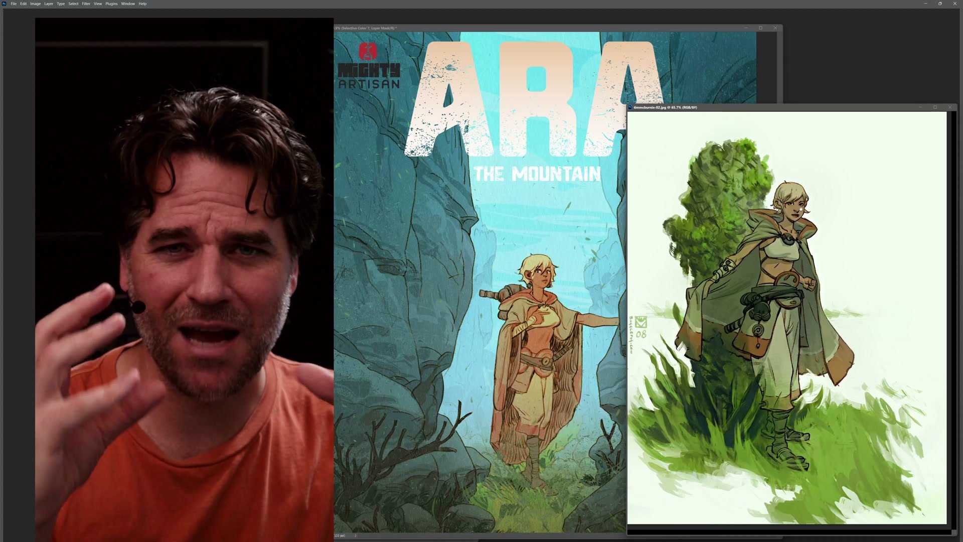
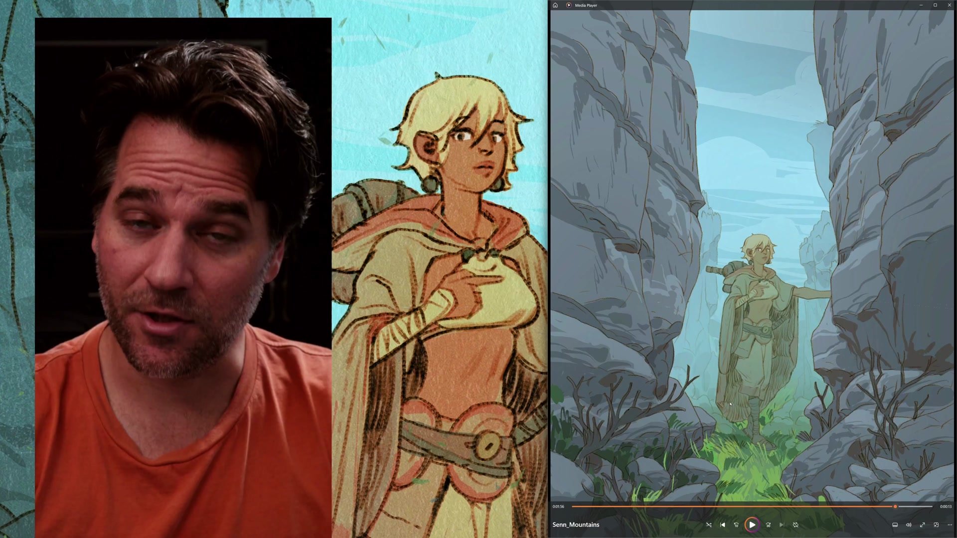
The subject here is Ara, a character from a fantasy comic project, placed in a simple centered composition designed for maximum impact with minimal complexity. The process demonstrates how combining steps, keeping tools simple, and trusting a reliable workflow produces professional-quality results even when experimenting.
The Idea and Process
Combining Steps for Speed
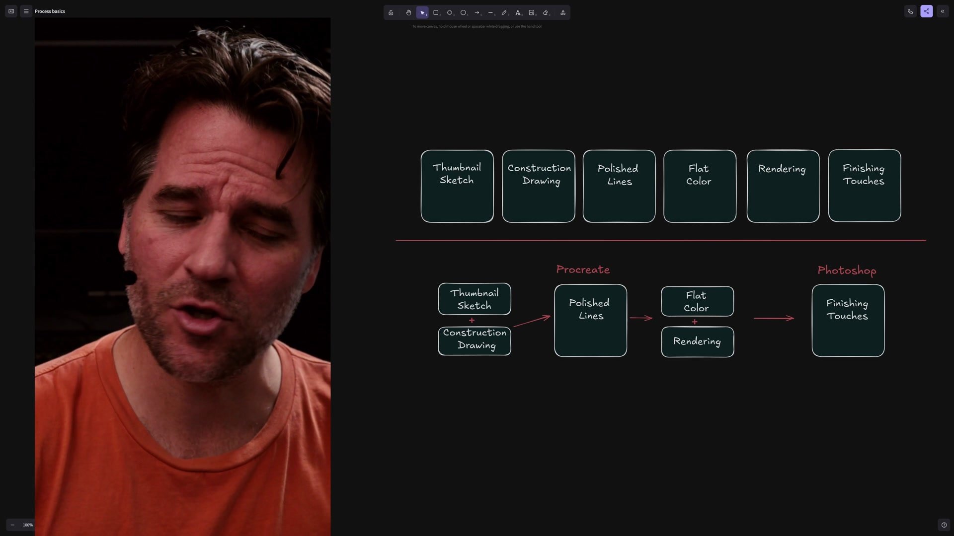
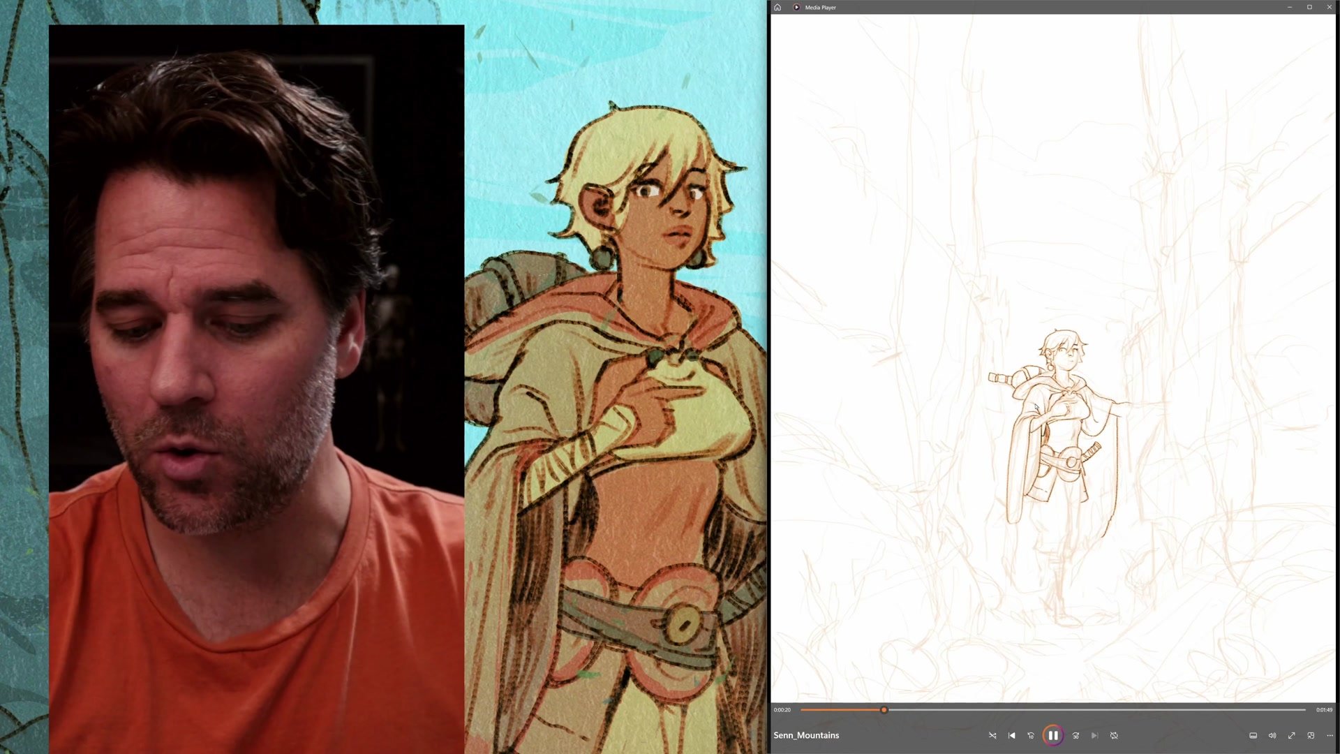
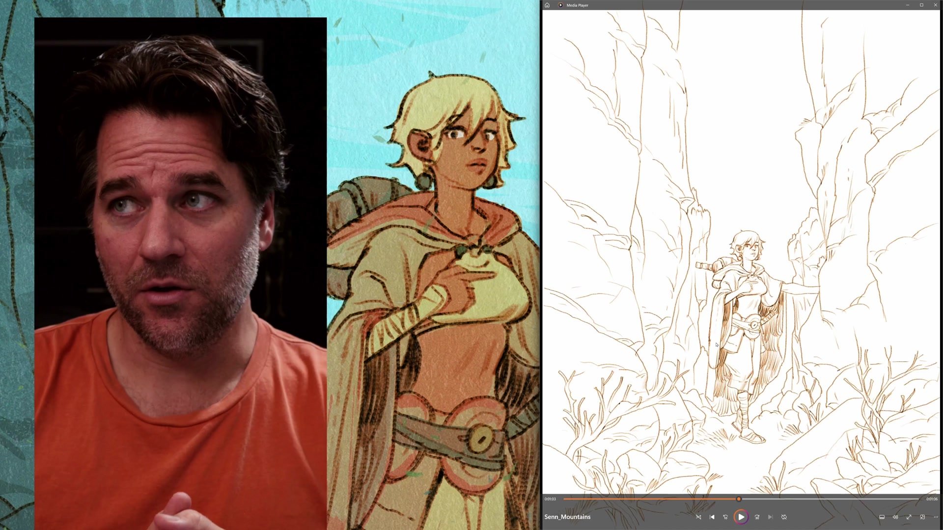
A standard line and color process includes thumbnail sketch, construction drawing, polished lines, flat color, rendering, and finishing touches. But these steps can be combined and simplified depending on the project. Here the thumbnail and construction drawing merge into a single exploratory sketch, and "polished lines" become "sorta polished lines" since the finish allows for some roughness.
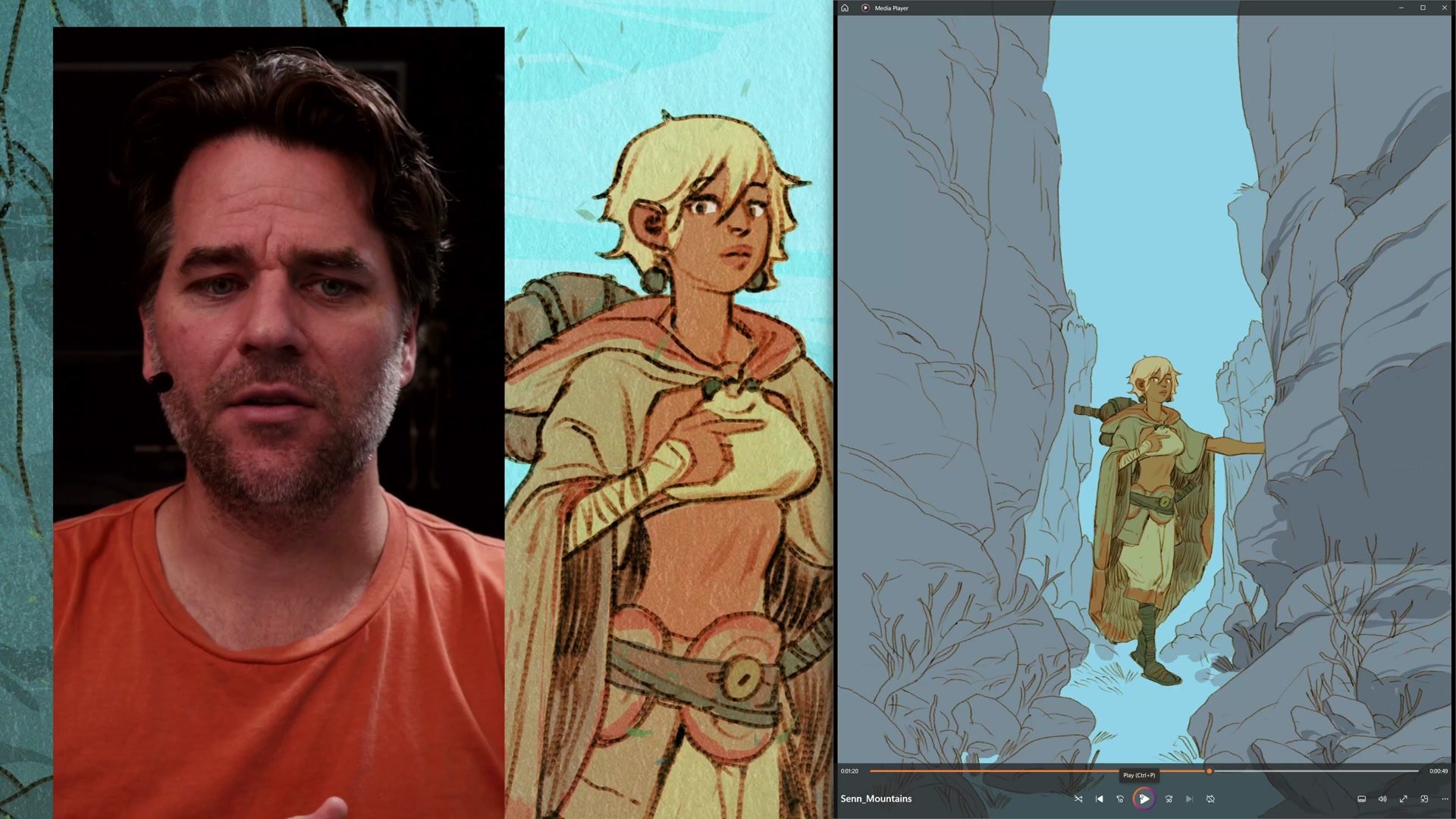
In Procreate, flat color and rendering also merge together. Rather than separating everything onto precise layers, the approach treats the iPad like watercolor painting, mixing flat shapes with minimal rendering using a single brush. This keeps the process manageable in Procreate where layer management and selection tools are more limited than Photoshop. The key insight is that process flexibility comes from understanding what each step actually accomplishes, then deciding which steps can share space.
Line Work and Construction
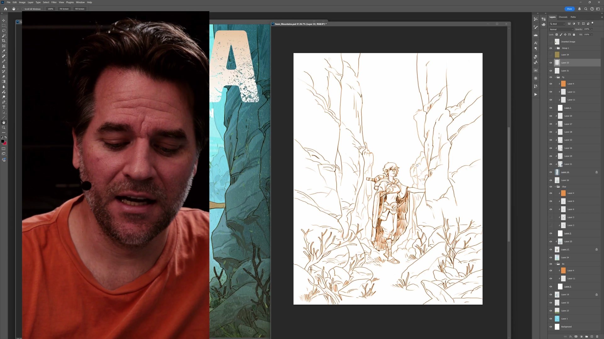
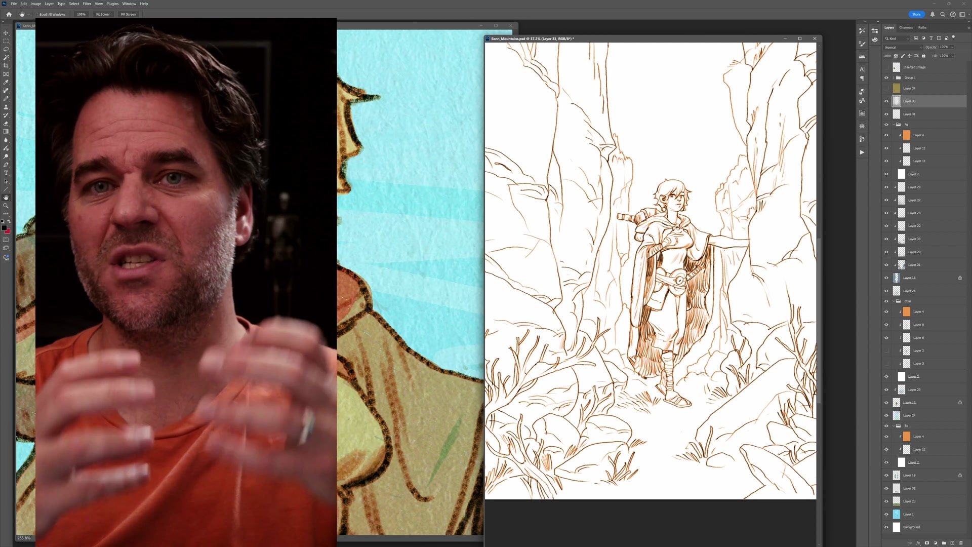
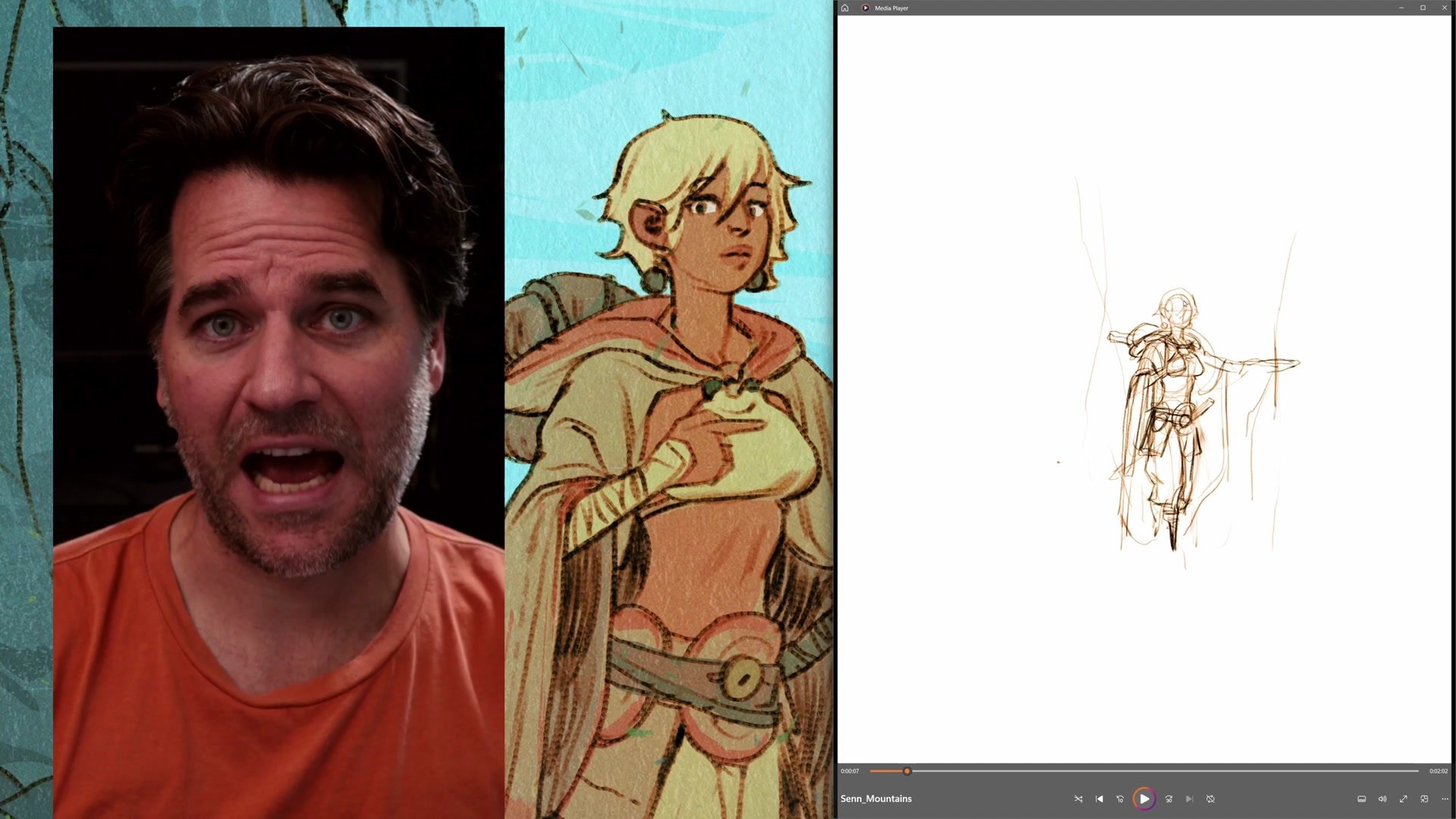
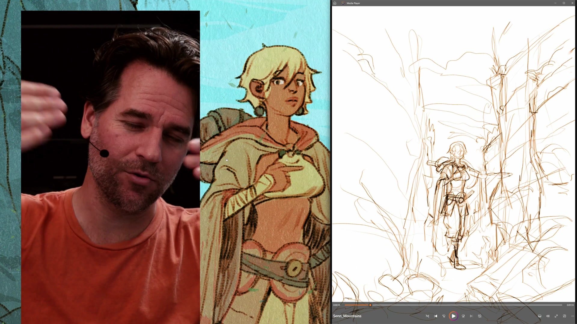
Composition and Character First
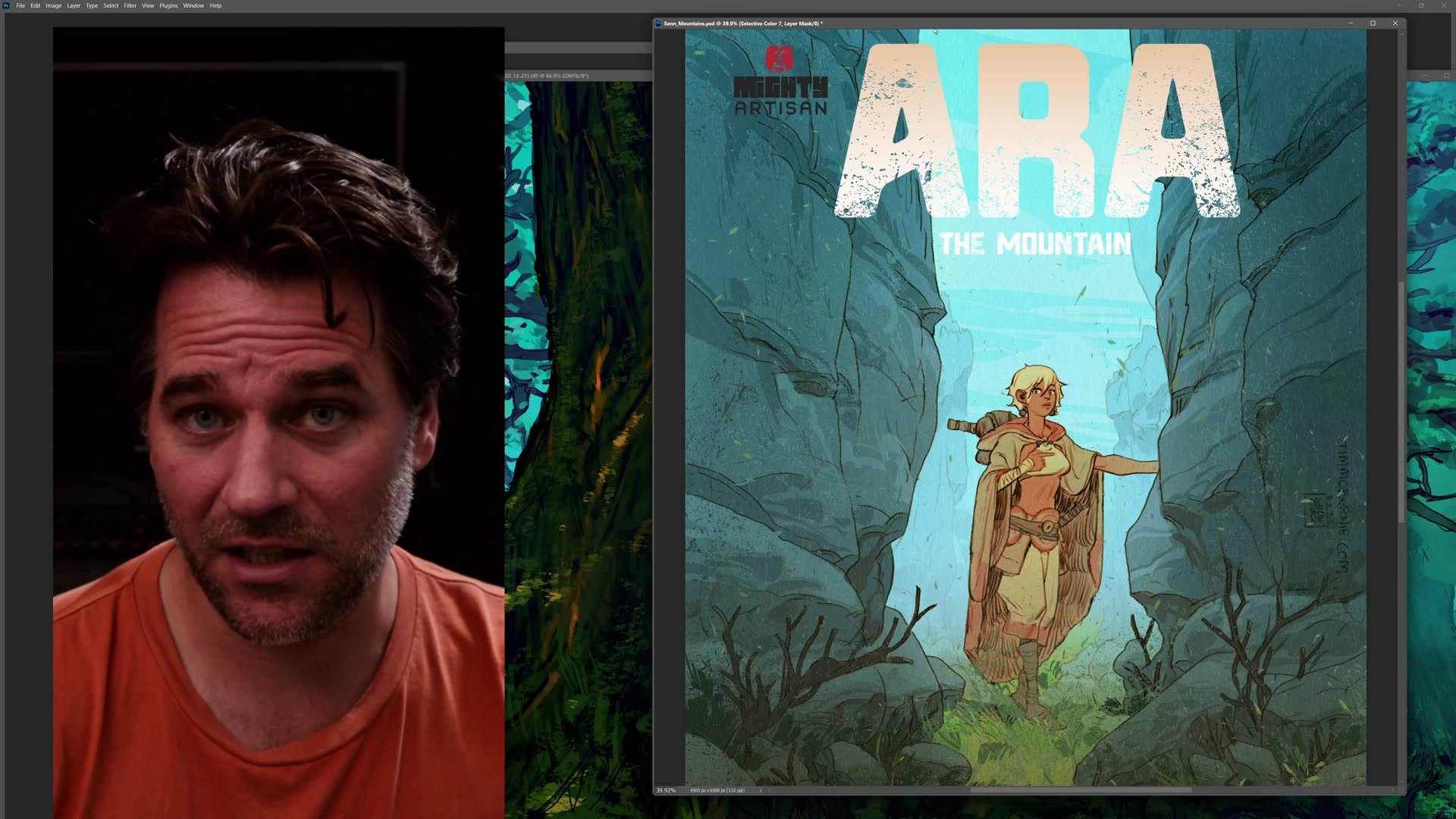
The image plan relies on a simple centered symmetrical composition with the character framed by rock pillars on either side and a shaft of light down the middle. This formal arrangement creates strength and impact without requiring complex staging. The entire composition depends on making the character engaging and full of the mystique that defines them.
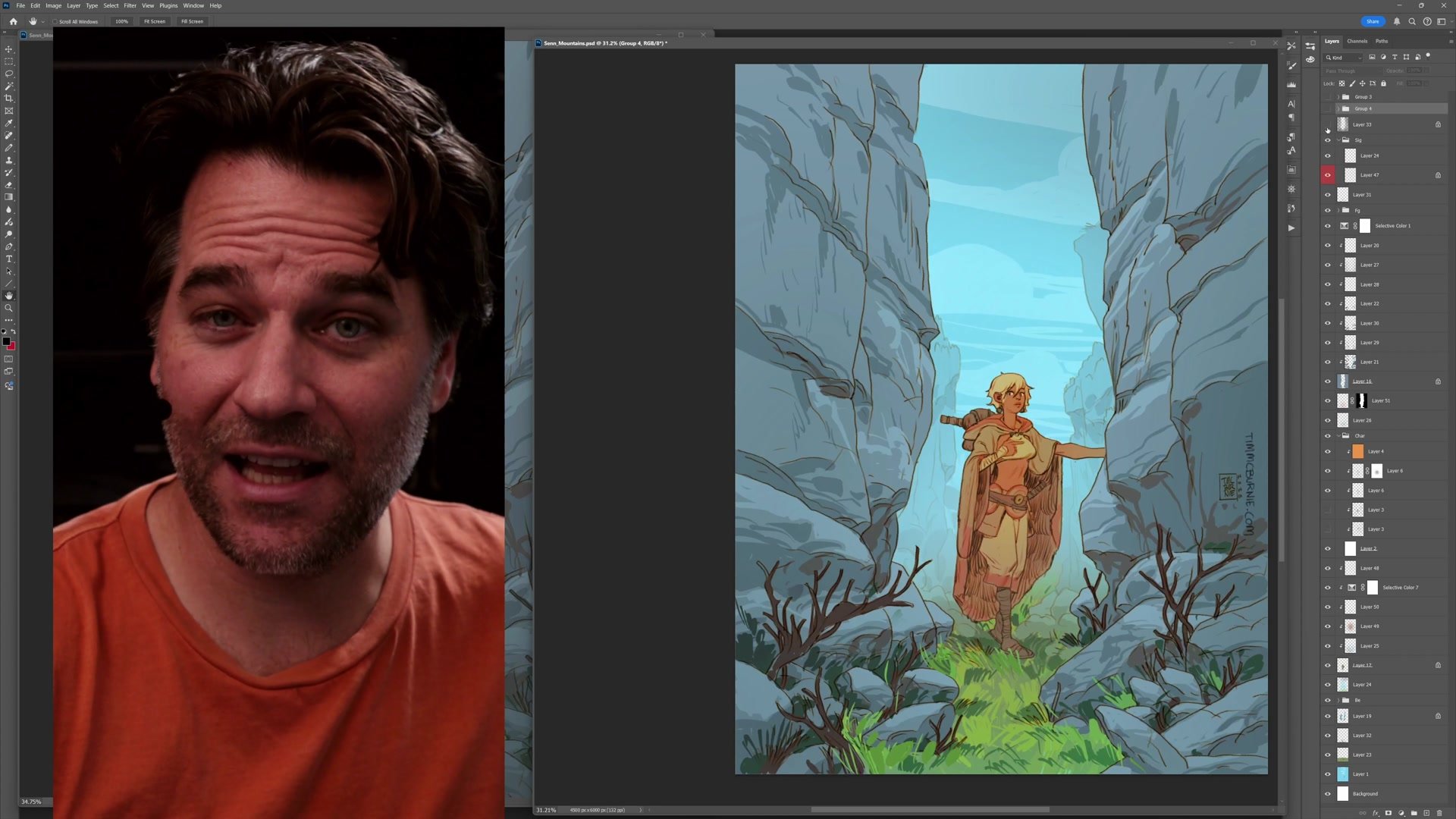
The drawing process starts with establishing the character pose and gesture. If the character works, everything else falls into place. If not, going back to refine construction is the priority before moving forward. The environment builds outward from there, using rock striations as leading lines directed toward the character and overlapping rock faces to tell the story of depth in the foreground. Every shape serves double duty as both representational form and abstract graphic design.
Color and Rendering
Simple Tools and Color Temperature
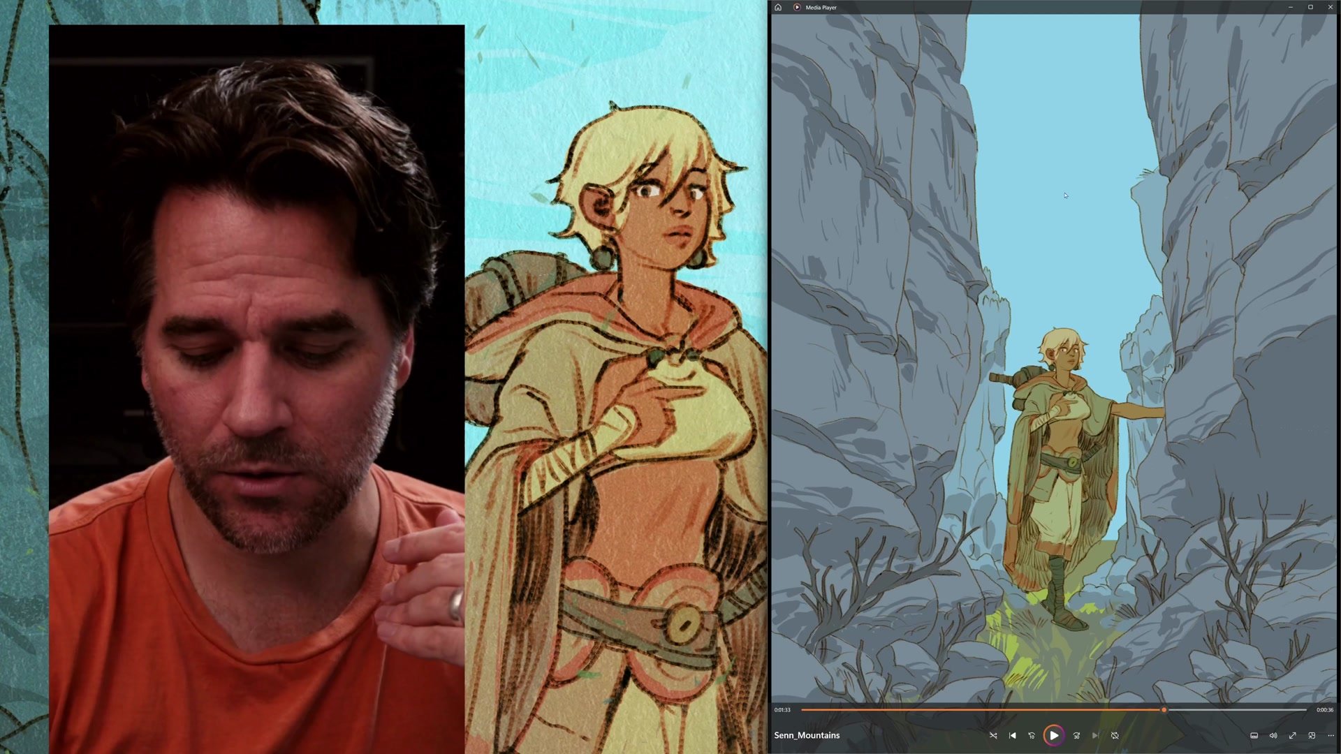
The entire Procreate phase uses essentially one brush, the syrup brush, which gives everything a coherent graphic quality. Flat color shapes with no blending, no gradients, and no edge control create an abstract graphic quality where the emphasis falls on designing interesting shapes rather than rendering realistic form. The approach echoes the thinking behind abstract composition, where marks need to look good even with the image turned upside down.
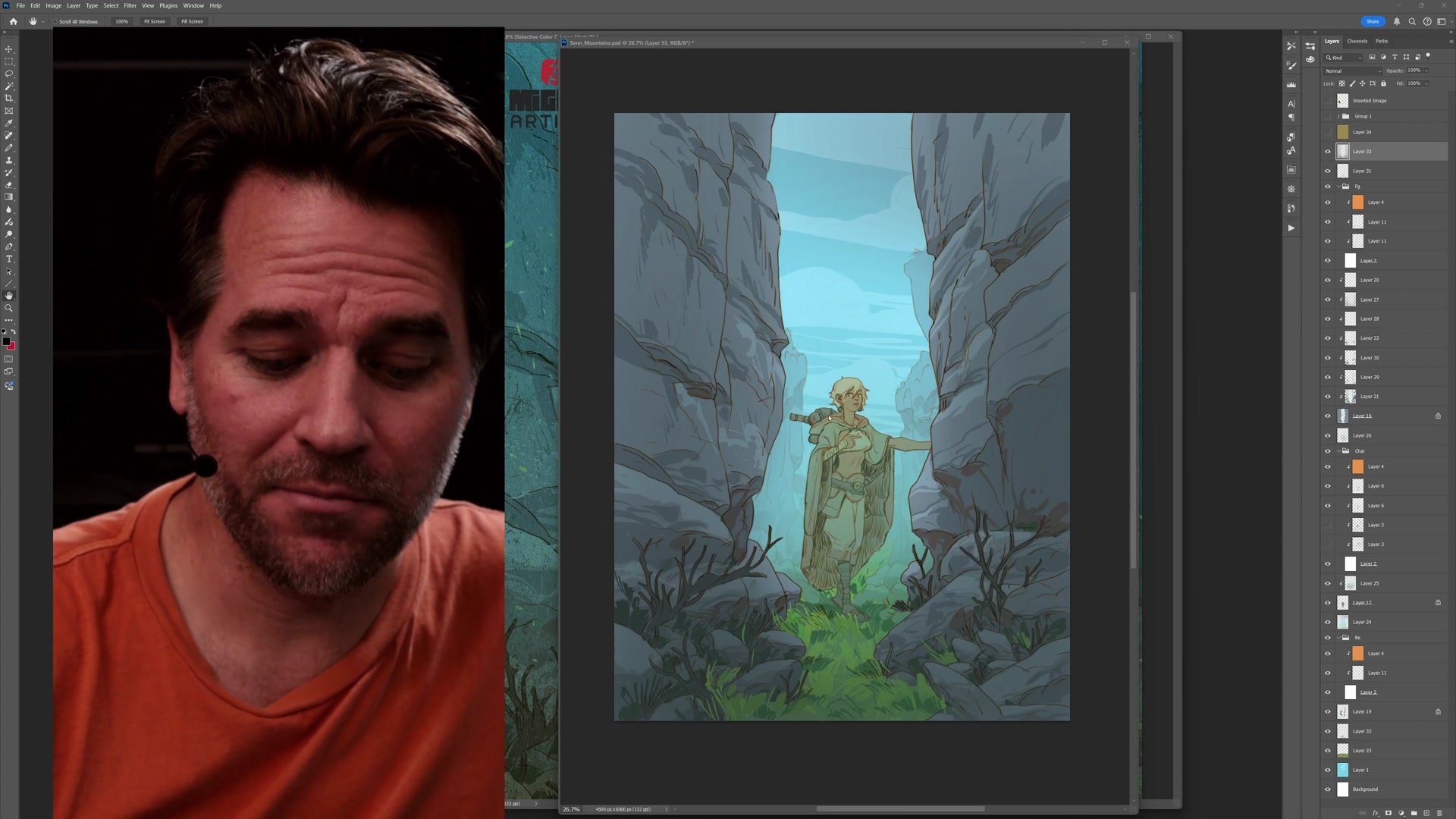
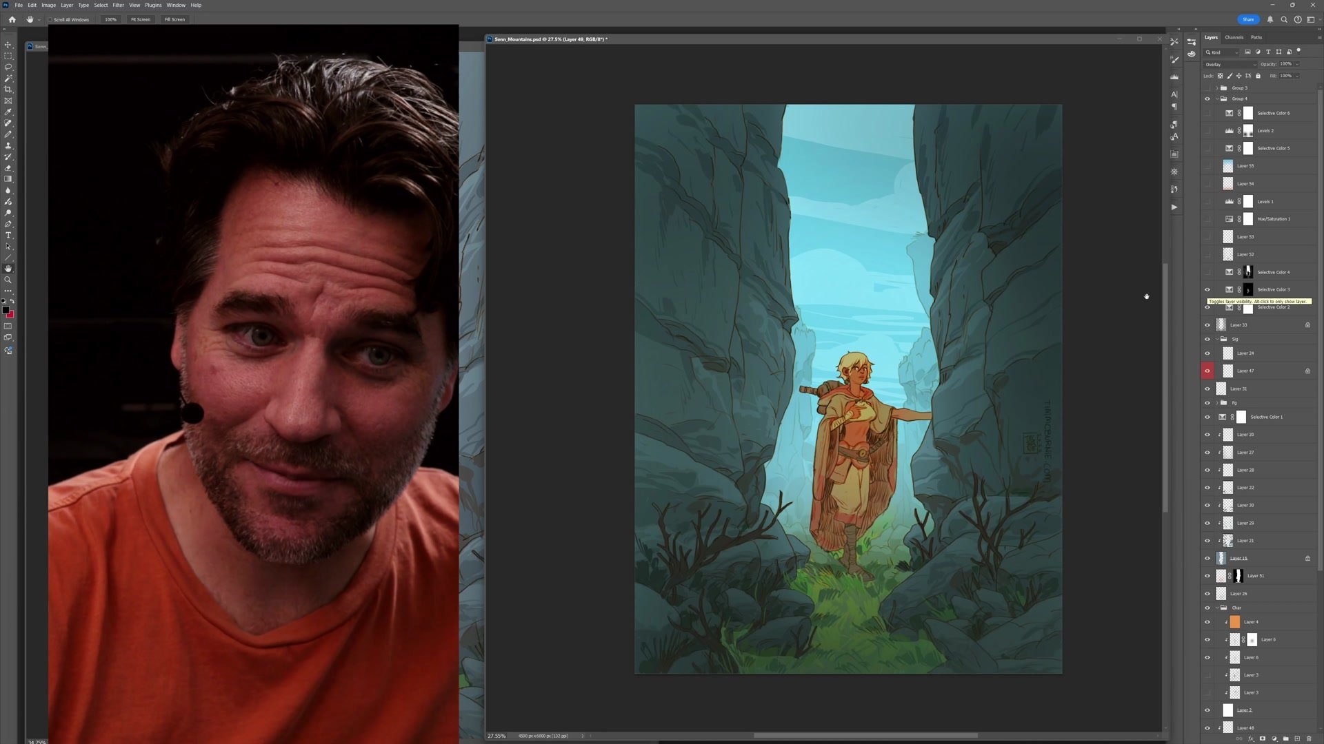
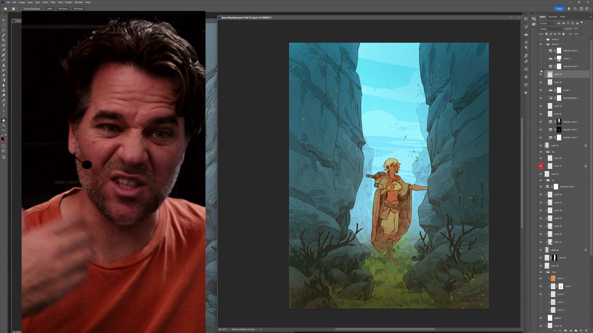
The finishing stage in Photoshop takes maybe twenty to thirty minutes. Using masks to isolate different elements, the warm character gets pushed brighter and more saturated while the cool background becomes deeply blue. A warm gradient overlay on the bottom brings the foreground forward, while a cool gradient over the top pushes the background back. Paper texture, fine grain noise, and subtle color adjustments tie everything together with cohesion that makes rough sketchy elements feel deliberate and illustrative.
Final Polish in Photoshop
Key Principles
Process Unlocks Creativity: Having a reliable step-by-step process removes anxiety about what comes next, freeing mental energy for exploration and experimentation with composition, color, and style.
Combine Steps Intelligently: Understanding what each process step accomplishes allows merging them when appropriate. Thumbnail plus construction, flat color plus rendering, all become possible once the purpose of each step is clear.
Simple Tools Create Cohesion: Using one brush for an entire phase gives work a naturally unified quality. Complexity comes from design decisions, not tool variety.
Color Temperature Creates Depth: Warm colors come forward, cool colors recede. Making the character warm orange against a deeply blue background creates automatic spatial separation without elaborate rendering.
Try This Process
Start Simple: Choose a character and plan a centered symmetrical composition. Place the character in the middle with simple framing elements on either side. Focus on making the character engaging before building outward.
Limit Your Tools: Pick one brush and use it for the entire painting phase. Work with flat graphic shapes rather than blending, and think about abstract design as much as representational form.
Finish in Two Stages: Get the image as far as possible in your primary tool, then switch to Photoshop for contrast, saturation, and color temperature adjustments using masks and gradients to push warm forward and cool backward.


