The Power of Simple Centered Compositions
Summary
The Overlooked Power of Simplicity
Composition theory can feel infinite. There are countless ways to arrange elements within a frame, from dynamic diagonals and depth-based staging to complex overlapping forms. But what if the most powerful compositional approach is also the simplest? Formal, centered compositions, where the subject sits squarely in the middle of the image with a roughly symmetrical arrangement, are one of the most effective and most overlooked tools available to illustrators.
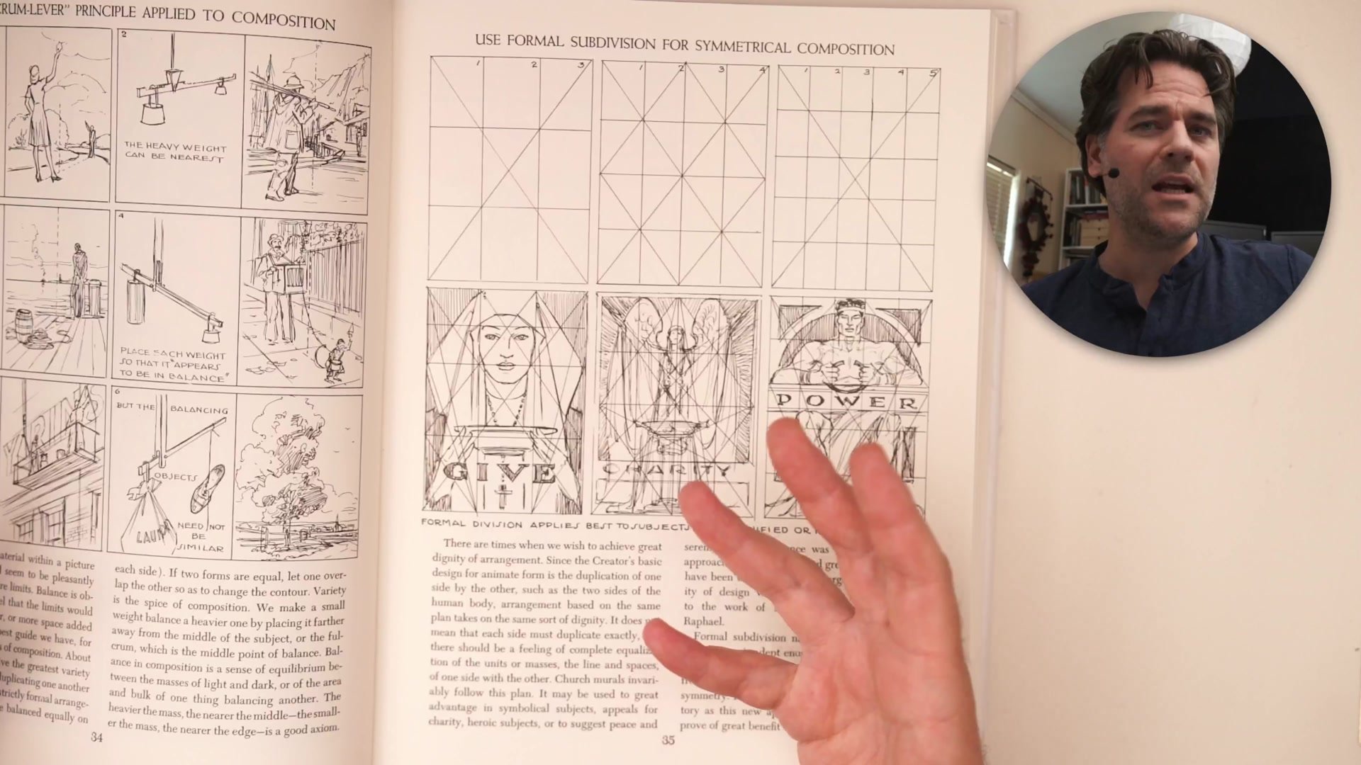
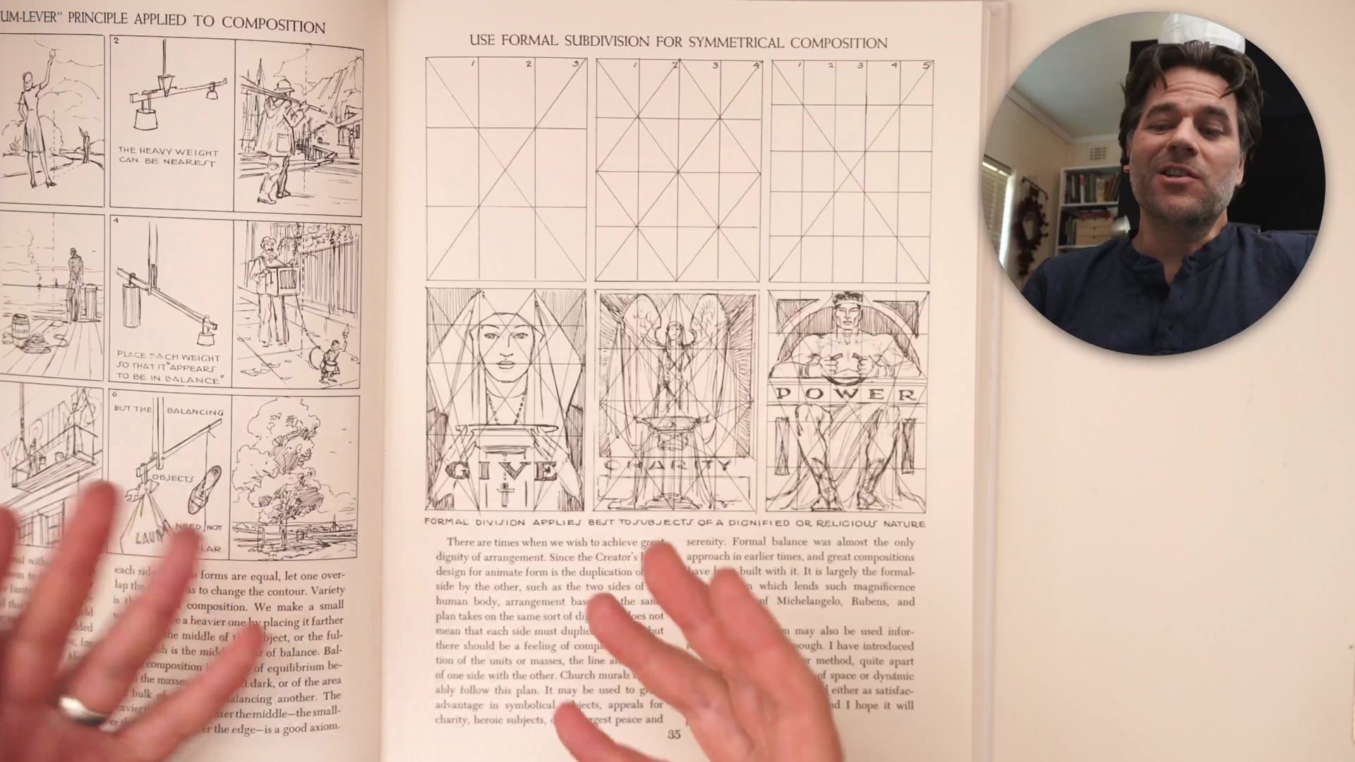
This approach, sometimes called formal subdivision, has been used in some of the most iconic commercial illustrations ever created. Andrew Loomis dedicates an entire section to it in Creative Illustration, yet it routinely gets swept under the rug in art education because it seems too basic. The reality is that simplicity carries enormous power. A centered, graphic composition commands attention immediately and allows the viewer's eye to settle on exactly what matters most. For artists working in figurative and character illustration, this is an especially valuable starting point.
Formal Composition in Practice
Why Simple Works for Growth
One of the most compelling reasons to embrace centered compositions is what they let you practice. When the compositional challenge is minimal, all the mental energy that would otherwise go toward balancing depth, directing the eye through complex arrangements, and managing spatial relationships becomes available for other craft elements. The one-two-three read, handling lost and found edges, refining the subtleties of a drawing, mastering edge quality and detail hierarchy: these are the skills that actually separate competent artists from great ones.
Composition is foundational to what makes good art, but it is also the kind of thing that artists play with more once they can already draw. If you cannot paint a tree, it does not matter where the tree goes. If you cannot draw anatomy, it does not matter how dynamic the pose is. Simple centered compositions let you focus on refining the craft skills that will eventually make complex compositions possible. They are not a shortcut; they are a training ground.
Masters of Centered Composition


Proven by the Masters
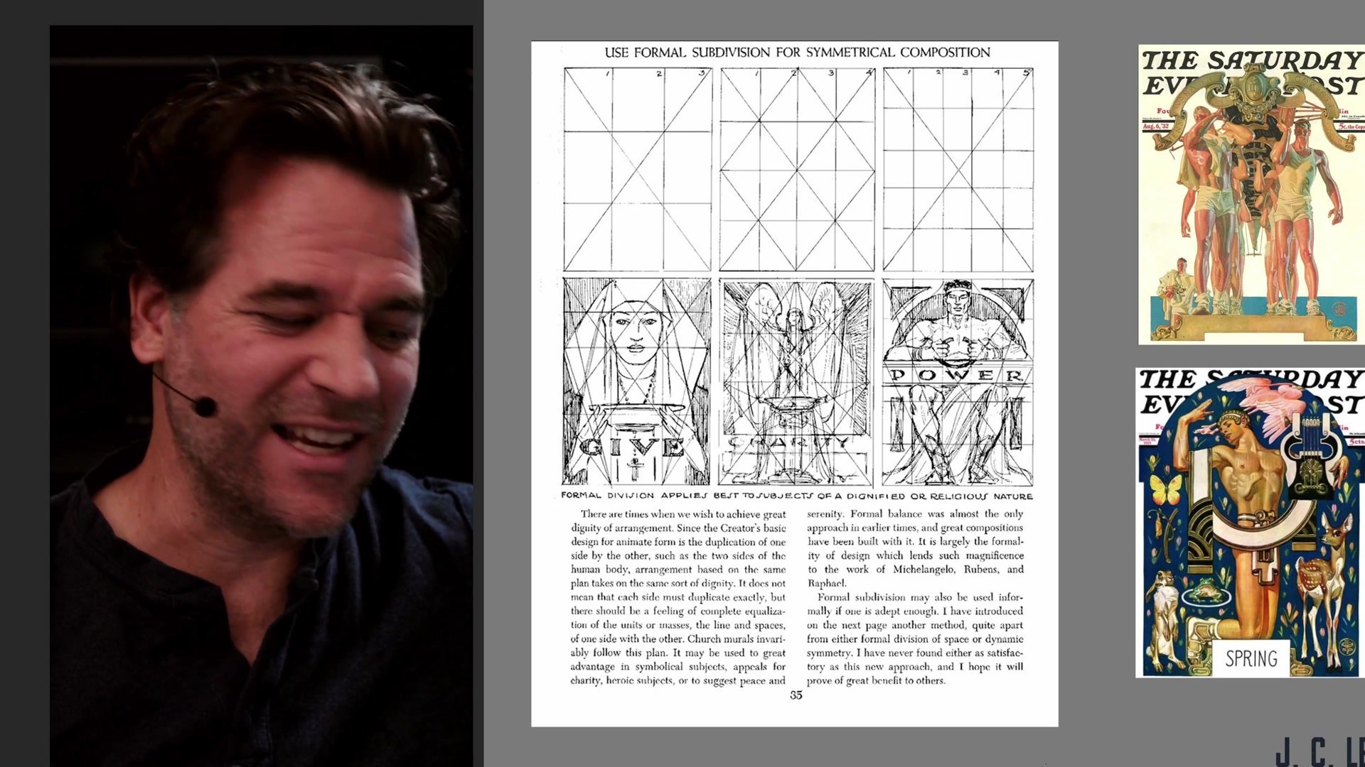
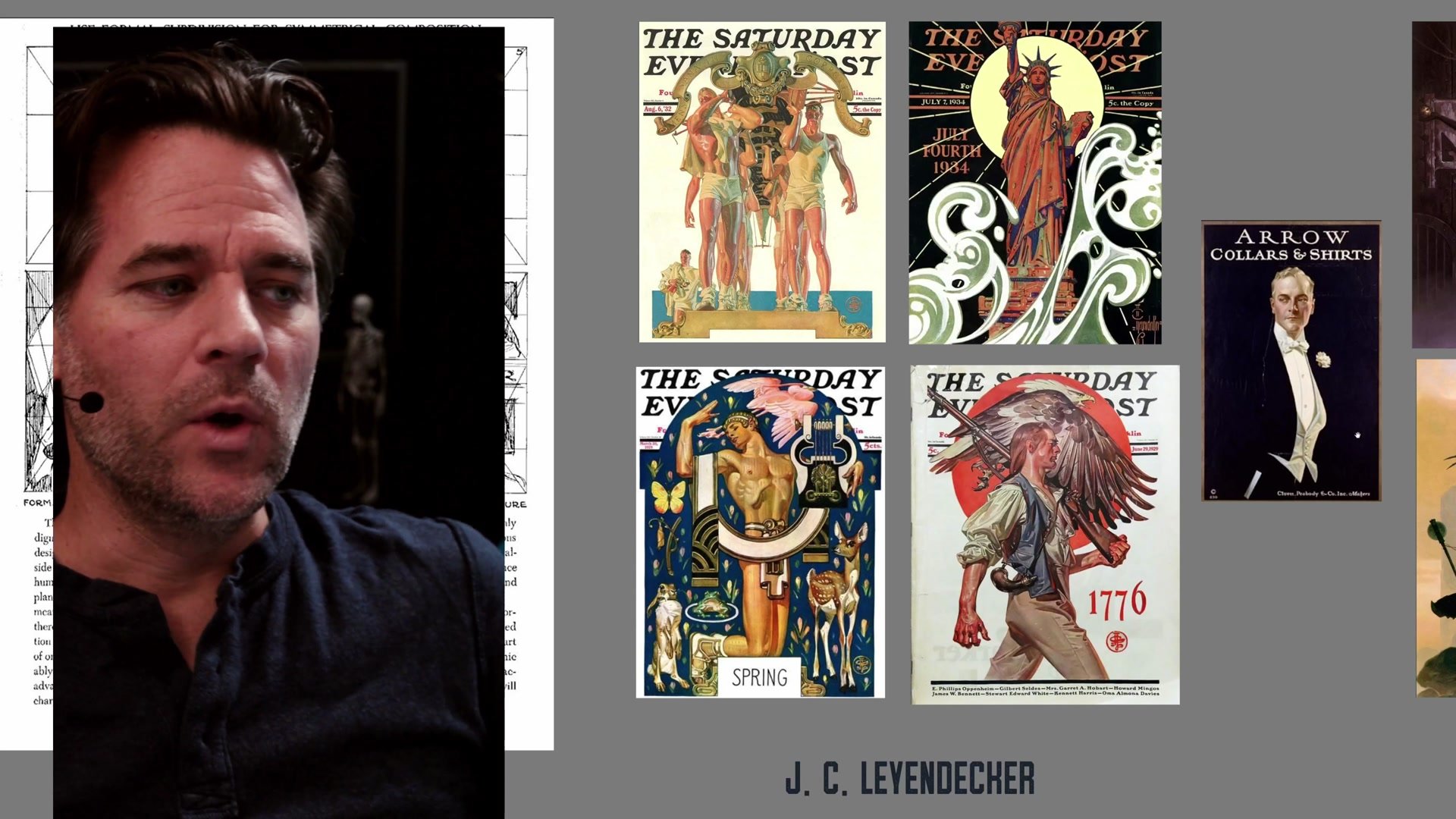
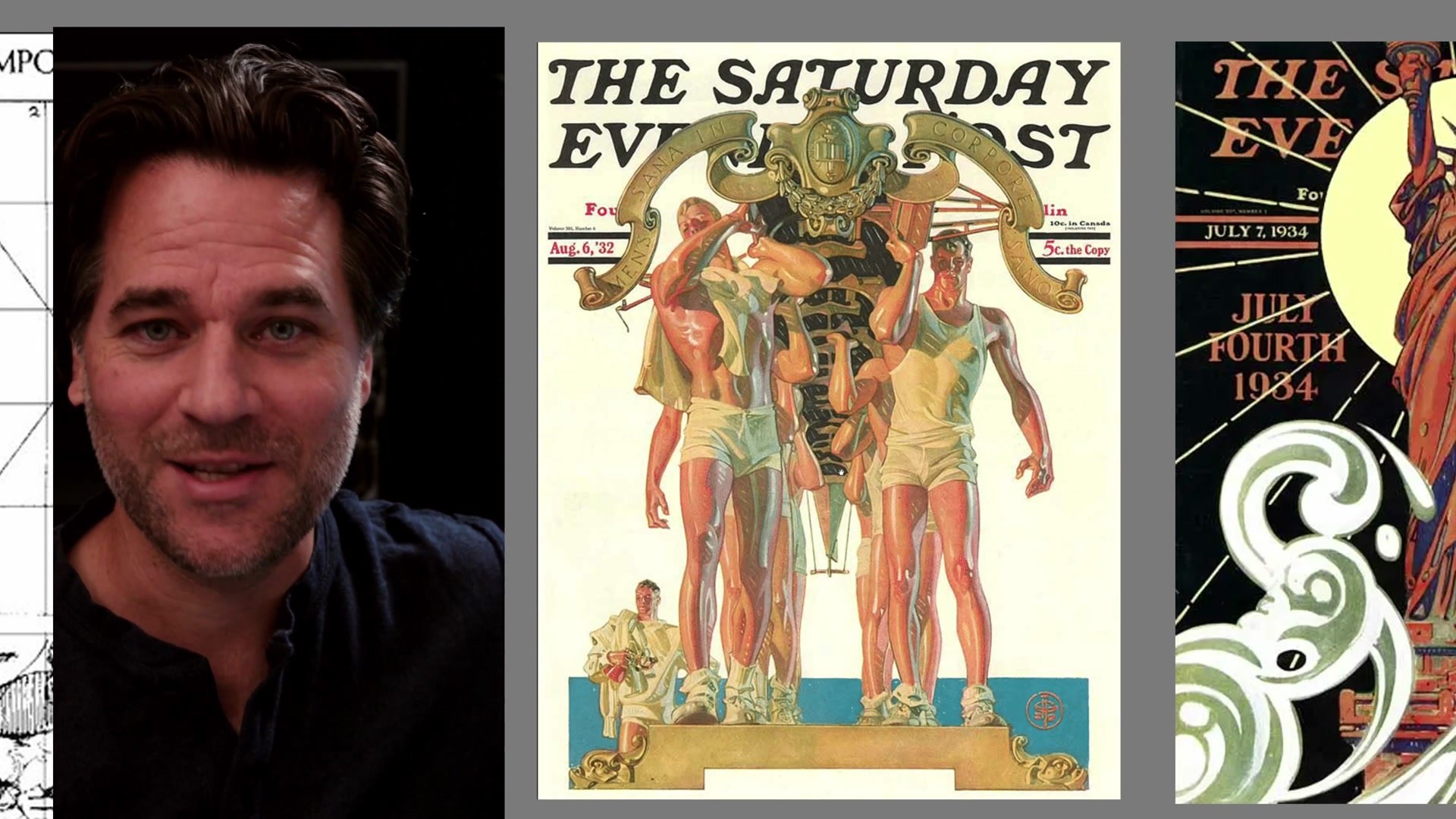
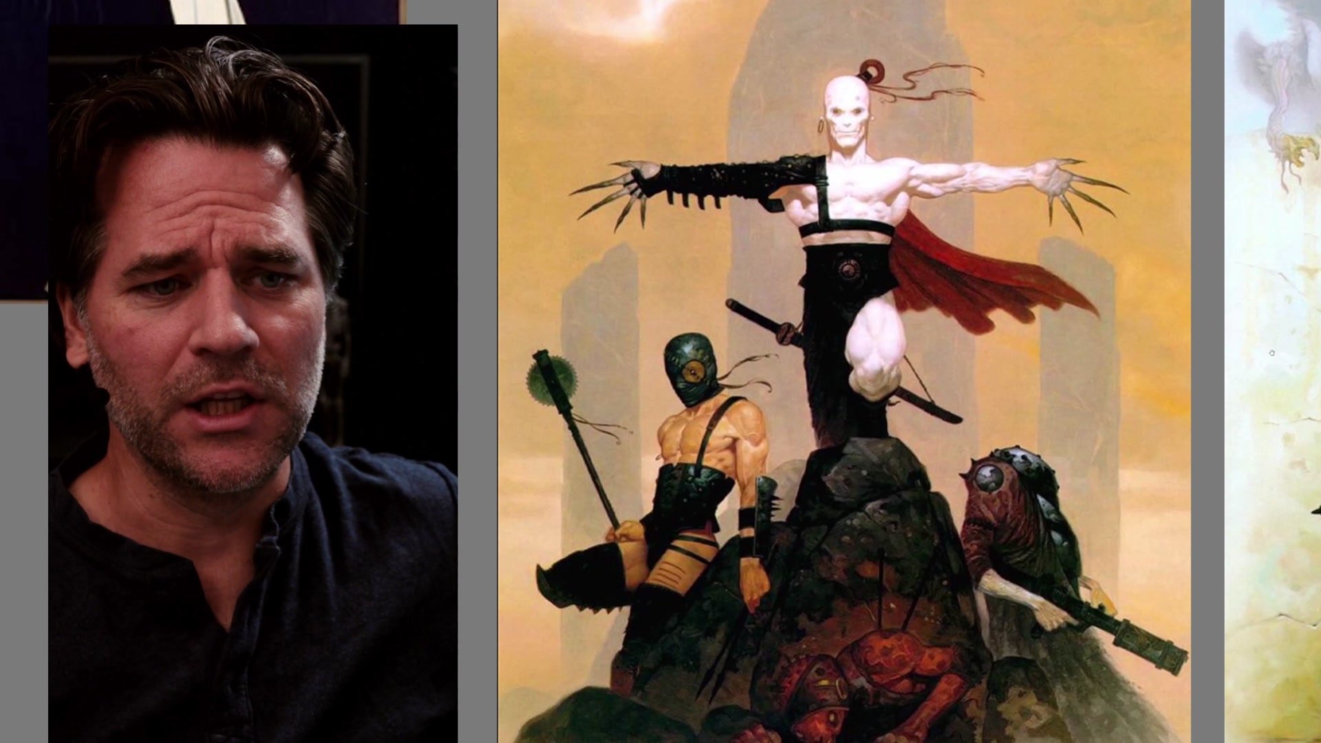
The proof is in the work. J.C. Leyendecker, one of the greatest illustrators to have ever lived, built many of his most iconic Saturday Evening Post covers on simple, centralized compositions. His figures sit centered in the frame, often roughly symmetrical, and the result is not boring or basic but graphic, powerful, and unmistakably confident. Gerald Brom did the same thing with fantasy illustration, creating some of the most memorable fantasy paintings of the last several decades using compositions that are fundamentally formal and centered.
This approach has been used in professional illustration at the highest level, from commercial cover work to personal projects. Even complex professional work often returns to this foundation. The Pinocchio graphic novel cover that resonated strongly with audiences was built on a deliberate choice to make the composition symmetrical, formal, and centered, placing the character squarely in the middle and letting the graphic quality carry the image. It seems like the simplest thing in the world, but it works.
Key Concepts
Formal Composition Is Powerful: Placing the subject dead center with a roughly symmetrical arrangement creates iconic, graphic images that command immediate attention. This is not lazy composition; it is a deliberate and proven strategy.
Simplicity Frees You to Practice: When compositional complexity is removed, all that mental energy goes into refining drawing skills, edge quality, the one-two-three read, and detail hierarchy. These are the skills that matter most.
Masters Used This Constantly: Leyendecker, Brom, and countless professional illustrators built careers around centered compositions. The approach works at every level, from student work to published covers.


