Simple Yet Powerful Covers
Summary
The Power of Simple Composition
Composition is one of the biggest challenges artists face. With countless theories about what makes an image work, there is a real temptation to believe that more complex, more dynamic, more technically demanding compositions are inherently better. That if a composition is hard to pull off, it must be more valuable. But difficulty and value are not the same thing. There are plenty of challenging compositional feats that do not actually make the image stronger.
What often gets overlooked is the power of centralized, somewhat symmetrical compositions. These direct, formalized images might seem basic on the surface, but they can carry enormous impact. More importantly, they free you to concentrate on the illustrative elements that actually separate good work from great work: your one-two-three read, edge control, value relationships, overlapping shapes, and shape design. When the composition is simple and direct, all the mental energy that would have gone into wrestling with complex perspective can go into refining these other fundamentals instead.
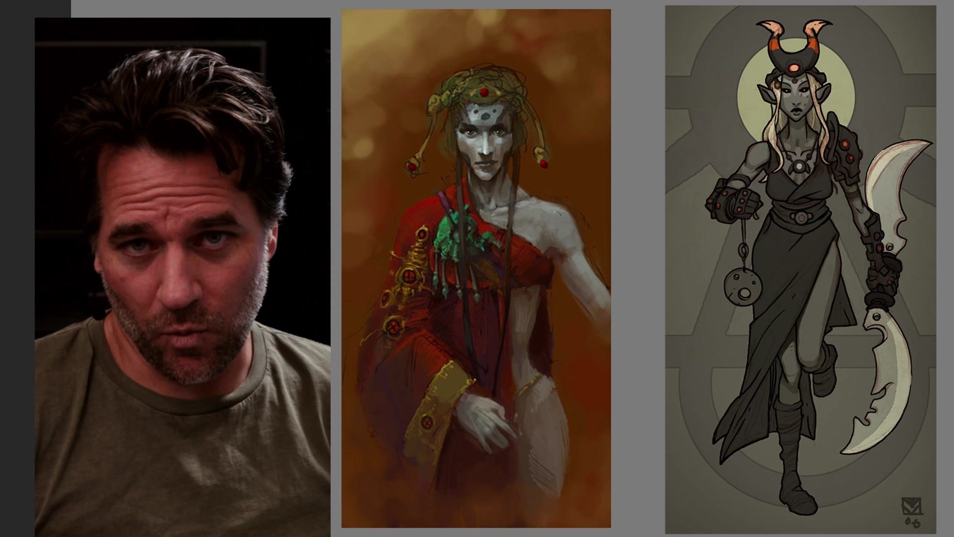
Early Portfolio and Cover Work
The Ego of Complexity
There is a common trap where artists equate complexity with quality. The logic goes: if a challenging foreshortened figure in a deep perspective environment is harder to draw, then it must be a better image. This leads to a kind of ego battle where the goal becomes showing off technical draftsmanship rather than making the strongest possible illustration. The drive to demonstrate anatomy skills, foreshortening ability, and perspective mastery can actually distract from what makes an image communicate.
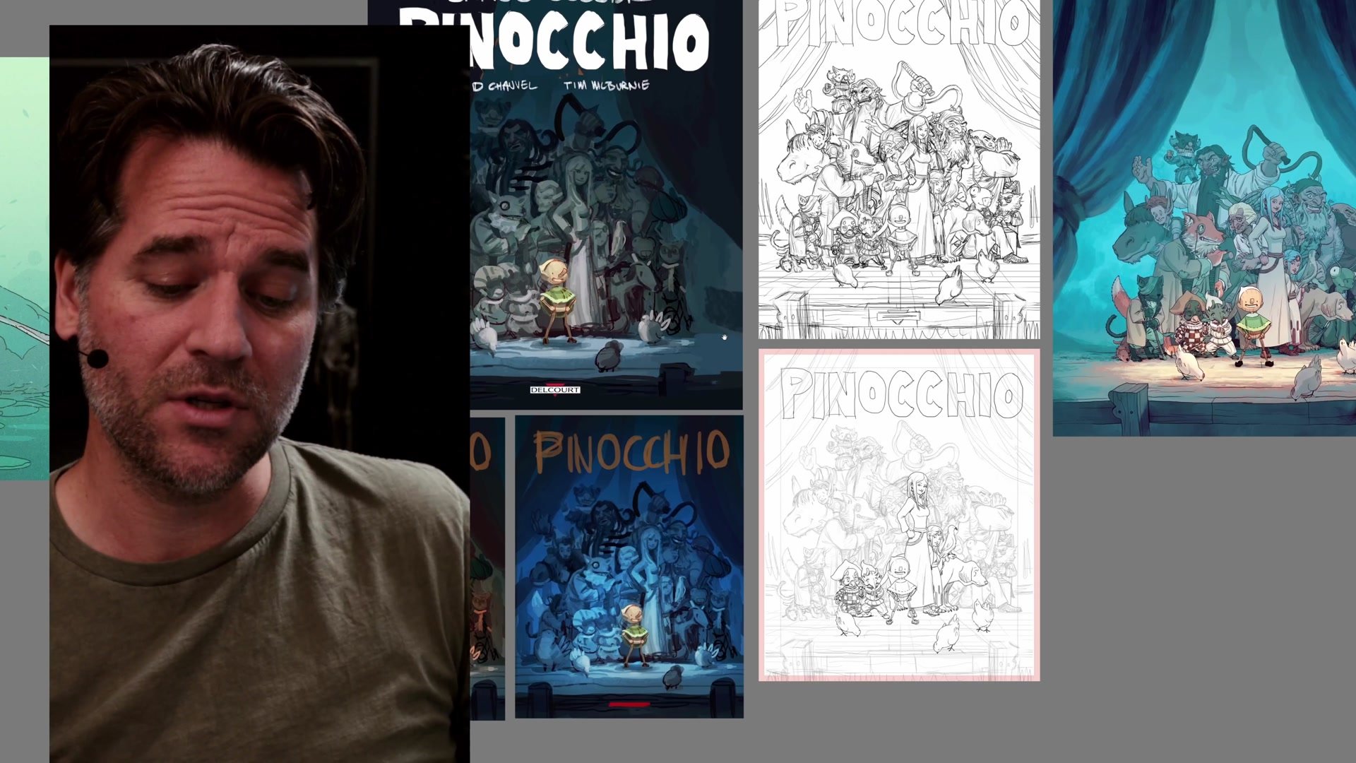
The reality is that some of the most impactful illustrations throughout art history use remarkably simple centralized compositions. Artists like Brom, who created powerful fantasy illustrations, regularly employed this kind of formalized, direct approach. It is not a shortcut or a compromise. It is a legitimate compositional strategy that allows artists to invest their energy into the aspects of illustration that create genuine impact. Simplicity of composition does not mean simplicity of illustrative quality.
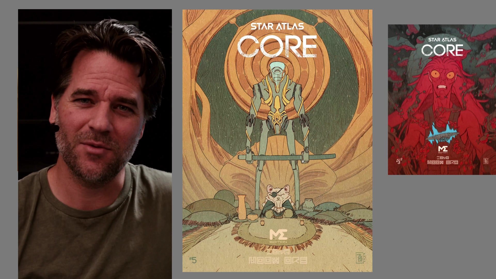
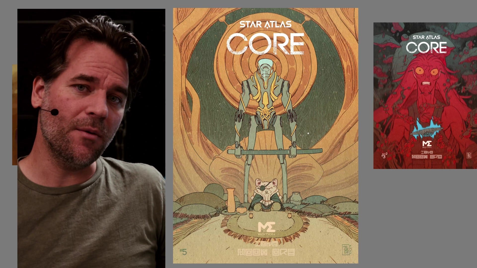
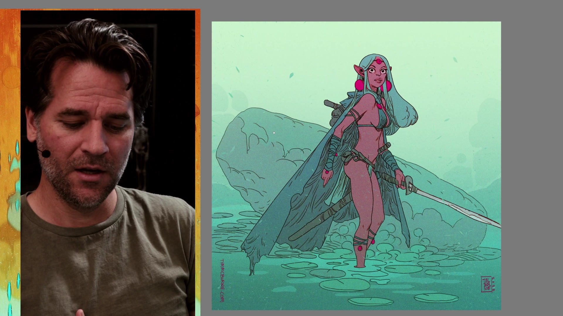
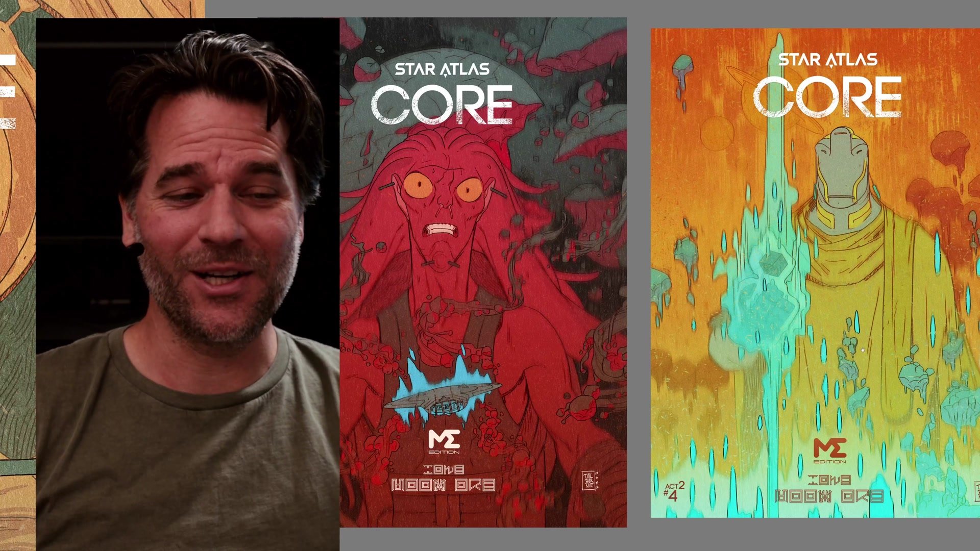
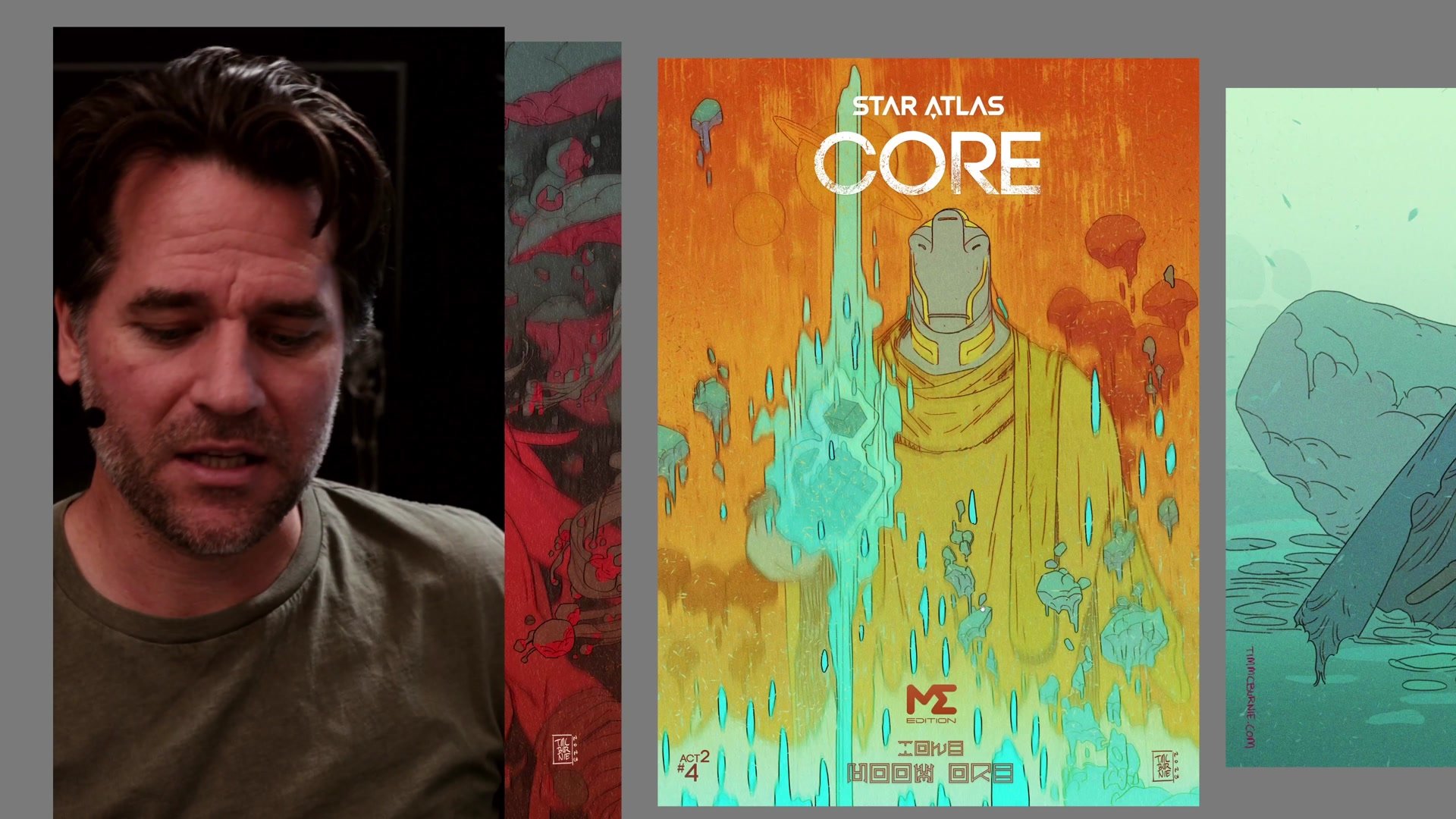
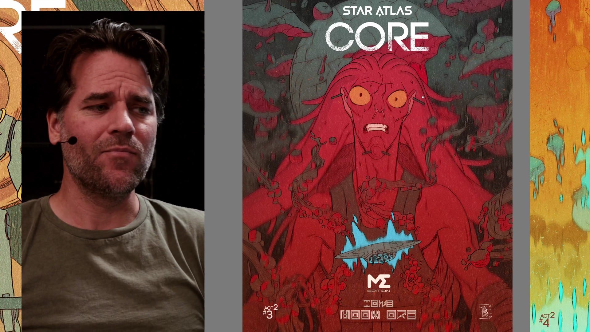
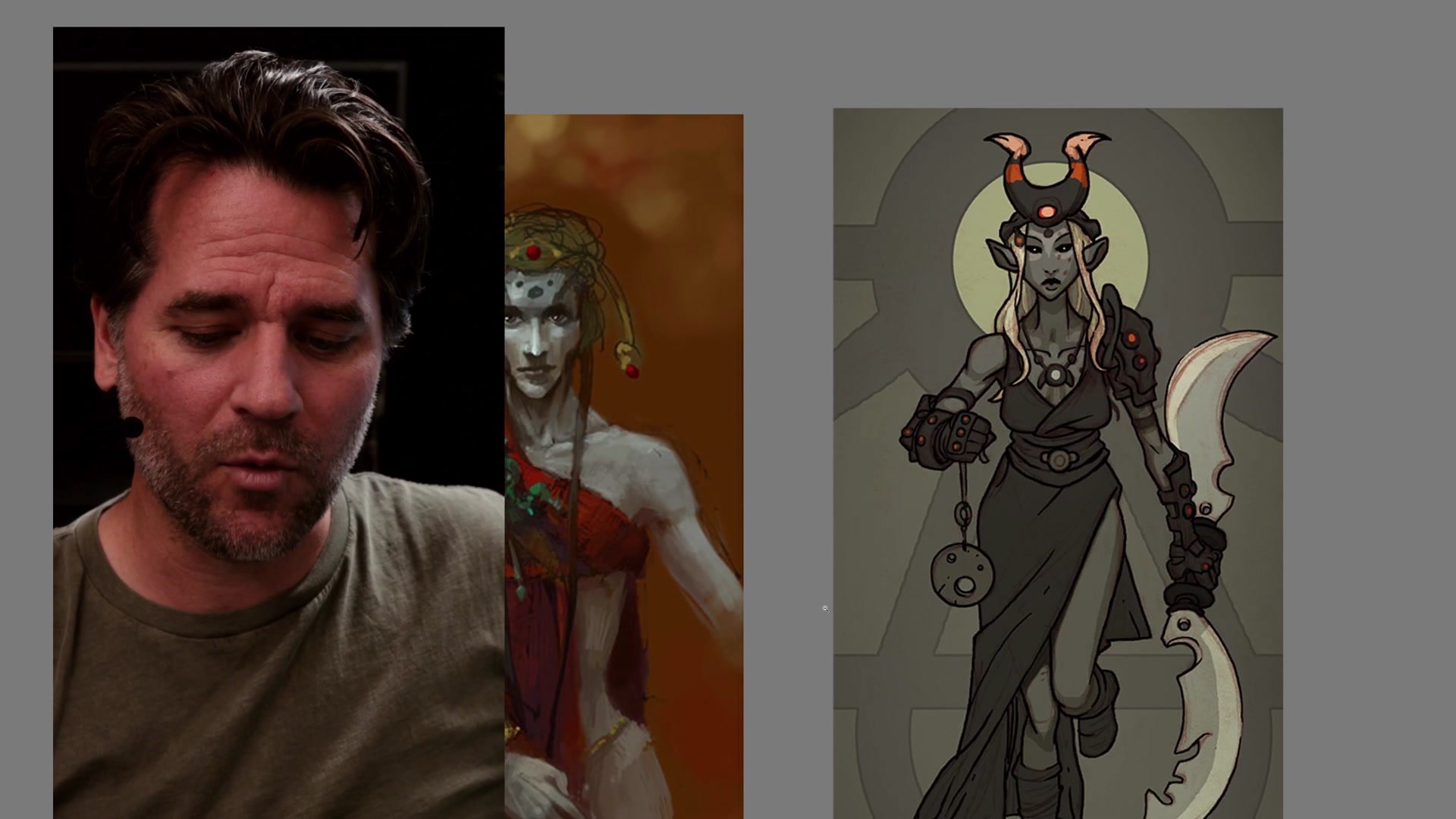
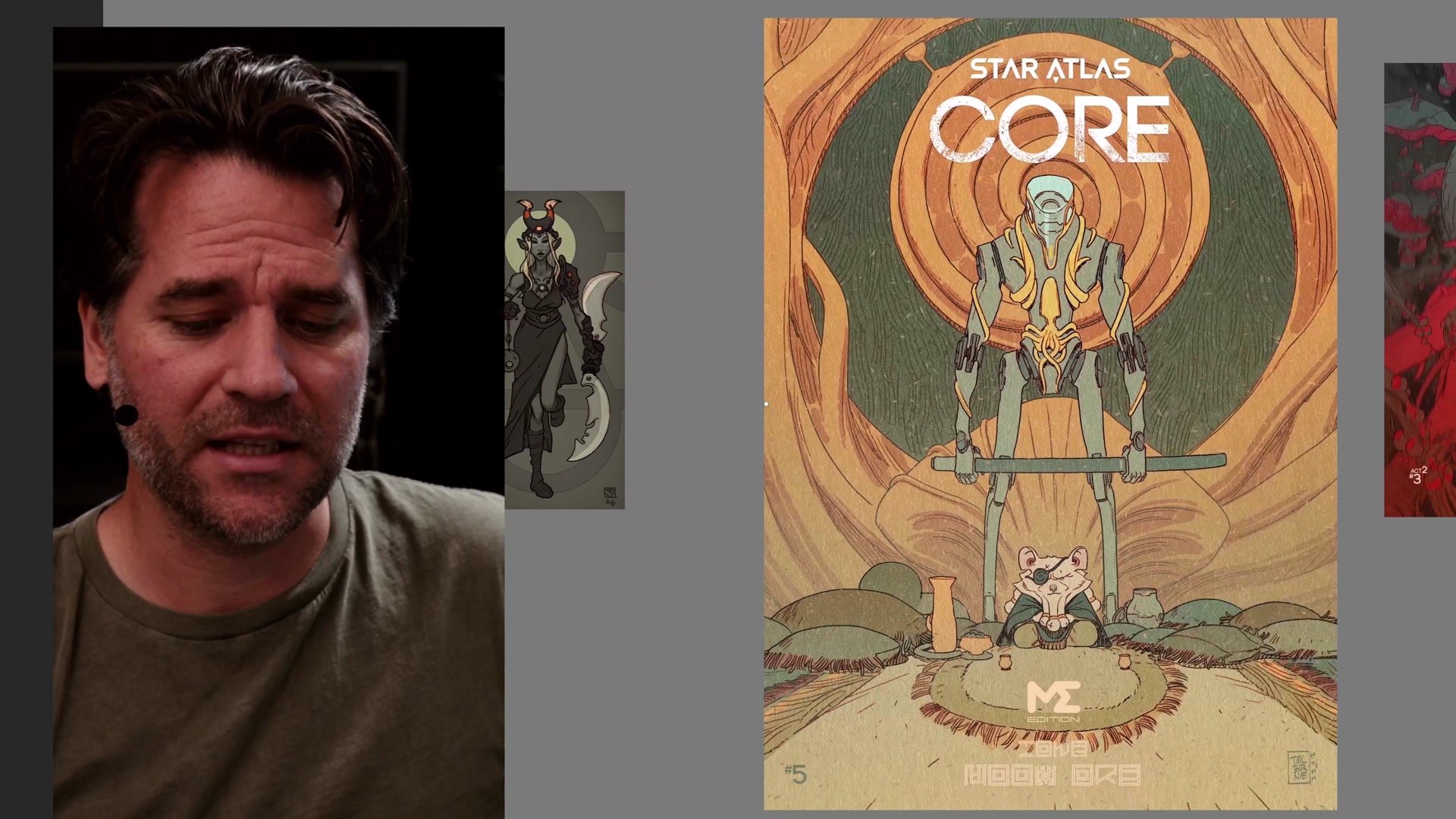
Professional Cover Examples
Learning Through Simplicity
One of the most useful discoveries is how much you can learn about illustration theory by working with simple, direct compositions. When a character is placed front and center in a relatively symmetrical arrangement, the drawing muscles can relax. That freedom makes it easier to focus on improving line work, shape design, process efficiency, and character design. The composition itself stops being the problem to solve, which opens up space to solve everything else.
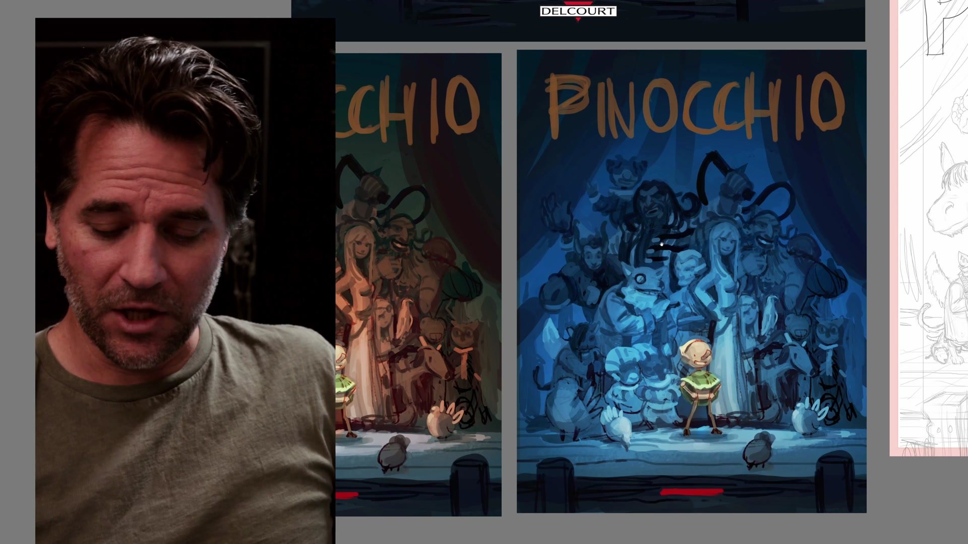
This approach scales surprisingly well into professional work. Comic book covers, which seem like they should demand the most dynamic and complex compositions, often work best when they use this kind of centralized staging. The theatrical quality of a formalized composition, almost like posing characters for a photograph, creates an abstract, intentional feeling that actually supports more adventurous choices in background design and visual storytelling. Once the basic idea is working, it becomes possible to add layers of depth through overlapping shapes, motion in ancillary elements, and interesting abstract background choices without losing the clarity of the image.
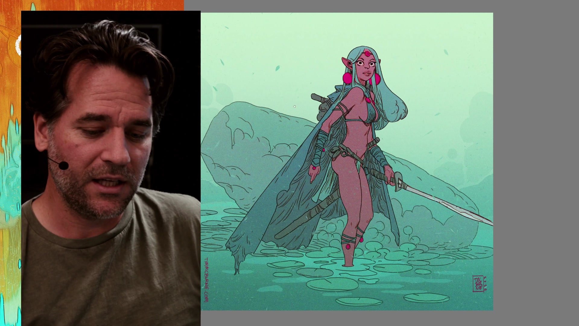
Pinocchio Cover Process
Repetition Reveals the Magic
Looking back across years of work, the images that consistently stood out and resonated with audiences were often the simple ones. Character in the middle of the frame, direct composition, clear intent. These were the pieces that people responded to most strongly, and they were also the pieces that pushed the greatest improvement in craft fundamentals like overlapping shape, depth through layering, and edge control.
The real insight is that mastering simple compositions gives you skills that transfer directly into more dynamic and complex work. Every basic principle of overlapping shape, every lesson about creating depth through layering, every improvement in your one-two-three read that you develop through simple centralized compositions will carry over when you tackle more ambitious layouts. It is the repetition and commitment to these basic compositional ideas that reveal their depth. Taking a couple of basic ideas and repeating them consistently is often where the magic happens in illustration.
Key Concepts
Difficulty Does Not Equal Value: Just because a compositional approach is technically challenging does not make it a better image. Simple, direct compositions can carry just as much impact as complex ones while freeing mental energy for other fundamentals.
Centralized Compositions Build Skills: Working with formalized, front-on compositions allows you to focus on improving edge control, value relationships, shape design, overlapping depth, and your one-two-three read without the distraction of perspective challenges.
Simplicity Scales to Professional Work: Comic book covers, illustrations, and portfolio pieces built on simple centralized compositions consistently create strong impact and audience response, proving this approach is not a compromise but a legitimate professional strategy.


