The Simple Color Schemes Pro Artists Use
Summary
Simple Color Plans That Work
Color theory in illustration often gets overcomplicated. There are countless ways to apply color and plenty of sophisticated approaches that yield interesting results, but a surprising amount of really strong art survives on very simple color schemes. Complementary pairs, analogous harmonies, and monochromatic plans underlie some of the most striking images in illustration and animation history.
What makes this worth studying is how consistently simple color logic produces powerful results. When we look at the actual artwork in books by Moebius, Miyazaki, Frazetta, and others, a pattern emerges: even when the surface looks wild and psychedelic, the underlying color plan is often remarkably straightforward. A basic complementary scheme, an analogous palette of colors sitting next to each other on the wheel, or a monochromatic foundation with a single pop of vibrancy. These are not shortcuts or beginner strategies. They are the reliable foundations that professional artists return to again and again because they work.
The real lesson is that aspiring artists often struggle by trying to do too much with color too early, when the most effective approach is usually to start simple and let that simplicity become the strength of the image.
Moebius Color Studies

Complementary Foundations
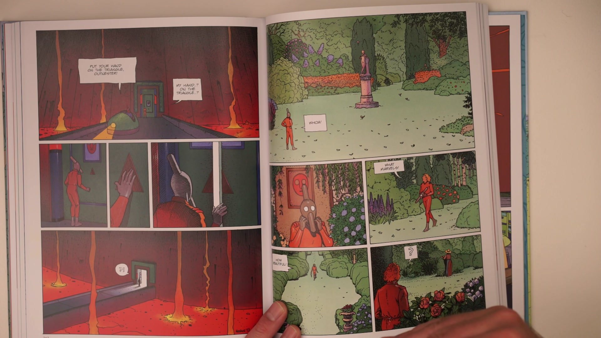
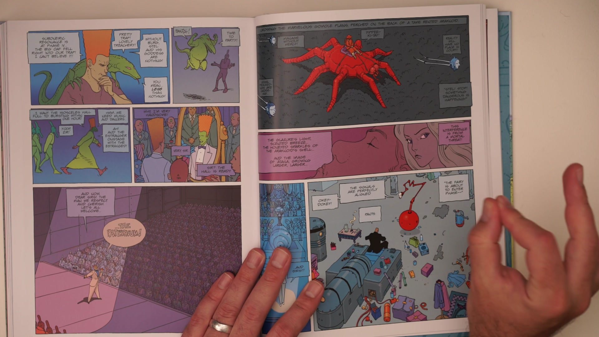
Even artwork that appears to use every color in existence often rests on a very basic complementary color scheme. Looking at the work of Jean Giraud (Moebius), there is frequently a psychedelic quality to the color, with greens, blues, purples, yellows, and oranges all present. But the overriding logic is almost always a simple complementary relationship. A yellow-orange main subject set against a blue-green background. Red contrasting with green. The flourishes and experimentation happen on top of that foundation.
What Moebius demonstrates so effectively is that a strong underlying complementary scheme is what gives an artist permission to go crazy with the details. The basic color relationship holds the image together while the artist pushes and pulls with hue variations and vibrancy. This is a critical insight for anyone who admires sophisticated colorwork but feels intimidated by it. The sophistication comes from playing within a simple structure, not from abandoning structure altogether.
Animation Color Design


Analogous Harmony
One of the clearest examples of a simple color plan working at the highest level comes from Studio Ghibli. The backgrounds painted by Oga Kazuo use what is essentially an analogous color scheme: greens and blues sitting next to each other on the color wheel. Green fields, blue skies. That is the whole plan. And it produces those classic Ghibli scenes that millions of people remember and admire.
The Porco Rosso films take a different approach with a primary color scheme: a red plane against a blue ocean and blue sky. The striking quality of that image is entirely about bold contrast within a minimal palette. These are designed color choices. From the original comics to the production design to the finished cells, the simplicity is intentional and it works every single time. Analogous colors will tend to go well together because they are neighbors on the wheel, and when the entire setting lives within that narrow range, characters with contrasting colors naturally pop without any complicated planning.
Monochromatic Color Plans


The Monochromatic Pop
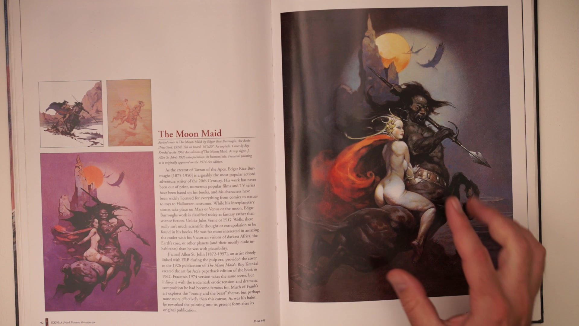
Frank Frazetta's work embodies one of the most effective and replicable color strategies: a monochromatic or near-monochromatic scheme with a small pop of vibrant color. So much of the image is essentially one color family, often earth tones or browns, but then a single element introduces a contrasting hue. A red cape against cool blue-purple background creatures. A warm figure against a cool environment. The color theory underneath is sophisticated, with subtle warm and cool shifts within the monochrome, but the overall plan is startlingly simple.
This monochromatic-plus-pop approach is a color scheme that always tends to work well. The restrained palette ties everything together and gives the image unity, while the pop of color creates a focal point and injects life. What often goes wrong for aspiring artists is trying to use too many colors from the start, when the real power comes from getting a simple monochromatic foundation in place first and then experimenting with small areas of vibrancy on top of that.
Consistent Color in Practice


Key Concepts
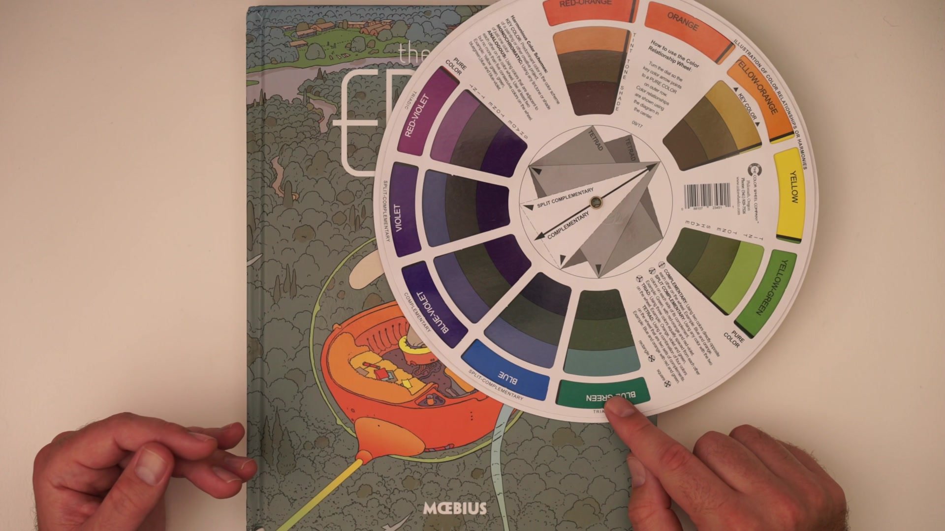
Complementary Foundations: Even the most psychedelic-looking artwork often rests on a simple complementary color scheme. The underlying relationship between opposite colors on the wheel holds the image together while the artist experiments on top of it.
Analogous Schemes Work Every Time: Colors that sit next to each other on the color wheel produce harmonious, reliable results. Green fields and blue skies, warm autumnal palettes, cool forest scenes. These simple analogous plans are what produce the iconic looks we admire in professional work.
Monochromatic Plus a Pop: One of the most effective strategies is to build an image in essentially one color family, then introduce a small amount of contrasting vibrancy. This creates focus and energy without the complexity of managing many different colors at once.
Try This Approach
Pick Your Setting First: Choose a simple environment for your next piece, something with an obvious color identity like a forest, a desert, or an ocean scene. The setting determines the base color scheme.
Limit to Analogous Colors: Use only three or four colors that sit next to each other on the color wheel for the environment. Do not go beyond five. This gives you a unified, harmonious base that will tend to work every time.
Add One Complementary Pop: Design a character or focal element that uses a color complementary to your environment. Red character in a green forest, warm figure against cool blue. Let that single contrast do the heavy lifting for visual interest.