Professional Line and Color Process - Cover Illustration Color
Summary
Cover Illustration Coloring Process
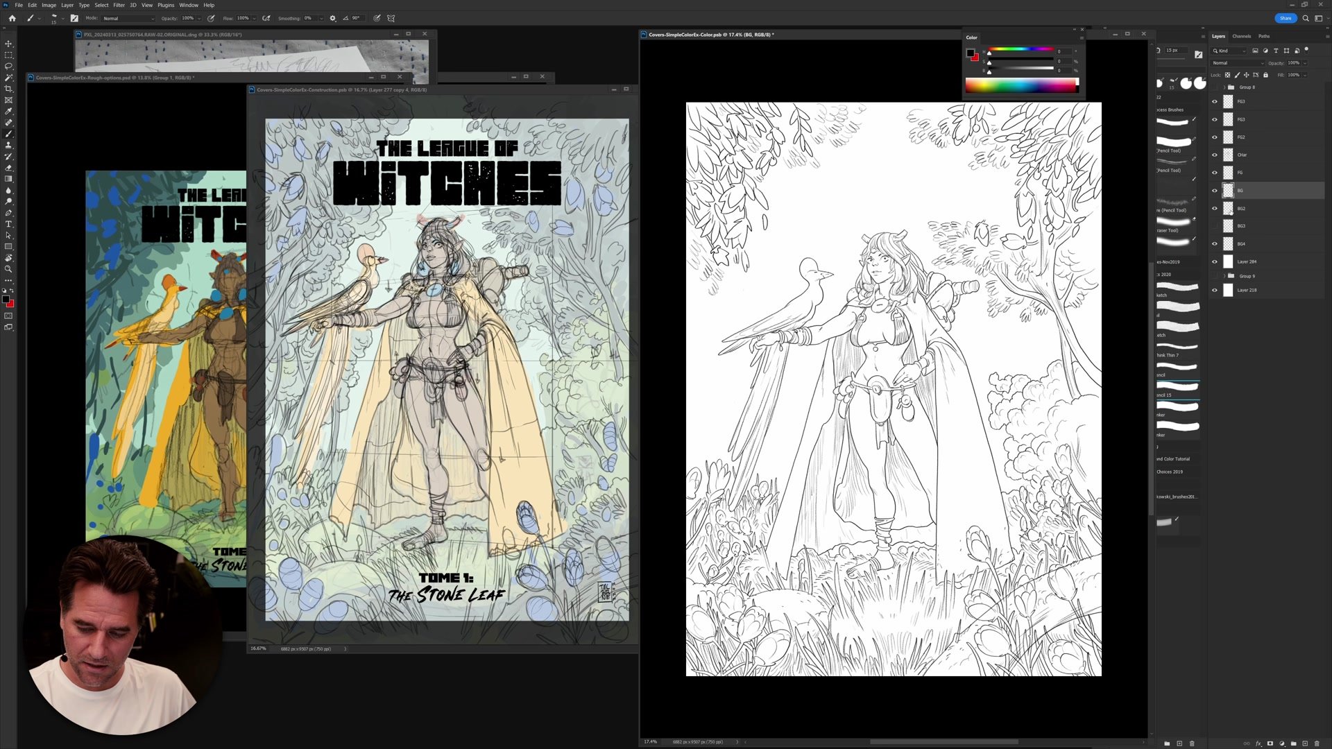
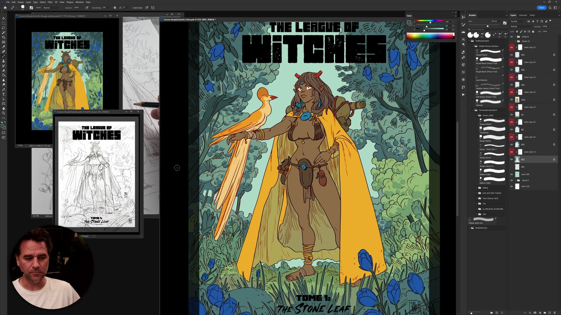
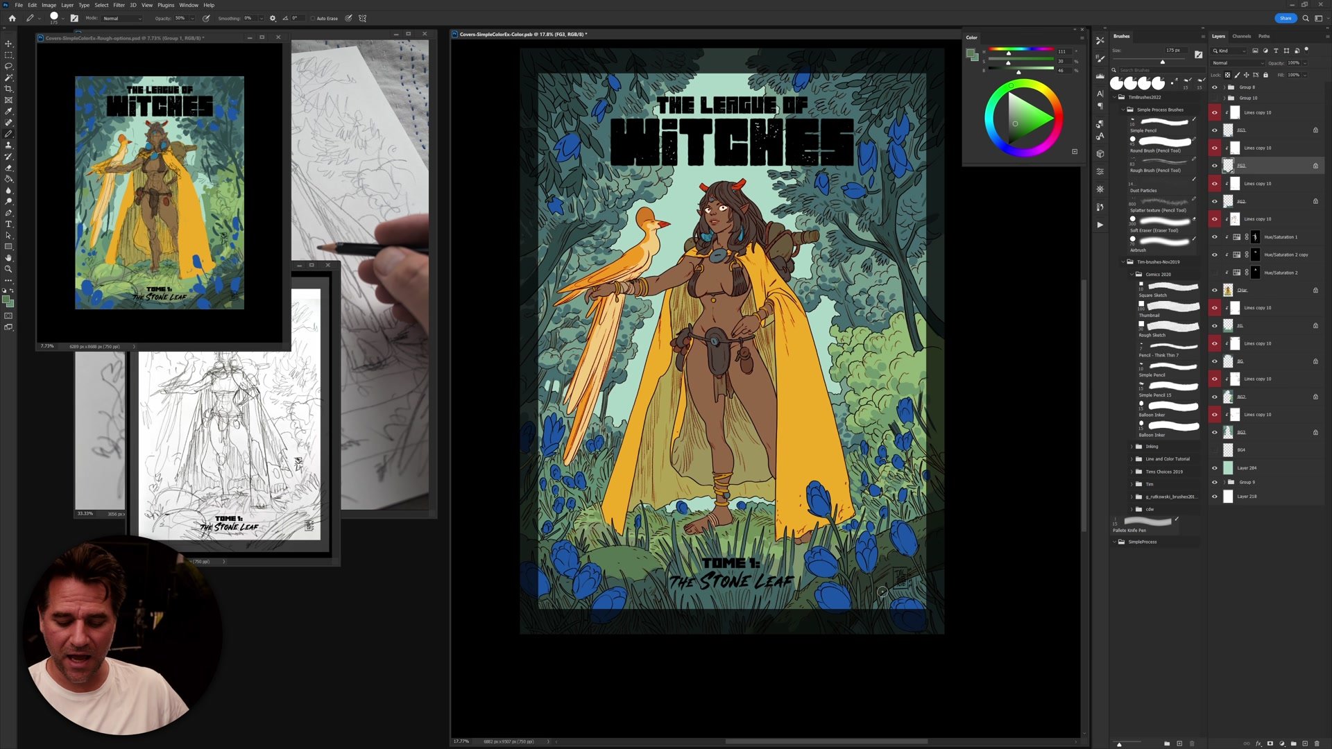
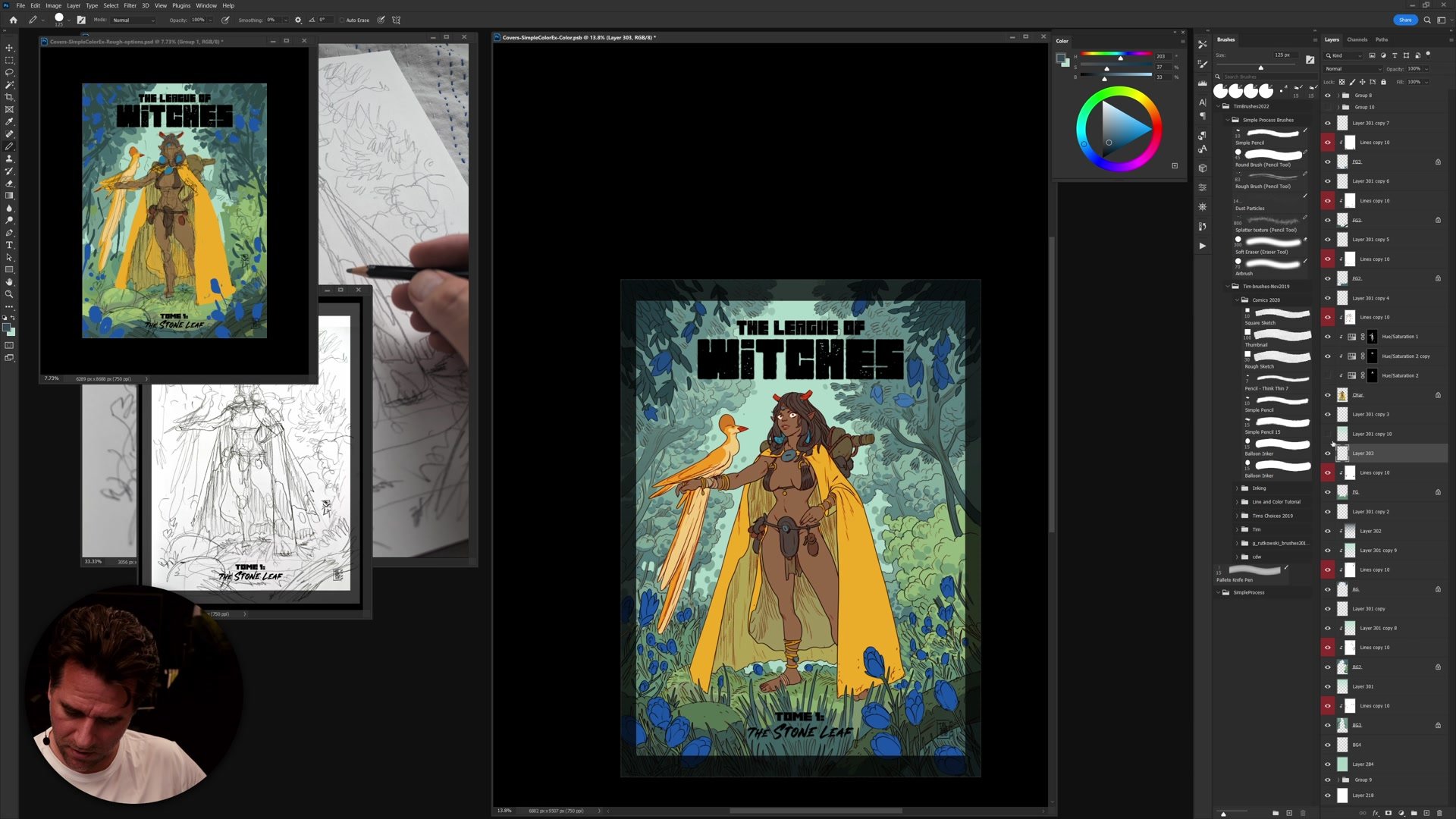
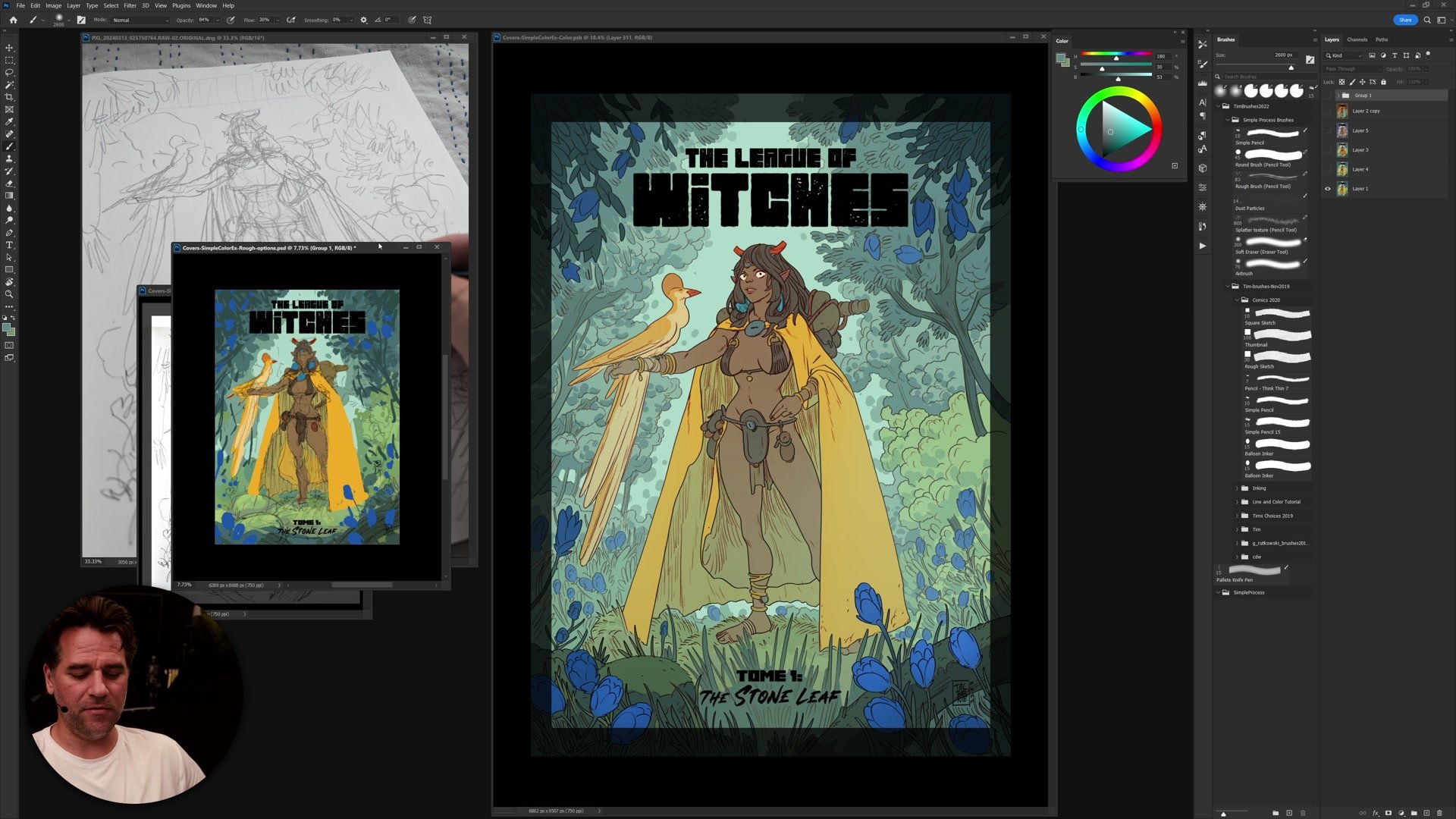
This is the final part of a four-part cover illustration tutorial series, focusing entirely on the coloring phase. The subject is a fantasy cover illustration titled "The League of Witches," and the session covers how to take a pre-established analogous color scheme from a thumbnail and translate it into a polished, finished piece. The full process runs over two and a half hours in real time, covering Photoshop flatting techniques, color application, and the subtle decisions that bring an illustration from flat colors to a cohesive final image.
Much of the early session focuses on efficient flatting using Photoshop actions combined with the pencil tool and quick mask. From there, the process moves into applying the analogous color scheme established in Part 1, building complexity through subtle temperature shifts and selective color adjustments, and knowing when to depart from the original color plan to push the piece further.
Flatting and Setup
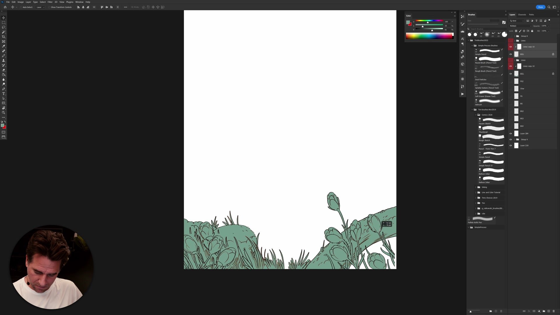
Efficient Flatting Workflow
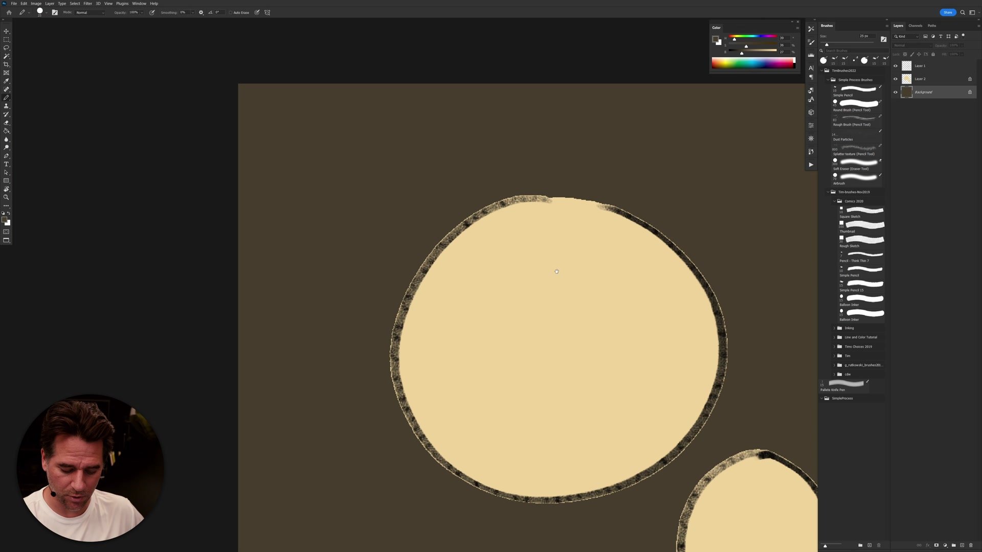
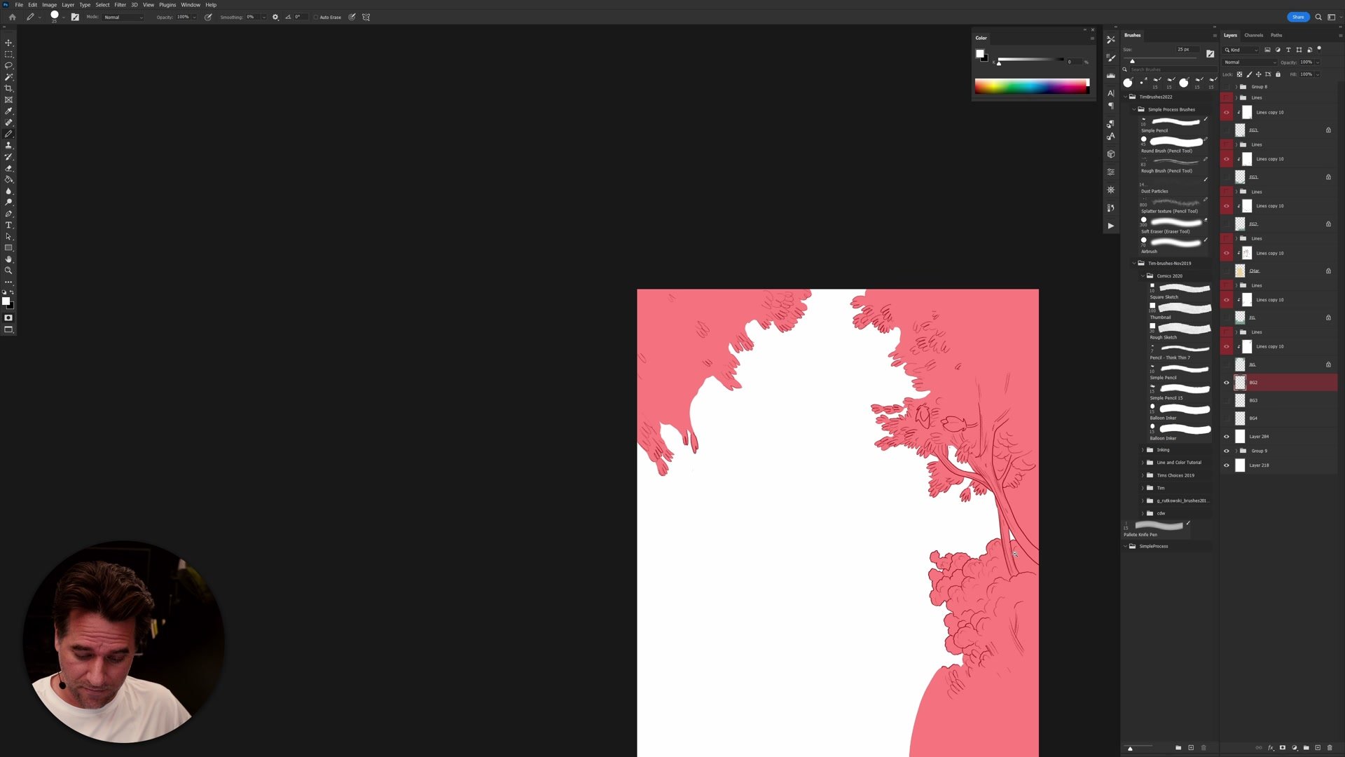
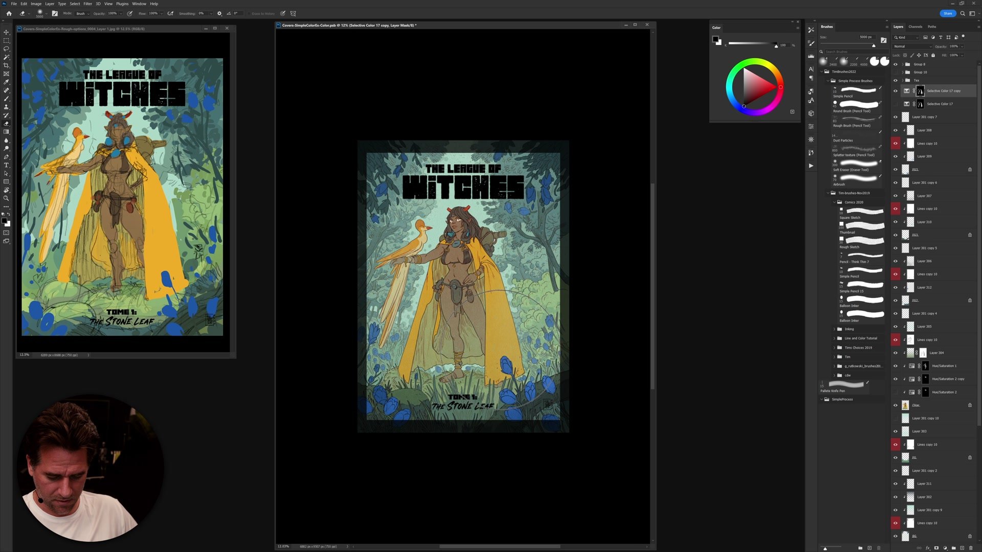
A significant portion of the session is dedicated to the flatting process, which is how clean, separated color regions are established before any painting or rendering begins. The approach uses the magic wand tool with tolerance set to 10, anti-aliasing off, and contiguous on to select areas around the linework. Those selections are refined in quick mask mode using the pencil tool, which produces hard, aliased edges that create perfectly clean separations between color areas.
Photoshop actions automate the repetitive steps of this process, turning what would be tedious manual work into a semi-automated workflow. The key insight is that flatting is not about getting pixel-perfect accuracy everywhere. Some roughness and organicness in the flats is acceptable and even desirable, as long as the tonal relationships between adjacent colors remain correct. The order in which elements are flatted matters too, following a logic similar to solving a puzzle where each selection builds on the last.
Building the Color Scheme
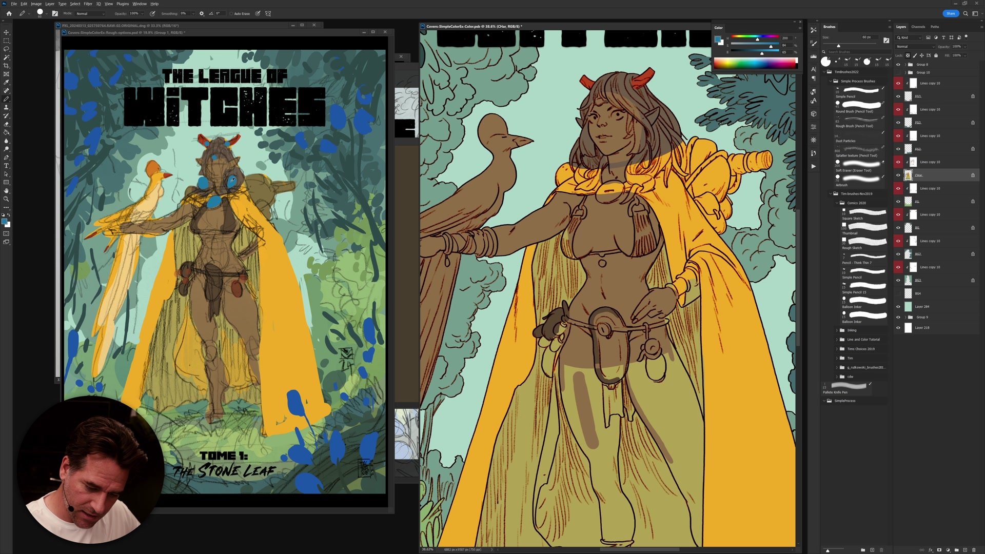
Applying the Color Plan
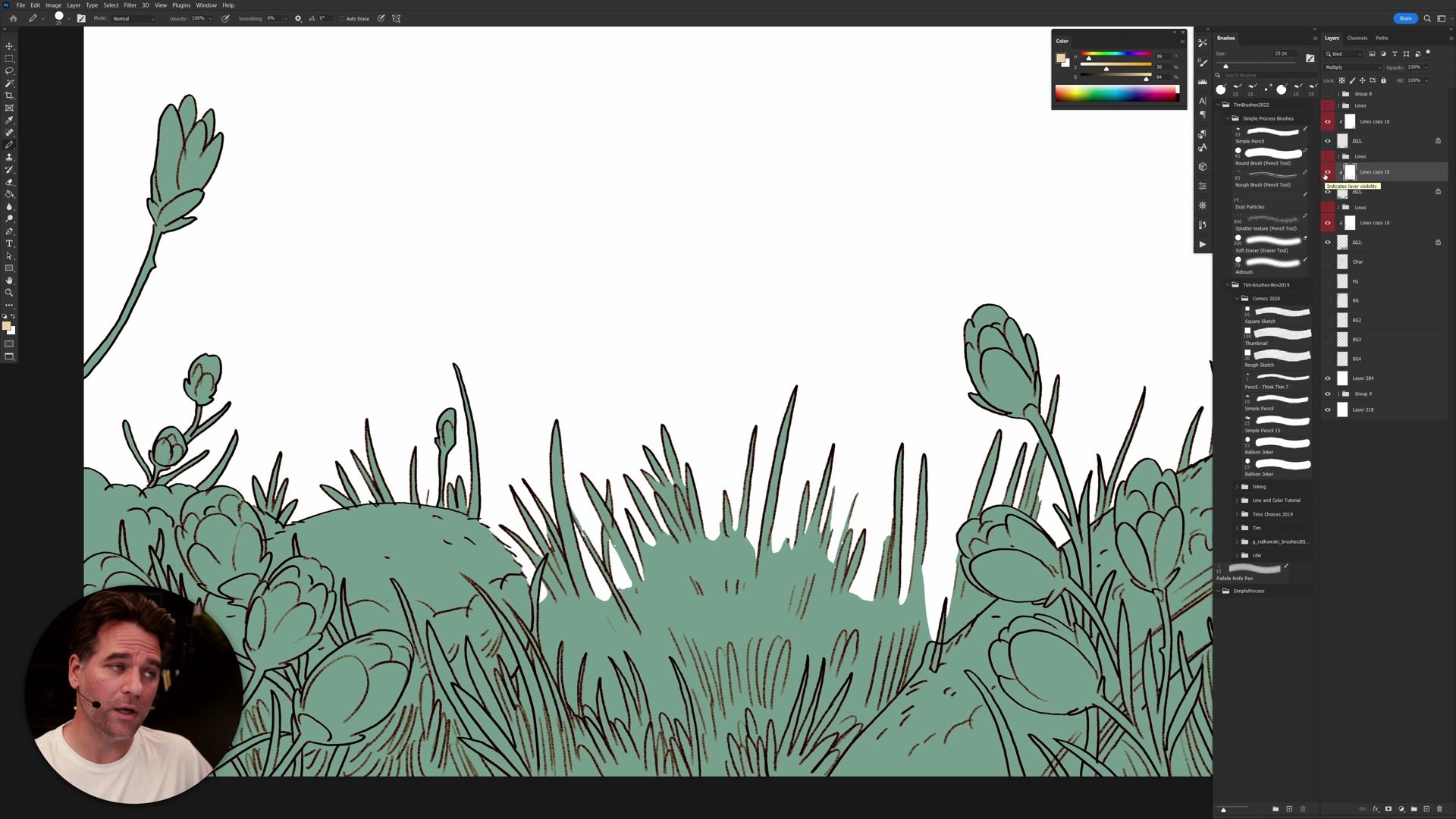
The color scheme for this illustration is analogous, built around yellows, greens, and blues with strategic spikes of red and orange for contrast and focal points. This plan was established during the thumbnail phase in Part 1 of the series, and the coloring phase is about honoring that plan while finding opportunities for creative experimentation. The process starts with very simple, flat color blocks that roughly match the thumbnail, then gradually builds complexity.
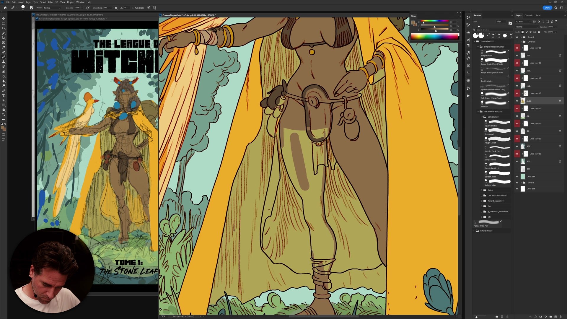
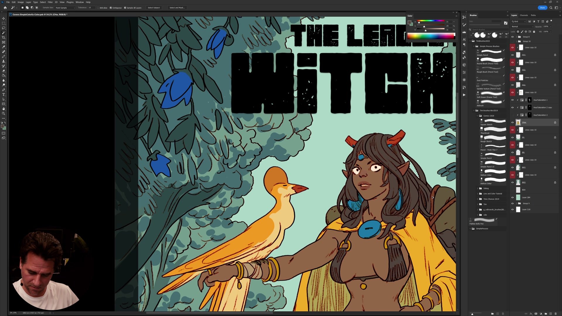
Working from a thumbnail means the core color decisions are already made, which removes a lot of uncertainty from the coloring process. Rather than agonizing over what color goes where, the focus shifts to how to create subtlety within those predetermined color relationships. Skin tones get slight redness in the ears and warmth in specific areas. The background foliage uses layered greens with temperature variation. Small color shifts between adjacent elements prevent the illustration from looking flat while maintaining the overall harmony of the scheme.
Refinement and Adjustments
Departing From the Plan
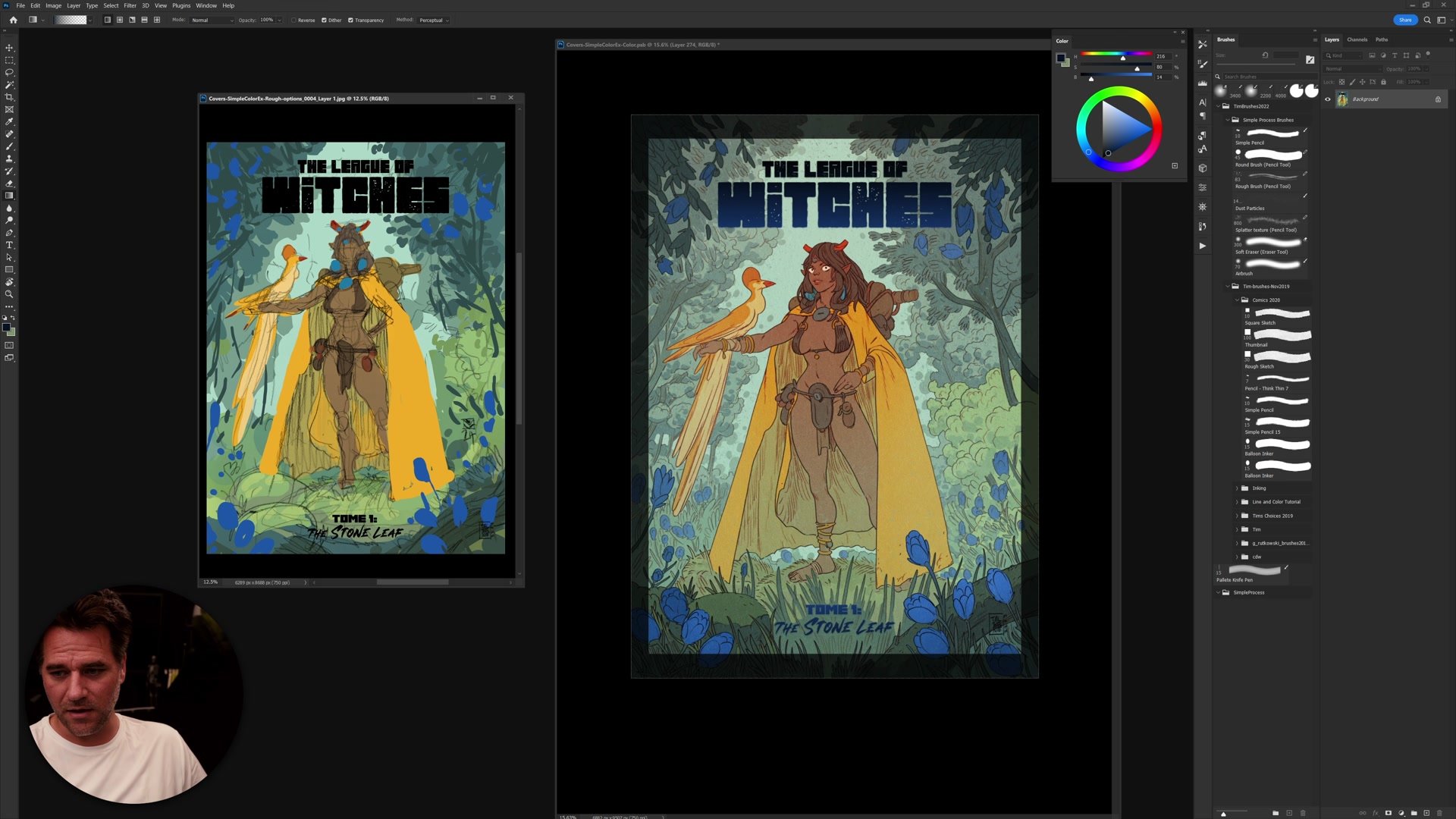
One of the most valuable lessons from this session is understanding when and how to depart from the original color thumbnail. Sticking rigidly to the plan produces reliable results, especially in professional contexts where a color comp has been approved. But the coloring process also benefits from experimentation, pushing warm and cool contrasts further, adjusting saturation in targeted areas, and finding moments where an unexpected color shift improves the overall read.
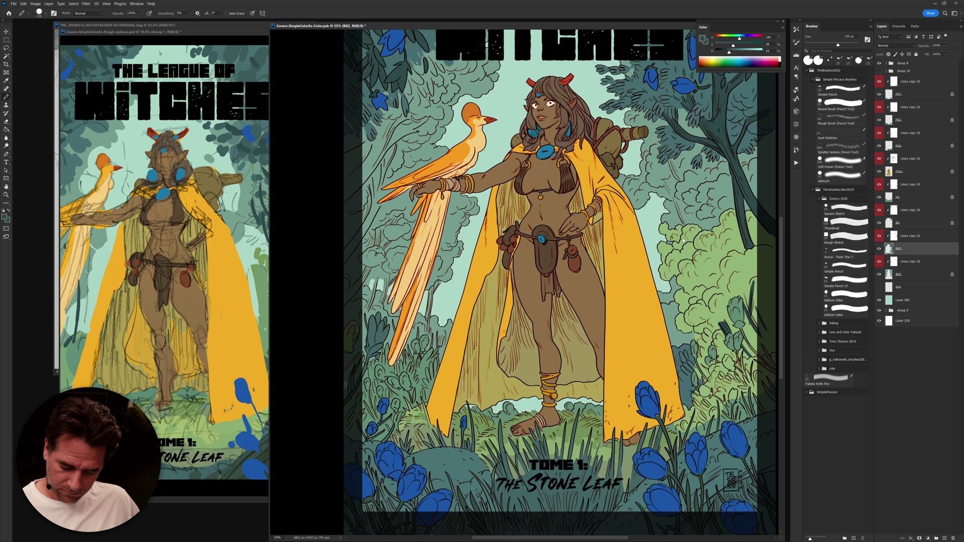
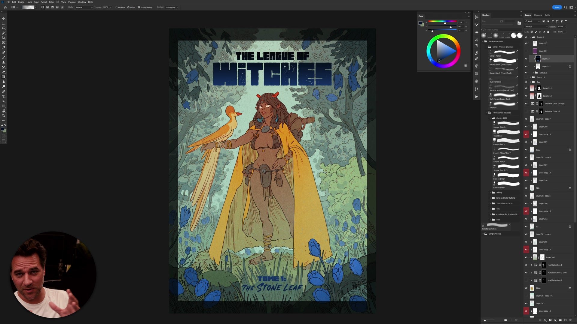
The final adjustments use selective color and hue/saturation layers to shift the entire piece, comparing the finished version against the original thumbnail side by side. The illustration maintains its first, second, and third read hierarchy throughout: where the viewer looks first, what holds attention second, and what fills out the background. These adjustments work because the underlying color structure is solid, built on a simple analogous scheme that tolerates experimentation without falling apart.
Finished Cover
Key Techniques
Flatting With Actions: Using the magic wand, quick mask, and pencil tool with Photoshop actions to create clean, efficient color separations without manual pixel-by-pixel work.
Analogous Color Foundation: Starting from a simple analogous scheme of yellows, greens, and blues, then building complexity through subtle temperature shifts and selective accents of complementary red and orange.
Selective Departure: Knowing when to follow the color thumbnail exactly and when to push beyond it, using adjustment layers to shift color relationships while preserving the established hierarchy of reads.
Layer Organization: Structuring the file with separate layers for foreground, character, and background elements so that each can be flatted, colored, and adjusted independently.
Try This Process
Start With a Thumbnail: Before coloring any illustration, create a small, simple color thumbnail with an analogous color scheme. Keep it rough and focus on establishing the overall color mood and hierarchy.
Practice the Flatting Loop: Set up the magic wand with tolerance 10, anti-aliasing off, and contiguous on. Select the space around an element, enter quick mask, refine with the pencil tool, then create flats from that selection. Practice until the sequence feels automatic.
Compare at the End: When the coloring is complete, place the original color thumbnail next to the finished piece. Note where the piece departed from the plan and whether those departures improved or weakened the overall read.


