The Power of Simplicity - Fantasy Art in Line and Color
Summary
Simple Process, Complex Results
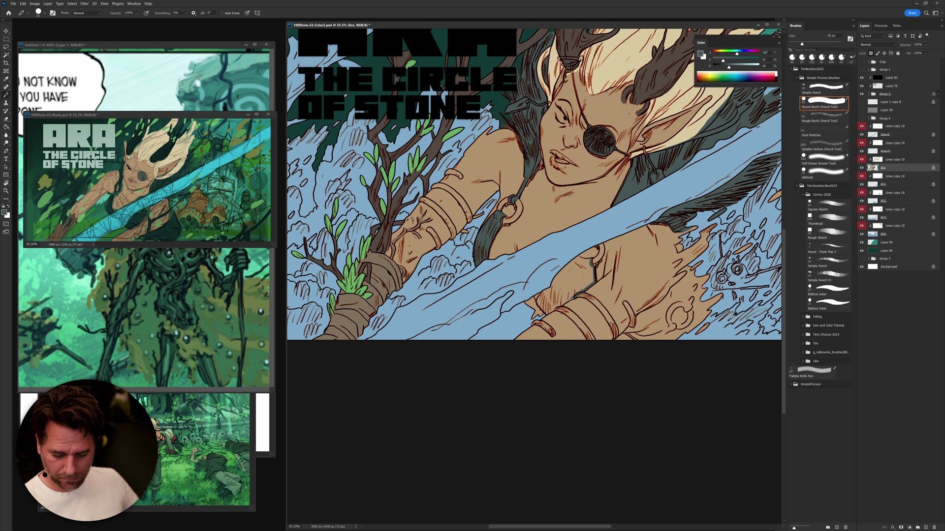
A four-hour real-time session building a fantasy splash illustration from a rough sketchbook thumbnail to finished line and color art in Photoshop. The subject is Ara, a character from a personal fantasy comic, and the goal is to create a punchy poster-style image using a deliberately simple process. The entire workflow proves that keeping your approach straightforward does not limit the complexity of what you can produce. It is the simplicity of the line and color method that makes ambitious compositions manageable.
The session covers every phase: compositional thumbnail planning, color blocking, construction drawing, inking through selection, flat coloring, and finishing. Each stage builds on the last, and the process stays grounded in practical decisions rather than over-planned perfection.
Thumbnail and Planning
Composition as Abstract Design
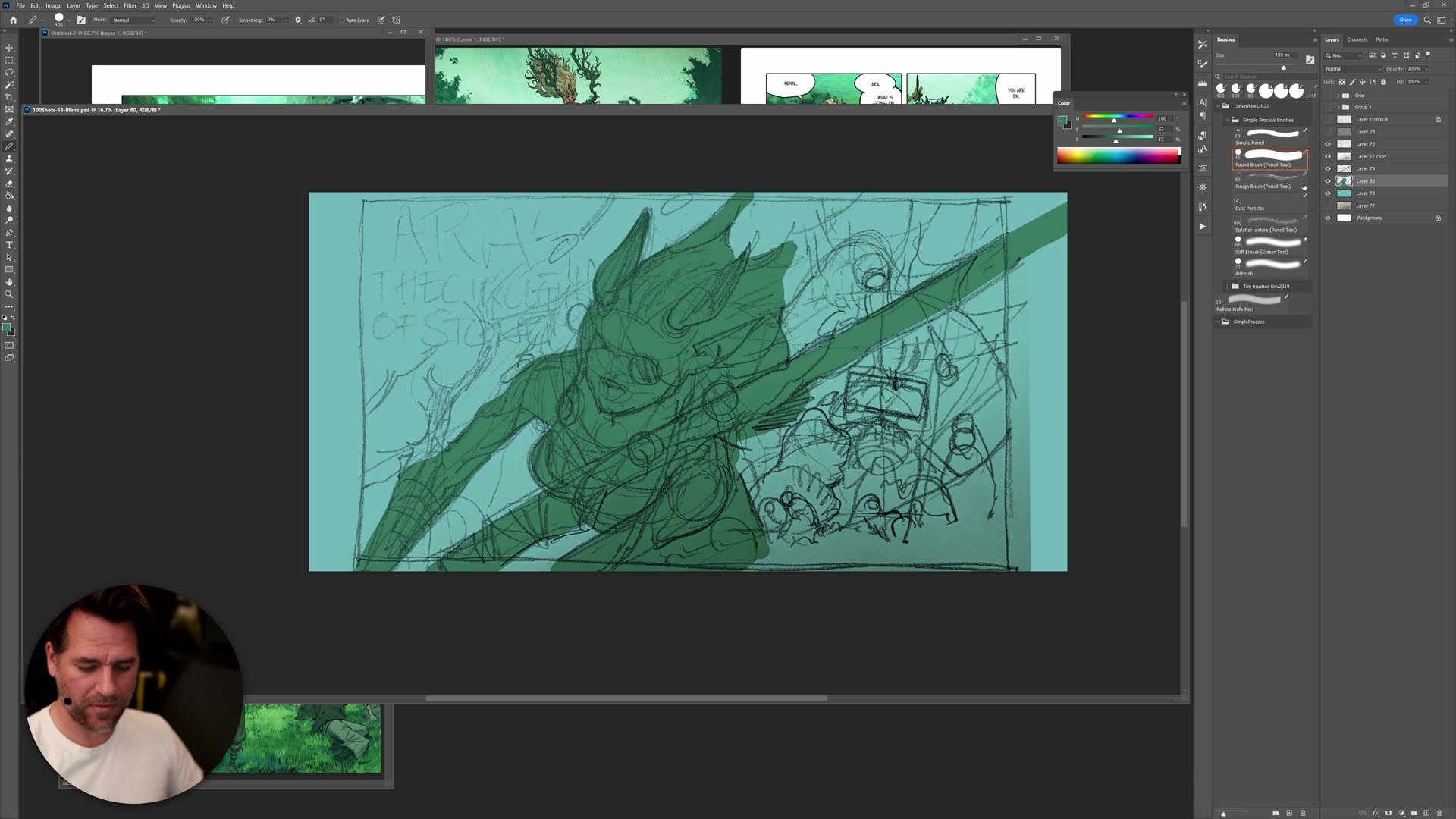
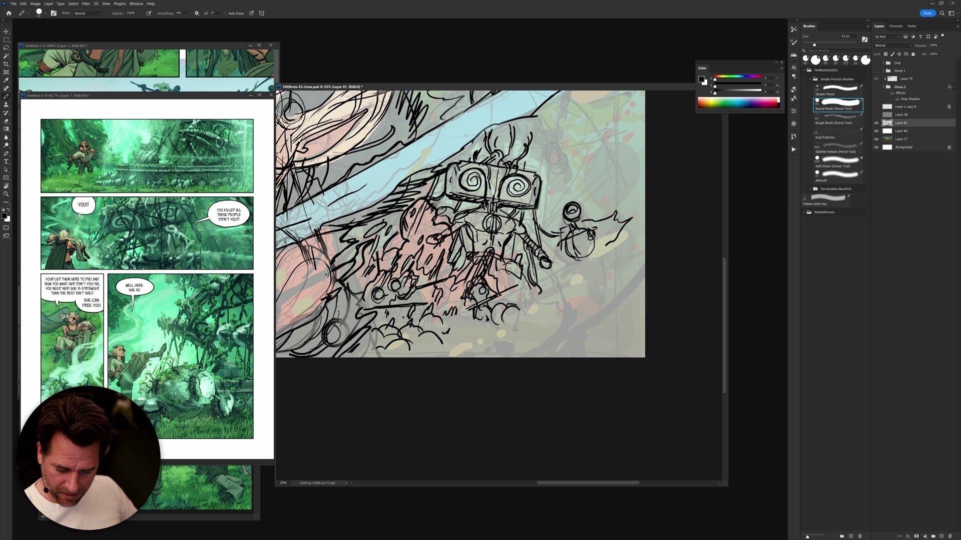
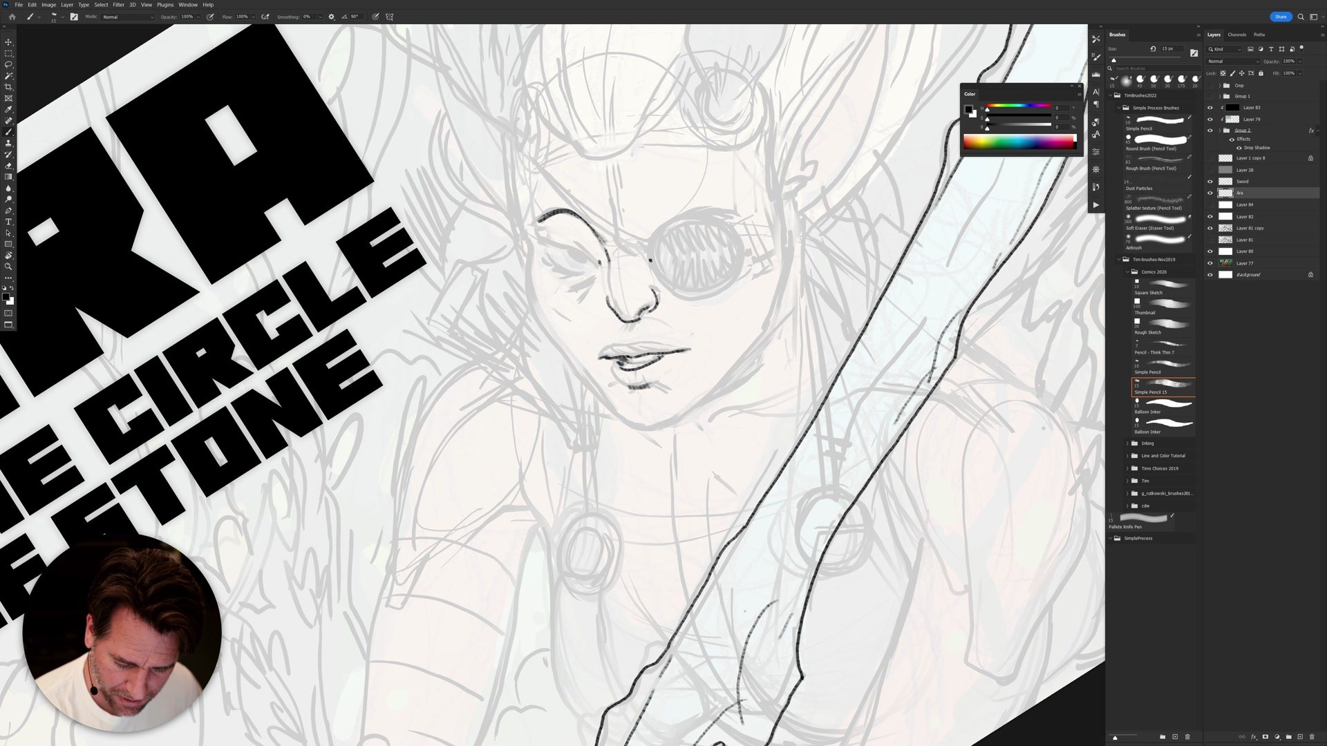
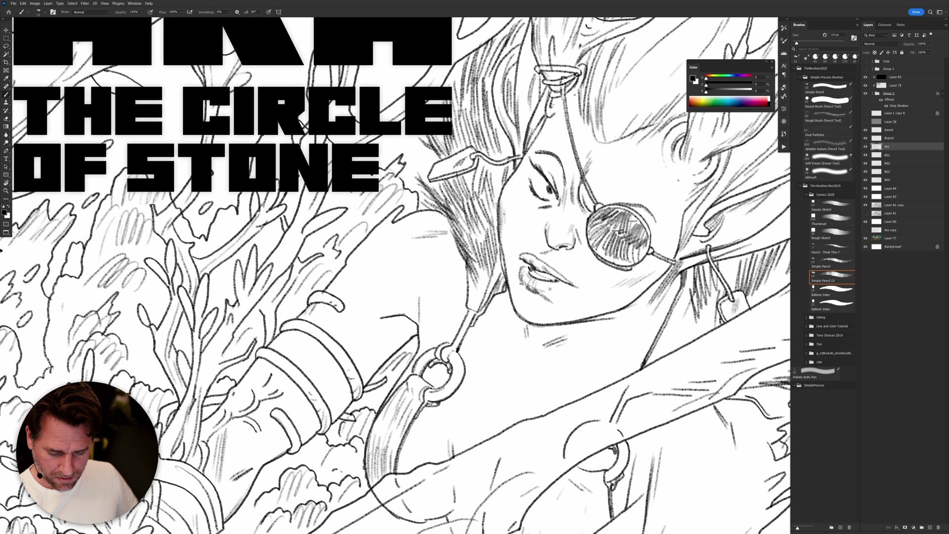
Before any drawing begins, the entire composition is blocked out using flat shapes with the pencil tool. The thinking here is purely abstract: where are the large shapes, where does the eye travel, and does the silhouette read at thumbnail scale. Text is treated as a major compositional element from the start, not added as an afterthought. This mirrors how comic covers are designed, where the composition should not look complete without the lettering because the lettering is part of the design.
The key insight is that if the abstract blob composition does not work, no amount of rendering will save it. Getting the big shapes right while everything is still rough and ugly is what separates a successful image from one that falls apart despite hours of detailed work. Constantly rotating and flipping the canvas helps catch problems early.
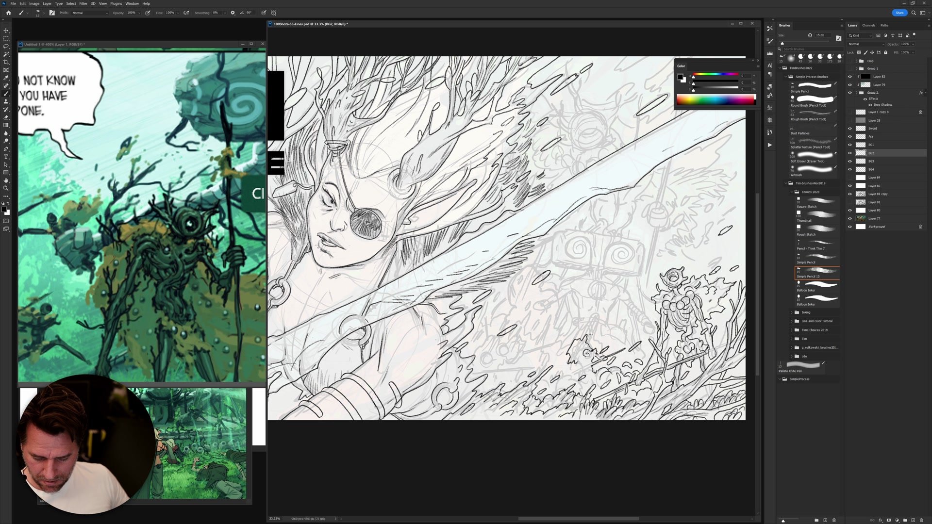
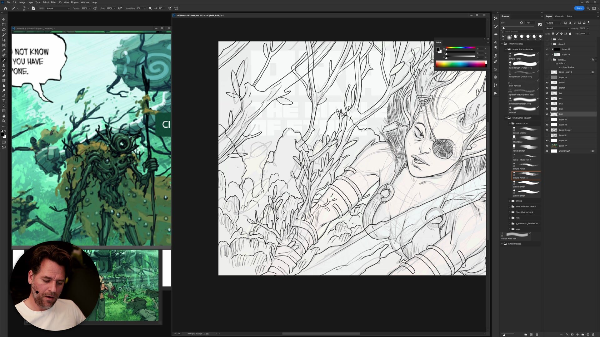
Construction Drawing
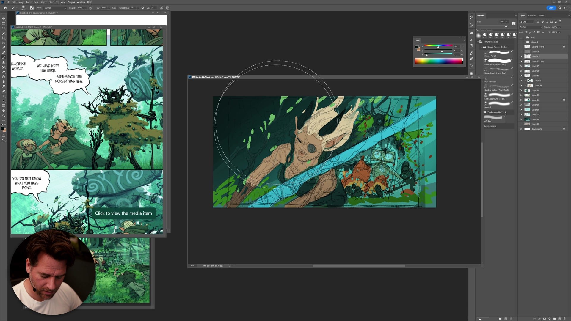
Construction as Refinement
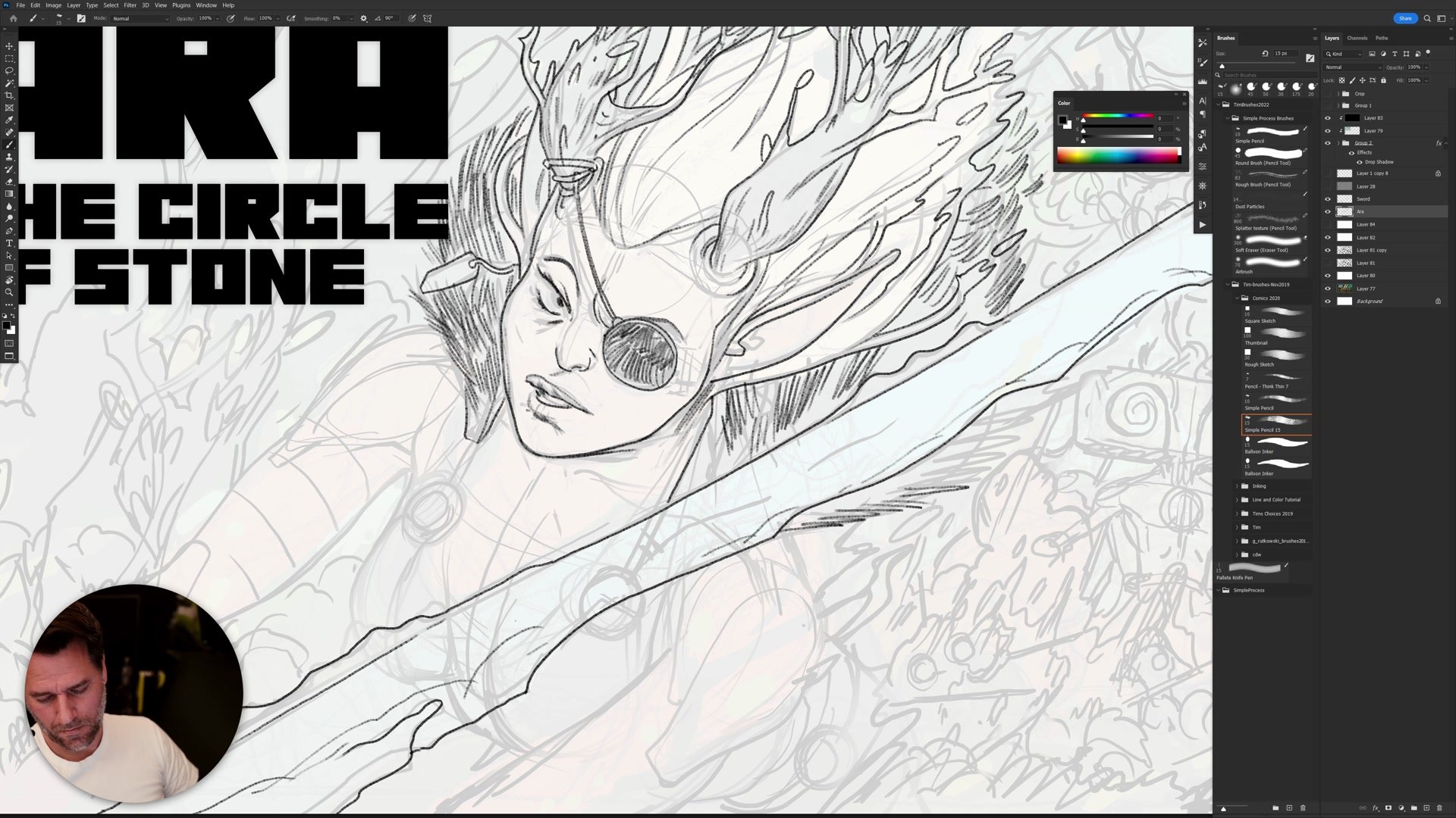
The construction phase adds structural drawing over the color-blocked composition. Center lines, brow lines, overlap indicators, and basic anatomy are layered in, but the goal is not a clean drawing. The goal is to figure out only what needs figuring out for the next phase. Some areas get tight construction because they need it (the face, the main character's hands), and other areas stay deliberately vague because detail there would be wasted effort.
This practical approach to construction removes the pressure to make a perfect underlying drawing. The question at every point is: what do I personally need to take this to the next stage? Sometimes that means careful anatomical work, and sometimes it means a few suggestive lines that establish overlap and form direction. The line and color process specifically rewards this kind of selective attention because the color does so much of the heavy lifting.
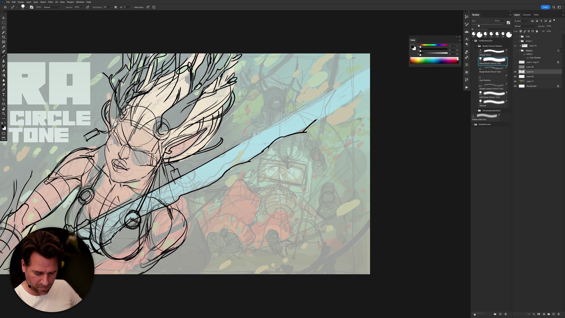
Inking and Selection
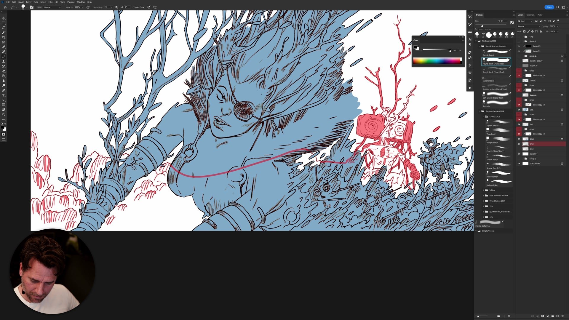
Line and Color Efficiency
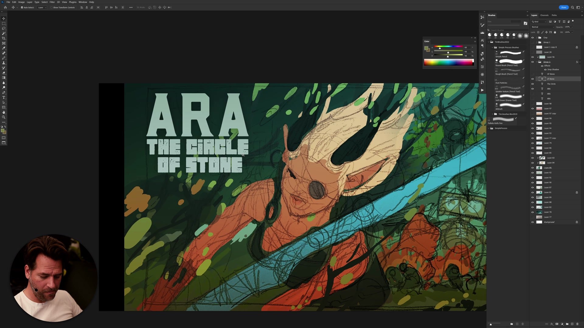
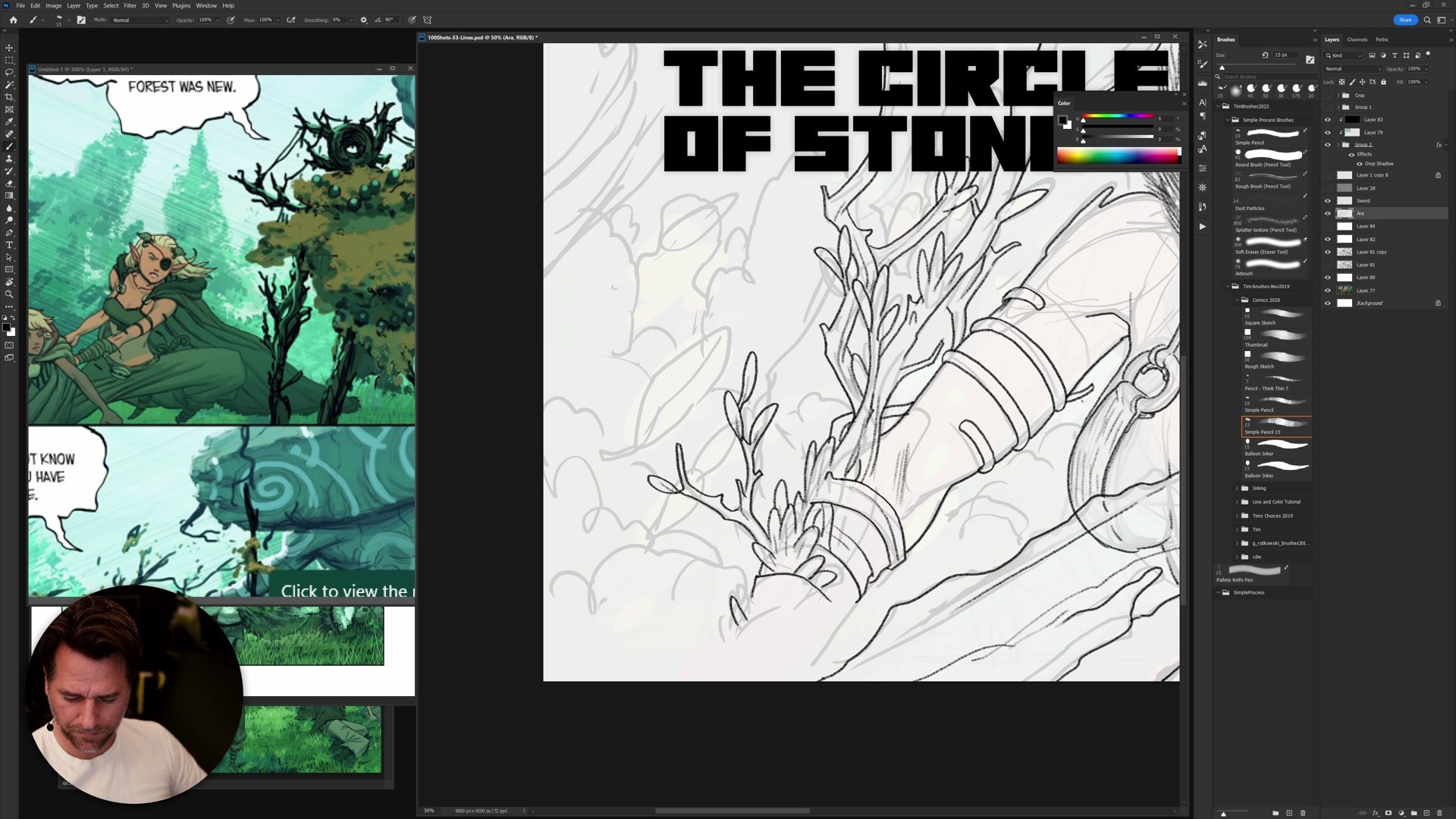
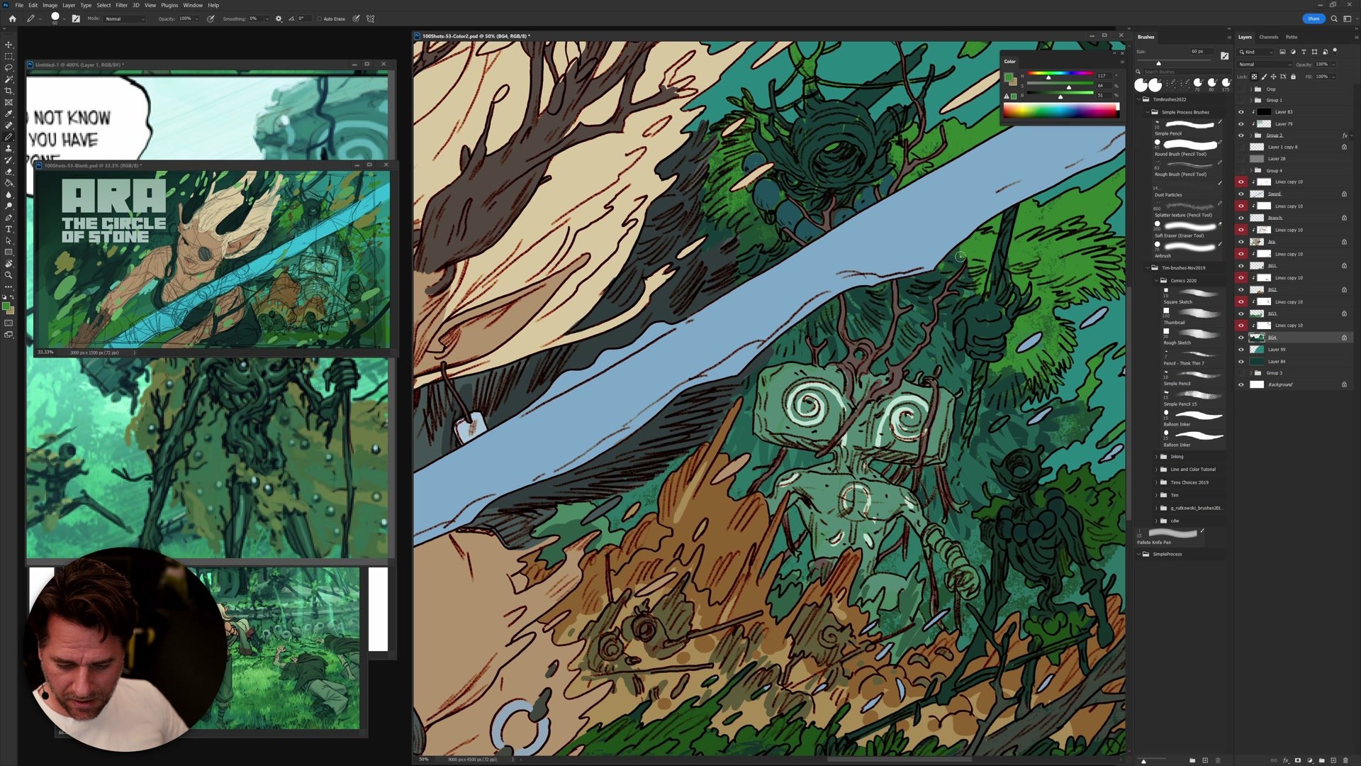
The inking phase uses layer separation to create clean, efficient flat areas for coloring. Every element gets its own layer grouping so that filling with the paint bucket becomes fast and predictable. The flat brush and pencil tool keep everything graphic and clean. This is the stage where the line and color style reveals its real advantage: nothing looks right until the color goes in, and that is by design. Adjusting expectations about how the work looks at each intermediate stage is critical to maintaining momentum.
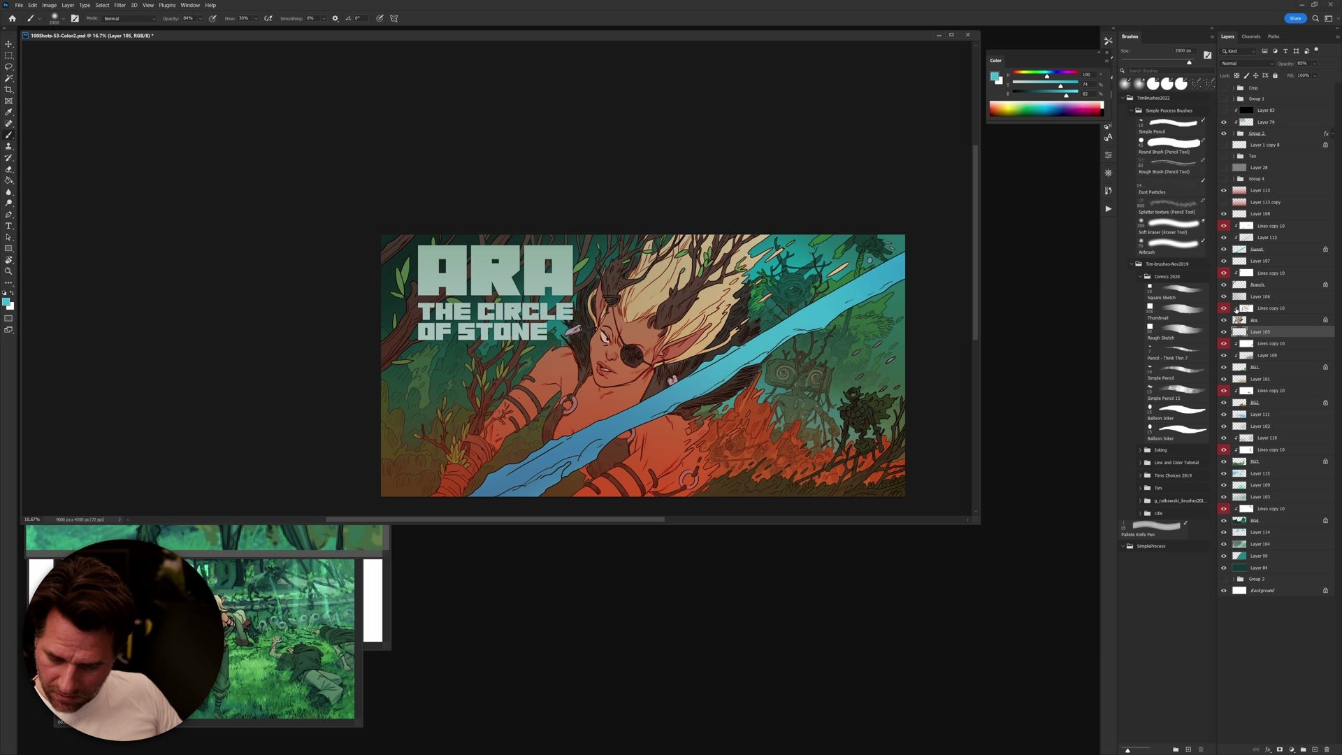
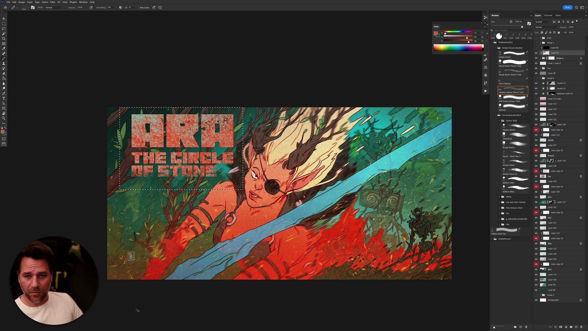
Once everything is flatted, color adjustments become trivial because each element is isolated. Costume colors, skin tones, background elements can all be shifted independently. The entire approach is built around the idea that complexity emerges from simple, well-organized layers rather than from complicated techniques. Even the finishing pass stays simple: overlays for warmth, a levels adjustment for punch, and scattered texture elements to add visual noise.
Final Colored Result
Key Principles
Thumbnail Composition First: Block out the entire image as abstract shapes before committing to drawing. If the thumbnail does not read, the finished piece will not either.
Text as Composition: Treat lettering and text elements as integral parts of the design from the start. The composition should look incomplete without them.
Selective Construction: Only construct what you personally need for the next phase. Tight anatomy where it matters, loose suggestions everywhere else.
Layer Separation Strategy: Organizing elements onto separate layers during inking makes the coloring phase fast and adjustable. Complexity comes from organization, not complicated technique.
Trust the Process: The line and color style looks unfinished at every stage until color is applied. Adjusting expectations to match each phase prevents unnecessary reworking.
Try This Approach
Start Abstract: Sketch a composition using only flat shapes and the pencil tool. No drawing, no detail. Just blocks of value and silhouette that read at thumbnail scale.
Add Text Early: If the image needs text or lettering, design it into the composition from the beginning. Check whether the layout still works with and without it.
Keep Layers Simple: Separate foreground, midground, and background elements onto their own layers during inking. Use the paint bucket to flat each layer independently, then adjust colors freely.


