Plan More Interesting Images
Summary
The Interesting Image Problem
Creating images that hold attention is one of the most overlooked challenges in illustration. When someone encounters a piece of art, whether scrolling through social media, opening a book, seeing it on a gallery wall, or just having someone hand over their iPad, they receive all the visual information at once. Give them too much (too much contrast, pattern, color, complicated story elements everywhere) and it becomes noise. People glance at it, can't figure out where to look, and keep scrolling. Give them too little and there is nothing to hold onto. The image is forgettable before they've finished looking at it.
Getting the balance right means people are engaged on multiple levels. Their visual processing is satisfied by an interesting pattern and clear focal hierarchy. There is often a narrative and story pulling them deeper. Small details reward closer inspection, but the viewer keeps getting drawn back to the main subject. This balance between not too much and not too little is what separates an illustration that captures someone from a drawing they skip past. Three areas control whether an image lands or falls flat: focus, breathing room, and complexity management.
Controlling Focus
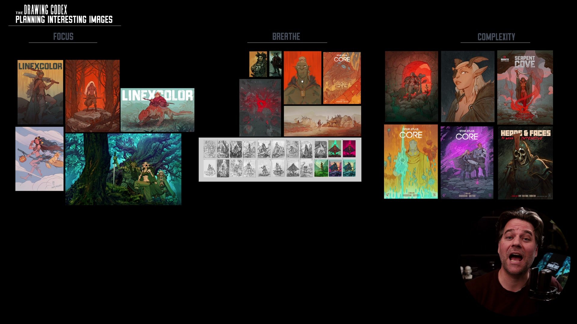
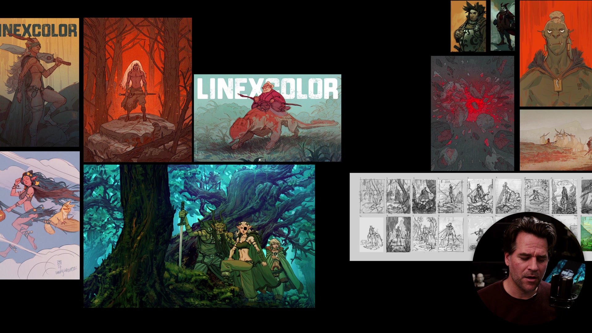
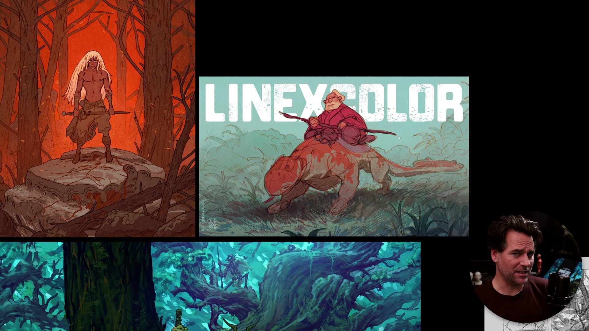
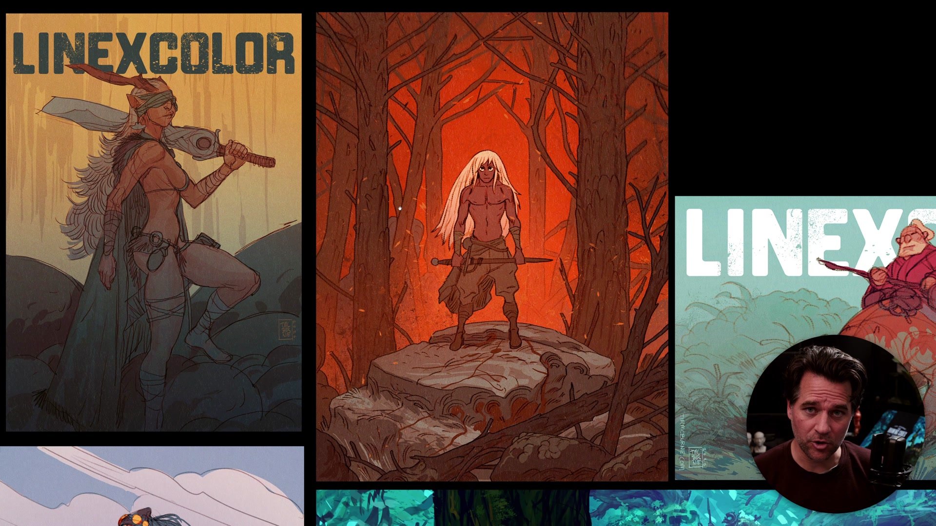
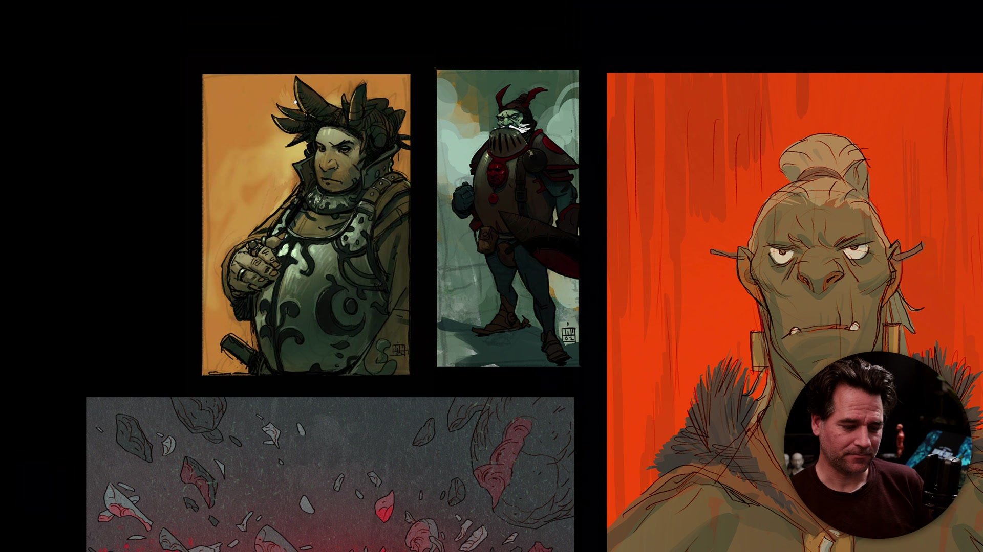
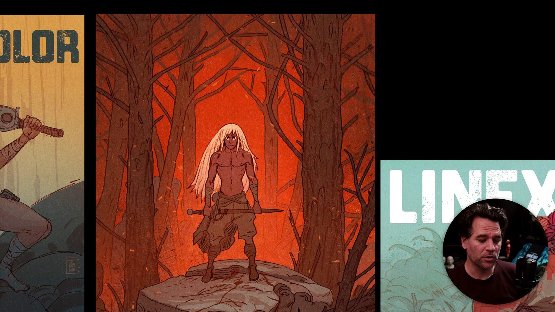
Focus is about directing where people look within the frame. There are four primary tools for this. Leading lines are shapes and contrasts within the composition that create directional flow, guiding the eye toward focal areas. These can be literal drawn lines or implied lines created by contrast between colors, values, or objects. Color contrast uses temperature differences to make elements pop. A warm character against a cool background is one of the simplest ways to control attention. Lighting and value work like cinematography, putting a spotlight where the eye should go, creating contrast through light and dark rather than color. And subject matter itself naturally draws attention. Faces, figures, and anything the human brain is hardwired to notice will pull the viewer's eye regardless of other compositional choices.
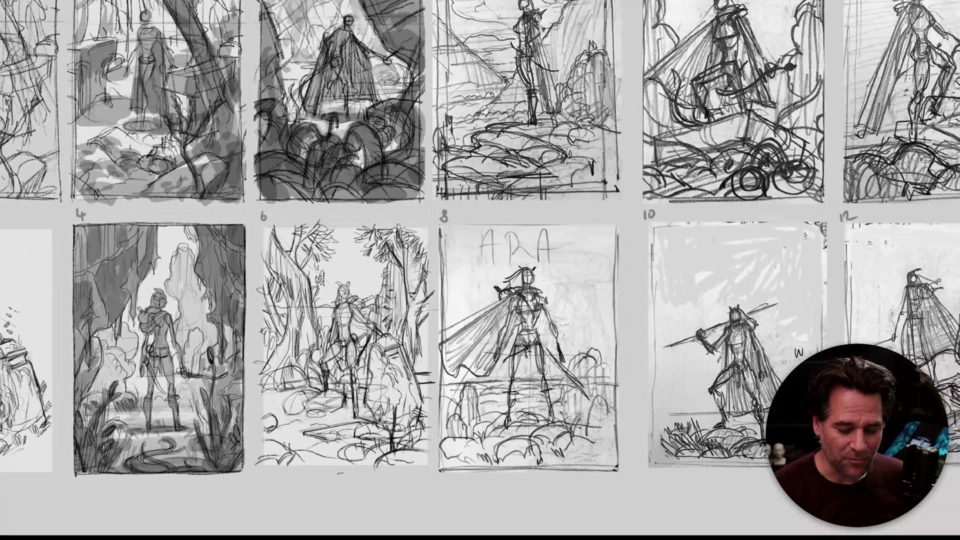
The real trap is forgetting about focus entirely. Getting absorbed in anatomy and rendering and ending up with competing focal points everywhere. Building the habit of planning focus at the thumbnail stage, through small compositional studies and tonal sketches, solves this before it becomes a problem.

Let Your Images Breathe
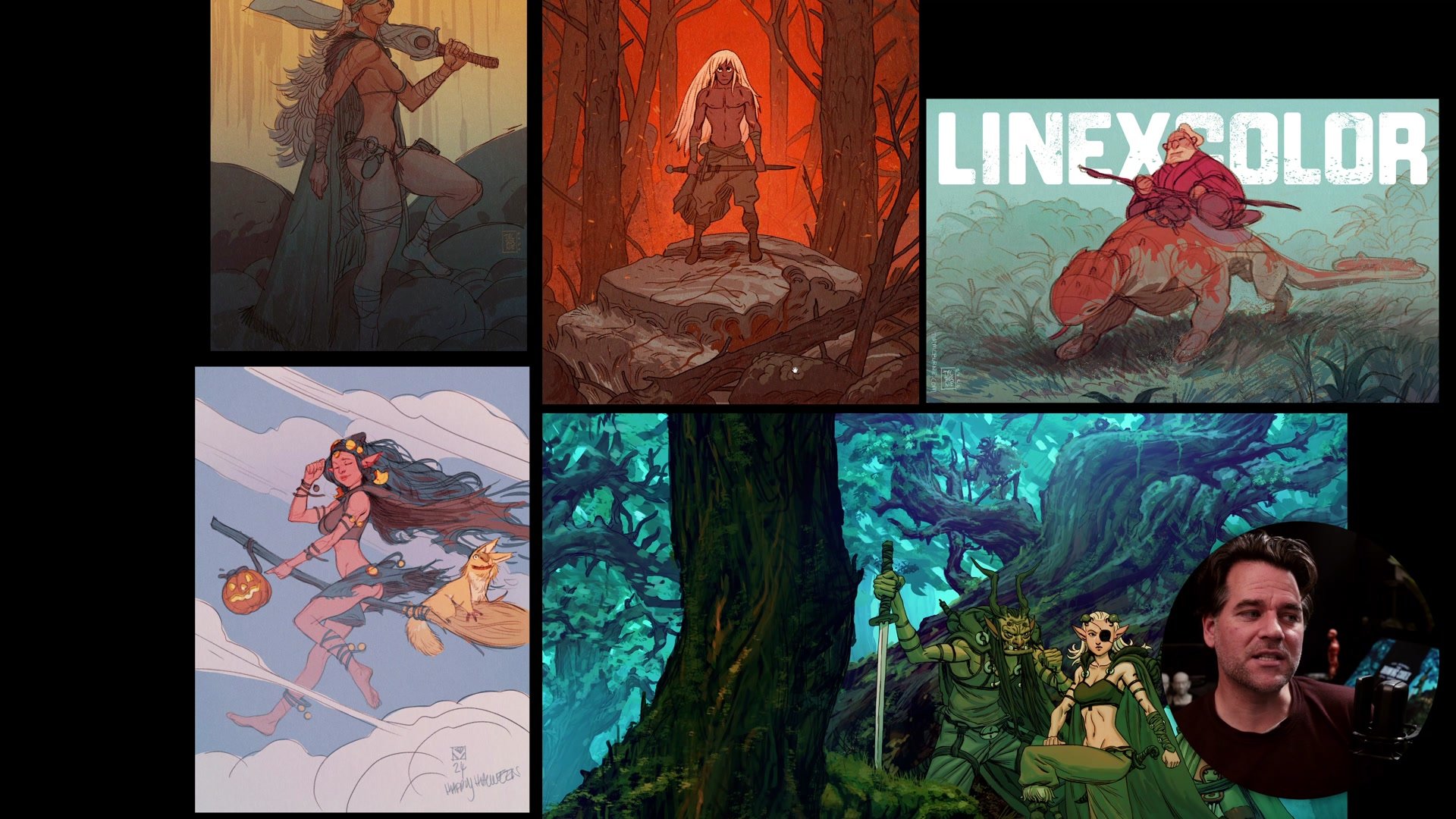
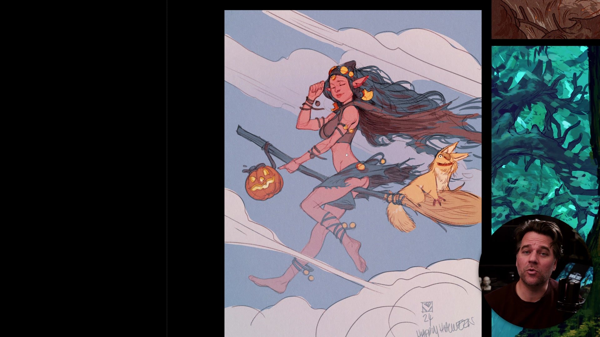
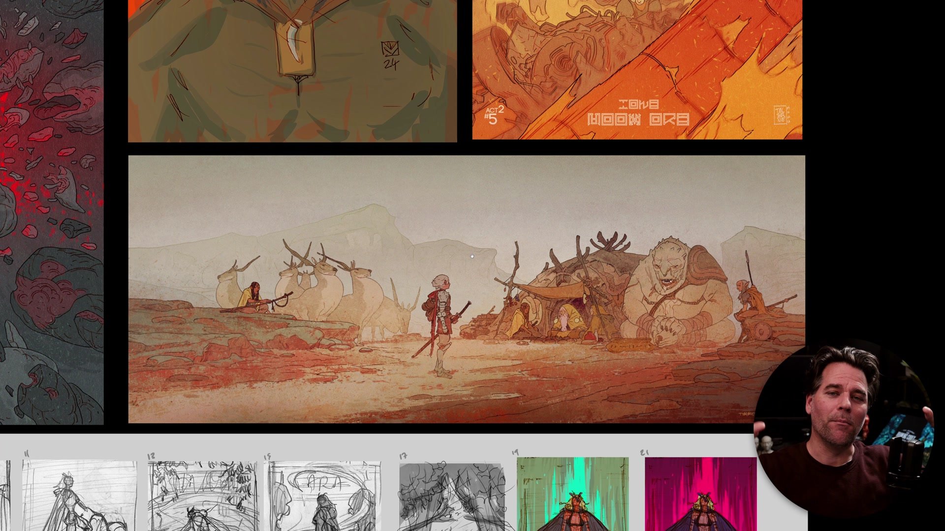
One of the most common mistakes is cropping too tight around the subject. When studying other artists' work, we notice the focal area (the character, the face, the action) and forget about the space surrounding it. Then when creating our own art, we recreate only that focal area and push it right to the edges of the frame. The result is an image that feels crowded and makes awkward shapes where the drawing meets the border.
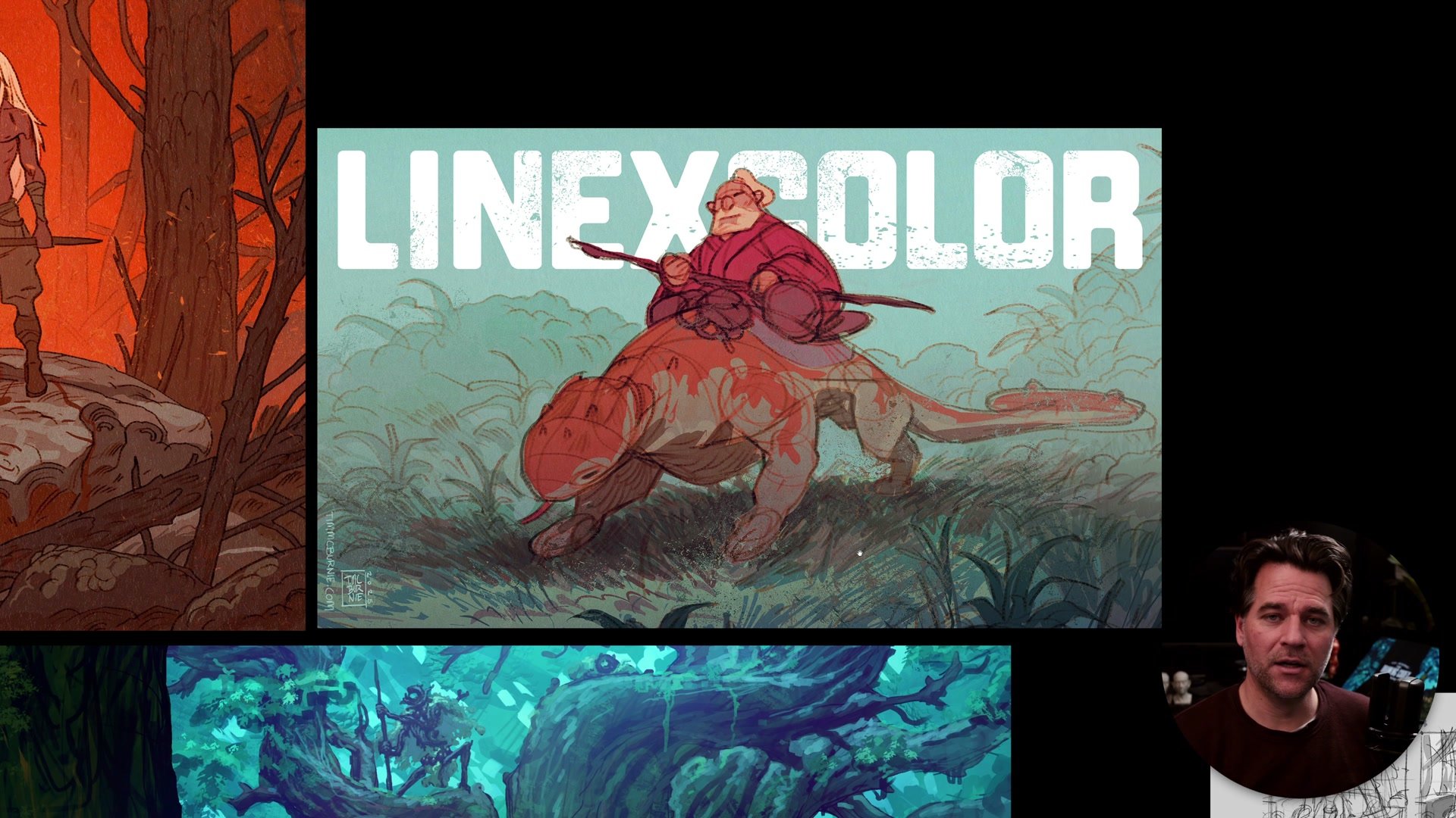
The fix is simple: leave more space around your subjects and fill it with background elements. This gives the illustration proper visual margins so the content can breathe without competing with the edge of the frame. It also builds the habit of drawing environments and backgrounds, which is critical for more complex illustration work. The tricky part is that leaving space feels wrong at first. It feels like wasting the frame. But space can always be cropped out later. It cannot be added once the drawing is done. Consciously building this buffer is one of the simplest improvements that makes work feel more polished and professional.
Balancing Complexity
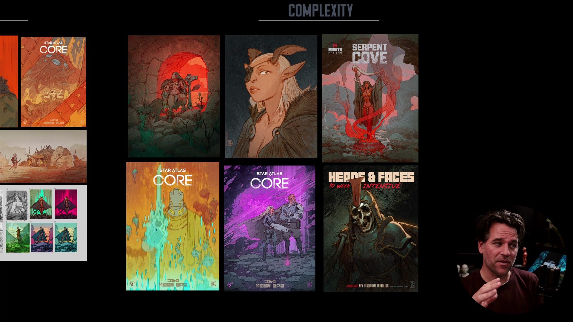
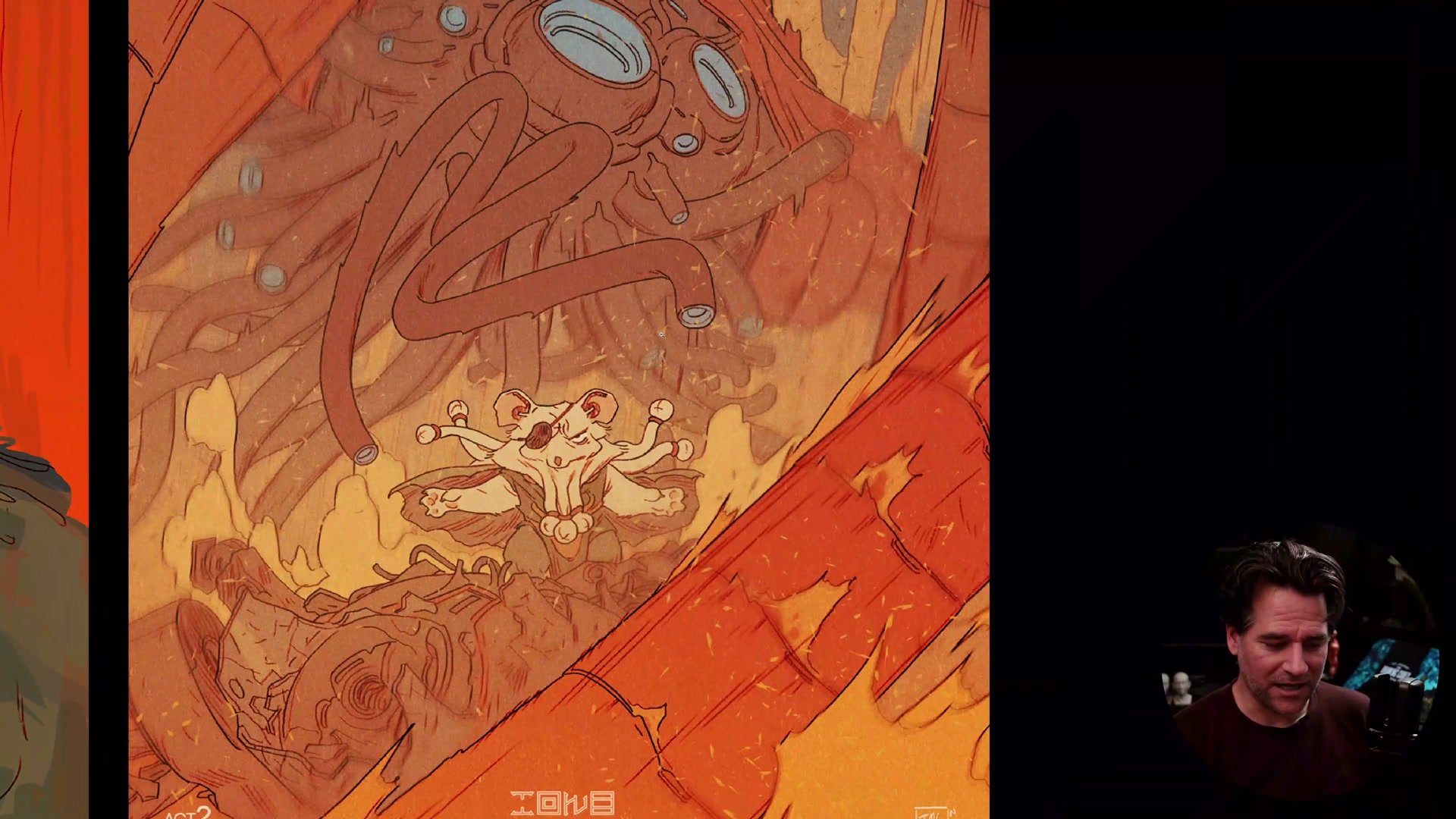
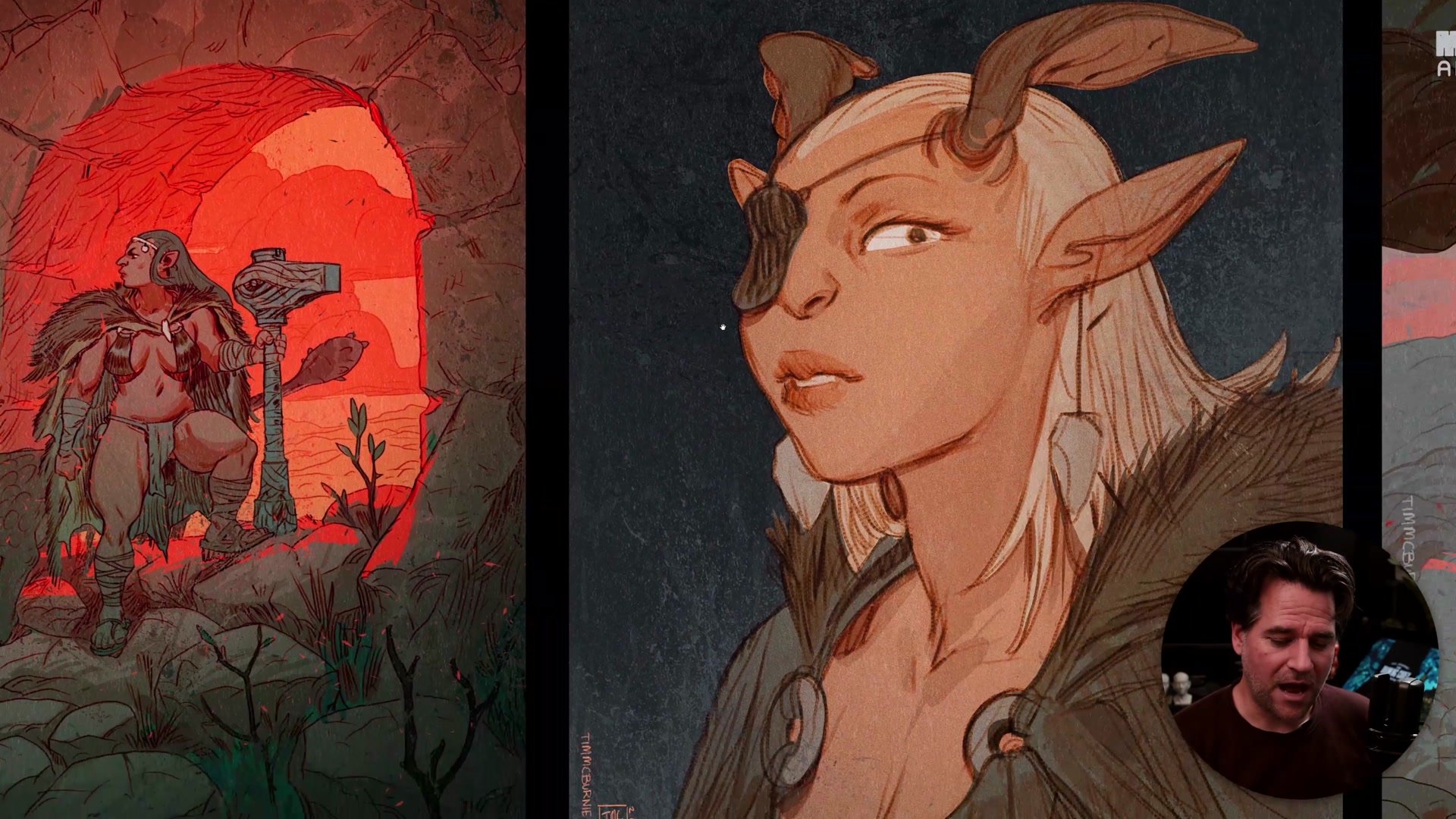
The Goldilocks principle applies directly to illustration. A complicated image with lots of narrative detail, many elements, and dense composition works best with a simple color scheme (monotone, analogous, or basic complementary). The complexity of the scene itself creates the interest, and adding complex color on top of that just overloads the viewer. On the other side, a simple image (a portrait, a single figure, a quiet scene) needs more sophisticated color, stronger vibrancy, or greater visual interest to hold attention. Simple subject with simple color just gives people nothing to look at.
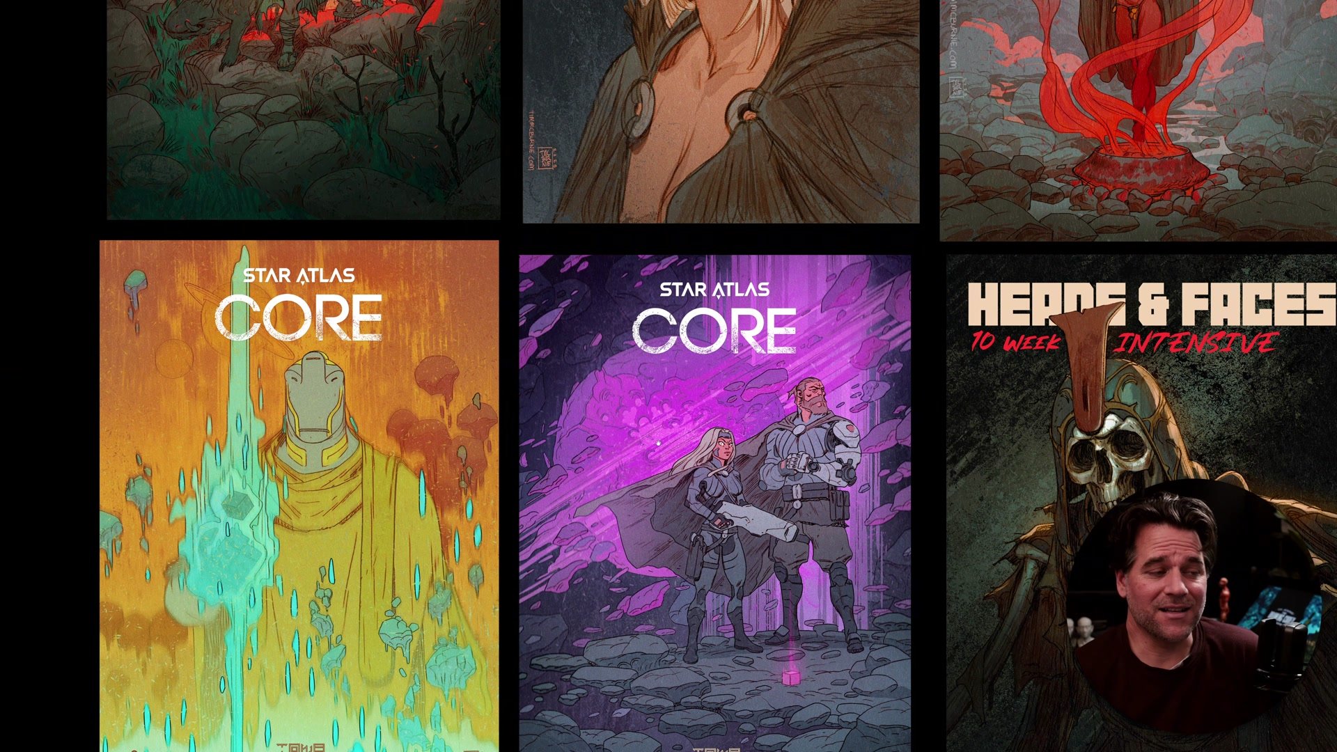
The same logic applies to value contrast versus color contrast. Choosing one as the primary driver of interest, rather than competing with both, gives the viewer a clearer visual experience. And if an image is designed to include text (like a cover), that text should be part of the original composition because it contributes to the overall balance. The underlying principle across all of this is bandwidth. The viewer's attention is finite. The job of the illustrator is to fill that bandwidth in a satisfying way, not overflow it and not leave it empty.
Key Concepts
Focus Comes From Intention: Leading lines, color contrast, lighting, and subject matter all control where people look. The most common mistake is forgetting to plan this at the thumbnail stage and ending up with competing focal points across the entire image.
Space Supports the Image: Leaving breathing room around the subject gives the illustration visual margins and prevents the composition from feeling cramped. The space can always be cropped later, but it cannot be added once the drawing is done.
Complexity Needs a Counterweight: Complex narratives and dense compositions work best with simple color schemes. Simple images benefit from more sophisticated color and visual treatment. Balancing these two forces is what keeps a viewer engaged without overwhelming them.
Try This
Start With a Thumbnail: Before any illustration, sketch a small thumbnail focused on composition and leading lines. Think about where the viewer should look and how the major shapes direct attention toward that point.
Add Breathing Room: Draw the subject smaller within the frame than feels natural. Fill the surrounding space with simple background elements. This builds the muscle of thinking about the full composition, not just the character or focal point.
Pick One Contrast Driver: Decide whether the image will rely on value contrast or color contrast as its primary visual hook. Keep the other simpler. If the scene is narrative-heavy with many elements, use a limited color palette to let the detail do the work.