Fantasy Cover Illustration: Full Session Walkthrough
Summary
A Fantasy Cover Illustration
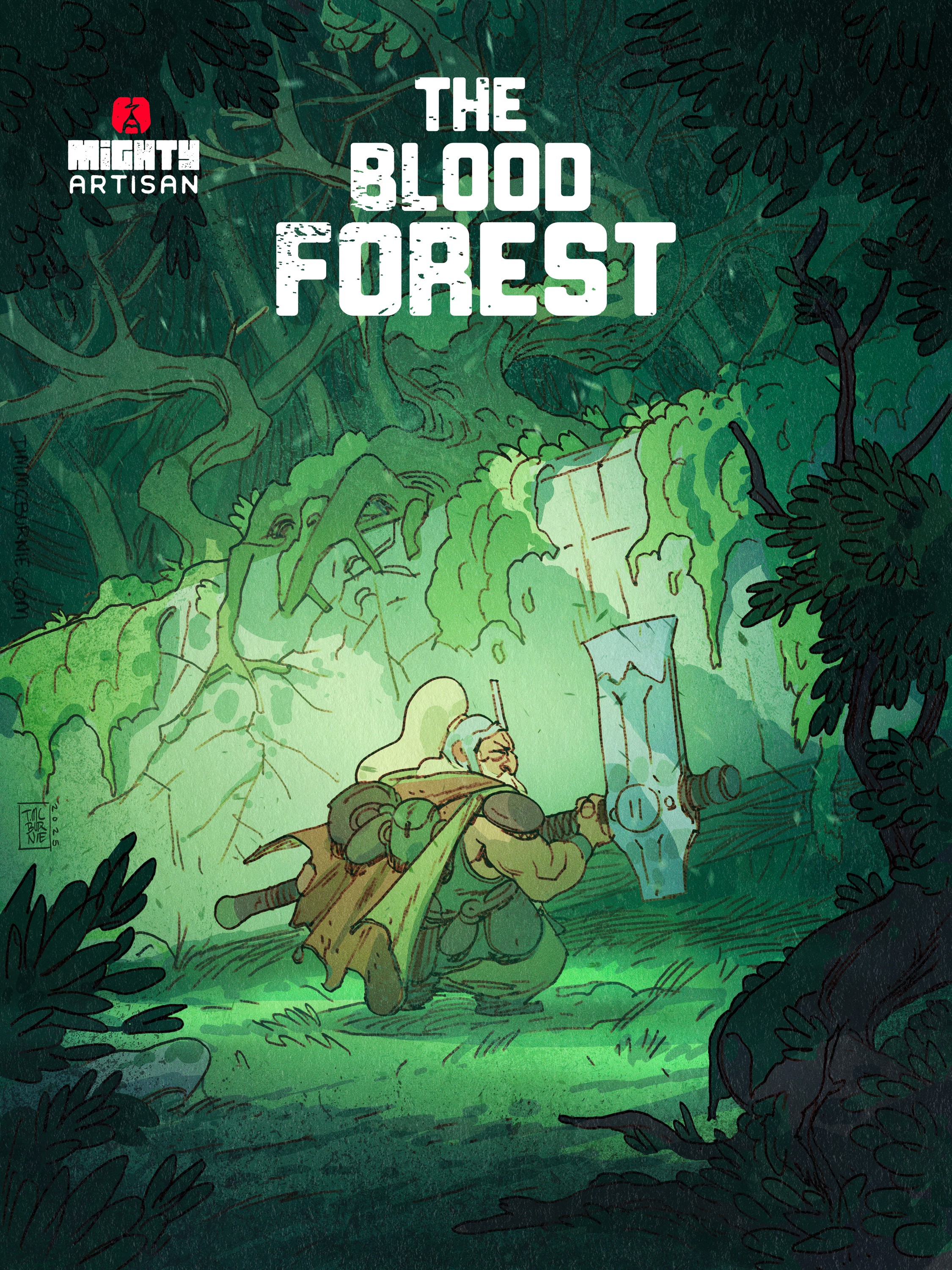
This session walks through a complete fantasy cover illustration in Photoshop: a dwarf adventurer standing before a crumbling megalithic ruin in a forest glade. The piece moves from a rough thumbnail sketch through construction, ink-style linework, flat color, and atmospheric finishing passes, all in a single real-time sitting using a line and color process adapted for concept art.
The page below lays out the full step-by-step of the piece. How the composition takes shape from a phone-photo thumbnail, how the linework locks silhouettes before any detail goes in, how simple flat colors leverage those same lines as ready-made selections, and how atmosphere layers build depth and light into a finished concept art image.
Thumbnails and Composition
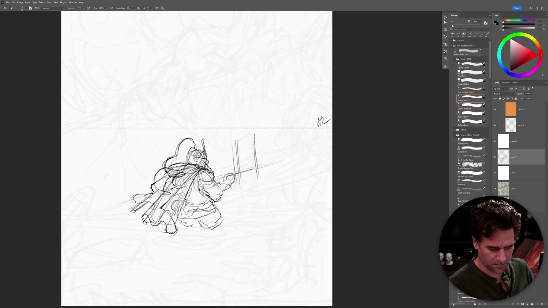
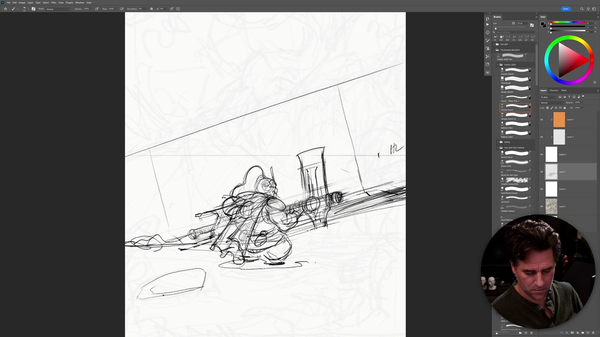
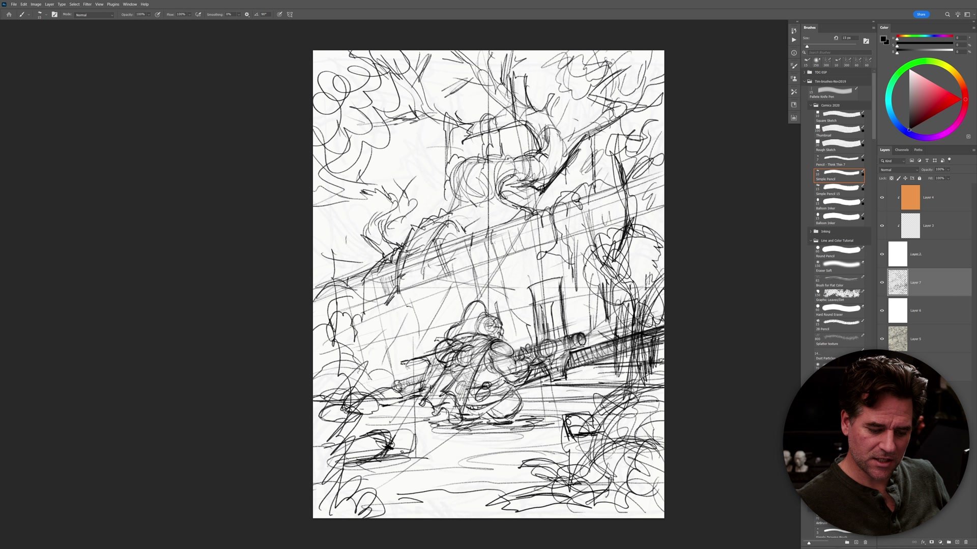
The session opens with a small thumbnail sketched from several rough options, all exploring 80s fantasy and D&D-inspired imagery. The chosen composition centers a dwarf figure in front of a fallen stone structure, surrounded by dense forest with massive roots breaking through the ruins. At this stage, the decisions are strictly spatial: where the horizon line sits, how the character relates to the ruins in scale, and how foreground foliage will frame the scene without creating confusing overlaps.
Tangent management starts early. The ruins need to read as massive without overlapping the character in ways that flatten the depth. Roots and overgrown foliage build into the foreground to create separation between planes. Informal composition lines (a Loomis technique mentioned during the sketch) help organize elements along loose diagonals, and the resulting alignments give the image a subtle structural logic even at the rough stage. The sketch stays rough deliberately. No finished drawing information goes in at this point. The thumbnail exists to plan where things go, to establish the spatial relationships that everything else will build on, and to confirm that the depth reads before any time gets spent on detail.
Linework and Silhouettes
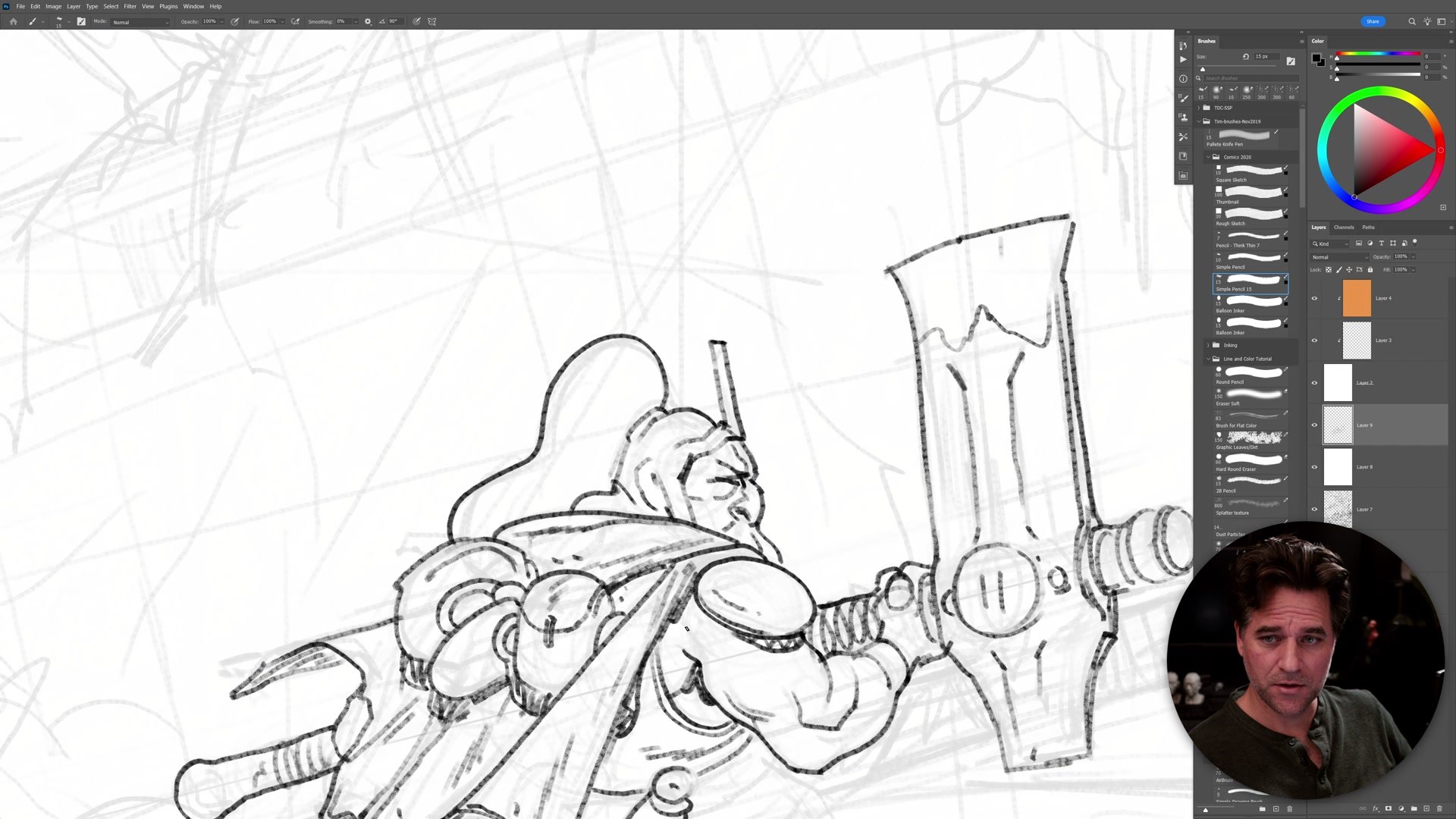
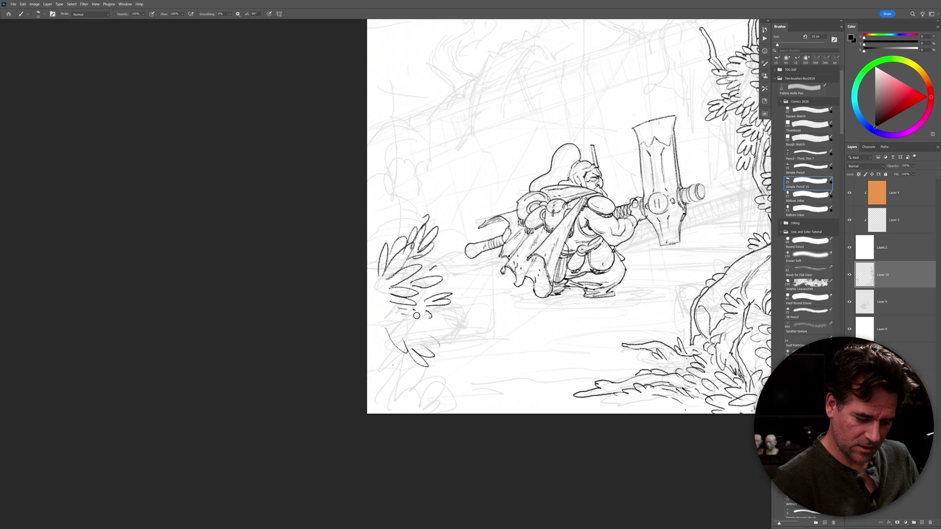
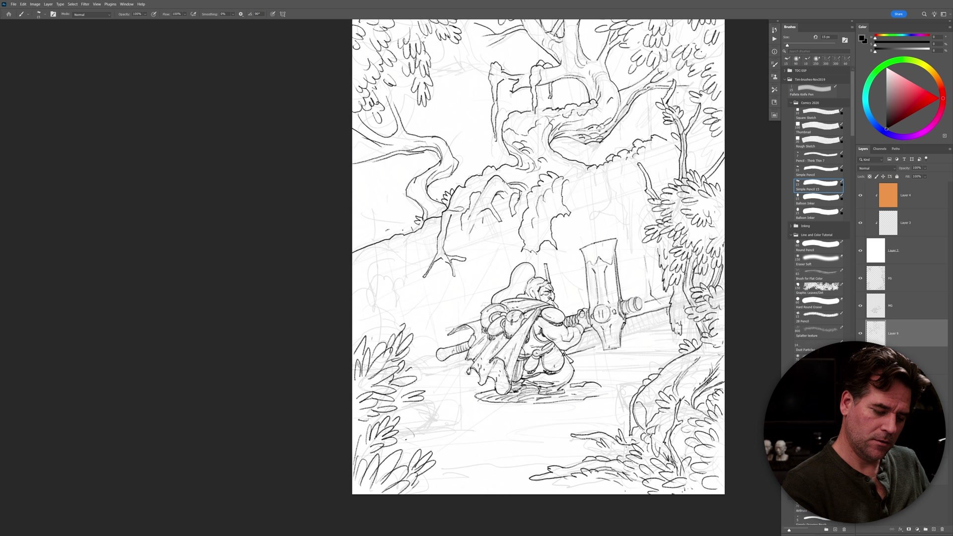
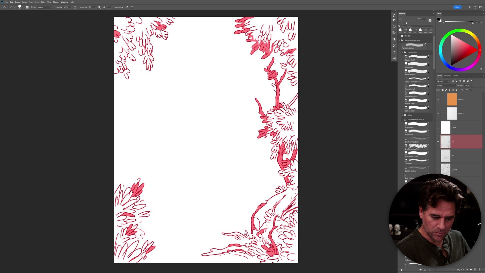
A semi-transparent white layer drops over the thumbnail and the linework phase begins. The approach is closer to concept art sketching than traditional inking. Line weight carries most of the visual hierarchy: thicker strokes define the character's outer silhouette, while thinner lines handle secondary structure and environment details. Getting this weight difference established early is critical. If the lines go too thin and too detailed, the drawing loses its graphic clarity and time spirals into areas that will not contribute to the final read.
The character's linework locks down first, establishing the pose and key proportions. Environment follows, with leaves, roots, and distant foliage built through simplified shapes rather than literal botanical rendering. The concept art approach here is to focus on what will actually read at viewing distance: spend time on the silhouette, suggest detail where it matters, and leave the background deliberately loose. Foreground elements receive the most line complexity because they carry the most visual weight. Background forms stay suggestive, creating depth through progressive reduction of information rather than trying to render every branch and leaf individually.
Flat Color and Palette
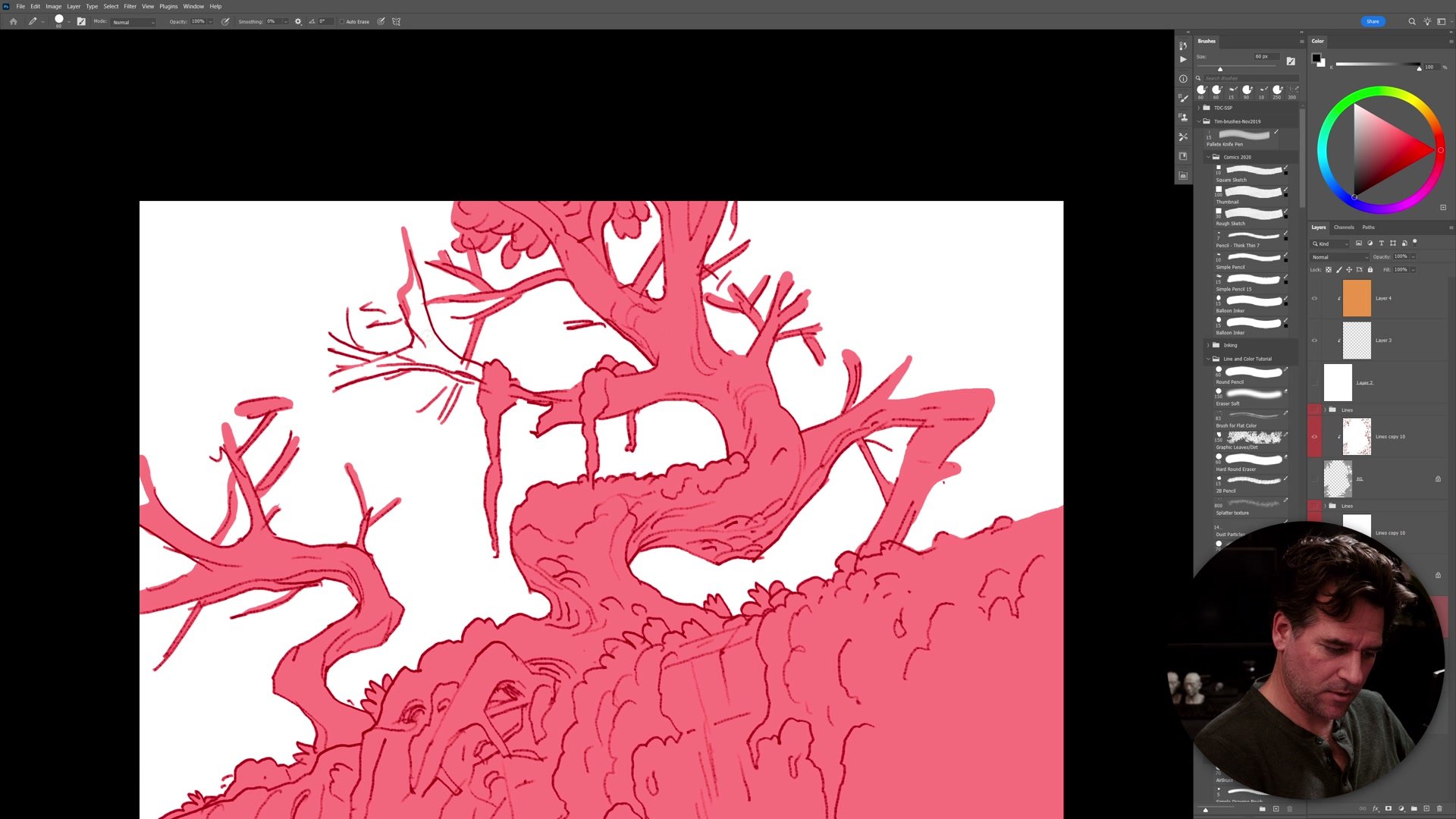
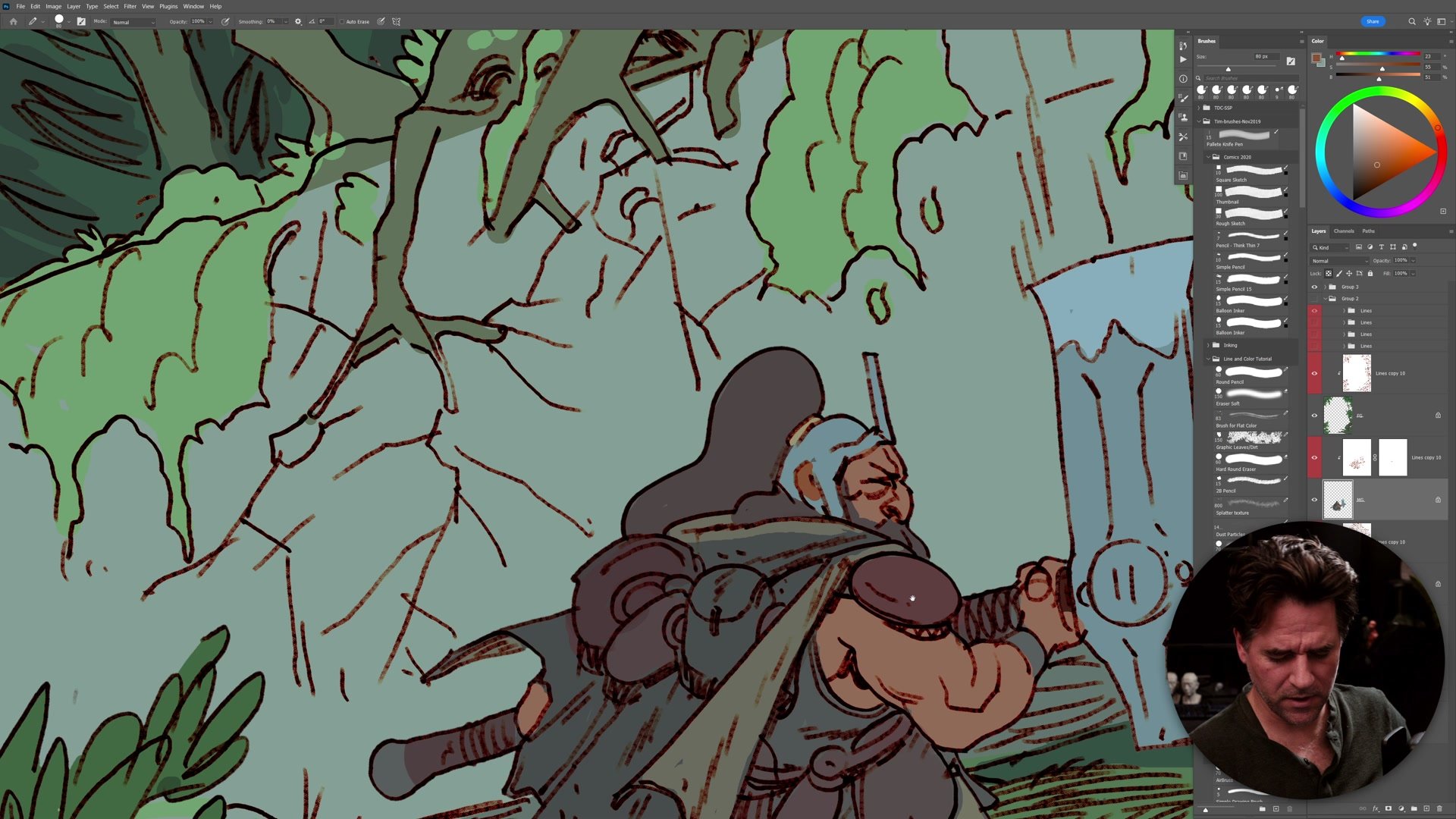
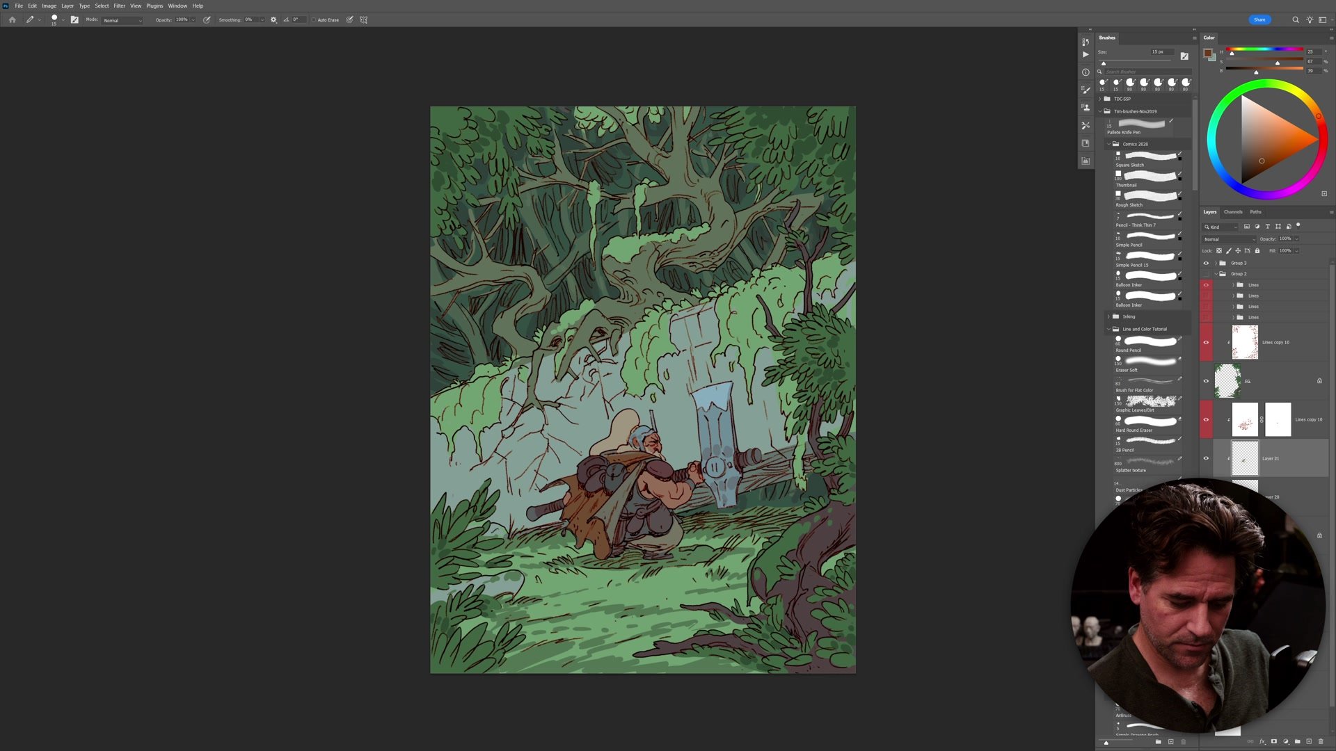
With the lines complete, the flatting process starts. Because the linework created closed (or near-closed) outlines, Photoshop's selection tools can isolate each region quickly. This is one of the core strengths of the line and color process for concept art: the drawing phase already defined every edge, so the color phase can leverage those edges as ready-made selections rather than painting freehand masks.
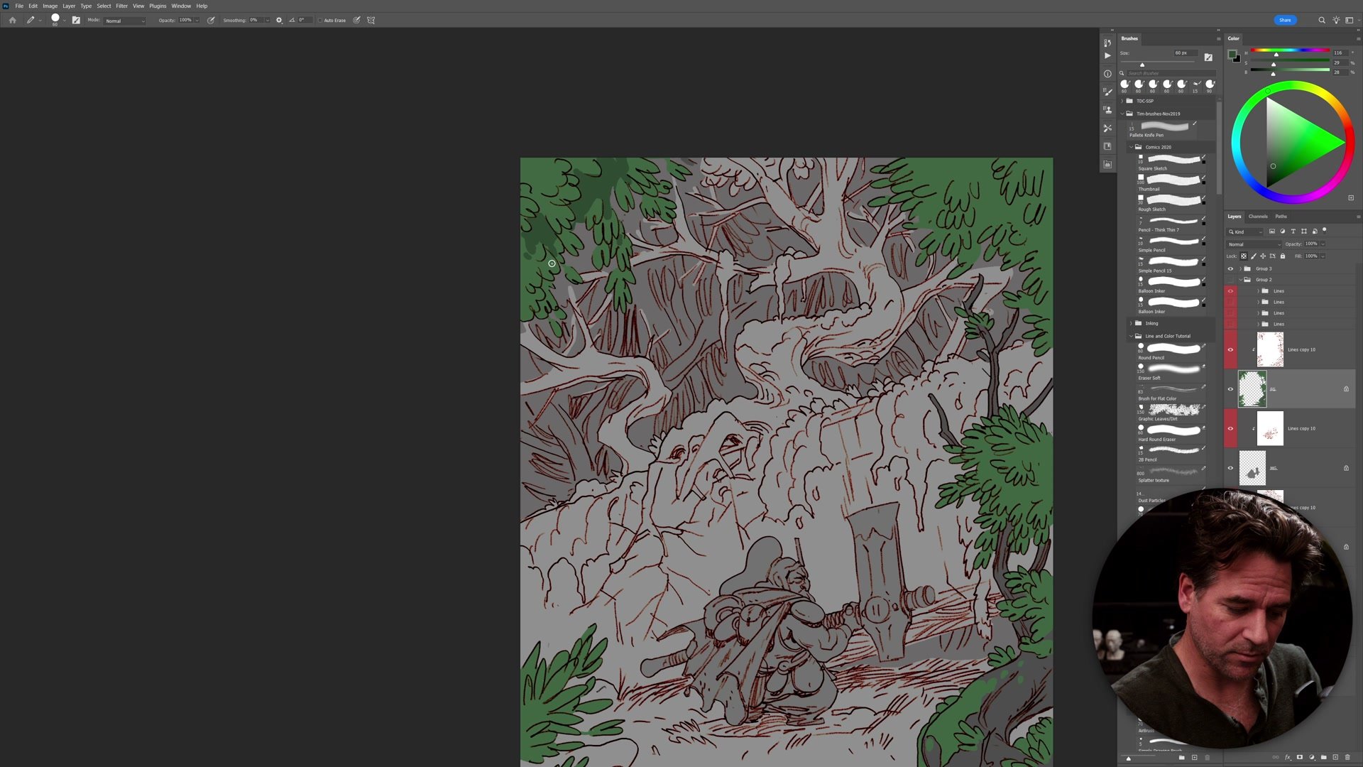
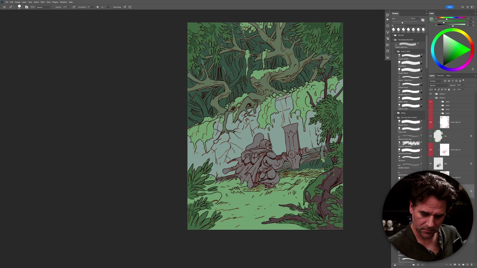
Color decisions begin with the obvious. A forest is green. Starting with what is already known, rather than hunting for a high-concept color scheme, keeps momentum going. The greens go in across the canopy and foliage first. The character receives a muted, sepia-leaning palette to sit comfortably within the environment without competing with the surrounding landscape. Brush opacity stays at 50% for most of this phase, treating the flat colors like a transparent wash that allows natural blending at overlaps. Skin tone, hair, and cape colors all get placed roughly and then adjusted with Hue/Saturation as compositional decisions rather than pre-planned swatches. The approach treats color as something to discover through the process rather than something that needs to be locked down in advance.
Atmosphere and Finishing
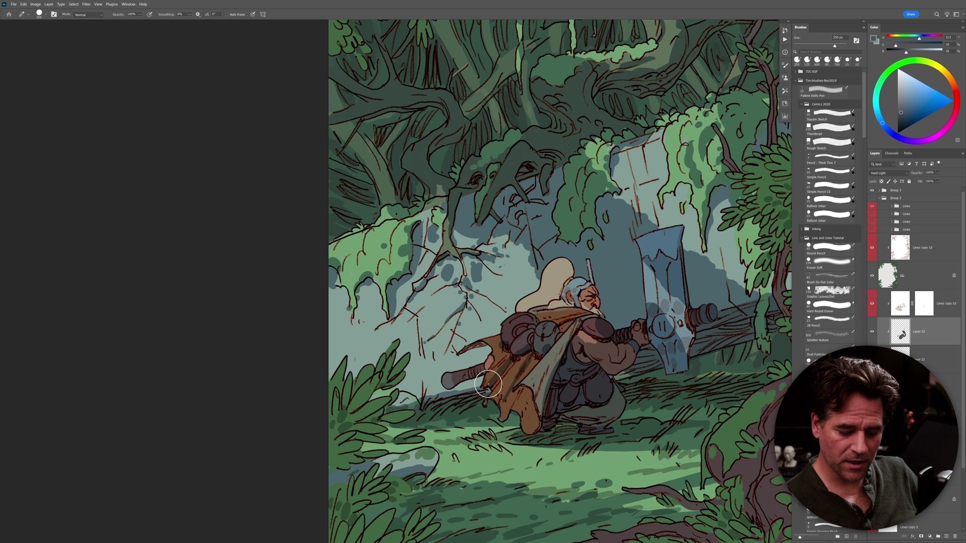
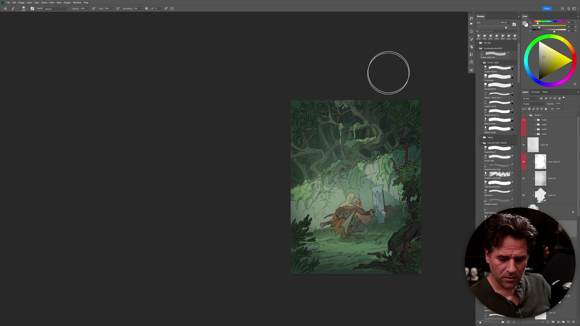
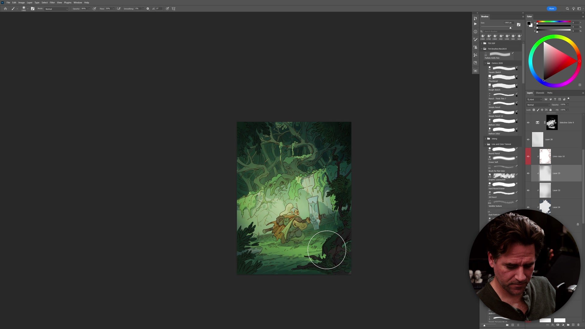
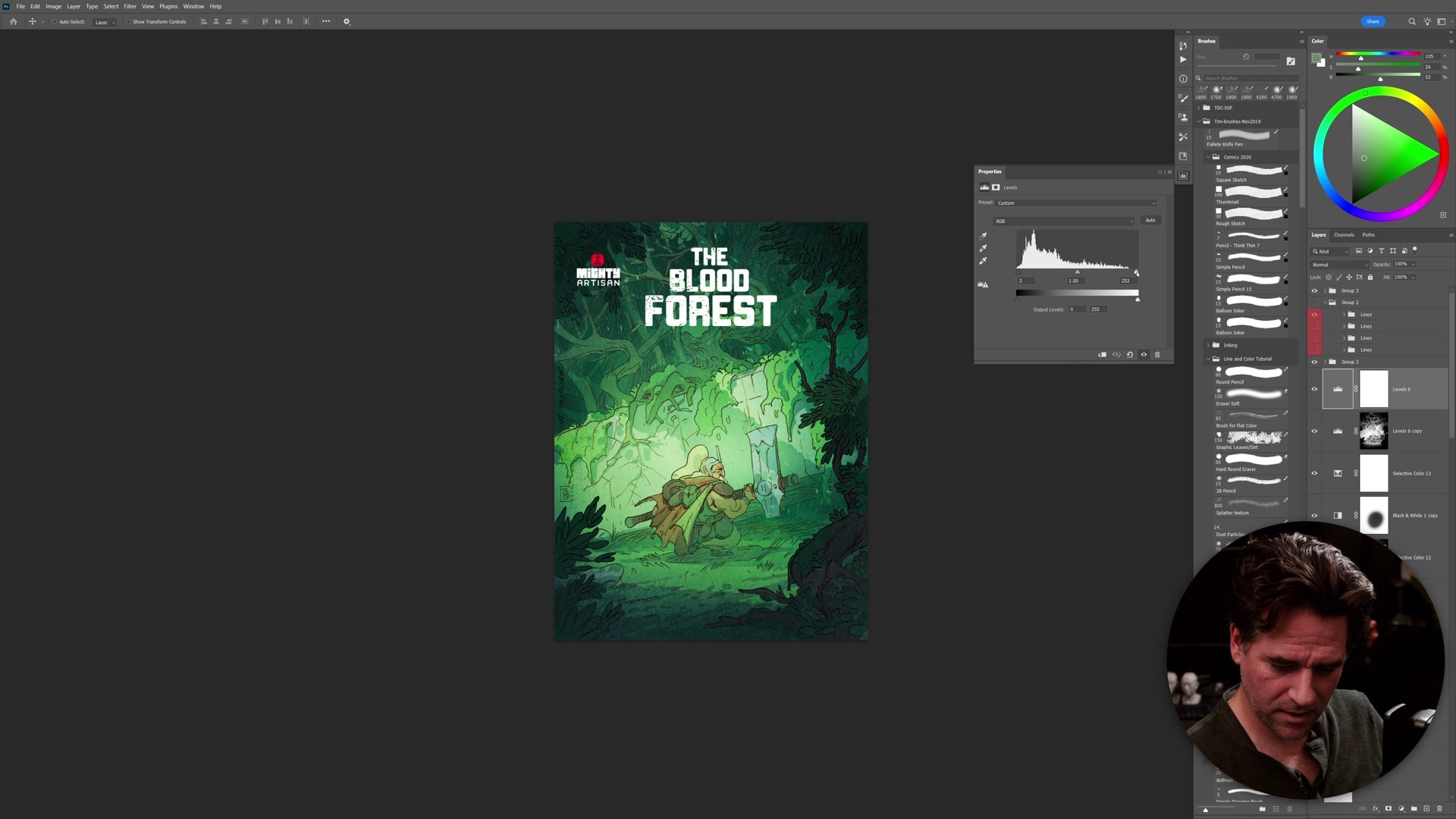
The final phase adds atmosphere layers to separate the depth planes. Cool, semi-transparent shadow passes go between the foreground, middle ground, and background, pushing distant elements back and pulling the character and near foliage forward. A single large shadow across the upper portion of the scene suggests a dense canopy overhead, filtering light down into the glade where the character stands.
Hard light and overlay layers introduce warmth, simulating light breaking through the trees behind the character. A lasso tool builds irregular light shapes that feel more organic than a smooth gradient. The foreground gets its own darkening pass to push the framing elements further from the lit middle ground, strengthening the sense of depth between planes. Final touches include a paper texture layer dragged from a previous cover illustration, adding surface grain that unifies the linework and flat color into a single coherent surface. Contrast curves, set to luminosity mode to avoid pumping saturation, dial in the focal point and complete the piece.
Session Principles
Silhouettes Before Detail: The linework phase focuses on overall silhouette shapes and readable contours before any interior detail goes in. This keeps the drawing functional at every scale and prevents time from disappearing into areas that will not contribute to the final read.
Start Color With What You Know: Rather than planning a complete color scheme in advance, the session starts with what is obvious (green forest, sepia character) and adjusts from there. Digital tools make color changes cheap after the fact, so getting something down beats getting it right on the first stroke.
Atmosphere Separates Planes: Simple semi-transparent layers between foreground, middle ground, and background accomplish more for depth than detailed rendering. A cool shadow pass plus a warm light overlay transforms flat color into environmental space.
Line and Color as Concept Art: The same process used for comic illustration adapts to concept art by treating line weight as the primary hierarchy tool and keeping color passes fast and loose. The linework phase creates all the selections the color phase needs.