Nail Your Colour Scheme With Thumbnails
Summary
Planning Color With Thumbnails
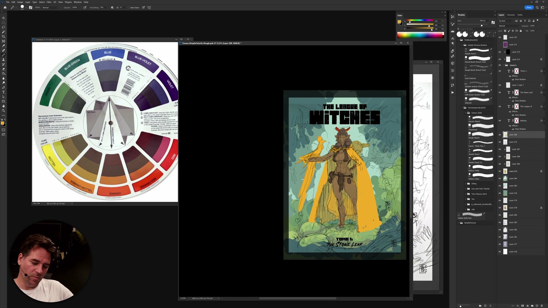
One of the biggest challenges in creating a finished illustration is choosing a color scheme that supports the mood and composition. The temptation is to dive straight into rendering, but without a color plan, the results feel disconnected. Color thumbnailing solves this by letting artists experiment with different schemes at a rough, low-commitment stage before any detail work begins.
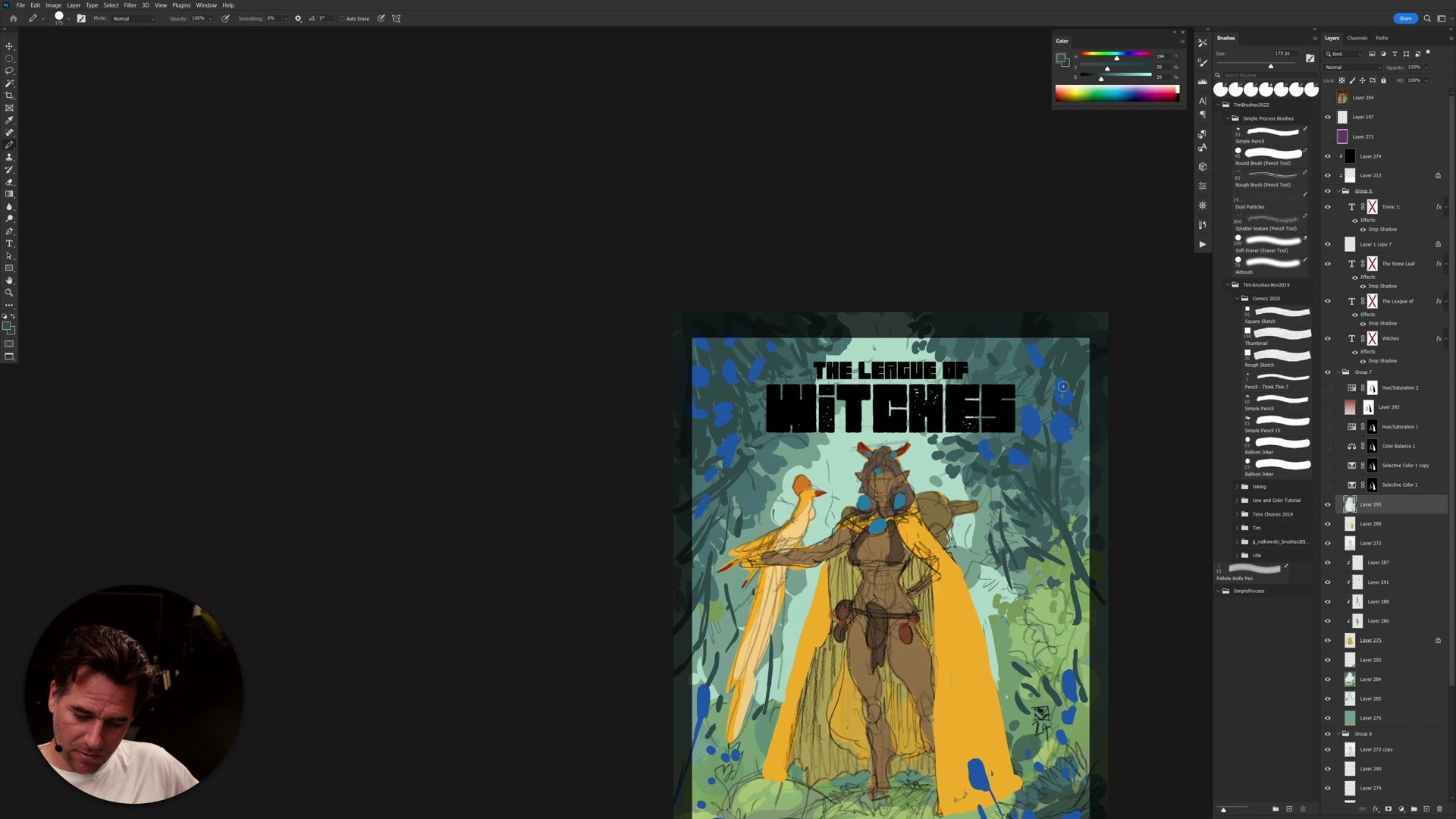
This tutorial walks through the color thumbnailing process for a cover illustration called "The League of Witches." Using simple color theory and flat color blocking in Photoshop, multiple color scheme variations are explored to find what works before committing to a final direction. This is Part 1 of a multi-part series covering the full illustration process.
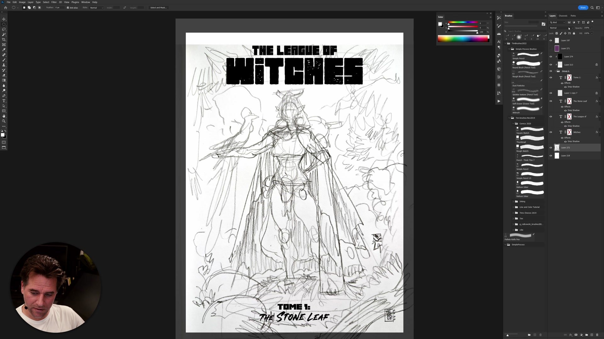
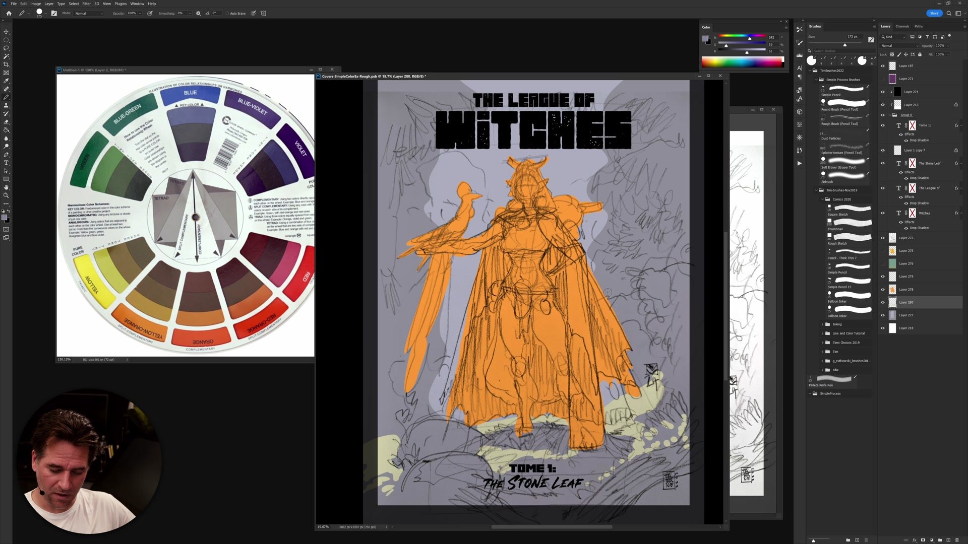
Rough Sketch and Setup
Analogous vs Complementary
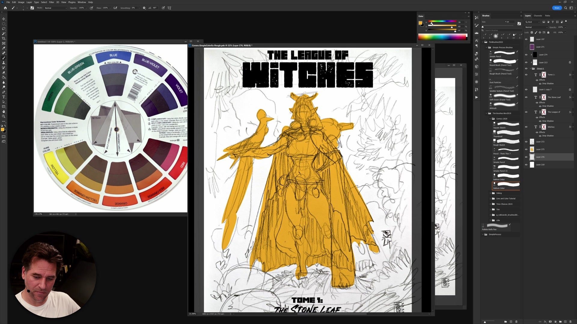
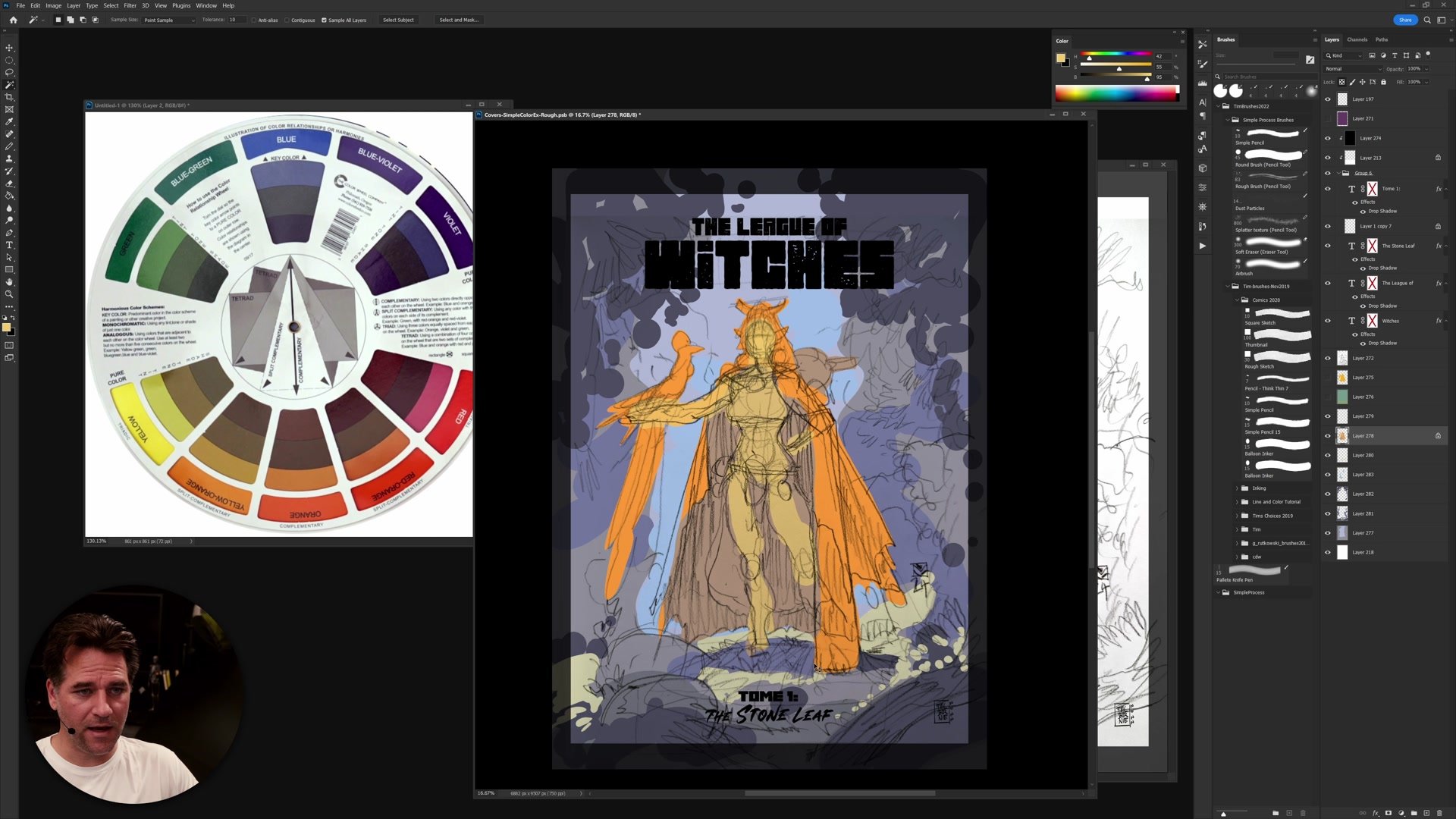
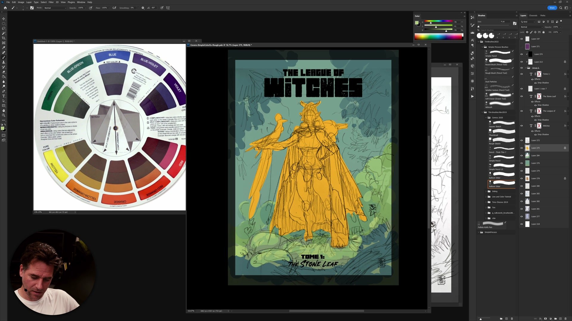
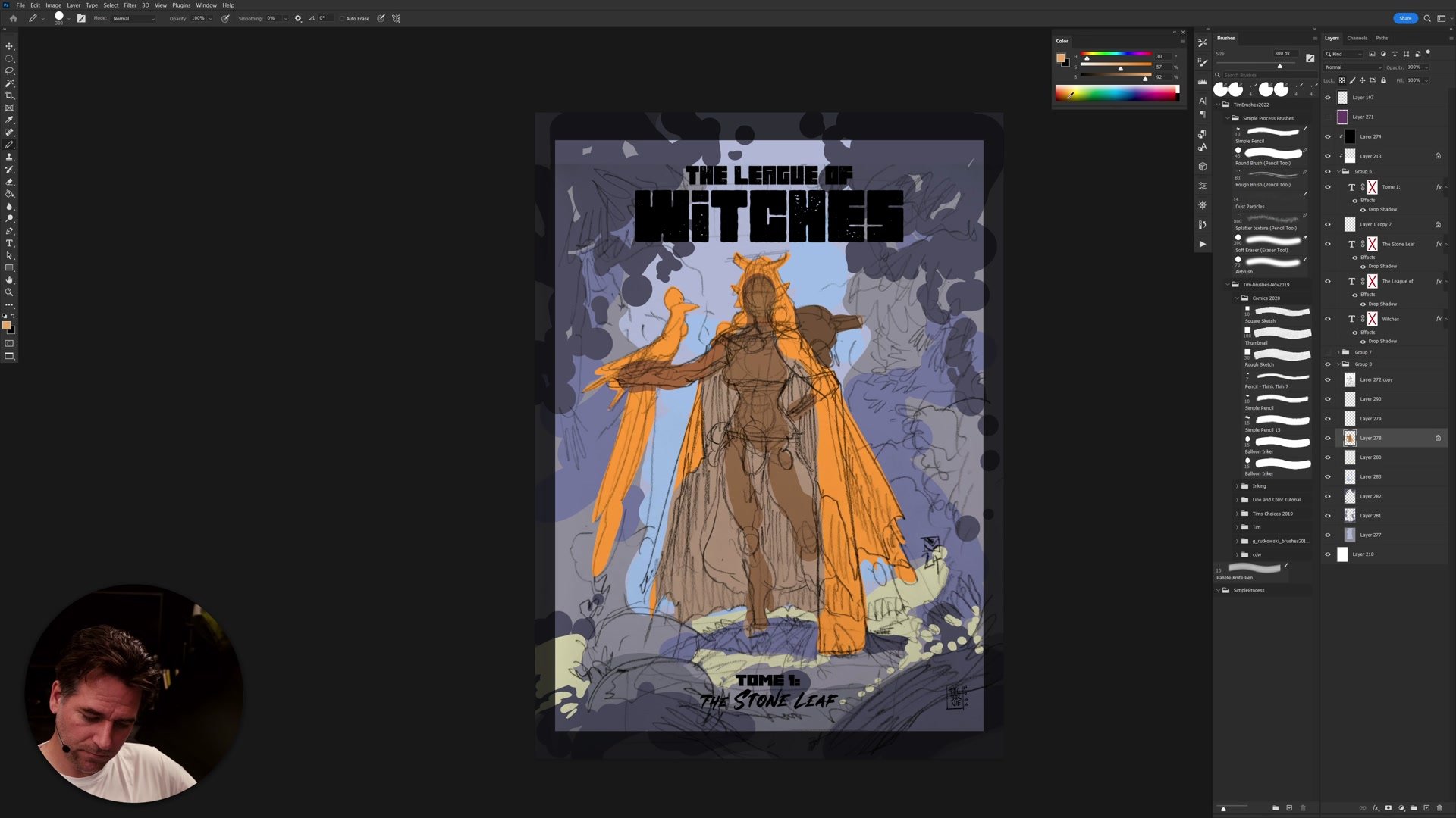
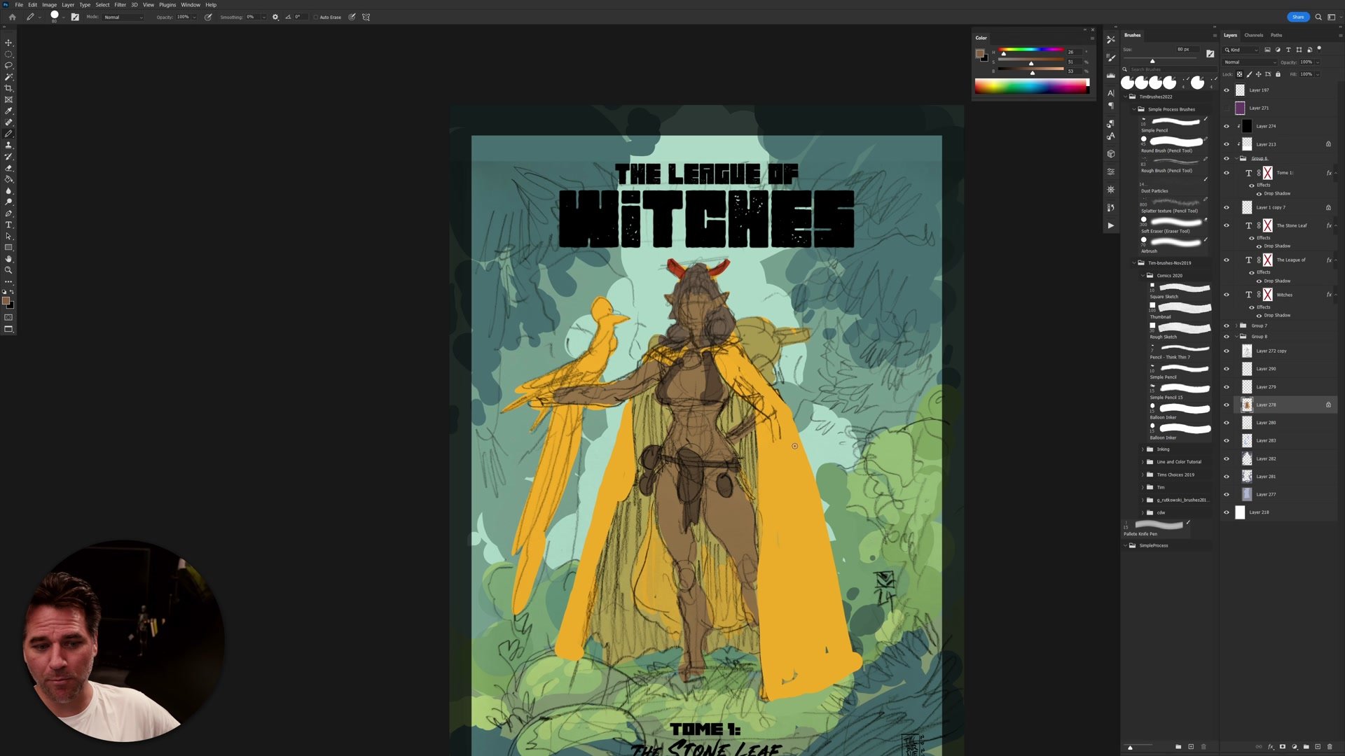
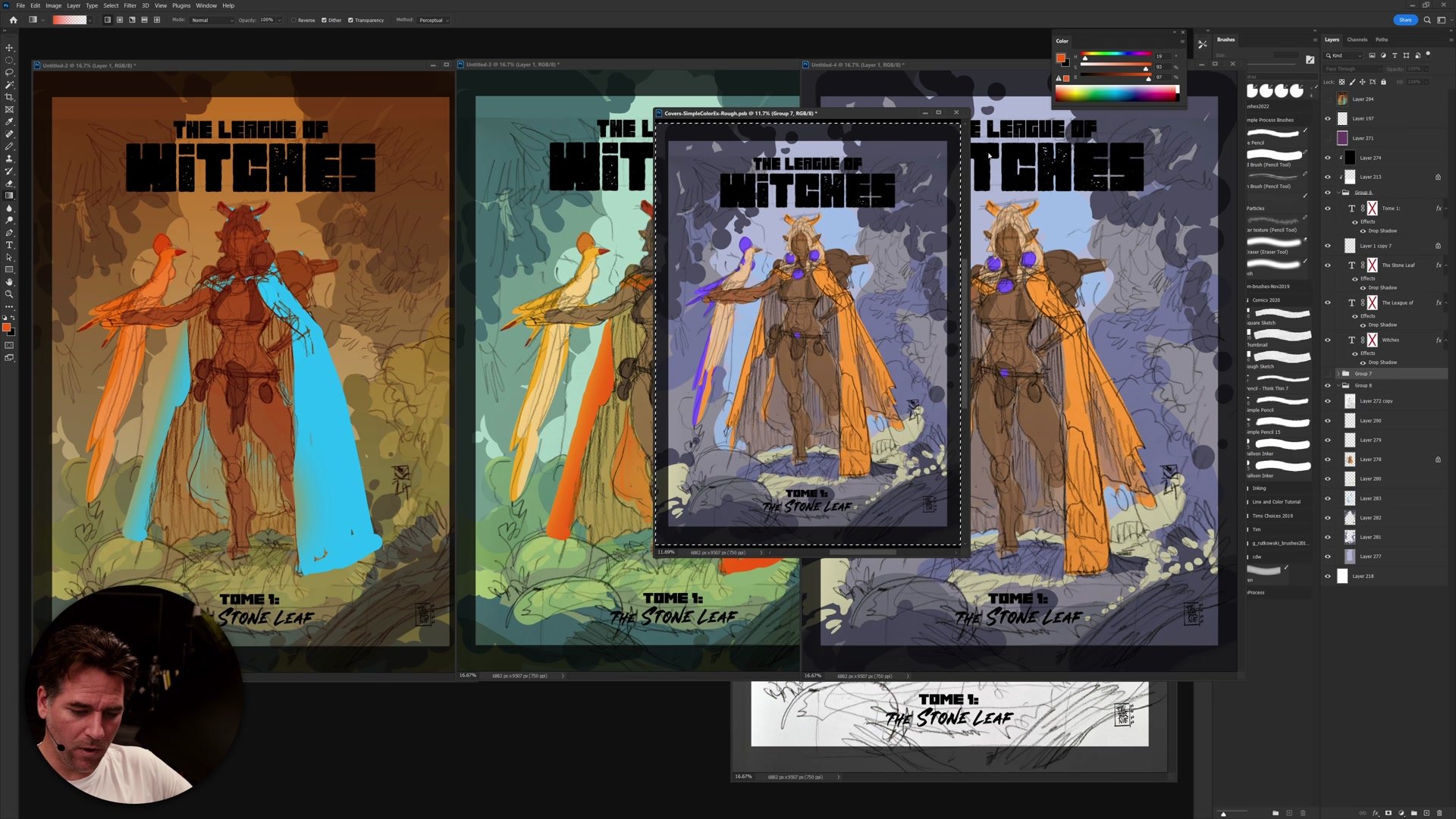
The two core color schemes explored are analogous and complementary. An analogous scheme uses colors next to each other on the color wheel. For a character with a yellow cape in a green forest, analogous is the natural and easiest choice because yellow sits right next to green. Everything stays in the same tonal family and the image reads clearly.
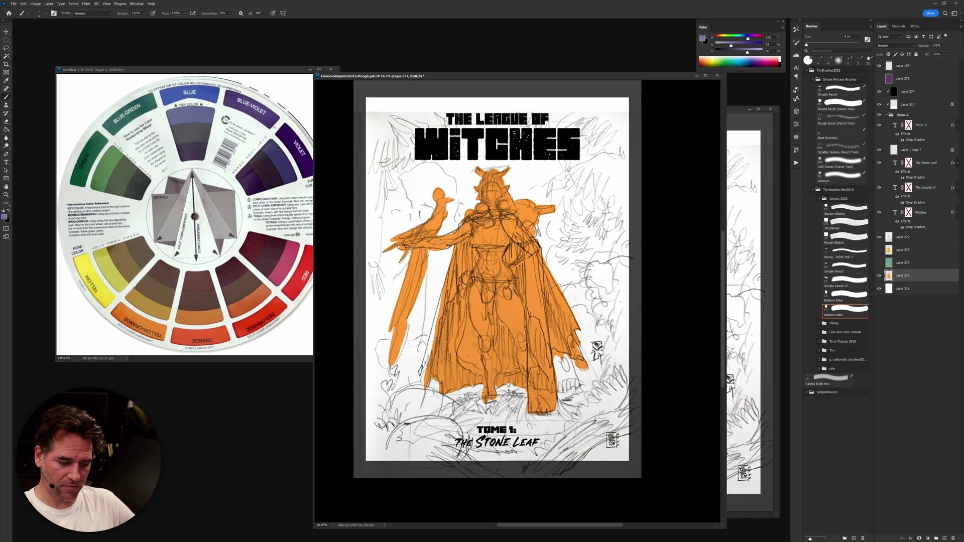
A complementary scheme uses colors opposite on the wheel. Yellow against purple creates a striking, almost fantasy-like atmosphere. The forest can no longer be green in a complementary scheme, which forces creative decisions about desaturated backgrounds and abstract color relationships. This approach takes more confidence but produces a distinctly different mood. The key rule is simple: pick one scheme and commit. Mixing both creates chaos.
Blocking In Color
Flat Color and Experimentation
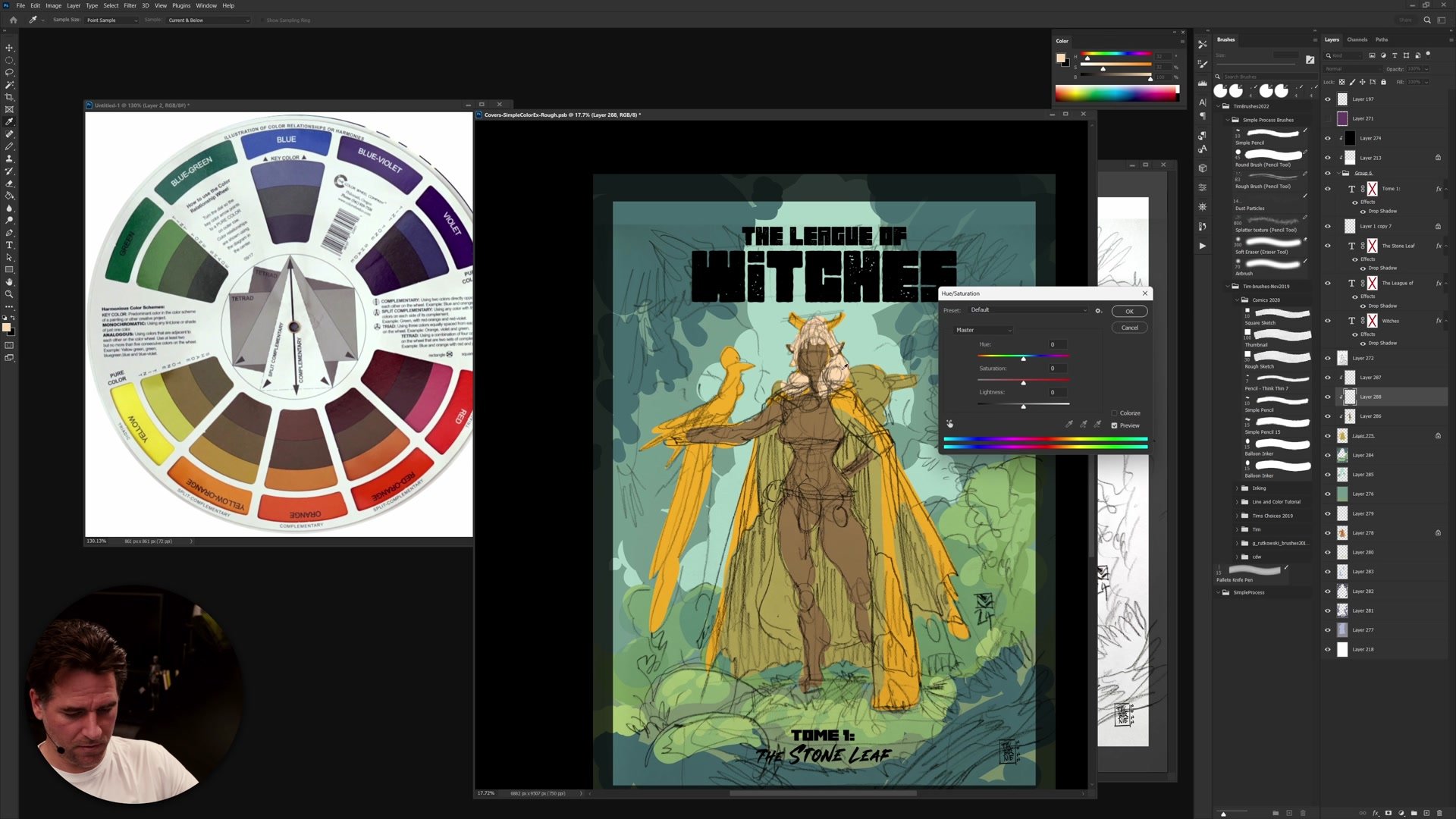
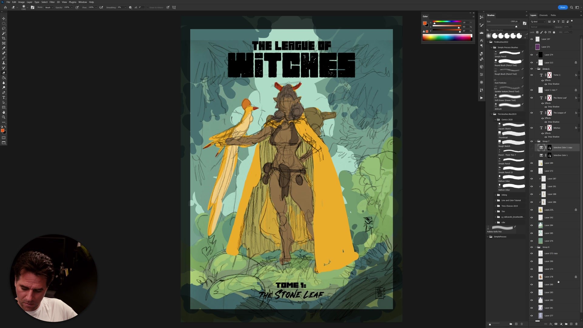
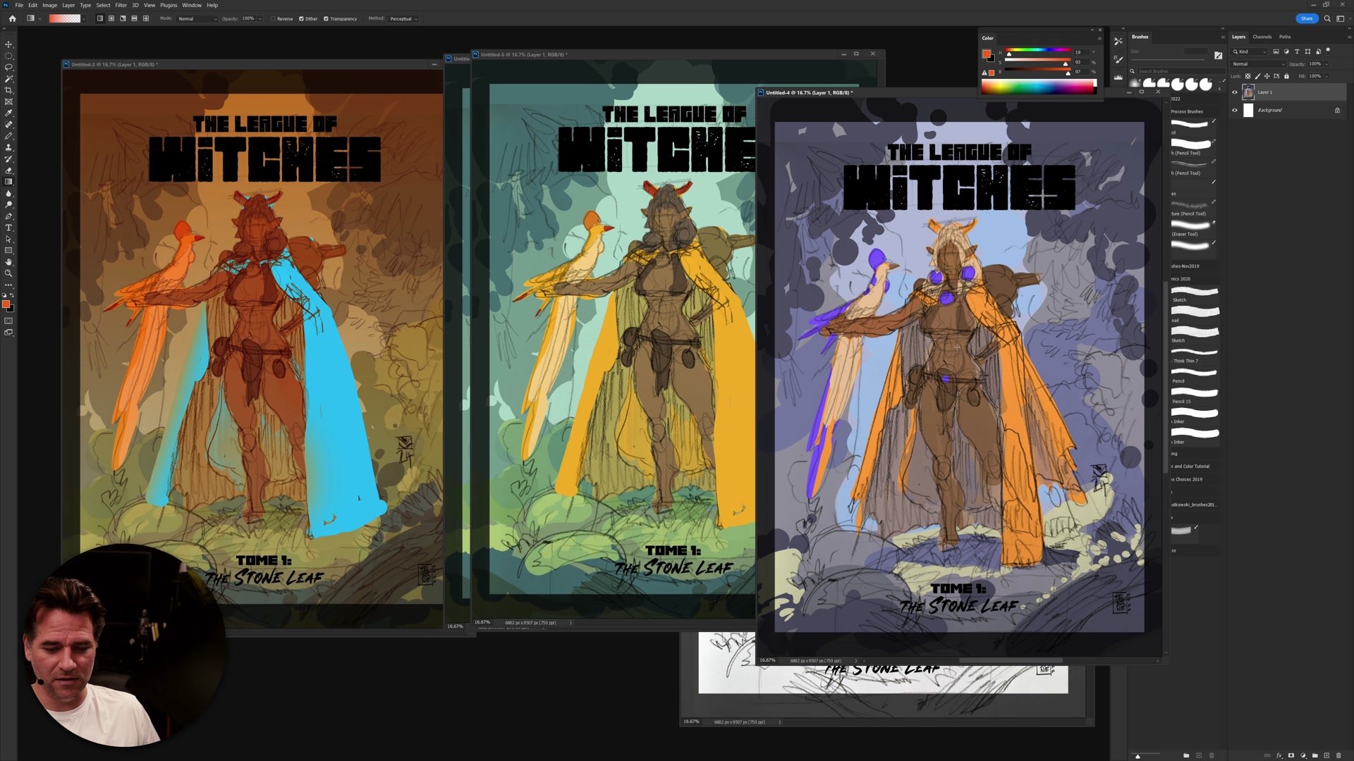
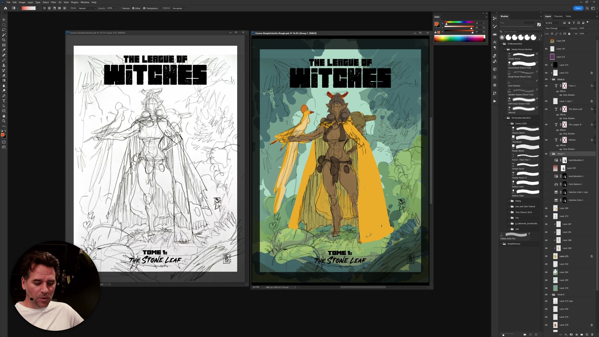
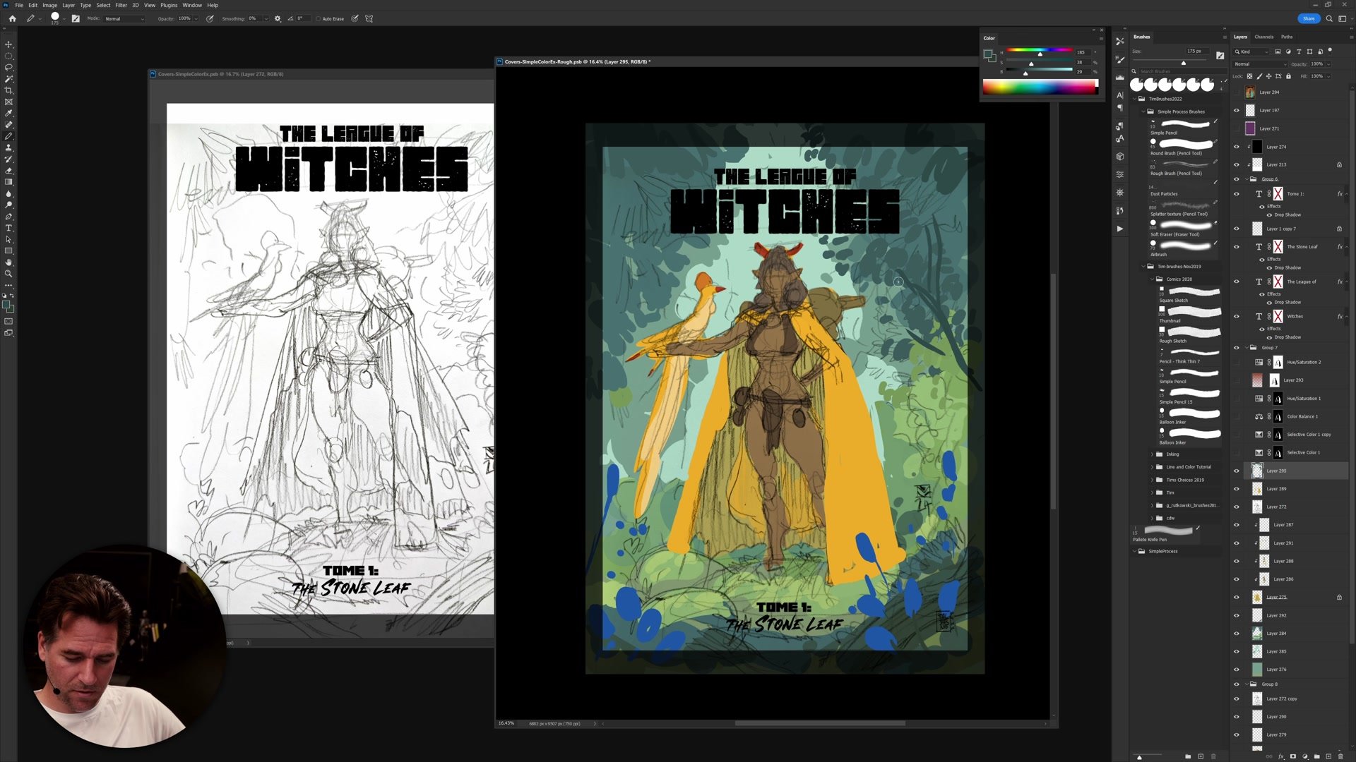
The line and color style makes color experimentation particularly effective. Because everything is blocked in as simple flat color on separate layers, adjustments are fast and non-destructive. Using Ctrl+U (Hue/Saturation) on any layer allows instant exploration of how shifting one element changes the entire image.
Working with the lasso tool and basic flat fills, each element gets its own color layer. The character, cape, background, foreground, and environmental details all sit on separate layers. This means the cape color can be shifted from yellow to red to blue in seconds, and the entire color relationship changes with it. The process is deliberately rough because the goal is evaluating the color scheme at thumbnail size, not rendering detail.
Exploring Variations
Evaluating at Thumbnail Size
The real test of a color thumbnail happens when zoomed out. Evaluating the image at small size reveals whether the color scheme creates visual interest and directs focus to the right areas. A big graphic shape of yellow cape against a muted green forest reads clearly at any size. A complementary purple background creates immediate mood contrast even in miniature.
Multiple variations get created side by side so the options can be compared directly. Some feel natural and fresh, others create weird, creepy, fantasy atmospheres. Neither is wrong, but they serve different purposes. The key insight is that color planning at the thumbnail stage directly influences composition because large areas of saturated color become graphic shapes that guide the eye.
Final Color Comparisons
Key Principles
Start With Simple Schemes: Analogous or complementary color plans give a reliable foundation. Trying to use every color creates chaos. Pick one approach and commit.
Color Affects Composition: Large areas of saturated flat color become graphic shapes. Planning color at the thumbnail stage means planning the visual hierarchy of the entire image.
Use Layers for Speed: Flat color on separate layers allows instant Hue/Saturation shifts. The line and color style is ideal for rapid color experimentation because nothing is blended or rendered yet.
Commit Before Adding Complexity: The color scheme must work at thumbnail size before introducing detail, textures, or secondary color accents. If it does not read at small scale, detail will not save it.
Try This Exercise
Pick a Rough Sketch: Take any thumbnail or rough drawing with a clear focal character and an environment. It does not need to be detailed.
Block In Flat Color: On separate layers, fill the main elements with flat color using the lasso tool. Start with the one element that must be a specific color.
Create Three Variations: Duplicate your layers and create an analogous version, a complementary version, and one experimental variation. Compare them side by side at thumbnail size to see which scheme best supports the mood.