Escaping The Low Contrast Muddy Color Trap
Summary
The Muddy Color Problem
One of the most persistent challenges in illustration is muddy color. Artwork ends up gray, washed out, and lacking vibrancy no matter how much contrast gets pushed. The instinct is to keep dialling up values, darkening shadows and brightening highlights, but the result just looks more forced without actually becoming more interesting. The real breakthrough comes from understanding color temperature, specifically the relationship between warm and cool tones and how they create separation, depth, and visual interest across an image.
This is a journey through years of color theory development, from early work that looked brown and mushy to illustrations that achieve vibrancy through simple temperature manipulation. The progression was not linear. Every time a new style or approach was attempted, the warm and cool fundamentals had to be reassessed and relearned. What emerged was a reliable understanding: temperature contrast is often more important than value contrast when it comes to making artwork feel alive and preventing that dreaded muddy look.
Early Work and Color Challenges
Temperature Over Value
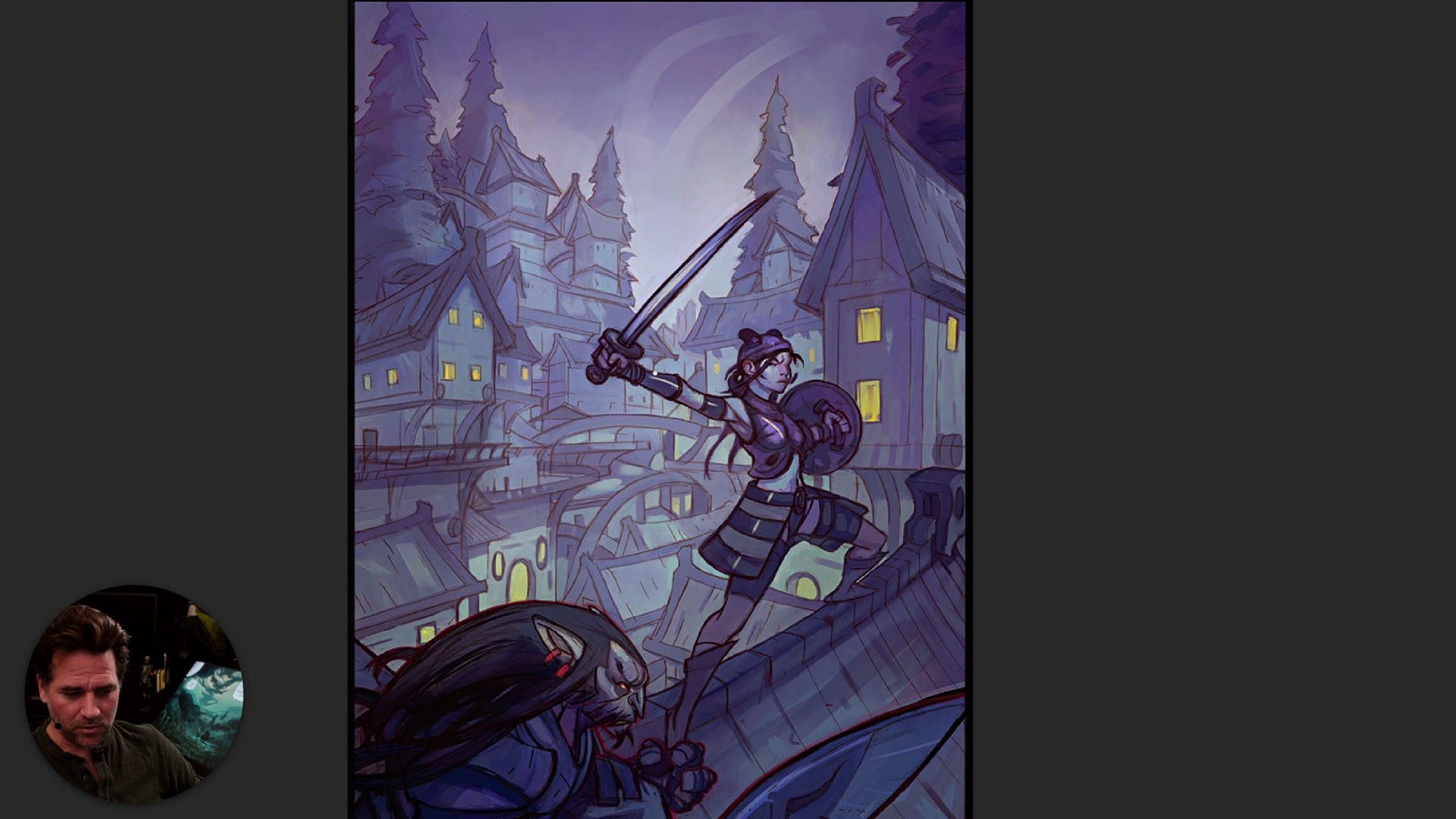
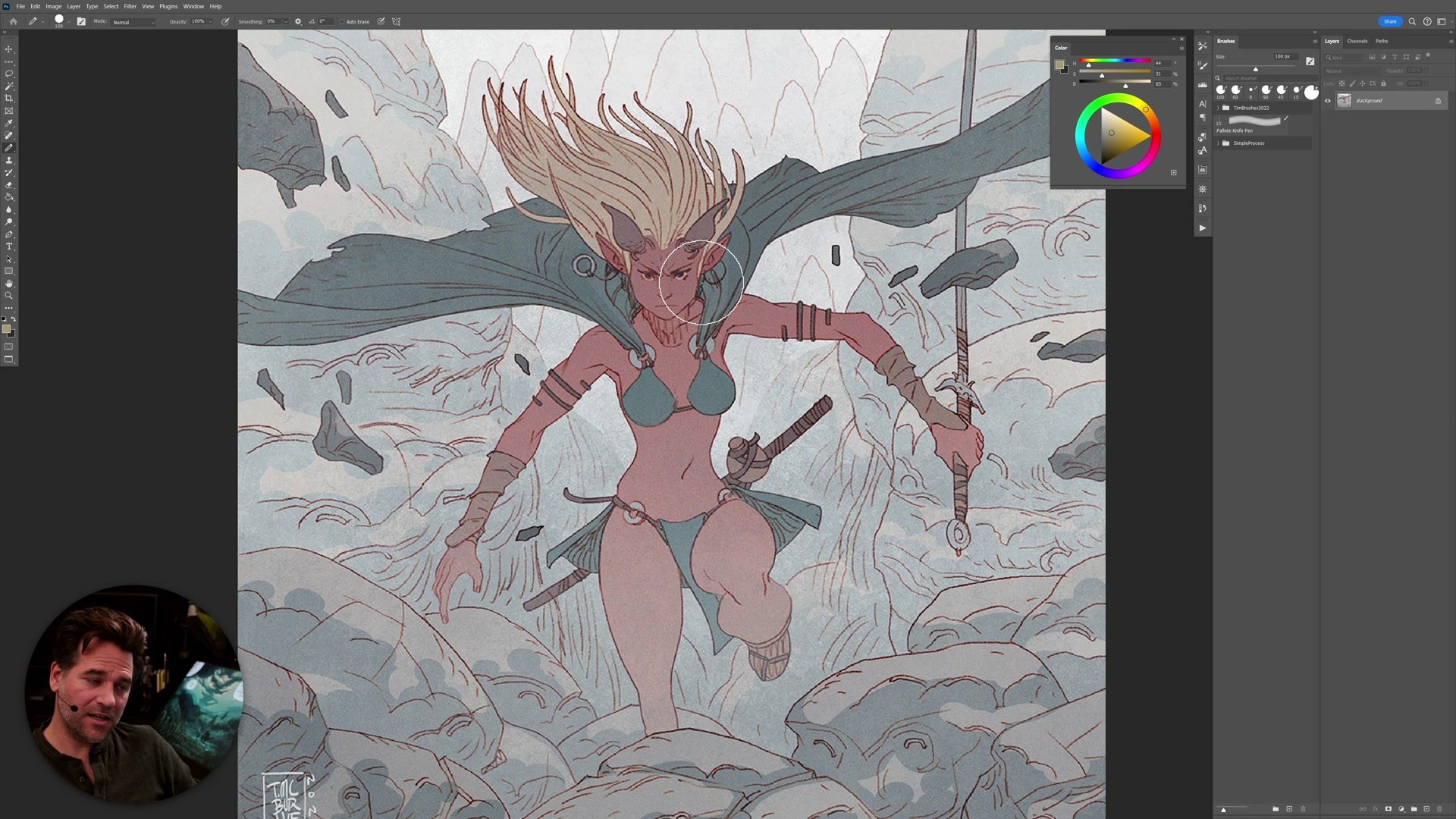
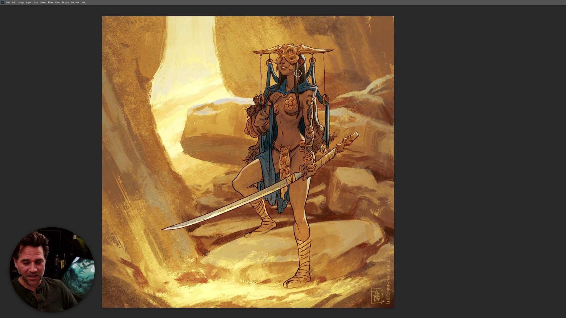
The fundamental shift away from muddy art comes from thinking in terms of warm versus cool rather than light versus dark. When early work fell flat, the instinct was always to push more contrast by making shadows darker and highlights brighter. But this just produces images that look overworked without gaining any real vibrancy. The actual solution is simpler than it sounds: make the shadows cooler and the highlights warmer, push background elements toward blue and foreground elements toward warmer hues, and allow the temperature differential to do the heavy lifting.
In practice, even within a single character, the lit side of a form should sit at a different temperature to the shadow side. The same green on a forest setting becomes cooler in the distance and warmer up close. These are not dramatic changes. Often the hue shift is subtle, just enough to create that vibration between warm and cool that makes an image feel fresh. Understanding this made the difference between a page that looked like everything was the same color and a page that felt vibrant and organized.
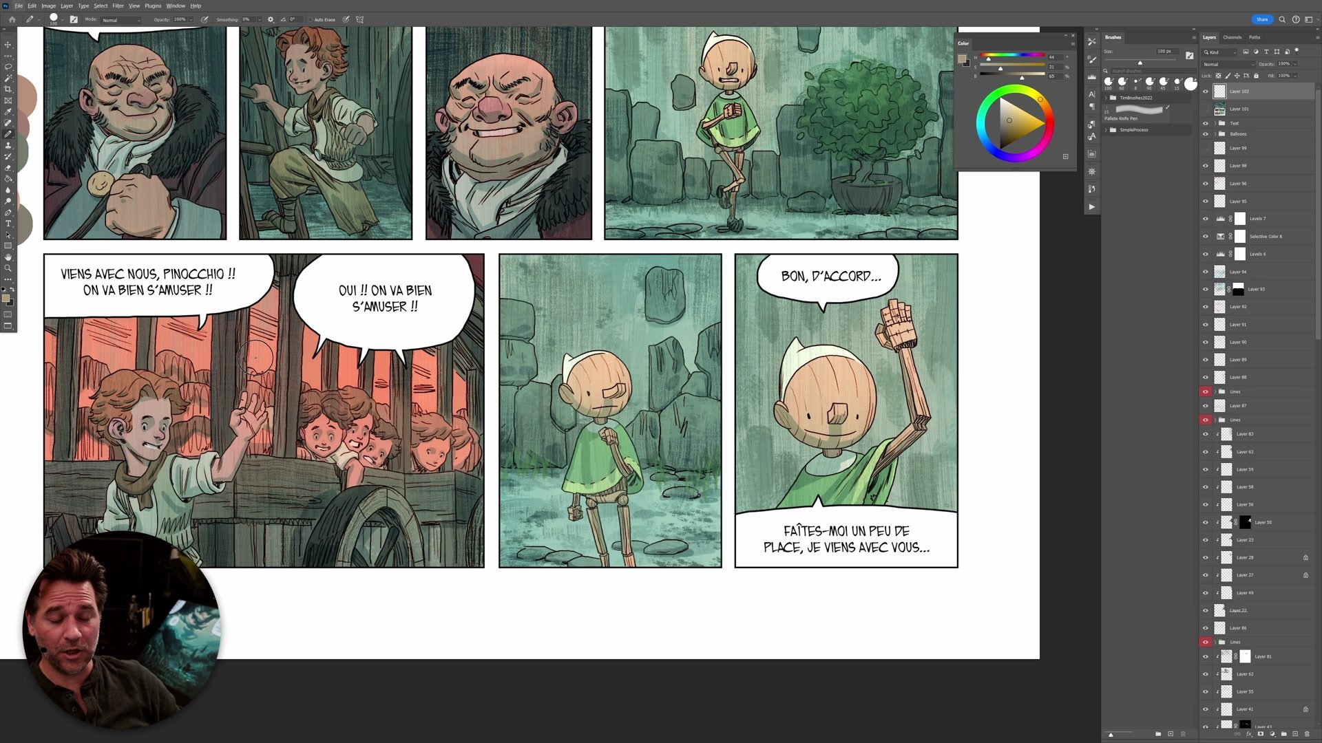
Color Temperature in Comics
Flat Color and Confidence
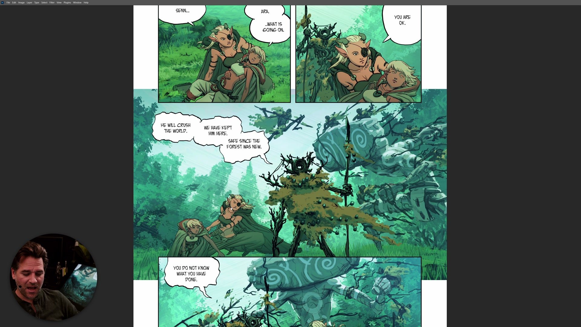
When transitioning from rendered, painterly work to a flat color line-and-color style, the warm and cool challenge appeared all over again. Without the ability to add subtle shadow rendering and atmospheric effects, color had to carry the entire weight of separation and depth. This forced a deeper understanding of how to use pure color relationships rather than relying on value. The key discovery was that vibrancy does not require extreme saturation or wild hue variety. Instead, subtle temperature shifts between foreground and background, between one element and another, create the visual complexity that makes flat color work sing.
A major part of this transition was developing the confidence to be more abstract with color choices. Instead of asking what color something would realistically be, the question became what color would make this image more interesting. Making a background more blue than reality, pushing a character's skin warmer than it should be, or adding a bright engine trail in pure blue against red. These decisions felt risky at first, but they are exactly what separates functional color from color that has real impact and energy.
Warm and Cool in Illustration
Designing For Color
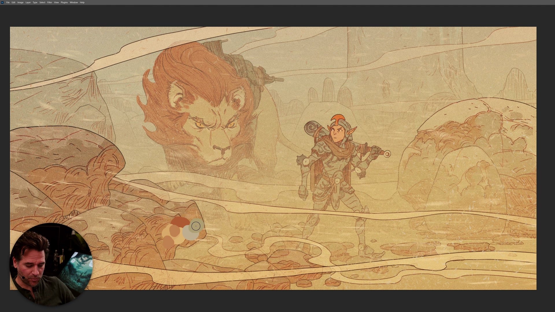
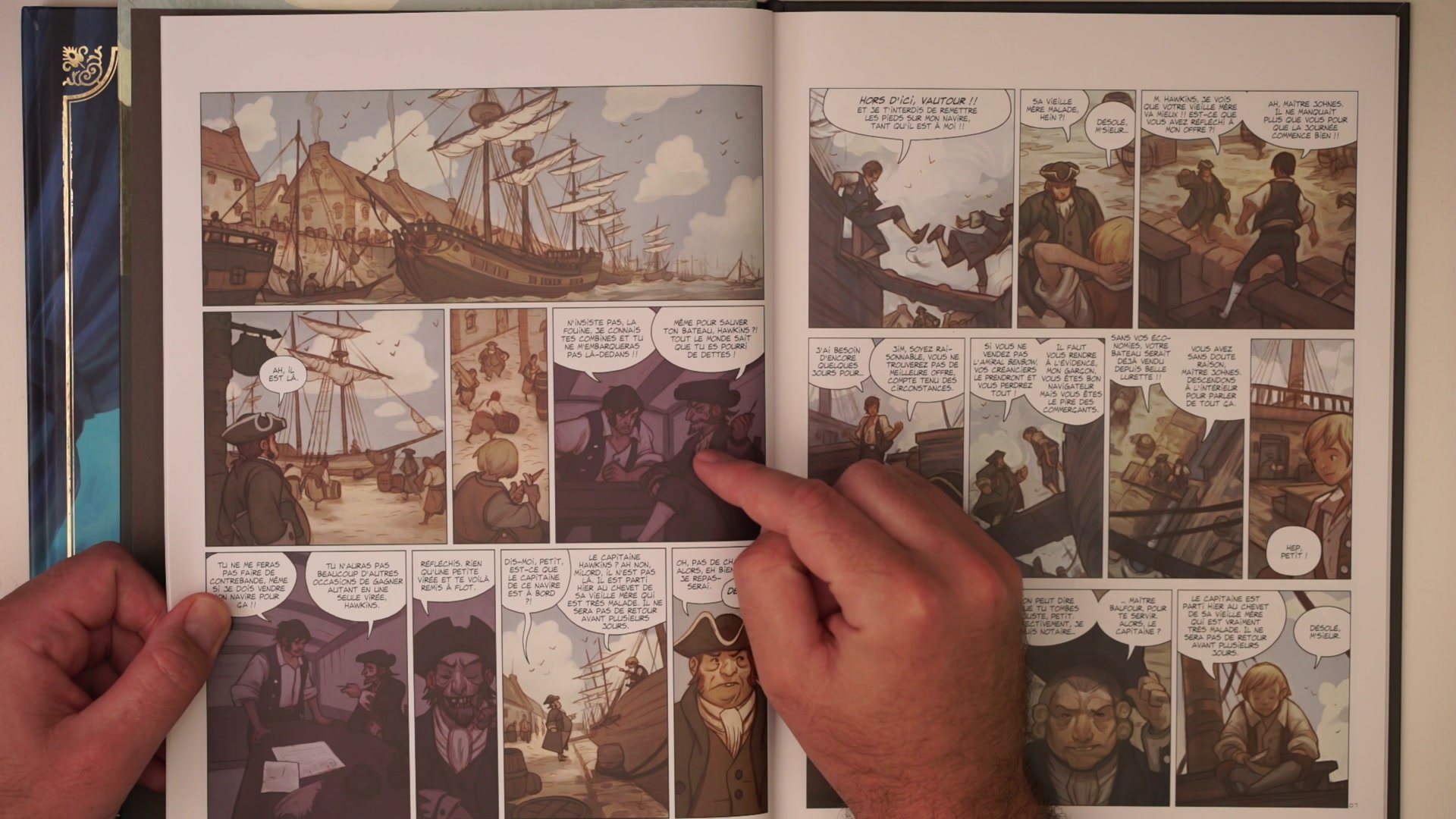
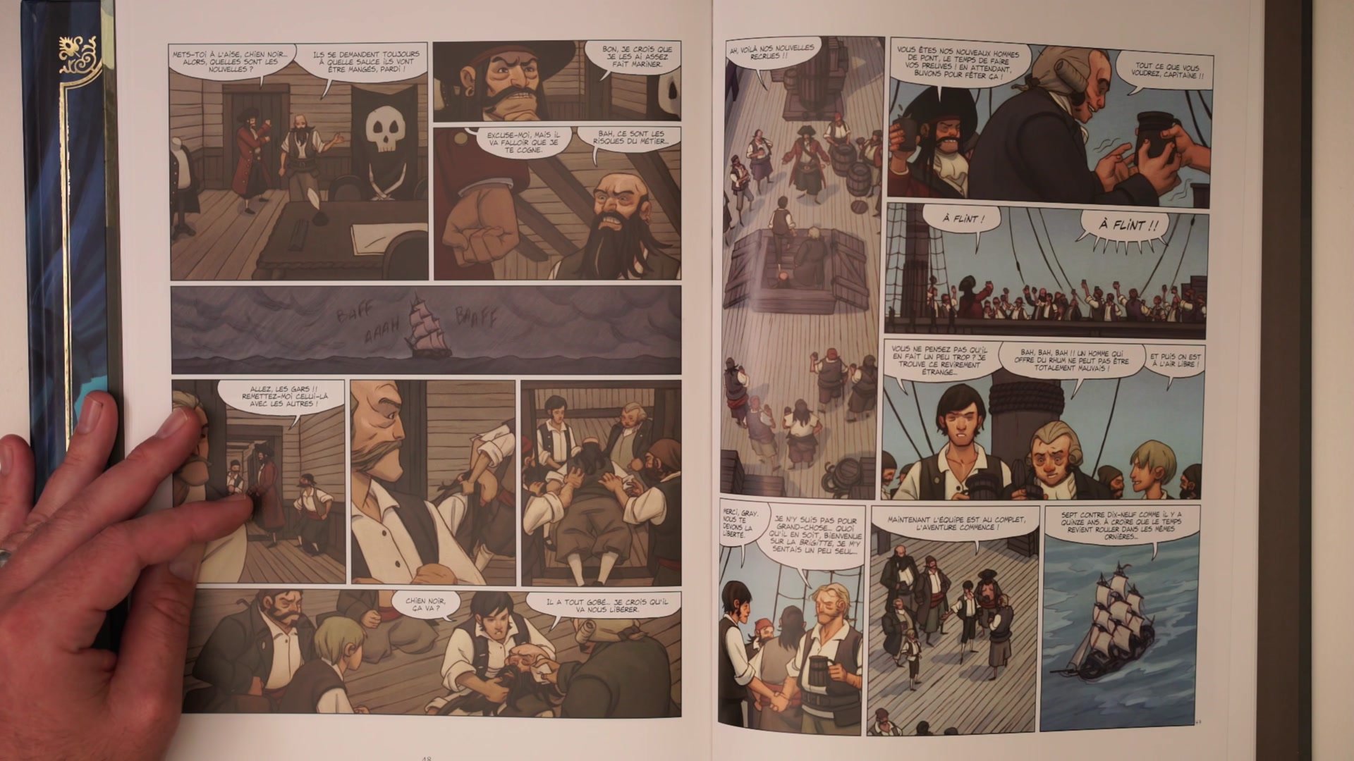
One of the biggest lessons across multiple comic projects was that some settings naturally produce better color than others. A pirate port with blue seas, red sashes, and warm sunlight practically colors itself. But interior scenes, dark hallways, and monotone environments require deliberate planning to avoid the muddy trap. The solution is not to avoid those scenes but to think about color before drawing starts. Doing a color thumbnail first, choosing a temperature plan for the whole page, and designing elements into the scene specifically to create warm and cool foils all make a massive difference.
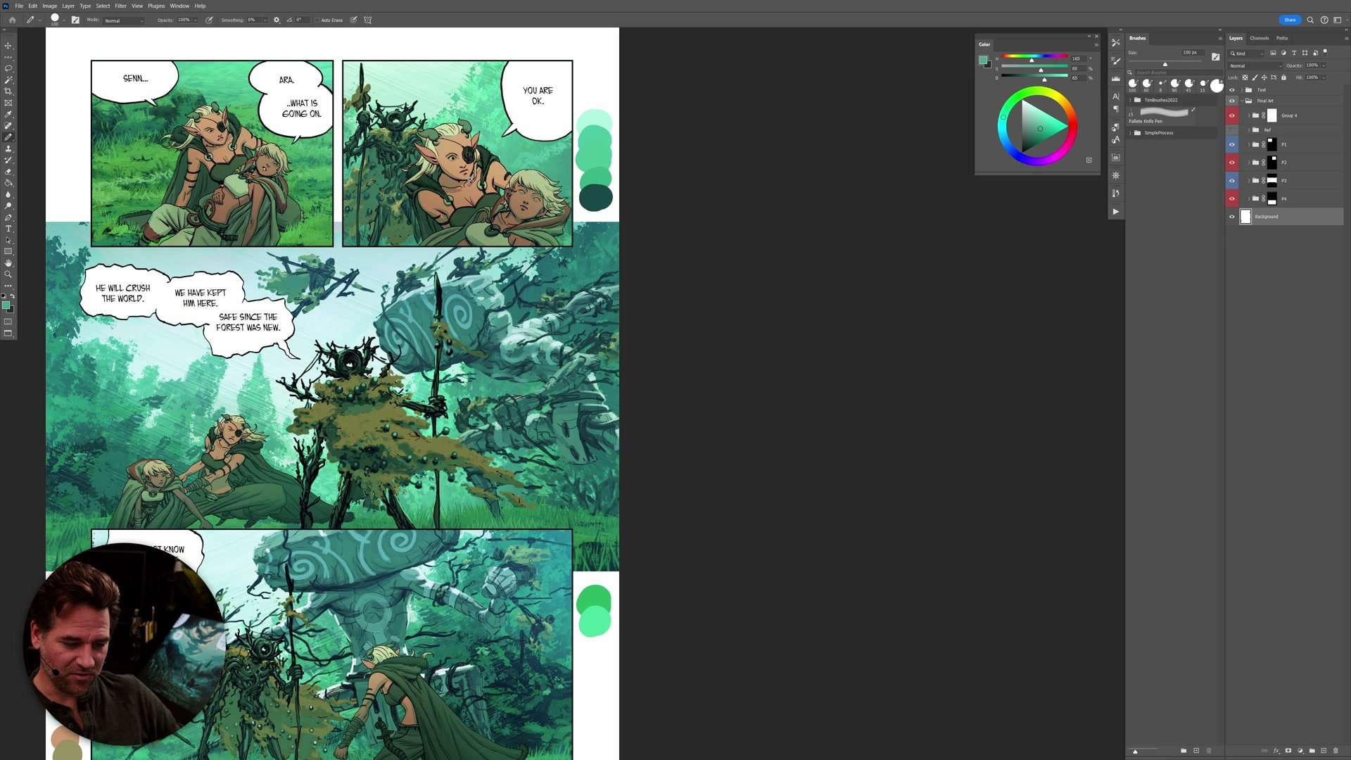
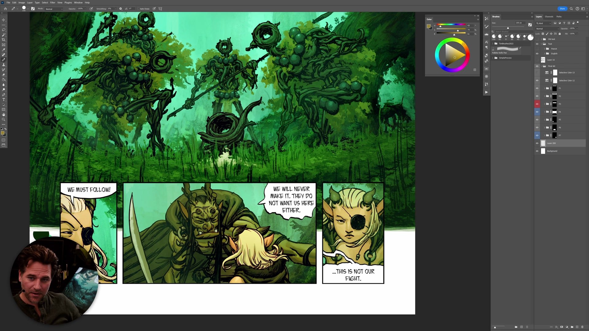
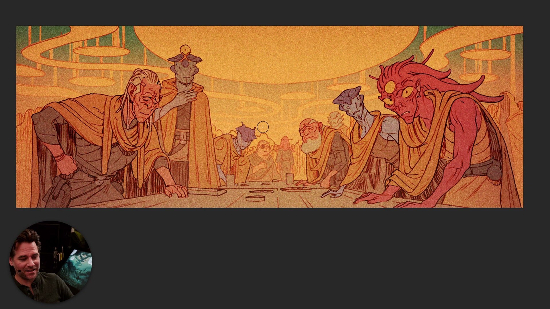
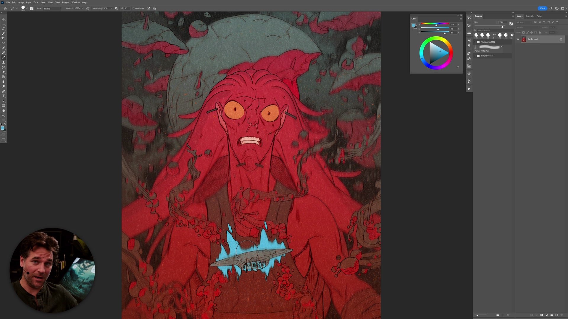
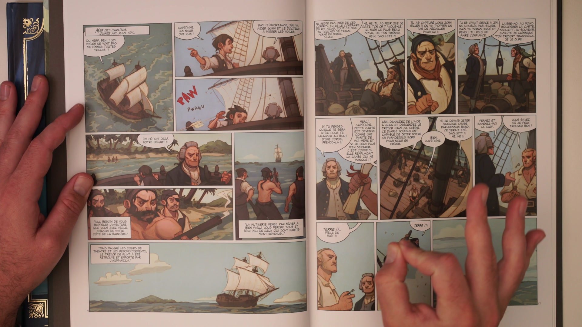
In comics specifically, warm and cool contrast operates at three levels: within individual panels, across the full page layout, and across the spread as a whole. A single red-toned panel on an otherwise cool page makes the entire spread feel more dynamic. This approach of using abstract color choices for storytelling, like making a violent panel pure red or a dreamscape golden yellow, gives pages visual punch that has nothing to do with rendering quality and everything to do with temperature planning.
Color Contrast in Published Work
Key Color Concepts
Temperature Before Value: When artwork looks muddy, the fix is usually not more contrast between light and dark. Shifting shadows cooler and highlights warmer creates vibrancy that value contrast alone cannot achieve. Think in terms of warm and cool rather than light and dark.
Color Confidence Matters: Fear of pushing color too far is one of the main reasons early work looks muddy. Being tentative with temperature shifts produces images where everything sits at the same temperature. Leaning into abstract, unrealistic color choices, like making backgrounds bluer than they should be, is often exactly what an image needs.
Plan Color First: Settings that lack inherent color variety need deliberate planning. Doing a color thumbnail before starting, choosing a temperature scheme, and designing elements specifically for warm and cool contrast prevents the muddy trap before it begins. The image will always be stronger when color is a decision, not an afterthought.
Try This Approach
Temperature Check: Take a recent illustration and use the eyedropper to check the actual hue values of shadows versus highlights. If they are the same temperature, shift the shadows cooler and the highlights warmer to see how the image changes.
Color Thumbnail: Before starting the next piece, create a small rough color study focused entirely on the temperature plan. Decide where warm and cool areas will sit in the composition and commit to those choices before any line work begins.
Abstract Push: Pick one element in a composition and change its color to something more abstract than reality demands. Make a background bluer, push a shadow into purple, or add a warm accent where none logically exists. See how that temperature contrast affects the energy of the whole image.


