Keyframe Illustration Ideas - Push Past Generic
Summary
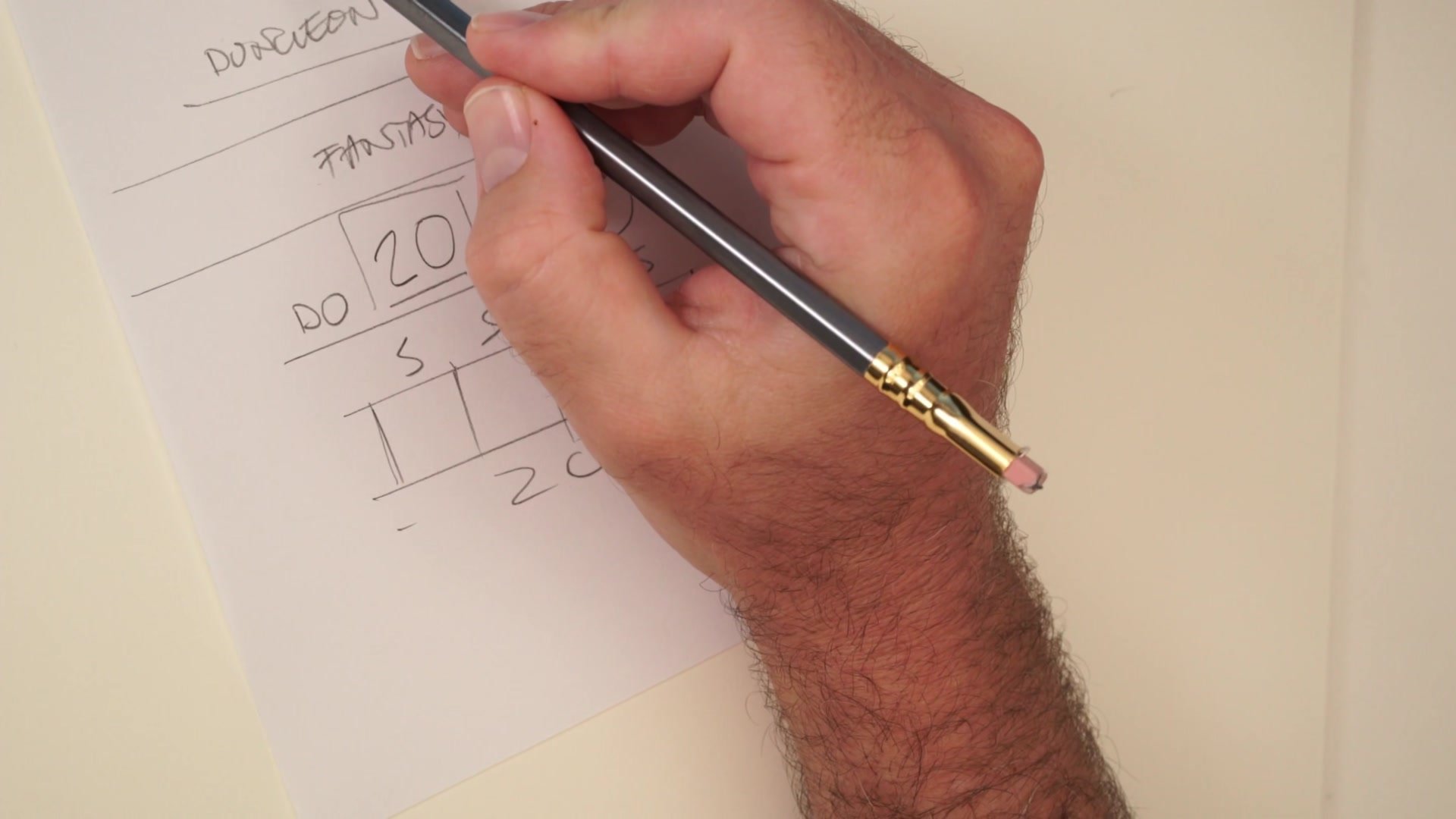
The Draw 20 Process
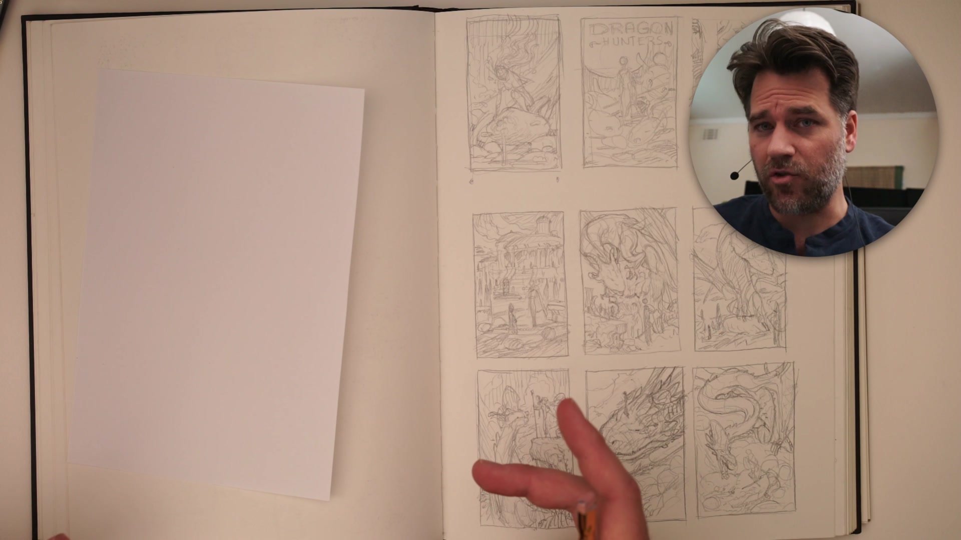
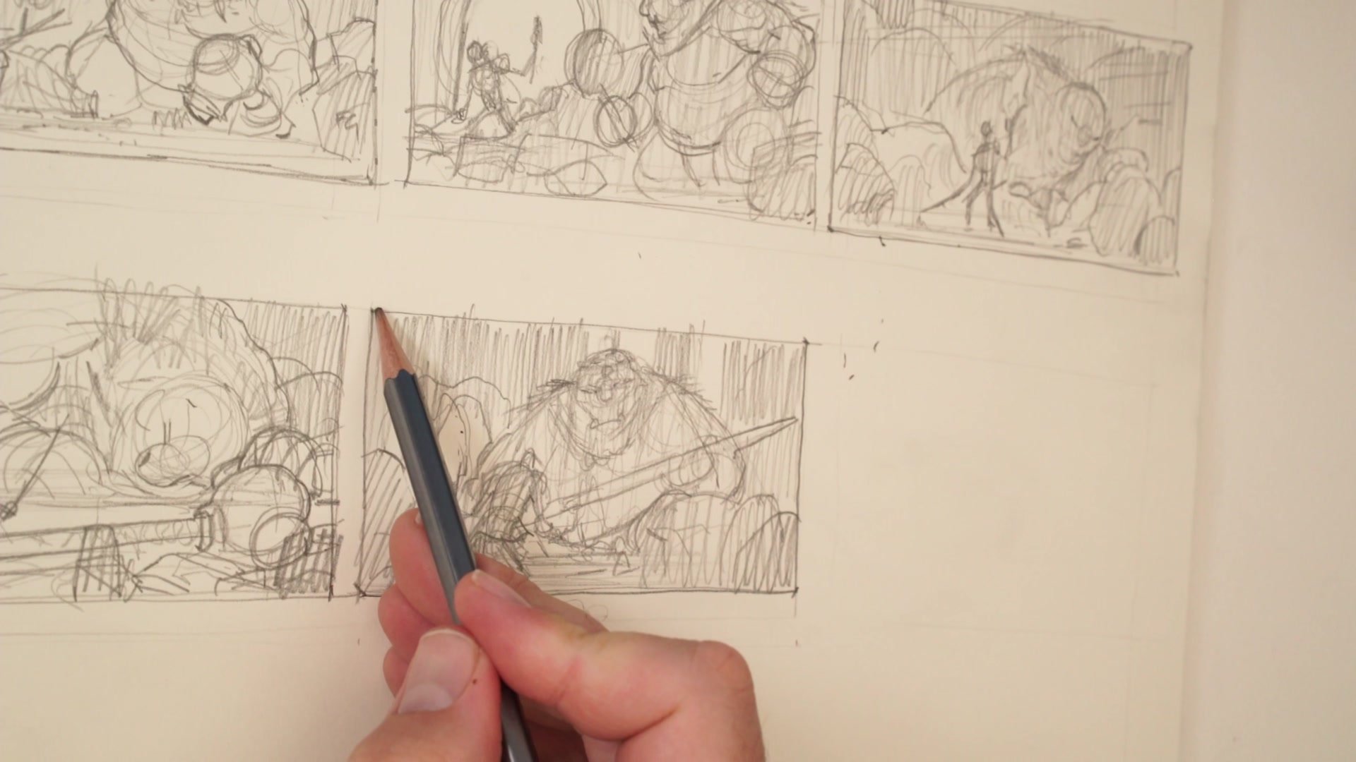
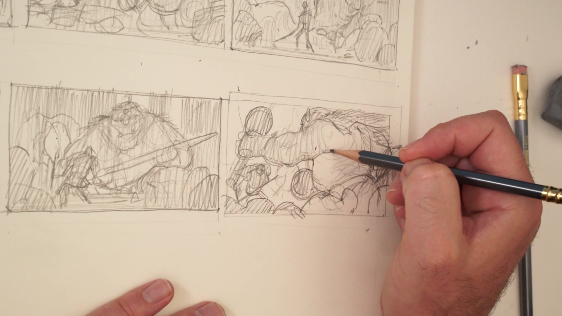
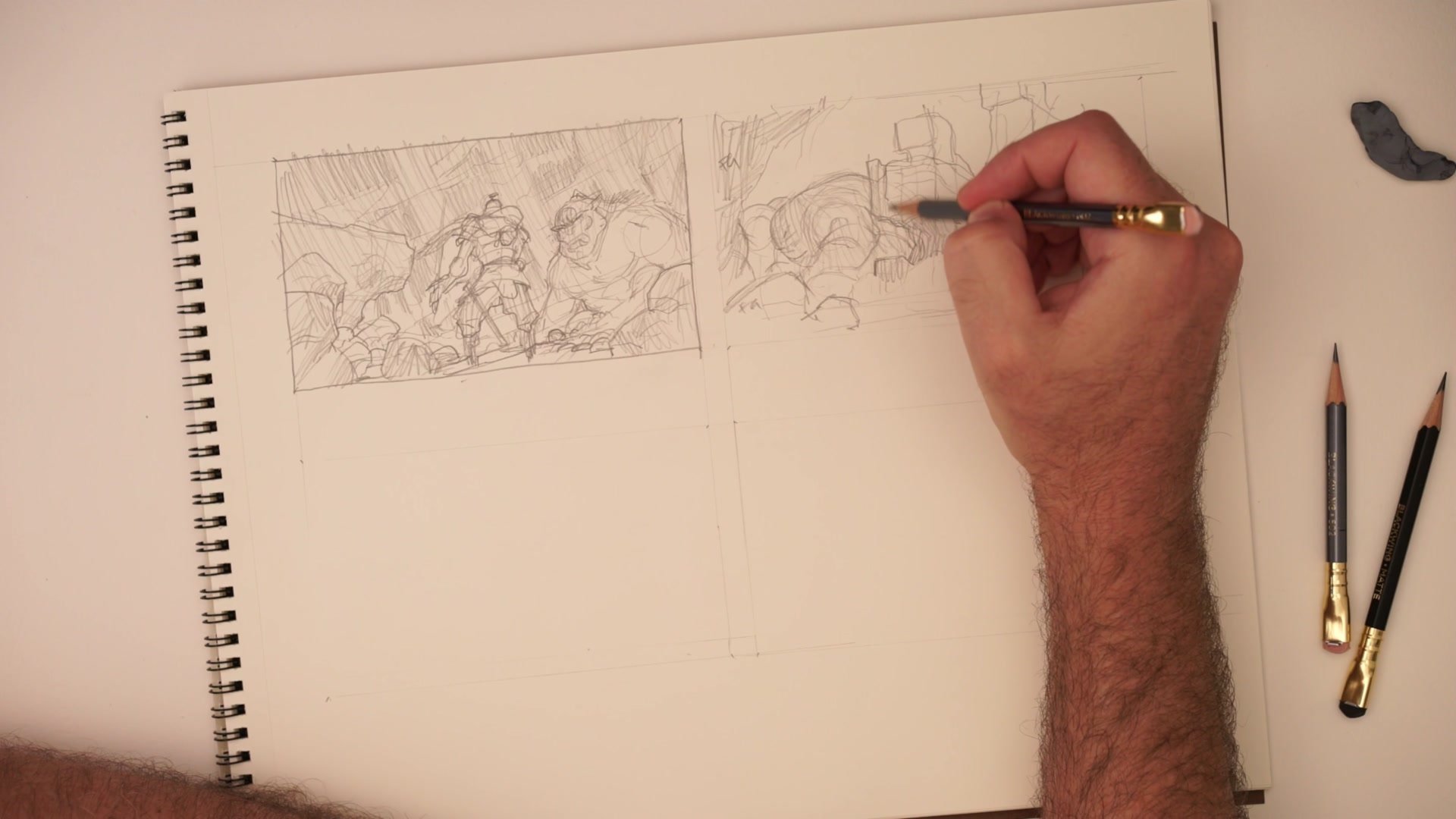
This is a two-and-a-half-hour real-time demonstration of the Draw 20 method for keyframe illustration ideation. Working traditionally with a Blackwing 602 pencil on Strathmore 400 series drawing paper, the session tackles a deliberately generic fantasy brief: a warrior encountering a giant troll or ogre in a dungeon. The generic subject is intentional. When the concept is simple, the creative pressure falls entirely on composition, staging, and visual storytelling rather than clever subject matter.
The session covers the full creative arc of thumbnail ideation, from the first obvious ideas through the increasingly difficult middle section where obvious options run dry and real creative problem-solving begins. Along the way, the demo explores scene planning techniques, foreground-midground-background staging, size variation within the frame, and strategies for presenting professional thumbnail sets to clients.
Early Ideation
Scene Planning First
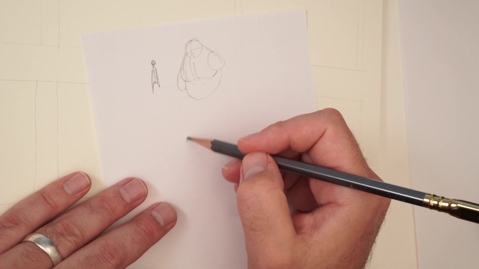
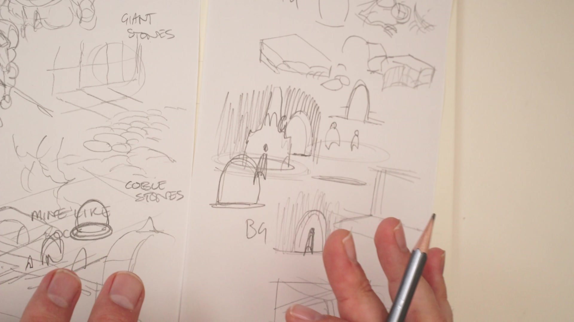
Before drawing any thumbnails, the session begins with visual brainstorming outside the frame. Rough character sketches establish what the warrior and ogre look like at a basic level, without locking in final designs. Then the environment gets explored through quick notes and doodles: cobblestones, hewn rock, architectural ruins, doorways, fire pits, barrels, skeleton remains, spider webs, collapsed stone structures. These environmental elements become tools for composing later thumbnails because they provide foreground, midground, and background options to draw from.
Floor plan thinking also enters the process. Considering the dungeon as a series of interconnected rooms with doorways, hallways, and intersections creates natural framing devices and lighting opportunities. A doorway can serve as a foreground element. Light spilling from an adjacent room can silhouette a character. Architectural angles create diagonal movement across the frame. All of this raw material gets sketched loosely on separate bits of paper so it can be referenced throughout the thumbnail session.
Building Variety
Size and Position in the Frame
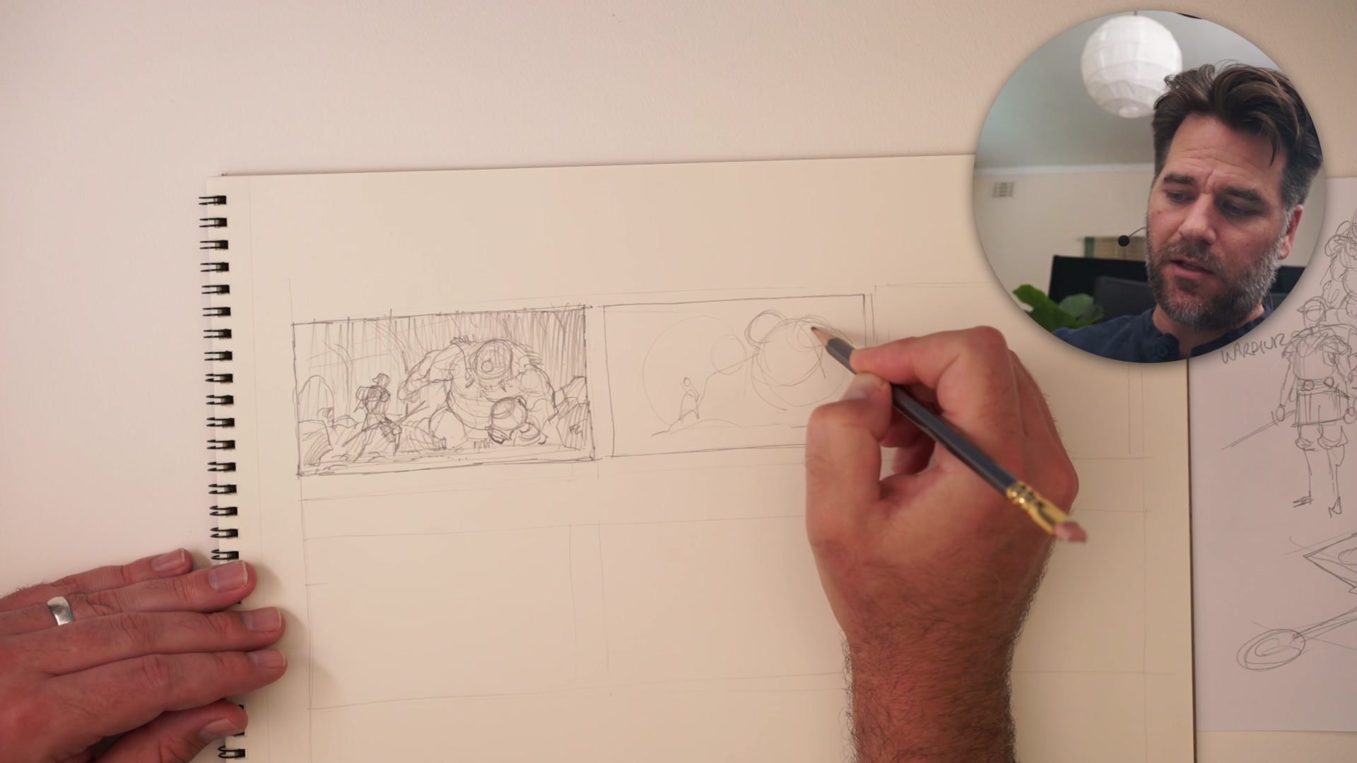
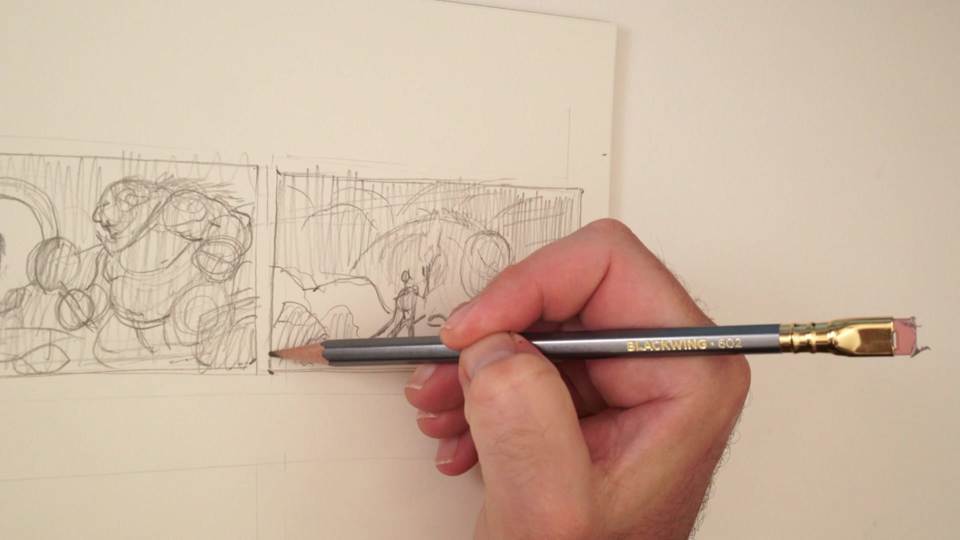
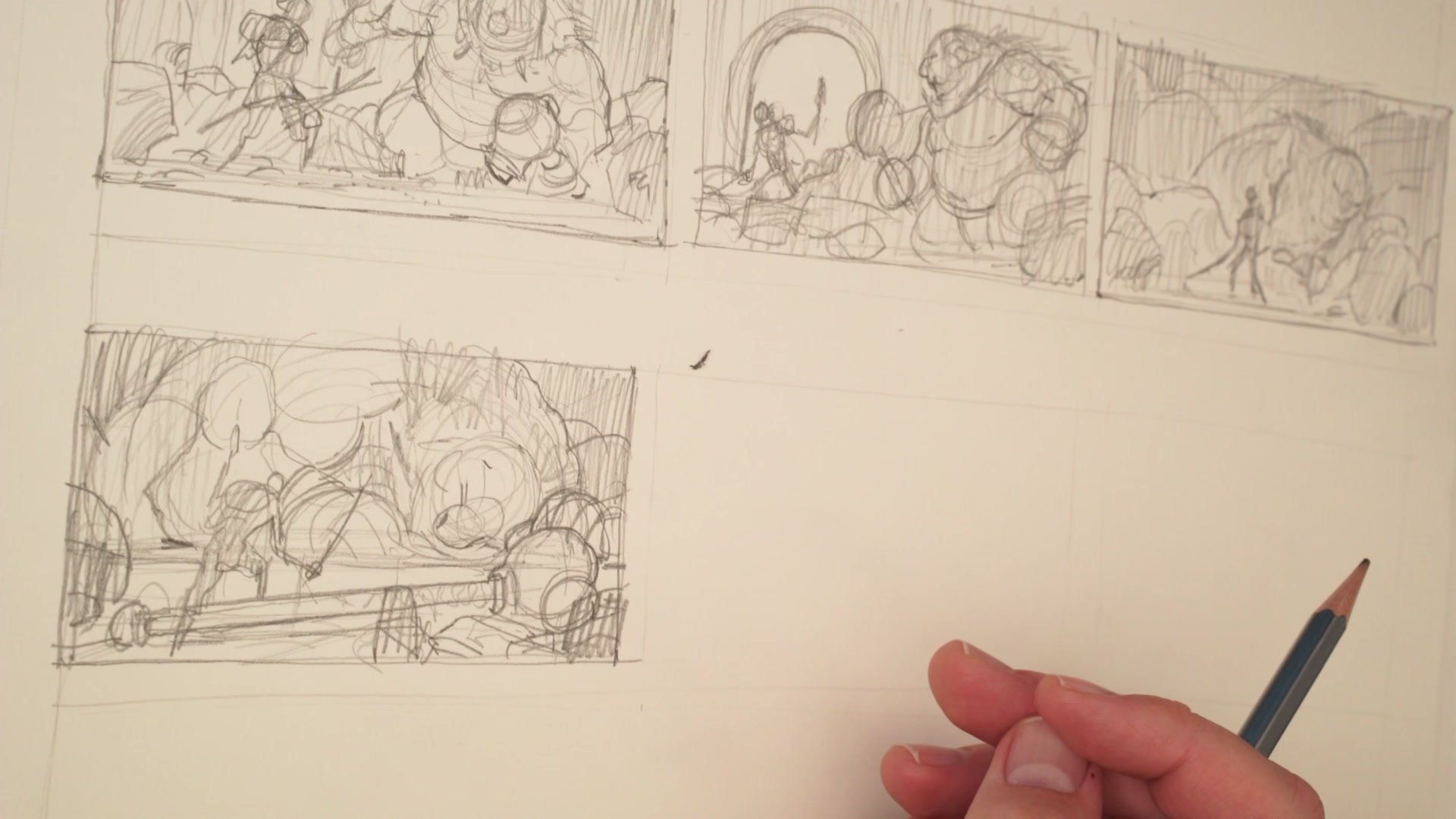
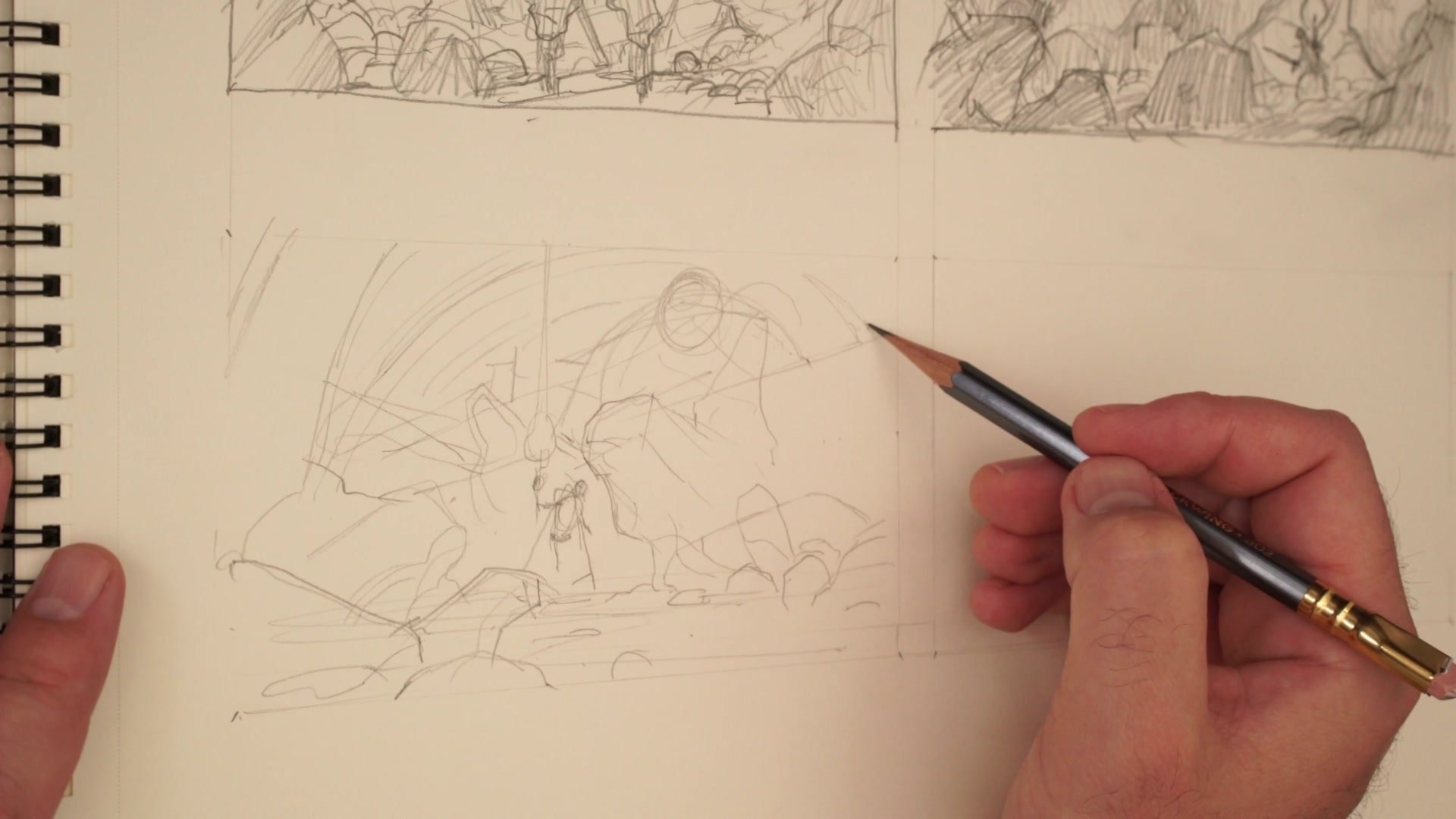
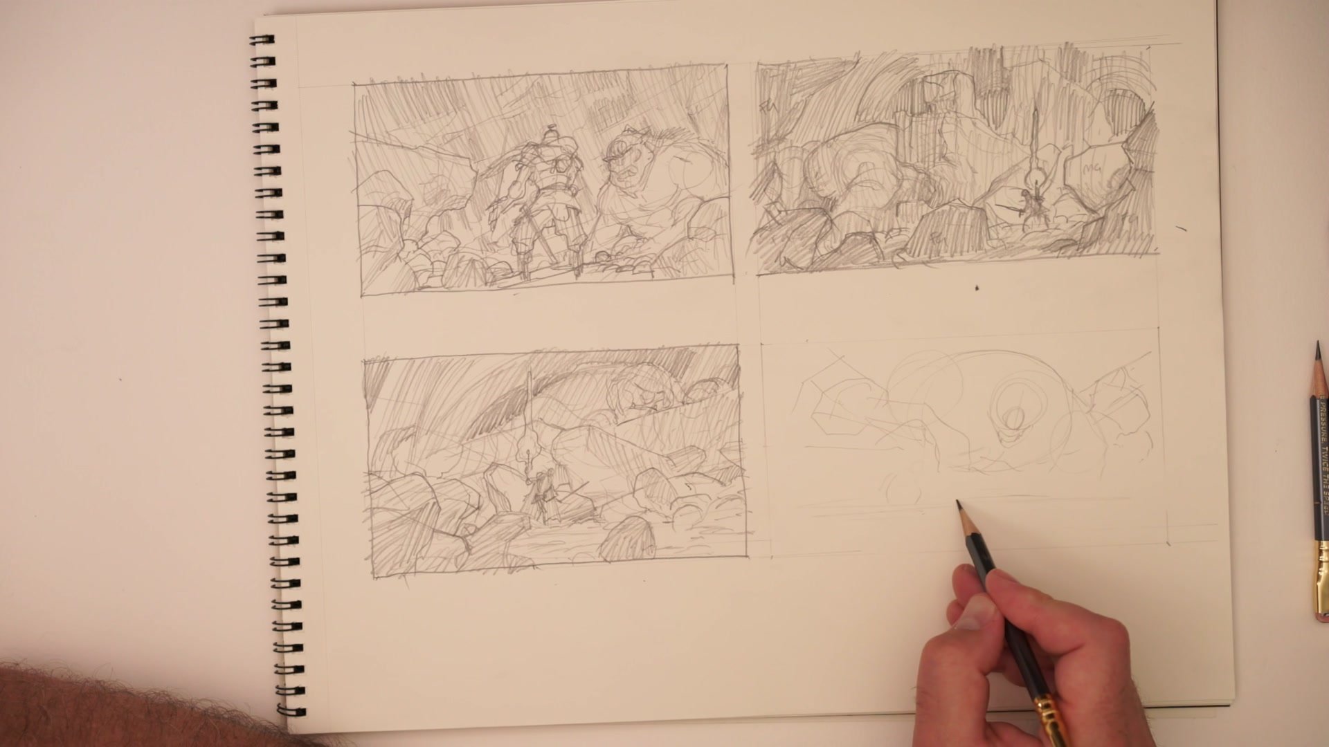
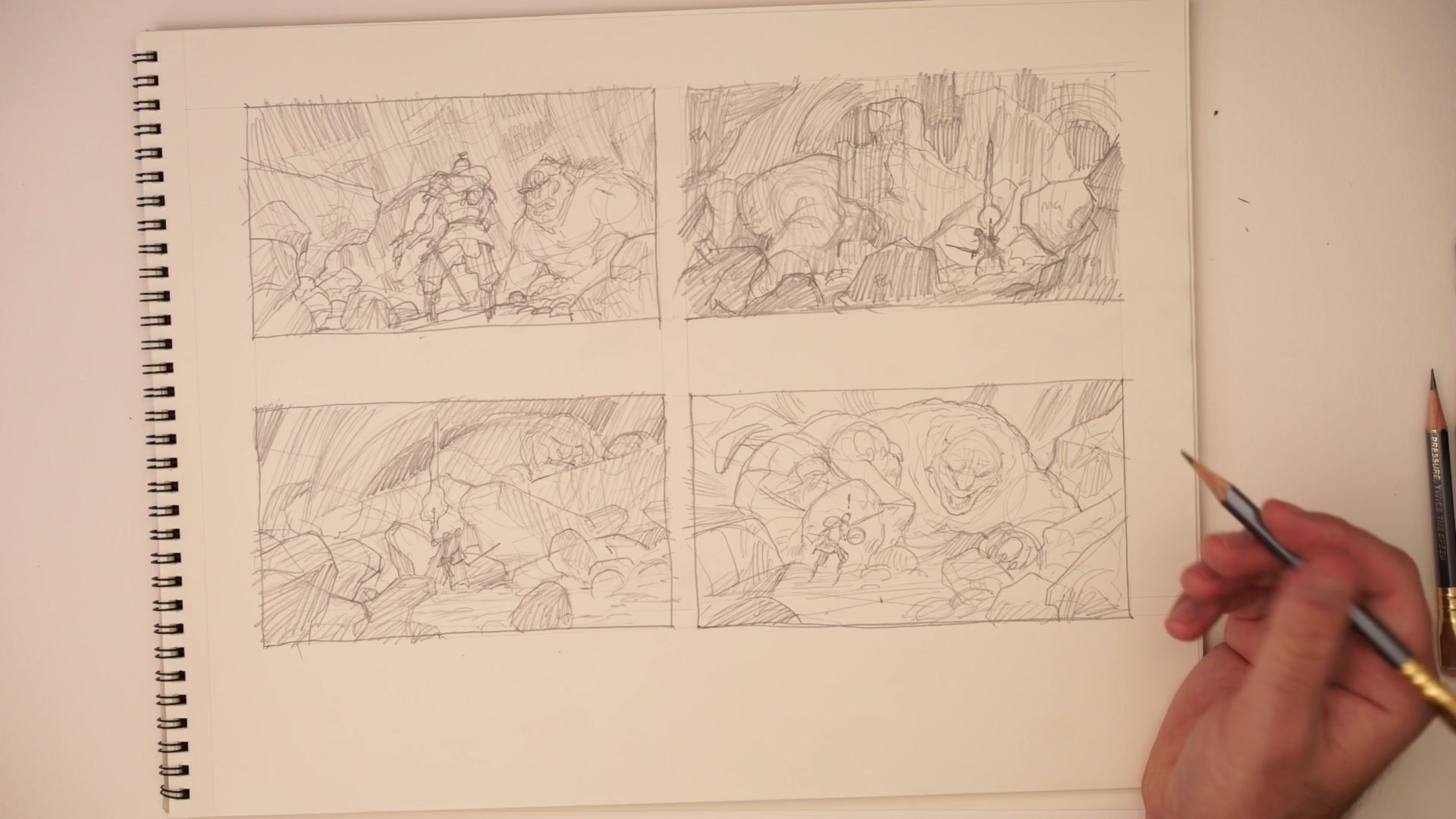
The second major technique demonstrated is manipulating who is large and who is small within the frame. The warrior can dominate the foreground with the ogre distant and mysterious, or the ogre can fill the frame with the warrior appearing small and vulnerable. These are fundamentally different stories told through the same two characters. The session works through multiple variations: character facing away from the viewer toward the threat, character centralized with dual threats flanking, the ogre sleeping while the warrior creeps past, and overhead angles where the viewer sees danger the character does not.
Each size relationship changes the visual hierarchy and the emotional narrative. A massive ogre with a tiny warrior tells a story of overwhelming threat. A centralized warrior with environmental chaos around them tells a story of determination. The session demonstrates that these are not random choices but deliberate decisions about whose perspective the viewer inhabits and what dramatic question the image poses: What is about to happen? What does the character not yet know?
Pushing Further
Working Through Creative Fatigue
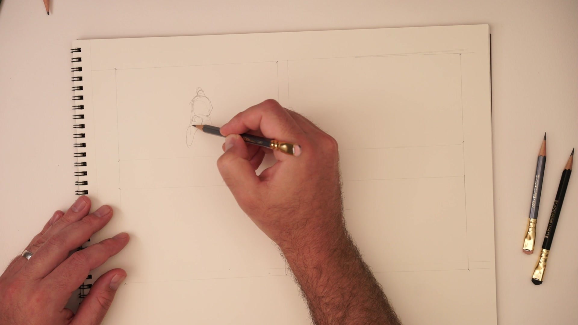
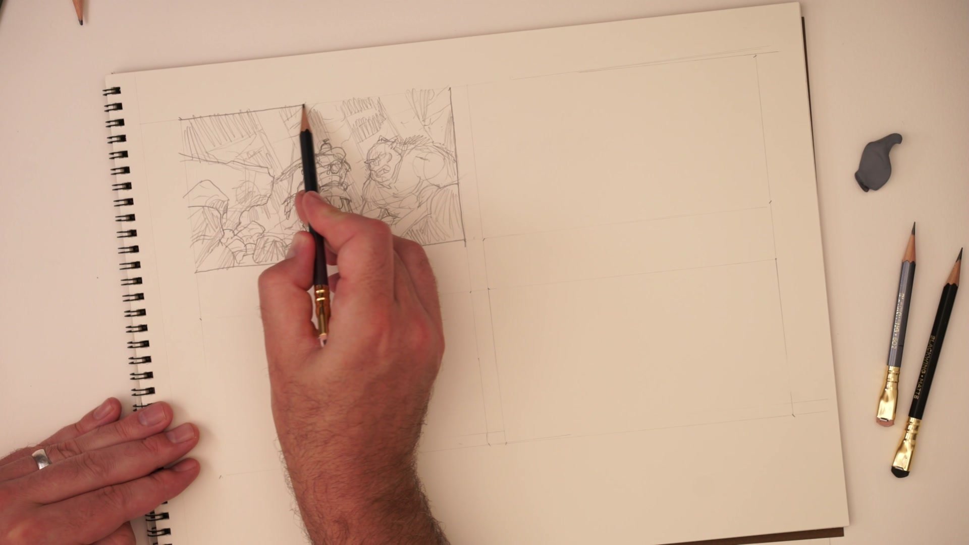
The honest reality of this process is visible in the session. After the first five or six thumbnails, the obvious ideas are exhausted. The pencil gets blunt. Some thumbnails come out as half-formed ideas that need another pass. Others turn into something unexpected. The session does not hide this struggle; it demonstrates that the difficulty is the point. Committing to 20 thumbnails means that nothing currently on the page is the final image. Everything is exploration, and that permission to fail is what unlocks the less obvious ideas.
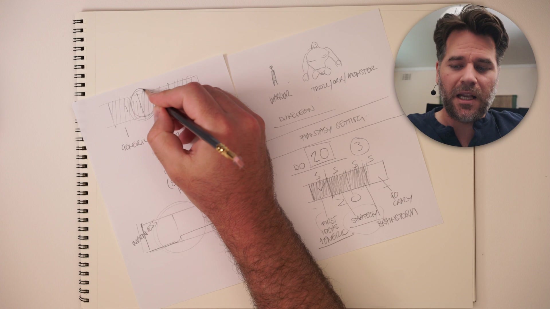
The session also addresses the professional reality of presenting thumbnails to clients. The three-category framework groups thumbnails into generic options that feel safe, generic-plus-twenty-percent options that add a creative spin, and wild experimental concepts that push boundaries. The experimental ideas exist partly to make the middle-ground options look more appealing by comparison, and partly because occasionally the crazy idea is exactly what the project needs. This framing helps artists understand that every thumbnail in the set serves a strategic purpose, even the ones that do not get chosen.
Final Results
Key Techniques
Quantity as Creative Tool: Setting a goal of 20 thumbnails removes the pressure from any single sketch. The obvious ideas run out around five to seven, and the genuinely interesting concepts emerge in the second half once the surface-level options have been exhausted.
Scene Planning Outside the Frame: Before composing thumbnails, sketching characters, environment elements, and floor plans on separate paper creates a library of foreground, midground, and background options to draw from throughout the session.
Size Controls the Story: Changing which character is large and which is small within the frame fundamentally changes the visual narrative, the sense of threat, and whose perspective the viewer inhabits.
Try This
Pick a Generic Brief: Choose a deliberately simple concept like the warrior-versus-ogre scenario used in this demo. The simpler the subject, the more the exercise forces creative composition rather than relying on clever ideas.
Draw All Twenty: Work through 20 thumbnail sketches on paper, spending no more than five to ten minutes each. Note where the obvious ideas run out and where the more interesting concepts start to appear.
Sort Into Three Categories: When finished, group the thumbnails into generic, generic-plus-twenty-percent, and experimental. Notice which category contains the work that feels most alive and worth developing further.


