How Detailed Should Your Thumbnails Be
Summary
The Thumbnail Detail Question
How detailed should thumbnails actually be? The answer depends entirely on who needs to see them and what value they provide to the people involved in the creative process. For professional work, thumbnails exist not just as a personal planning tool but as a communication bridge between the artist and everyone else on the project. Art directors, clients, writers, and production teams all need to understand what the finished image will look like before it gets made. The level of detail in a thumbnail needs to match the visual literacy of the people reviewing it and the trust that has been built through the working relationship.
This is fundamentally a question about the minimum viable product in the creative process. What is the least amount of effort that produces something with the highest amount of value to the people around you? Sometimes that means a detailed color preliminary that looks almost identical to the finished piece. Sometimes it means a loose five-second sketch in a notebook. The answer changes depending on the scenario, the collaborators, and the stage of the project.
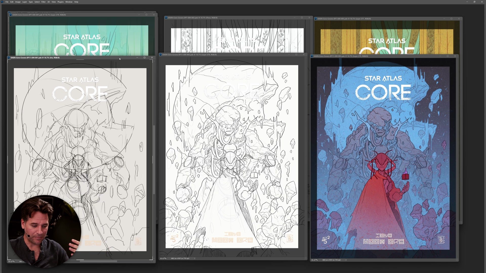
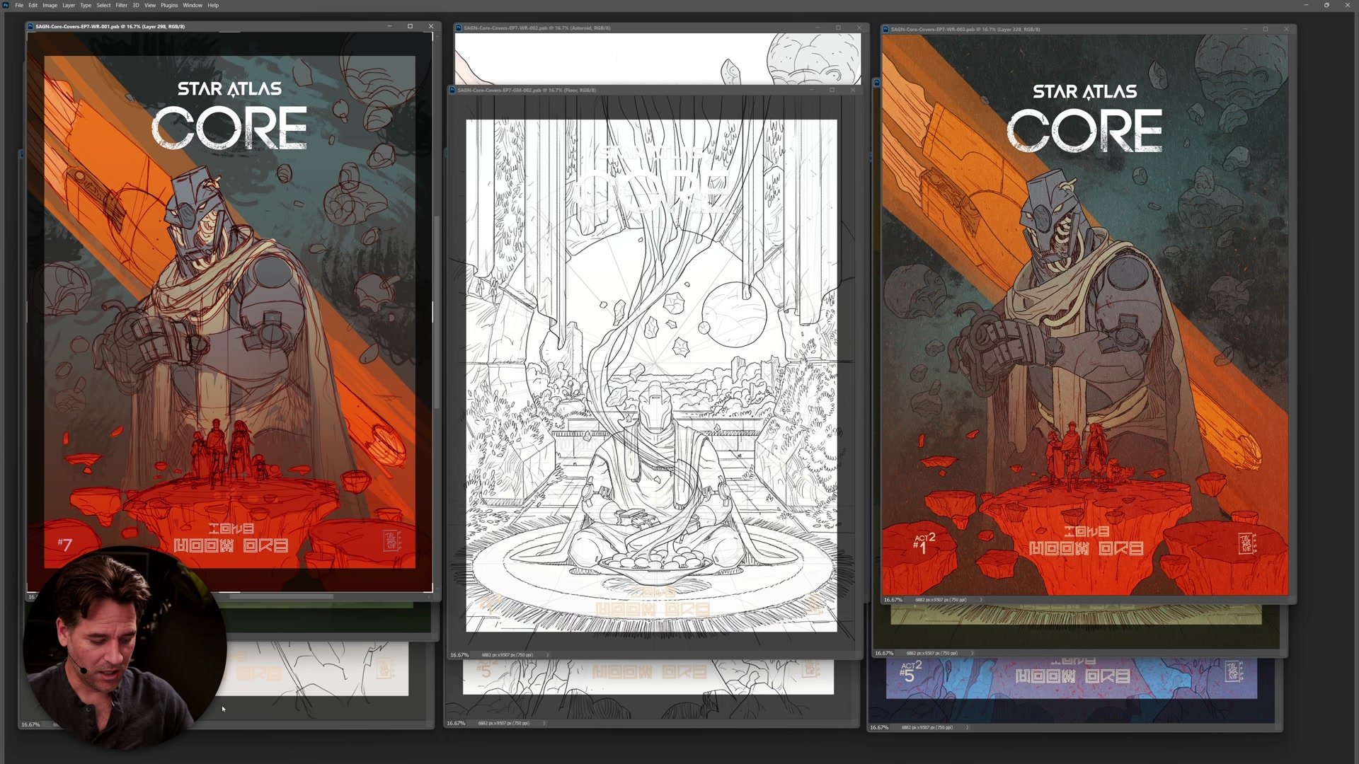
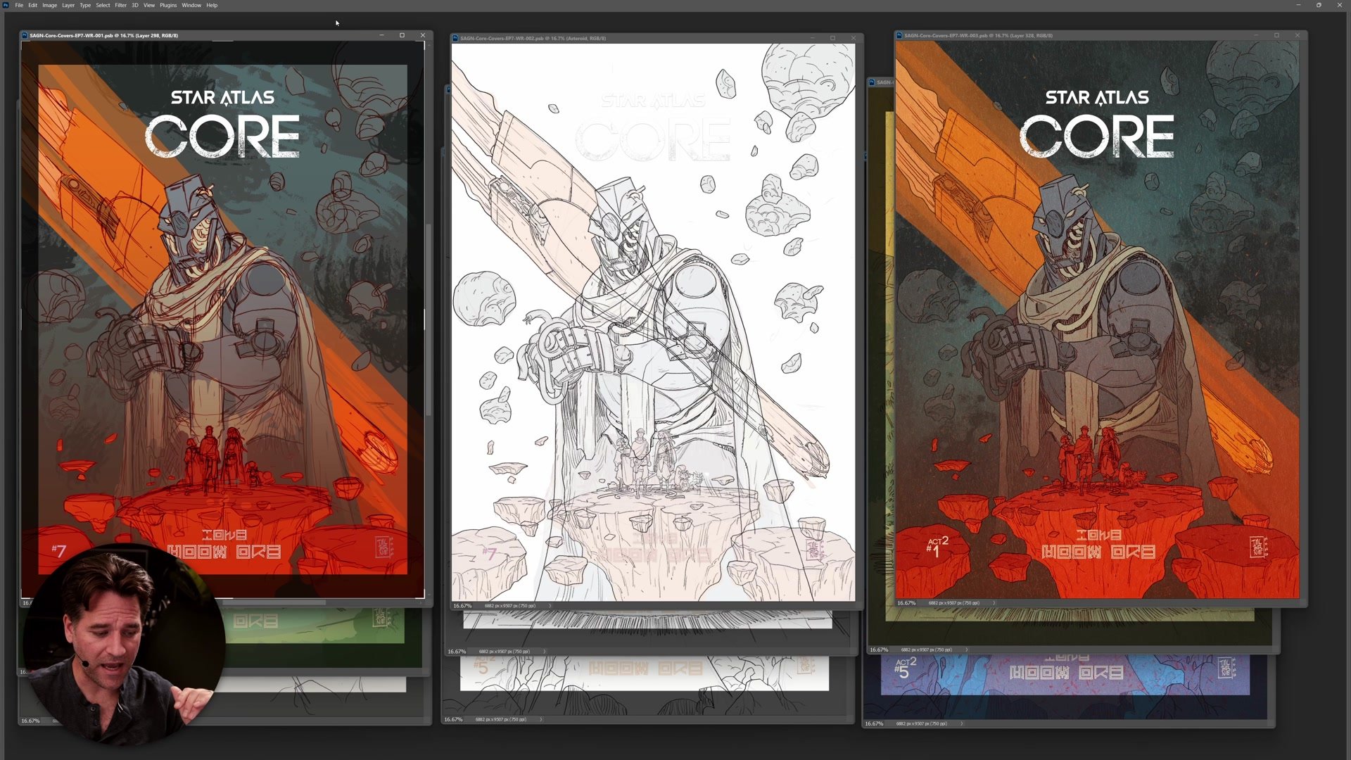
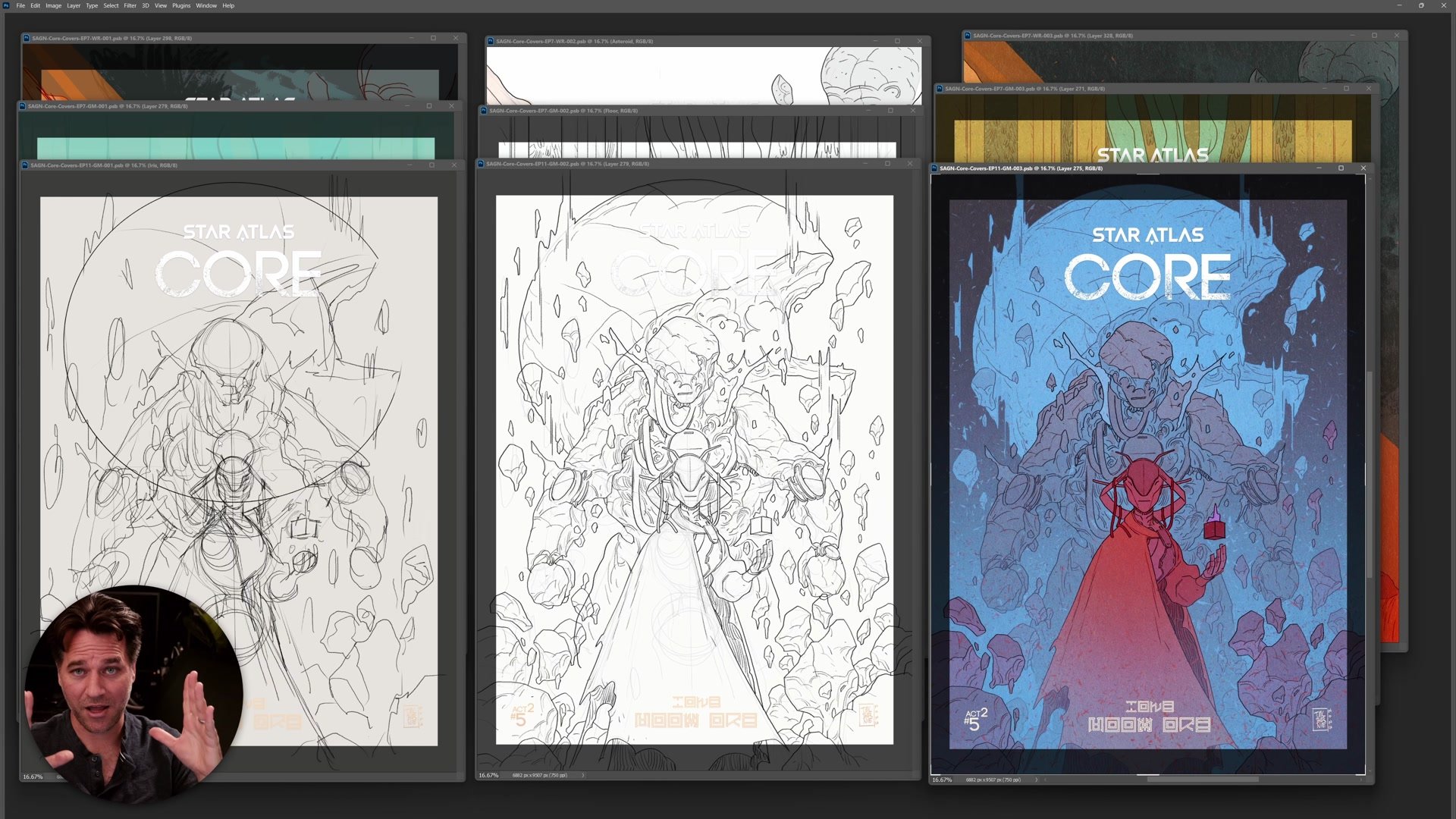
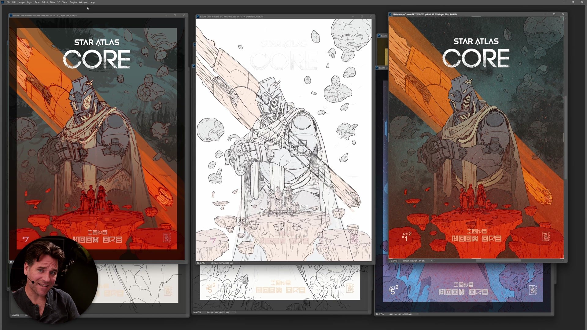
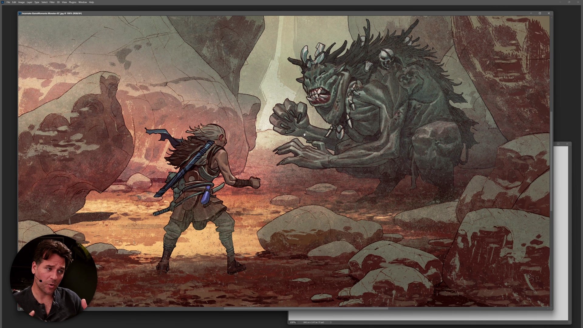
Cover Process Examples
The Professional Standard
When working with clients and art directors, the safest approach is to produce thumbnails and preliminary images that closely represent the finished result. A detailed color rough that looks almost exactly like the final cover means everyone can see what they are signing off on. If the person reviewing the work is not visually literate, a loose pencil sketch is not going to communicate anything useful to them. They will approve something vague, imagine something different, and then feel blindsided when the finished piece does not match what they had in their head.
Including people in the creative process at every stage builds trust and prevents nasty surprises at the end. When everyone has been involved through thumbnails, roughs, line work, and color stages, even if the final piece deviates slightly from the original thumbnail, there are understood reasons for those changes. The collaborative struggle bonds the team. If someone has seen the work develop step by step, they are far more likely to accept creative adjustments than if they only see a rough sketch and then a finished result they did not expect.
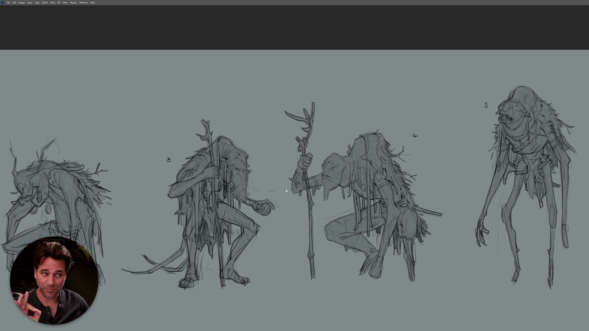
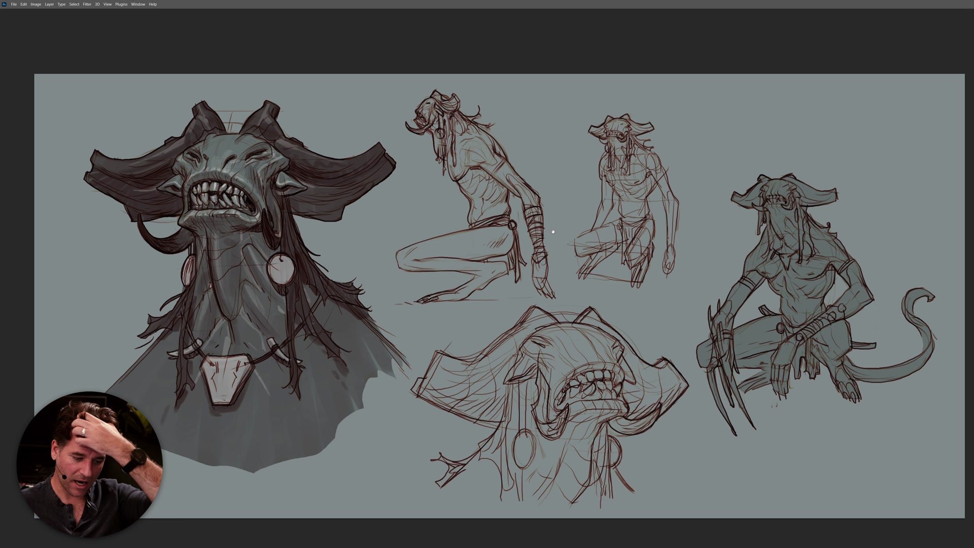
Concept Art Thumbnails
Concept Art and Keyframes
In concept design, the rules shift. The entire discipline is built around creating a hybrid style that communicates ideas clearly in the shortest possible time. Character silhouettes, creature designs, and keyframe illustrations all exist at a level of finish that is rough but readable. A concept artist spends years perfecting the ability to produce a pencil drawing in ten or twenty minutes that looks finished enough to communicate the idea effectively.
These thumbnail sketches need to be detailed enough that anyone on the team, from animators to level designers, can look at them and understand what is being proposed. If the work is too rough, people approve vague ideas and the team lacks clarity. The fundamental unit of concept art is taking something rough and working it up as and where needed. Most rough ideas get thrown away, but the ones that survive need enough information that people from different technical areas can evaluate them. An animator needs to know if a creature design will cause rigging problems. A level designer needs to see how a boss encounter will read on screen.
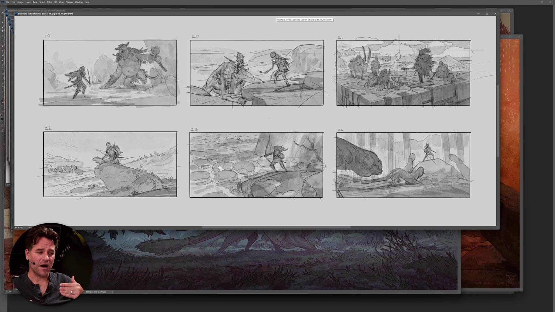
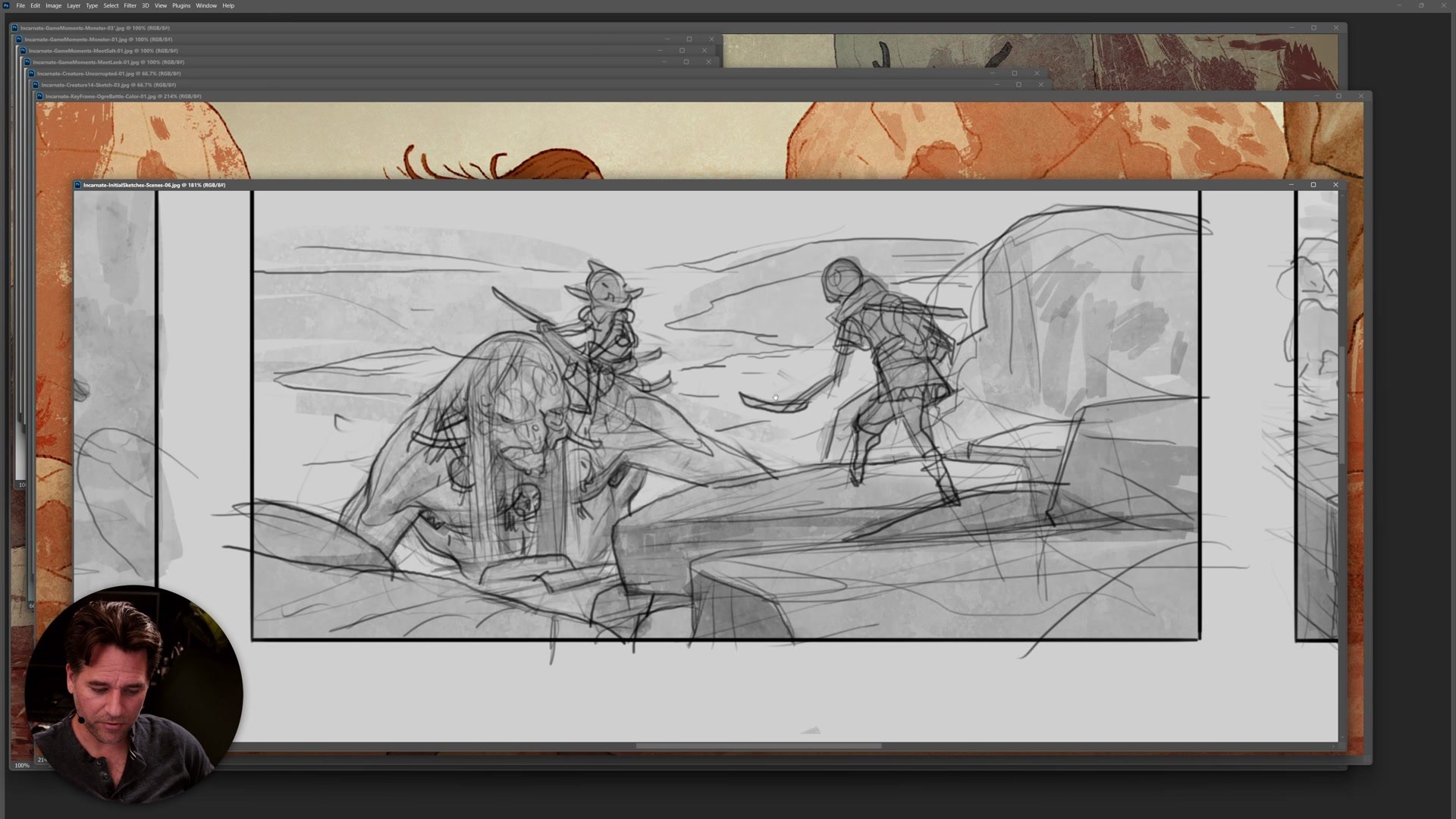
Comic Storyboards
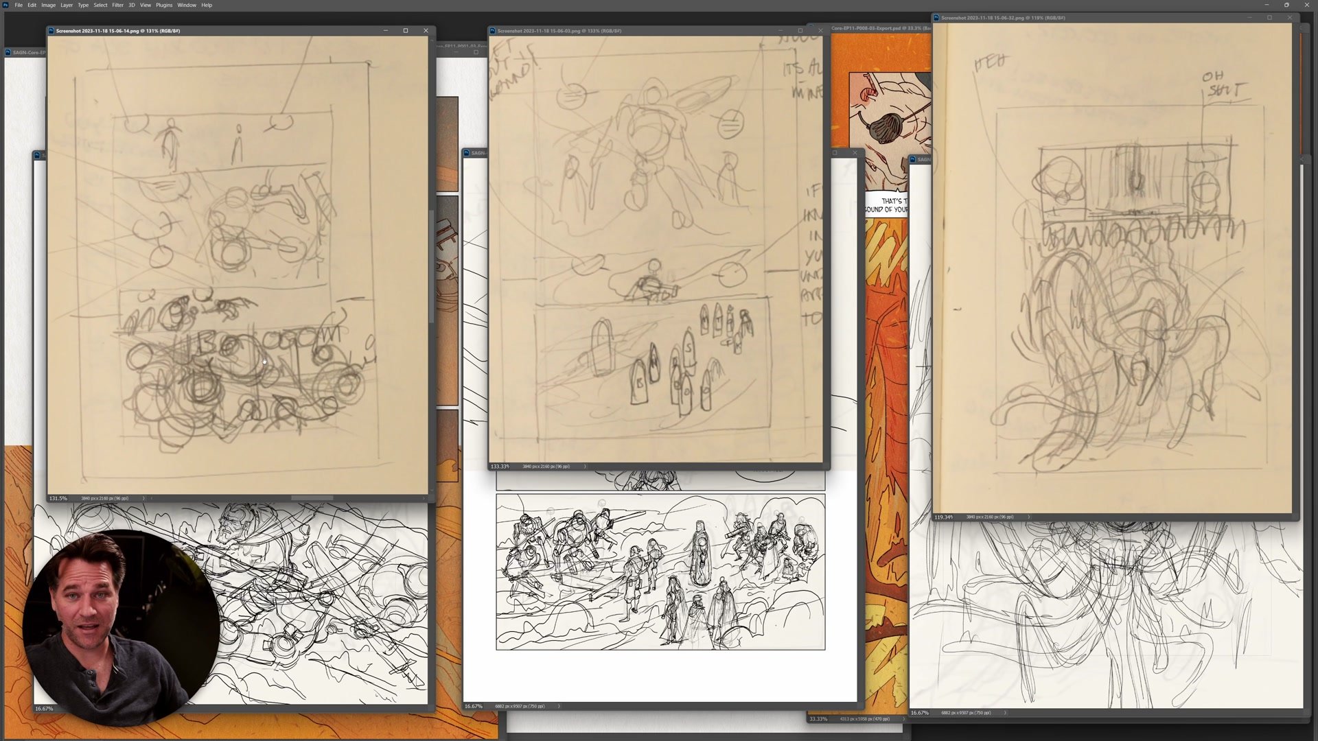
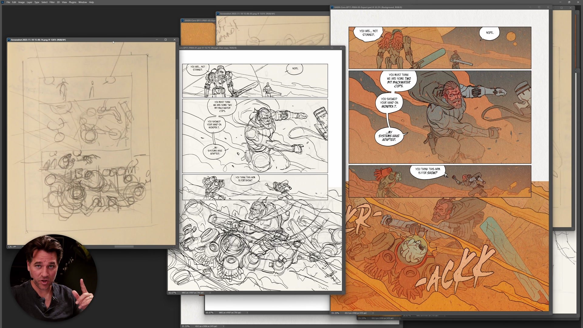
The Rough Sketch Freedom
When the working relationship is strong and the collaborators are experienced, thumbnails can be extraordinarily rough. Comic book editors who have reviewed thousands of storyboard pages can read stick-figure sketches. An experienced art director who has built trust over months of working together can look at a barely legible notebook drawing and understand exactly what the finished page will contain. This level of roughness is earned, not assumed.
For personal work, the bar is even lower. All that is needed is a way to record ideas and move forward. A rough Moleskin sketch with stick figures and notes is often enough to plan an entire comic page. The efficiency gained from keeping thumbnails loose allows more time to be spent on the actual finished work. But this only functions because the artist themselves can read the sketch and translate it to a finish. The moment someone else needs to understand the work, the level of detail must rise to meet their ability to parse visual information. Matching the thumbnail detail to the production context is what separates an efficient process from a frustrating one.
Key Concepts
Minimum Viable Product: Every thumbnail should represent the least amount of effort that still provides maximum value to the people who need to see it. If it can be rougher without losing clarity, make it rougher. If it needs to be more polished to communicate, polish it.
Collaborative Trust Matters: The level of detail required drops as the working relationship strengthens. A new client needs a detailed color preliminary. A trusted art director who has worked with the same artist for months can read a rough sketch. Trust is earned through consistent inclusion in the creative process.
Clarity Over Quality: The drawing does not need to be good. It needs to be clear. After twenty years of practice, the sketches will naturally be more fluid, but the fundamental requirement is always that anyone looking at the thumbnail can understand what it represents and make informed decisions about it.


