Form vs Shape in Your Art Style
Summary
The Form vs Shape Question
One of the most fundamental yet slippery concepts in artistic style is the distinction between form and shape. Form is about structure, anatomy, and three-dimensionality, typically revealed through lighting and tonal value. Shape is iconographic and symbolic, where we perceive the world through distinct objects placed against each other rather than through how light falls across surfaces. This distinction underpins how we perceive style across every visual medium, from cinema and animation to comics and video games.
The reason this concept matters so much is that it directly affects the mood, feeling, and readability of any image. A shape-based image with flat, even lighting is open, clear, and easy to understand. A form-based image where lighting defines the scene creates ambiguity, tension, and asks the viewer to work harder to decode what they are seeing. Neither approach is better. They serve different purposes, and understanding when to lean into one or the other is a critical stylistic choice that every artist needs to make deliberately.
Form and Shape in Practice
Lights On vs Lights Off
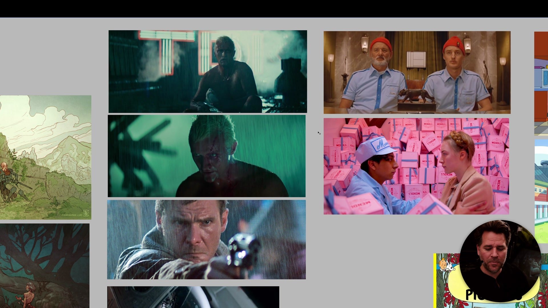
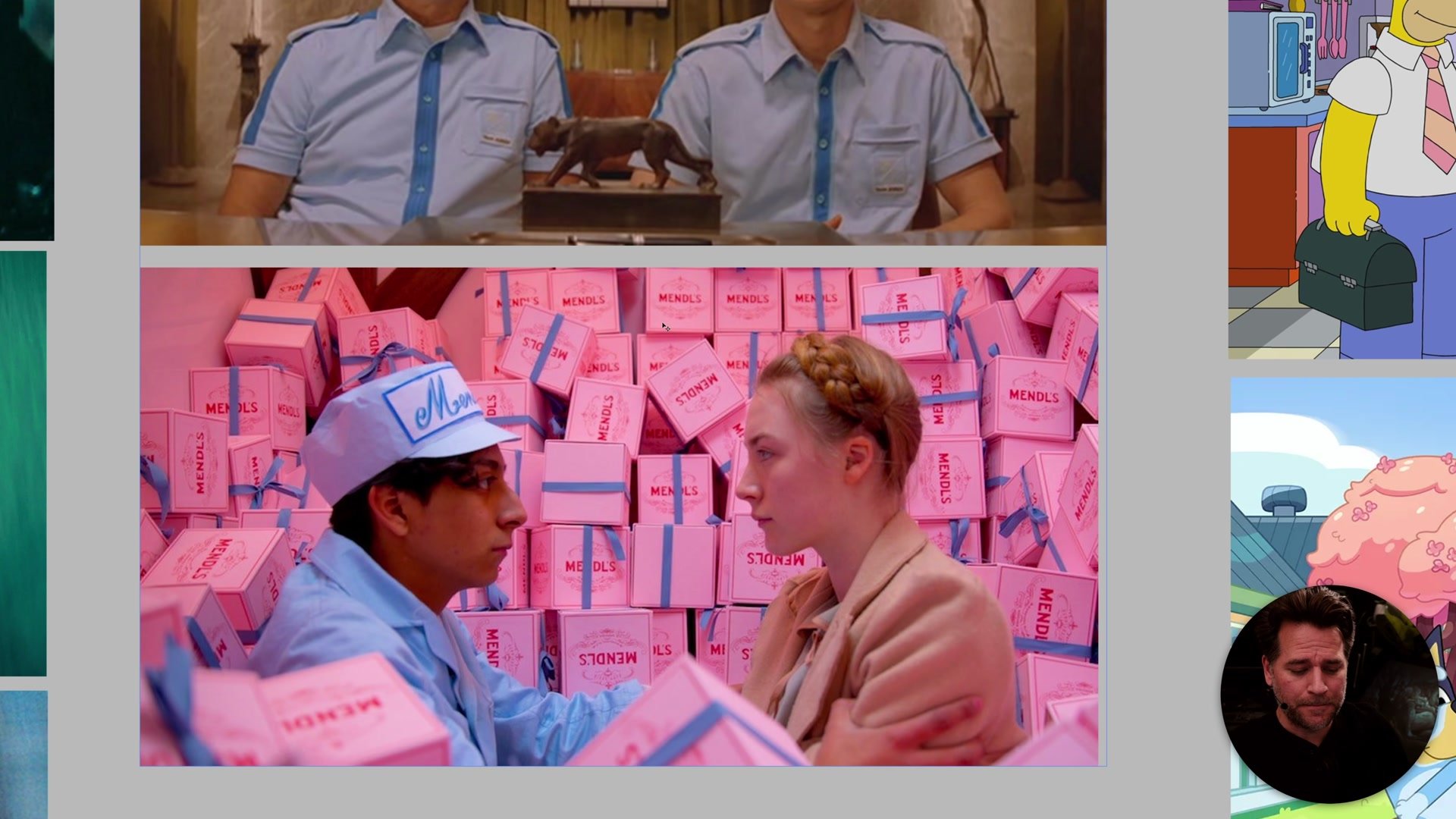
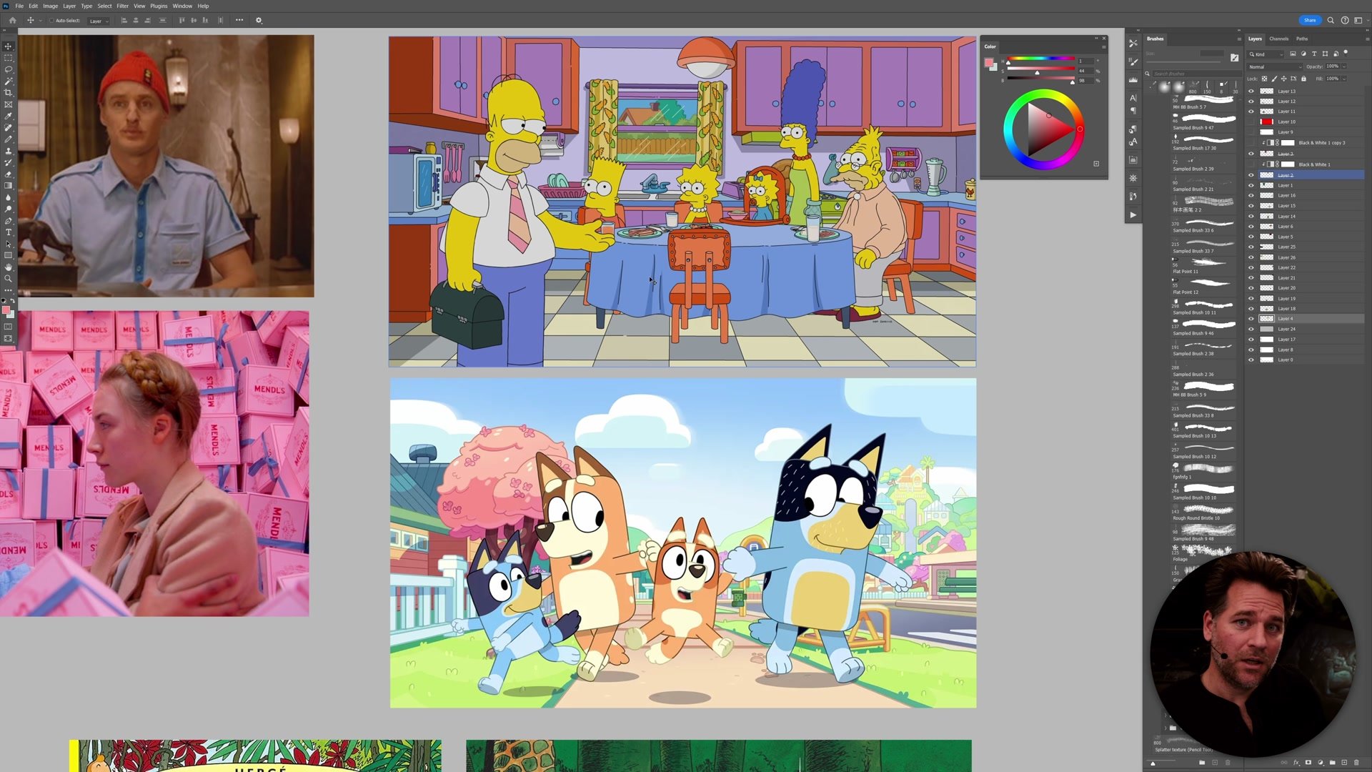
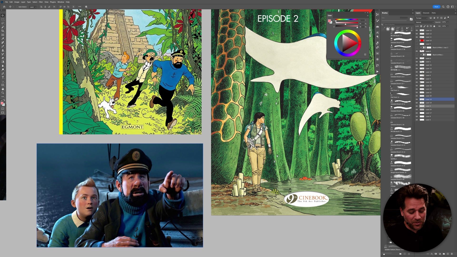
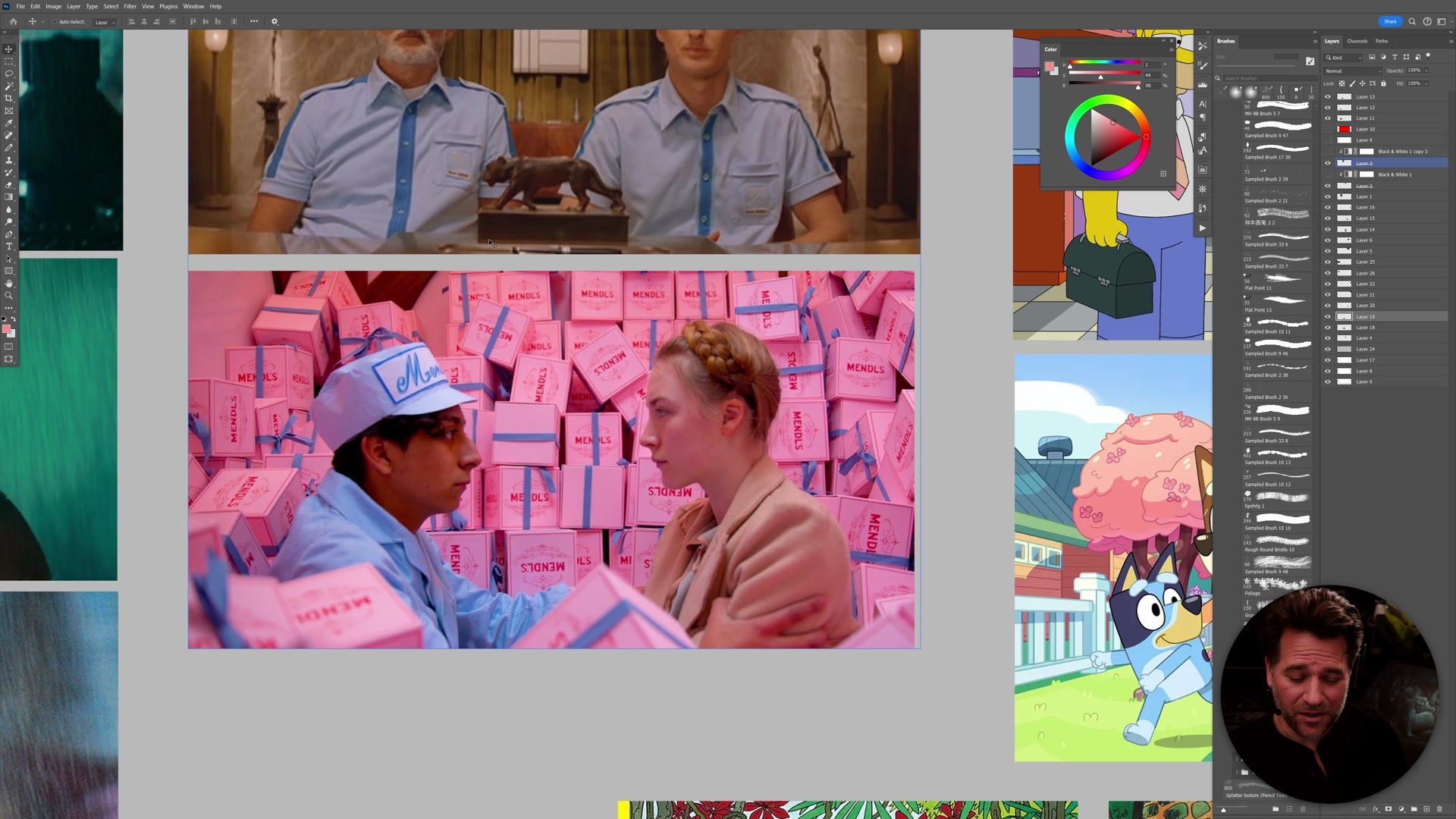
A useful way to think about this concept is whether the lights are on or off. When the lights are on, as in a typical Wes Anderson film, everything is evenly lit with lots of fill light. The shadow side of a face barely differs from the light side. We perceive the frame through distinct shapes, objects, and color relationships. One character is separated from another by their clothing color, not by how light wraps around their body. This is why these frames feel so graphic and unchallenging to read.
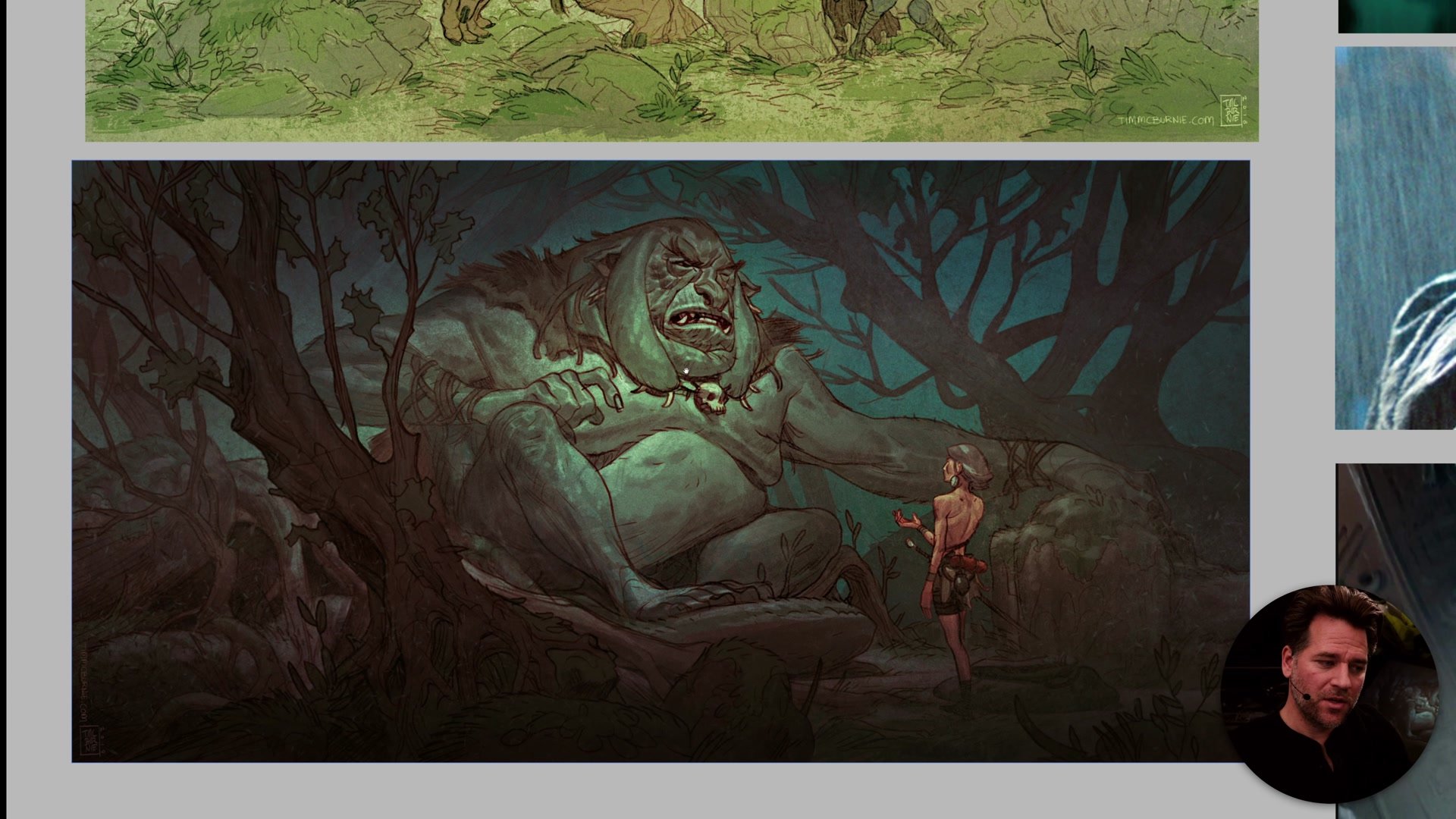
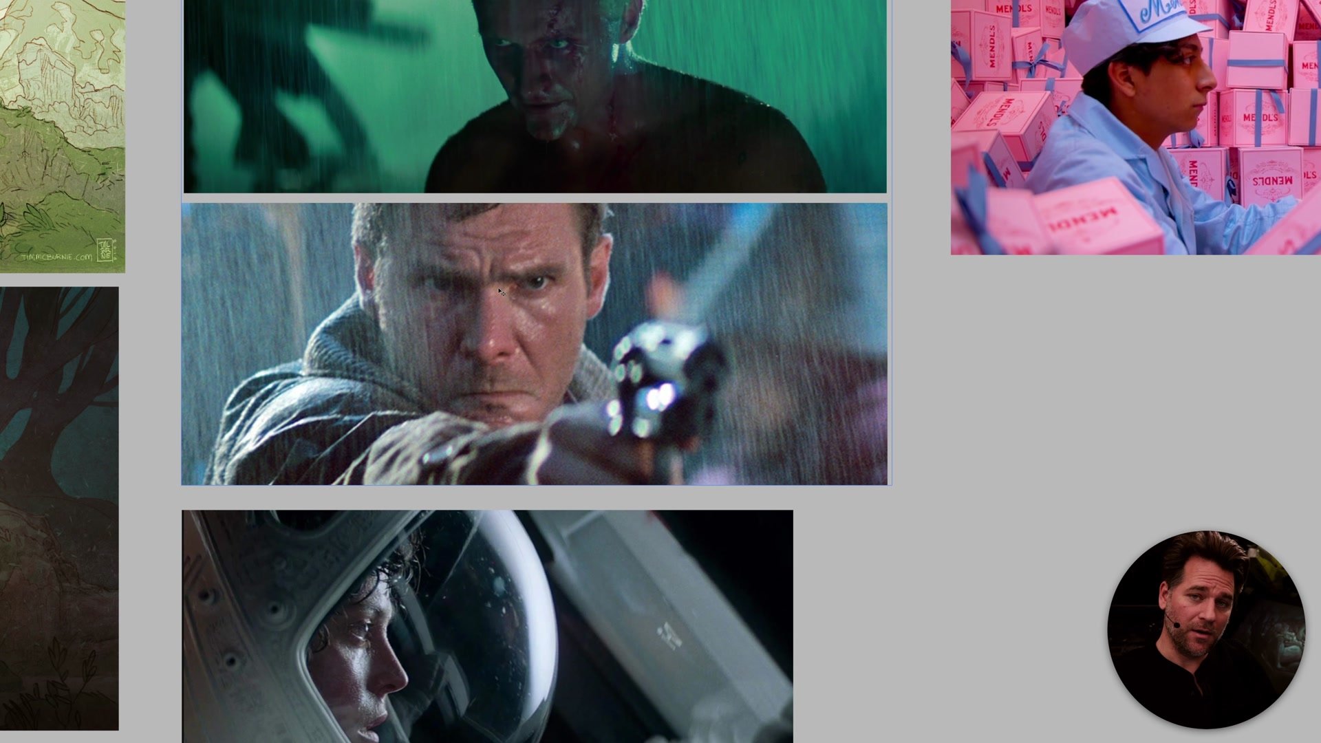
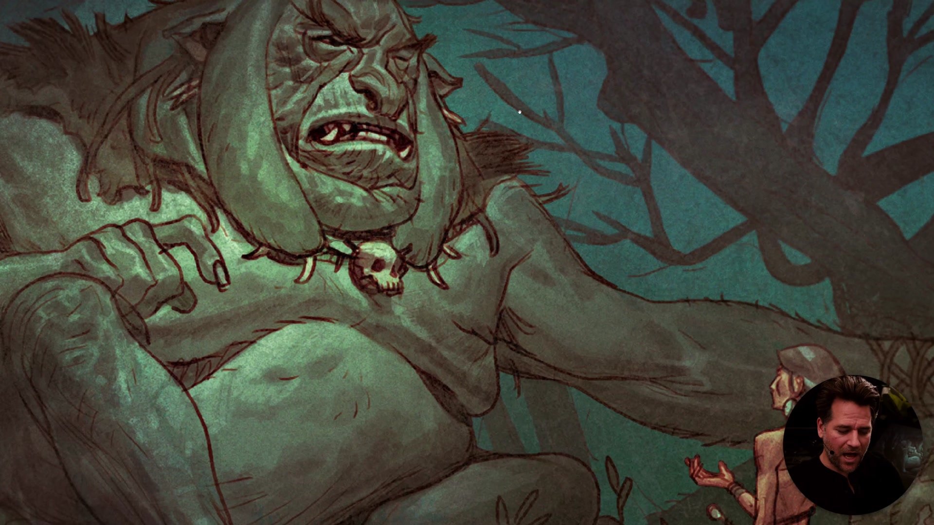
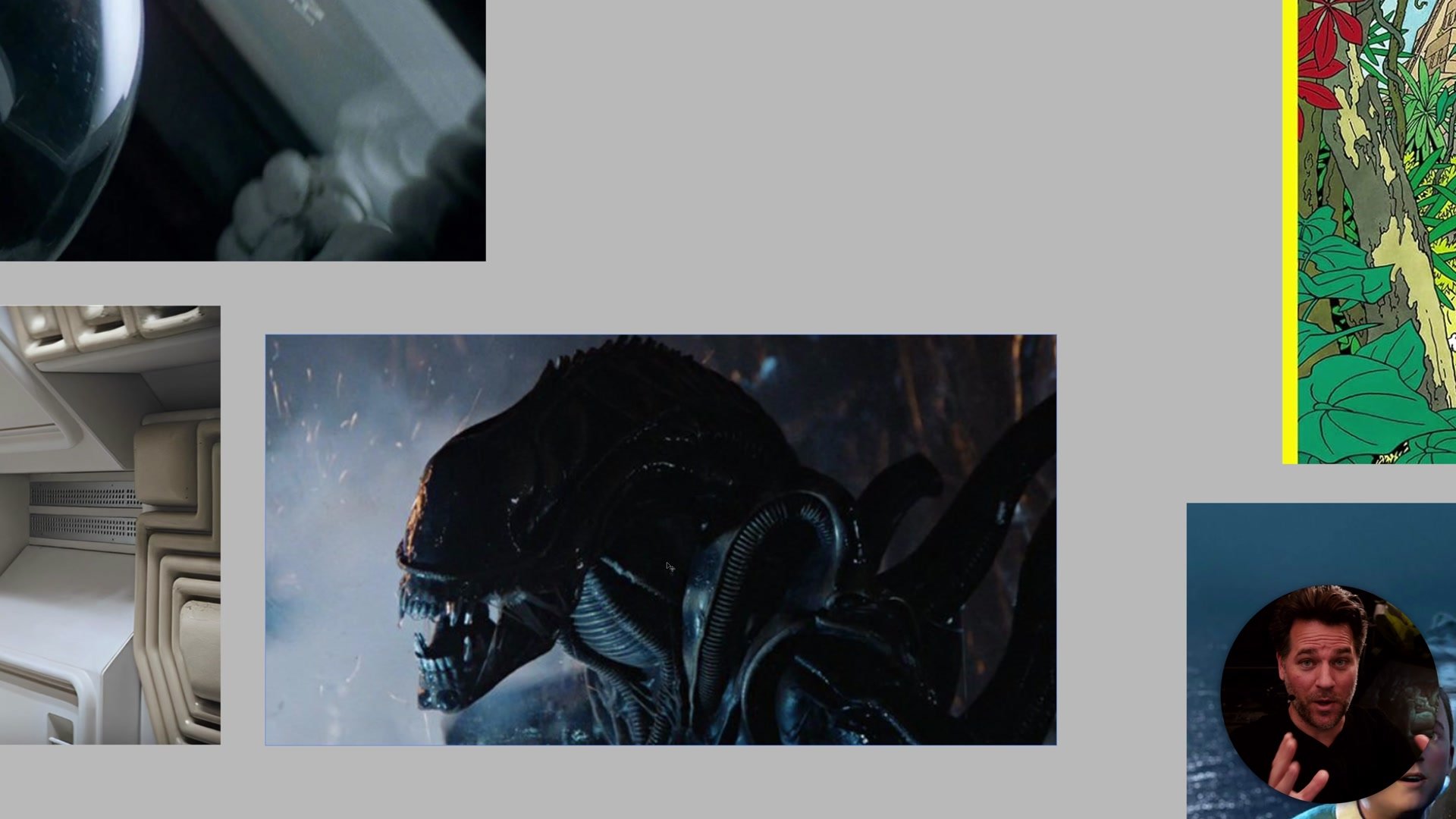
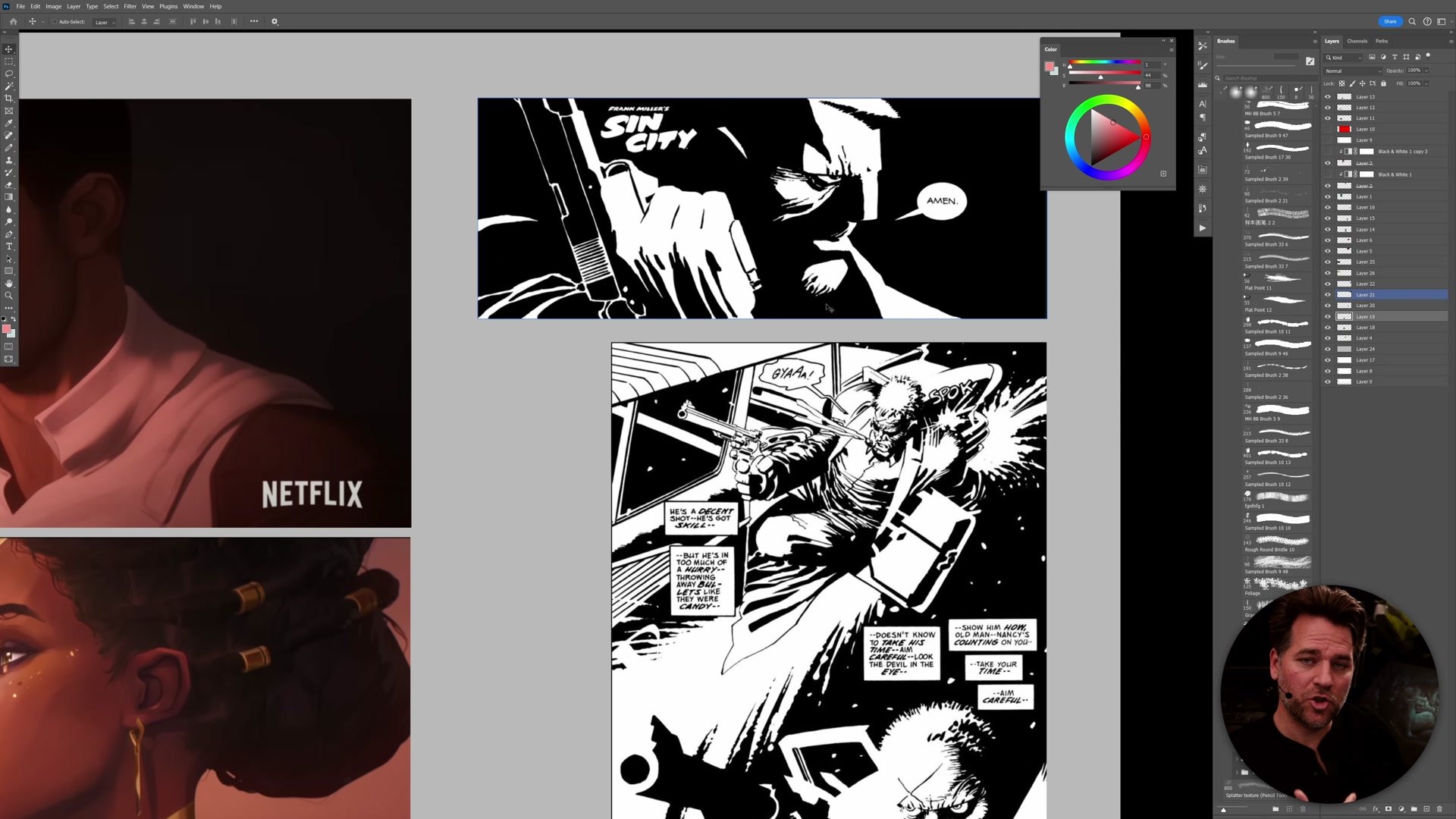
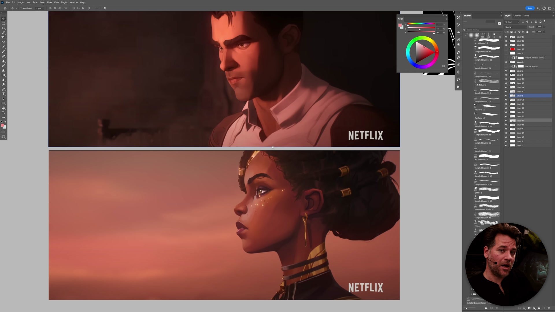
When the lights are off, as in Blade Runner or Alien, we are forced to understand the scene through how light reveals form. Characters blend into backgrounds. Features are occluded by shadow. The viewer has to actively use their understanding of how light affects three-dimensional surfaces to decode what is happening. This is inherently more stressful, which is why horror, film noir, and suspense genres rely so heavily on form-based imagery. The darkness challenges our perceptual systems, and that challenge creates emotional tension.
Shape-Based Styles Across Media
Color Contrast vs Tonal Contrast
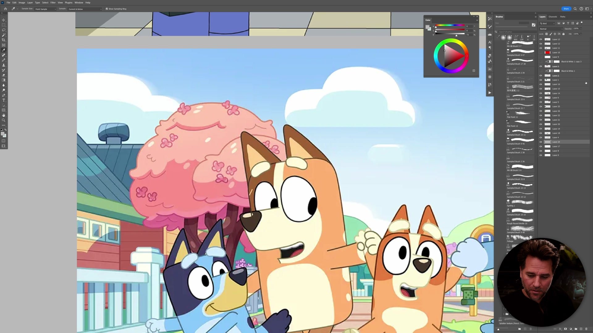
Shape-based styles frequently lean on color contrast rather than tonal contrast to create visual separation. Cartoons like The Simpsons and Bluey use almost zero value-based lighting to define form, yet they still feel like complete, vibrant worlds. The trick is that color does the heavy lifting. If you desaturate a Simpsons frame, it collapses into an almost uniform gray because there is virtually no tonal range. All the contrast lives in the color relationships between objects.
This is a deliberate stylistic choice, not a limitation. Even when shape-based styles add some rendering or shadow, the differential is handled through color shifts rather than dramatic value changes. A shadow might be a saturated pink rather than a darker version of the same hue. This preserves the open, readable quality of the image while still suggesting dimensionality. French clean-line comics like Tintin demonstrate this perfectly. The backgrounds can be highly detailed and architecturally accurate, yet the lighting plays almost no role in how we perceive the scene. Everything reads through one object placed against another.
Blending Form and Shape
Storytelling Through Style
The choice between form and shape is not just aesthetic. It directly affects what kind of stories can be told and how the audience experiences them. Shape-based imagery supports clarity and openness. A Bluey cartoon or a Tintin comic presents the world in a way that is immediately understandable. There is something comforting about iconographic imagery where everything is clear, the characters are readable, and there is no ambiguity about what is happening.
Form-based imagery creates the opposite experience. Frank Miller's Sin City pages are understood almost entirely through abstract shapes of light and dark. Pages can be genuinely difficult to decode, which mirrors the moral ambiguity and darkness of the stories being told. Artists like Moebius demonstrate what becomes possible when you have full command of both approaches. The same artist can render clean-line pages with almost no lighting, then shift to dramatically lit scenes with cast shadows and rendered form when the story demands tension or mystery. That flexibility comes from understanding the underlying structure well enough to choose how much to reveal.
Key Concepts
Form Reveals Through Light: Form-based imagery uses light and shadow to define three-dimensional structure. The viewer must decode the lighting to understand what they are seeing, which creates tension, ambiguity, and emotional weight.
Shape Communicates Through Icons: Shape-based imagery presents the world through distinct objects and color relationships. Lighting plays a minimal role, making images open, readable, and immediately understandable, like icons or cartoons.
Style Is a Deliberate Choice: Understanding form versus shape gives artists the freedom to choose how their audience experiences an image. Different stories, moods, and mediums call for different balances between these two approaches, and mastering both provides the most creative flexibility.


