Warm and Cool Color Theory For Artists
Summary
The Warm vs Cool Challenge
The vast majority of problems with images that feel muddy, lack contrast, or just don't have impact come down to one simple thing: warm versus cool. The temperature contrast between warm and cool colors is one of the most effective tools for increasing vibrancy and perceived contrast in artwork, yet it sits at the top of a lot of theory as it relates to picture making. The concept itself is straightforward. One color is always warmer or cooler relative to another color. But the way that warmth or coolness manifests can vary. It could be through a different hue, a change in saturation, or the amount of black mixed in. What makes this both powerful and tricky is that color temperature is fundamentally relative. There is no objectively warm or cool color in isolation. Everything depends on what it sits next to.
Often in the beginning, work lacks vibrancy and impact, and no amount of turning up the brightness and contrast slider or adding more detail fixes it. That is frequently because there was no good warm-cool contrast set up from the start. Understanding and applying color temperature is the key to solving this.
Color Temperature Basics
Three Practical Frameworks
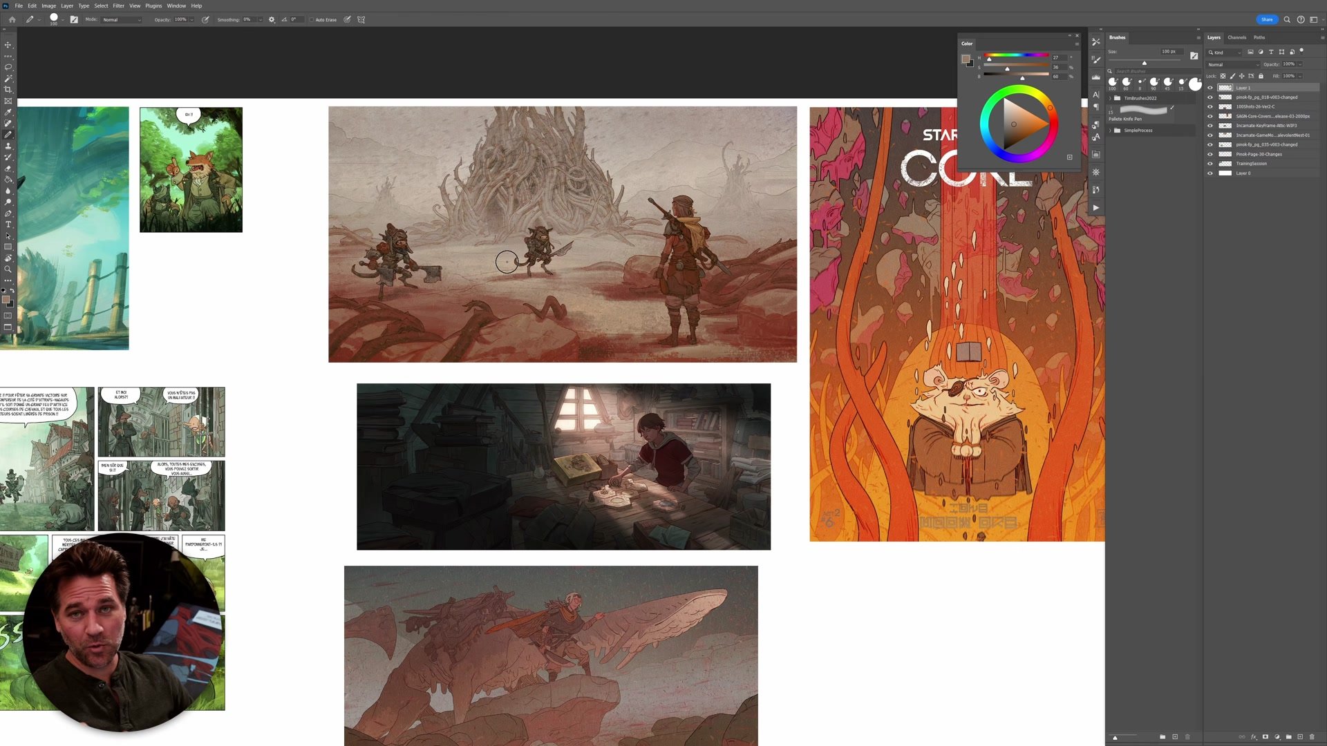
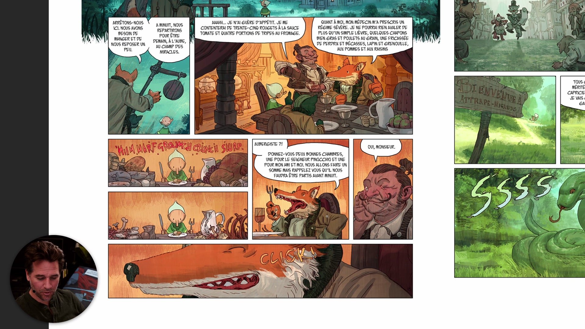
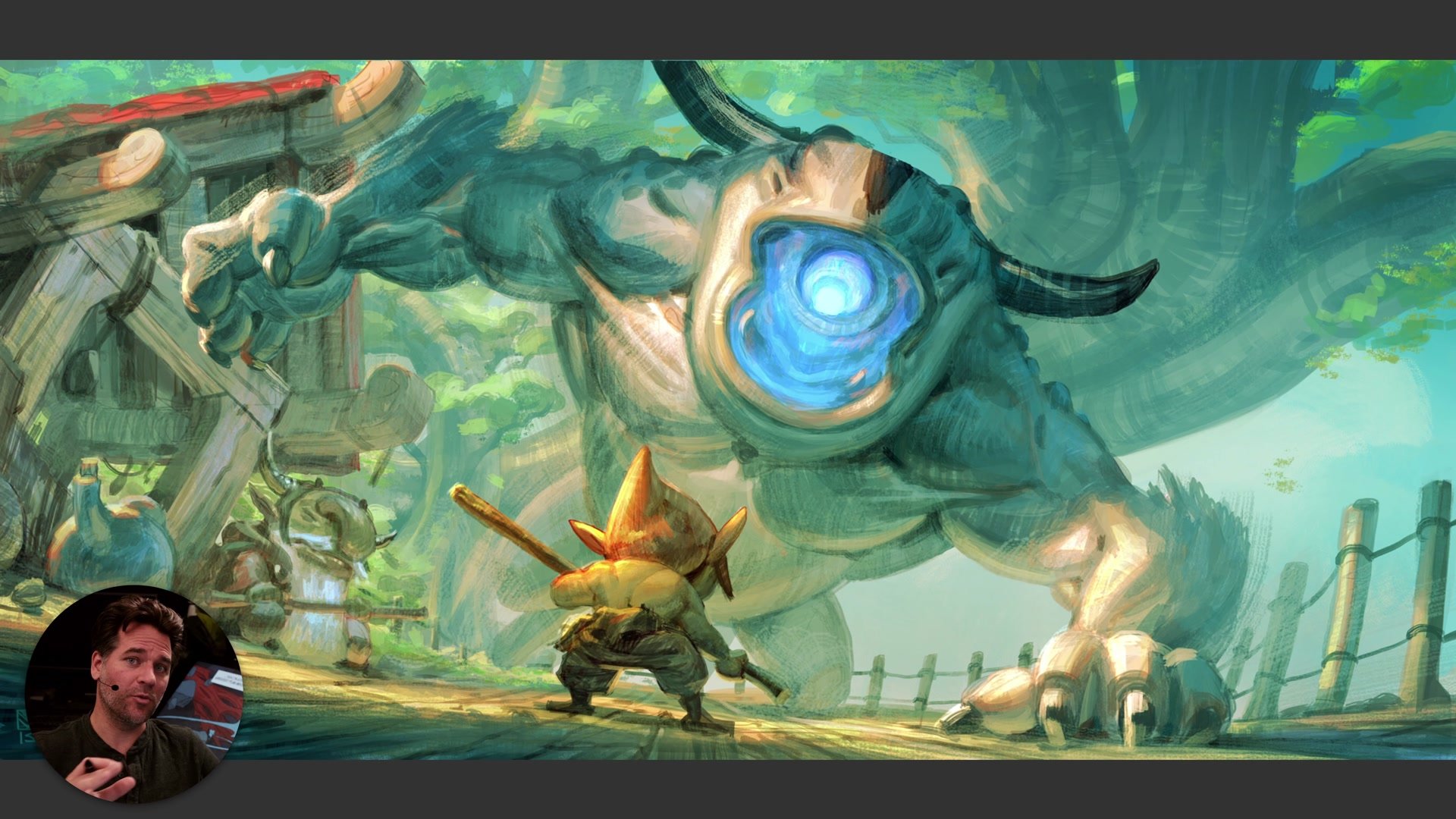
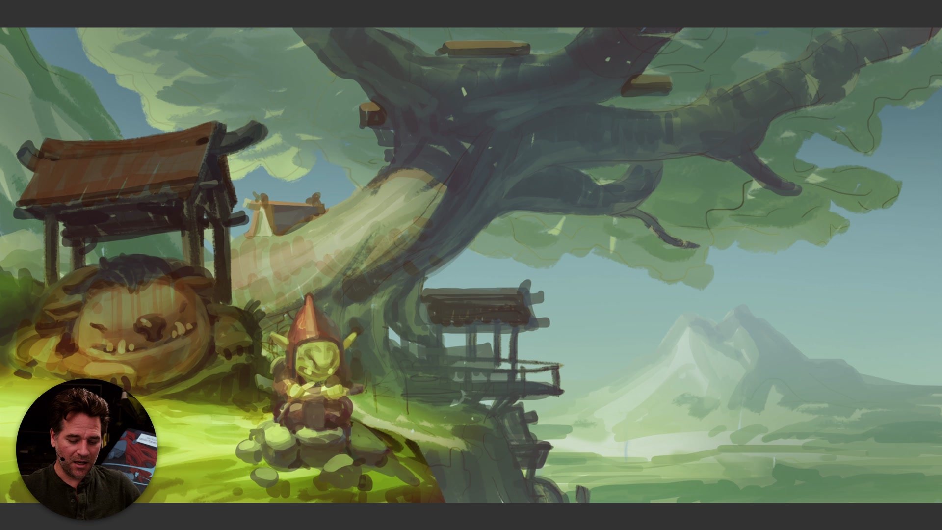
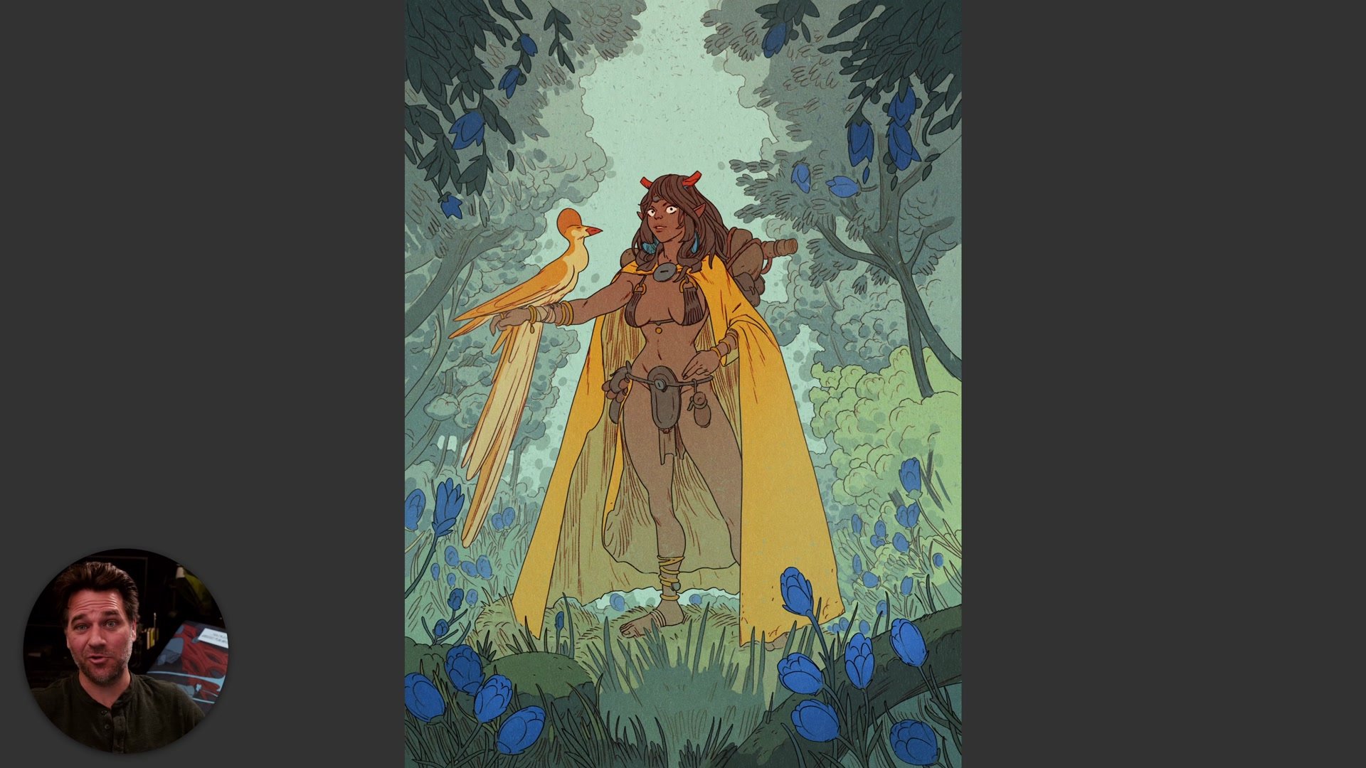
There are three core frameworks that make warm and cool immediately useful. The first is working warm-cool contrast into the lit side versus the shadow side of form. Having warm highlights with cool shadows, or vice versa, increases the perceived contrast across form without having to dial up the actual values. This is especially useful in comic book and manga styles where you want to delineate form without creating heavy value contrast.
The second framework is that warm colors come forward and cool colors recede. The eye is drawn to the warmer, more saturated elements in an image. This means warm colors naturally pull focus, and cool colors push things into the background. Accidentally putting the warmest element somewhere you don't want the viewer to look is one of the most common problems. The third framework is simpler still: people just tend to respond to warm color schemes. Warm colors sell, warm colors feel inviting. It is reductive, but it has been well tested over time and it tends to hold up.
Warm and Cool in Practice
Planning and Checking Color
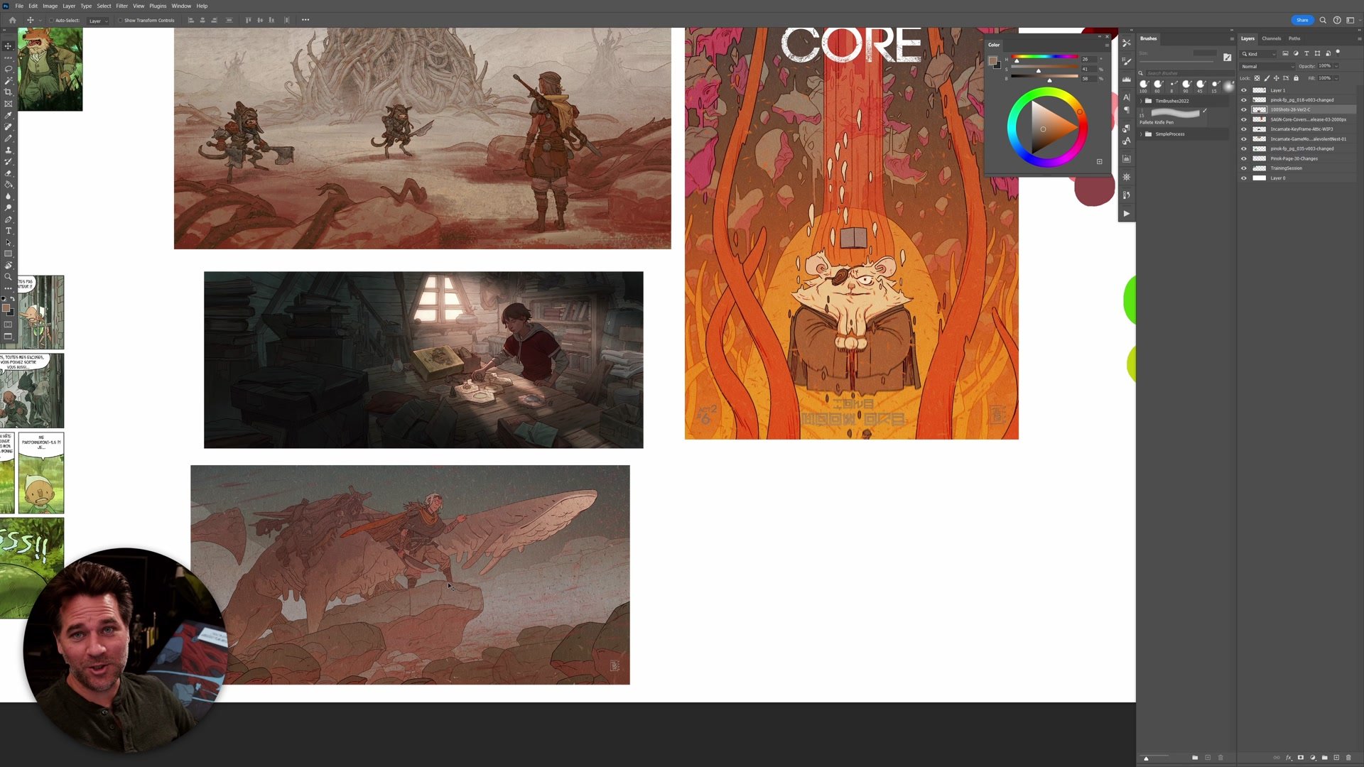
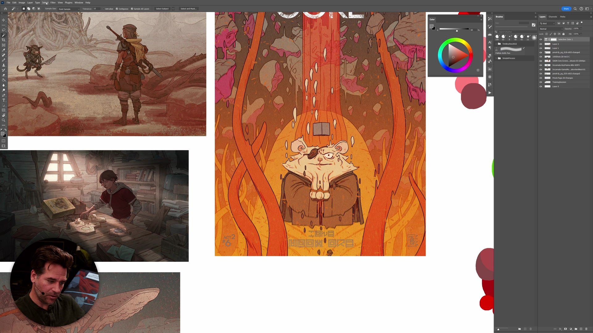
There are two main ways color temperature gets applied in practice. The first is during the planning stage, where you think about the overall color scheme and set up natural warm-cool contrast from the beginning. Choosing scenario elements that inherently create temperature contrast, like an orange character walking through a green forest, gives you a strong foundation before any rendering happens. The second application happens during the process itself. Often the image gets part way through and doesn't have enough color contrast. This is where checking the image becomes critical.
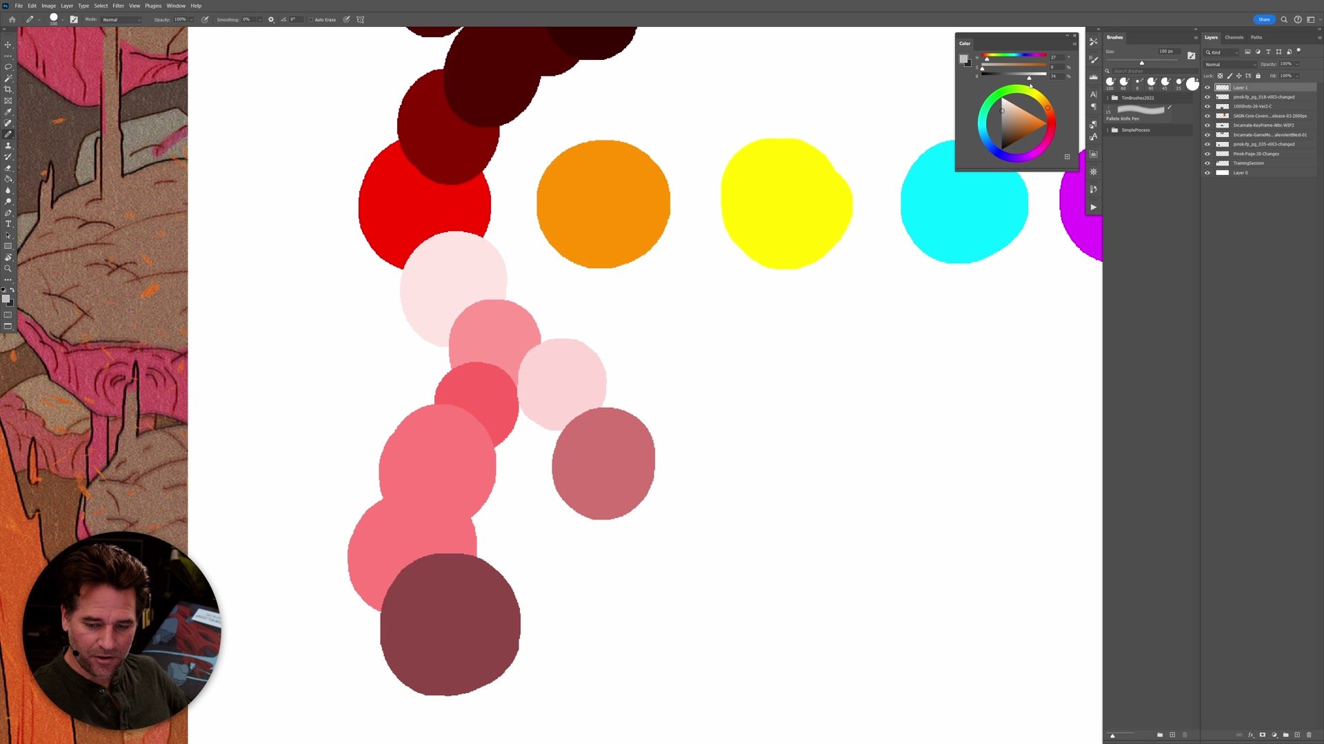
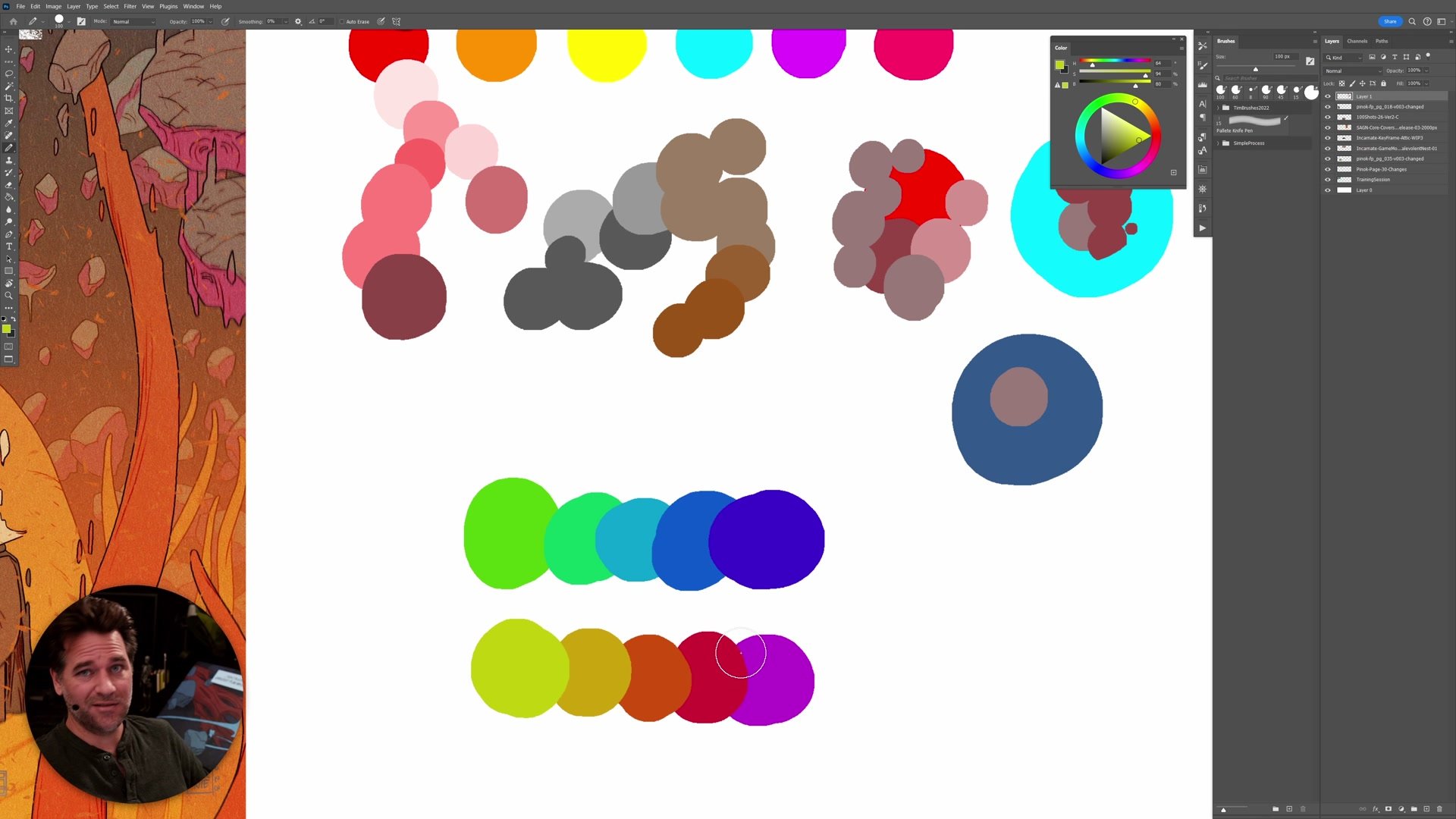
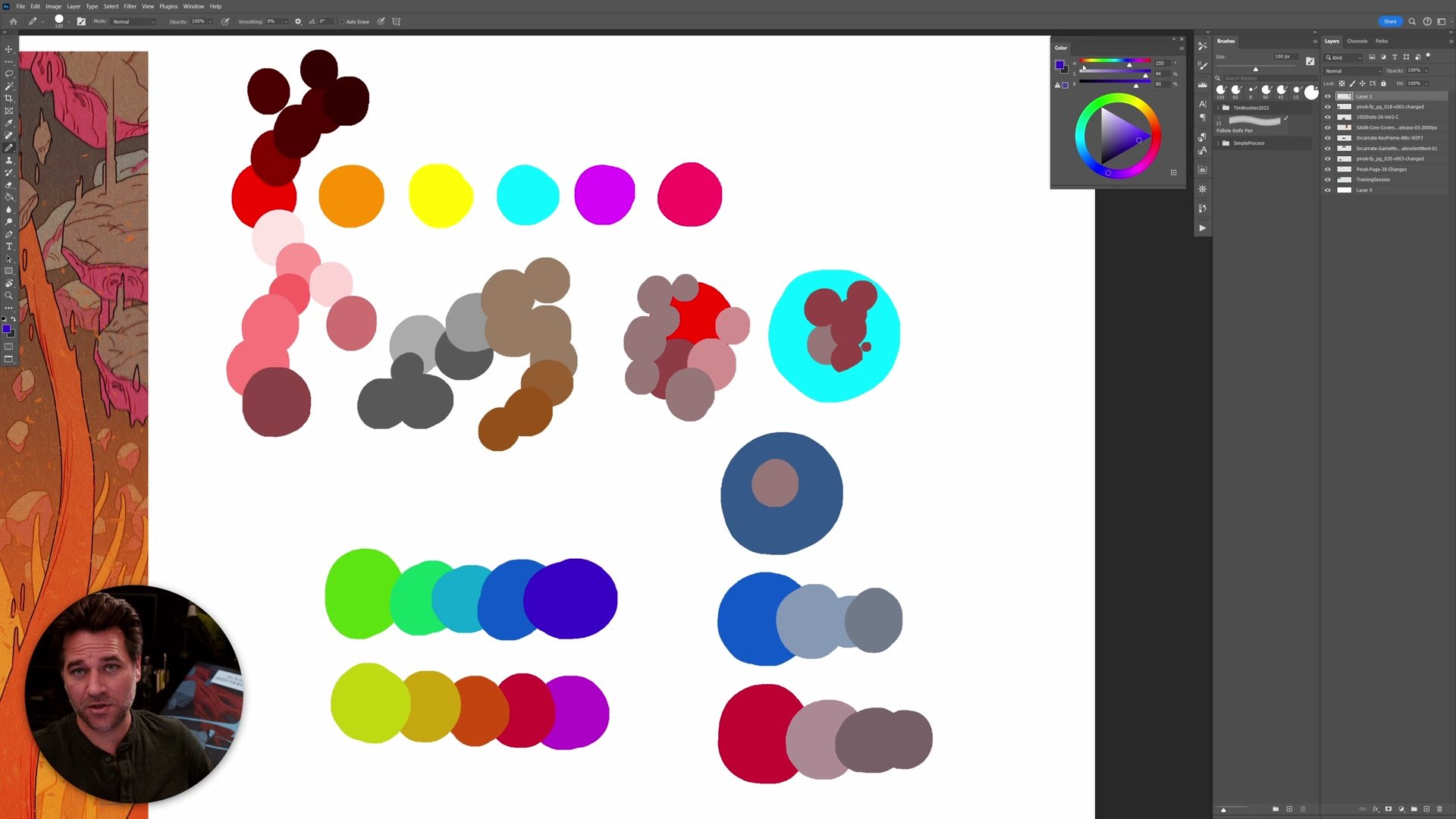
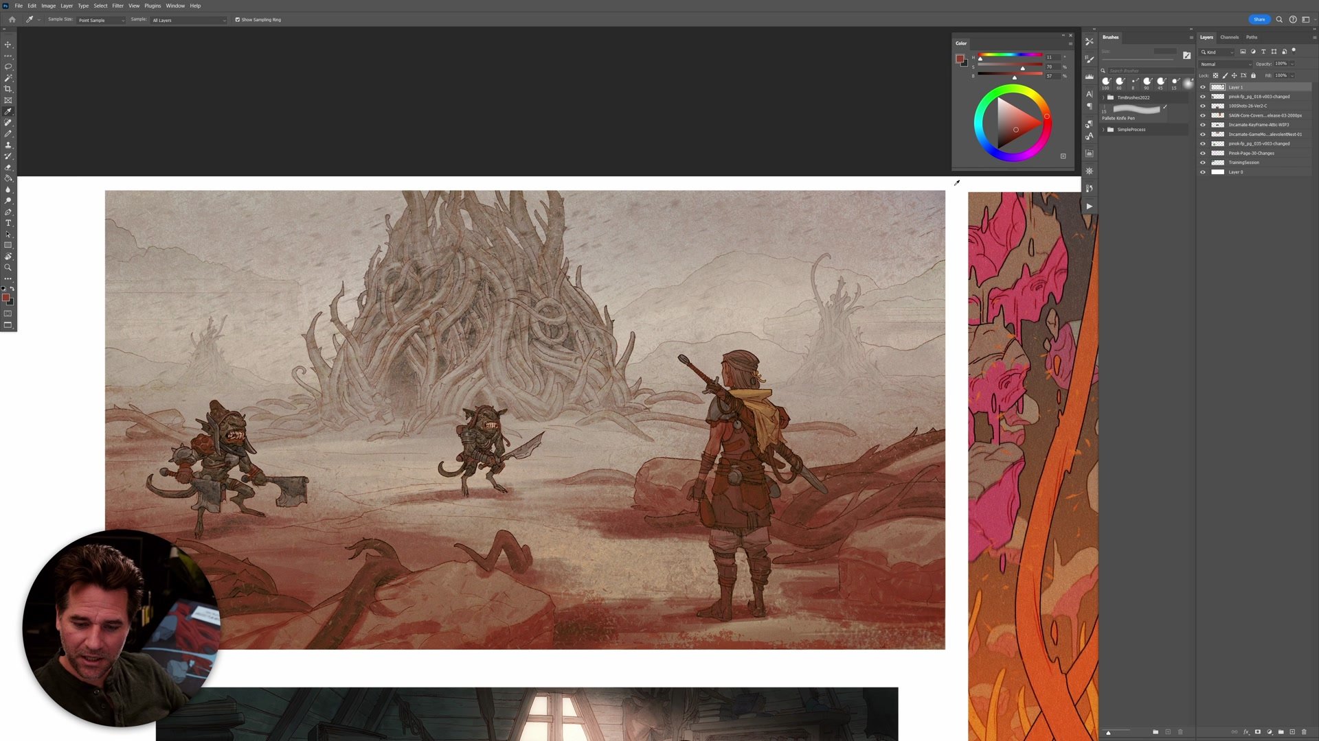
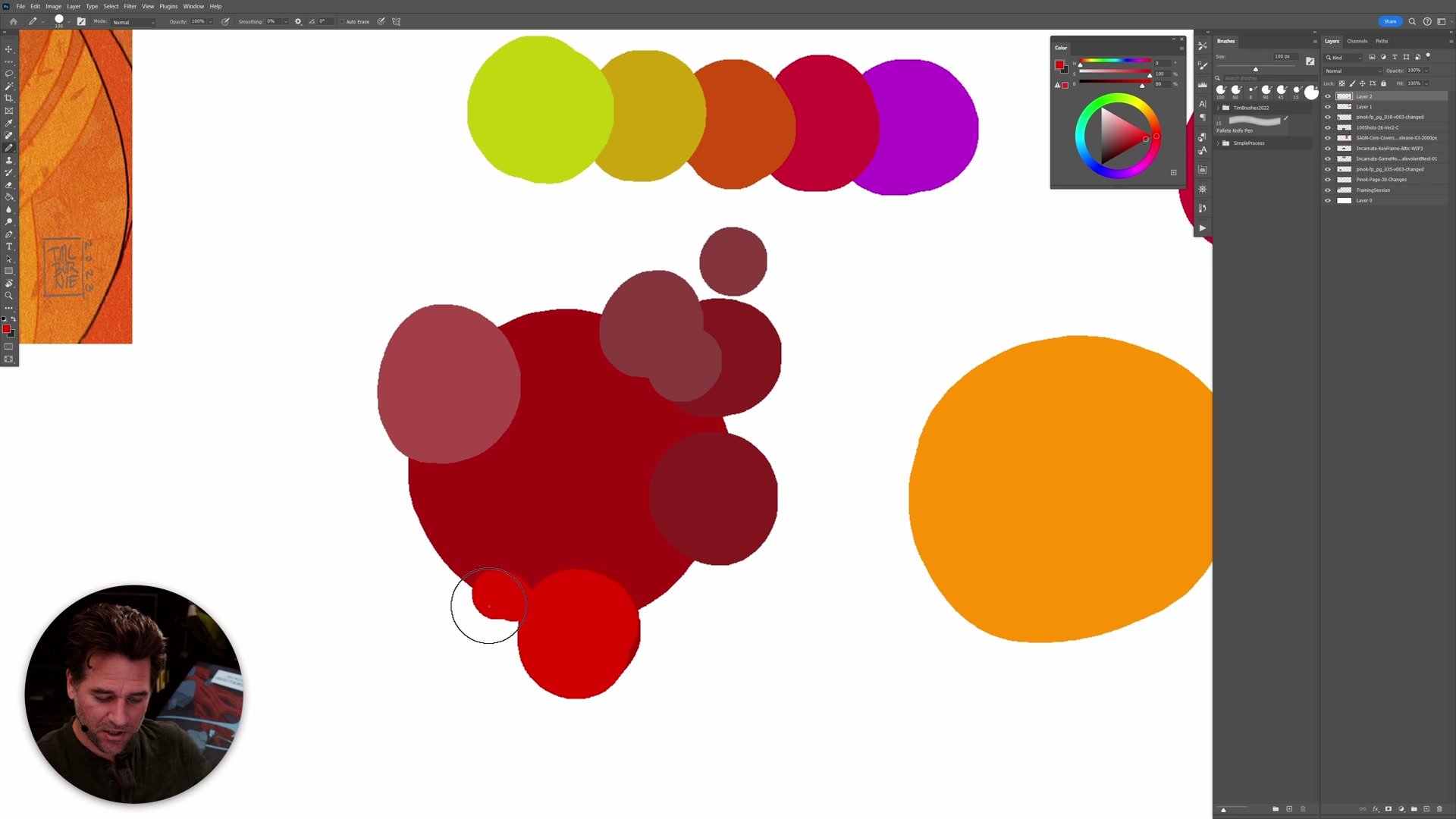
Using the eyedropper tool to scroll across an image and watching where colors land on the color wheel or HSB sliders reveals the actual temperature relationships. From there, selections and hue-saturation adjustments let you modify the temperature of specific areas. The key is to give yourself headroom. Starting at full saturation or maximum brightness leaves no room to push things warmer later. Staying slightly below the maximum gives space to increase contrast when the image needs it at the end.
Color Adjustments and Results
Working With Grays
One of the most underappreciated aspects of warm and cool is what happens in the grays. A huge amount of professional color work, especially in more painted and tonalist styles, involves manipulating subtle shifts between warm and cool grays rather than working with bright saturated hues. When saturation is reduced and you are working closer to the neutral center of the color wheel, small shifts in temperature become the primary source of contrast. The eye picks up these temperature shifts even when the colors themselves are very subdued.
This is often the difference between work that feels flat and work that has depth and presence. The ability to create a symphony of warm and cool gray tones, where nothing is screaming for attention but everything has a subtle feeling of contrast and movement, is a hallmark of sophisticated color handling. Temperature contrast is frequently the way to get impact without creating overwhelming high-contrast imagery. It is a tool of subtlety, but it works on the viewer's perception at a fundamental level.
Key Color Concepts
Temperature Is Relative: No color is warm or cool in isolation. Every color is only warmer or cooler compared to the color beside it. This relativity means you can create contrast through hue shifts, saturation changes, or adjusting how much gray is mixed in.
Warm Comes Forward: Warm, more saturated colors pull the eye and come forward in an image, while cool, desaturated colors recede. Using this principle to organize where you want the viewer to look is one of the simplest and most reliable ways to strengthen a composition.
Check Your Image During Process: Don't wait until the end to address color temperature. Use the eyedropper to scan across the image and watch the color wheel and HSB sliders. If everything is sitting in the same temperature range, there is not enough contrast to create vibrancy.
Try This Color Check
Sample Your Colors: Open a finished or in-progress piece and use the eyedropper tool to sample colors across the entire image. Watch where they land on the color wheel and HSB sliders. Note whether they cluster in one temperature range or spread across warm and cool.
Push The Temperature: Select the areas you want to come forward and use hue-saturation adjustments to make them slightly warmer or more saturated. Select background or secondary elements and push them cooler or more neutral. Even small shifts create noticeable contrast.
Plan From The Start: Before starting your next image, decide on a simple warm-cool plan. Choose which elements will be warm (focal point, foreground) and which will be cool (background, secondary elements). Having this plan before you start painting gives the whole image a stronger foundation.


