Fairy Queen Real Time Tutorial in Procreate
Summary
Drawing a Dark Fairy Queen from Scratch in Procreate
Most real-time tutorials skip the messy parts. This nearly three-hour session shows the entire process of creating an illustrated fairy queen character in Procreate on an iPad Pro, from a rough thumbnail sketch through figure construction, insect companion design, flat color application, and atmospheric finishing. The approach uses the same simple, reliable line and color process that works across Photoshop and Procreate, proving that a cross-platform workflow built around basic brushes and sound structural drawing principles produces results regardless of software.
The subject blends figure construction with creature design, applying Loomis-based mannequin building to a fantasy character while also tackling improvised insect anatomy using minimal reference. The entire drawing is built progressively, starting small and zooming in, which is especially critical when working on a smaller iPad screen.
Thumbnail to Construction
Building the Figure from a Thumbnail
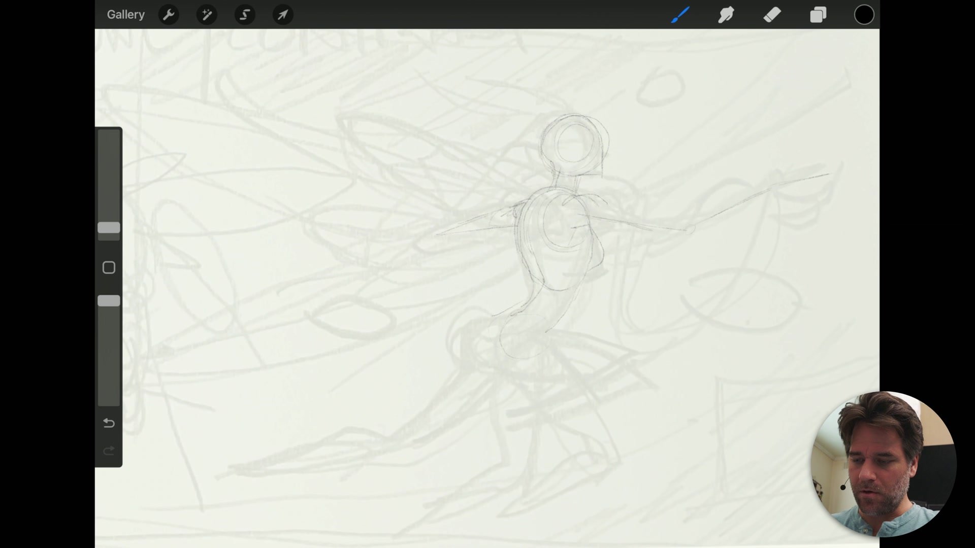
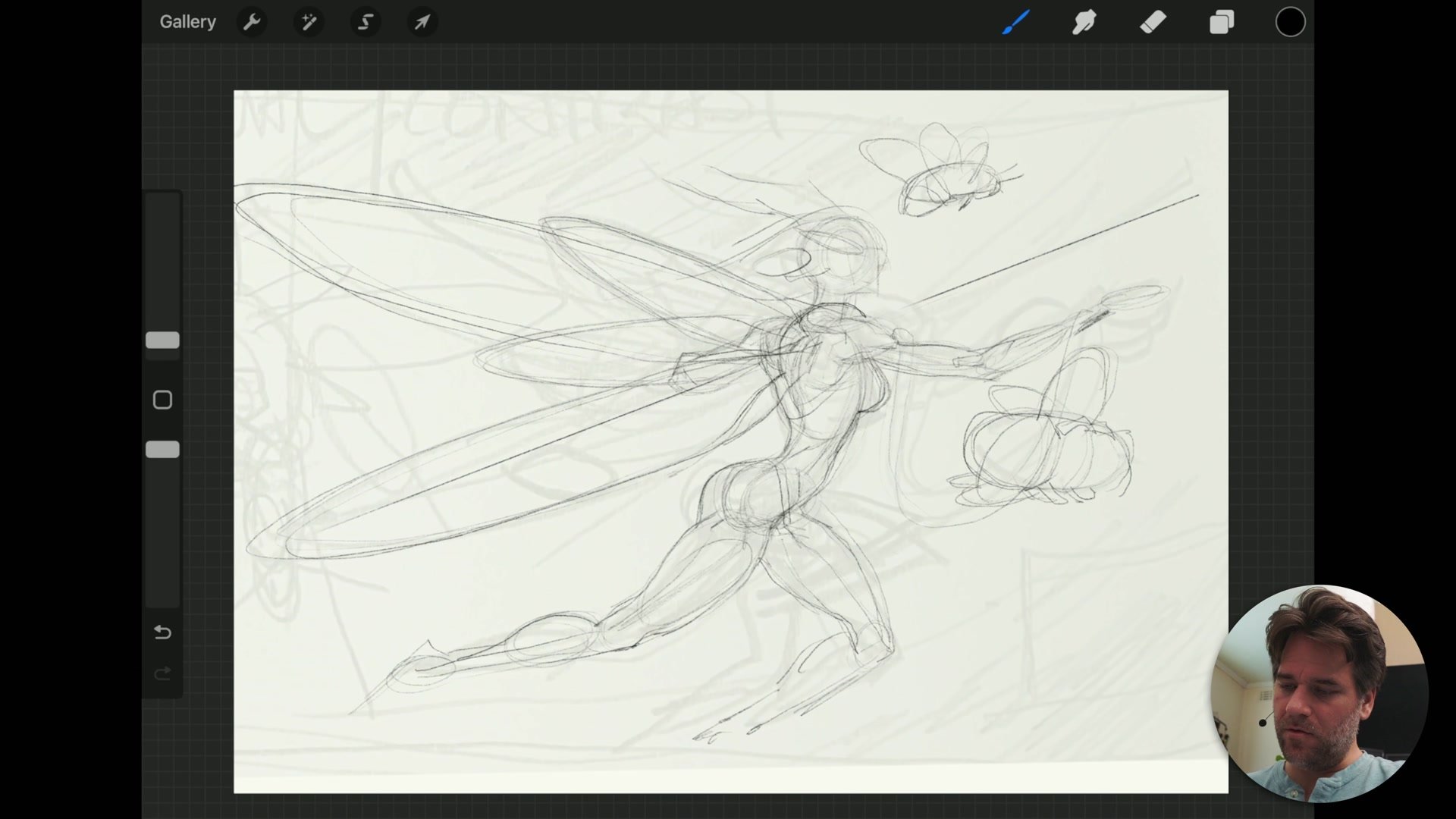
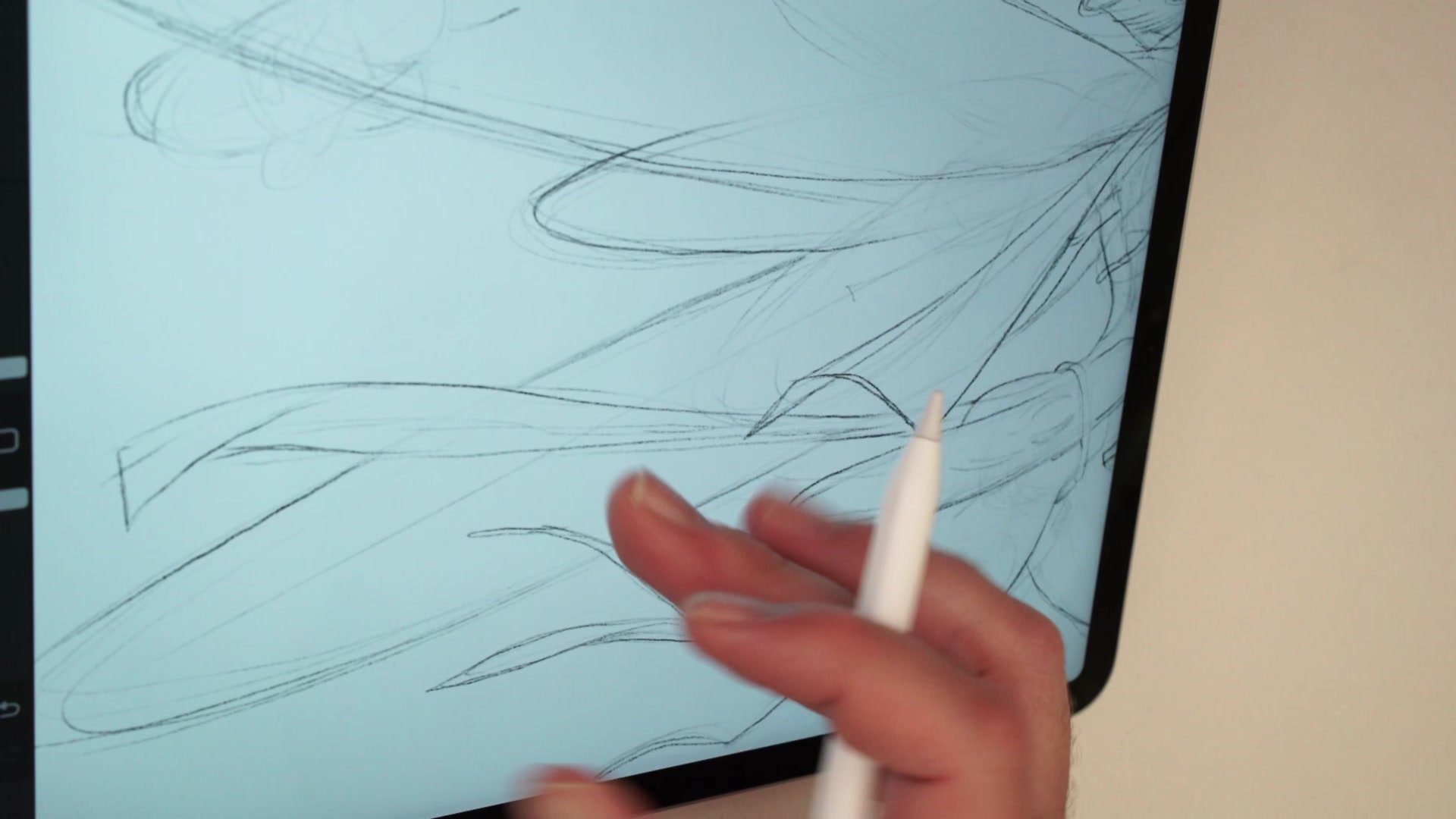
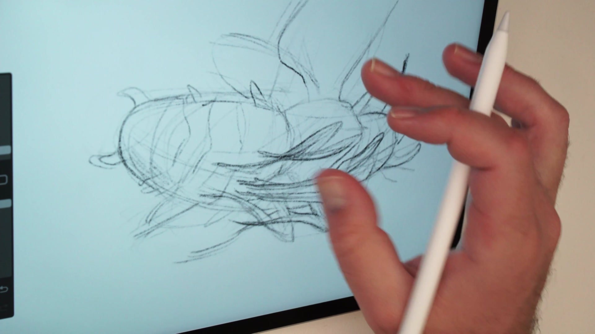
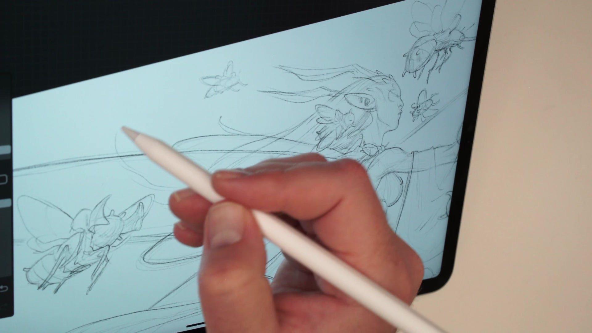
The session starts with a pencil sketch transferred from a sketchbook page into Procreate. Rather than jumping straight to detail, the approach is to build a basic mannequin of the figure first, checking proportion by blocking in the rib cage, pelvic area, and limbs as simple masses. This keeps the drawing loose enough to adjust while establishing the structural relationships that hold the entire pose together.
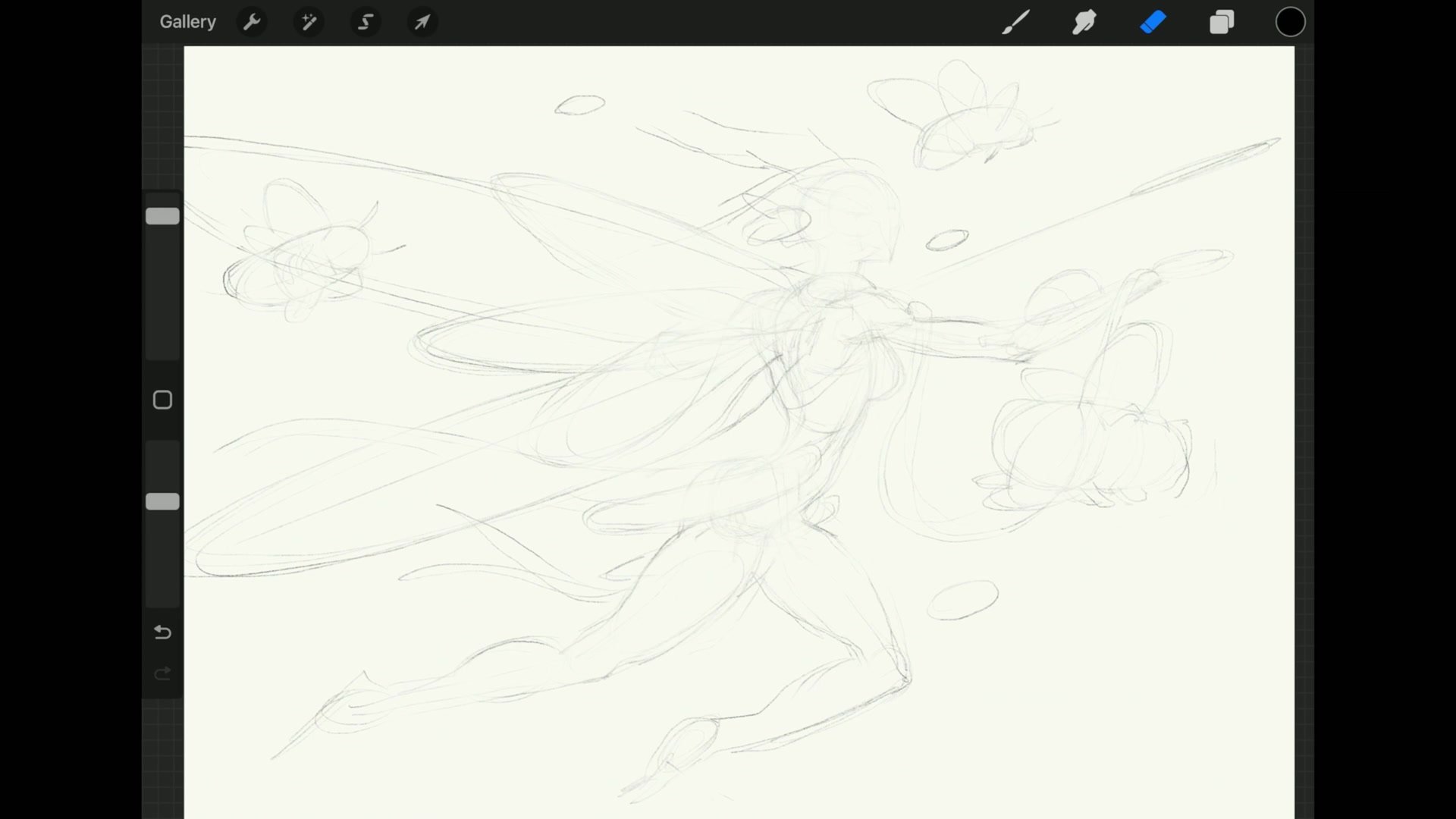
One of the key decisions is resisting attachment to the thumbnail. The initial sketch provides a starting point for composition and gesture, but the actual illustration needs to be rebuilt with proper construction. Drawing through overlapping forms, even where they will be covered by wings or costume, builds a more convincing sense of three-dimensional structure. The erasing phase works exactly like using a kneadable eraser on paper, softening the construction lines while preserving the marks that define the final drawing.
Creature Design and Detail
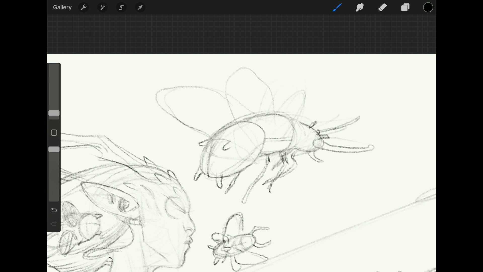
Improvised Insect Design with Basic Visual Library
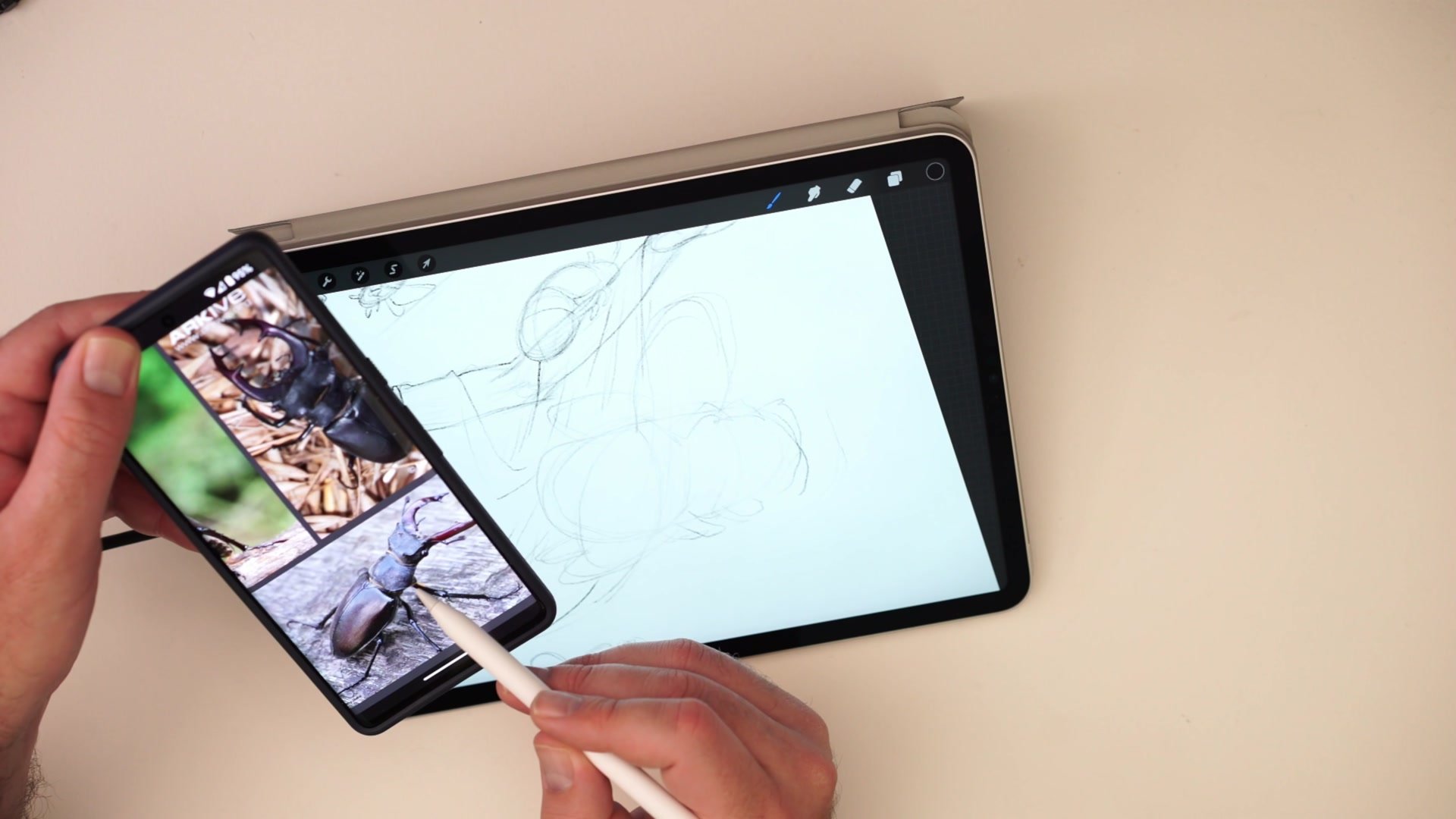
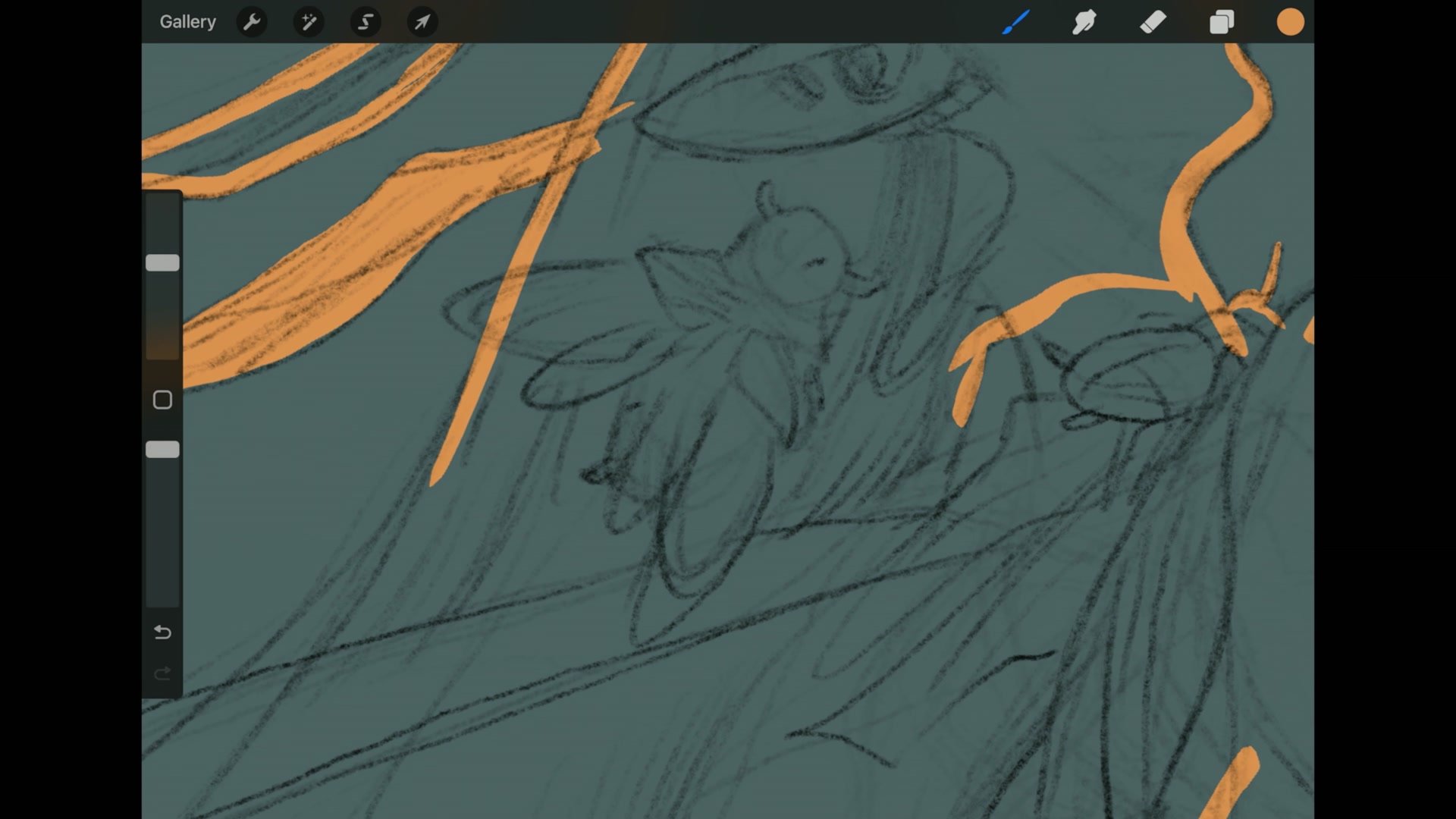
The insect companions are designed using basic structural drawing rather than detailed anatomical study. Each bug is broken down into three jelly bean shapes, with legs emerging from the central segment and wings from the thorax area. This level of knowledge, that insects have three body sections and the legs connect at the middle, is enough to create convincing fantasy creatures without copying specific species.
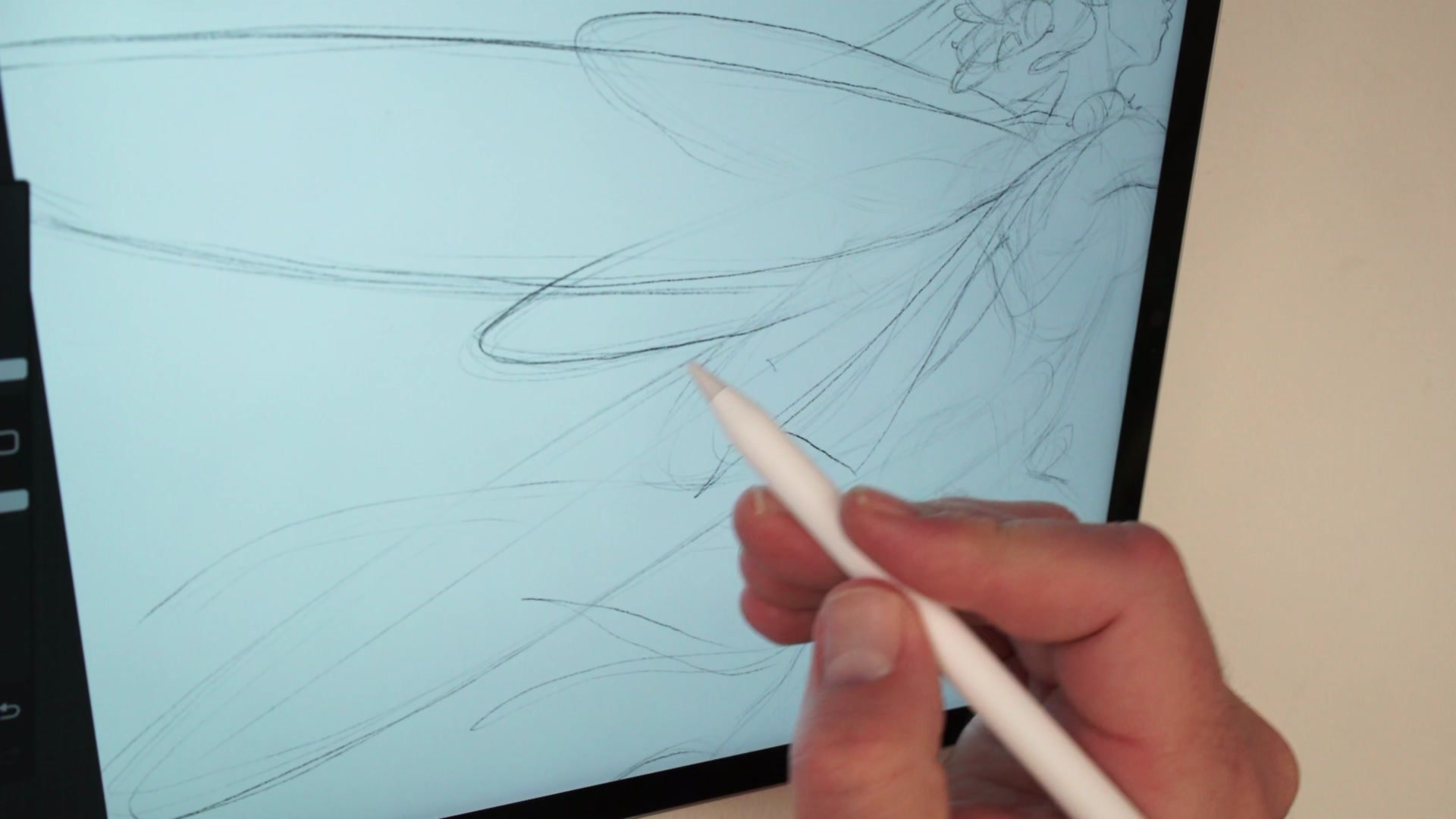
Reference is used selectively. A phone with beetle images sits next to the iPad, providing just enough information about leg direction and body articulation to avoid drawing something completely wrong. This approach to reference, using it for directionality and proportion rather than copying, is central to building visual library. By the end of the session, nine different bugs have been drawn, each one pushing structural drawing ability further while keeping the work fun and illustrative rather than academic.
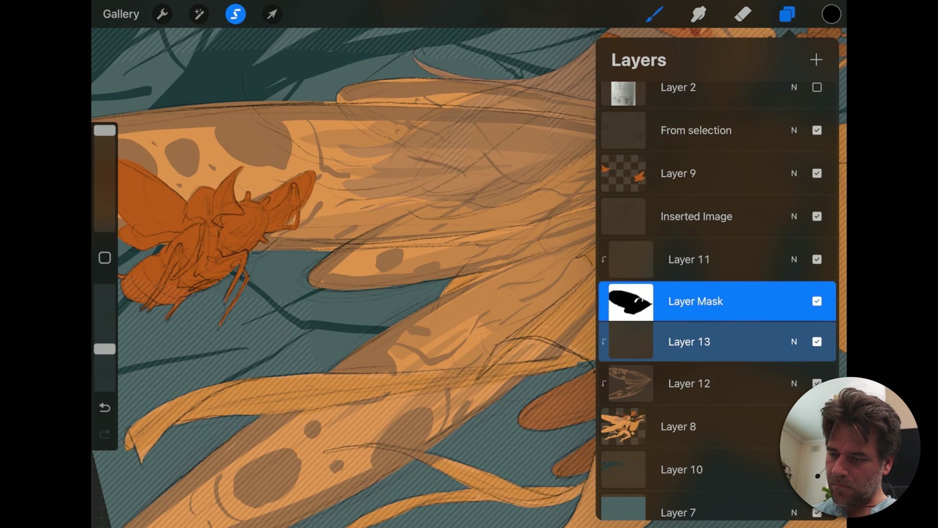
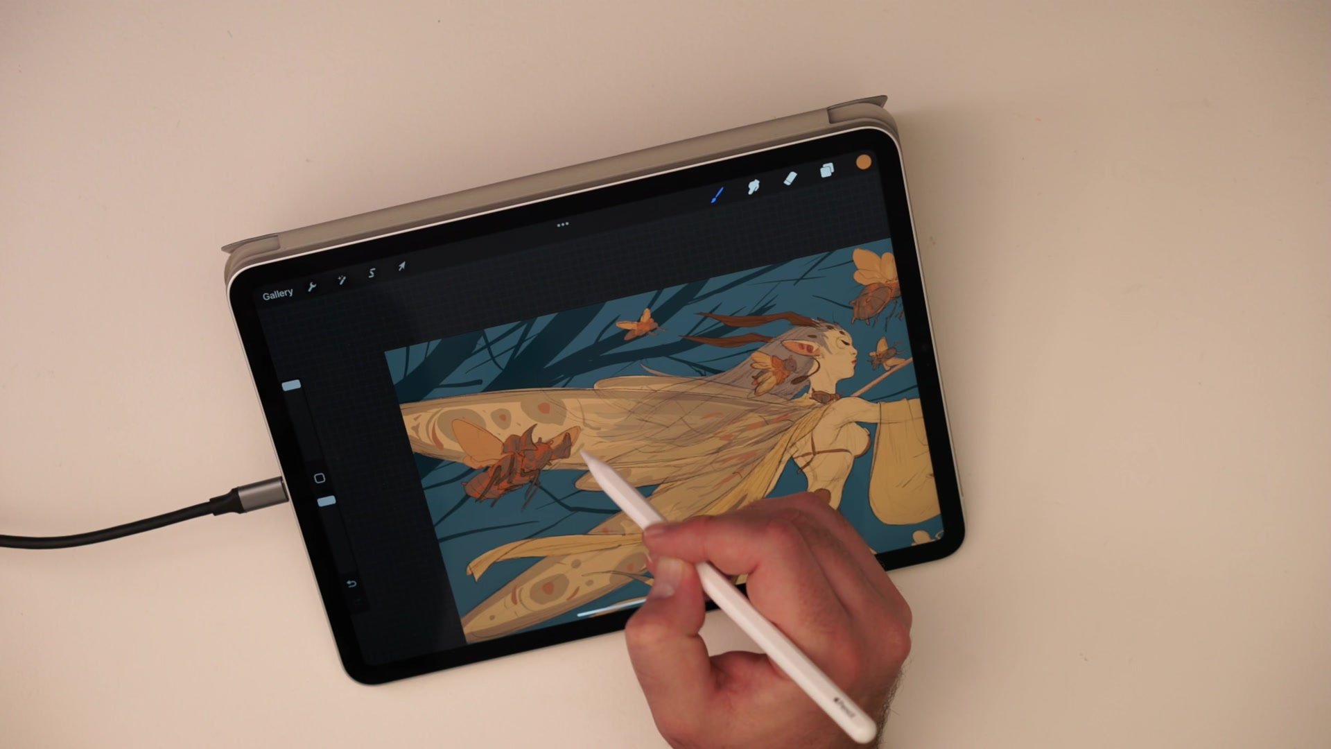
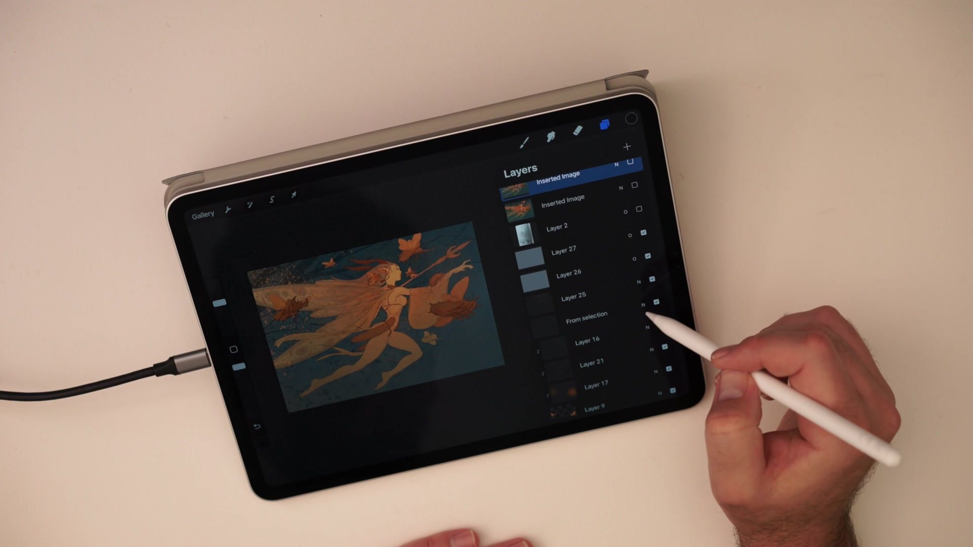
Flat Color Application
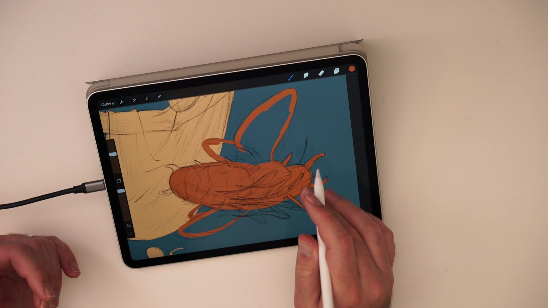
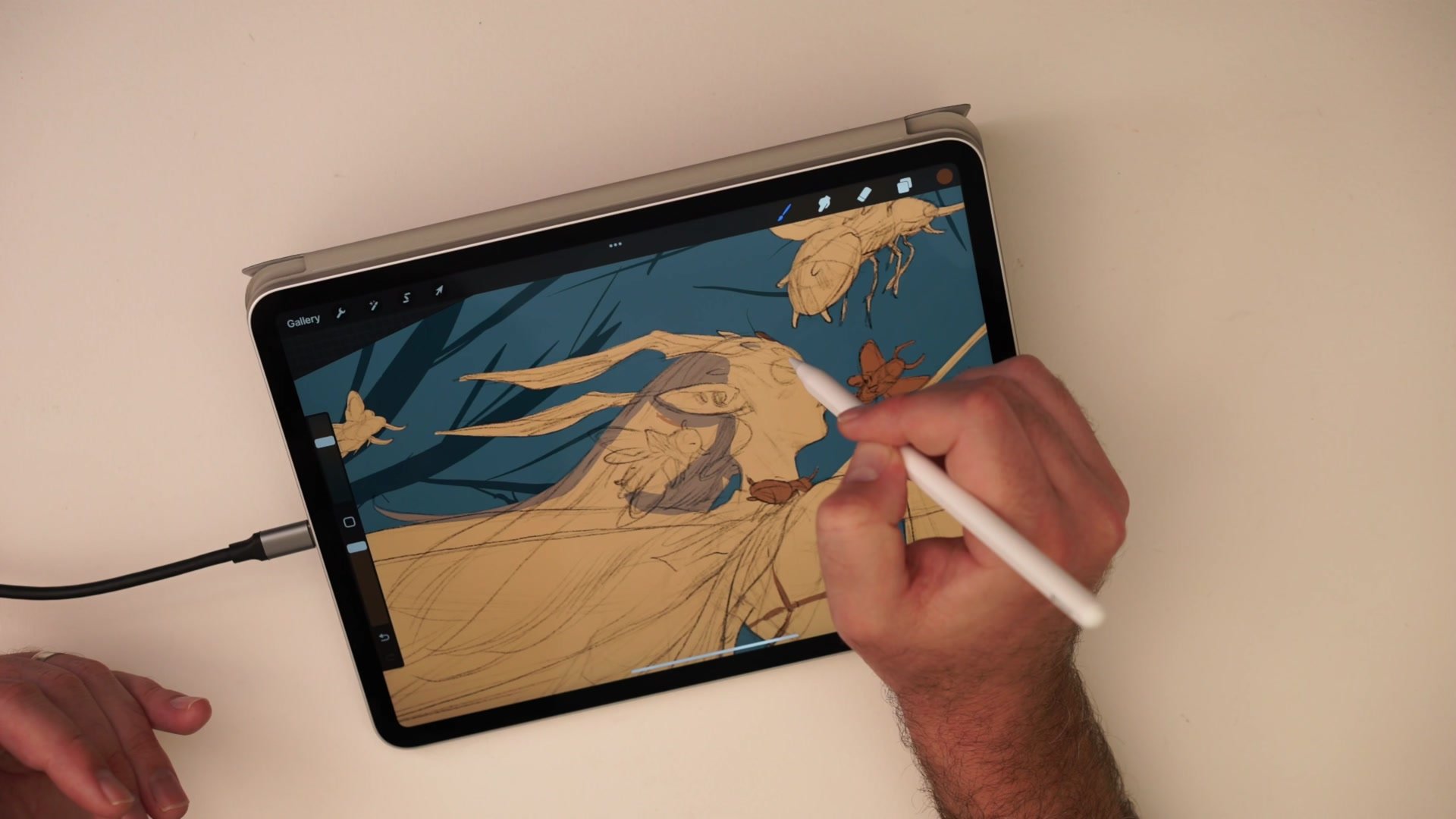
Simple Color Flatting and Atmosphere
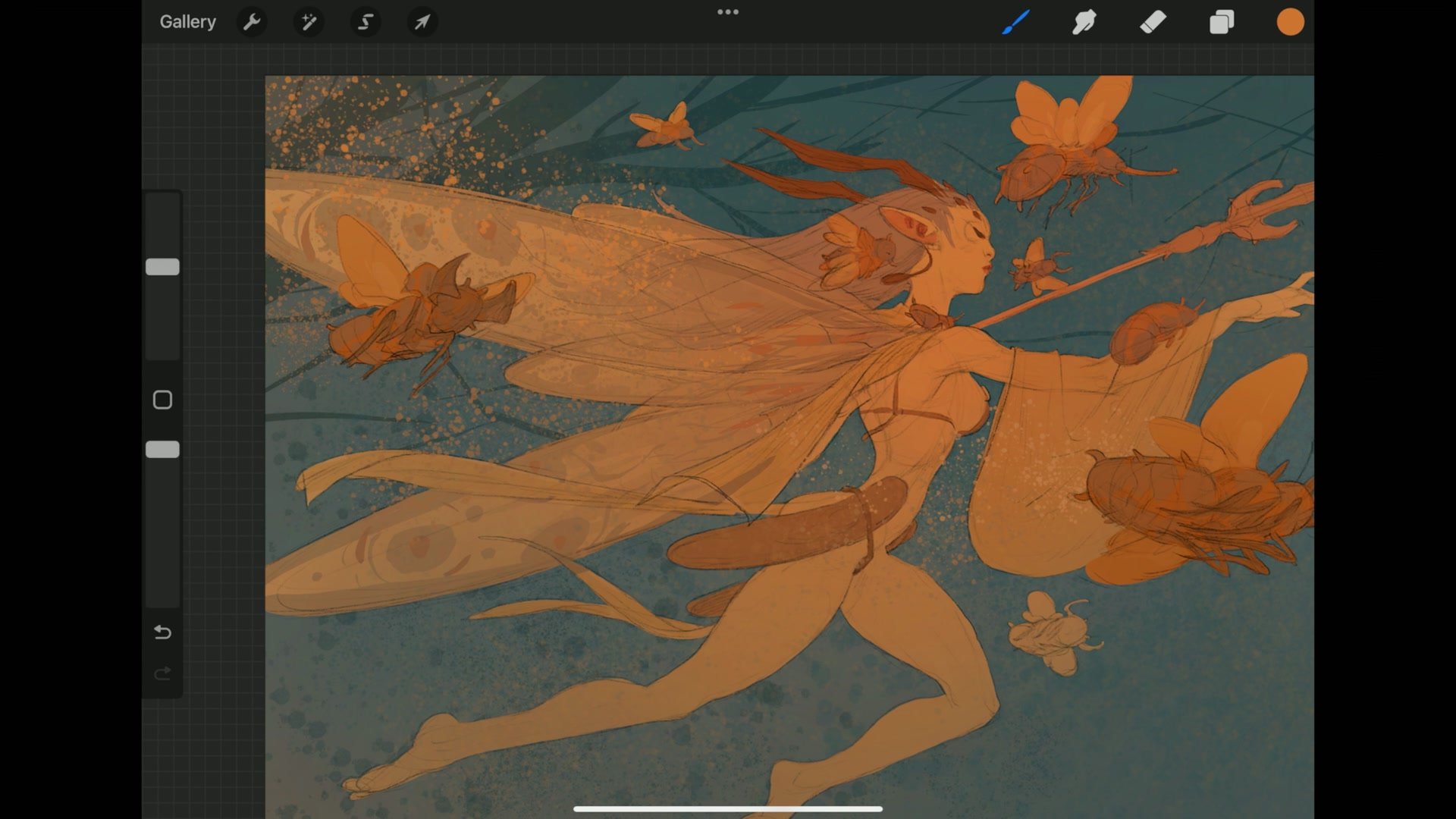
The coloring phase uses the simplest possible approach. A single inking brush with thick-to-thin capability handles all the flat color application. The palette stays deliberately low saturation, leaning into tonal contrast rather than bright color, which gives the piece a moth-like quality that fits the dark fairy concept. Every element gets separated by even minor color differences so the line art delineation reads clearly.
After flatting, the finishing process adds gradients with a soft airbrush to create depth between foreground and background, texture through procreate noise layers at different scales, and color vibrancy through overlay blend modes with selective saturation. The approach prioritizes keeping the flat graphic quality intact while adding just enough atmospheric complexity to prevent the image from feeling one-dimensional. The entire color phase demonstrates that most of the impact comes from the drawing itself, and simple flat color simply brings it to life.
Final Colored Illustration
Key Principles
Thumbnail First, Then Rebuild: Starting with a rough thumbnail sketch provides composition and gesture, but the actual illustration needs proper construction built on top. Avoid getting attached to thumbnail-level detail.
Progressive Zoom Workflow: Working small first to establish proportion, then zooming in for detail, is essential on smaller screens. This mirrors the same approach that works with traditional sketchbooks and larger digital setups.
Cross-Platform Process: Using the same basic line and color process across Photoshop and Procreate means less resistance switching between tools. Avoid relying on software-specific tricks that break when changing platforms.
Reference for Direction, Not Copying: Using reference to confirm directionality and basic anatomy rather than copying specific forms builds visual library while keeping the work original and illustrative.
Flat Color Reveals Drawing Strength: If an illustration looks good at the flat color stage, the composition and structure are working. Adding atmosphere and texture elevates what is already there rather than hiding problems.
Try This Exercise
Start with a Thumbnail: Sketch a small thumbnail of a fantasy character in a sketchbook or on a separate layer, spending no more than five minutes on it. Focus on gesture and composition, not detail.
Build the Mannequin: Transfer the thumbnail into a fresh layer and construct the figure using basic rib cage, pelvis, and limb masses. Draw through all overlapping forms even where they will be hidden.
Flat Color Only: Apply color using one brush and a limited palette. Resist the urge to render. If the flat color version looks strong, the drawing is working.


