Get Emotion and Structure in Your Linework
Summary
Finished Lines Process
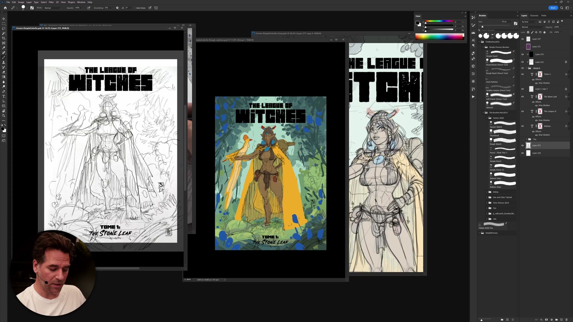
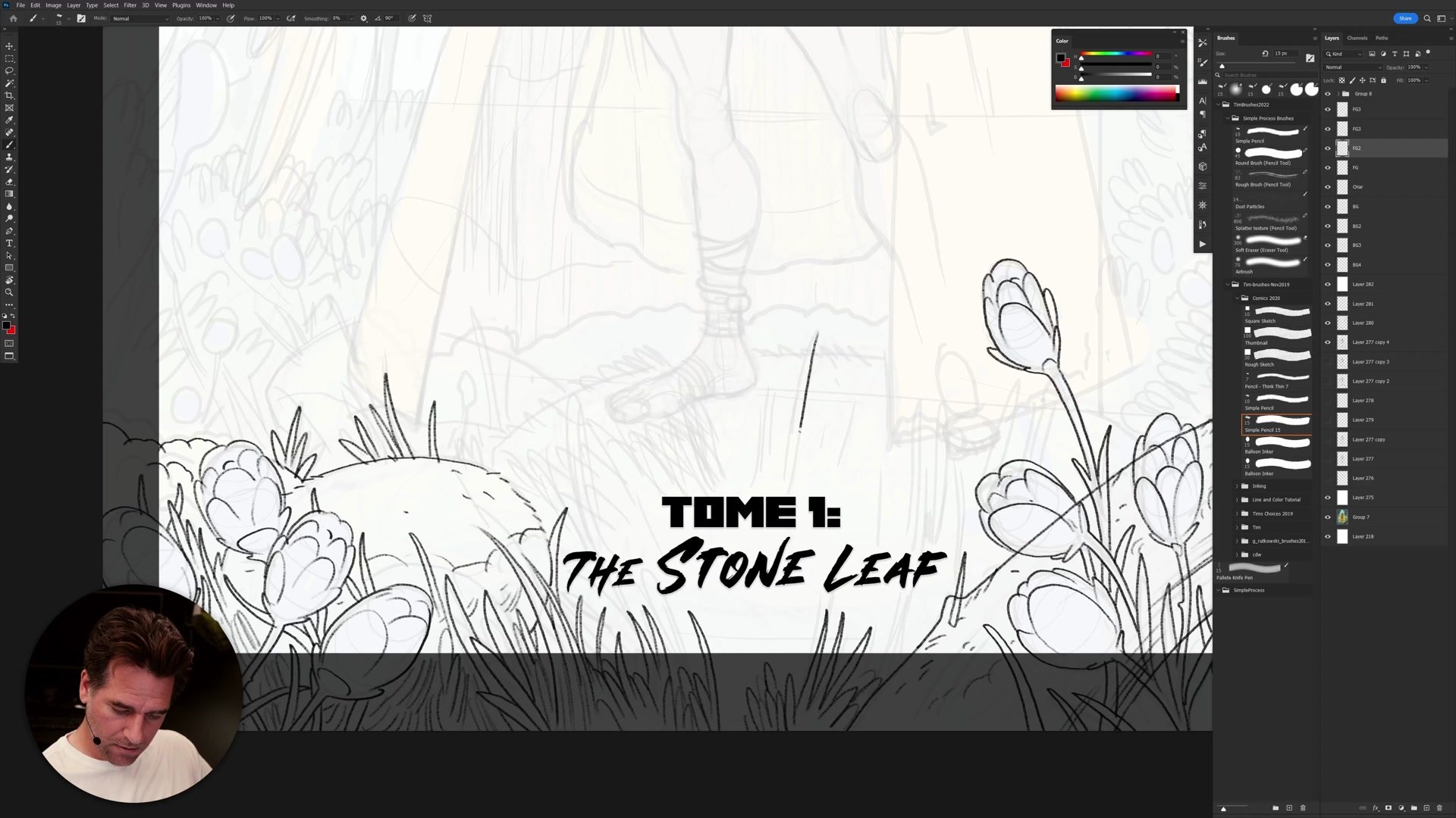
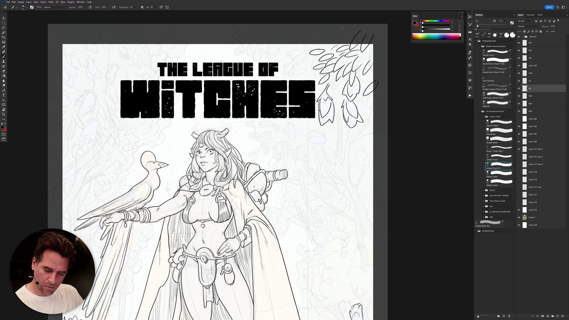
This two-hour-plus real-time session covers the finished line phase of a fantasy cover illustration titled "The League of Witches." Part three of a four-part tutorial series, the session picks up from a completed construction drawing and works through creating every polished ink line that will appear in the final image. The work progresses from foreground foliage through the central character to background trees, demonstrating how layer organization and a foreground-to-background workflow keep a complex cover manageable.
The session reveals the meditative reality of inking -- closing lines for easier flatting, managing tangents at crop boundaries, and continuously balancing detail against hierarchy. Throughout, there is honest discussion of the time investment required and the problem-solving that happens when construction decisions meet final line execution.
Setup and Foreground Inking
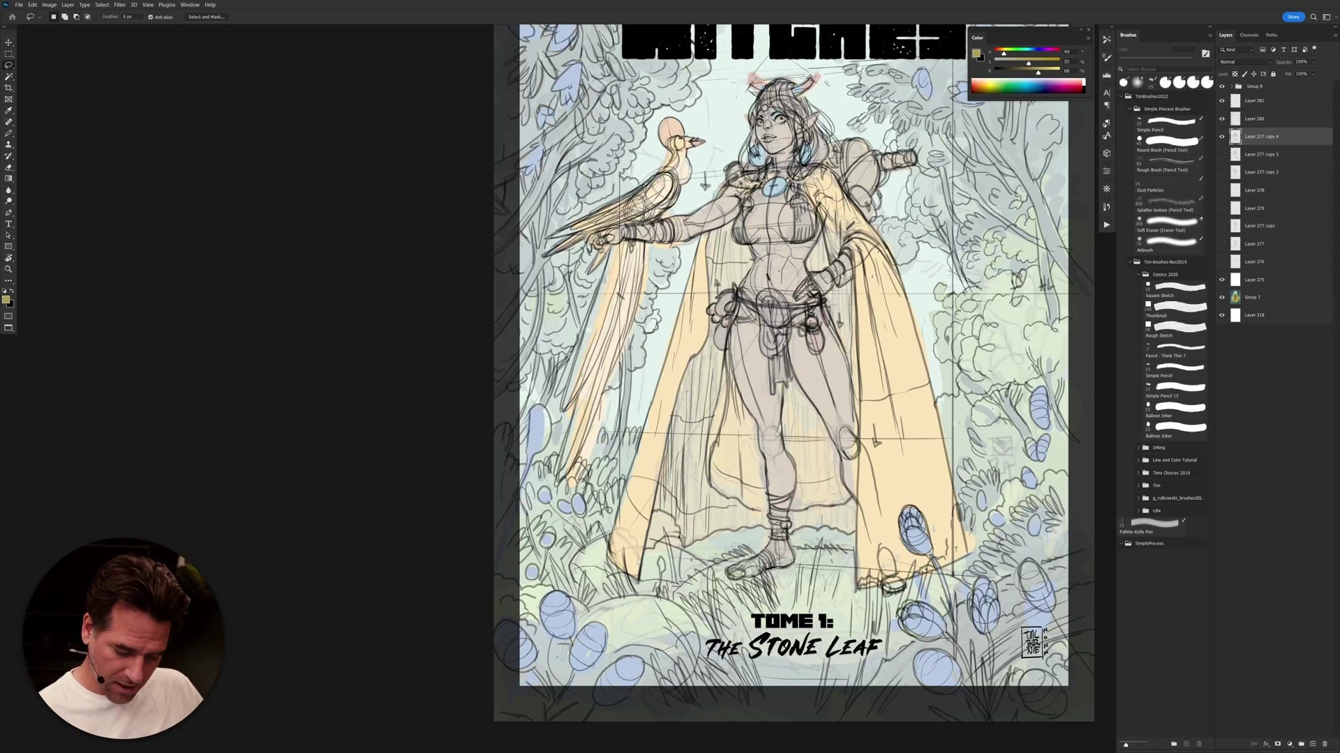
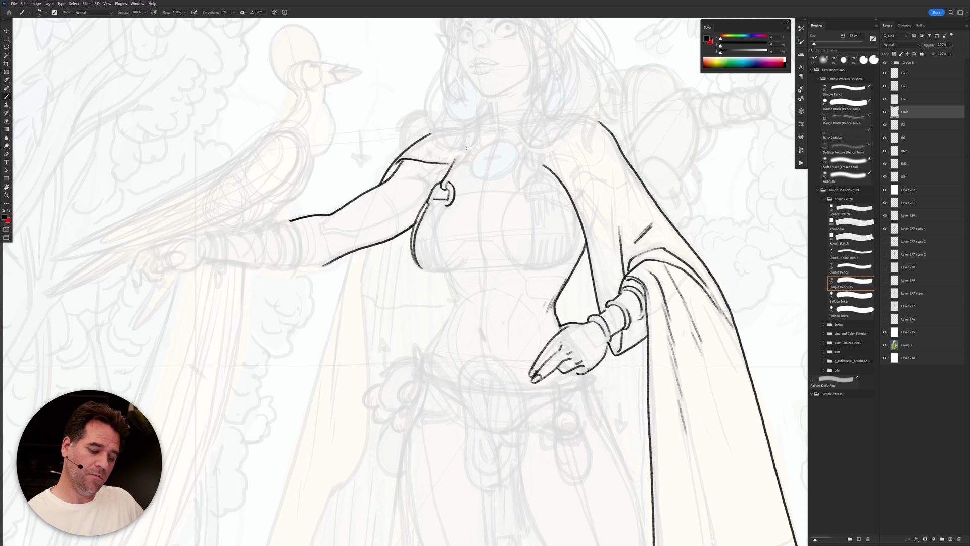
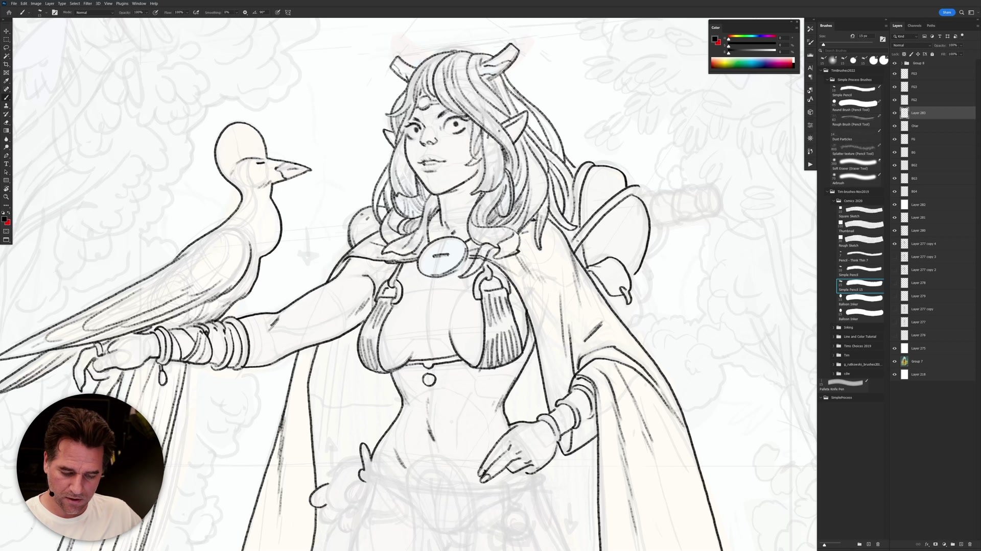
Foreground to Background
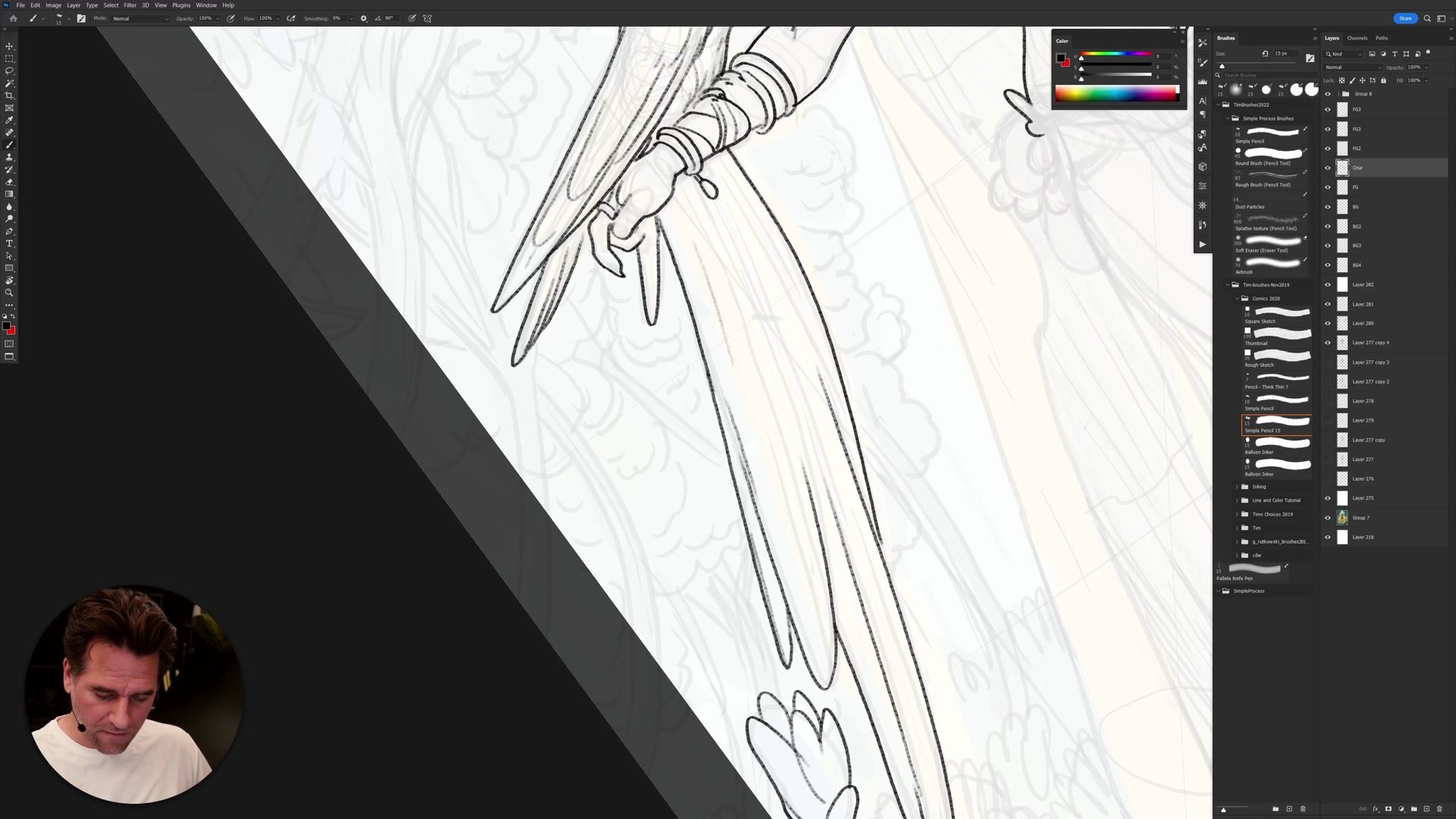
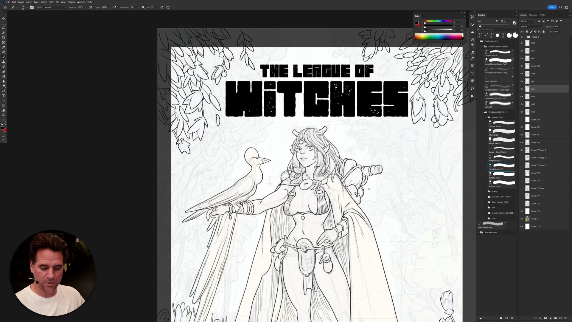
The entire inking session follows a strict foreground-to-background workflow. Four foreground layers, one character layer, and four background layers are set up before any inking begins. Starting with the closest elements -- flowers, grass, and foliage that overlap the bottom of the composition -- the approach establishes the highest level of detail first. These foreground elements receive tight, closed linework because they will need clean selections during the flatting phase.
Closing lines is a recurring theme. Every shape that can be sealed is sealed, even when it takes longer, because open gaps create significant pain during the color flatting stage. Tangents at the bleed line also get careful attention. Rather than letting lines awkwardly intersect the crop boundary, each element is drawn with awareness of where the final printed edge will fall. These small details add a percentage point of polish that accumulates across the entire cover.
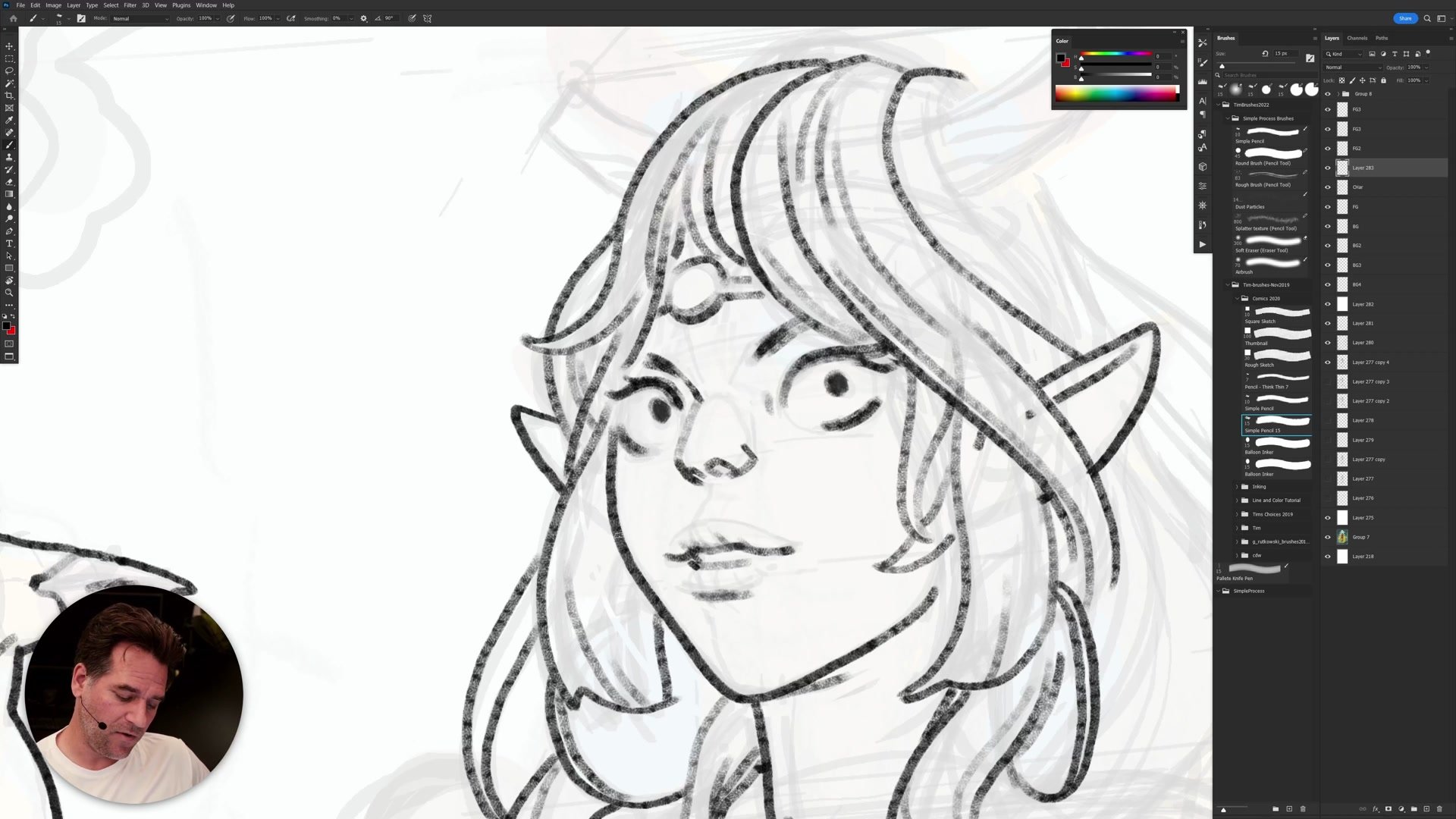
Character Inking
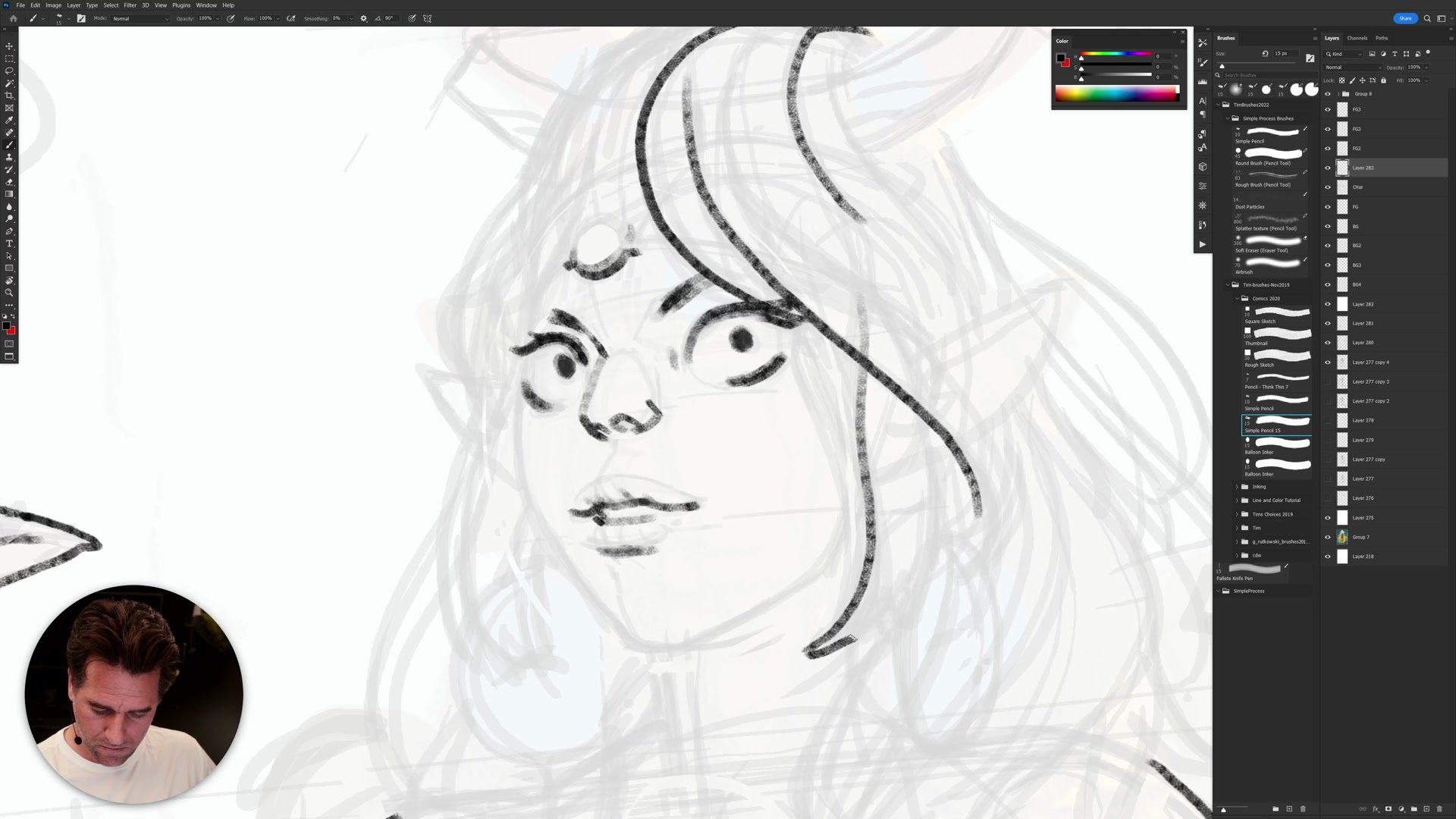
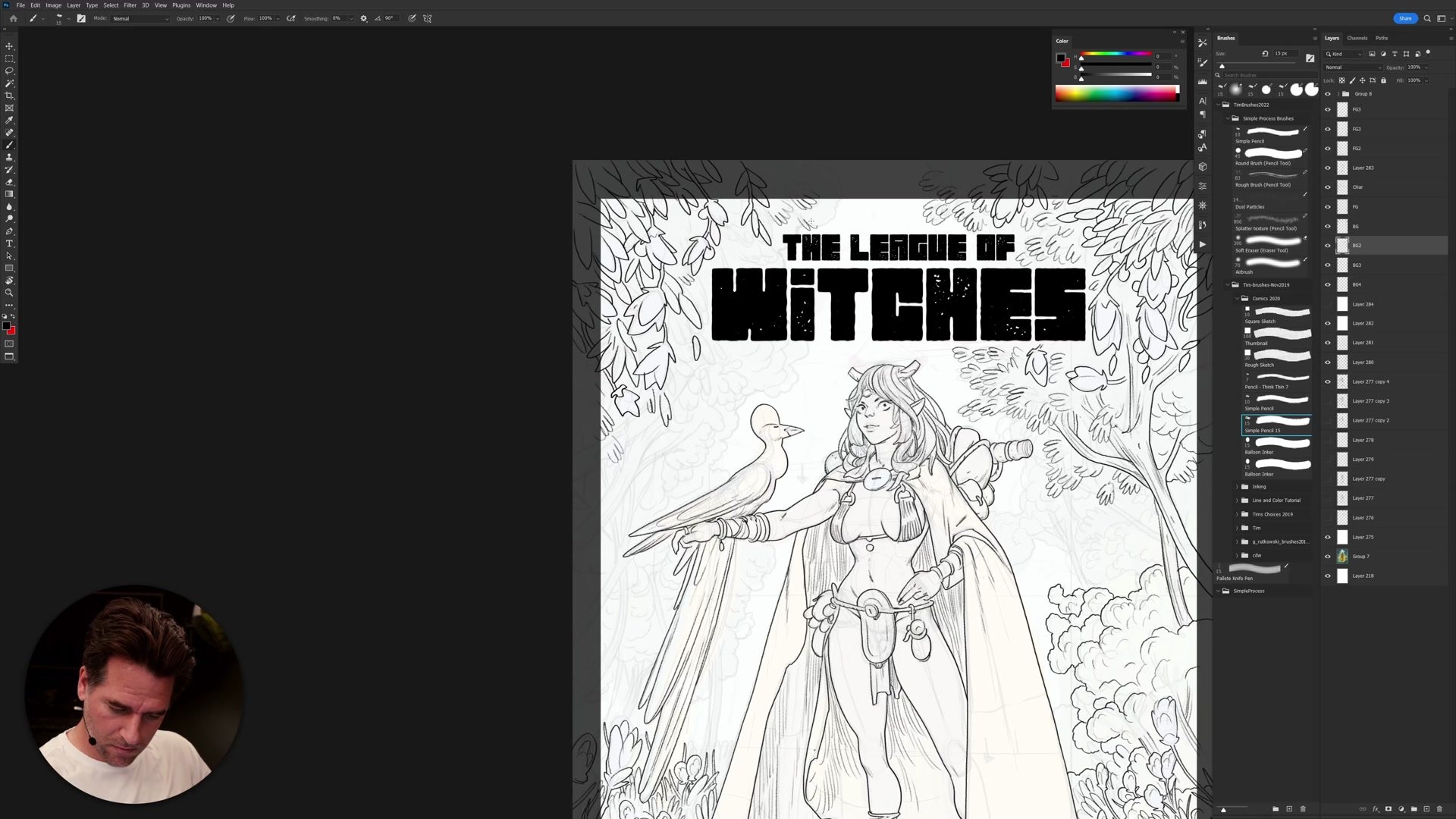
Face Inking Sequence
The character inking begins at the center of the face and works outward. Eyes are placed first, then the nose and lips, and only after these features are established does the face outline get drawn. This sequence matters because the precise distance between features -- measured in the actual pixel width of the brush being used -- defines the character more than anatomical accuracy does. Moving the face outline by even a few pixels completely changes the look.
This connects to a broader insight about line iconography. Lines are symbolic representations, not literal anatomy. The features are floating in an iconic, symbolic space, and getting their relationships right at the brush width being used matters more than structural correctness. The facial outline wraps around the features rather than the features being fitted inside a pre-drawn head shape. Separate layers for the face and hair make it possible to adjust overlapping elements without redrawing everything.
Detail and Background
Hierarchy of Detail
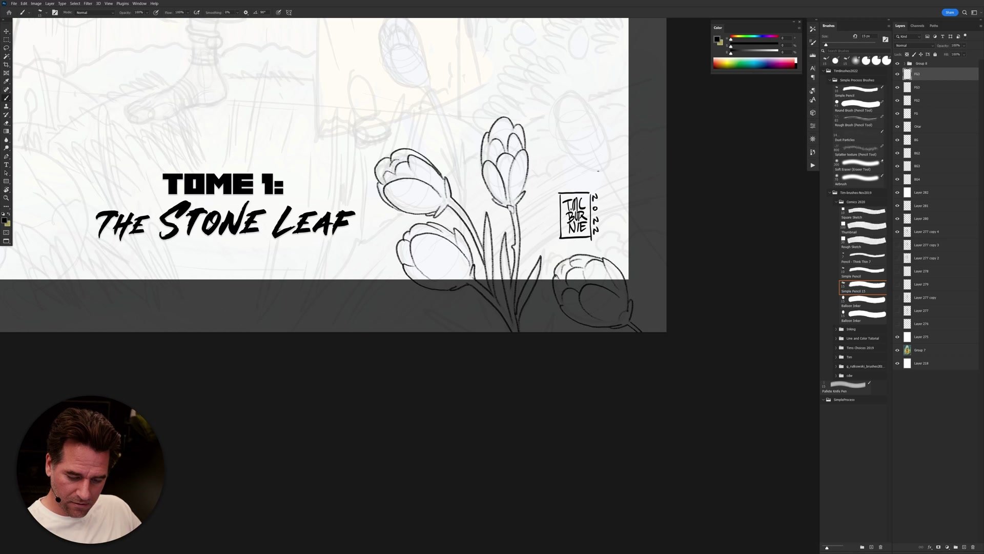
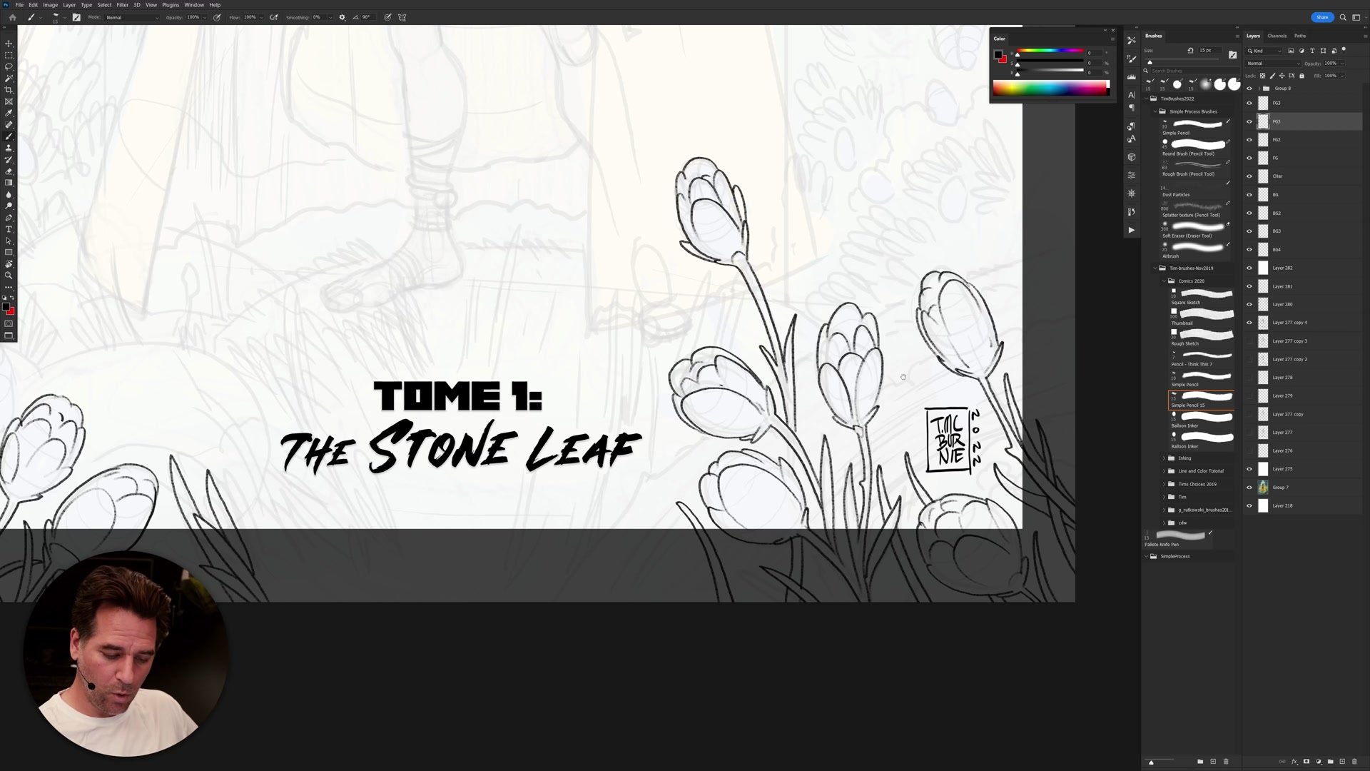
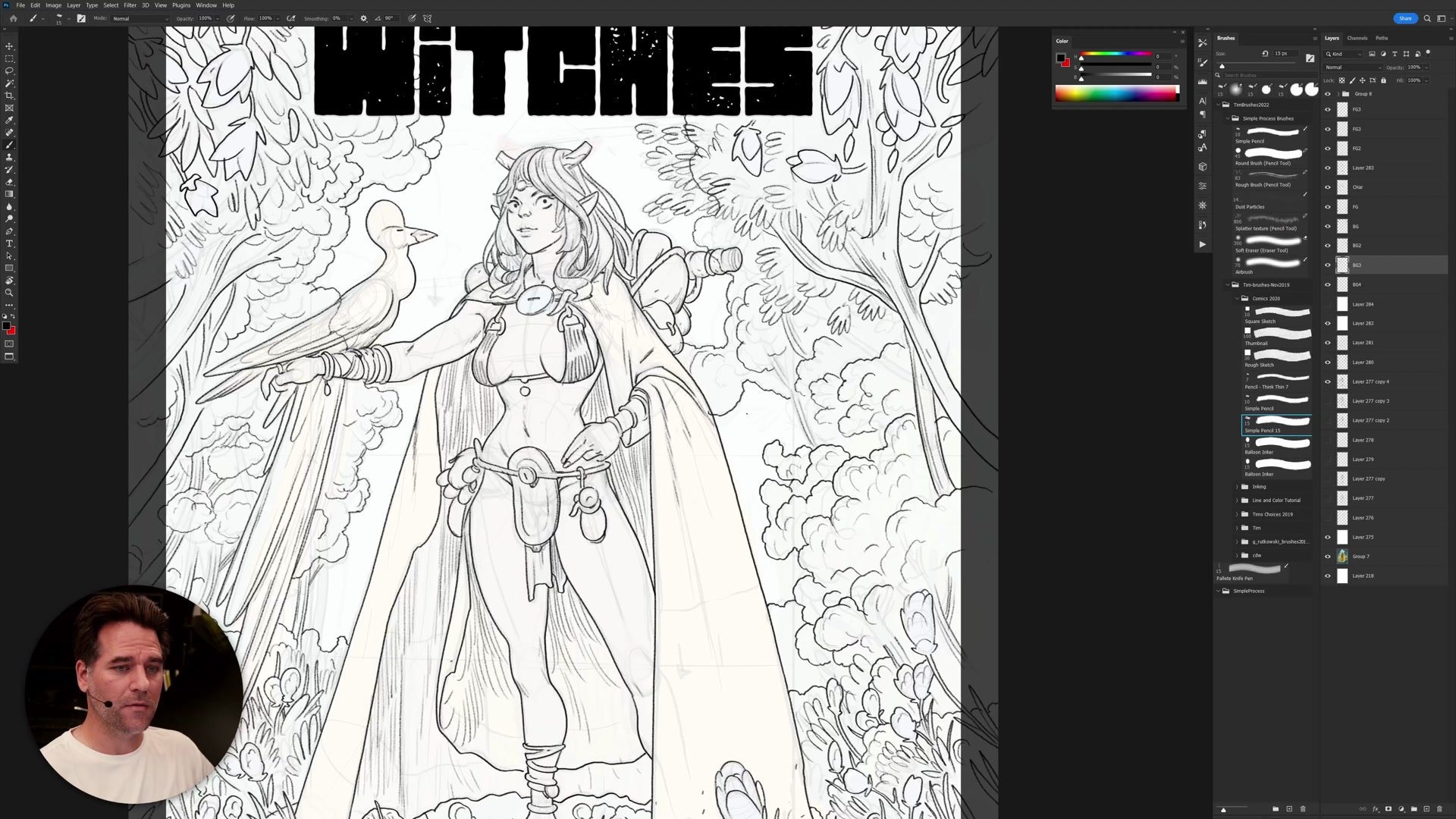
As the session moves into the background, the level of detail drops deliberately. The foreground established what the flowers and foliage look like with full fidelity, so the background versions can be drawn much looser and still read correctly. The viewer's brain fills in the gaps because the foreground already trained it on what these shapes represent.
Each successive background layer becomes more suggestive. Trees are indicated with outlines and canopy edges rather than individual branches. Grass textures get simpler. The primary concern shifts from drawing quality to silhouette design -- making sure the shapes read well against each other and that nothing competes with the character's face, which sits at the top of the triangular composition as the primary read. This conscious management of where detail lives and where it fades is what separates a finished cover from an overworked one.
Complete Linework
Key Techniques
Close Your Lines: Sealing every shape during inking makes the flatting phase dramatically easier, even though it takes more time upfront.
Feature-First Face Inking: Placing eyes, nose, and lips before drawing the face outline produces more appealing characters because the outline wraps around the established features.
Line Iconography: Lines are symbolic representations, not literal anatomy. Respecting that the brush width and feature spacing define character appeal more than structural accuracy.
Hierarchy of Detail: Establishing full detail in the foreground gives permission to be progressively looser toward the background without losing visual coherence.
Pre-Ink Check: Stepping back before starting finished lines to verify anatomy, center lines, horizon, and drapery logic prevents costly redraws during inking.
Try This
Set Up Layers First: Before inking, create named foreground, character, and background layers. Having the layer structure ready allows uninterrupted flow once the inking begins.
Ink Features Before Outlines: On your next character face, place the eyes, nose, and lips first, then draw the face outline around them. Notice how the outline adjusts to serve the features.
Reduce Detail Consciously: After establishing full detail in one foreground element, redraw the same element type in the background at half the detail. Compare how both still read correctly.


