Learning to Draw Morrigan
Summary
Deconstructing Character Design
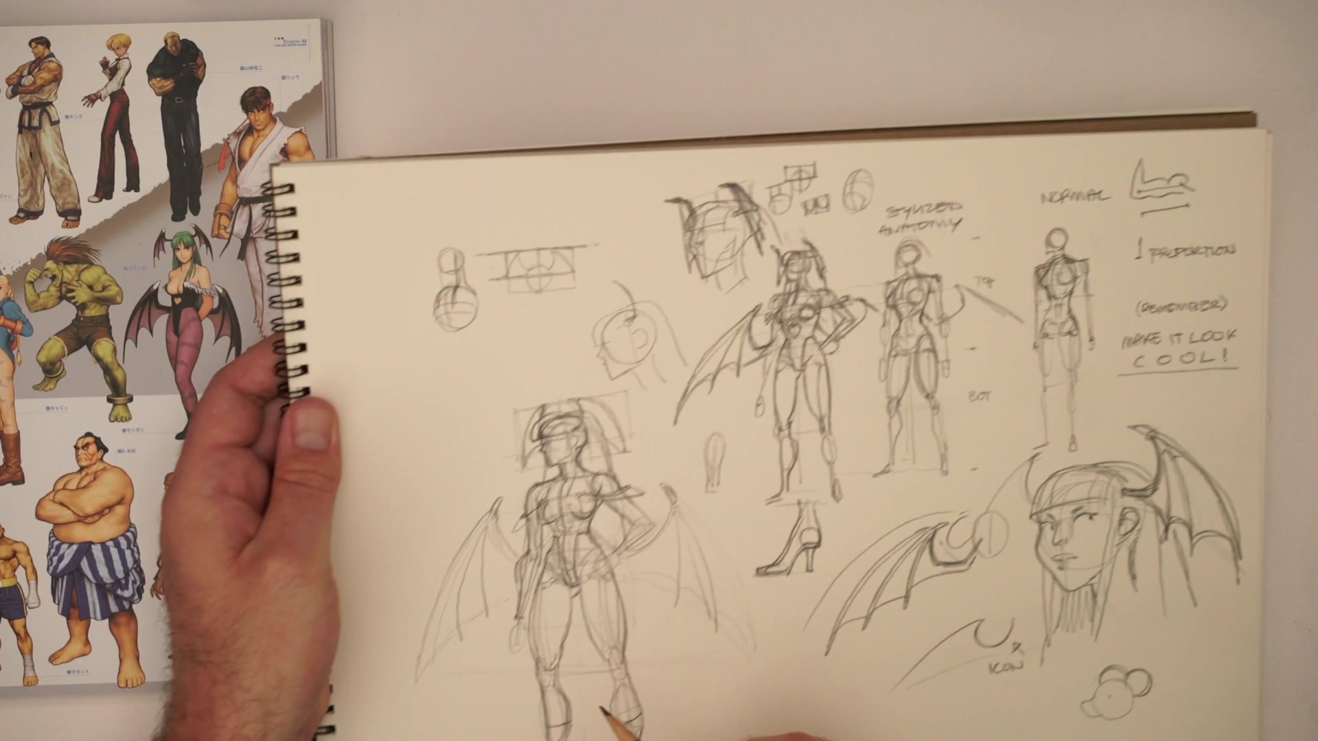
Drawing complex character designs becomes overwhelming when everything gets tackled at once. Wings, elaborate costumes, flowing hair, and specific proportions all competing for attention creates paralysis. The structural approach breaks characters into three distinct layers: proportion, form, and iconography. Each layer gets solved separately before combining into the final construction.
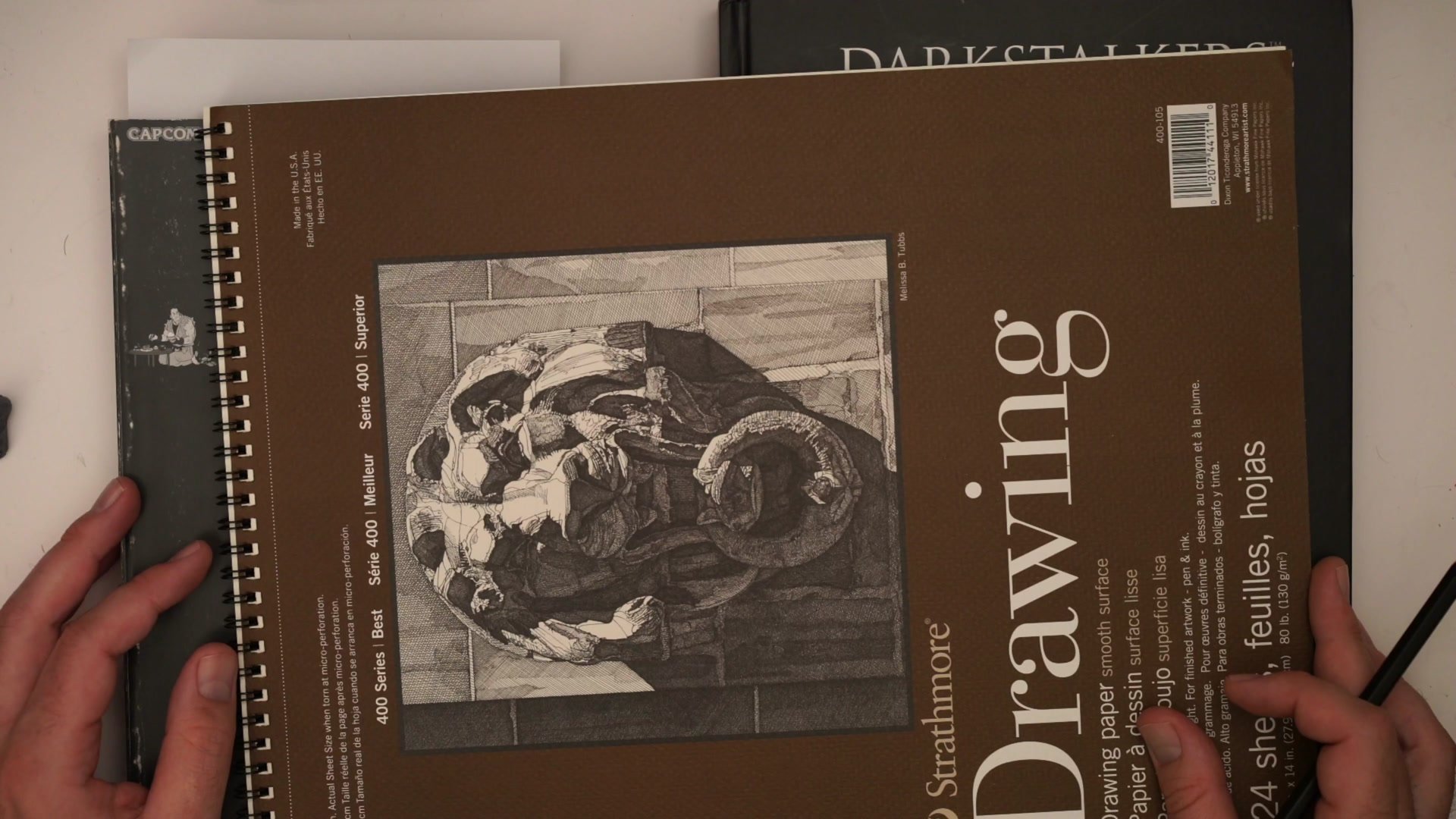
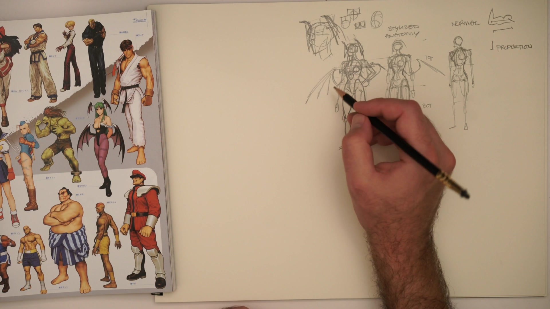
Using Morrigan from Darkstalkers as the subject, this demonstration applies the Loomis mannequin method to establish skeletal proportion first, then builds anatomical volumes, and finally balances structural accuracy with iconic visual clarity. The same approach used for professional comics and concept art translates directly to breaking down any character design into manageable, repeatable construction.
Reference and Setup
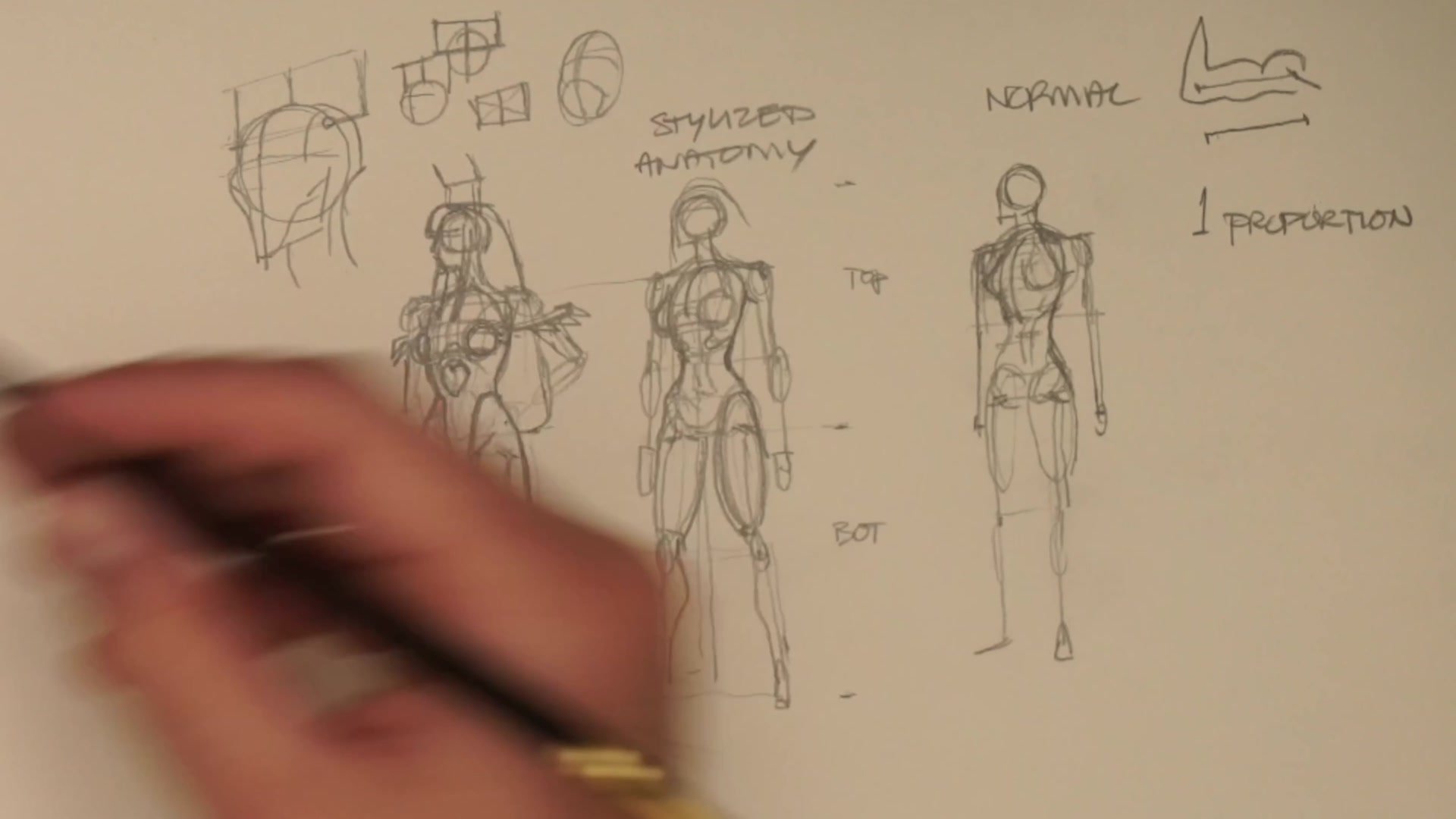
Proportion Before Form
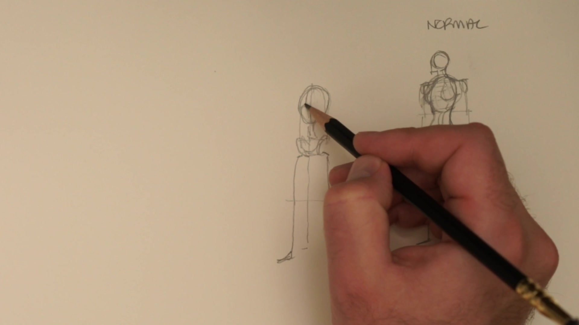
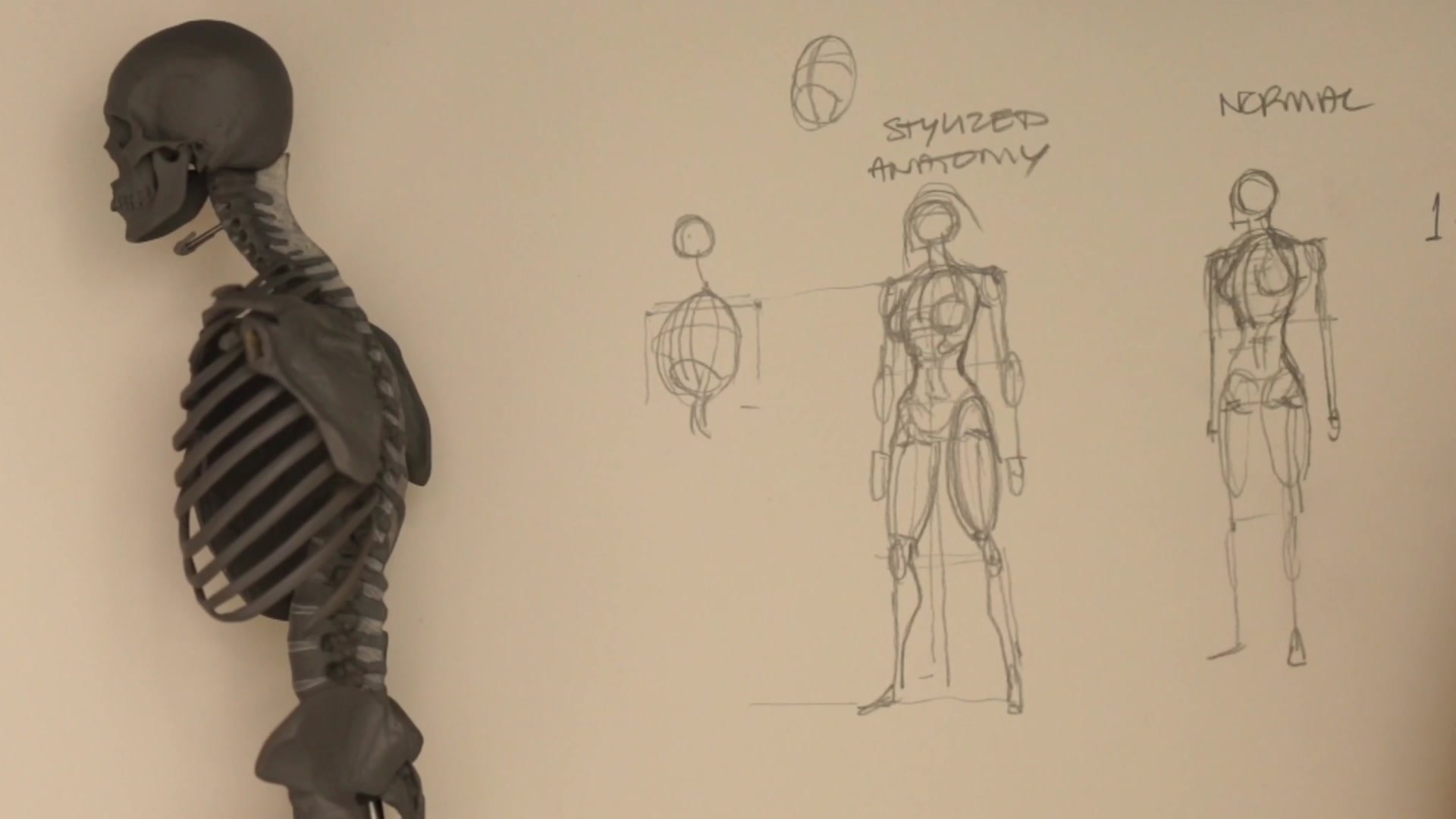
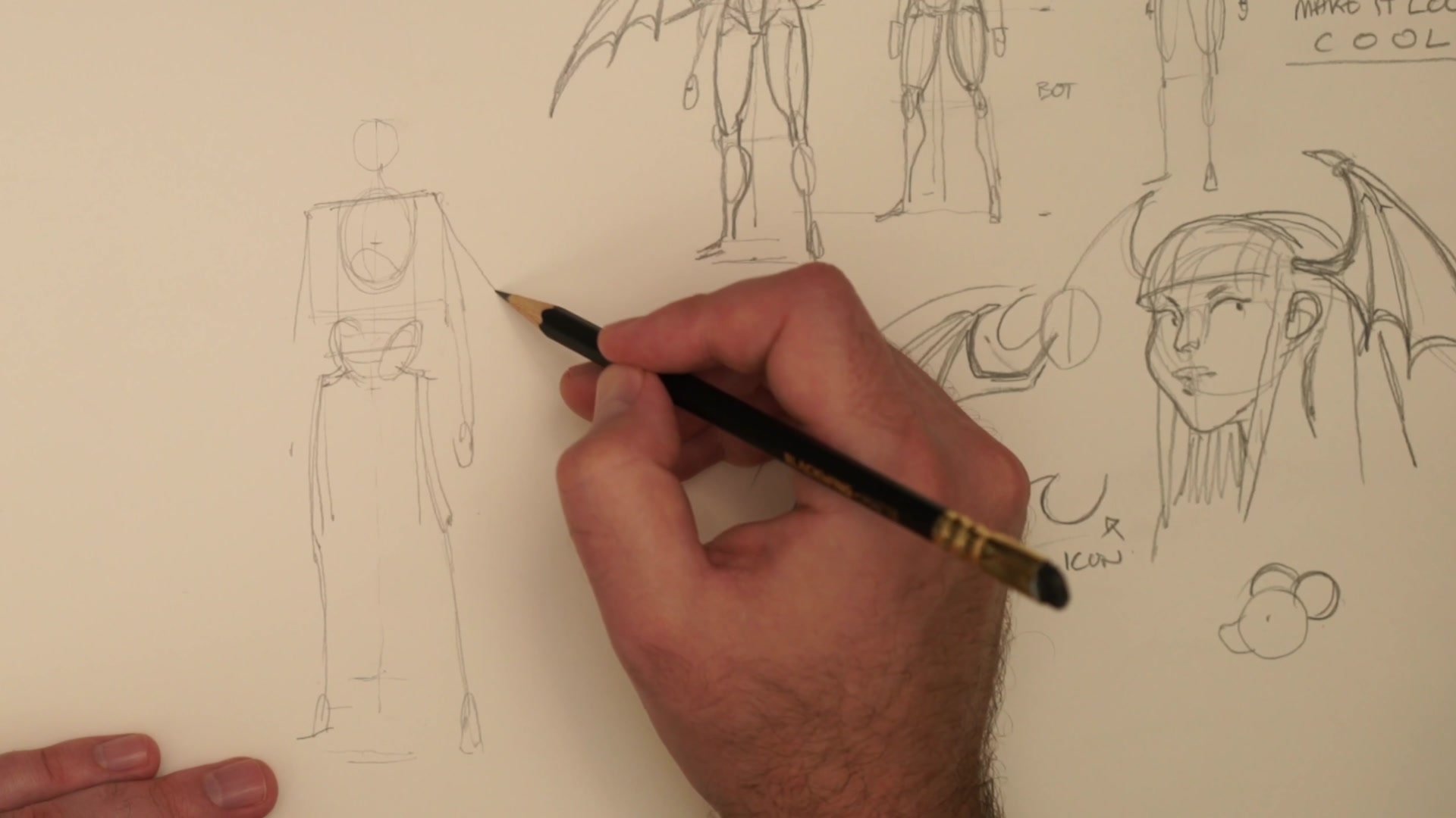
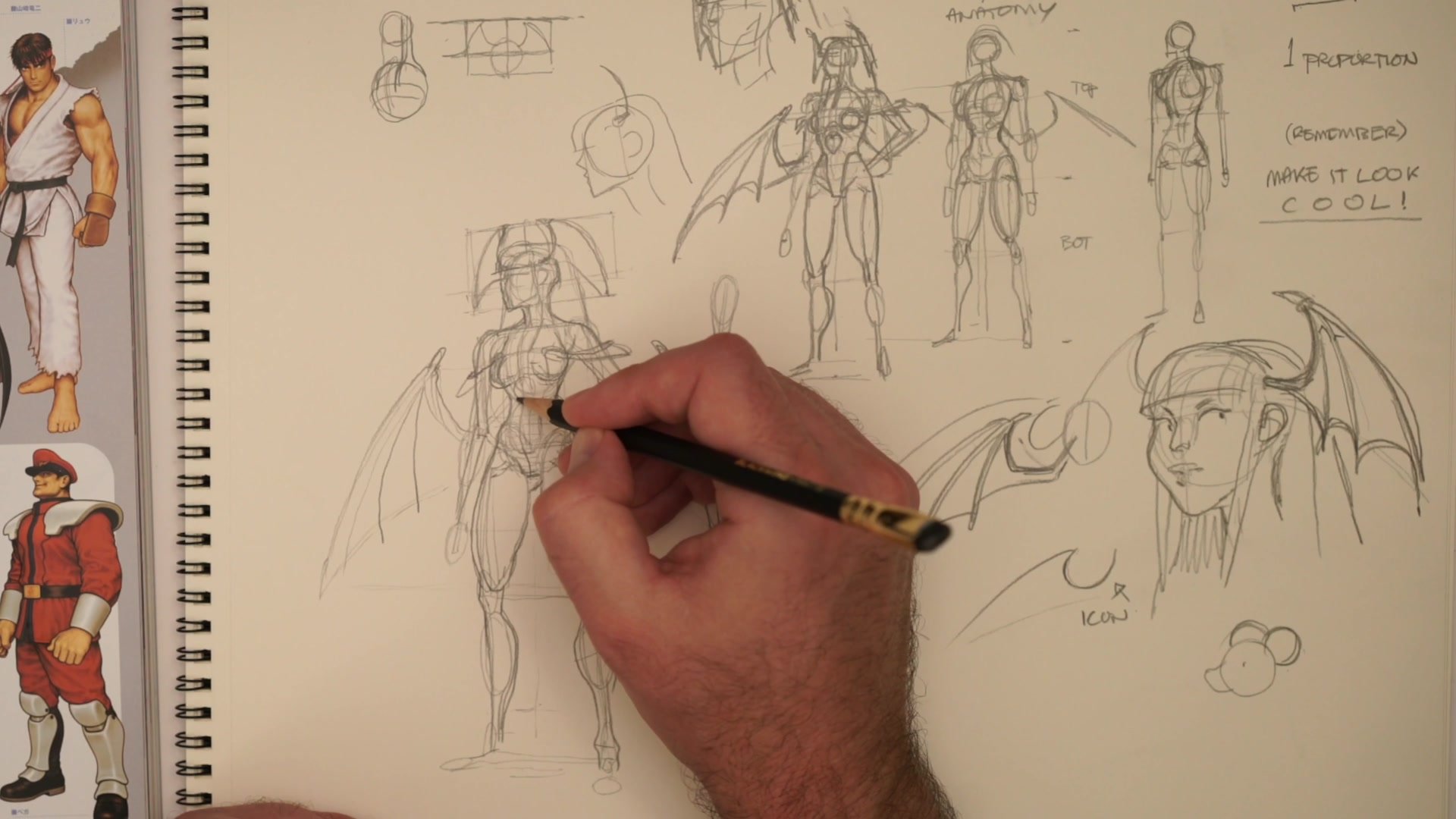
The process starts with a Loomis-style mannequin, a glorified stick figure representing the skeleton. Proportion means finding where things exist in space. Where the head ends, where the torso begins, where the legs start. This is entirely separate from form, which deals with muscles and volumes.
For this character, standard female proportions get modified. The figure normally divides into two equal halves from head to pelvis and pelvis to feet. Adding extra length to the legs creates that spring typical of Capcom character design. The waist tucks in more, the hips flare slightly. These are subtle proportional differences, but they define the character's look before a single muscle or costume detail gets drawn.
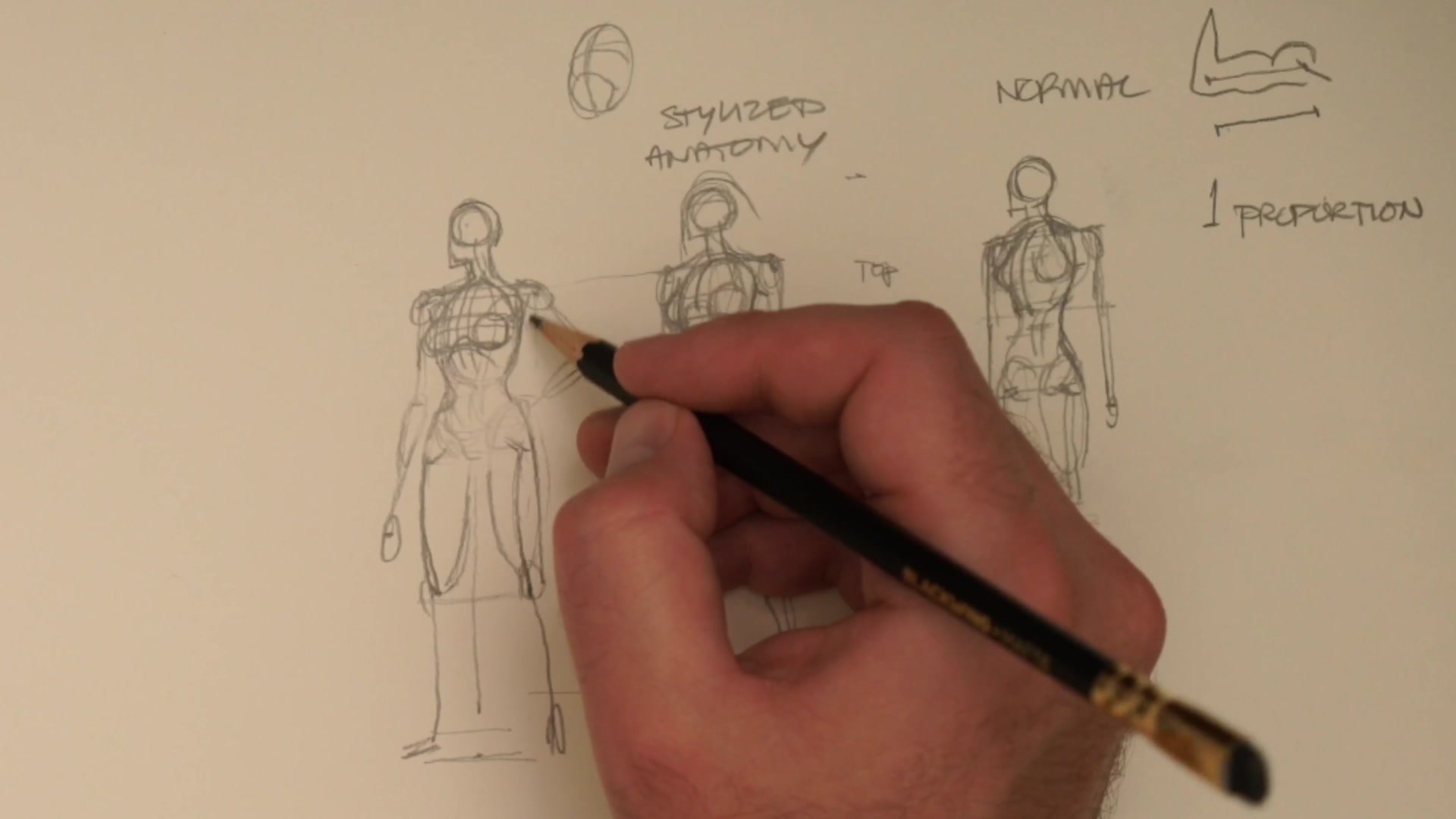
Getting proportion right first with simple lines and markers means everything built on top works. If proportion is wrong, nothing else will save the drawing. Only after spatial relationships are established does anatomy get layered on. The rib cage as a squished sphere, the pelvis, the shoulders, the spine moving through space.
Proportional Construction
Iconography vs. Structure
Visual iconography is what makes a character immediately recognizable. The shapes and silhouettes that define their look at a glance. Sometimes iconographic clarity matters more than three-dimensional accuracy.
The classic example comes from early Disney animation. Freddie Moore had incredible instinct for making Mickey Mouse look good. The character is a big circle with two smaller ear circles. When animators tried drawing Mickey from different angles, it stopped looking right. Moore's basic reply was: just don't draw him from a different angle. The design works iconically from specific views, and maintaining that visual clarity matters more than dimensional consistency.
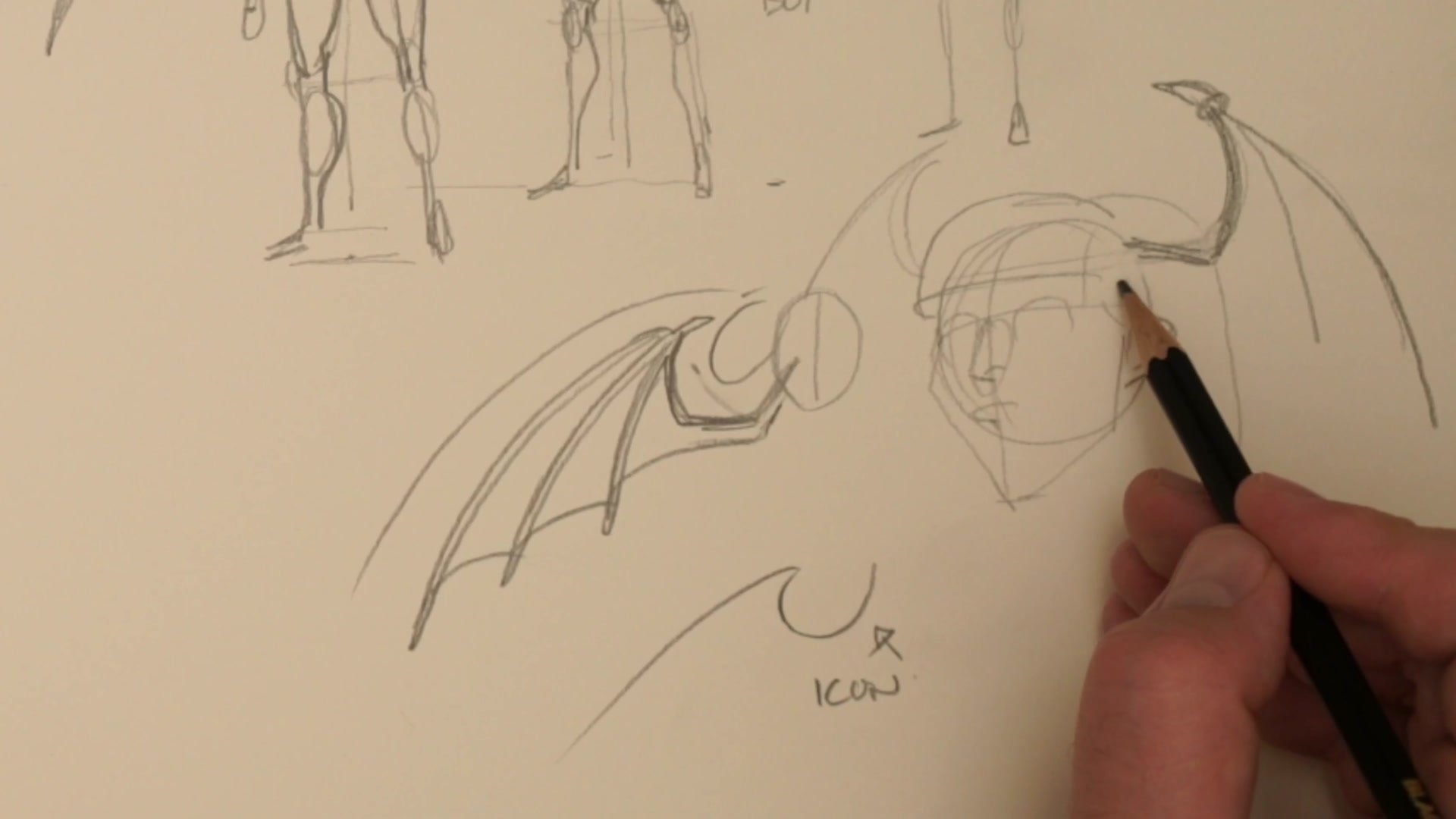
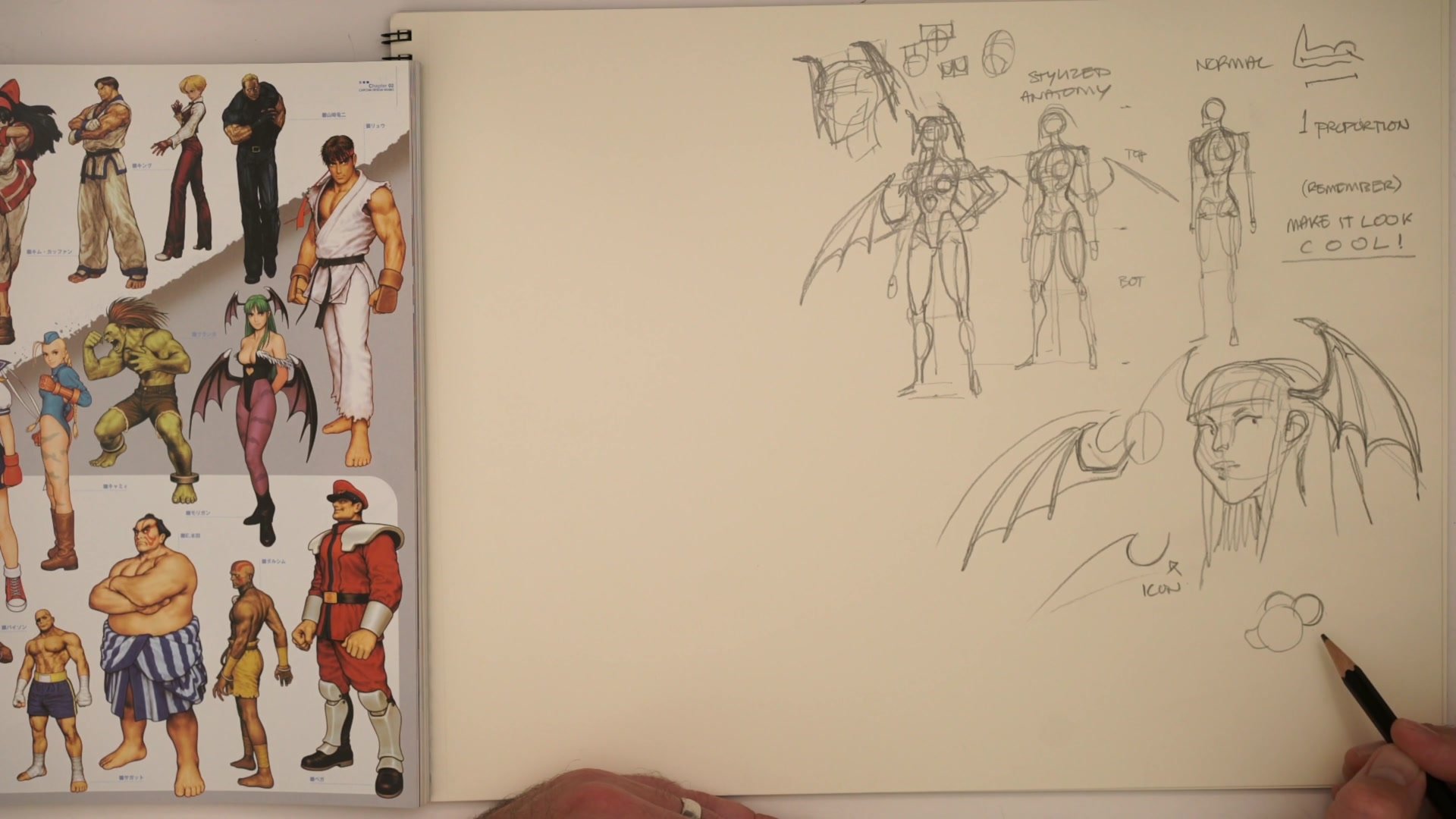
This applies directly to character design. Morrigan's bat wings have a specific curved silhouette. The goal when drawing them is not perfect structural accuracy but maintaining that iconic curved feeling. Structure provides the foundation to rotate forms in space. Iconography provides the recognizable shapes that make the character feel right. When these conflict, maintaining iconic clarity often wins for character work.
Wing Construction
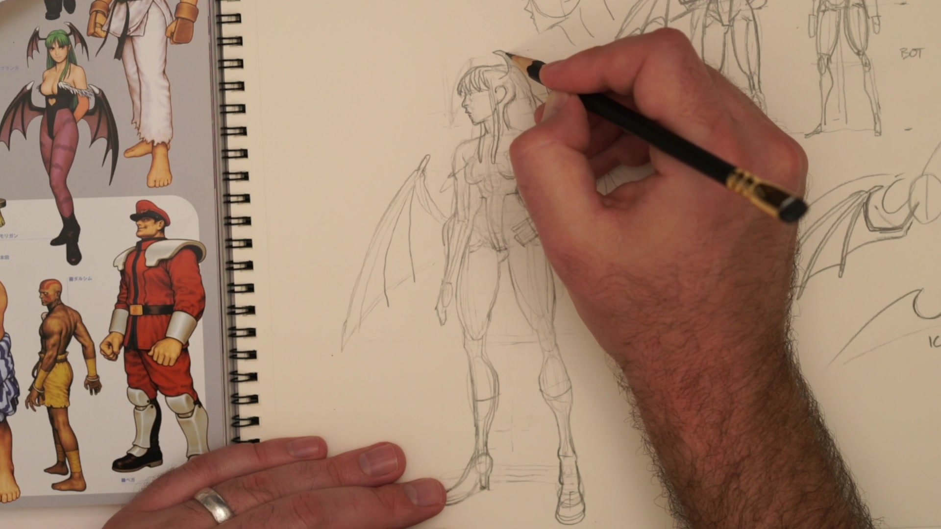
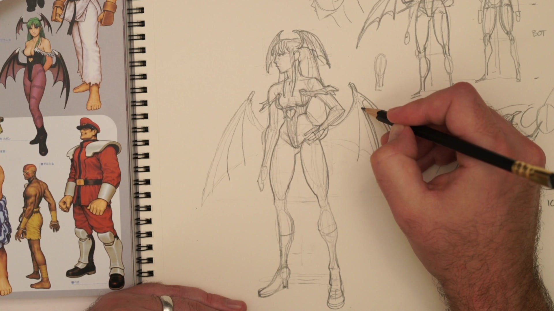
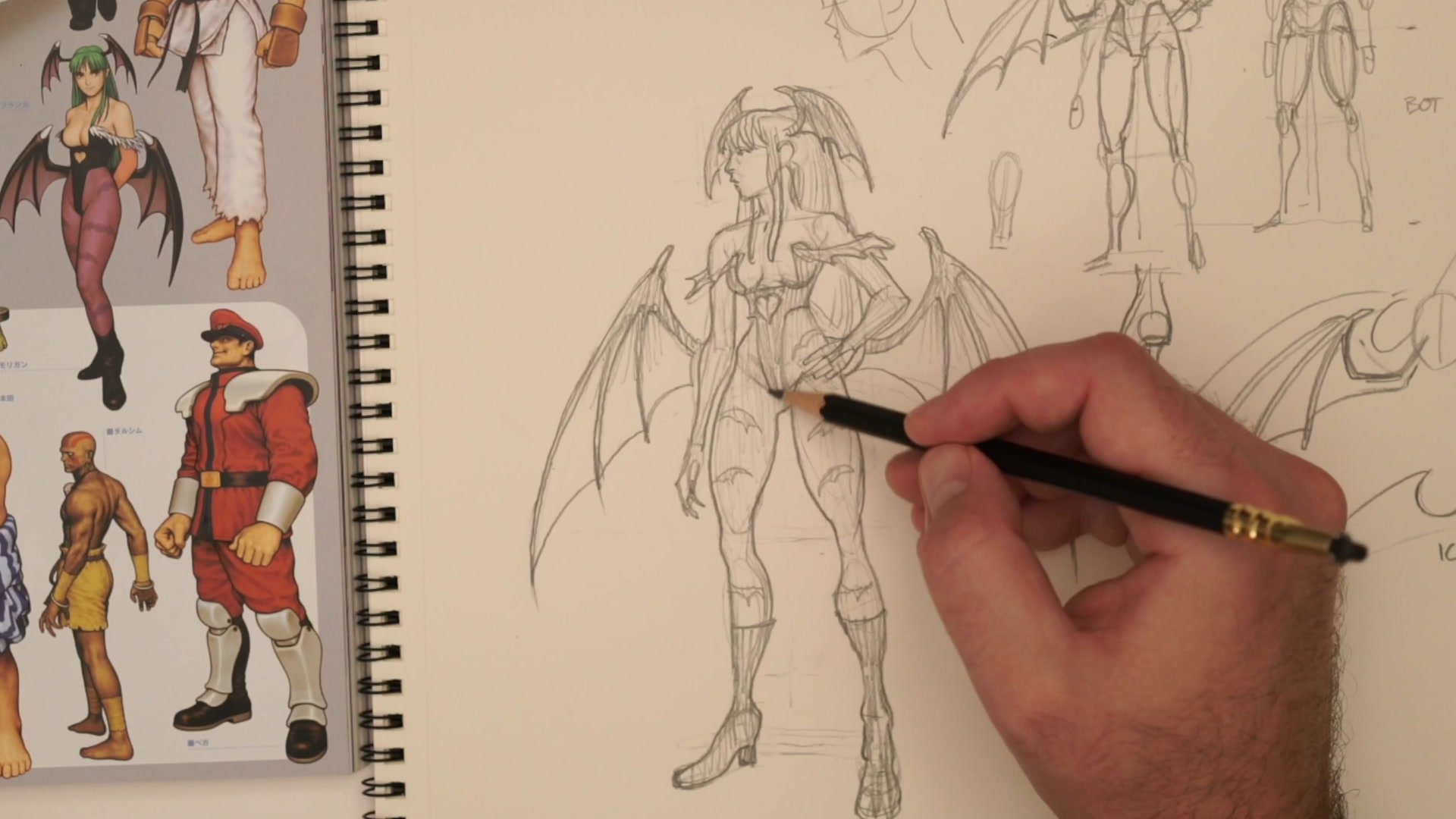
Constructing Secondary Forms
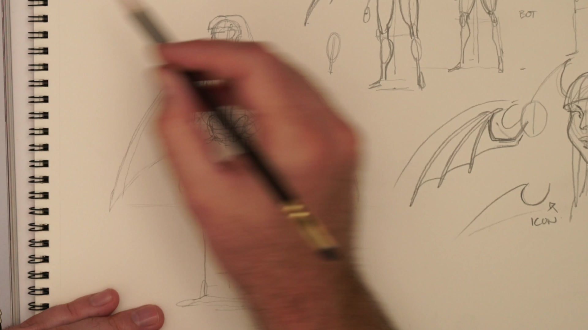
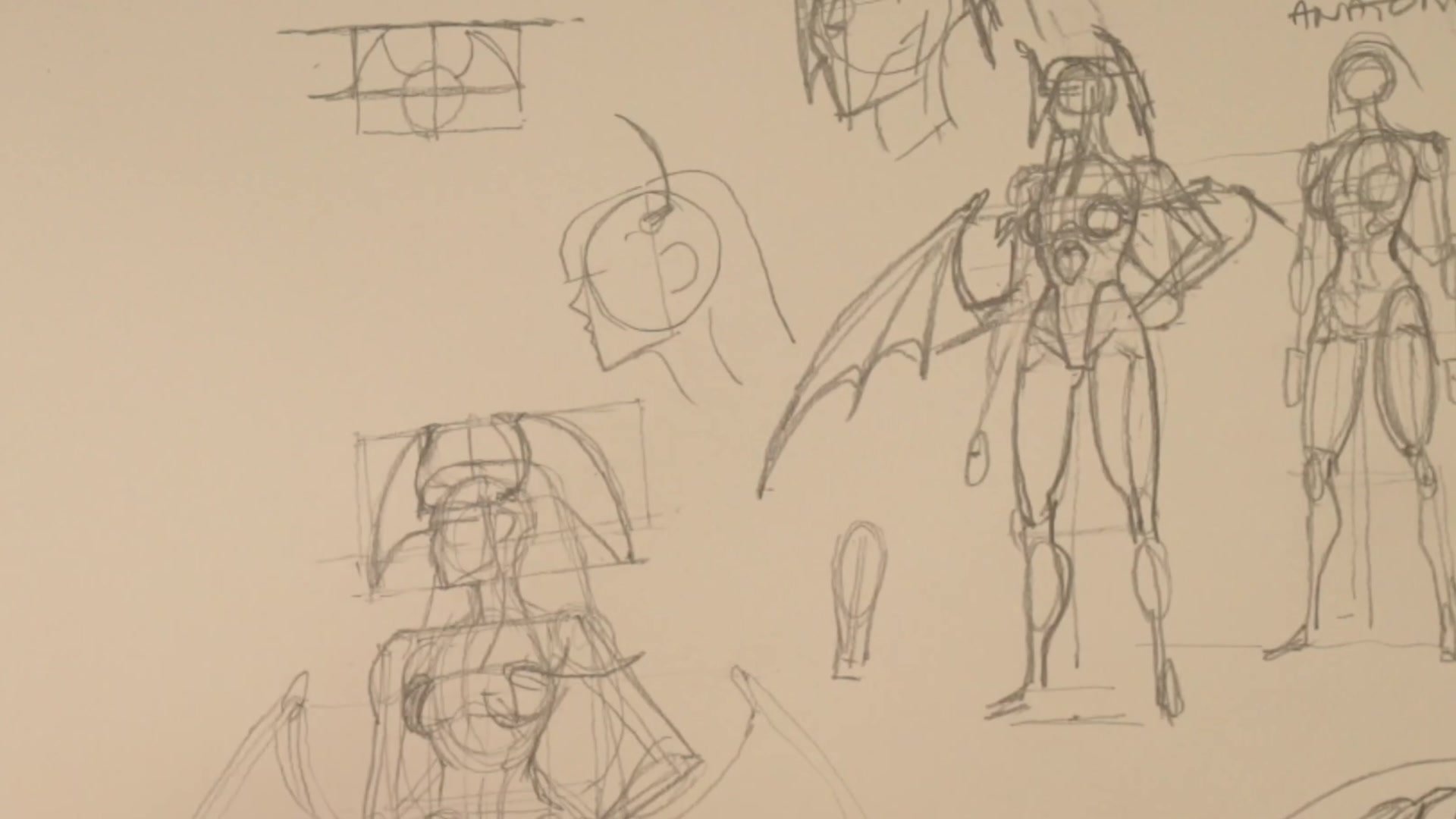
Complex elements like wings require constructive anatomy thinking. For Morrigan's head wings, finding the center line of the face establishes how far each wing extends from center. Two-dimensional measurement gets placed first as equidistant markers, then translated into perspective by thinking about planes in space.
Each wing has specific articulation points. One bone segment, another segment, then the large spike and webbing. Counting these articulations correctly and getting the number of spikes right is what makes the character recognizable. The draw-through technique helps construct symmetrical elements by visualizing both front and back connection points and transferring measurements across.
The same layered approach applies to every design element. Costume details like the heart shape on the chest, the high-cut design, and the gloves wrapping around fingers each get constructed with attention to how they sit on the underlying form. The hair wraps around dimensional forms underneath. Everything builds systematically: skeleton, anatomy, costume, secondary elements. Complex designs become manageable through this repeated layering process.
Final Construction
Key Principles
Proportion First: Establish spatial relationships with a simple stick figure before adding any form or detail. If proportion is wrong, nothing built on top will work.
Three Separate Layers: Break character construction into proportion, form, and iconography. Solving each independently prevents overwhelm and creates systematic control.
The Freddie Moore Principle: Iconic visual clarity sometimes matters more than dimensional accuracy. Maintaining recognizable shapes is what makes character drawings feel right.
Draw-Through Construction: Building symmetrical elements requires visualizing both visible and hidden connection points. The structural thinking happens first, cleanup comes later.
Practice This
Start Proportional: Pick a complex character and draw only a stick figure establishing proportion. No muscles, no details. Just the spacing of head, torso, pelvis, and limbs. Check proportional relationships against reference.
Identify Iconic Shapes: Before adding structure, identify what shapes make the character immediately recognizable. Draw these as simple 2D shapes to establish size and placement.
Layer the Construction: Only after proportion and iconography are established, add structural detail. Use draw-through to connect elements that wrap around the form, drawing both visible and hidden parts for consistency.


