Learn To Draw Blanka from STREET FIGHTER
Summary
Structural Anatomy for Stylized Characters
Academic anatomy teaches realistic proportions and structure, but characters like Blanka from Street Fighter demand something different. The gap between textbook figure drawing and exaggerated character design is where most artists get stuck. Standard instruction builds understanding of the human form as it actually exists, but character art requires pushing far beyond accuracy into iconic, superhuman territory while keeping structural believability.
This demonstration uses the Loomis mannequin approach as the structural foundation for drawing Blanka, showing how proportion, the three-form hierarchy, and character iconography combine to create stylized figures that feel solid despite heavy exaggeration.
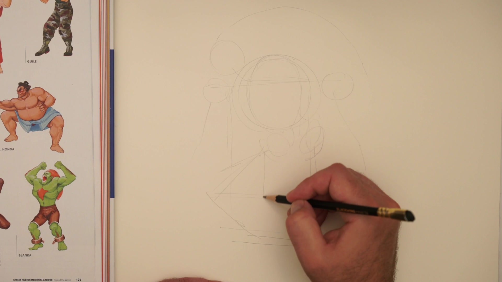
Mannequin Foundation
Expanding the Frame
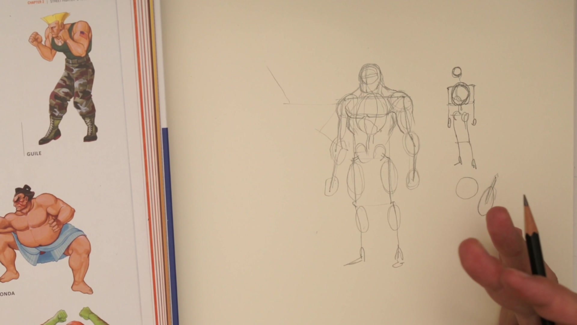
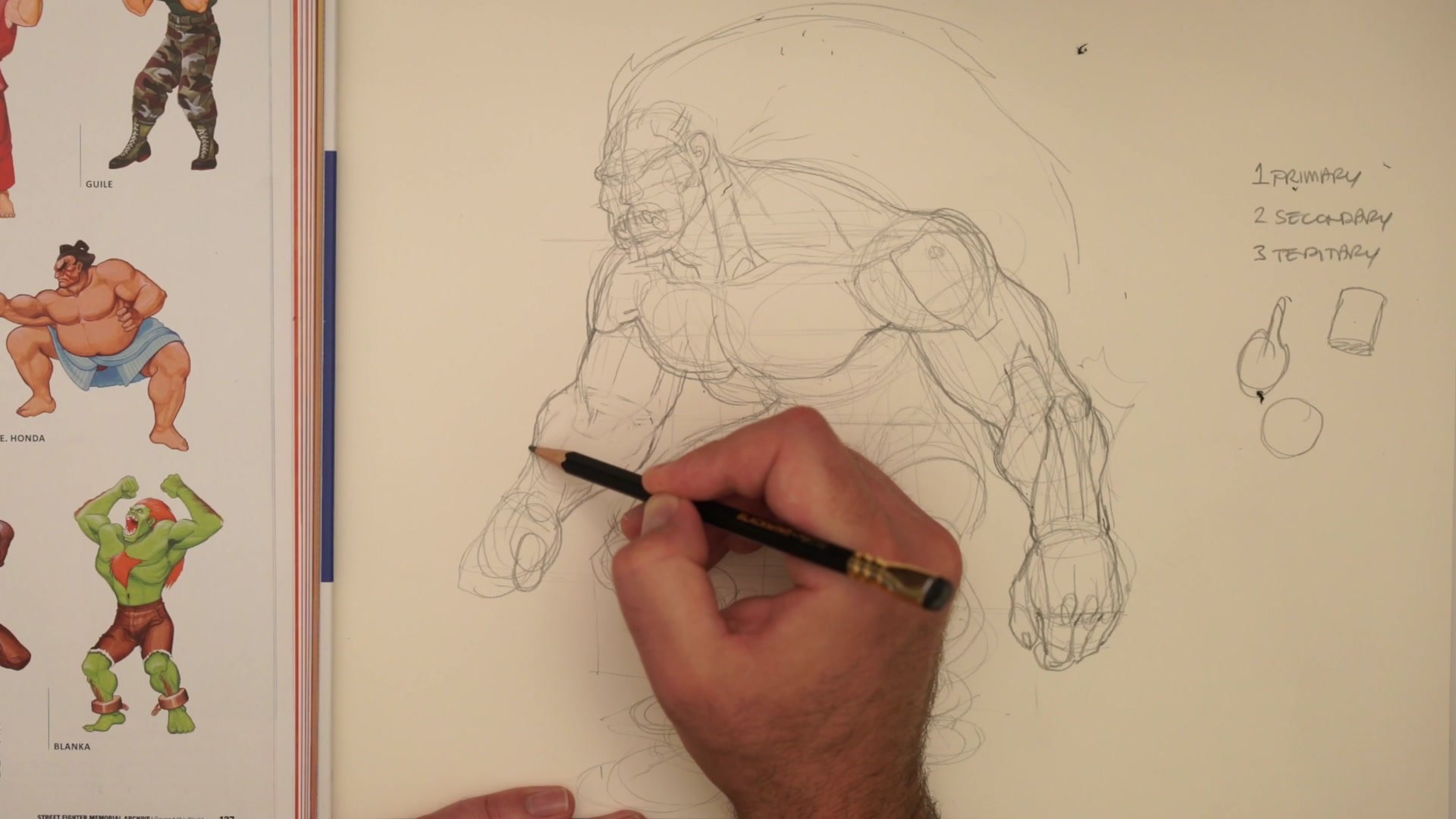
Bigger musculature needs a bigger frame. Looking at real humans with extensive muscle development reveals that the skeleton itself is larger. Wider shoulders, bigger bones. Adding muscle to a standard frame never produces superhero proportions because the frame has to be expanded first.
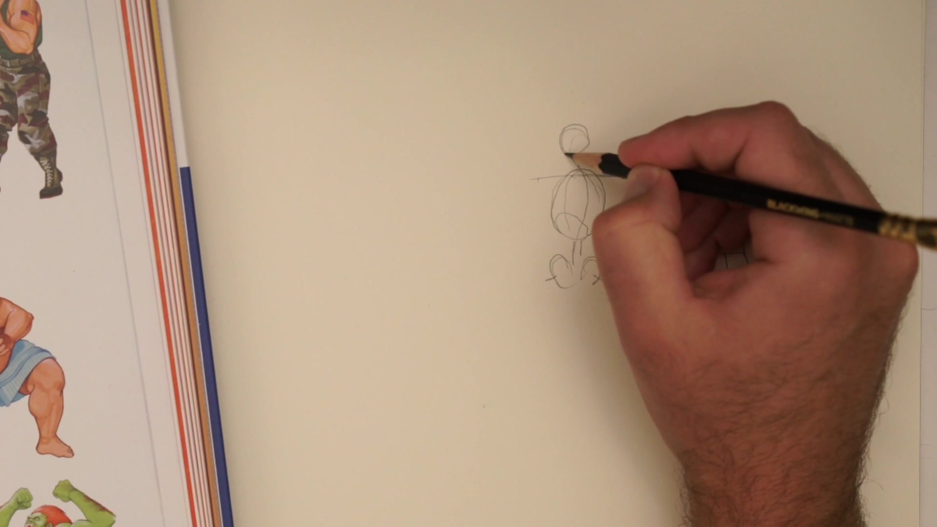
The Loomis mannequin adds more than skeleton. It includes the cape of shoulder and pectoral mass plus the lats. These areas show significant bulk that skeleton alone does not represent, and they stay static during posing, making them ideal for the mannequin stage. Simple spherical forms become useful here. Shoulders as bowling balls, limbs as drumsticks. A bone with muscle mass wrapped around it. These basic forms establish the character's overall size and proportion before any detailed anatomy gets added.
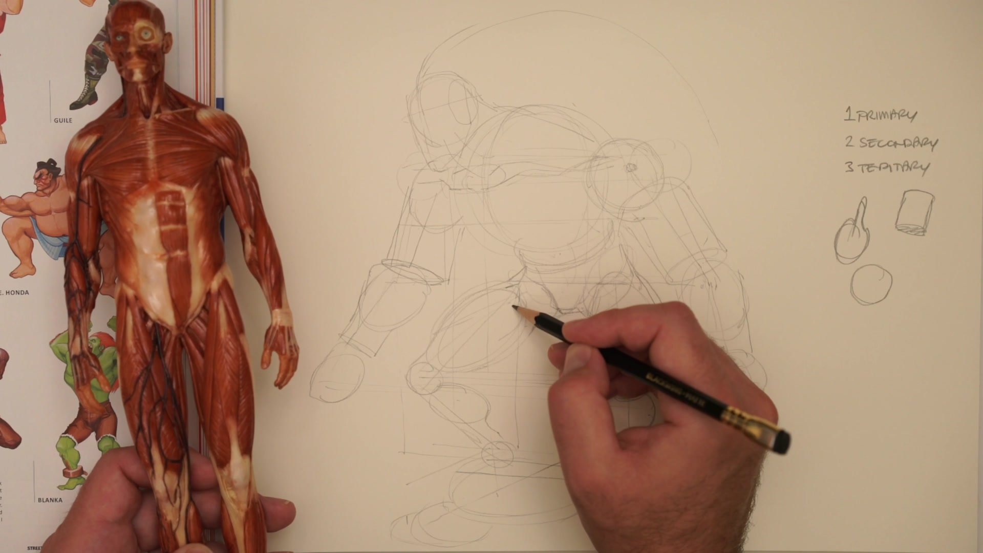
Three-Form Hierarchy
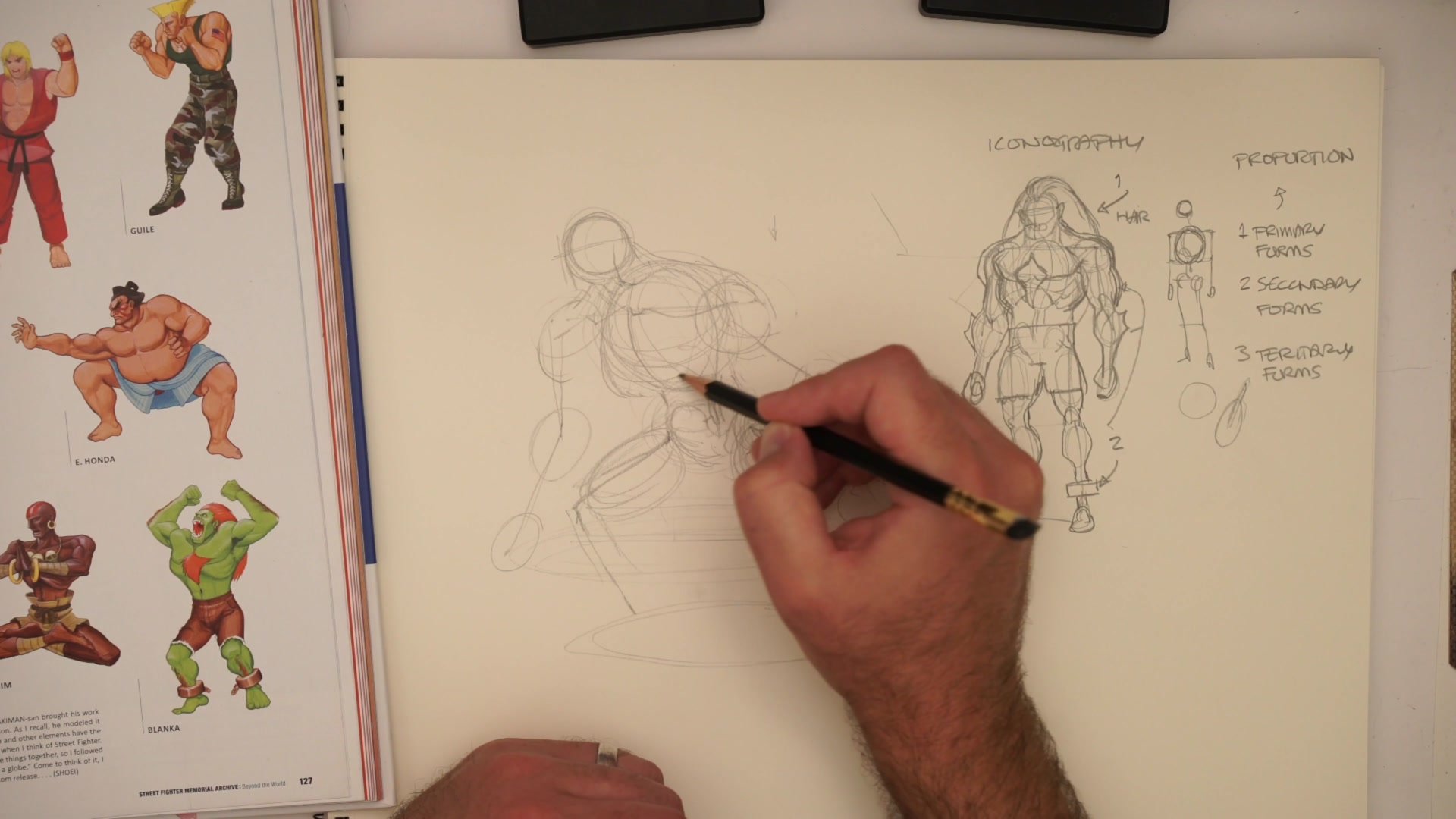
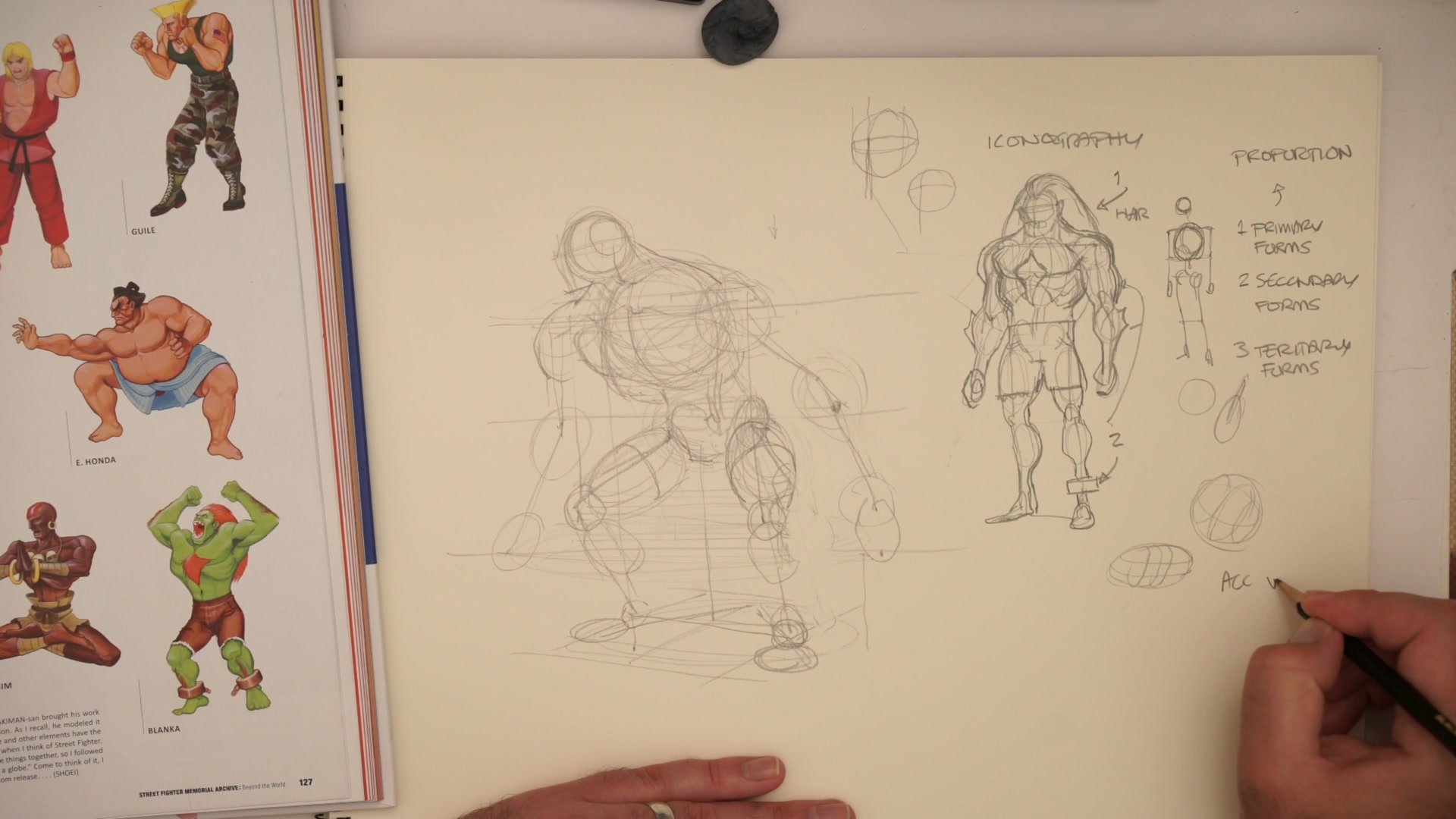
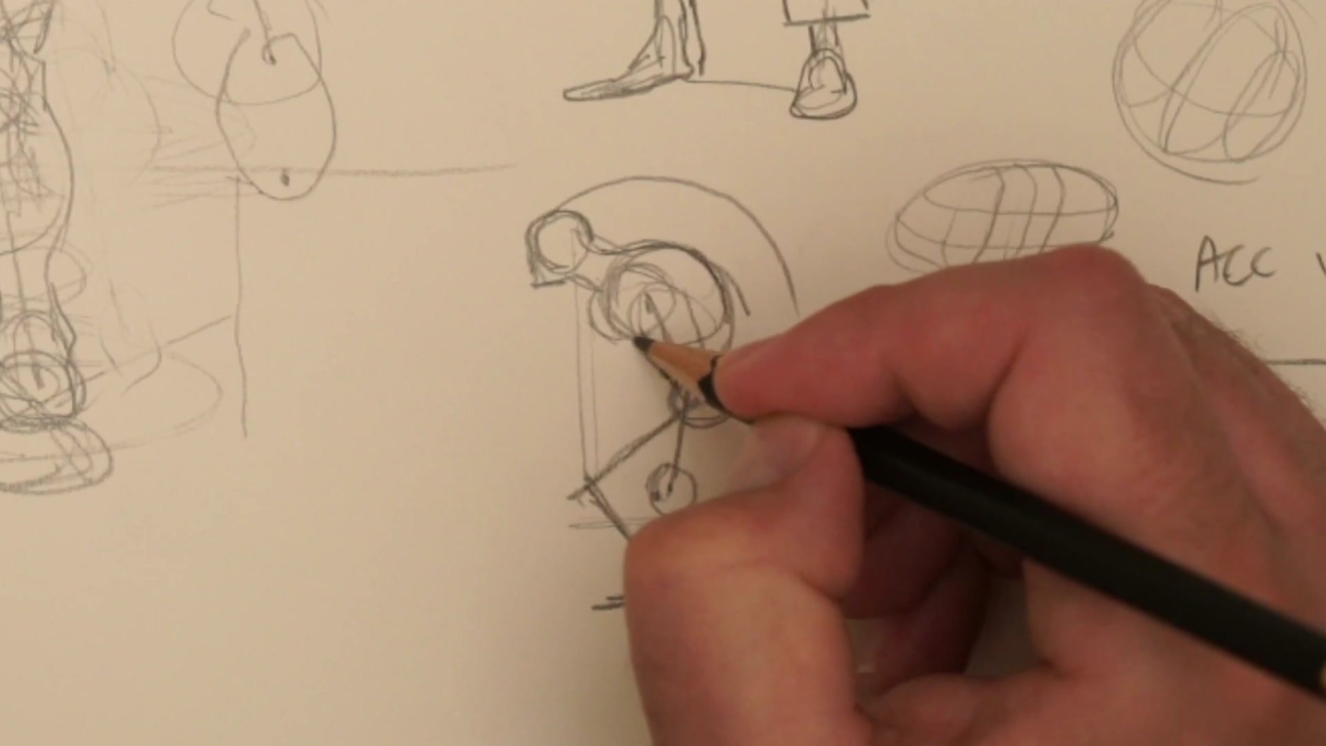
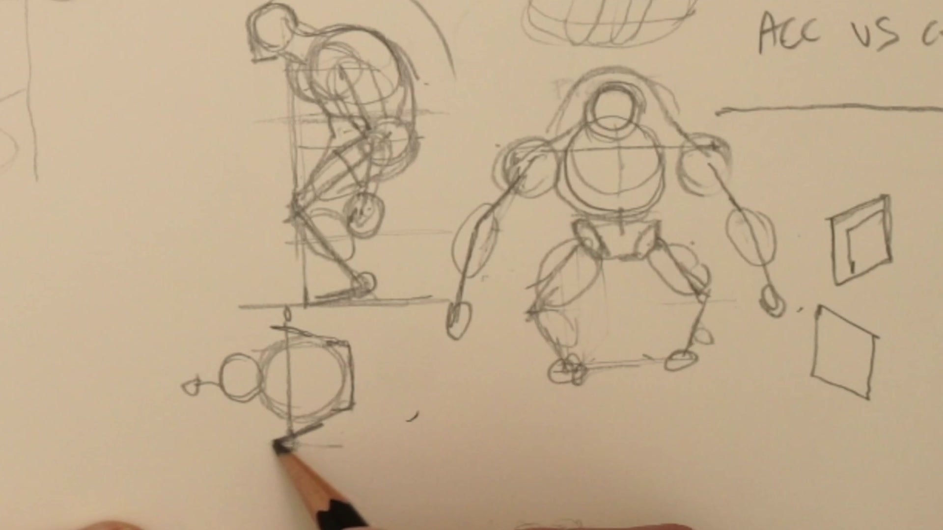
Primary, Secondary, Tertiary
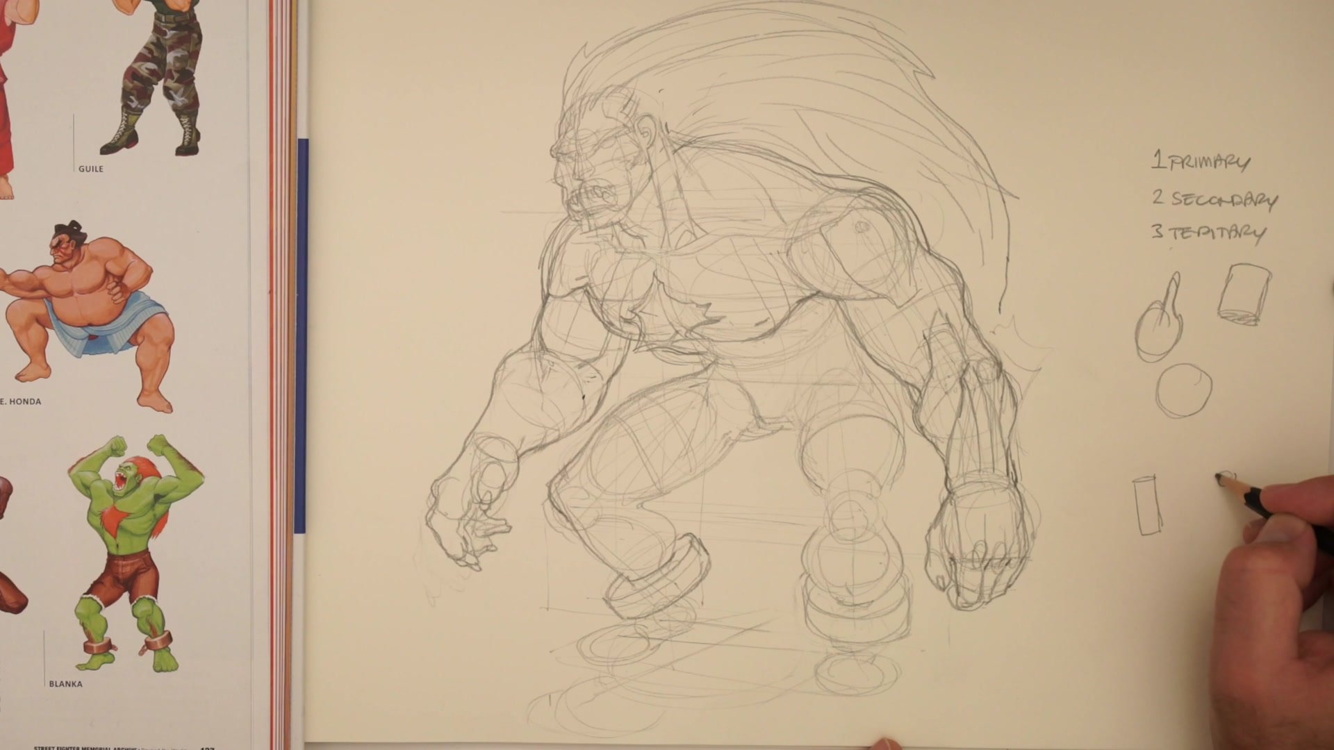
Drawing complex characters becomes manageable through the three-form hierarchy. Primary forms are pure proportion and basic masses. Simple spheres for joints, basic volumes for torso and pelvis, drumstick shapes for limbs. When posing a character, working only at this level prevents the confusion that comes from adding detail too early.
Secondary forms add dimensional muscle groups. Toilet roll logic and bowling ball thinking help visualize three-dimensional anatomy. The deltoid breaks into three sections. The pectorals sit on top of the rib cage like squashed masses. The forearm muscles wrap over the two bones like overlapping cylinders. Even exaggerated anatomy feels solid when the three-dimensional structure is sound. Tertiary forms are surface details like wrinkles, scars, and muscle striations. The discipline is not jumping to this stage before the foundation supports it.
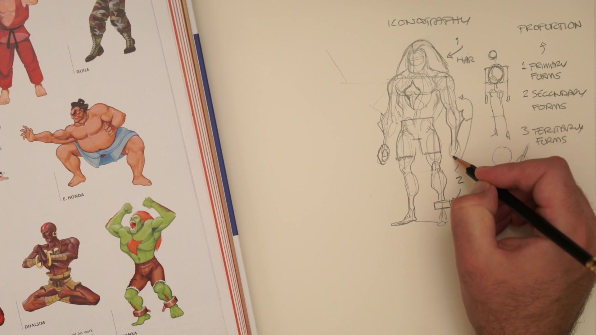
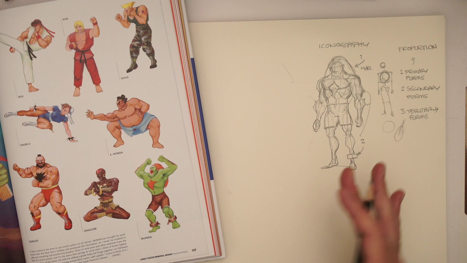
Iconography and Pose
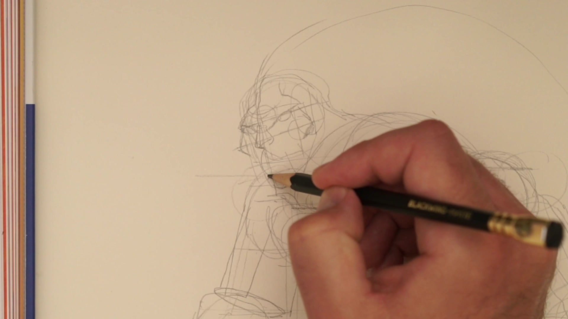
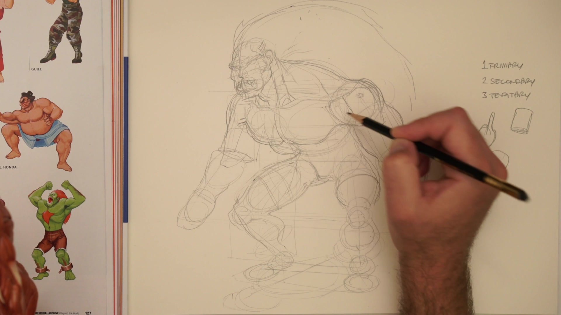
Character Identity
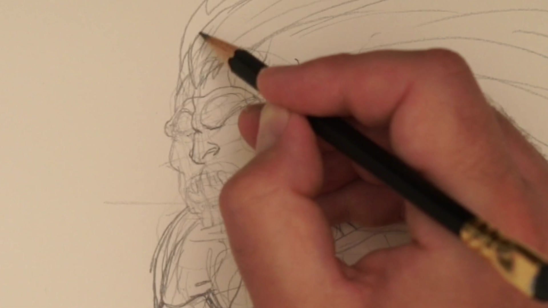
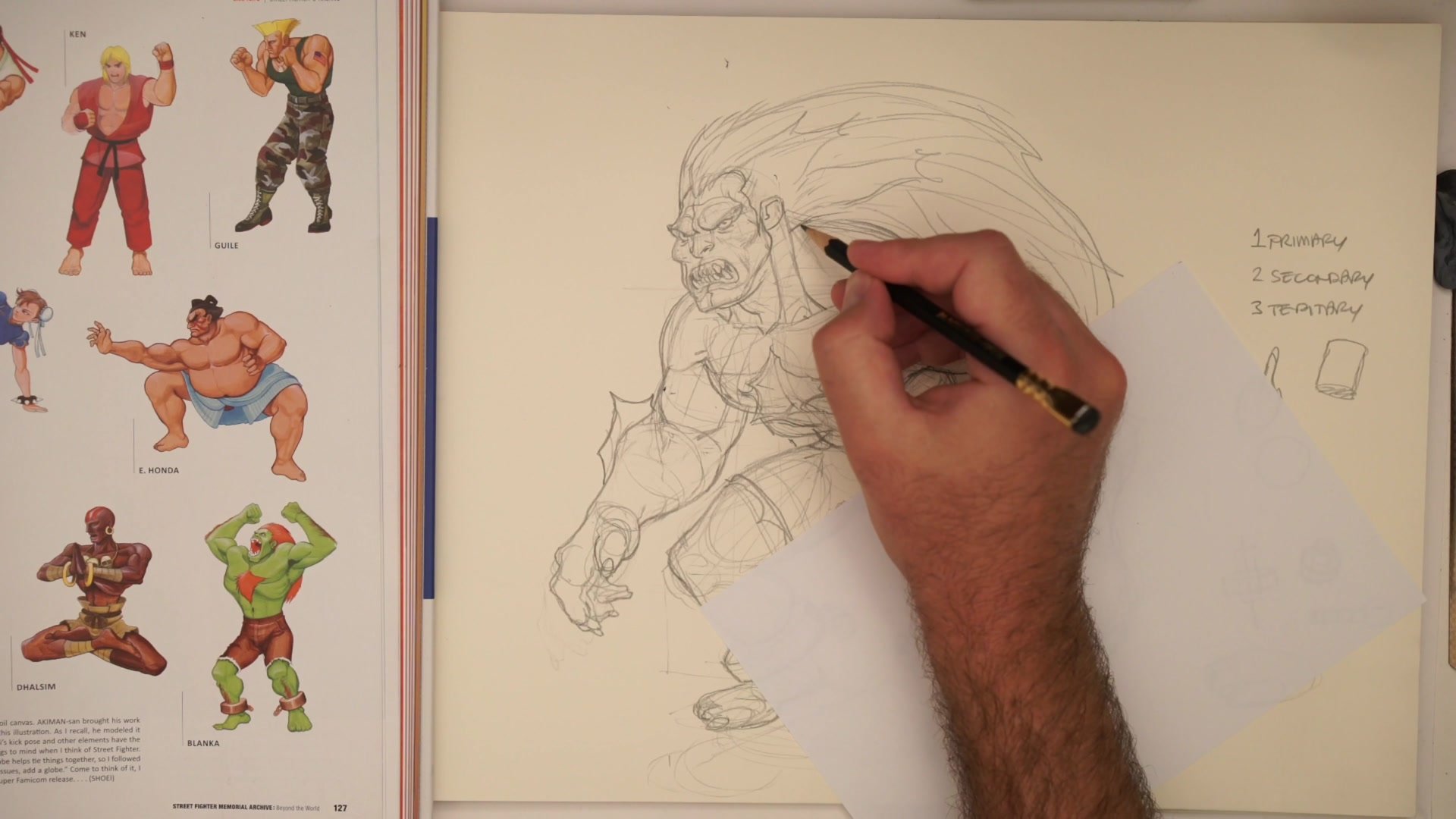
Perfect anatomy does not make a drawing look like a specific character. Visual iconography does. For Blanka, the wild hair is non-negotiable. The chest hair, the shackles with chains, the massive fangs, the claw-like hands and feet. Remove these elements and even flawless anatomy reads as a generic muscular figure.
Every recognizable character has two or three visual elements that cannot be removed without losing identity. Identifying these iconic elements before drawing prevents the frustration of creating technically sound work that somehow does not capture the character. Pose and emotion matter equally. Blanka hunches forward with an ape-like posture, shoulders rolled, aggressive but not fully upright. This physicality communicates character even in silhouette. Calibration takes repetition. The first attempt usually does not push proportions far enough, and stylized art requires consciously over-pushing what feels anatomically comfortable.
Refined Construction
Key Principles
Expand the Frame First: Superhero proportions require enlarging the skeleton before adding muscle. A standard mannequin frame cannot support exaggerated musculature.
Three-Form Hierarchy: Primary forms establish proportion, secondary forms add dimensional anatomy, tertiary forms refine surface details. Working out of order is the most common structural mistake.
Iconography Before Anatomy: Identify the two or three non-negotiable visual elements of a character before drawing. Recognition comes from iconic elements more than perfect anatomy.
Calibrate Through Repetition: Early attempts at stylized characters rarely push proportions far enough. Consciously amplify until it feels excessive. That is usually closer to the actual character design.
Practice This
Choose a Character: Pick a stylized character from games, comics, or animation. Before drawing, list their three to five most iconic visual elements that cannot be removed while keeping recognition.
Build the Expanded Frame: Draw a standard Loomis mannequin with realistic proportions, then modify it by pushing every proportion further than feels comfortable. Shoulders wider, chest bigger, limbs chunkier.
Add Iconography to Structure: Apply the identified iconic elements to the exaggerated frame. Compare this to what instinct alone would have produced. The conscious over-pushing creates proportions closer to the actual character design.


