Digital Art Monitors - Your Ultimate Guide
Summary
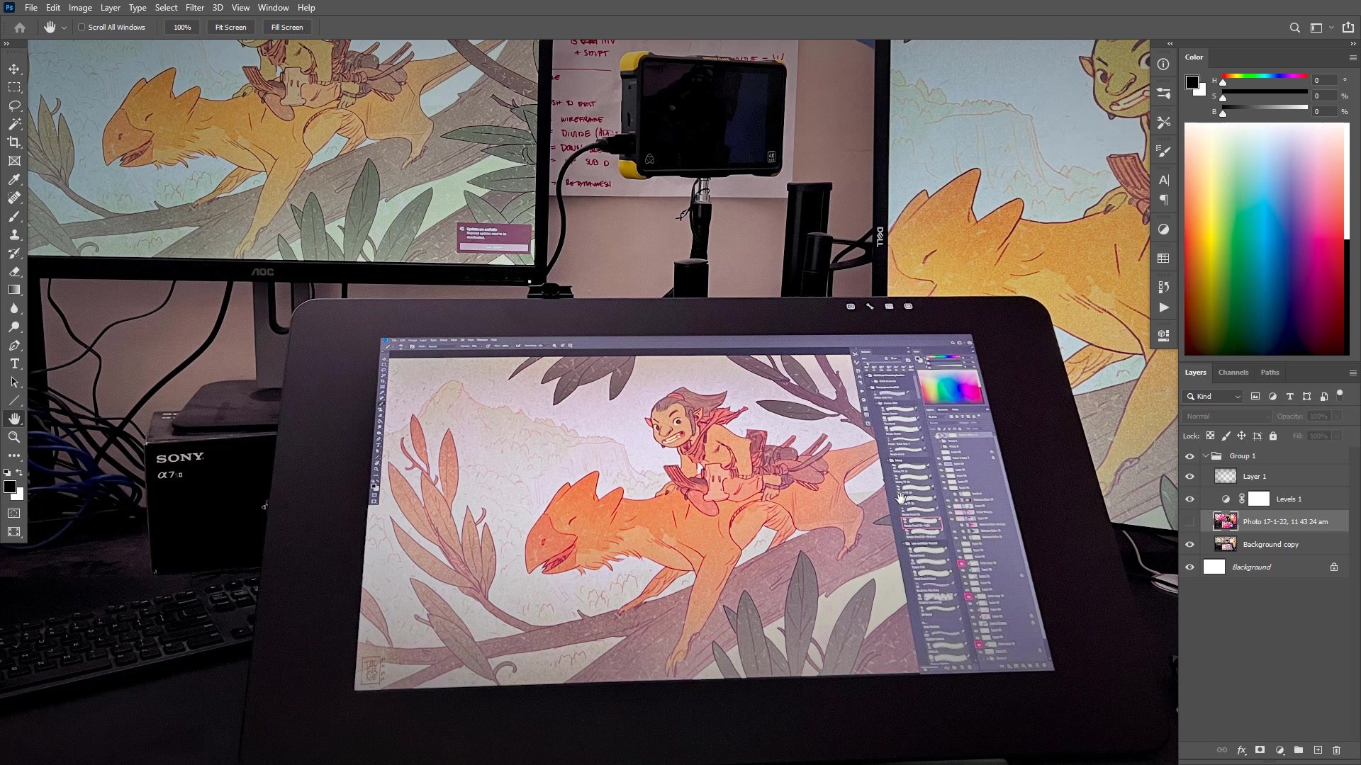
The Monitor Problem
Figuring out which monitor to buy as a digital artist is a deceptively tricky proposition. There are mountains of specifications, marketing buzzwords, and recommendations from people who are reviewing monitors for gaming or general use rather than for creating art. The challenge is that what makes a monitor good for gaming is often the opposite of what makes a monitor good for digital art. Response times and contrast ratios that gamers chase are irrelevant to artists, while the things that matter most to us, like color accuracy and viewing angles, rarely make it into mainstream reviews.
The good news is that the actual buying decision, once stripped of all the noise, comes down to a small number of concrete specifications. After twenty years of professional digital art and owning enough monitors to fill a small office, the core advice is surprisingly simple. There are three things to look for, and understanding those three things will protect against making an expensive mistake while ensuring the monitor becomes a reliable tool for creating art.
Panel Tech and Specifications


IPS Is Non-Negotiable
The single most important specification for a digital art monitor is the panel technology, and the answer is always IPS, or in-plane switching. The reason is simple and fundamental: IPS panels maintain consistent color and contrast across wide viewing angles. With a 178-degree viewing angle, the image looks essentially the same whether viewed dead-on, from the side, or while standing up and looking down at the screen.
Other panel types like TN and VA will shift colors, brightness, and contrast depending on the viewing angle. For a digital artist who might be leaning in close one moment and sitting back the next, that inconsistency is a disaster. Gaming monitors specifically avoid IPS because response times are slower, but the 14-millisecond response time on even an expensive Wacom Cintiq Pro would be laughable to gamers. That speed difference is completely irrelevant for drawing. Just confirm the spec sheet says IPS and the viewing angle is around 178 degrees, and the panel technology question is answered.
Color Gamut and Dynamic Range


Understanding Color Gamut
The second critical specification is the color gamut, meaning how much of the visible color spectrum the monitor can actually display. This is where marketing terms like HDR and high dynamic range create confusion. For a buying decision, the focus should be on which color spaces the monitor covers. sRGB and Rec 709 are the baseline. A monitor claiming 100% of either is not exceptional, but it does confirm the panel is not going to be terrible at displaying color.
The more meaningful color spaces to look for are Adobe RGB, DCI-P3, and Rec 2020, which cover larger portions of the visible spectrum. The Wacom Cintiq Pro claims 99% Adobe RGB coverage, which is genuinely good. A cheaper Dell or BenQ might only claim 99% sRGB, which is adequate but not remarkable. The real danger is buying something, particularly a laptop, that does not even claim to cover sRGB properly. Cheap business laptops with 6-bit panels pretending to be 8-bit will produce colors that look completely different from what was intended. That situation creates constant frustration where artwork looks fine on screen but wrong everywhere else.
Multi-Monitor Setup and Comparisons


Practical Buying Strategy
The most practical approach to monitor buying is layered. Only one monitor in a setup needs to be the reliable, color-accurate reference display. Secondary monitors can be budget options used for reference images, palettes, or browser windows. This approach dramatically reduces the required investment. In Photoshop, the same file can be displayed across multiple monitors simultaneously using Window then Arrange then New Window, which means work can happen on a pen display while the reference monitor shows the true colors.
Mixing monitor quality levels is actually an advantage. A high-gamut display next to a standard one provides instant feedback about how artwork will look on both types of screens. Since most viewers will not be using high-end displays, checking work on a cheaper monitor prevents over-saturating colors. The world is moving toward high dynamic range displays, but in the meantime, having a range of monitor quality in the setup offers a more realistic preview of how art will appear in the wild. The core takeaway is that adapting to tools matters more than having the absolute best tools. As long as the fundamentals are covered, the work will follow.
Key Buying Criteria
IPS Panel Technology: Always ensure the monitor uses an IPS panel. This guarantees consistent color and contrast at wide viewing angles, which is essential when working on art. Avoid TN and VA panels marketed toward gamers, as their strengths are irrelevant to digital art.
Color Gamut Baseline: At minimum, look for 100% sRGB or Rec 709 coverage. For more serious work, seek Adobe RGB or DCI-P3 coverage. Be especially cautious with cheap laptops, as business and gaming laptops frequently have panels that cannot accurately reproduce color for art creation.
One Good Reference Monitor: Not every screen needs to be high-end. Invest in one reliable, color-accurate display and use budget monitors for secondary tasks. This approach keeps costs manageable while ensuring the artwork is created on a trustworthy screen.
Adaptation Over Perfection: The difference between 99% and 100% of a color space will not change the quality of the art. Spending as much as is reasonable and then adapting to the tools will always produce better results than endlessly chasing specifications.
Monitor Checklist
Check the Panel Type: Before purchasing any monitor, find the specifications page and confirm the panel type is IPS with a viewing angle of approximately 178 degrees. If the listing does not mention panel type, treat that as a warning sign.
Verify Color Space Coverage: Look for explicit claims about sRGB, Rec 709, or ideally Adobe RGB coverage. If the monitor does not mention color gamut at all, it was not designed with visual creators in mind and the color reproduction may be unreliable.
Evaluate the Whole Setup: Consider how many monitors are needed and which one will serve as the primary color reference. Budget accordingly so that at least one display is reliable for color work, even if the others are more affordable secondary screens.