What Actually Makes Art Look Professional
Summary
The Polish Problem
What separates professional-looking artwork from amateur efforts? The answer is less about raw drawing skill than most artists assume. Plenty of artists with modest technical ability produce work that looks polished and intentional, while others with strong drawing skills create images that never quite come together. The difference comes down to three fundamental shifts in how an image gets made.
The core idea is a transition from being a passive artist to an active one. A passive artist draws and hopes it works out. An active artist takes deliberate control of what the viewer sees and experiences. This means deciding in advance where people should look, choosing subjects and skills to display strategically, and investing in the atmospheric foundation that makes an image feel complete. None of these require years of additional skill development. They require a change in mindset: taking responsibility for the viewer's experience instead of leaving it to chance.
Focal Point Control
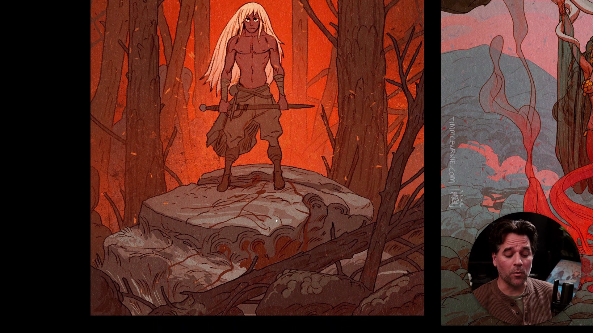
Control the Viewer's Eye
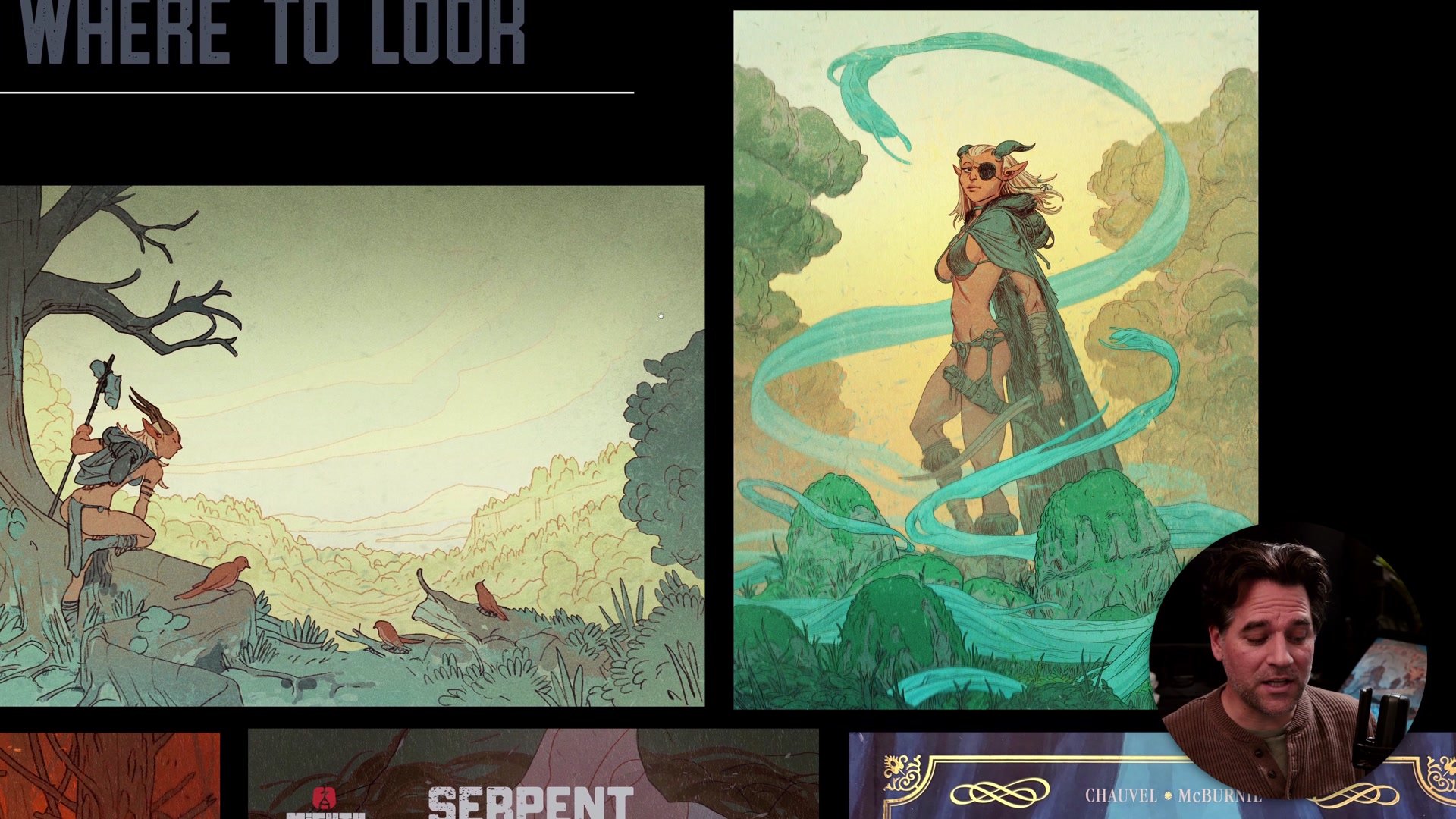
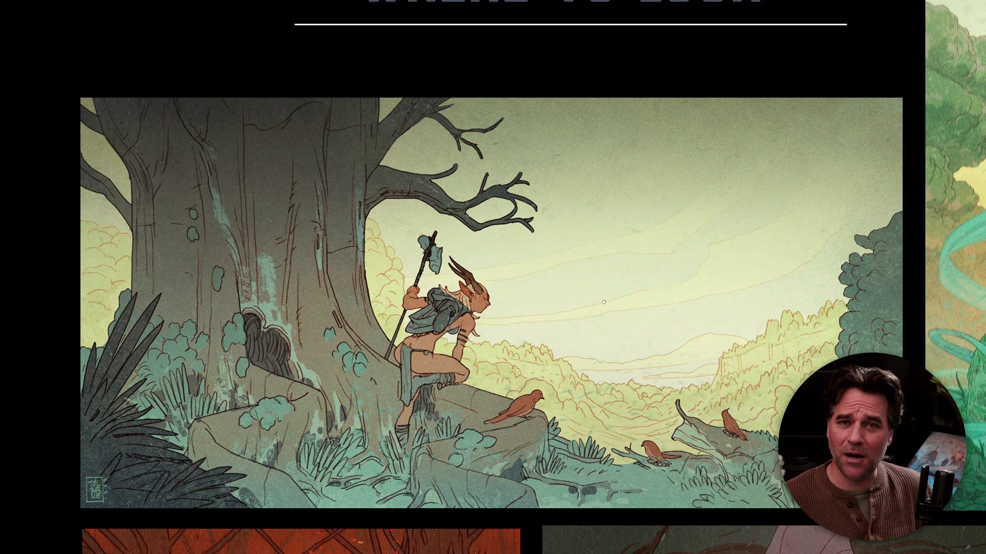
The single most common compositional failure is not knowing what viewers should look at. When every part of an image receives equal rendering and detail, nothing stands out. Professional work controls two things: how the composition leads to the focal point, and how the hierarchy of detail reinforces that focal point.
In practice, this often means spending considerable time blurring out, fading, and reducing detail in areas that are not the focus. A fully detailed background with a fully detailed character creates visual noise. A simplified background with a high-contrast, detailed character creates a clear read. Even a speed painting can look polished when the focal area (typically a face, a silhouette, a high-contrast shape) is clear and everything else is pushed back.
Before starting to render, the practical step is simple: identify the primary read (what viewers see first), the secondary read (what they see second), and the tertiary read. Then commit to that hierarchy throughout the entire image.
Strength on Display
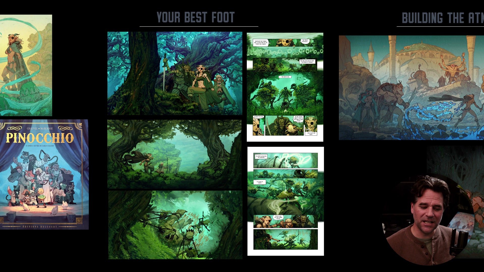
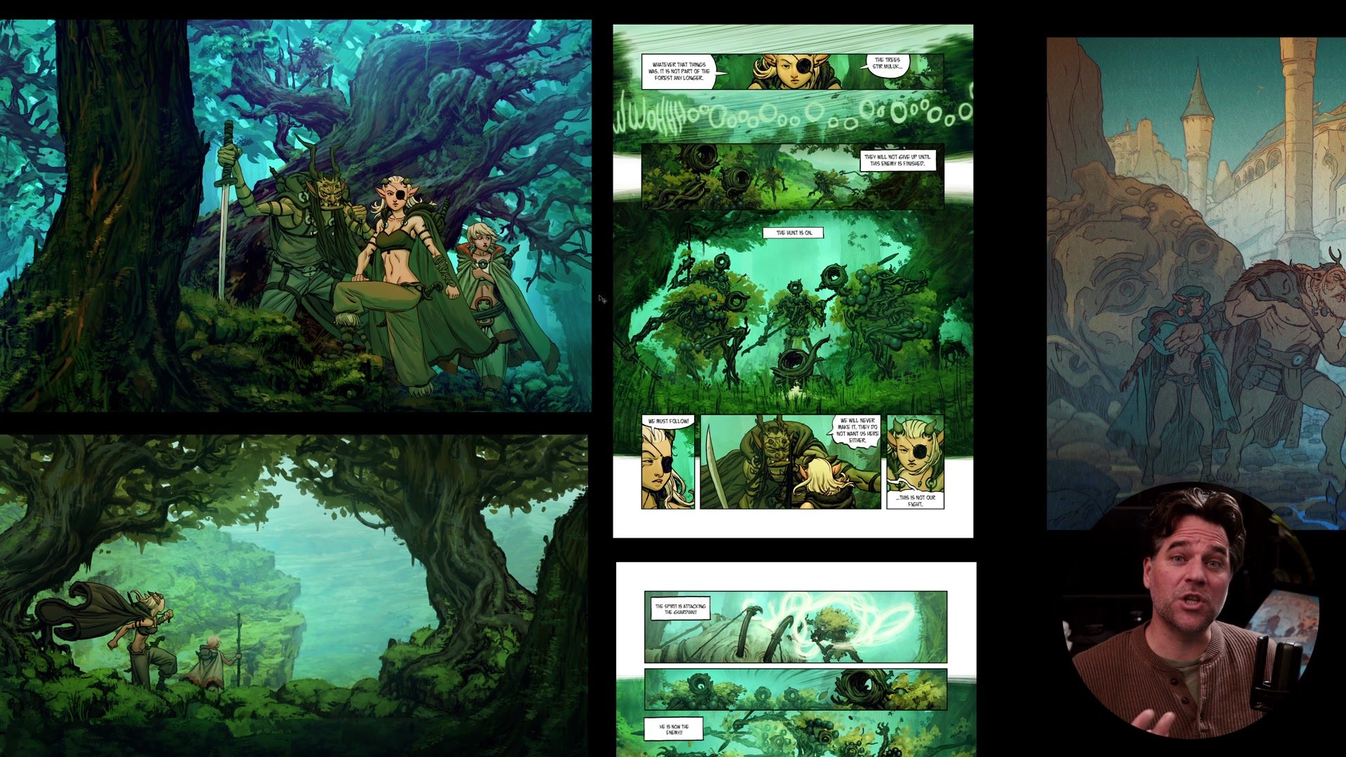

Show Your Strengths
No artist is good at everything. Concept artists specialize in characters or environments. Hard surface designers and creature designers rarely overlap. Even within a single career, the scope of what gets shown to an audience is carefully curated.
This is not a limitation to overcome. It is a strategy to embrace. The practical reality is that professional artists show what they are good at and hide what they are not. An entire comic book can be set in a forest because that is what the artist can draw well right now. Castles and cities can wait for another year, another project, another level of experience.
For artists still building their skills, the critical mental shift is separating learning time from presentation time. During learning, experiment freely. When making a finished piece, choose subjects and compositions that showcase existing strengths. If that means doing portraits and single characters for now, that is a perfectly valid body of work. The scope of what can be included grows naturally with practice and experience.
Build the Atmosphere
The counterintuitive truth about highly polished images is how much time goes into elements that viewers are not supposed to focus on. Backgrounds, environmental details, atmospheric effects. The rocks, the trees, the rubble, the mountains. These elements rarely draw the viewer's attention directly, but their absence is immediately felt.
The comparison to film production is instructive. The Shire in Lord of the Rings was physically built and left to grow over for a year so the grass and weeds would look natural. Nobody watches the opening of Fellowship thinking about garden design. But if that environmental richness were missing, the suspension of disbelief would collapse. The same principle applies to illustration. The background details create the foundation of believability that allows the focal elements to land with full impact.
What this means practically is that a significant portion of time on any polished image goes into drawing things that support the atmosphere. Trees, rocks, props, architectural details. Not every one needs to be masterfully rendered. They just need to be there, contributing to the sense of a living, breathing world.
Key Concepts
Control the Eye: Decide where viewers should look before rendering. Build composition and detail hierarchy around a primary, secondary, and tertiary read. Blur, fade, and reduce detail everywhere else.
Show Your Strengths: Professional artists display what they do well and avoid subjects they cannot render convincingly. Separate learning time from presentation time, and choose compositions that showcase existing skills.
Build the Foundation: Atmospheric details like backgrounds, props, and environmental elements may not be the focus, but their presence creates the believability that makes focal elements land. Invest time in the parts nobody consciously notices.
Try This
Identify Your Focus: Before starting the next image, identify the primary read (what viewers see first), the secondary read, and the tertiary read. Write it down or draw a layer over the thumbnail sketch. Commit to this hierarchy before any rendering begins.
Audit Your Strengths: List the subjects and techniques that can currently be drawn with confidence. Plan the next finished piece around those strengths rather than around subjects still being learned.
Study Professional Reads: Pick three favorite professional illustrations. For each one, identify where the eye goes first, second, and third. Note how the artist used contrast, detail, and simplification to control that sequence.