Concept Design For Comics
Summary
Designing Within Constraints
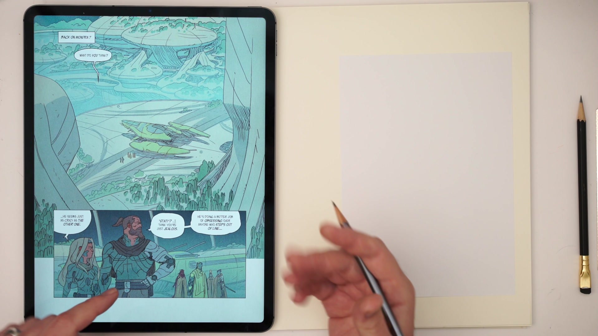
Concept design for comics is a different challenge than concept design for film or games. When designing environments for a graphic novel, every shape, every form, every detail has to be drawn and redrawn across dozens or even hundreds of panels. That reality alone changes the entire design process. Add to that the constraint of working within an existing IP where other artists have already established visual language and aesthetic direction, and the problem becomes genuinely complex.
This is where having a structured design process becomes essential. Without one, it is easy to create something that looks impressive as a single piece of concept art but becomes a nightmare to reproduce consistently in sequential storytelling. The real craft lies in developing a visual language that serves the story, fits the existing world, is iconic enough to read at any size, and remains genuinely enjoyable to draw panel after panel. That balance between ambition and practicality is what separates professional design work from portfolio pieces that never get tested in production.
Comic Pages and Design Notes
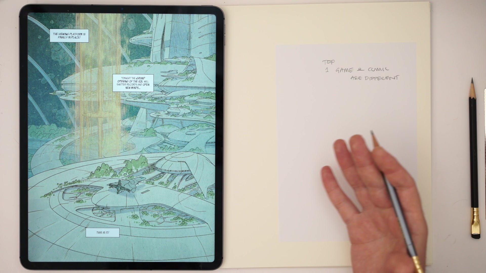
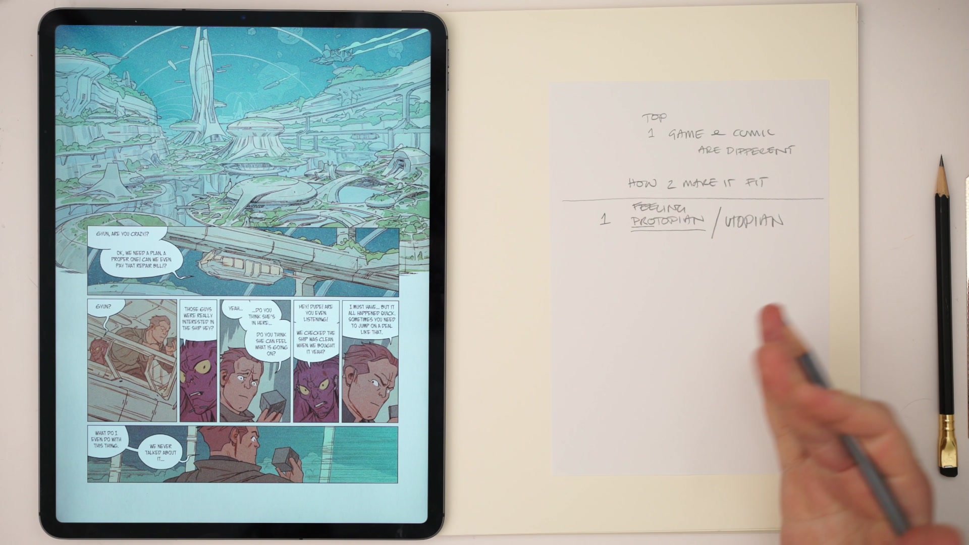
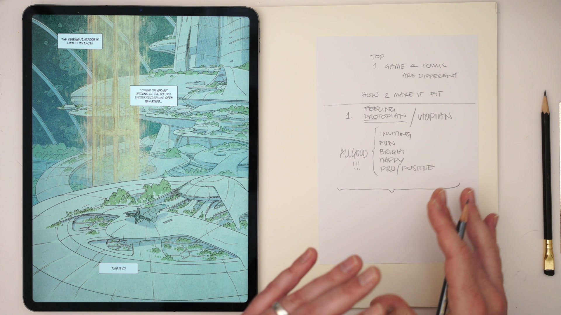
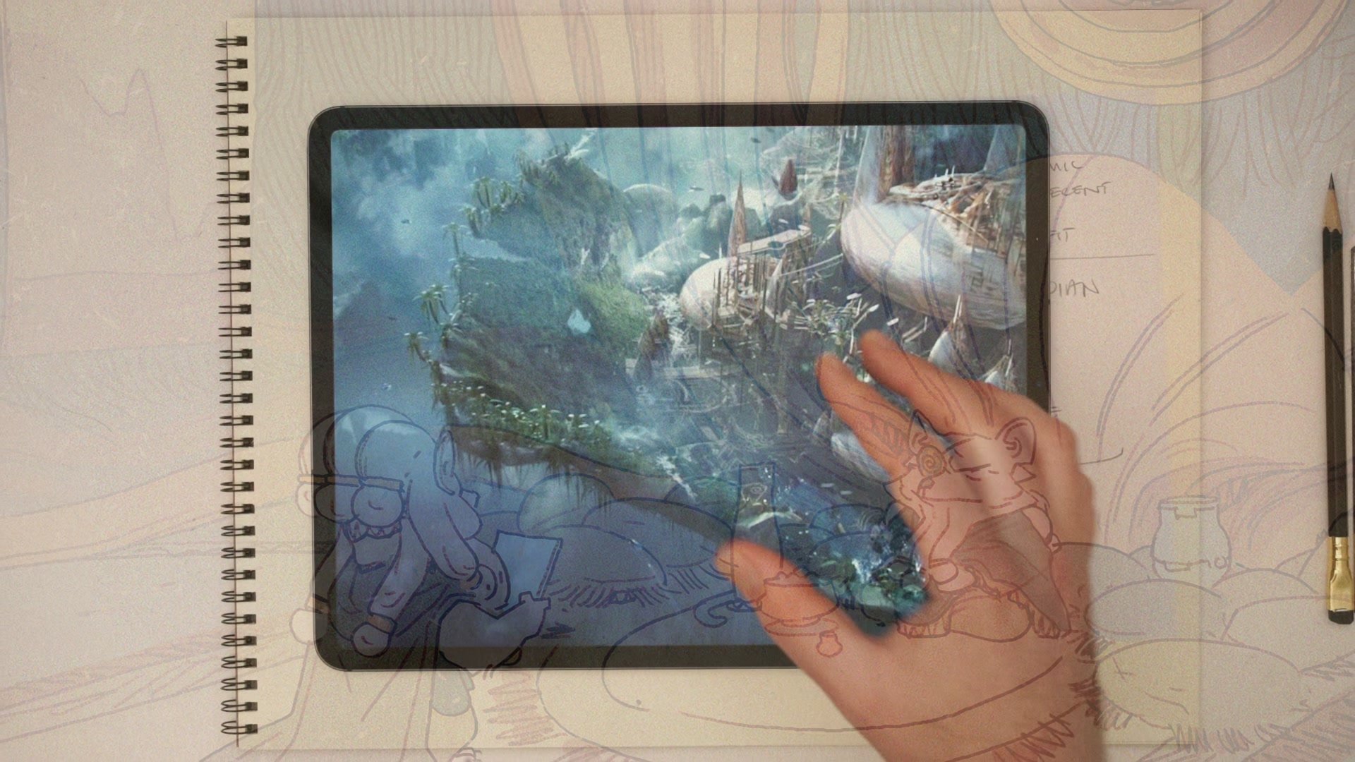
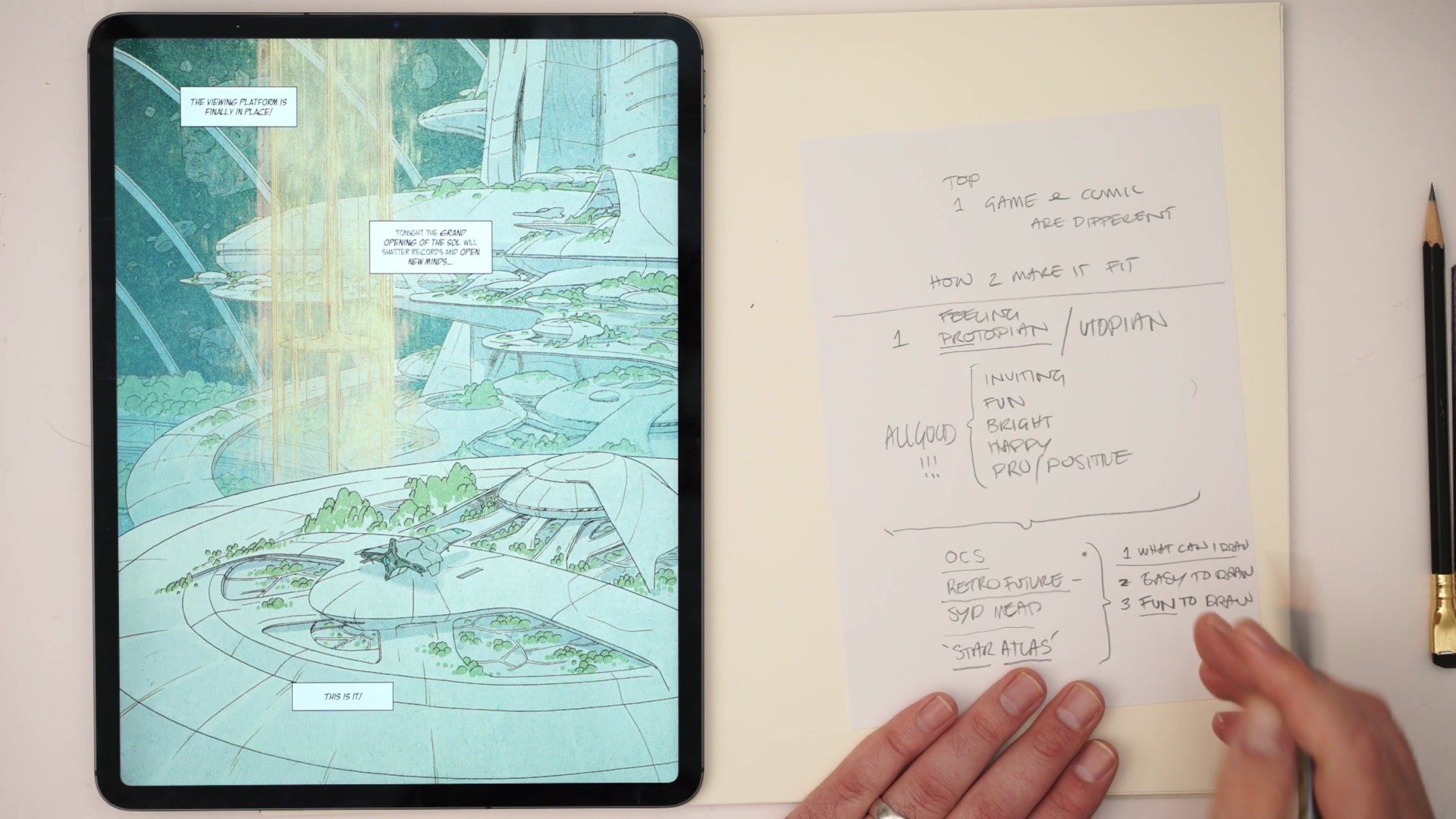
Start With Feeling
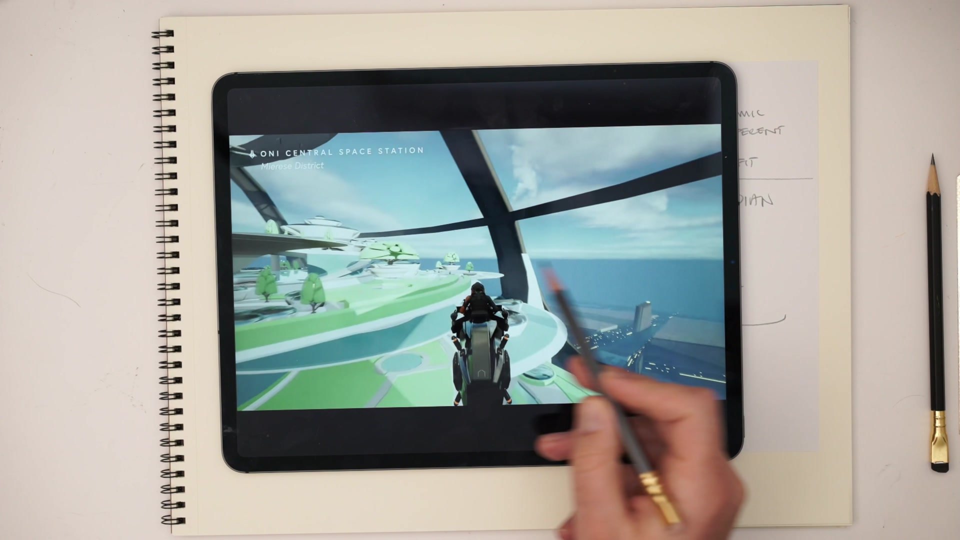
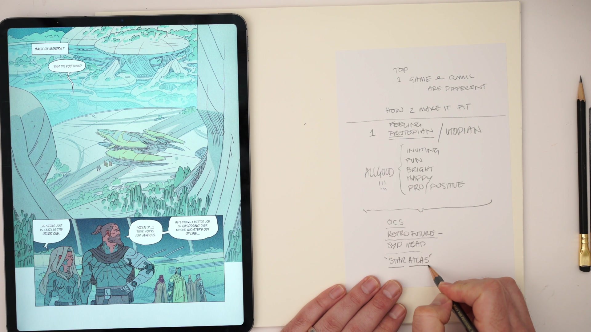
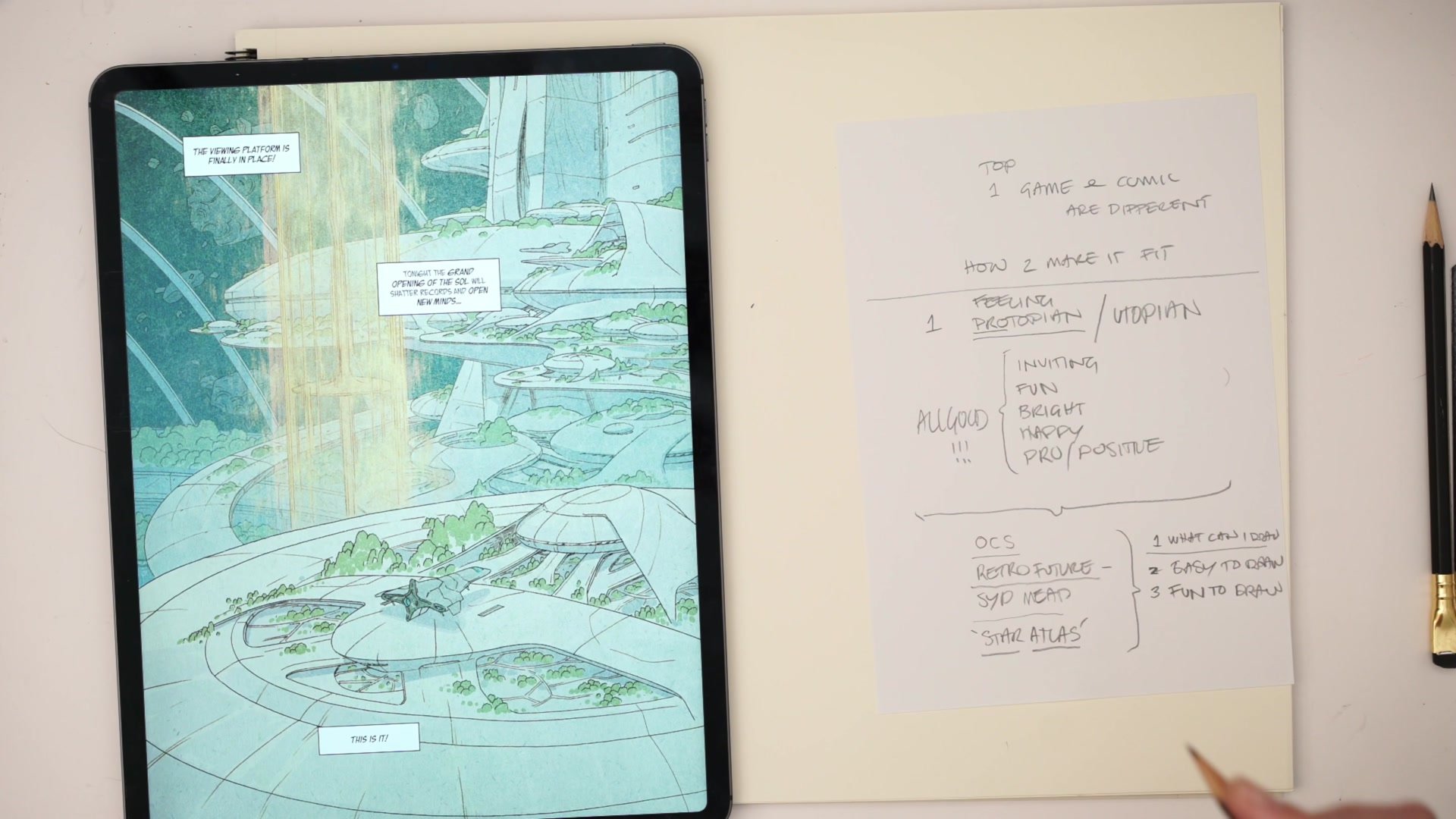
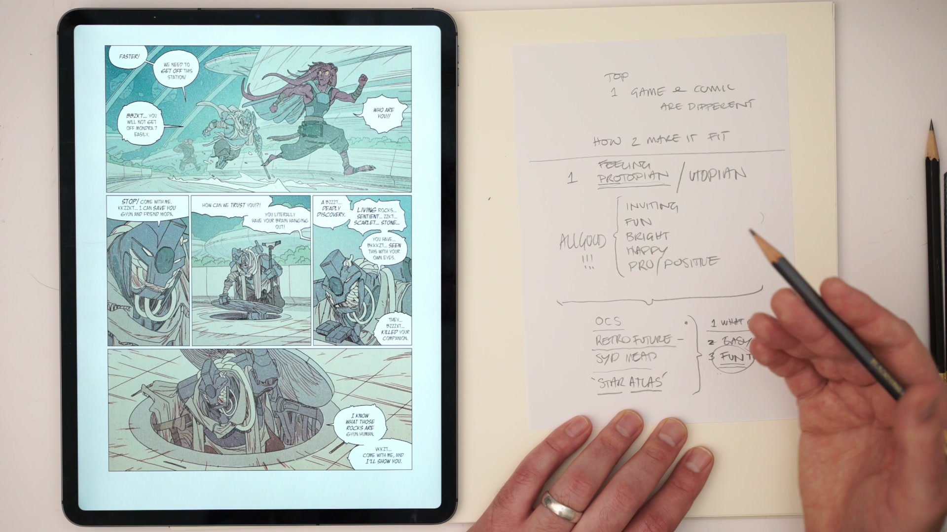
The first and most important step in a design process is not sketching shapes or collecting reference. It is defining the feeling the design must evoke. For a sci-fi city in a protopian universe, that means the environment should feel inviting, fun, bright, happy, and positive. Not utopian in the sense of unrealistic perfection, but protopian in the sense that the future is going to be good. Kids might be running around playing games. There are parks, recreation areas, greenery mixed with advanced architecture.
Establishing these emotional guardrails is critical because they define the boundaries of every decision that follows. Once it is clear that dystopian aesthetics are off limits and that the overall feeling must be warm and welcoming, every shape, color, and structural choice can be evaluated against that simple emotional brief. Writing these parameters down and journaling the design direction is an underrated but vital step that many designers skip.
Reference and Influence
Visual Literacy as a Tool
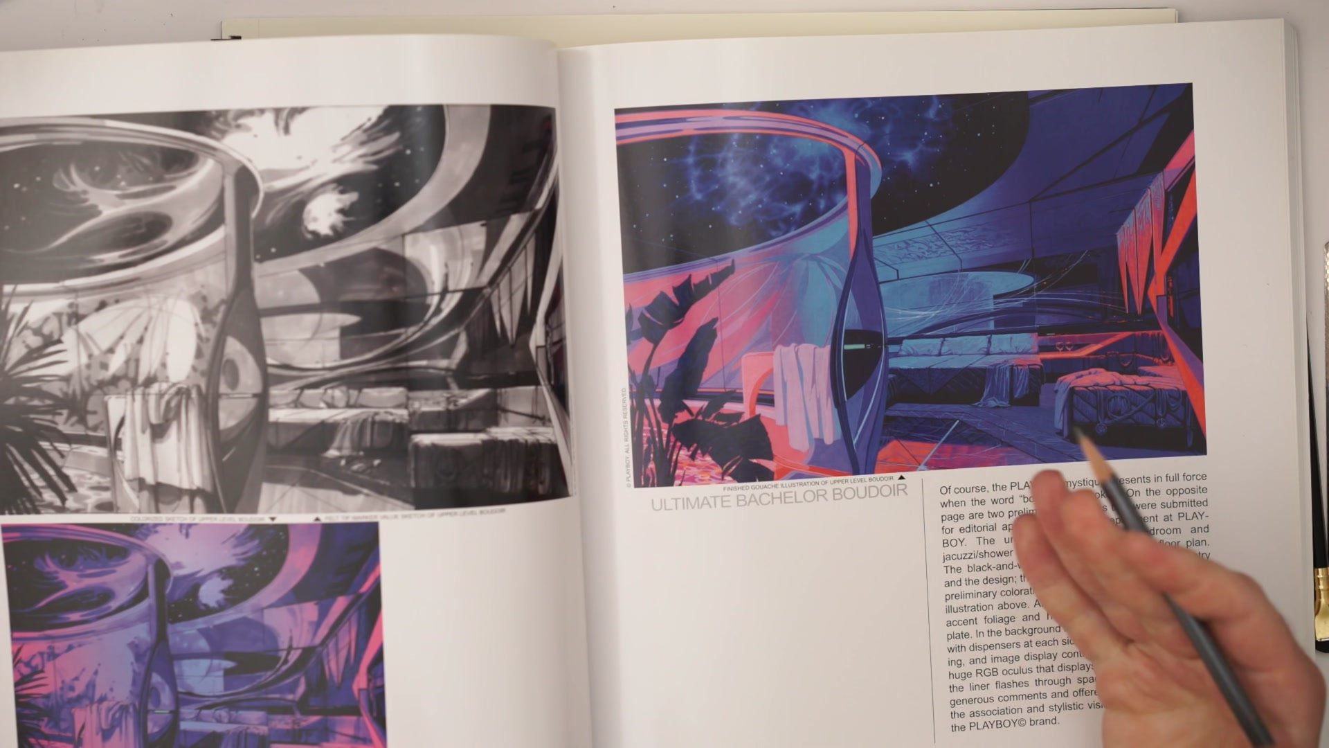
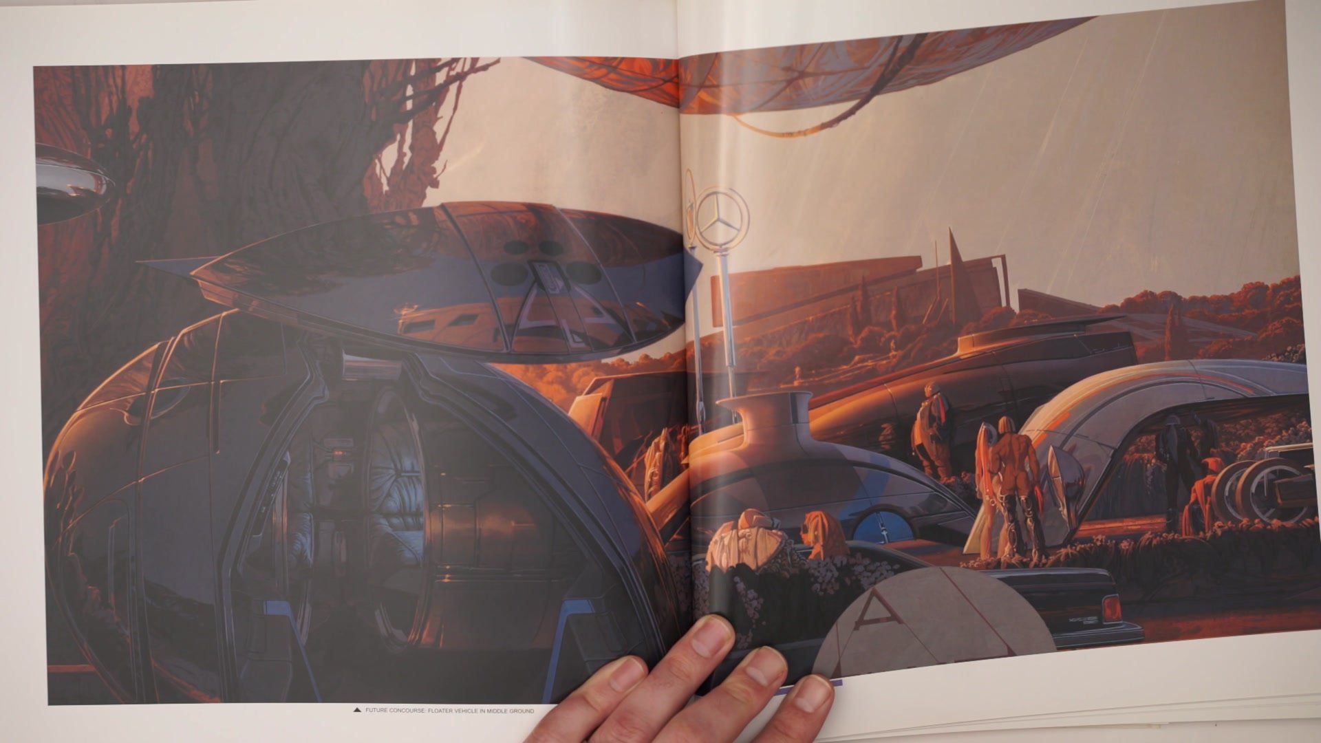
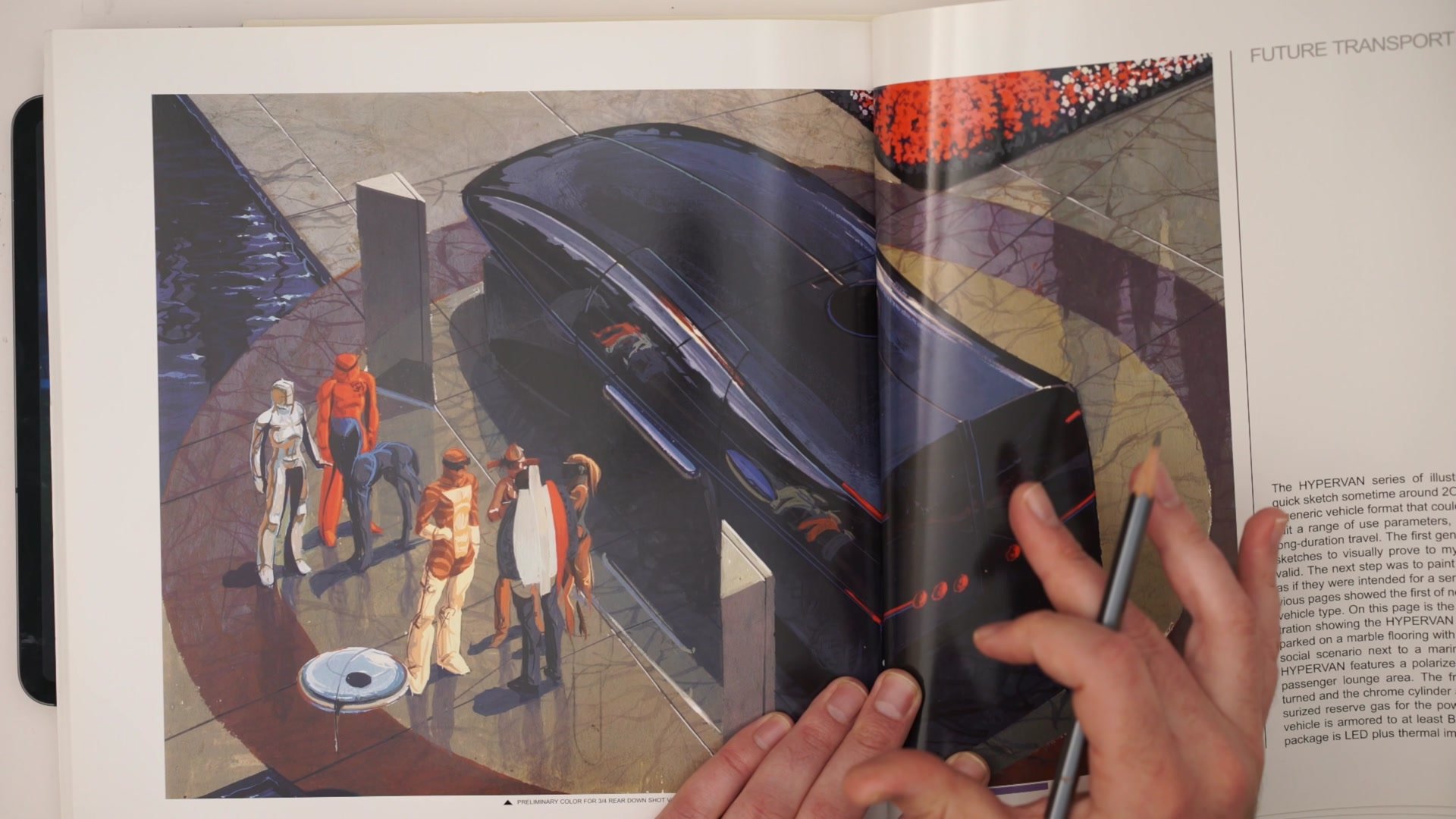
Gathering reference is standard practice, but the real skill lies in how that reference is interpreted. Rather than directly copying pre-existing concept art from the same project, drawing deeper influence from an artist like Sid Mead allows a designer to access the underlying principles of retrofuturism. Mead's work embodies that mix of hyper-futuristic manufactured shapes set against organic natural environments, that feeling of high-end industrial design applied to an entire civilization. Understanding that aesthetic at a conceptual level rather than just copying surface details is what visual literacy enables.
The important distinction is between looking at existing project art and understanding why it works versus simply replicating it. By filtering the brief through a strong reference point like Mead's design philosophy, the resulting work carries the right DNA while still being original. This approach of limiting reference sources to get a clear visual read rather than drowning in hundreds of images is a practical technique that helps maintain design coherence.
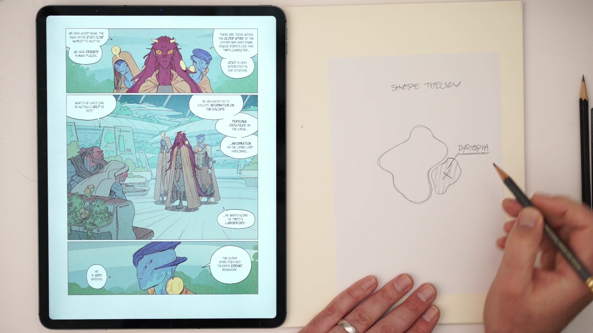
Iconic Shapes and Drawability
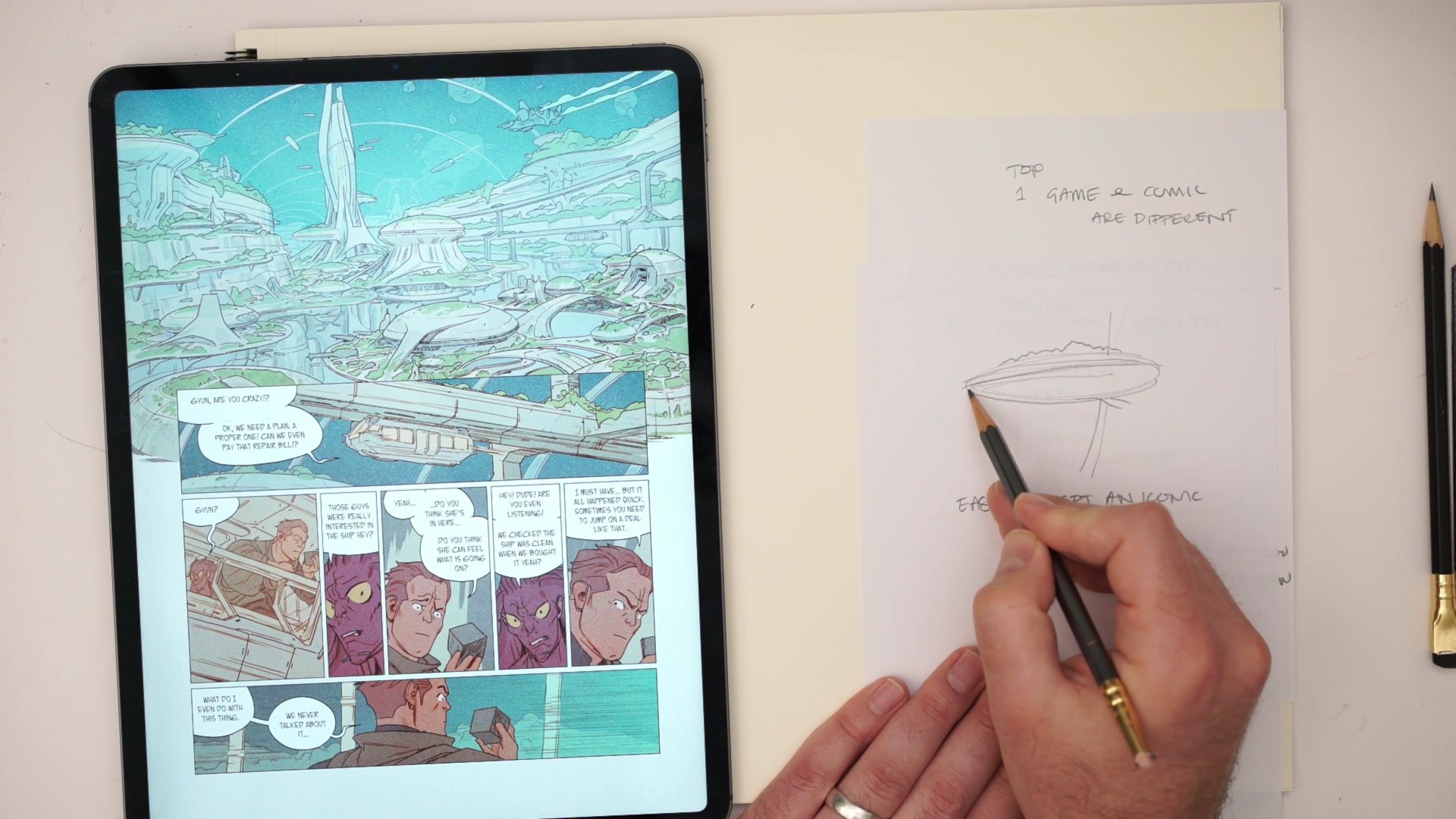
Design for Drawability
Three critical questions filter every design decision when working in comics. First, what can the artist actually draw well? Working within existing strengths rather than against them produces better and more consistent results. Second, what is easy to draw? Simple, iconic shapes that read clearly at any scale, from a full-page splash to a tiny background detail, are far more valuable than complex designs that require careful rendering every time. Third, and perhaps most importantly, what is fun to draw?
The fun factor is easy to dismiss but it is genuinely important. If a design is enjoyable to produce, the artist will naturally draw it better, more consistently, and with more energy across an entire book. Think of classic Jack Kirby character designs like Thor or Spider-Man. They have been refined by artists over decades, and the successful ones share a common trait: big, simple, well-laid-out shapes with nothing fiddly. That same principle applies to environment design. The goal is a set of iconic forms that can be reproduced hundreds of times without losing their impact or becoming tedious.
Design Boundaries in Practice
Design Process Principles
Define the Feeling First: Before sketching anything, establish the emotional brief. Protopian versus dystopian, inviting versus threatening, bright versus dark. These emotional guardrails shape every design decision that follows and prevent the process from drifting into territory that does not serve the project.
Filter Through Visual Literacy: Rather than copying existing project art directly, draw influence from master designers who embody the aesthetic principles the project requires. Understanding why reference works at a conceptual level produces designs that carry the right DNA while remaining original.
Design for Repeated Drawing: Every element in a comic environment must be drawn dozens of times. Prioritize what is drawable, what is easy, and what is fun. Iconic, simple shapes that read at any scale will always outperform complex designs that look impressive once but become a burden across a full book.
Respect Existing Boundaries: When working within an IP, understand the visual territory that has been claimed and what remains open. Focus on elements that tell the story without designing details that might conflict with future project development.


