Simple vs Painted Coloring in Comics
Summary
The Comic Book Style Dilemma
One of the most common struggles for artists who want to make comics is choosing between a detailed, painterly coloring style and a simpler, flatter approach. The desire to render and paint can feel deeply personal, tied to the kind of art that first inspired the creative journey. But when those ambitions meet the reality of producing page after page on a schedule, something has to give.
What makes this question especially interesting is that comic book styles did not emerge from pure aesthetic preference. They are the product of functional limitations, economic pressures, and production demands that shaped how artists work over decades. Understanding why these styles exist in the first place changes how the choice between simple and detailed coloring is understood. It is not just about what looks good. It is about what the medium demands and what is sustainable over an entire project.
Comic Book Style Examples


Style Follows Function
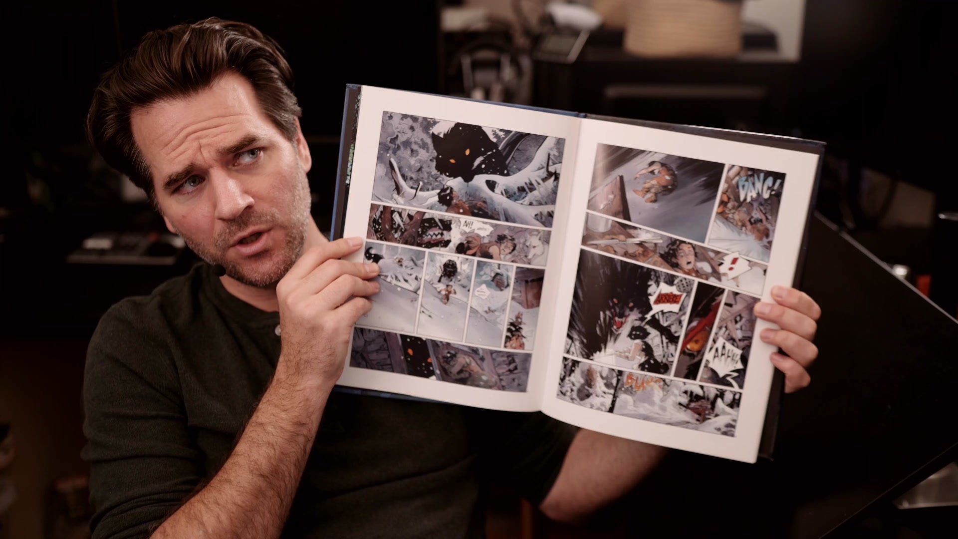
The bright primary colors of early superhero comics were not a bold artistic choice. They were cheaper to print. Superman is red and blue because mixing colors on a printing plate required cutting additional masks by hand, and that cost real money. Disney figured out that adding an extra button to a character design cost twenty thousand dollars across an entire production just from the labor of redrawing it. Line art as a comic medium exists because it reproduces well on a printing press.
These are not arbitrary traditions. They are functional solutions that became aesthetically valued over time. The entire concept of lines plus flat color underneath is technically unnecessary. Art could be painted, rendered, or finished any number of ways. But because constraints forced artists to find creative solutions, those solutions developed their own visual logic and appeal. Style in comics is made up of two layers: the personal idiosyncratic marks that define individual handwriting, and the functional choices dictated by medium, schedule, audience, and economics. The second layer is where the real decisions about simple versus detailed coloring live.
Key Concepts
Style Is Functional: Comic book coloring styles were shaped by printing technology, production budgets, and deadlines far more than pure aesthetic preference. Understanding this history reframes the choice between simple and detailed as a functional decision, not just a taste decision.
Match Style to Career Structure: Choosing a detailed painted style means working within industries that allow four to five days per page, writing tightly compressed stories, and competing at a very high quality bar. A simpler flat style allows faster production, longer stories, and a wider range of publishing options. The style choice reshapes the entire career path.
Constraint Creates Quality: The pressure of actually producing comic pages on a deadline naturally pushes artists toward cleaner, more efficient solutions. Many artists who start wanting to paint everything find themselves gravitating toward simpler approaches not because they give up, but because they discover that the simplicity creates its own kind of clarity and strength on the printed page.


