Combining Color Theory With Color Intuition
Summary
The Color Proportion Challenge
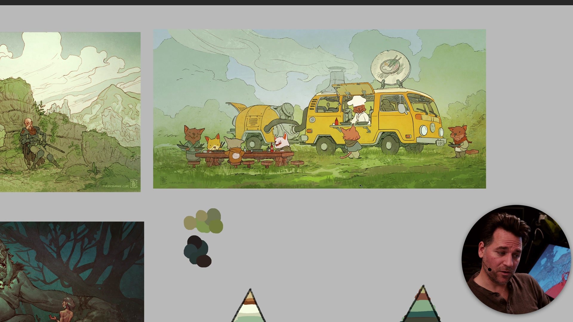
One of the trickiest aspects of making better images is figuring out how to balance intuition with theory. Plenty of artists have a natural sense of what looks right, but that instinct alone hits a wall when scenes get more complex. Color proportion offers a practical framework for this: visualize the color balance in any image as a pyramid. At the base sits the majority of the image, often neutral, muted tones that form a kind of gray foundation. At the top, a small percentage of vibrant accent colors draws the eye and creates visual excitement.
This simple model reveals something important about how strong images actually work. The accent color is often a tiny fraction of the total image, yet it carries enormous visual weight. Without it, the image flattens into an undifferentiated mass. With it, the eye has somewhere to go and the picture comes alive. Understanding this proportion, and learning to plan for it rather than hoping intuition delivers, is one of the most reliable ways to elevate illustration and comic book work from functional to genuinely compelling.
Color Proportion in Practice
Intuition Hits a Wall
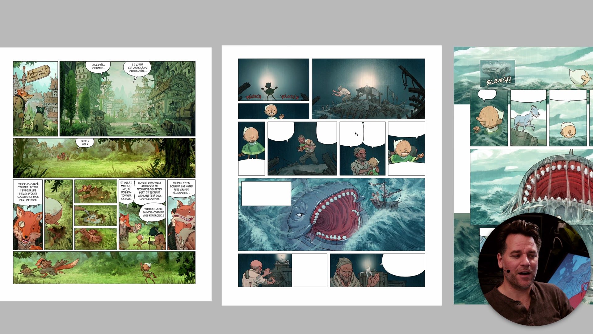
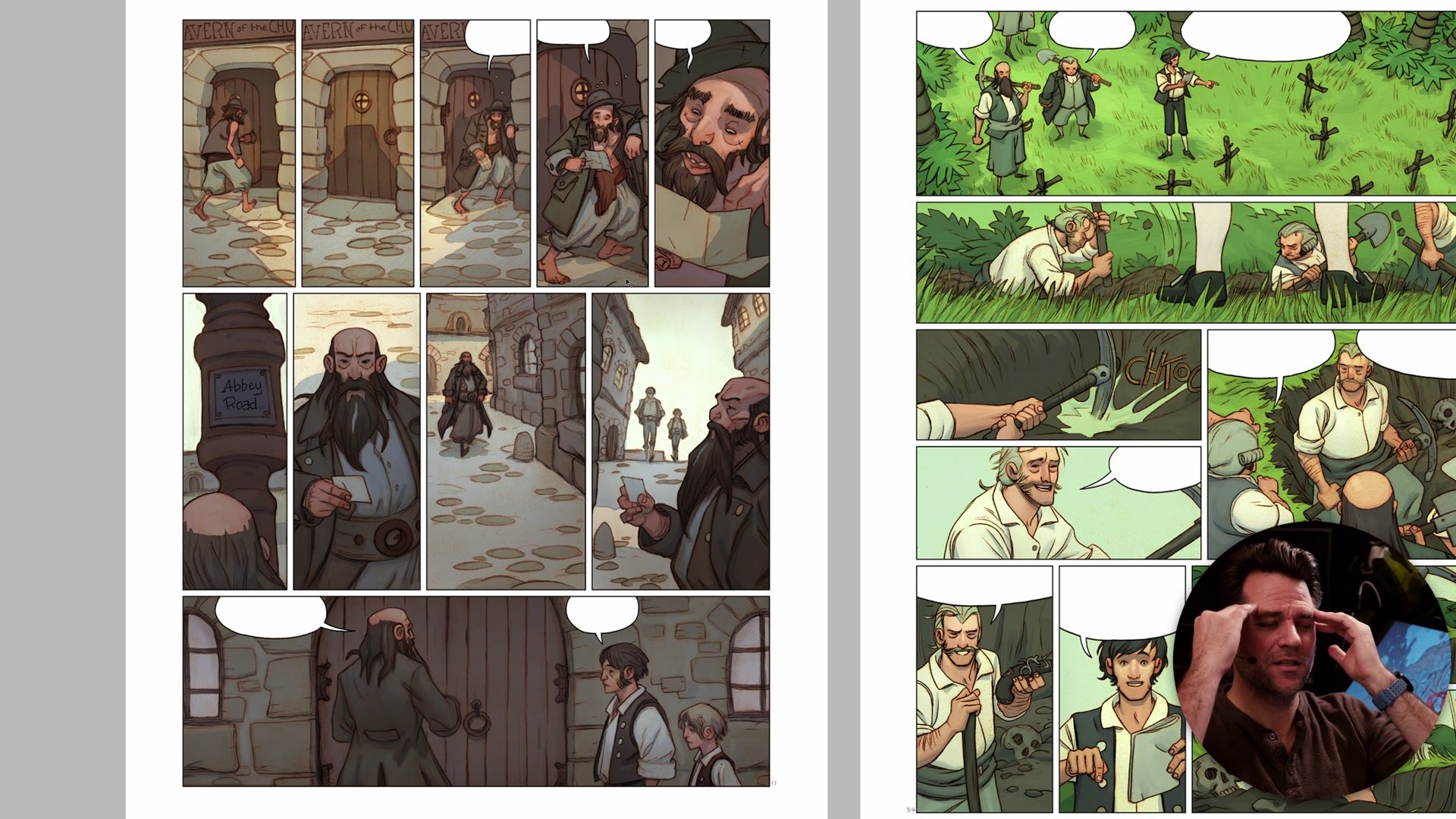
Having a good intuitive sense of color is a genuine advantage, but it comes with a hidden trap. When that intuition works, there is no pressure to understand why. Simple compositions with obvious color contrast, like a character against a contrasting background, resolve themselves almost automatically. The problems surface when scenes get more complex. Comic book pages with indoor conversations, muted environments, or limited color variety expose the limits of pure instinct.
What tends to happen is a pattern of inconsistency. Some pages turn out well because the scene naturally lends itself to good color proportion, green environments with red accent characters, for instance. But then the next page is set in a brown room with characters in brown clothing, and suddenly there is nothing to grab onto. Without a plan, these pages end up flat and lifeless. The artist can feel something is wrong but cannot articulate what, because the framework for understanding color proportion was never consciously developed. The intuition that once felt like a superpower becomes an unreliable partner.
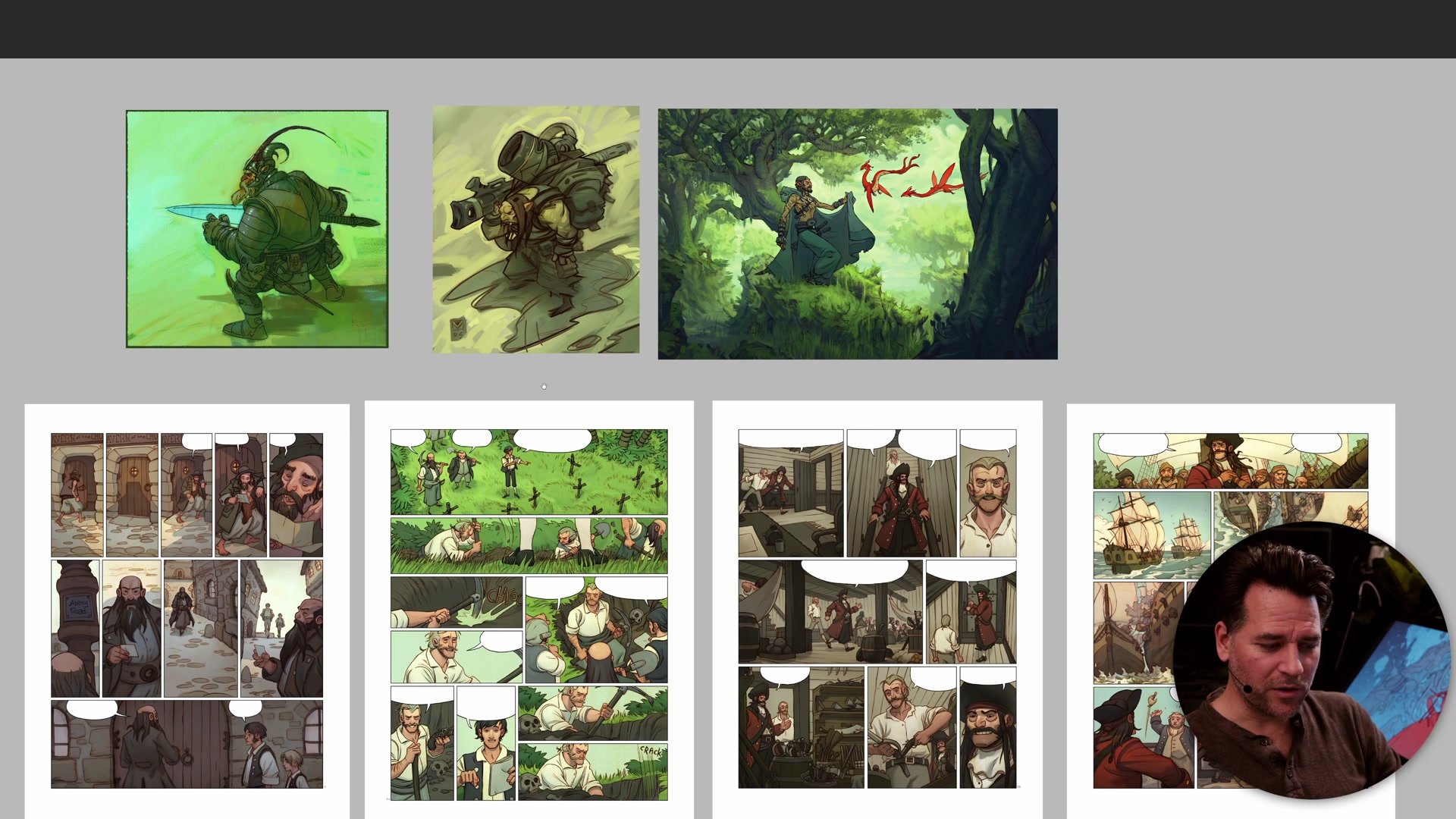
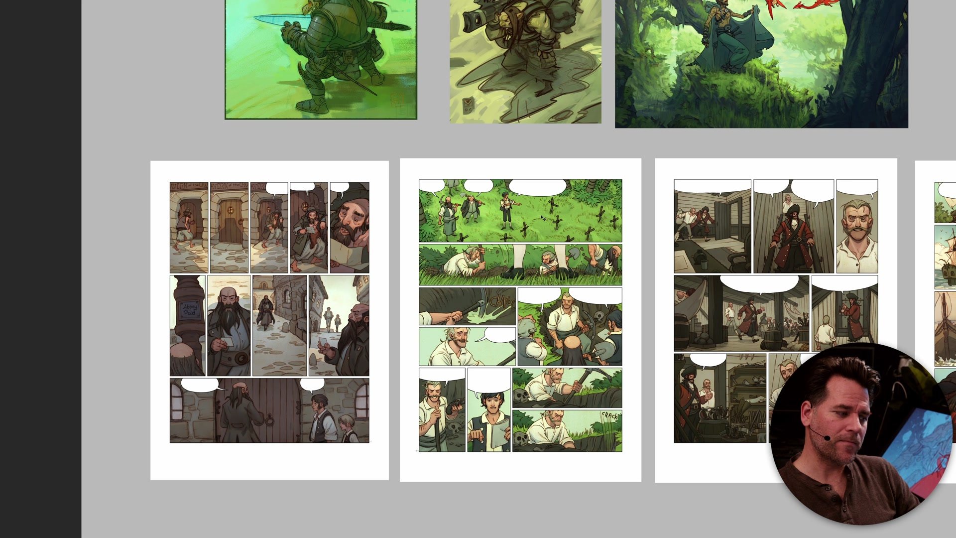
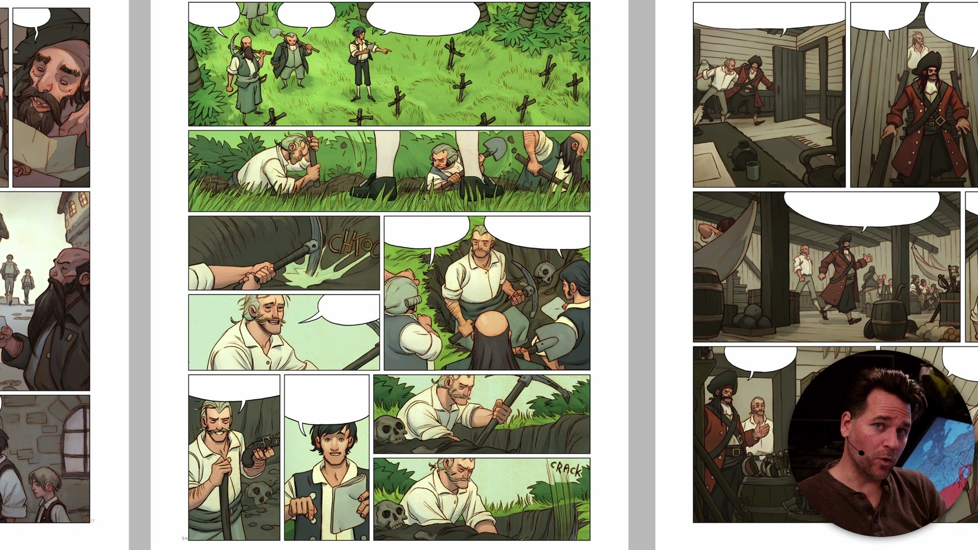
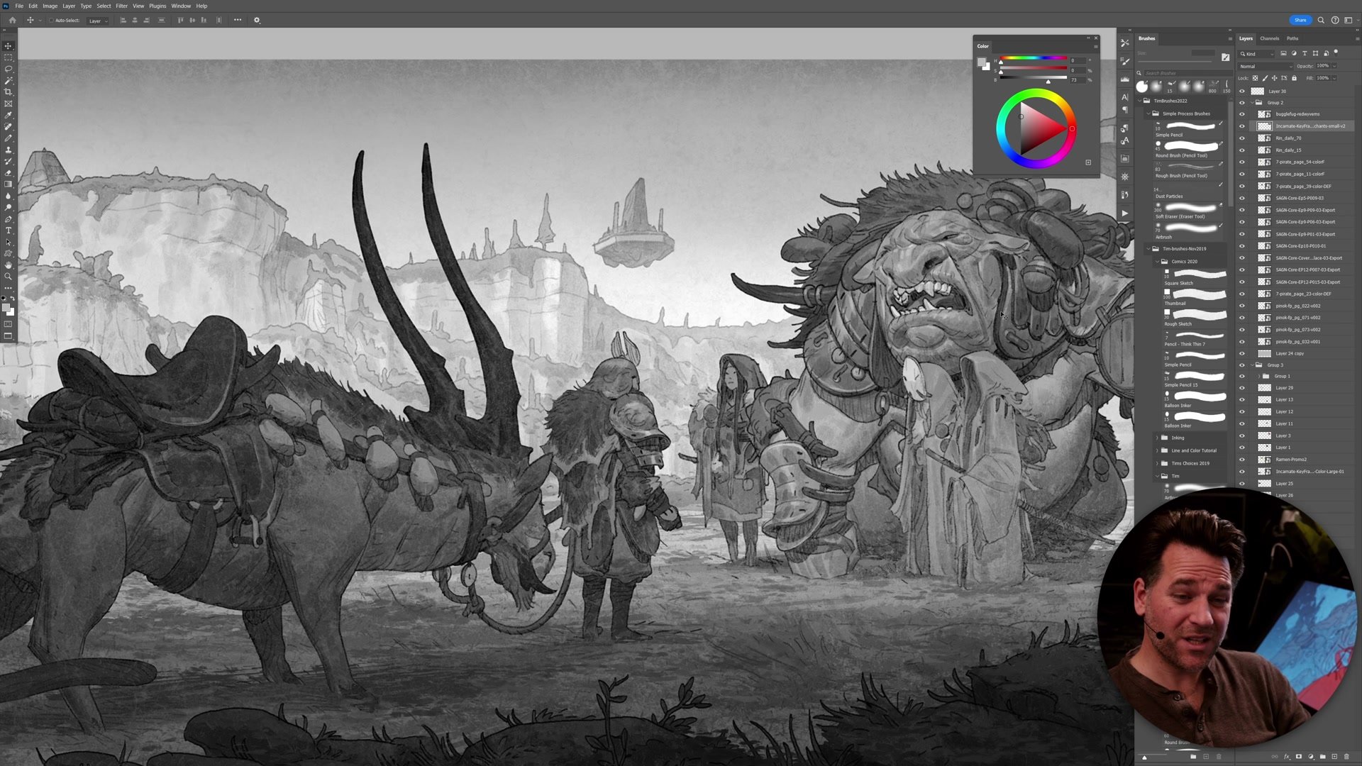
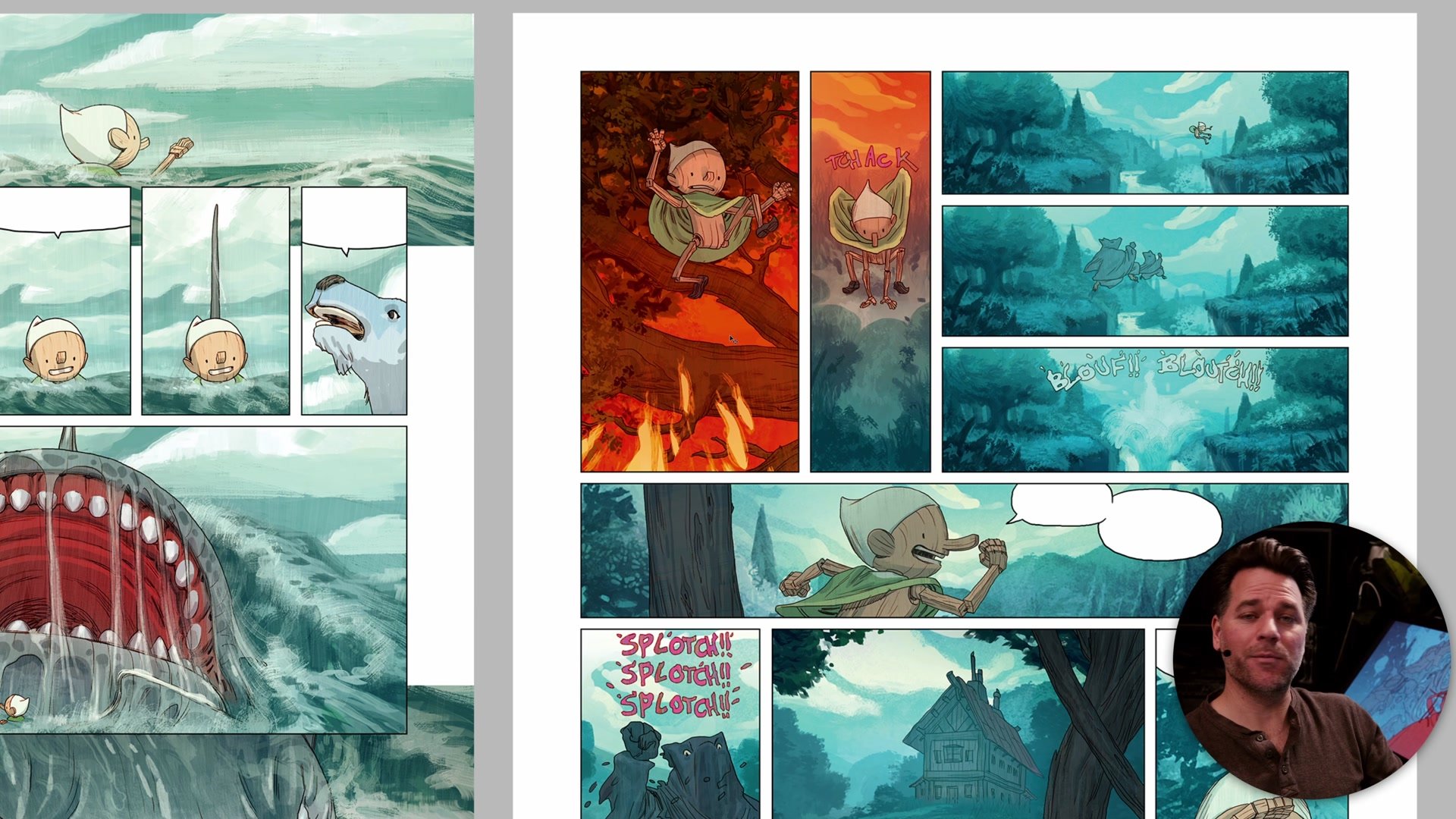
From Seven Pirates to Pinocchio
Owning the Environment
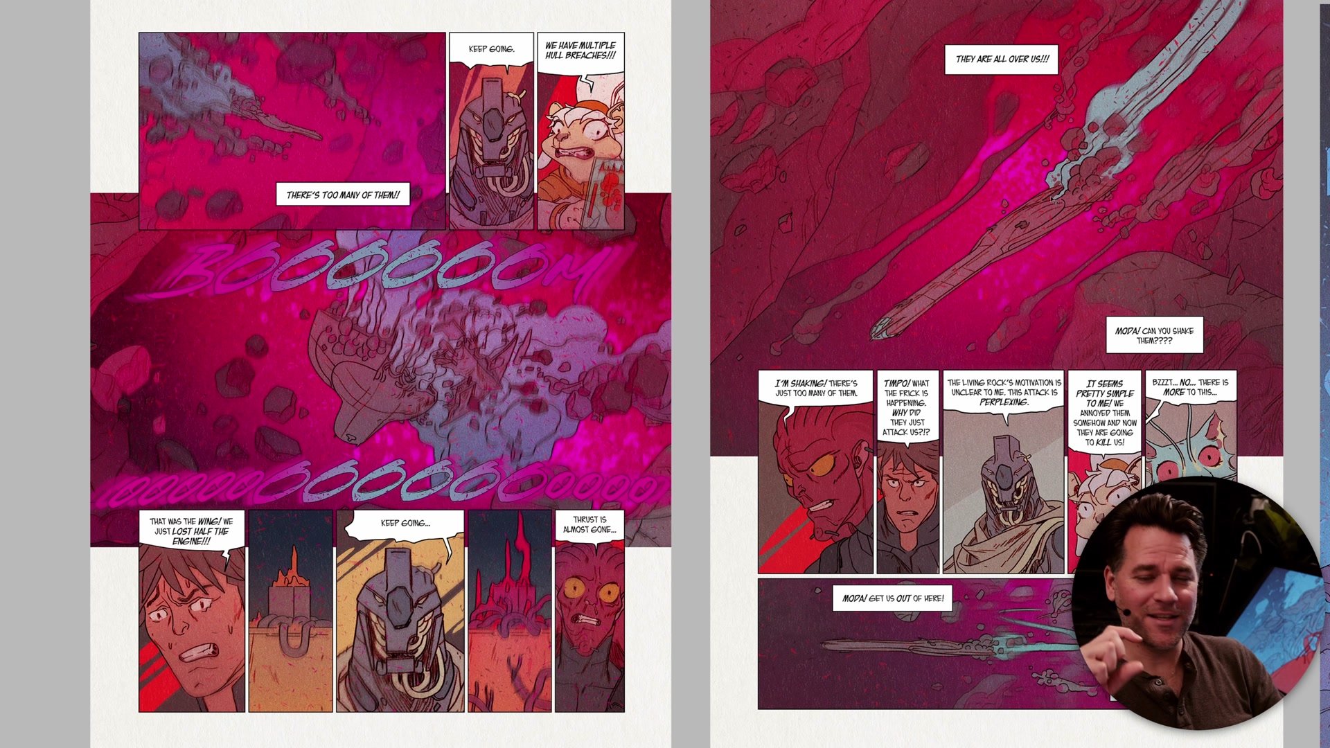
A major breakthrough comes from realizing that the artist is not a servant of the scene. Early on, it is common to feel bound by what the environment logically should look like. A boring interior stays boring because that is what it would look like in reality. But this thinking ignores what directors, production designers, and art directors do every day: they design every element of a scene so it serves the visual storytelling. Architecture, set dressing, lighting, even the color of a holographic projection in the middle of a conversation scene, all of these are deliberate choices.
The shift is from reacting to the environment to designing it. A page set in a spaceship does not have to be uniformly gray. An orange holographic display placed between characters creates natural color contrast, supports the story, and makes the page visually interesting. Once this control is internalized, even the most mundane talking-head scenes can carry visual weight. The realization that you can put any color anywhere, draw from any angle, and design any background specifically to support good color proportion is genuinely liberating.
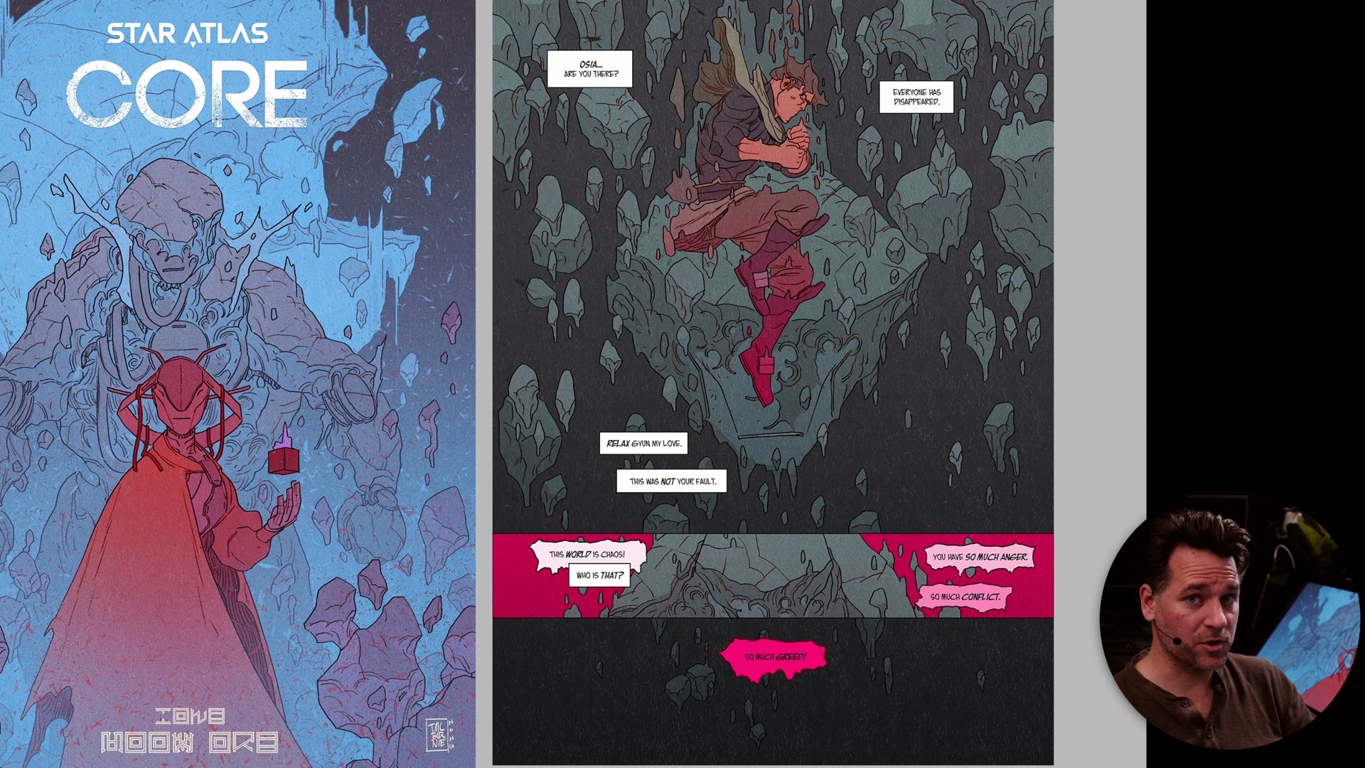
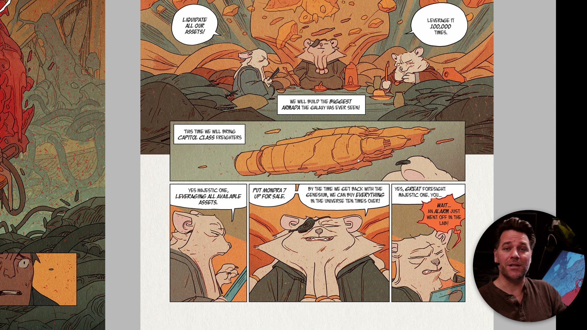
Star Atlas Core Color Design
Proportion as Priority
Over the course of multiple professional projects, from early comic work through to more recent graphic novels, the hierarchy of priorities shifts. Color proportion moves from being a secondary consideration, a nice idea, to sitting at the very top of the decision-making stack. Everything else, including strict environmental logic, becomes subservient to the need for the page to be visually engaging. This mirrors how film, cinema, architecture, and design all operate: the visual impact is carefully controlled.
When color proportion is treated as a necessity rather than a bonus, the entire creative process changes. Planning happens earlier. Scene design accounts for where accent colors will appear. The storytelling itself can be enhanced by associating specific colors with narrative elements, so that shifts in the color scheme carry emotional weight. Viewing these fundamental principles as king, not as one consideration among many, is what separates pages that merely communicate the story from pages that genuinely entertain the eye.
Key Concepts
Color Proportion Pyramid: Most strong images are built on a foundation of neutral, muted tones with a small proportion of vibrant accent colors at the top. This simple framework helps diagnose why some images work and others feel flat.
Intuition Needs Structure: A good instinct for color is valuable but insufficient for complex work like comic book pages. Planning color proportion deliberately fills the gaps that intuition cannot consistently cover.
You Control the Environment: The artist is not a servant of the scene. Every element can be designed to support good color proportion, from background objects to lighting to abstract color choices that serve the story.


