TUTORIAL: Barbarian Pulp Fantasy Cover
Summary
Pulp Fantasy Cover Demo
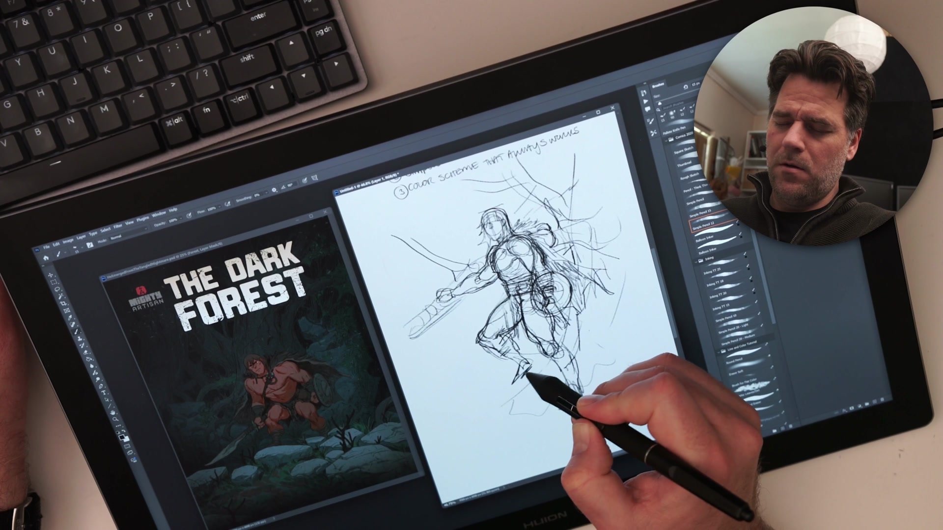
This 2.5-hour real-time demo walks through the complete creation of a pulp fantasy comic cover illustration. A barbarian character stands in a dark, overgrown forest, framed by branches and tangled roots. The entire process is fully narrated, covering thumbnailing, anatomy construction, inking, flat coloring, and final grading.
Three Drawing Codex frameworks drive the session. The 5% rule structures the planning phase. A simple reliable process keeps the workflow moving from rough to finish. And a straightforward color strategy, warm character against cool background, handles the palette decisions. The tools are Photoshop and a Huion Kamvas 19 Pro 4K display tablet.
Planning and Construction
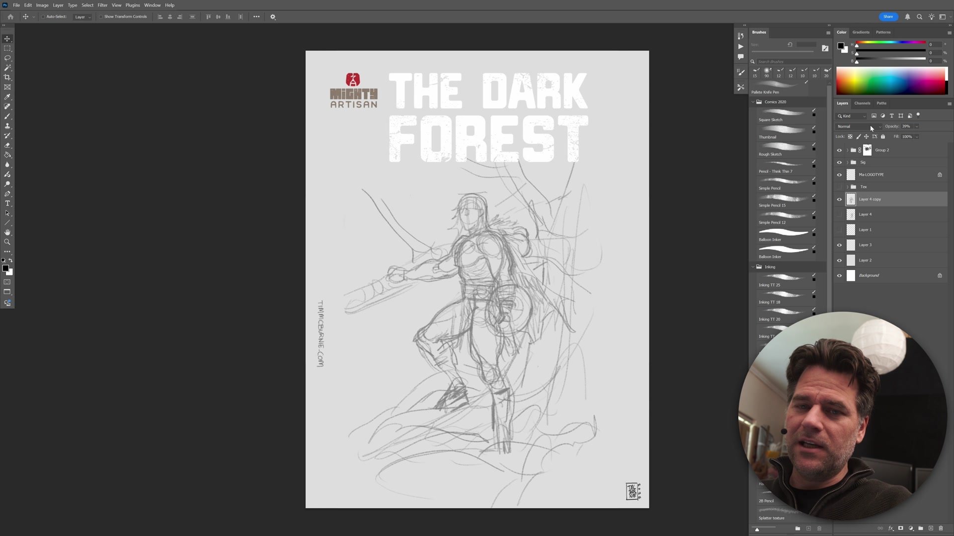
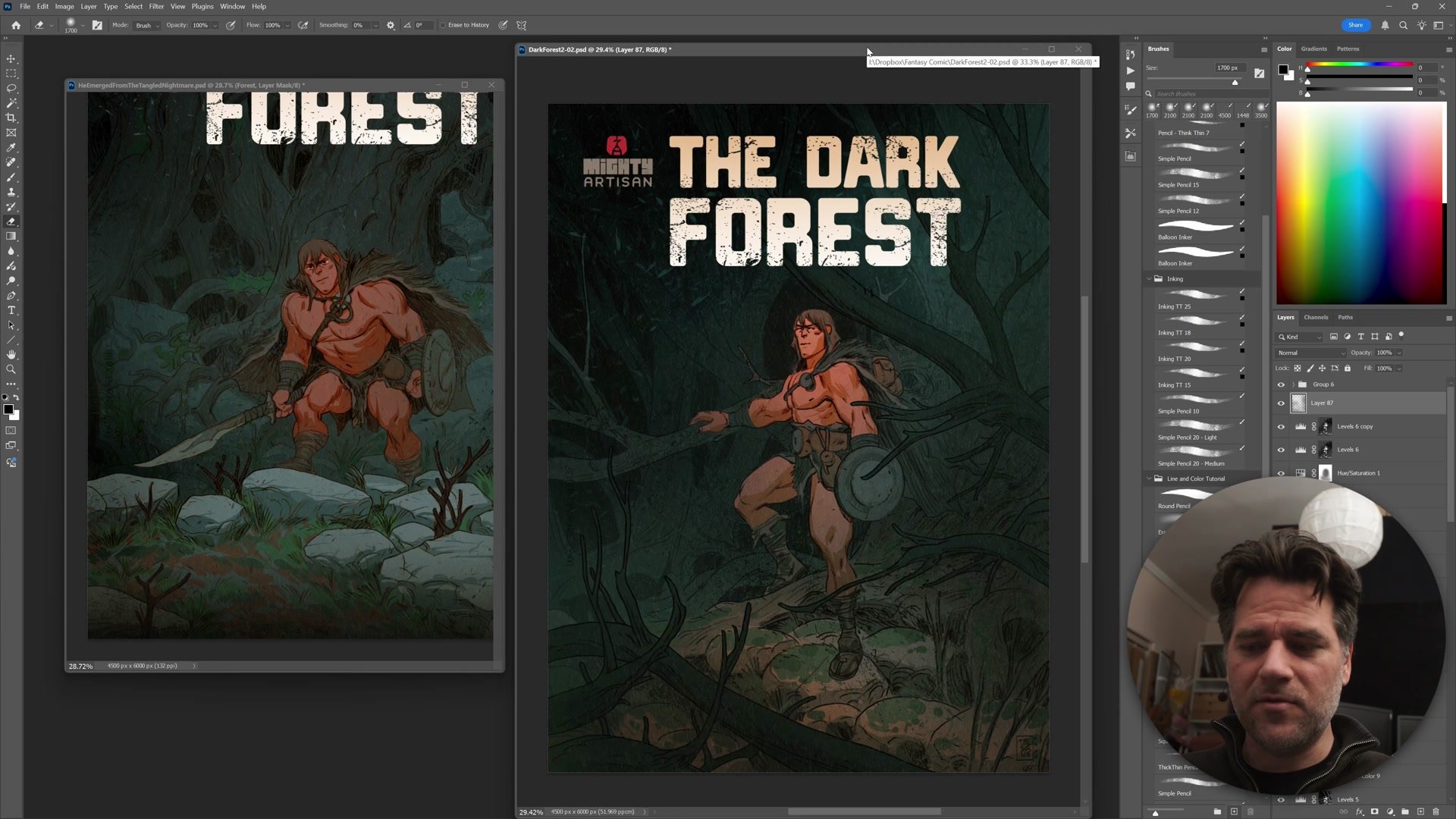
The demo opens with roughly 15 minutes of thumbnailing, actually closer to 10% of total time rather than the minimum 5% the rule suggests. During this phase the pose gets established, foreground tree branches are positioned for framing, and the composition gets tested with a mock logo to simulate a real comic cover layout. Designing with text in mind forces better compositional decisions and reveals where the focal areas truly sit.
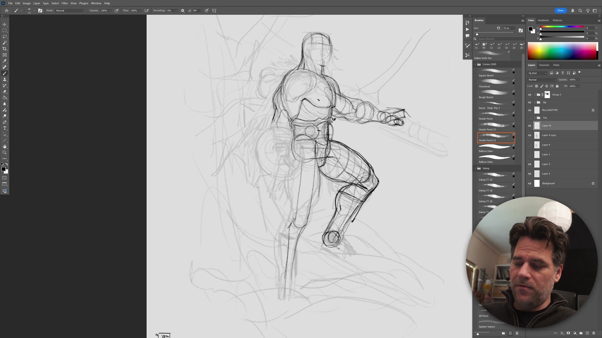
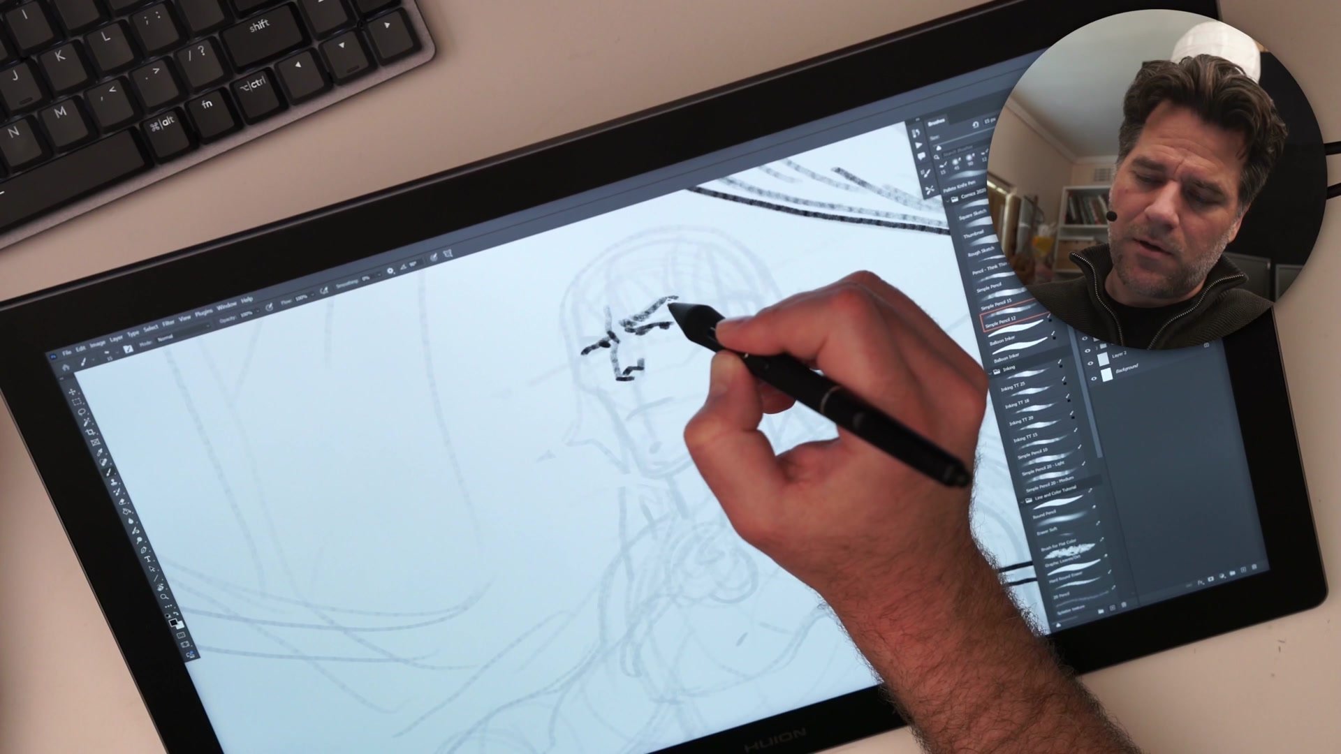
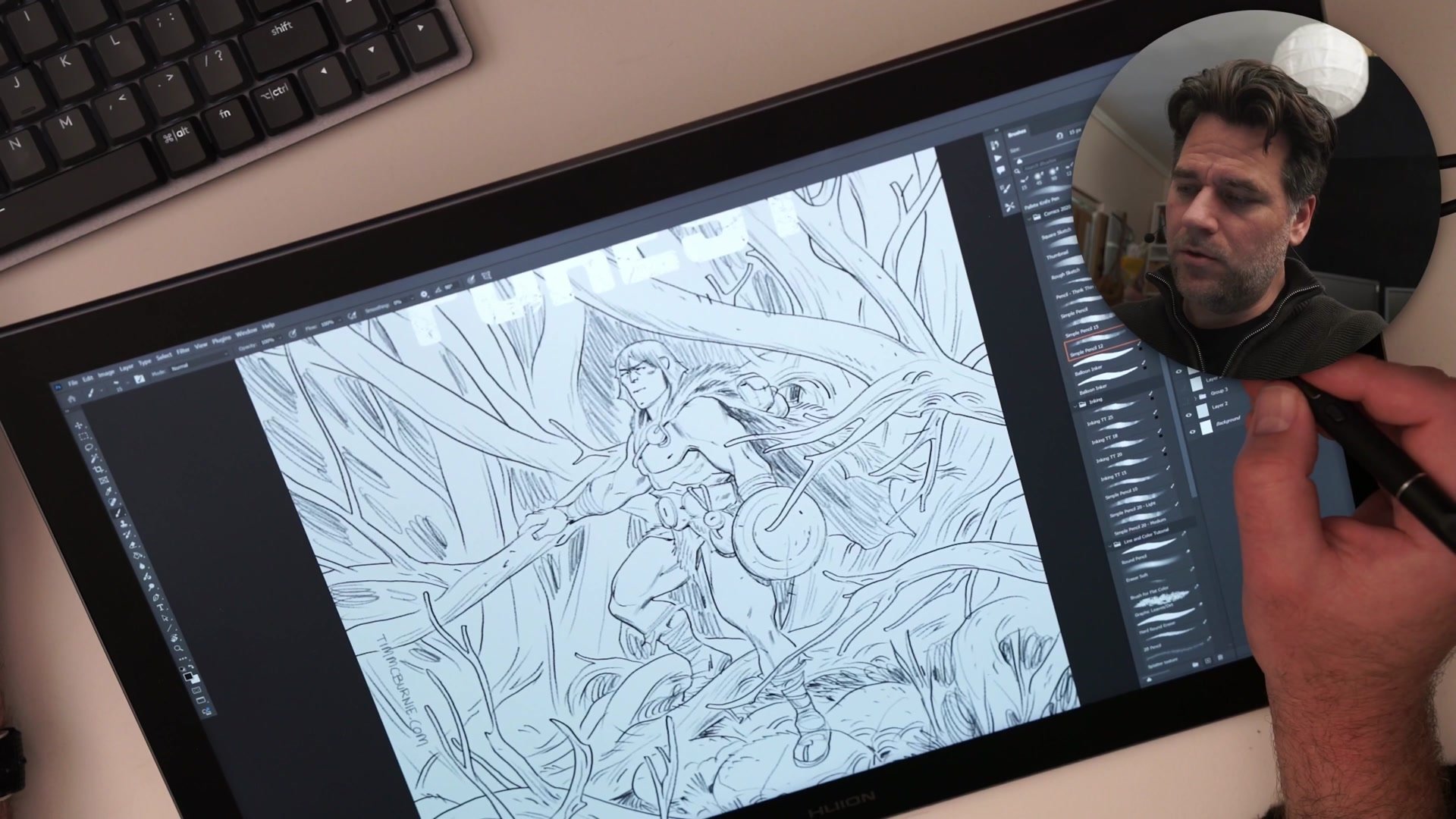
After the thumbnail, a second construction pass begins on a reduced-opacity layer. Rather than erasing and reworking the rough sketch, a lightbox-style approach creates a fresh drawing over the existing one. This iterative method preserves the energy of the original thumbnail while truing up the anatomy. The Loomis method anchors the head construction, starting from the center line and brow ridge and working outward to maintain symmetry and proportion.
Inking and Visual Hierarchy
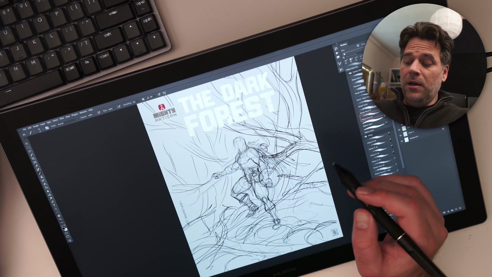
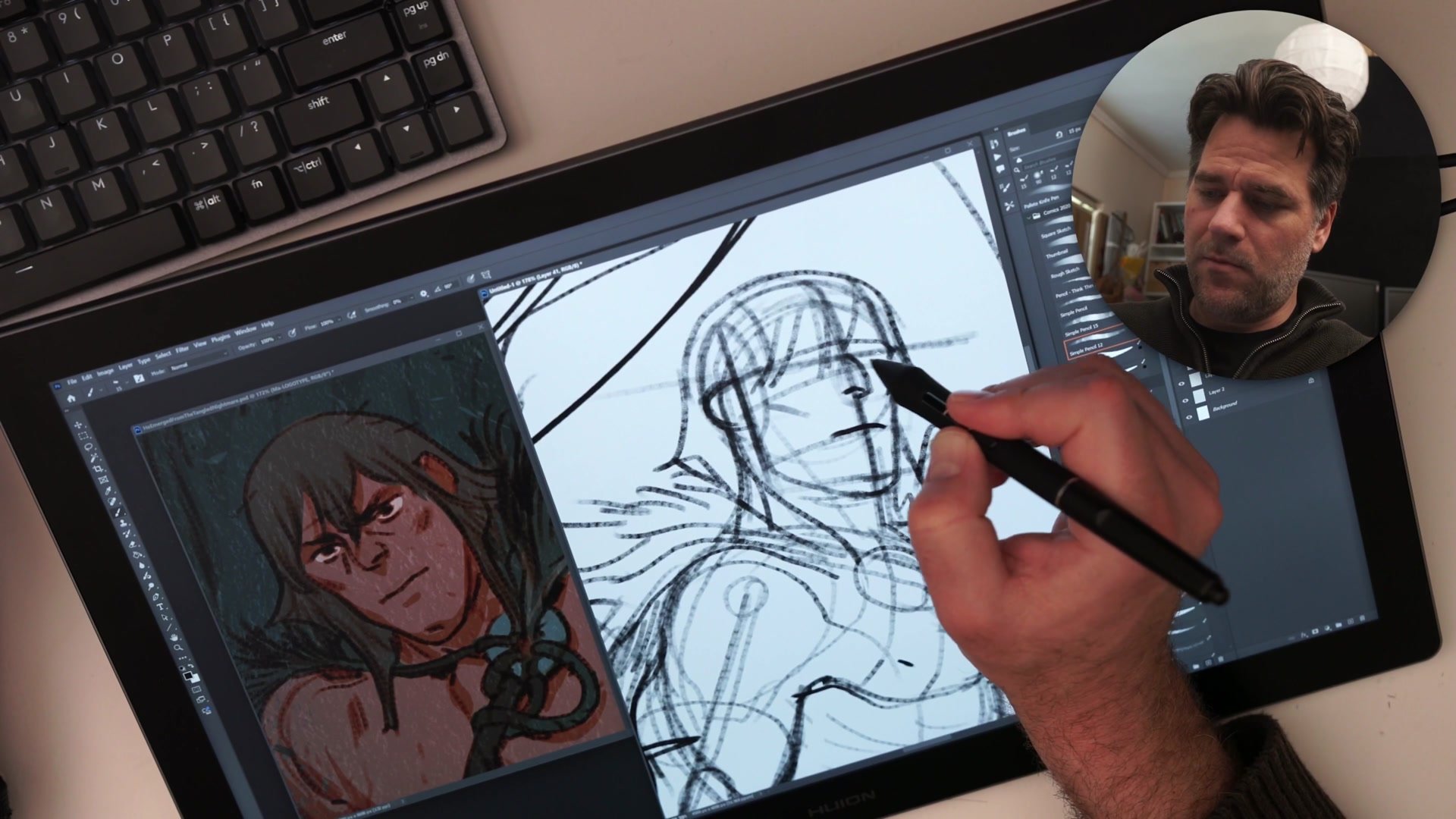
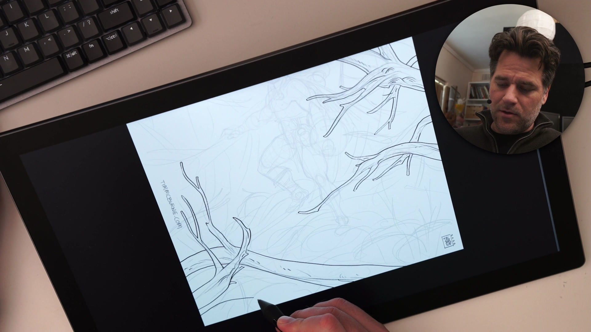
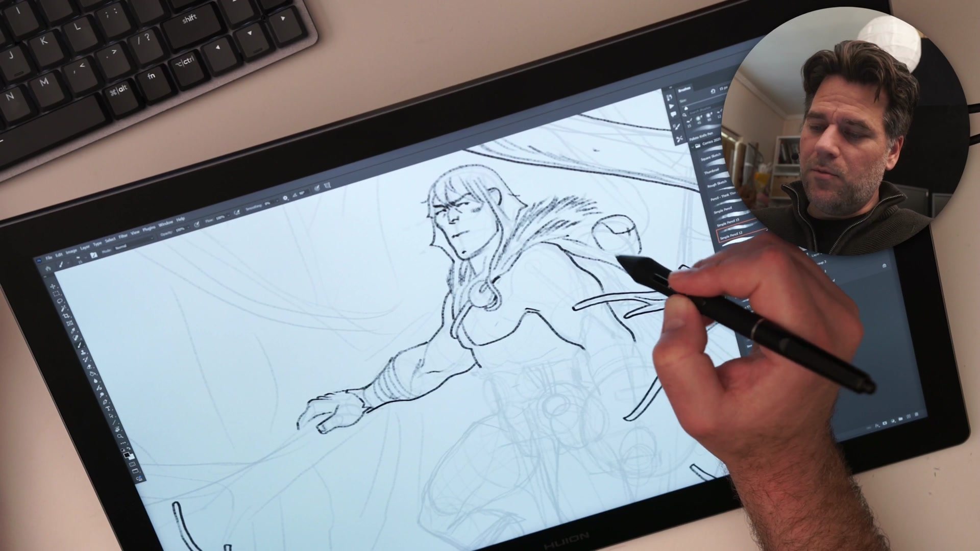
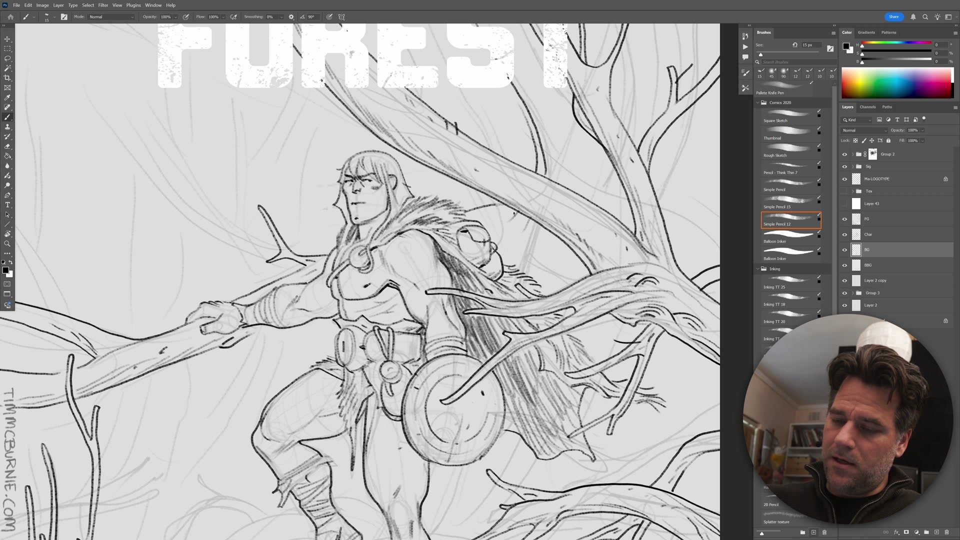
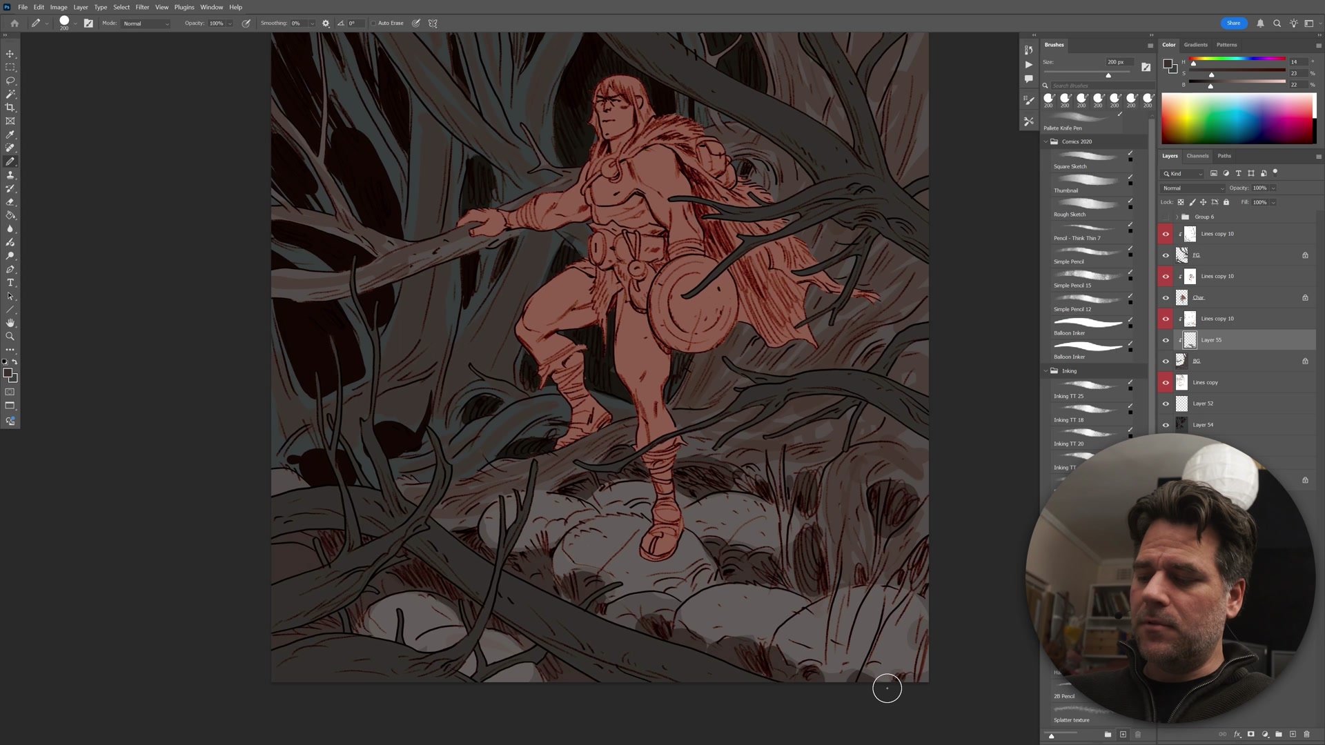
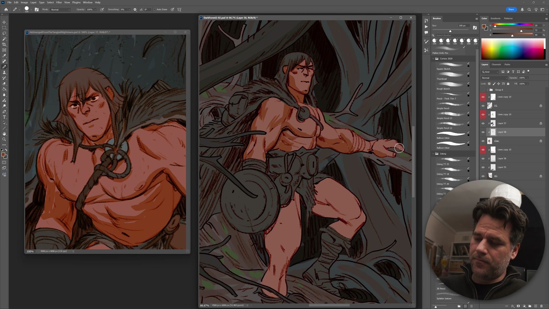
Inking runs on three separated layers: foreground, character, and background. Drawing the foreground branches first establishes what will overlap everything else, which immediately clarifies where the focal area sits and where detail can be reduced. This foreground-first approach prevents overworking areas that will ultimately be hidden.
The character gets inked next, with careful attention to micro composition. Every overlap between foreground elements and the character gets resolved intentionally, making sure lines behind the foreground branches respect those in front. This gives the digital work a more cohesive, almost traditional feel. The background receives the loosest treatment. Trees and rocks are indicated with gestural marks rather than tight linework, because the visual hierarchy demands attention at the character, not behind it. Suggesting detail rather than rendering it is a skill built through hundreds of pages of repetition.
Color Strategy and Grading
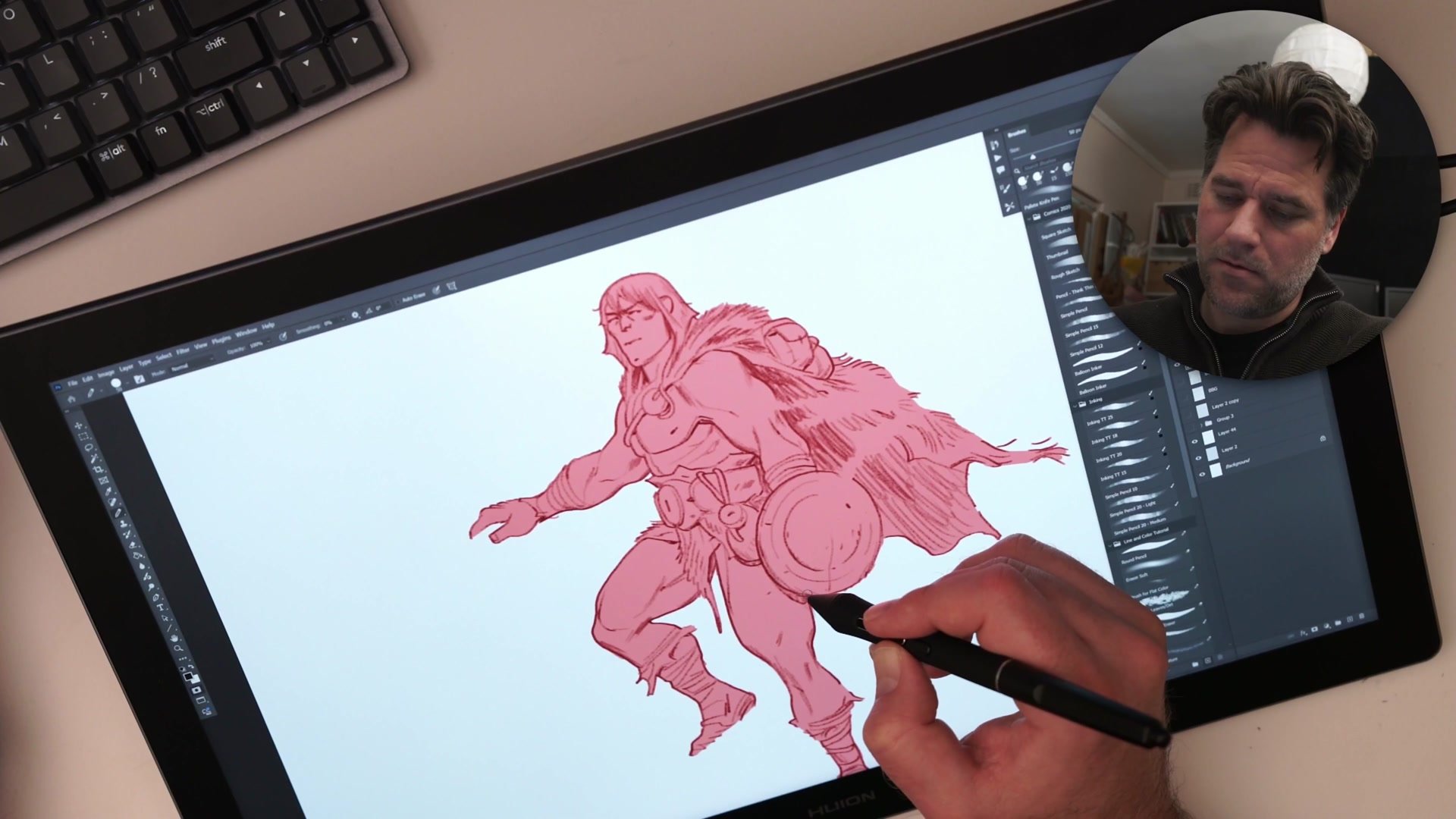
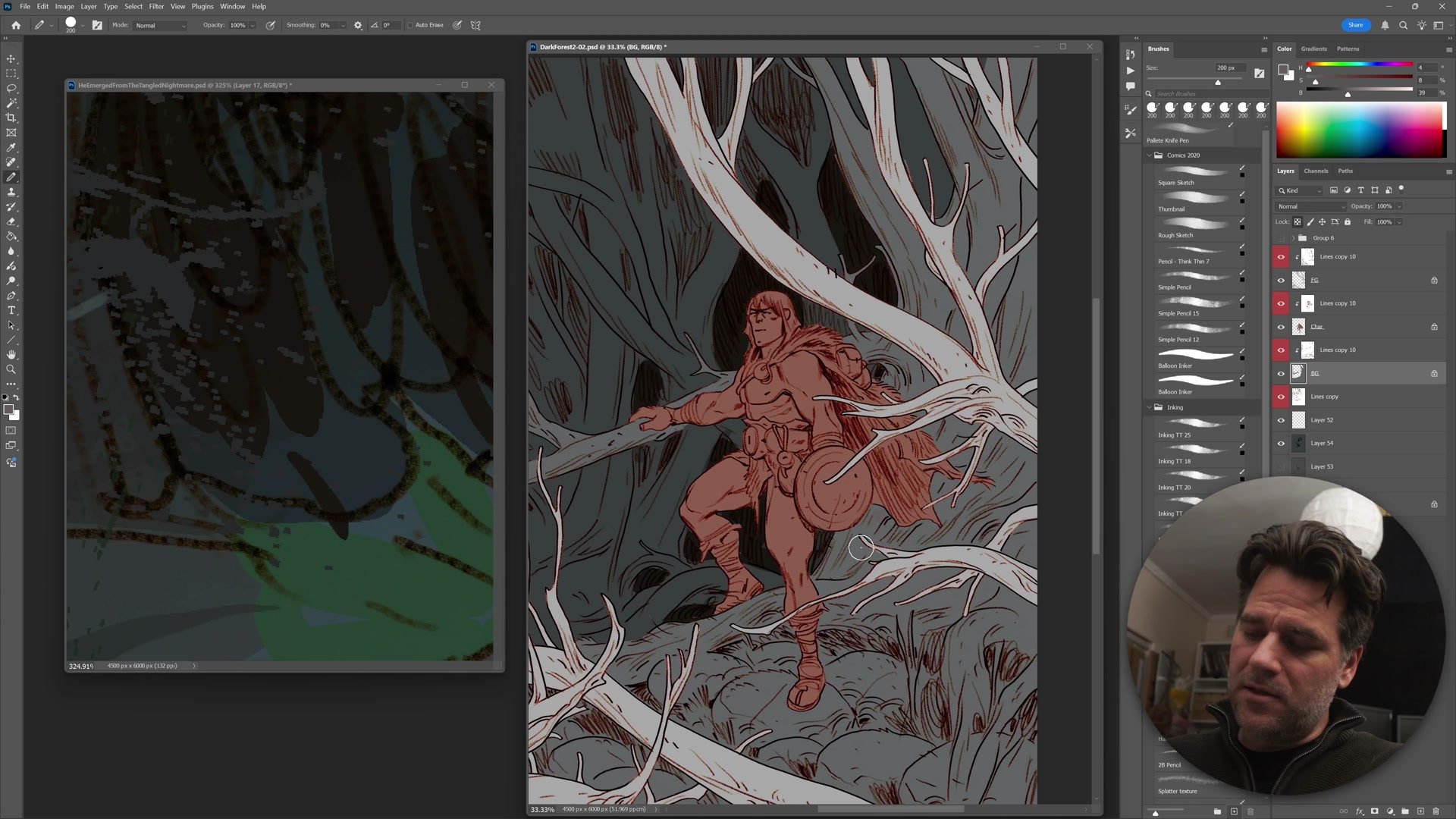
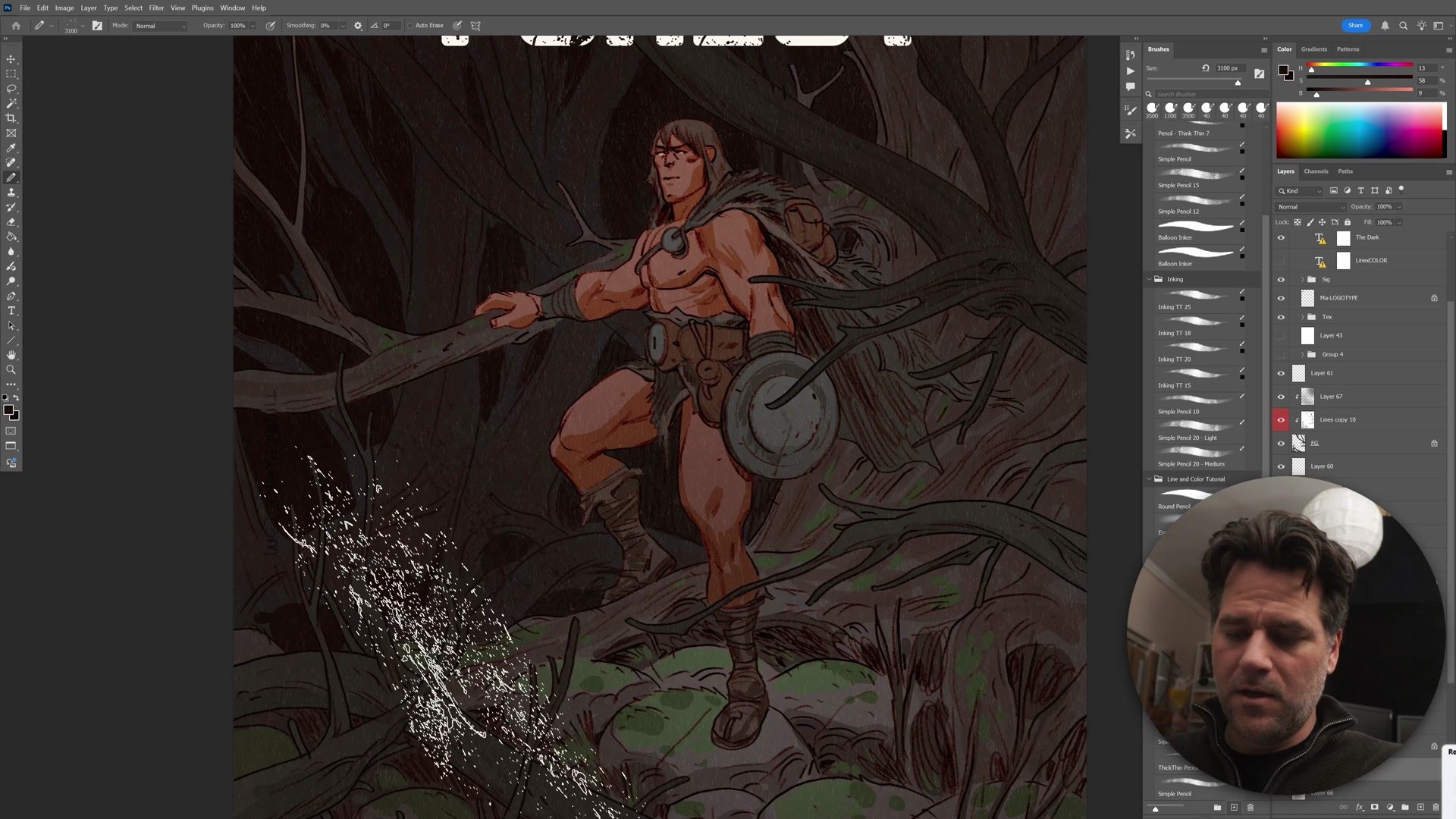
The coloring phase starts with simple flats, using the magic wand tool and quick mask to select and fill shapes. The color scheme follows what already exists in the image: warm pink skin tones on the character, dark blue-green tones in the forest. Warm advances, cool recedes, and this natural contrast does most of the heavy lifting.
The background goes nearly black in many areas, with subtle warm scumbling pulled through select trees to create depth. Foreground branches get darkened almost to silhouette. Final grading uses Photoshop's color range selection to isolate and push the character's warmth further forward, while separate passes cool and desaturate the background. Texture overlays, atmospheric particles, and gradient layers add the finishing atmosphere. The result is a dark, moody cover where the character emerges from a tangle of forest through color temperature alone.
Key Techniques
Three-Layer Inking: Separating foreground, character, and background onto individual layers manages depth, prevents overworking hidden areas, and simplifies later color flatting.
Foreground-First Workflow: Drawing what sits in front of everything else first establishes the visual hierarchy immediately and reveals exactly where detail matters and where it can be reduced.
Iterative Construction Passes: Reducing sketch opacity and drawing over it on a fresh layer preserves energy while improving anatomy, rather than erasing and reworking the same drawing.
Color Temperature Contrast: Warm character against cool background creates natural separation without complex rendering. The palette decisions flow directly from what already exists in the scene.
Try This Process
Start Simple: Create a complete illustration from start to finish in one sitting. Keep scope manageable, a single character with a simple background. The goal is completing the full creation loop, not complexity.
Apply the 5% Rule: Spend at least 5% of total working time on thumbnailing and planning. For a two-hour session, that means at least six minutes of rough composition work before any finished lines.
Use Layer Separation: Organize inking into foreground, character, and background layers. Draw what sits in front first, then work backward. This builds the habit of thinking in visual hierarchy from the start.


