Draw a Tree Goblin - Storybook Illustration from Thumbnail to Finish
Summary
Storybook Illustration from Thumbnail to Finish
Taking a rough thumbnail sketch and turning it into a finished pencil illustration on watercolor paper is one of those processes that reveals how drawing actually works. The gap between the messy energy of a thumbnail and the clarity of a final piece is where most of the real learning happens. This session walks through that entire journey using a storybook-style tree goblin character, working with a 2B Tombow Mono pencil on Fabriano Artistico bright white watercolor paper.
The process explores two different approaches to transferring a thumbnail: tracing with a light box for reliability, and freehand transfer for faster improvement. Both have their place, but the freehand approach is where drawing skills actually develop.
Thumbnail Transfer
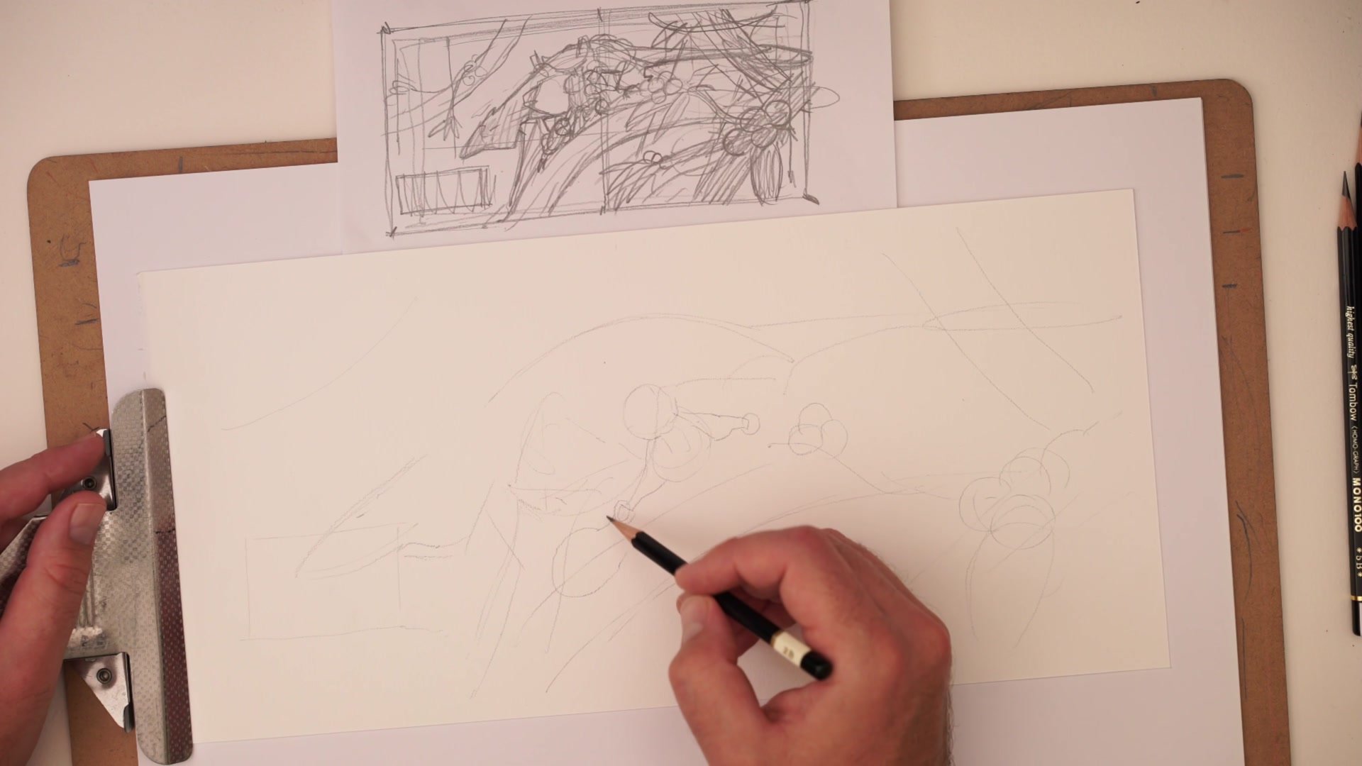
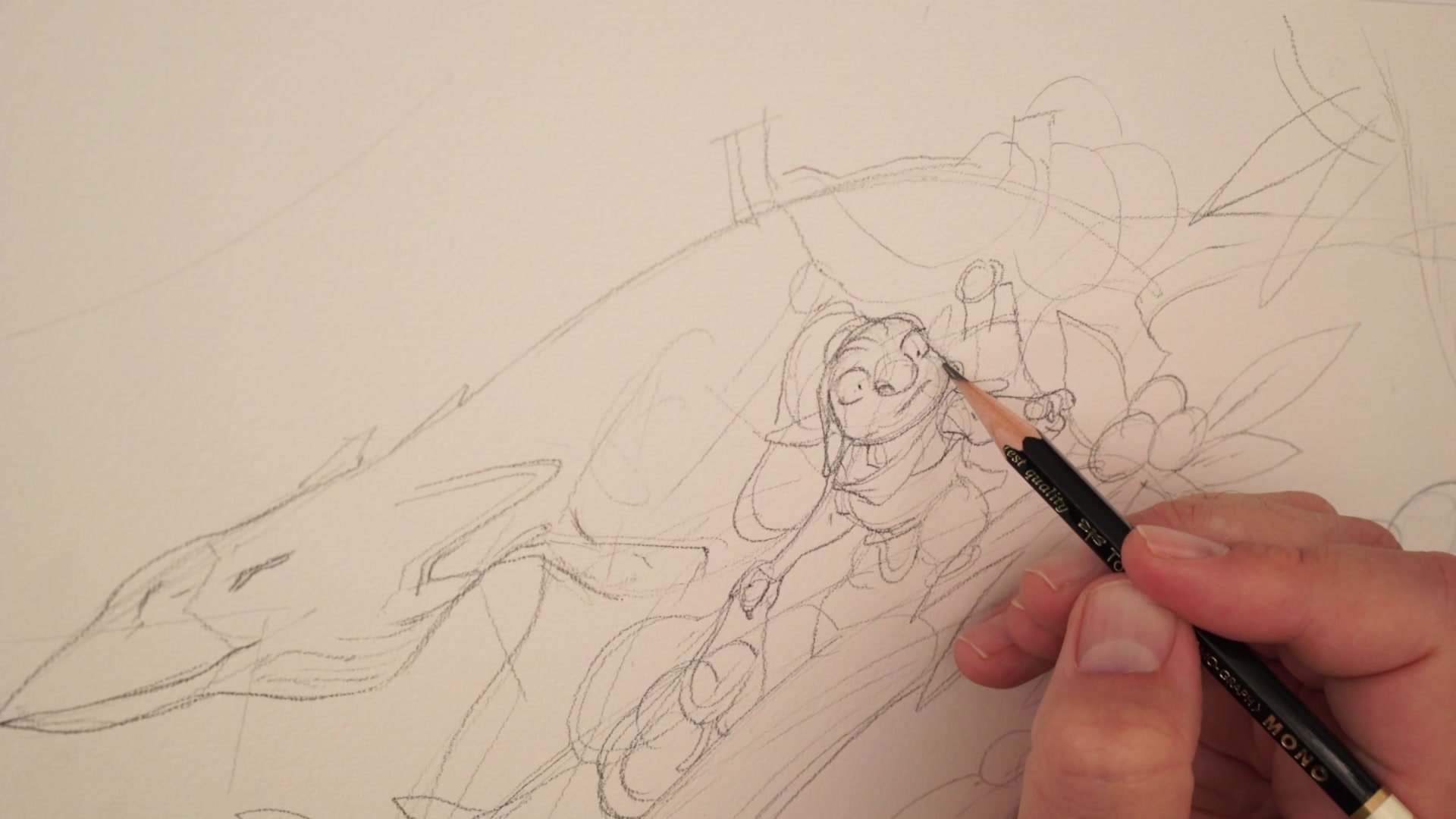
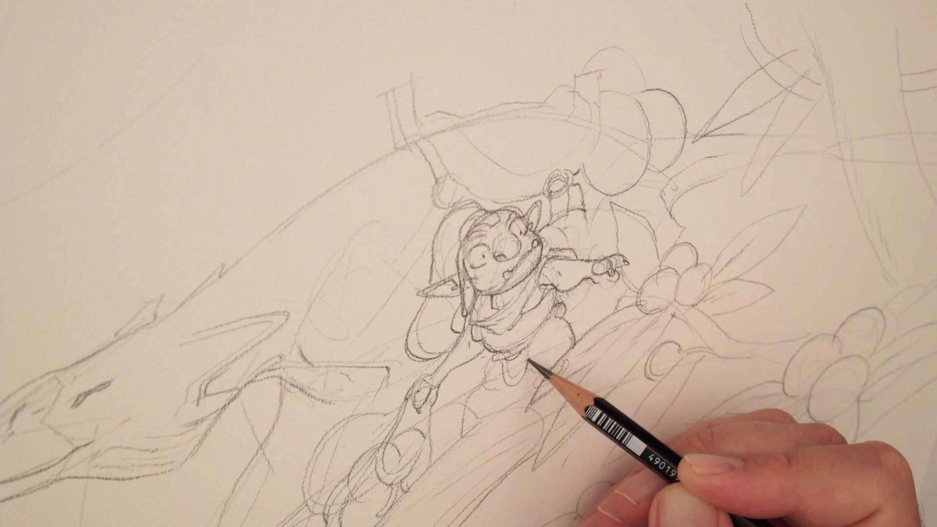
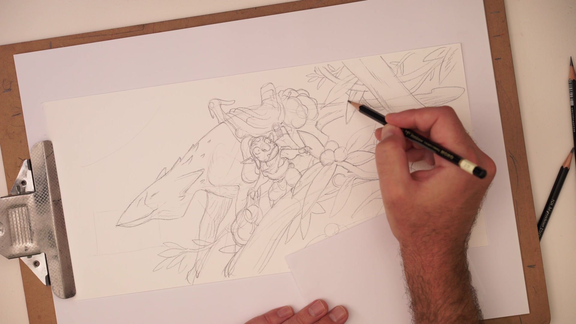
Transferring the Thumbnail
There are two ways to get from a working thumbnail to a larger drawing. The most reliable method is to scan, print, and trace using a light box. That gives consistent results every time and is how most traditional comic work gets done. But trying to transfer the drawing by eye, looking at the thumbnail and reconstructing the placement and proportions freehand, is what actually builds drawing ability. Learning to judge whether something sits a bit this way or that way, training the eye to read spatial relationships, that transfers into every other drawing situation.
The temptation is to protect the sketch by tracing it, because often the thumbnail feels like it has something special that might get lost. In practice, the thumbnail contains less critical information than it seems. The real value is in what gets discovered during the transfer and refinement process.
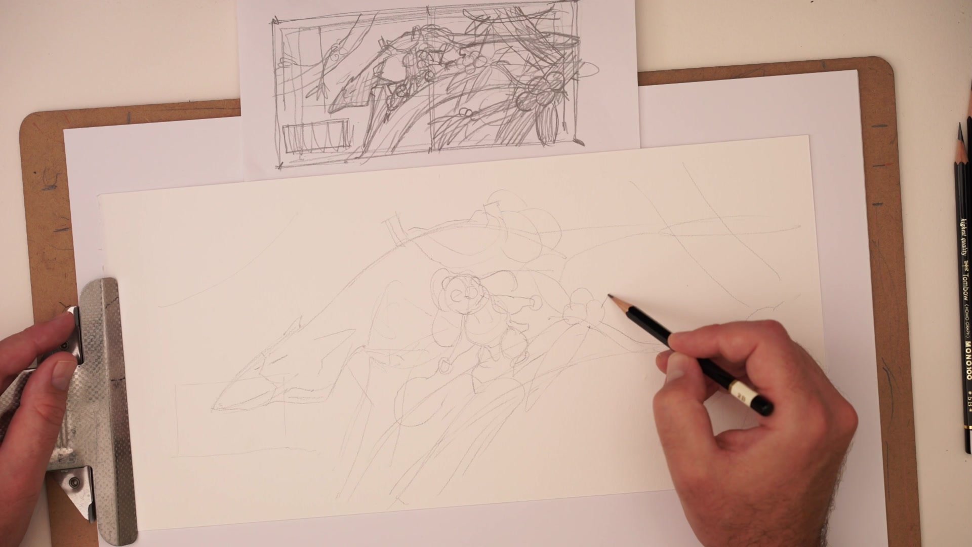
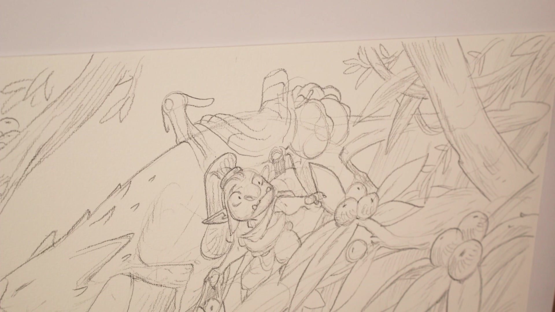
Building the Scene
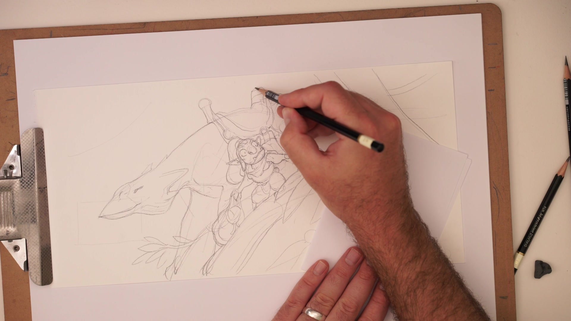
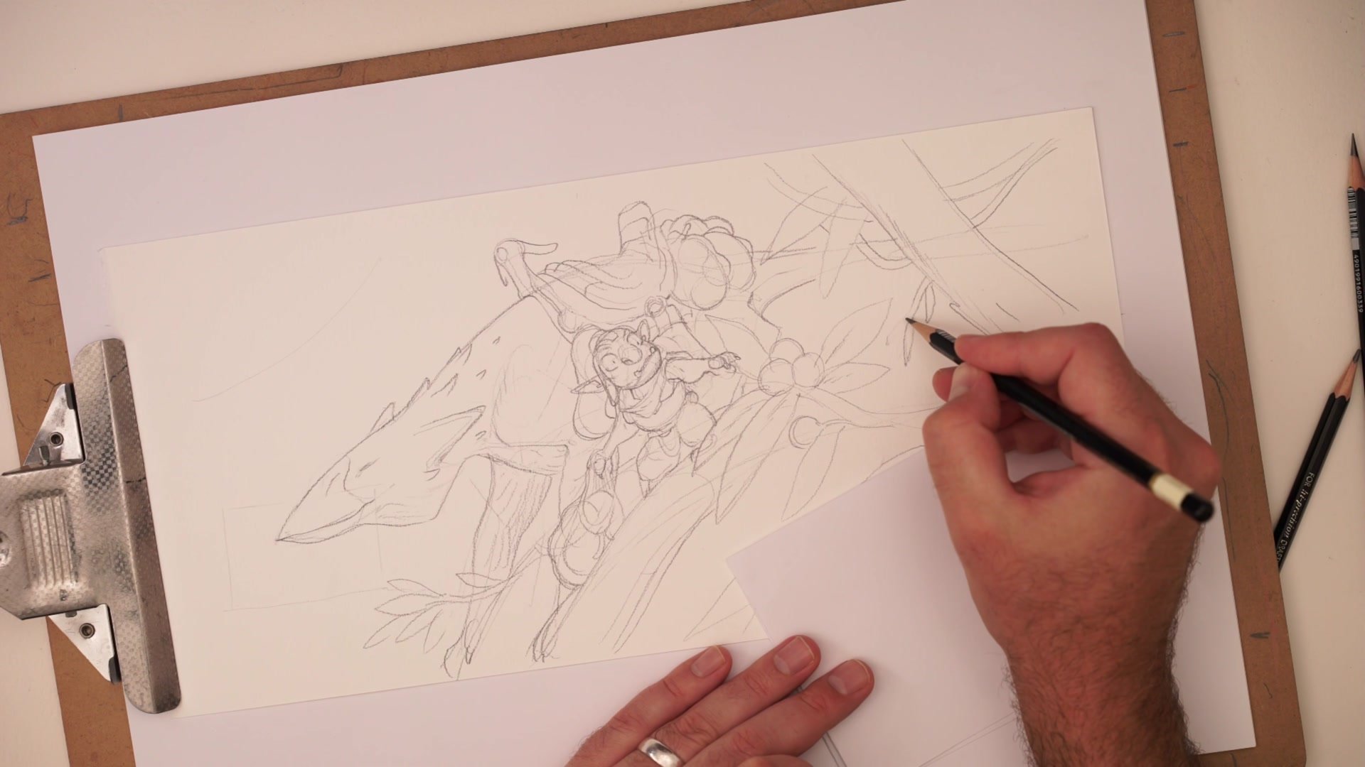
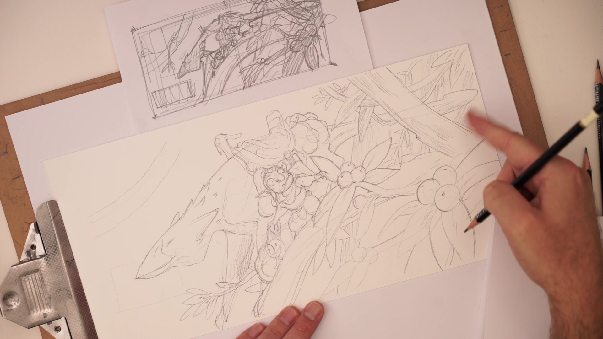
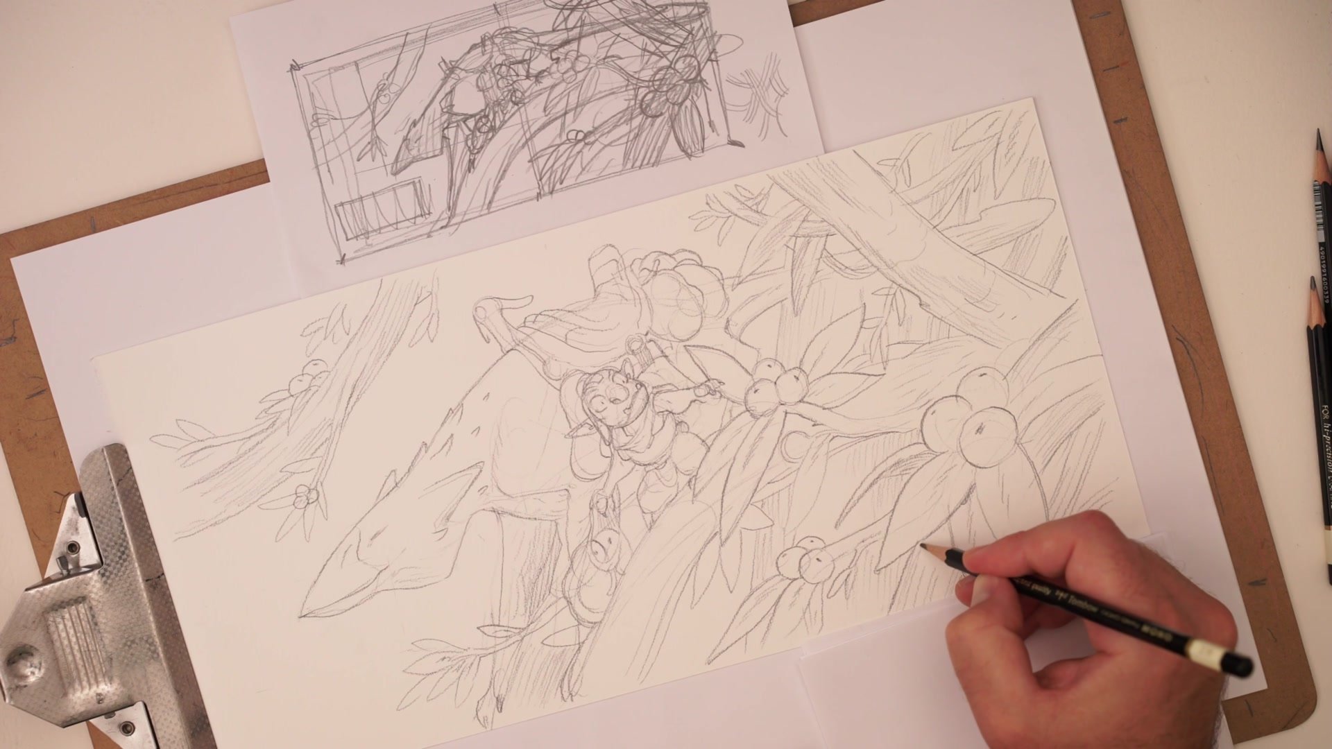
Visual Complexity Through Pattern
One of the most practical concepts in this drawing is the illusion of complexity. The scene looks dense and detailed, but much of that effect comes from overlapping forms and contrasting directional patterns rather than fine rendering. Trees go one direction, branches another, leaves create a different rhythm. These pattern changes create visual separation between areas even without tonal value pushing things darker or lighter.
This is the kind of concept that seems obvious in a high school art class but turns out to be fundamental to illustration, inking, and comic art. Directional contrast between patterns creates areas of rest that let the eye separate different zones of the image. Even keeping everything relatively light in value, the contrasting directions do most of the work.
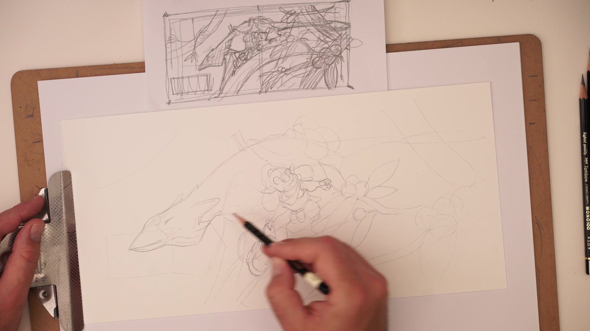
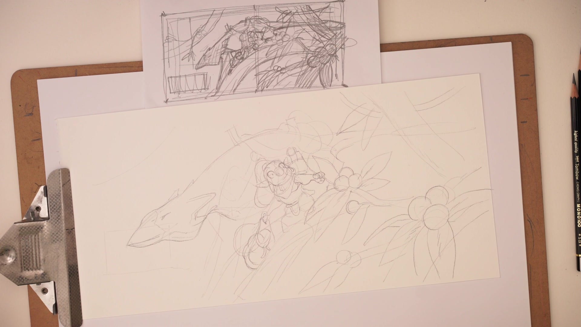
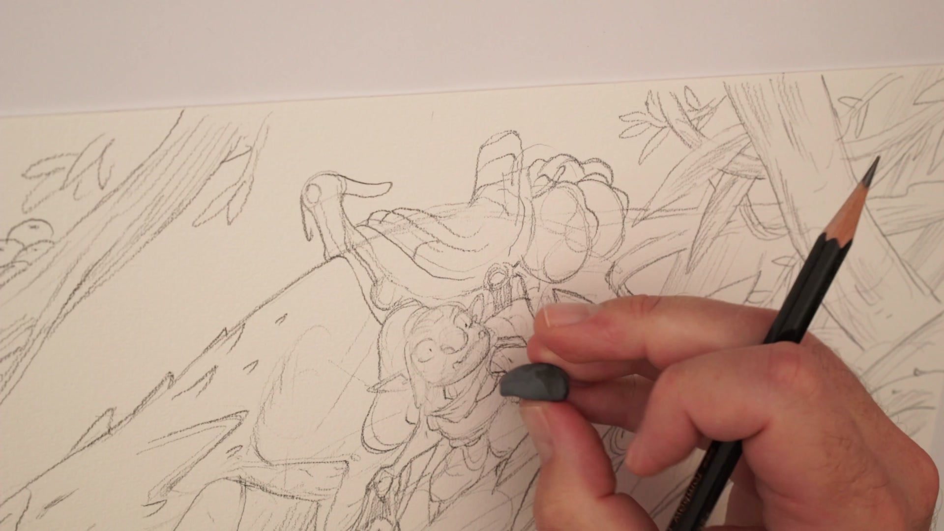
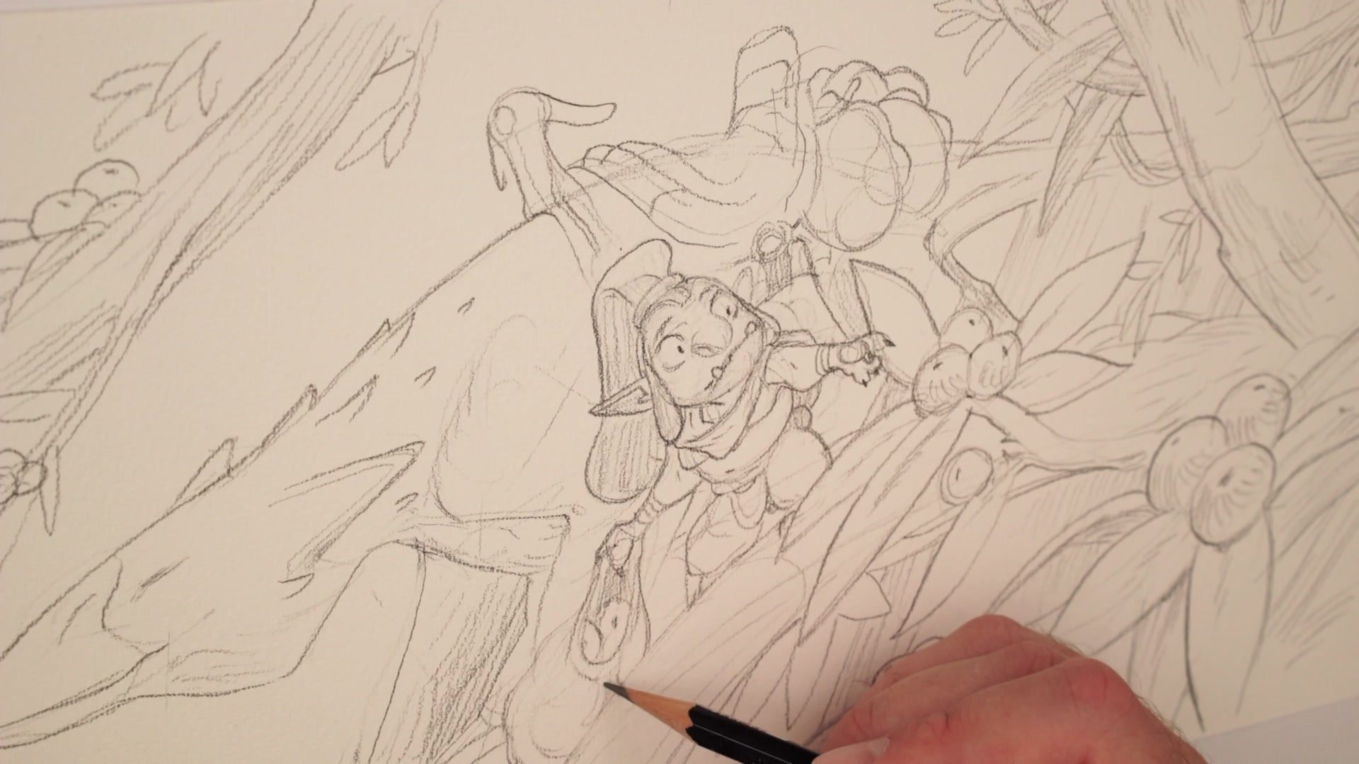
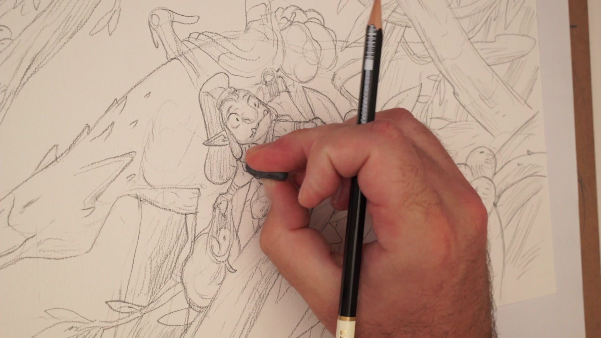
Character Refinement
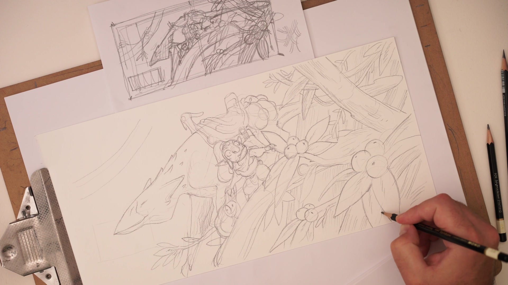
Managing the Hierarchy of Detail
Refining the goblin character's face and costume details demonstrates a critical problem in illustration: the hierarchy of detail. As the drawing develops, certain areas start competing for attention. The character's hair, the bag, and surrounding foliage all accumulate visual weight. The danger is that everything ends up at the same level of finish, flattening the image. The solution is selective emphasis. Push certain areas darker, leave others lighter, and resist the urge to render everything equally.
Working on 100% cotton watercolor paper with a 2B pencil allows aggressive erasing and reworking without destroying the surface. The trade-off is that 2B runs dark on this paper, which limits the amount of detail possible before things get smudgy. That constraint actually helps keep the drawing simpler and more focused on what matters.
Finished Drawing
Key Principles
Freehand Transfer: Reconstructing a thumbnail by eye rather than tracing builds the spatial judgment skills that improve all drawing. The thumbnail contains less critical information than it feels like it does.
Directional Pattern Contrast: Visual complexity comes from overlapping forms with contrasting directions, not from tonal rendering. Different pattern directions create natural separation between areas of the image.
Hierarchy of Detail: Resist finishing every area equally. Selective emphasis on focal areas and restraint elsewhere keeps the drawing readable and prevents visual flattening.
Paper and Pencil Awareness: The 2B on cotton watercolor paper runs dark fast. Starting lighter or using a softer grade like B first helps maintain control before committing to darker marks.
Try This
Start with a Thumbnail: Sketch a small, rough composition of a character in an environment. Keep it loose and gestural, around 2-3 inches across.
Transfer by Eye: Without tracing, try to reconstruct the thumbnail at a larger scale on a fresh sheet. Focus on getting the main shapes and relationships right rather than copying every mark.
Use Pattern for Separation: Add visual complexity to the environment through overlapping forms with contrasting directions rather than adding tonal shading. See how much depth the pattern contrast alone creates.


