How to Add Texture to Your Art
Summary
Adding Texture to Digital Art
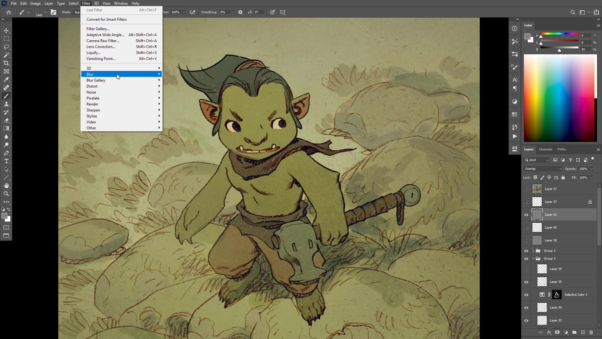
One of the first things aspiring digital artists chase is brushes and brush packs, driven by a desire to bring digital work closer to the randomness and variety that traditional media provides naturally. The clinical precision of digital tools makes everything look too clean, too perfect, lacking the life that comes from working on actual paper with real pigments. Rather than hunting for the perfect brush pack, there are simple, effective techniques for adding texture and an analogue feel to any line and color illustration using Photoshop. These methods work as part of the coloring and grading process, applied over the top of a finished flat-color image to bring everything together and give the surface of the painting a cohesive, textured quality.
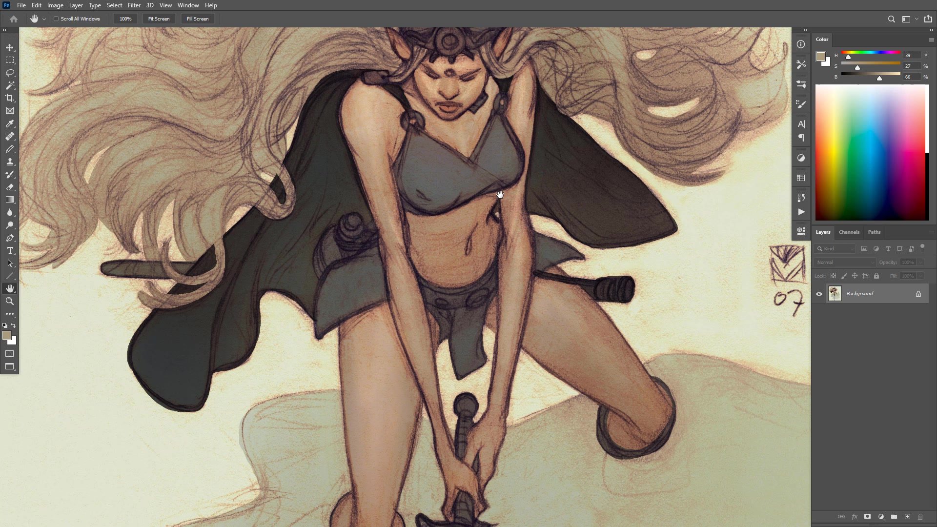
Line and Color Foundation
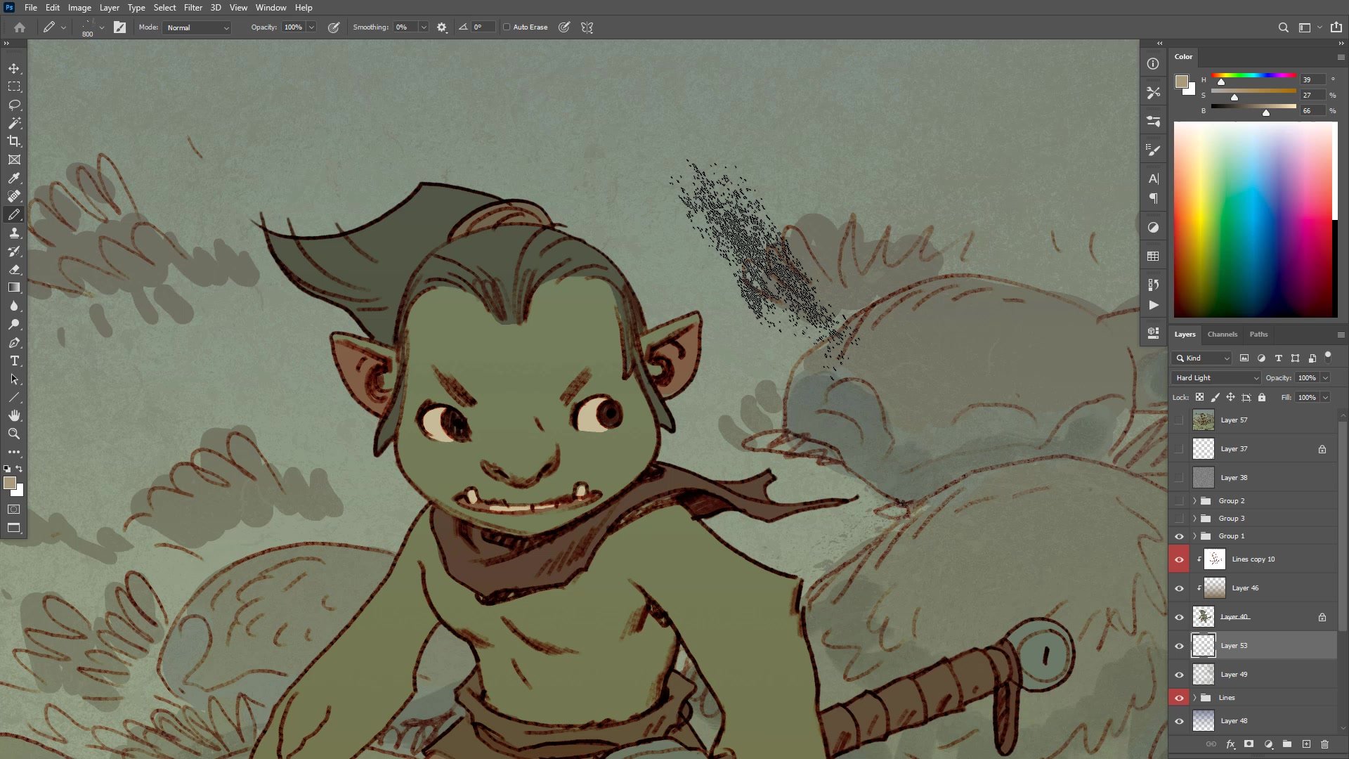
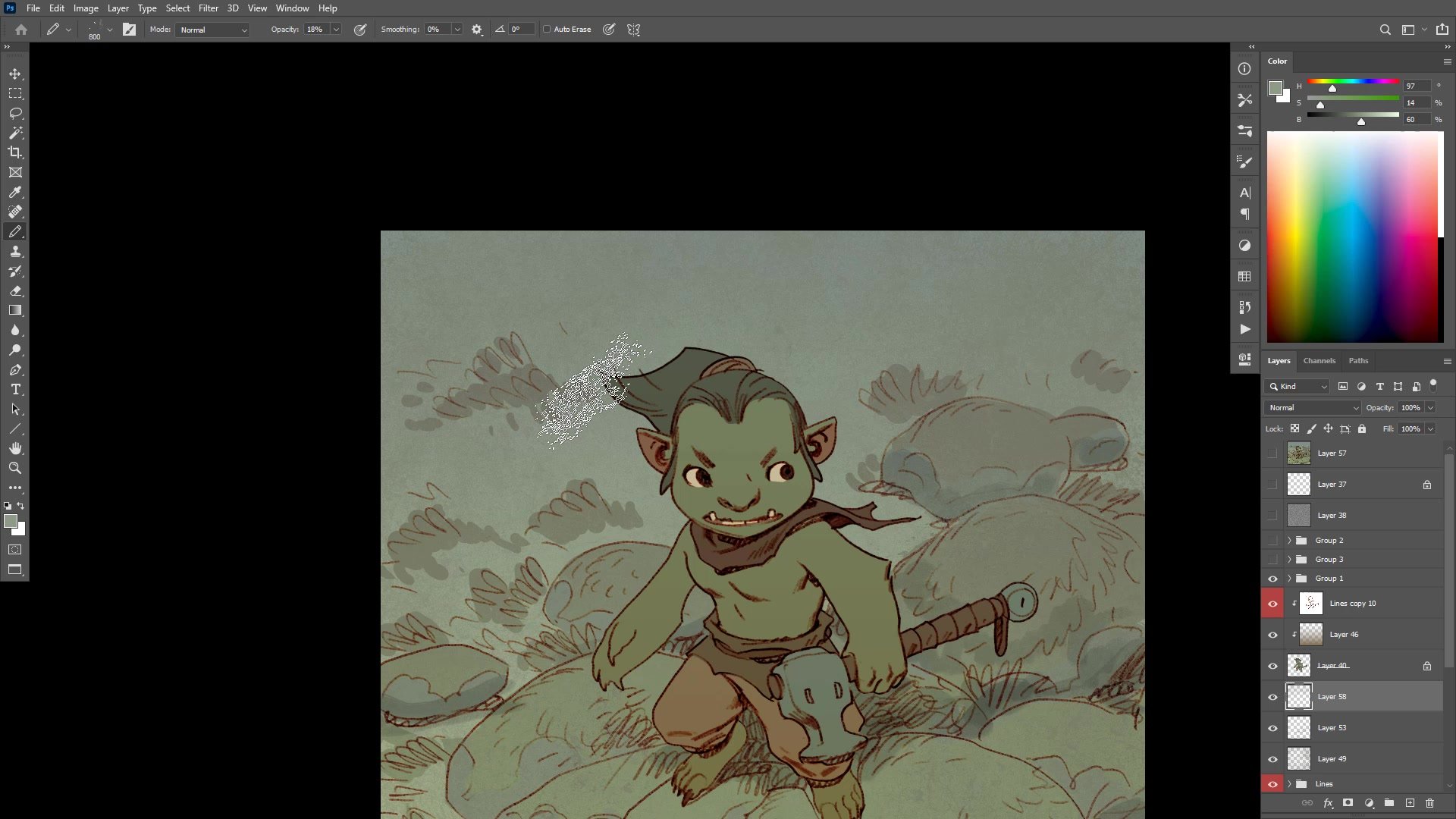
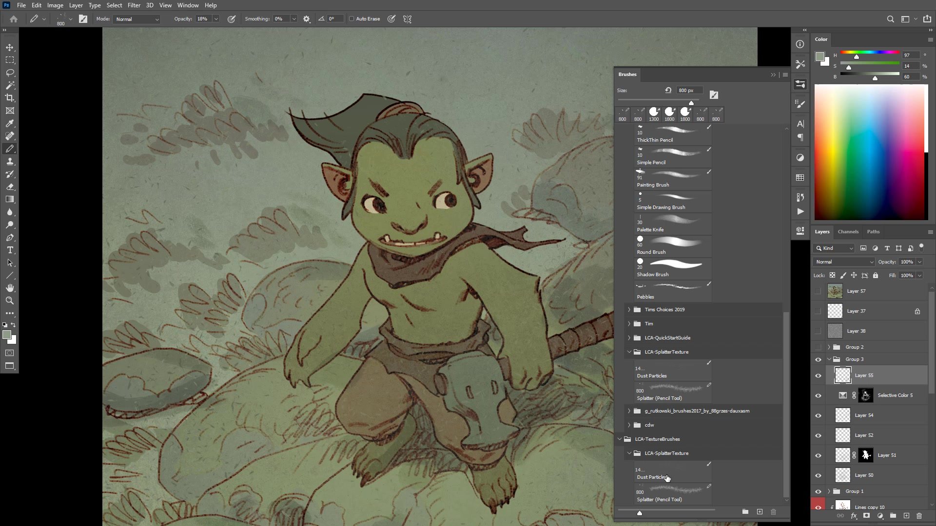
Scatter Brush Atmosphere
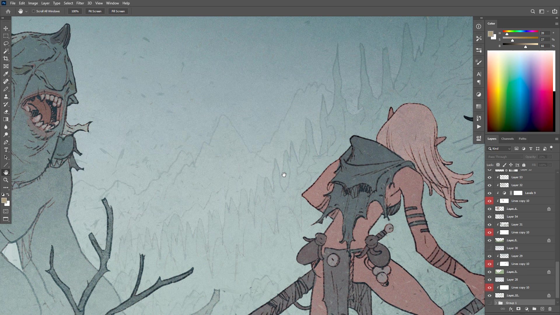
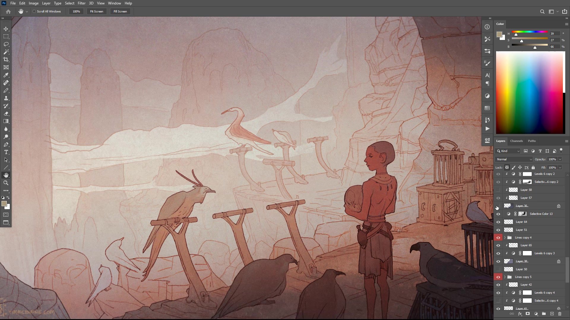
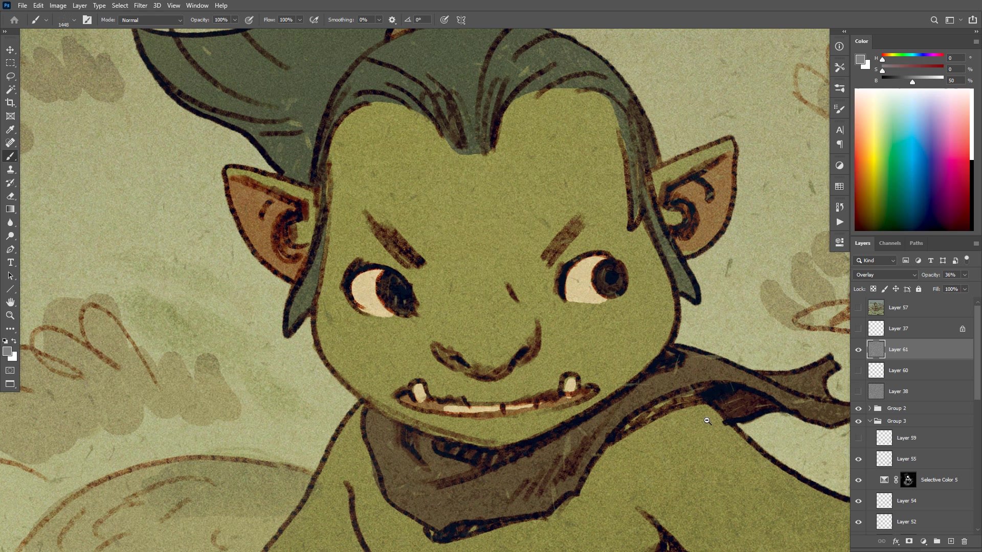
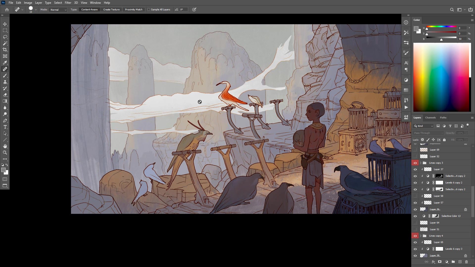
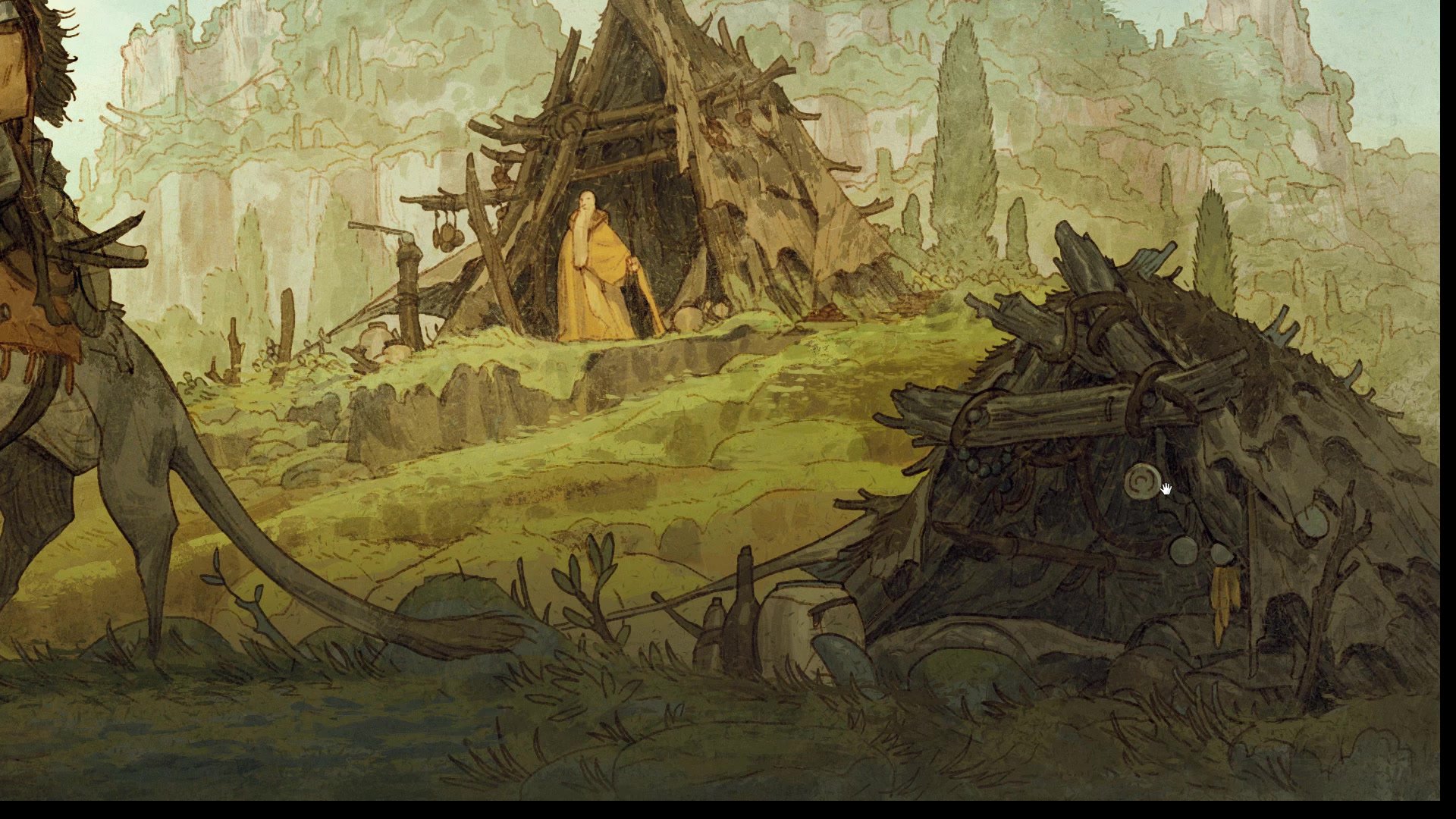
The first technique uses large, low-opacity scatter brushes to blend and homogenize areas of the image. Rather than painting detail, these textured brushes throw randomized marks across the surface. The key is picking colors already present in the image and painting them across adjacent areas at low opacity, which softens contrast between elements and pushes things together. This is especially powerful for backgrounds, where reducing contrast draws attention away from secondary elements and toward the focal point. A background painted over with soft scatter brush strokes at low opacity has less contrast than the foreground character, so the eye naturally gravitates to where the detail and contrast remain strongest.
This approach is more nuanced than using a plain airbrush for the same purpose. The textured marks add visual interest and complexity that a smooth gradient cannot, making a relatively simple image feel more sophisticated than it actually is. The technique works both behind and in front of character layers, adding atmosphere and depth to what would otherwise be a flat line and color illustration.
Brush Techniques
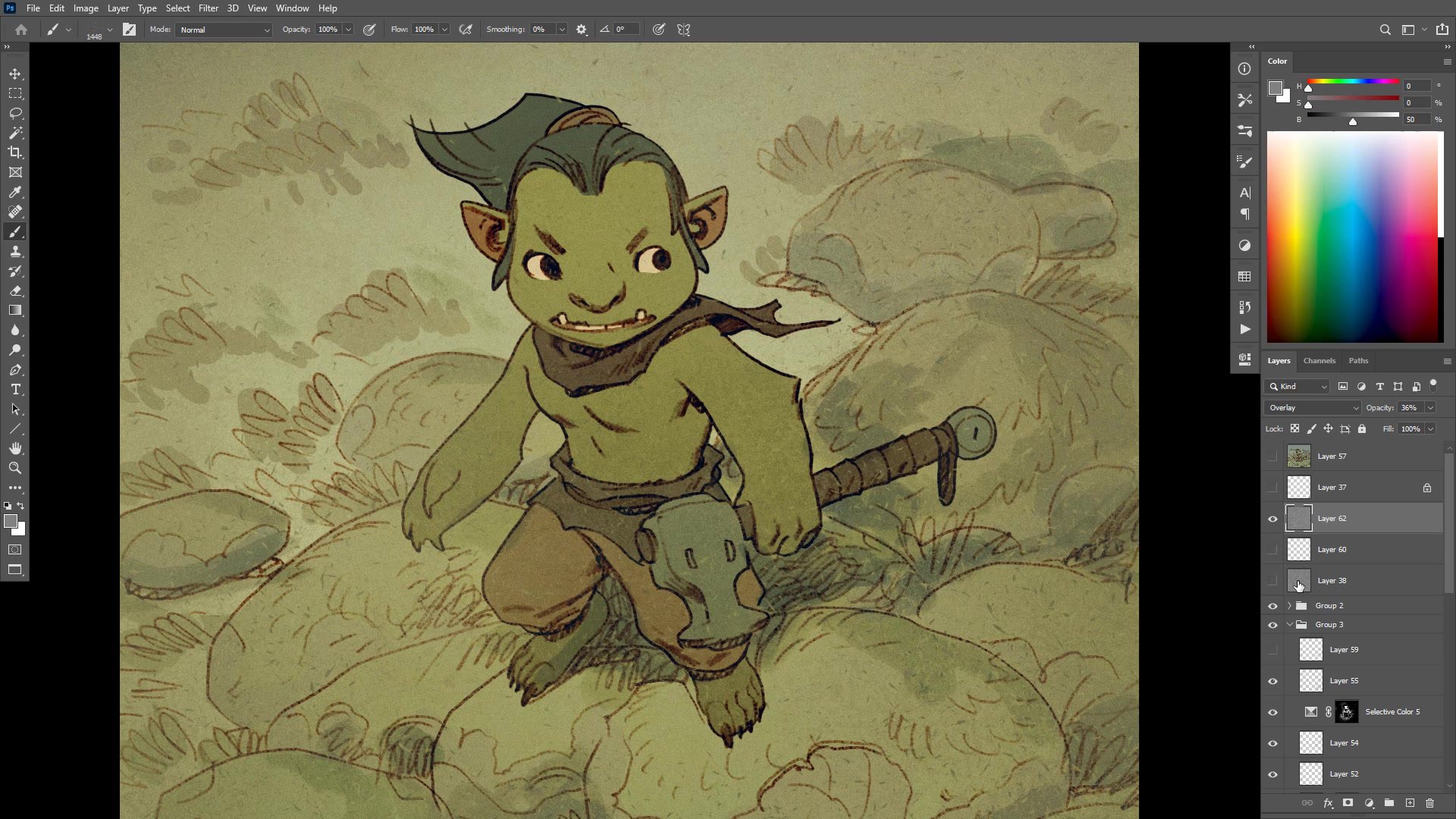
The Noise Layer Overlay
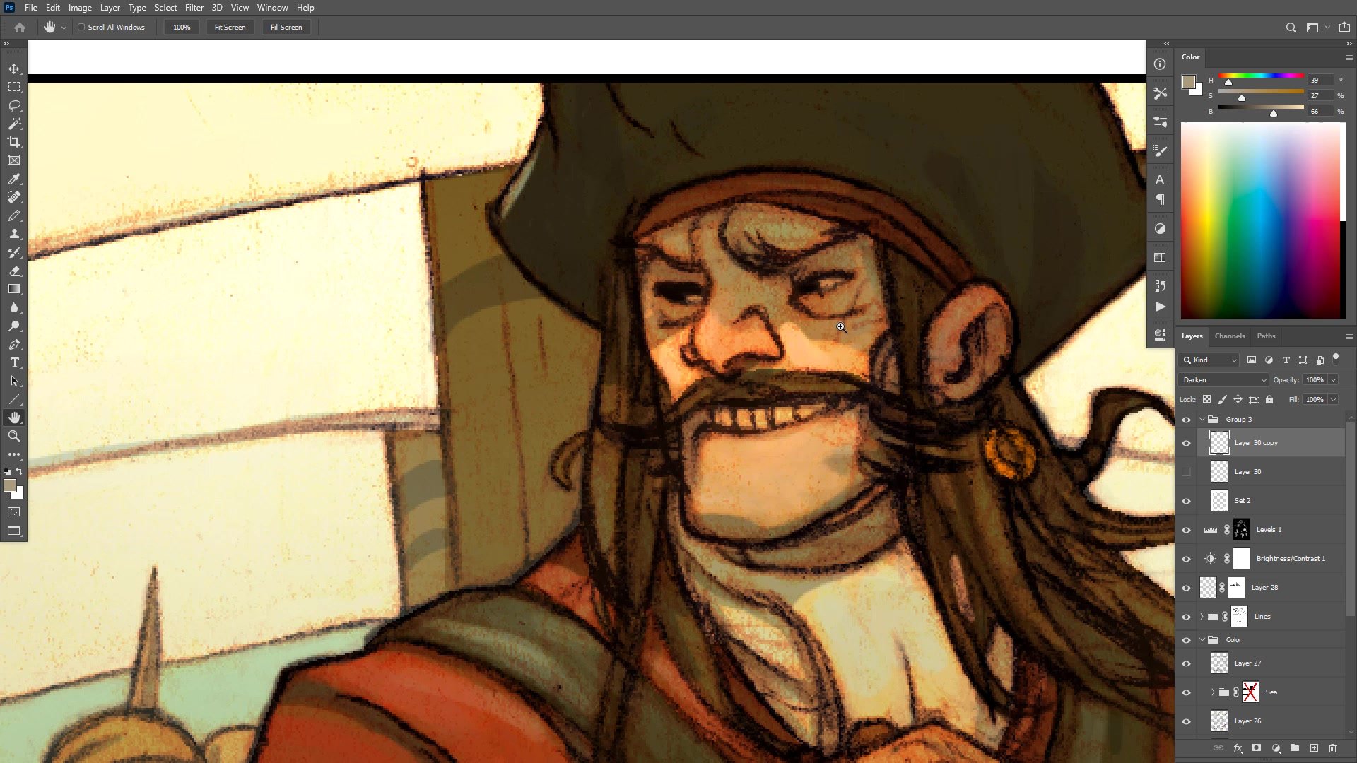
The second technique adds a noise texture across the entire image using a simple Photoshop method. Create a new layer, fill it with 50 percent gray, and set the blending mode to overlay, which makes the gray transparent. Then apply Filter, Noise, Add Noise to introduce subtle value and color shifts across the surface. Desaturating the noise layer slightly, rather than making it fully monochromatic, preserves some color variation while keeping it subtle. If the noise grain appears too small for the canvas resolution, scale the layer up to match the desired texture size, then crop it to the canvas bounds to avoid massive hidden pixel data inflating file sizes.
Adjusting the opacity of this noise layer controls how much texture is visible. Even at low opacity, it homogenizes the entire image, bringing disparate elements together under one unified surface treatment. This is cheap, simple, and effective, requiring no special brushes or texture packs. The same result could be achieved with scanned paper textures set to overlay, but noise gets the job done without any additional resources.
Noise and Color Grading
The Surface of the Page
Understanding why texture matters goes beyond aesthetics. Traditional print naturally squished images together, adding a surface quality by default that softened harsh edges and homogenized tones and colors. Artists had to push contrast and sharpness past what looked good on screen, knowing the printing process would destroy detail. The golden age of illustration taught artists to create images strong enough to survive bad printing, and that knowledge about visual hierarchy and contrast management remains valuable today.
As print gives way to high-resolution digital screens and tablets, the task reverses. Instead of pushing past what looks good to survive destruction, digital artists must consciously pull back, adding the texture and subtlety that print used to provide automatically. The unlimited color vibrancy and precision of modern displays means every imperfection is visible, but also that carefully applied texture, atmosphere, and surface treatment can create depth and richness that hyper-clean digital work often lacks. Thinking about the surface of the page as a deliberate creative choice is becoming increasingly important for digital illustration.
Finished Examples
Key Techniques
Scatter Brush Blending: Use low-opacity textured scatter brushes to homogenize background elements, reduce contrast, and control the focal hierarchy of the image by picking colors already present in the scene.
Noise Layer Overlay: Create a 50 percent gray layer set to overlay, add noise, desaturate slightly, and adjust opacity. This gives the entire image a unified textured surface without any special brushes or texture packs.
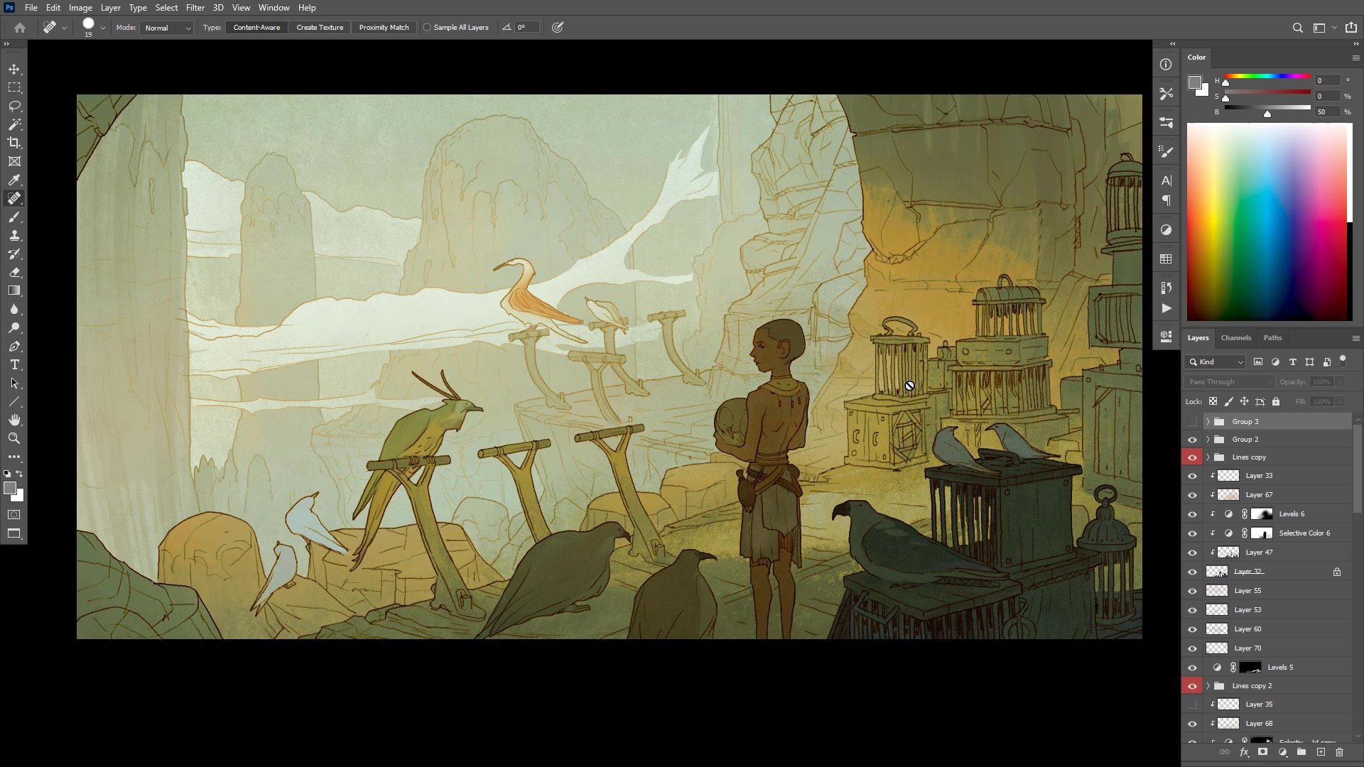
Layered Depth Control: Separate foreground, midground, and background elements on different layers, then apply texture and atmosphere between them to create depth. Elements further back receive more blending, pushing them into the distance naturally.
Try This
Start Simple: Take a finished flat-color line and color illustration and add a low-opacity scatter brush pass across the background, picking colors from within the image to blend elements together.
Add a Noise Layer: Create a new layer filled with 50 percent gray, set it to overlay, add noise, desaturate it, and reduce the opacity until the texture is barely visible but present across the entire surface.
Compare the Results: Toggle the texture layers on and off to see how they bring the image together, then experiment with adjusting opacity and scale to find the level that suits your project.


