Using Gradients for Professional Line Art
Summary
The Missing Element in Flat Color
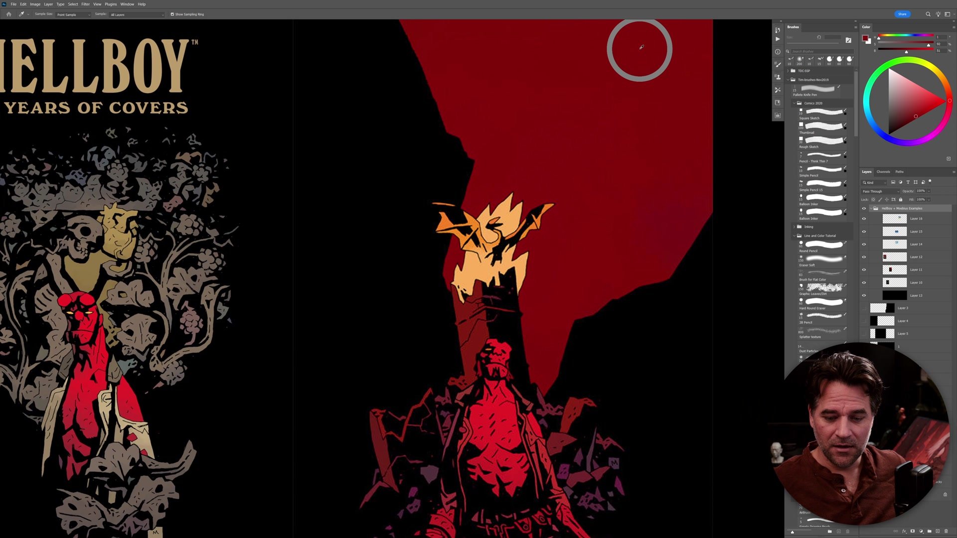
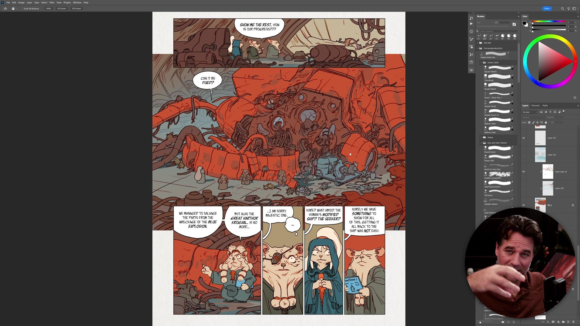
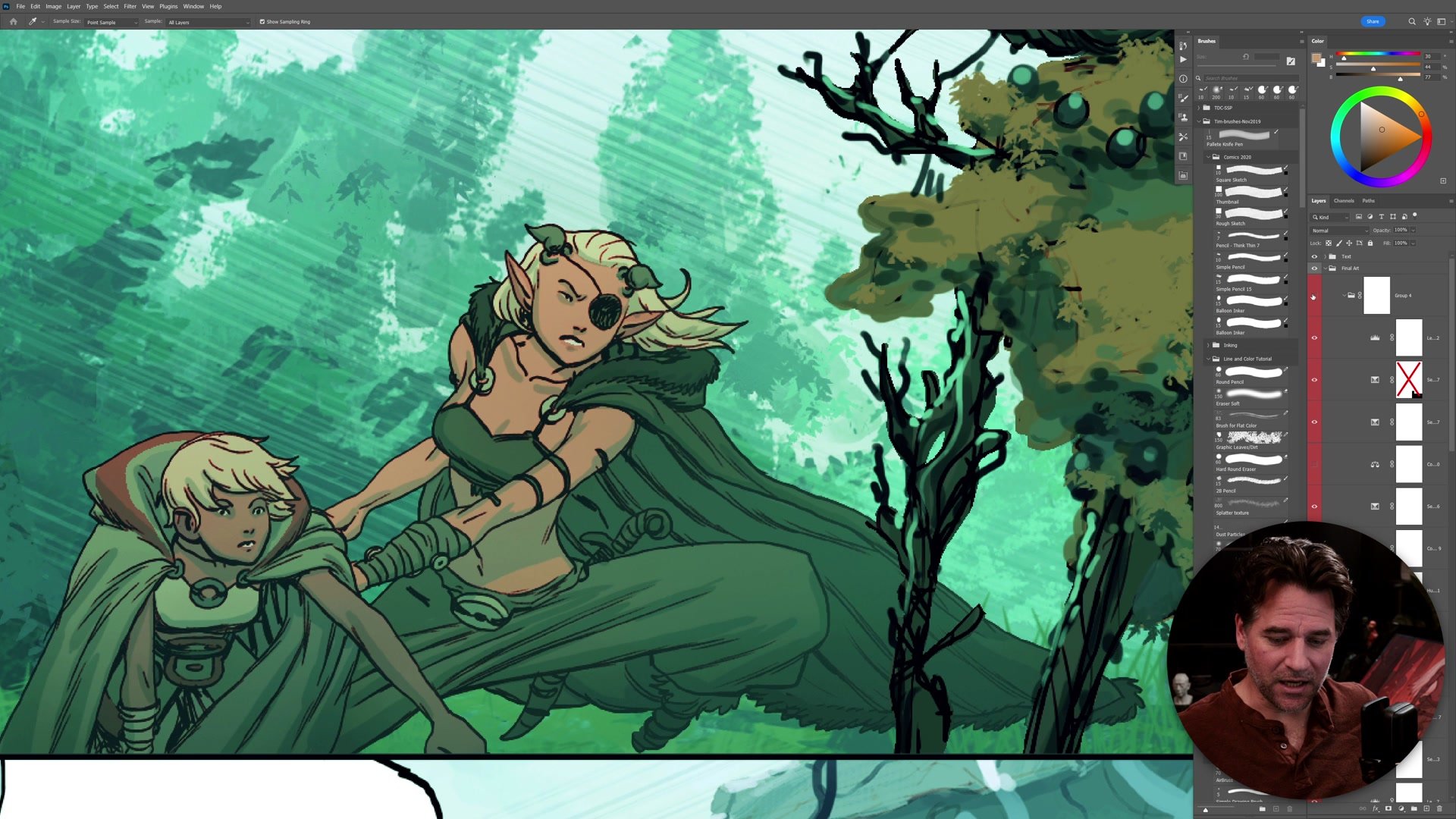
One of the most common challenges in line and color illustration is making flat color work look professional and sophisticated rather than just clean. When we study the work of artists like Mike Mignola (with Dave Stewart's colors on Hellboy) or Mobius, the art appears to use simple flat colors. But sampling those colors in Photoshop reveals something subtle: there are gradients running through nearly everything. A slightly different red at the top of a character than the bottom. A gentle shift in hue across a background. These tiny variations are often what separates polished professional work from work that feels too flat.
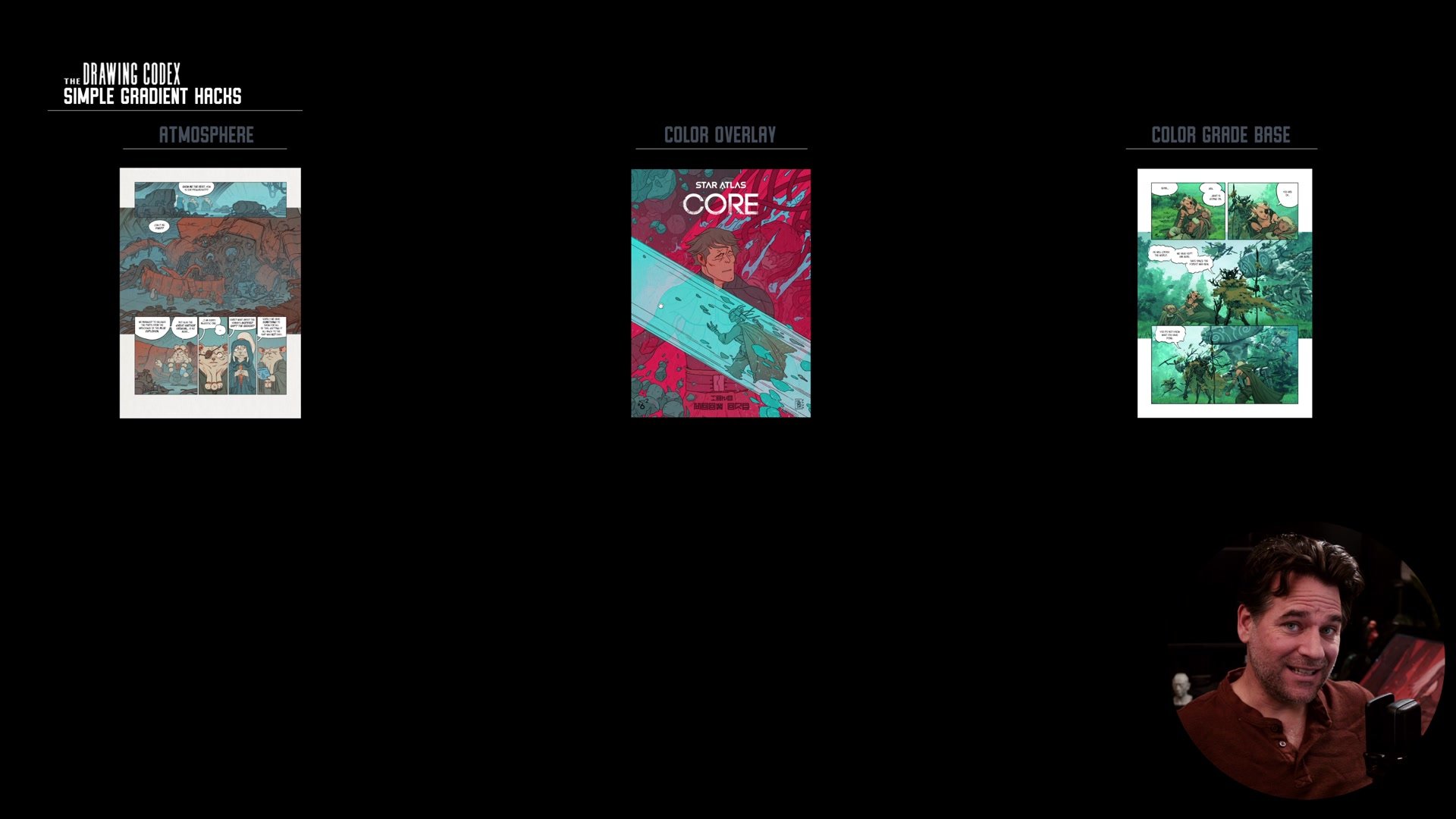
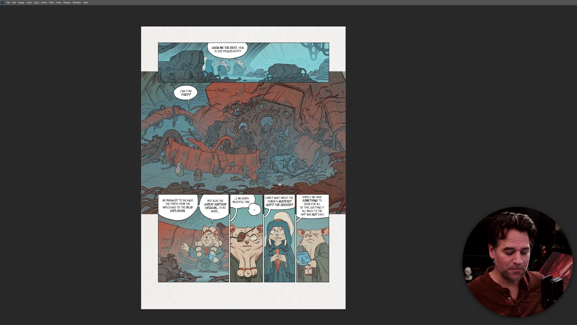
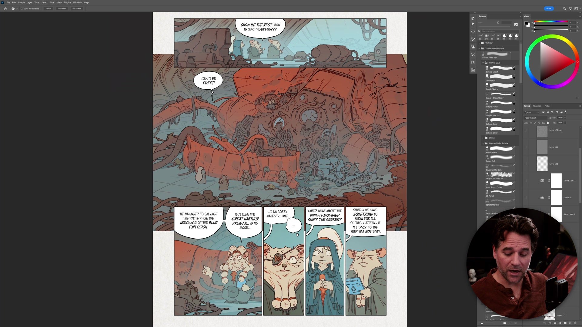
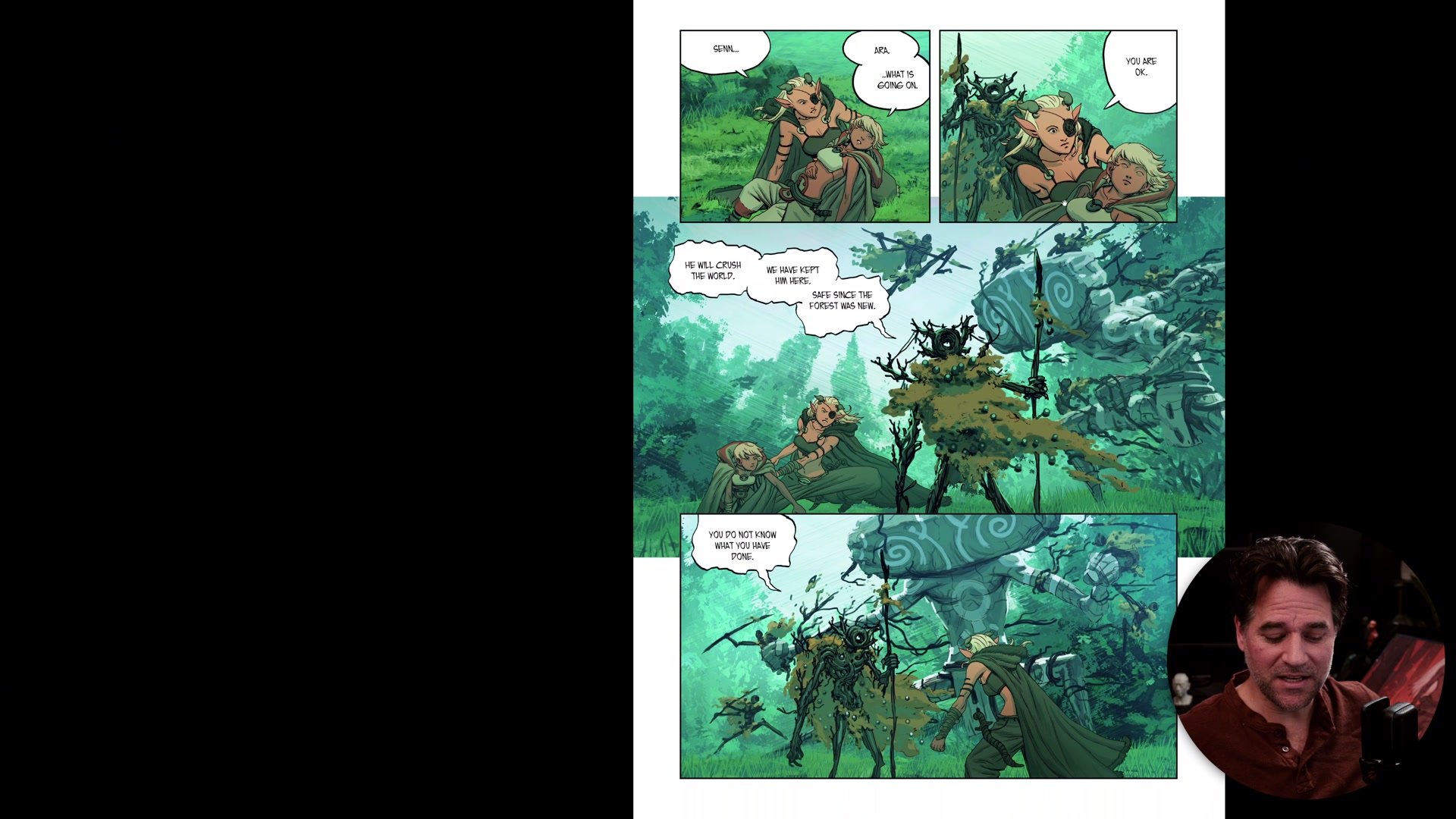
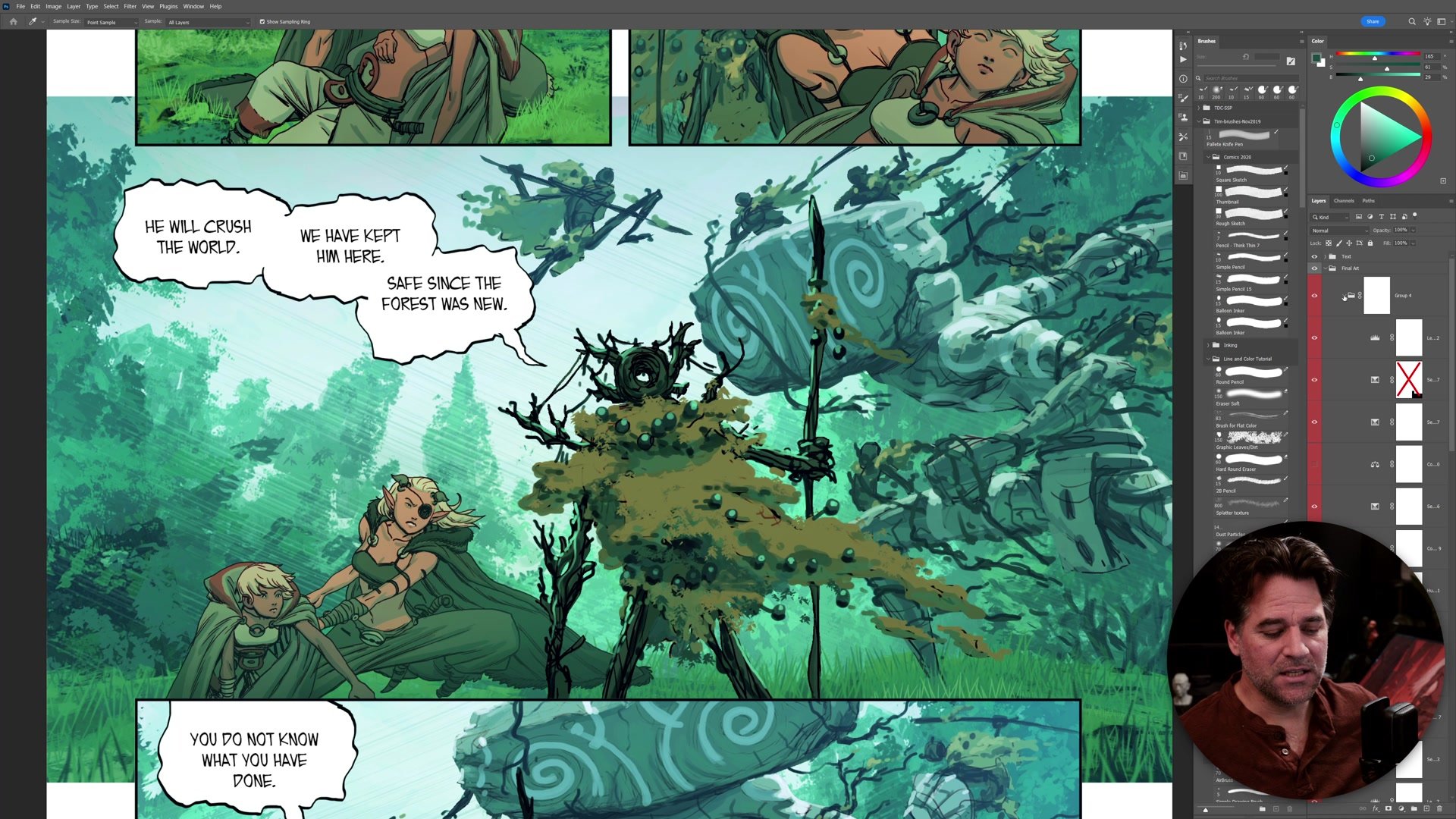
The first and most straightforward use of gradients is atmospheric depth. By placing large soft gradients on separate layers, you can push background elements back, clarify the separation between foreground and middle ground, and describe the different planes of your illustration. In Photoshop this takes seconds with the gradient tool or a large airbrush. In Procreate on iPad, large airbrushes work just as quickly. The key requirement is that your illustration needs to have foreground, middle ground, and background elements on separate layers so you can add atmosphere between them independently.
Gradients as Color Overlays
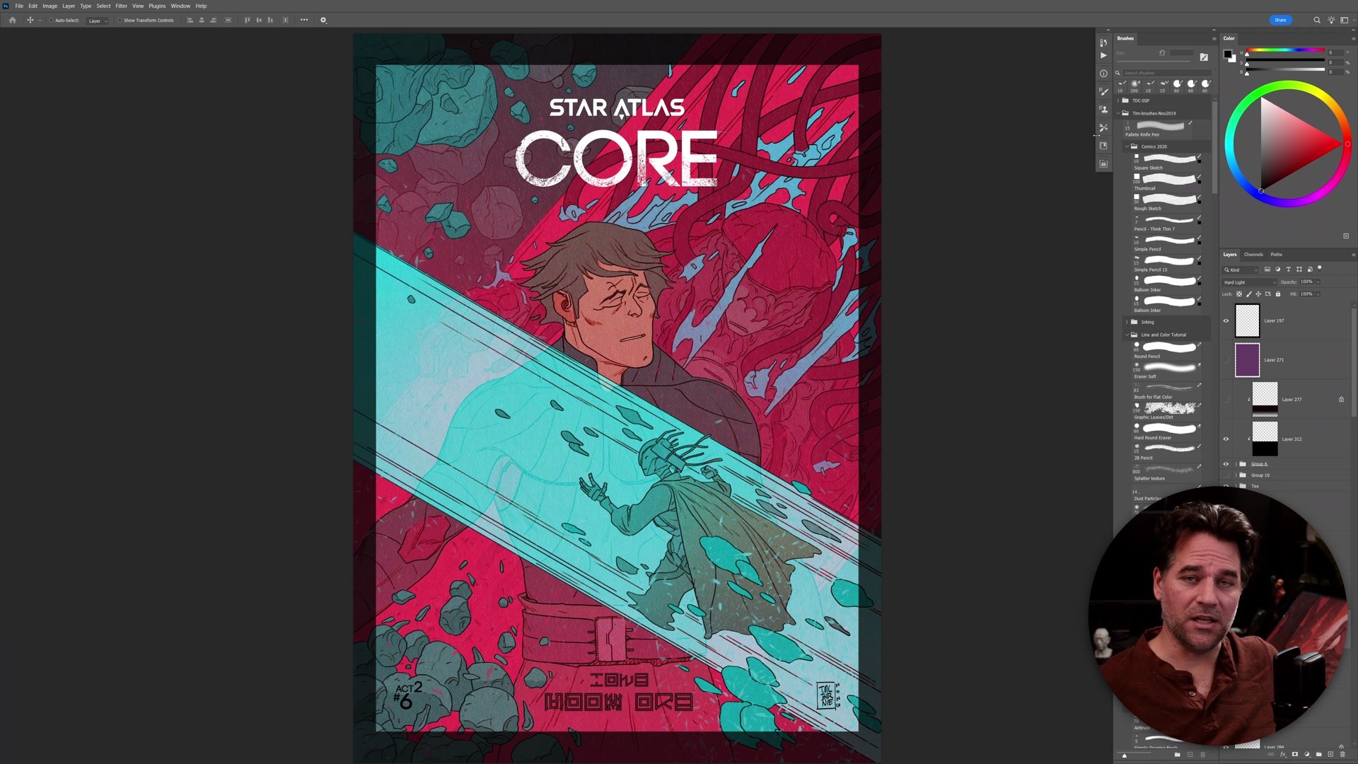
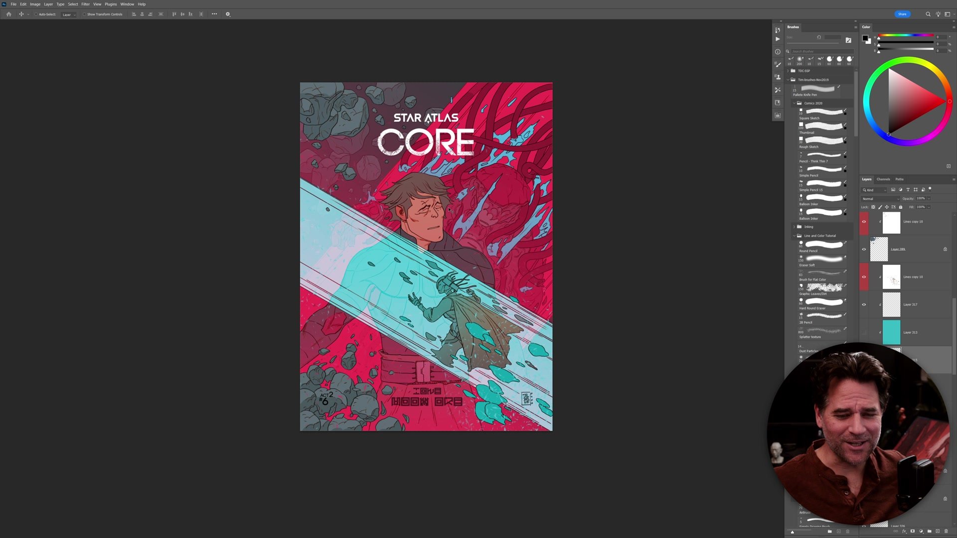
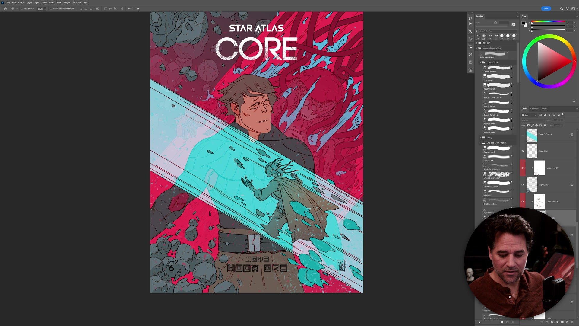
The second approach uses gradients as color overlays. Instead of using gradients purely for atmospheric fog, you can place bold color gradients on overlay or hard light blending modes to unify disconnected elements and add color sophistication. On a comic book cover, for example, running a warm gradient up a character's body on a normal layer while placing a large colored gradient across the background on overlay mode creates the feeling that everything belongs in the same color space. Flat colors underneath get enriched and pulled together. The control comes from having elements on separate layers so you can target exactly which elements receive which color shifts.
Combining Gradients with Color Grading
The third technique combines both approaches with color grading. Color grading is a concept borrowed from film, where color adjustments are applied to footage to create a specific mood or look. In illustration, this means applying color adjustment layers across the whole page. The powerful part is what happens when you add subtle atmosphere gradients before applying those adjustments. Because the gradient has already shifted certain areas slightly in hue or value, the color adjustment reacts differently to different parts of the image. A single flat skin color ends up displaying different hue, different saturation, and different value simultaneously across the form. All from one gradient and one adjustment layer. This creates an immense amount of color sophistication essentially for free, and it produces the most professional-looking results with the least amount of manual work.
Key Concepts
Atmosphere Gradients: Large soft gradients on normal layers push background elements back and separate foreground from middle ground. This is the simplest gradient technique and requires keeping your illustration layers organized by depth plane.
Color Overlay Gradients: Bold color gradients on overlay or hard light blending modes unify disconnected page elements and add color sophistication. Even placing a single color gradient on a normal layer across a character's form creates richness that flat colors alone cannot achieve.
Gradients Before Grading: Adding subtle gradients before applying color adjustment layers causes the adjustments to react differently across the image. The same flat color ends up with varying hue, saturation, and value, creating maximum color variation with minimal effort.
Try This
Separate Your Layers: Organize your illustration so foreground, middle ground, and background elements are on distinct layers. This is the foundation that makes all gradient techniques possible.
Add Atmosphere First: Place a large soft gradient on a new layer above your background elements. Use a color slightly cooler or lighter than your scene to push those elements back and create depth.
Stack a Color Grade: After adding atmosphere gradients, place a color adjustment layer (like Curves or Hue/Saturation) over everything. The gradients underneath will cause the adjustment to create different color shifts across the image, giving you sophisticated color variation without painting it in by hand.