How Great Artists Create Depth in Every Scene
Summary
The Depth That Makes It Real
Creating dimensionality in illustration often comes down to one deceptively simple skill: knowing when and how to place foreground, middleground, and background elements within a scene. This is the compositional muscle that separates flat, graphic images from illustrations that feel like living, breathing worlds. The challenge is that many artists resist adding these elements early on because it feels like unnecessary extra work. Through examining the work of Frank Frazetta, Vincent Mallie, Hayao Miyazaki, and Eric Henninot, this study session breaks down why that resistance exists, when depth elements are essential, and when simpler compositions work just as well.
Depth in Practice
Scene Art vs Cover Art
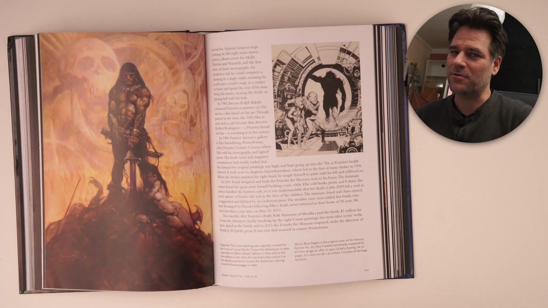
Not every illustration demands explicit foreground, middleground, and background elements. A key distinction exists between graphic or cover-style images and scene-based storytelling. Frazetta's work demonstrates this perfectly. His paintings carry extraordinary power through bold, graphic compositions that feel like single planes with a background. They communicate dimensionality through overlapping forms and foreshortening, but they rarely place the viewer inside the scene the way a storybook illustration does.
The difference matters because many developing artists see successful work without these depth elements and use it to justify skipping them entirely. The real question is whether the goal is a graphic, representational image or a scene that feels immersive. Comics, concept art, storybook illustration, and any work that aims to place the viewer inside an environment requires that extra compositional framing. Cover art and graphic pieces play by different rules.
Franco-Belgian Masters
Framing Every Shot
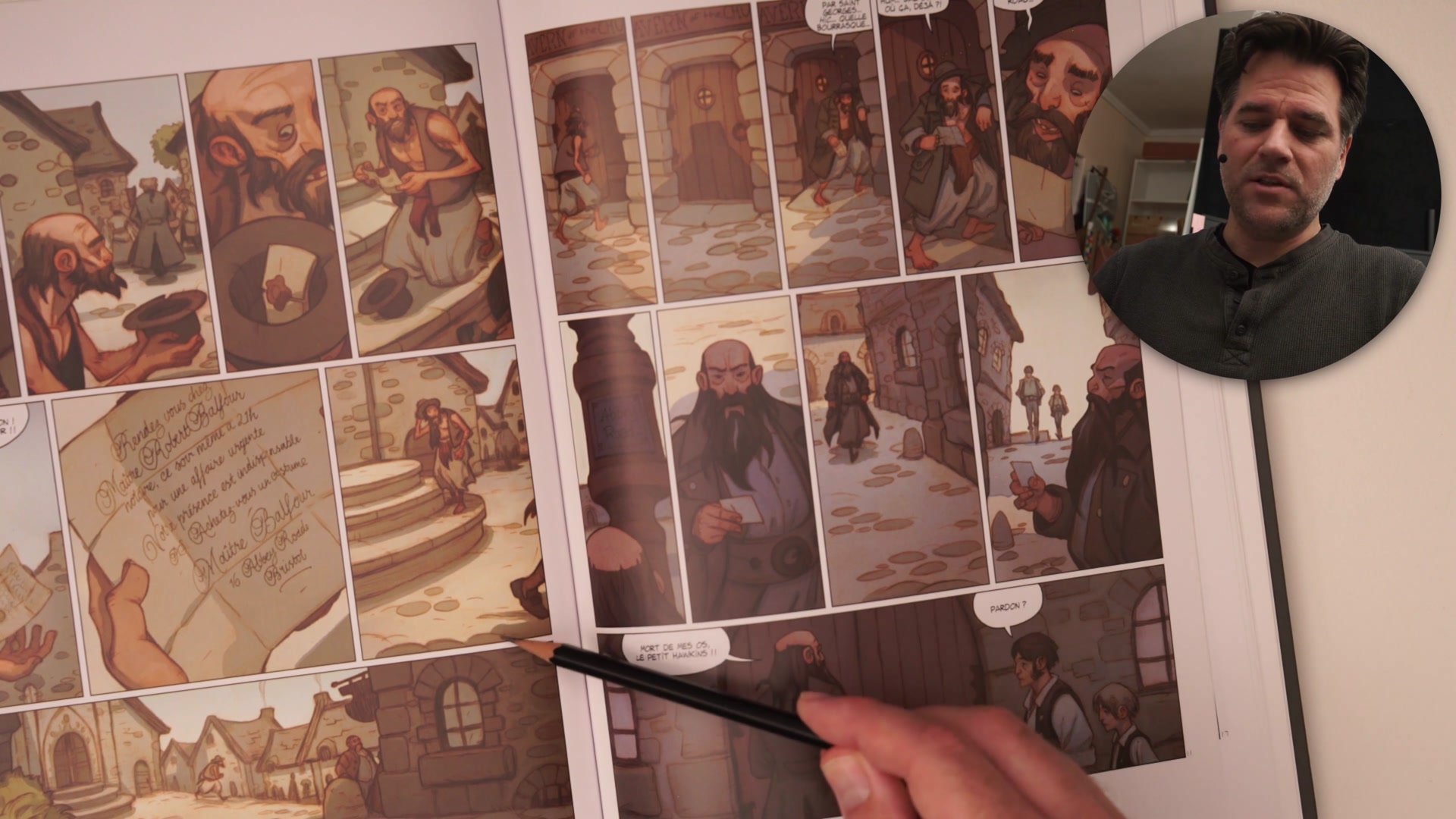
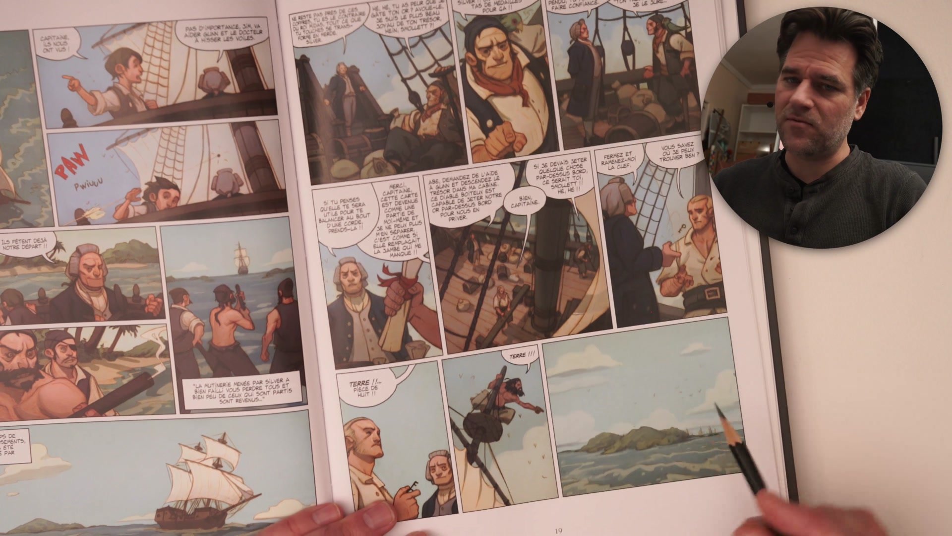
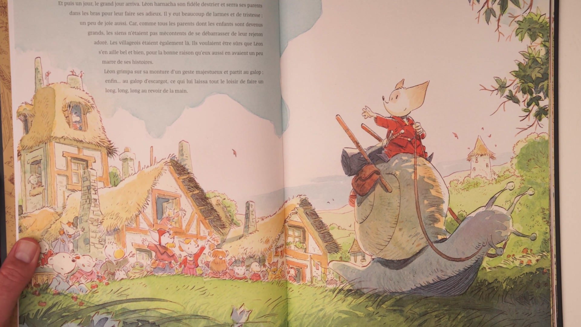
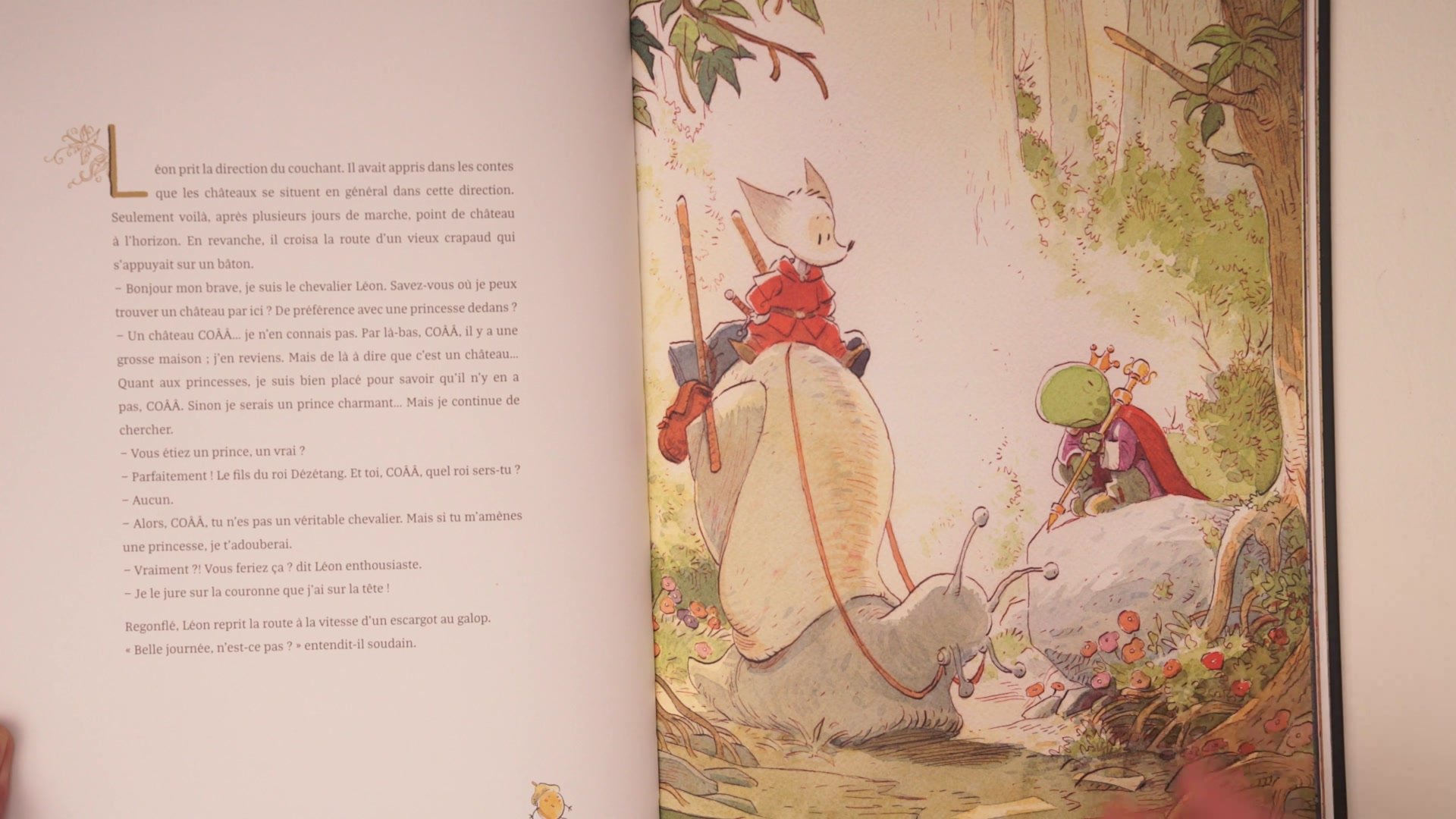
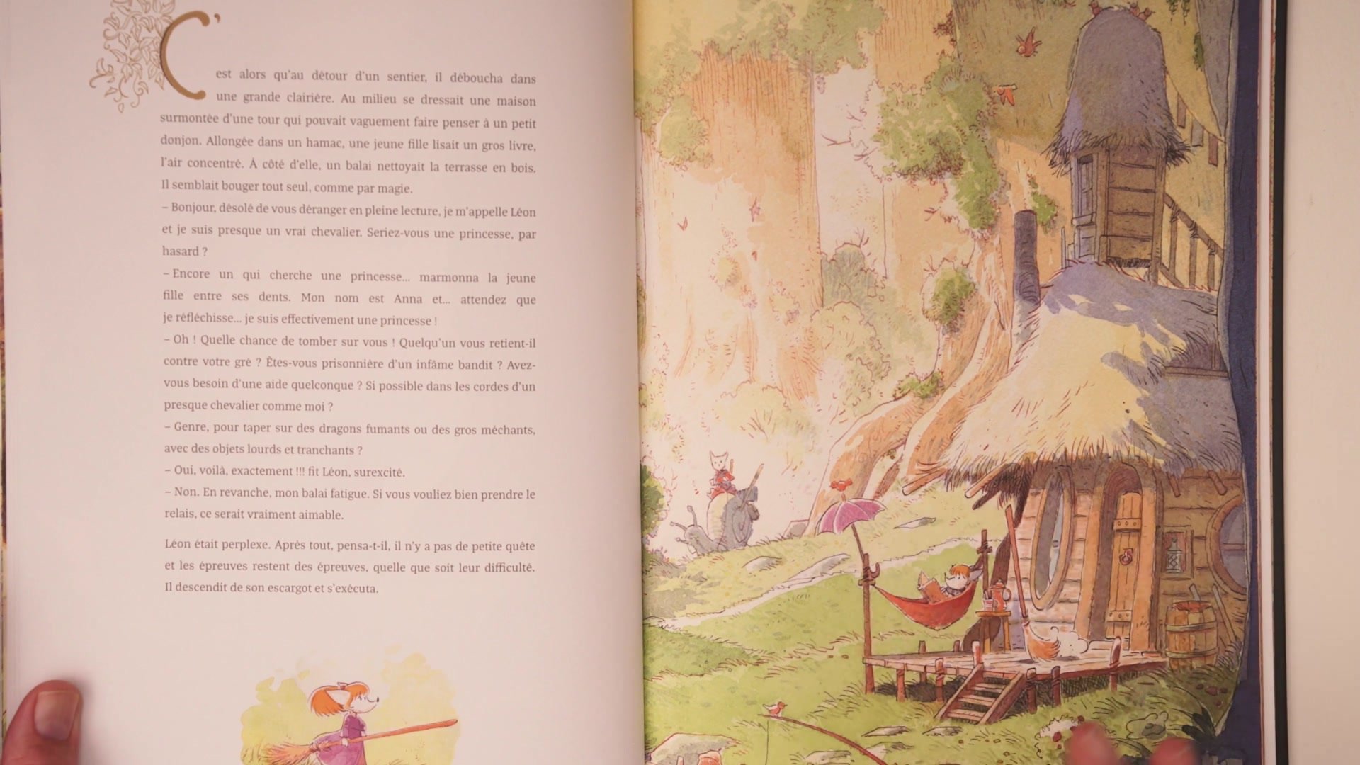
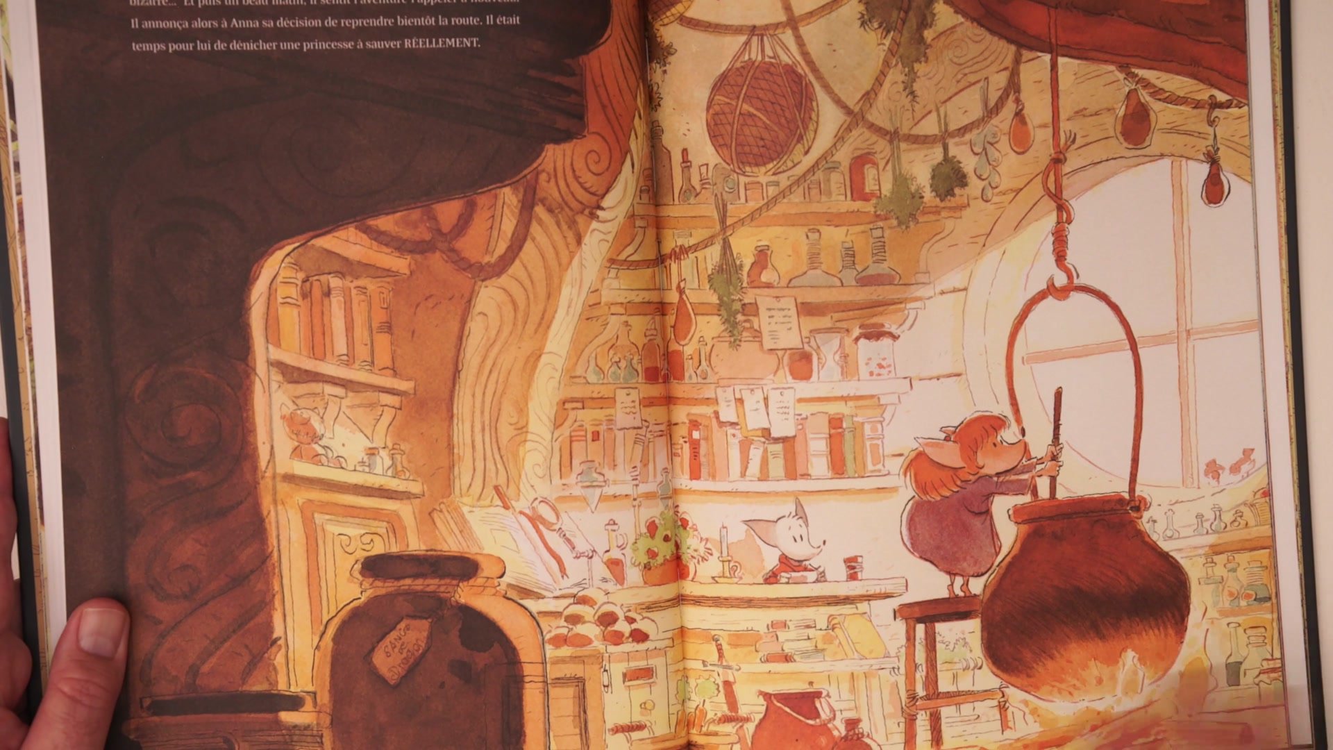
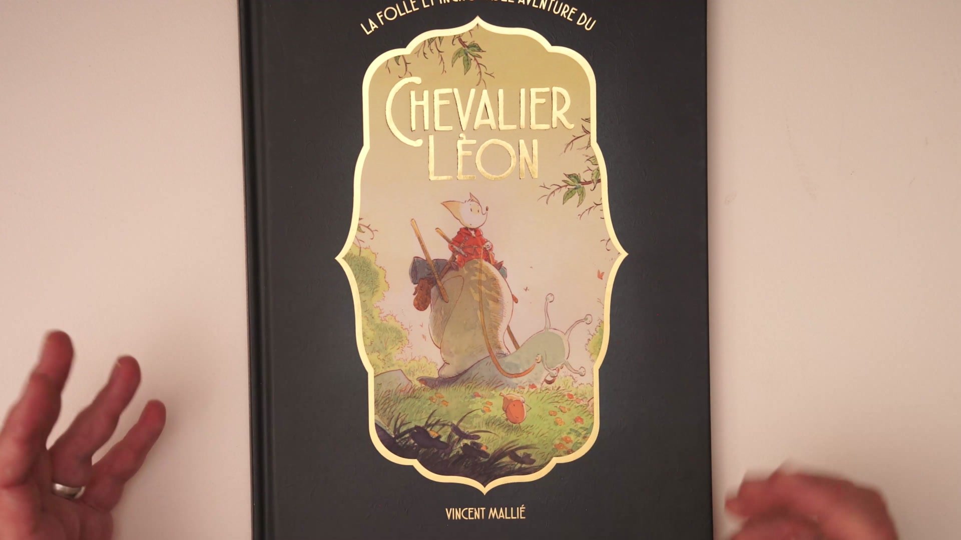
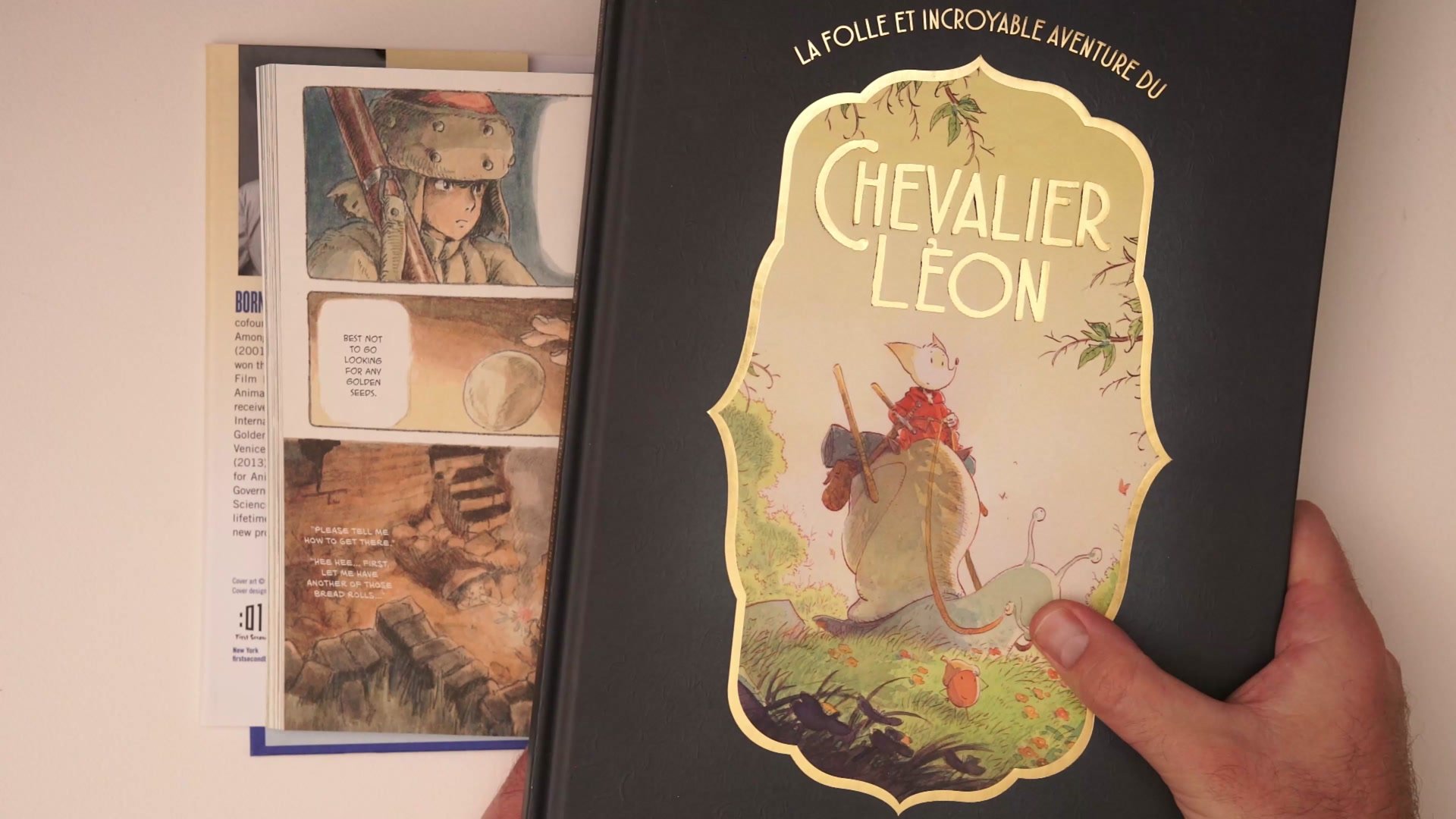
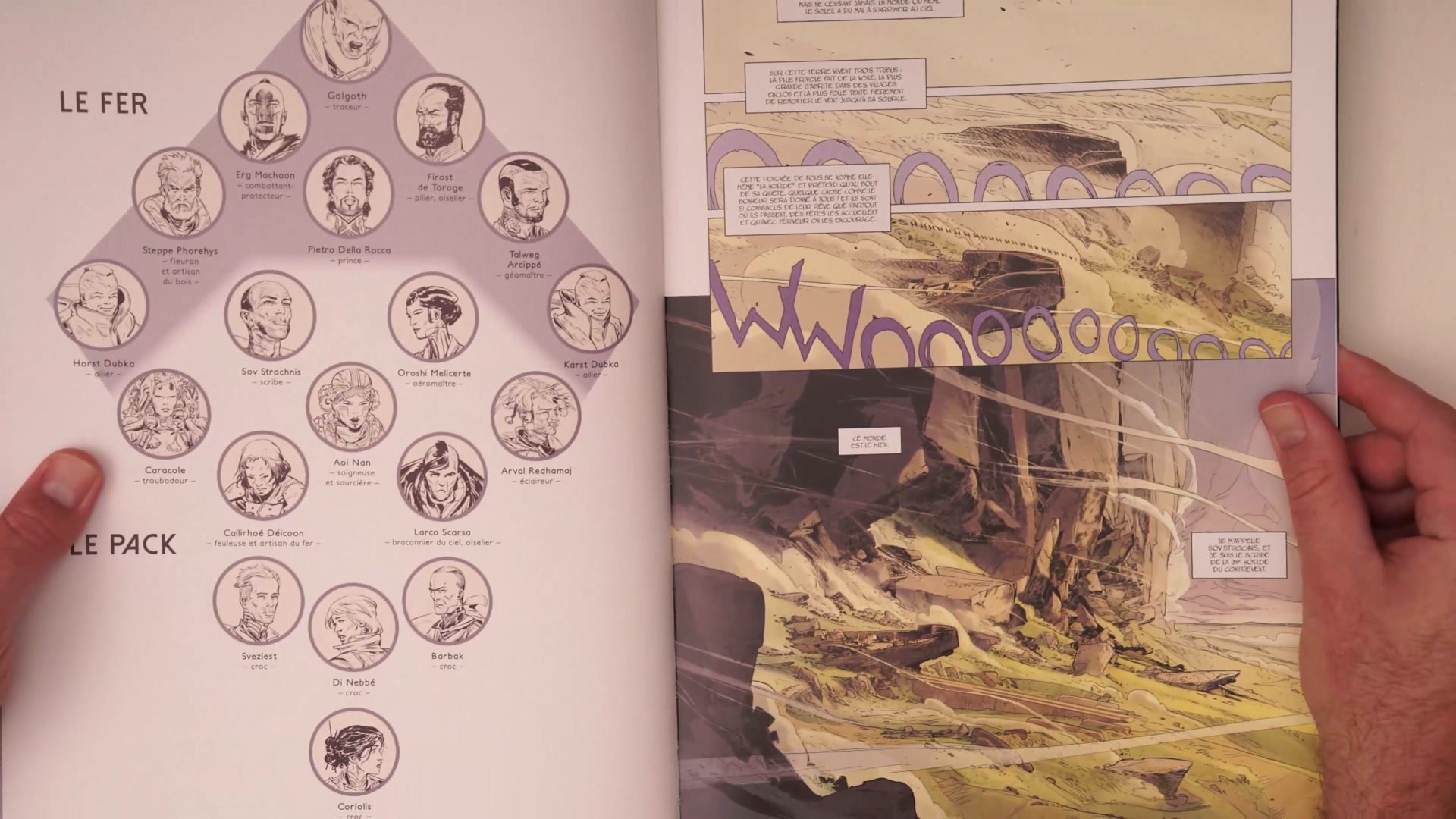
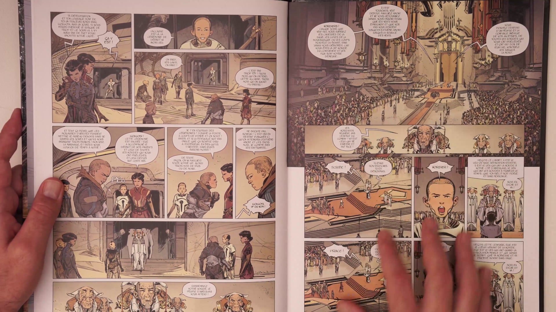
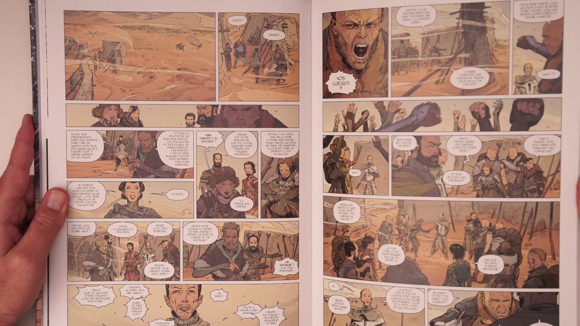
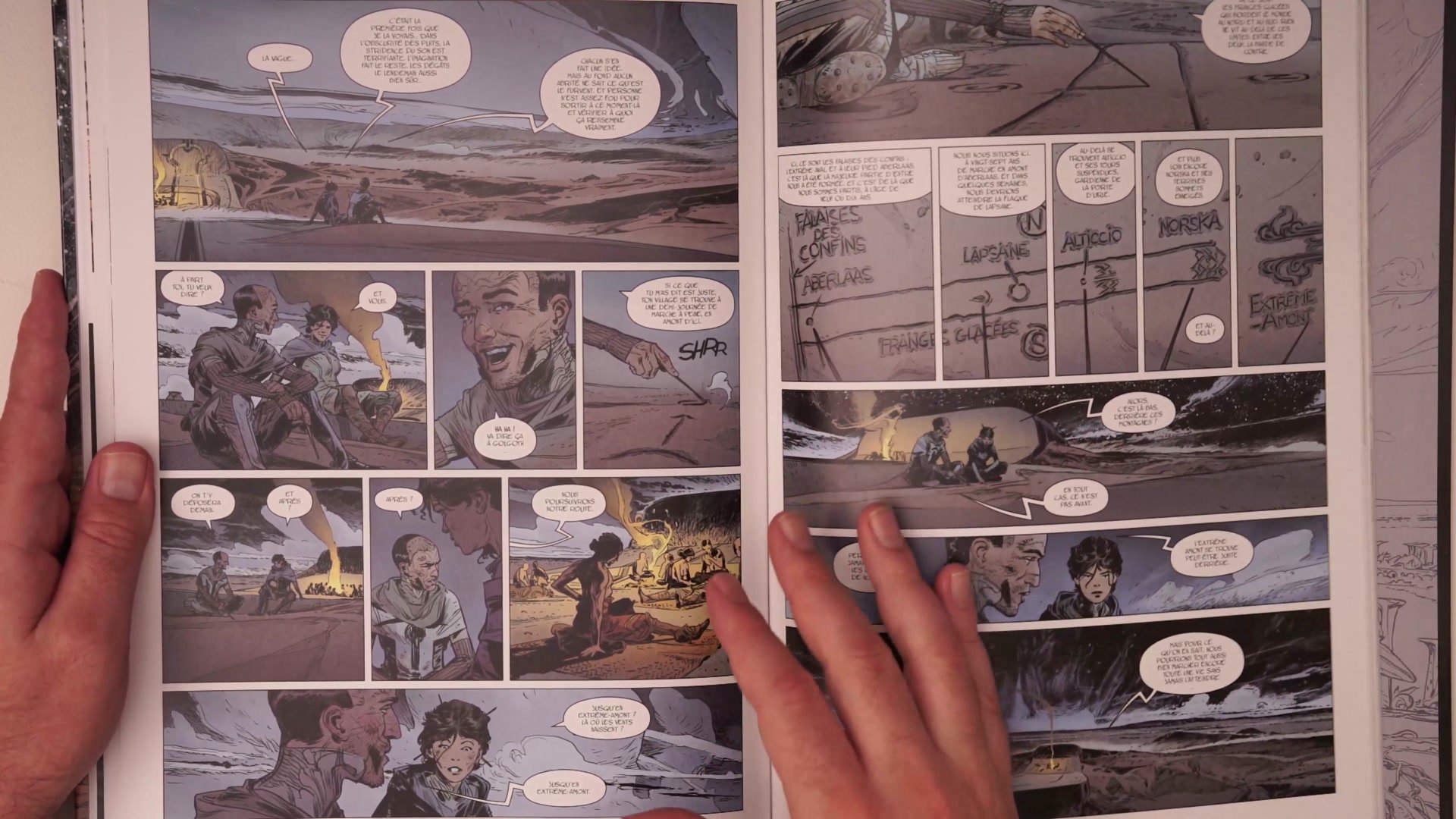
The Franco-Belgian comics tradition offers some of the strongest examples of consistent depth and dimensionality. Artists working in this tradition treat every panel as a cinematic shot, establishing clear foreground, middleground, and background relationships. Vincent Mallie's work exemplifies this storybook quality where every illustration feels as if the viewer is physically present in the environment.
The practical tools for creating this depth are often surprisingly simple. Branches, leaves, rope, architectural elements, and environmental details placed in the foreground frame the shot and establish spatial relationships. Eric Henninot's adaptation of La Horde du Contrevent takes this further by using wind itself, both as onomatopoeia and graphic representation, as a foreground element that threads through every scene. The lesson is that each setting offers its own natural tools for showing depth. The key is thinking about what is available in the environment and placing it deliberately.
Compositional Tools
Featured Artists
Frank Frazetta (1928-2010, American) One of the most influential fantasy artists in history, known for powerful, graphic compositions with extraordinary energy and drama. His cover paintings for Conan, Death Dealer, and countless other properties defined the look of fantasy art for decades. His work demonstrates how graphic, single-plane compositions can carry immense power without traditional depth layering.
Vincent Mallie (1973-present, French) Franco-Belgian comic artist and painter trained at the Ecole Superieure des Arts Graphiques in Paris. Known for his work on La Quete de l'Oiseau du Temps and Le Grand Mort, his illustrations carry a distinctive storybook quality where every scene feels fully inhabited. His personal illustration work showcases masterful use of foreground framing elements.
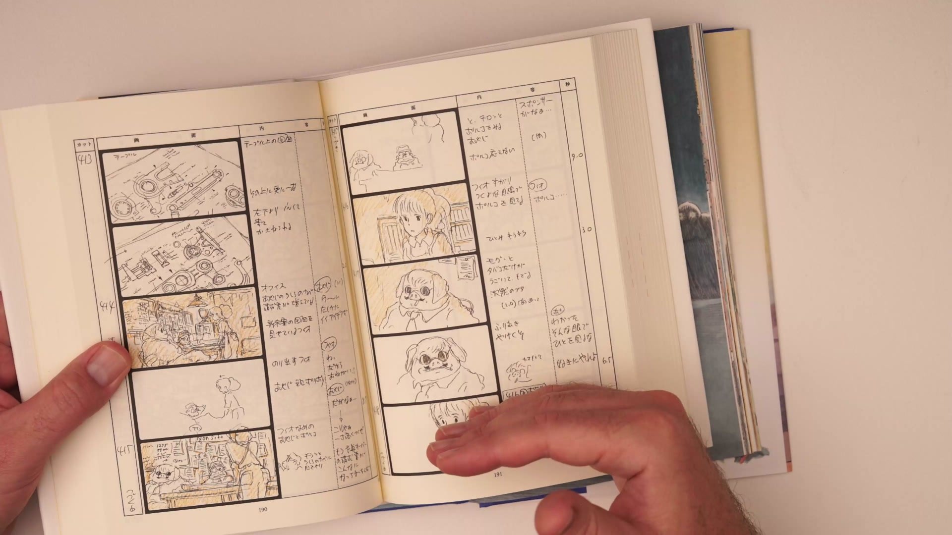
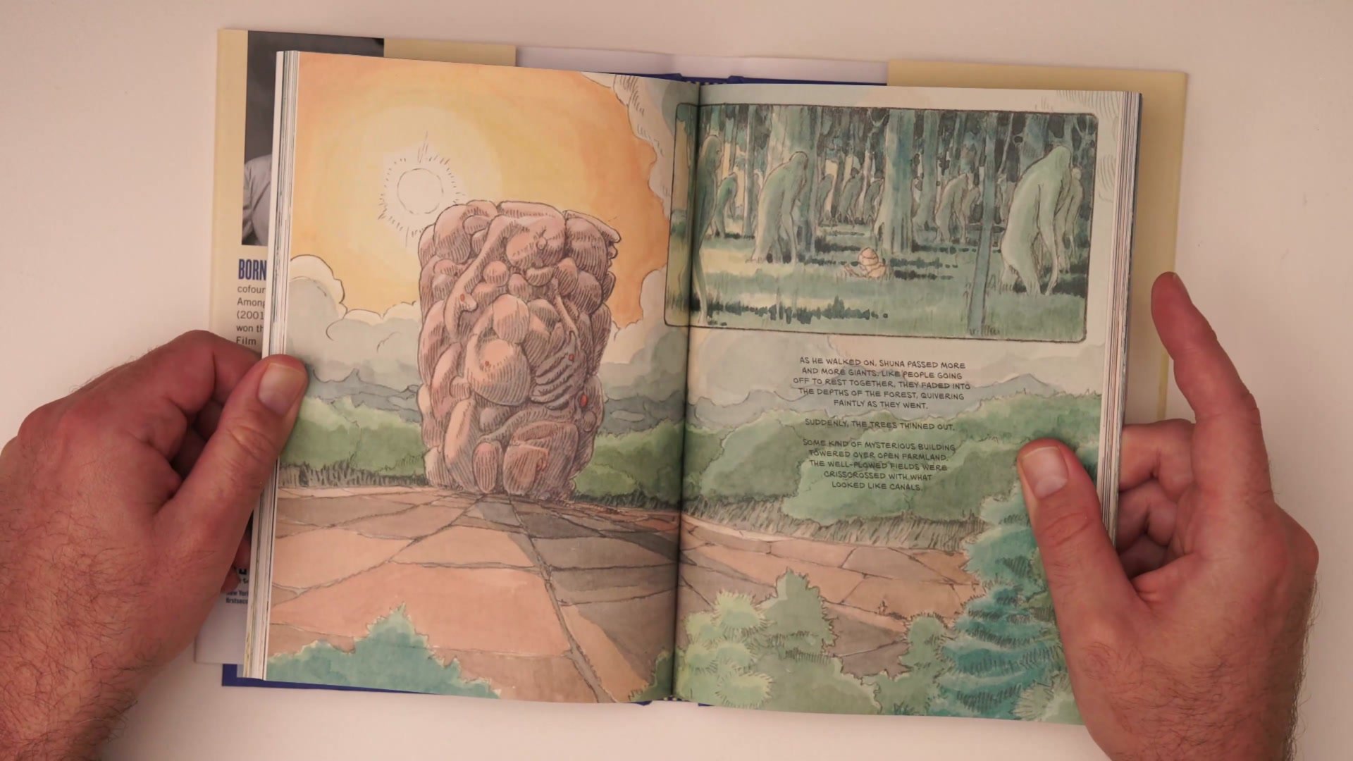
Hayao Miyazaki (1941-present, Japanese) Legendary animator and manga artist whose work includes Shuna's Journey, a watercolor-illustrated graphic novel mixing characters and themes from across his career. His storyboard work for films like Porco Rosso shows how animated storytelling balances detailed environmental depth with simpler graphic panels for narrative pacing.
Eric Henninot (1974-present, French) French comic artist who adapted Alain Damasio's novel La Horde du Contrevent into a visually stunning comic series. His use of wind as both graphical element and depth indicator throughout every panel demonstrates how environmental tools specific to a story's world can solve compositional challenges in creative ways.
Building Depth
Key Observations
Scene vs Graphic: Not every illustration needs foreground, middleground, and background. Cover-style and graphic images work differently from scene-based storytelling. The deciding factor is whether you want the viewer to feel placed inside the environment.
Resistance Is Normal: The instinct to skip foreground elements because they feel like extra, pointless work is extremely common. Building this compositional muscle requires pushing through that friction until framing shots with depth becomes automatic.
Environmental Tools: Every setting provides natural tools for showing depth. Branches, leaves, architectural elements, wind, and environmental details specific to your world can all serve as foreground framing devices.
Franco-Belgian Standard: Studying Franco-Belgian comics provides an exceptional education in consistent depth because the tradition demands every panel read as a cinematographic scene with clear spatial relationships.
Study This
Step 1: Pick an art book or comic with strong environmental depth. Go through it page by page and identify the foreground, middleground, and background elements in each panel. Notice how simple many of the foreground framing devices actually are.
Step 2: Study how different shot types handle depth. Bird's eye views, interior scenes, exterior landscapes, and close-ups each have their own vocabulary of foreground elements. Build a mental library of what works for each type.
Step 3: Apply this to your own work by asking one question before every illustration: what could go in the foreground to frame this shot? Even a simple element like branches, a hand, or an environmental detail can transform a flat composition into an immersive scene.